Most safety content treats a car’s warning lights, brakes, and sensors as a maintenance checklist — things to fix before they become expensive. That’s true, but it skips the more interesting question: how does a car actually tell you something is wrong in the first place? A squealing brake, a flickering dashboard icon, a steering wheel that pulls slightly to one side — these aren’t just symptoms.
They’re a design language, built the same way any interface is built, to communicate risk before it becomes a crisis.
I spent years working across automotive and industrial design, including early concept work on one of the first Ukrainian electric vehicles, and the thing that stuck with me is how much of a car’s safety system is really a communication system wearing an engineering costume.
A dashboard symbol has to convey urgency instantly, across languages and literacy levels, in a driver’s peripheral vision, in under a second. That’s not a small design problem. It’s one of the hardest interface challenges in consumer product design, and most drivers never think about it as design at all.
Product designers spend years developing intuition for exactly this kind of problem — how to make an object communicate a state change without requiring a manual. A car’s safety architecture is that same problem scaled up to a two-ton object moving at highway speed, with genuinely fatal consequences if the communication fails. Once you start looking at brakes, dashboard icons, and sensors through that lens, the whole system reads differently: not as a list of parts that can break, but as a layered interface that was designed, tested, and refined specifically to keep a driver informed without overwhelming them.
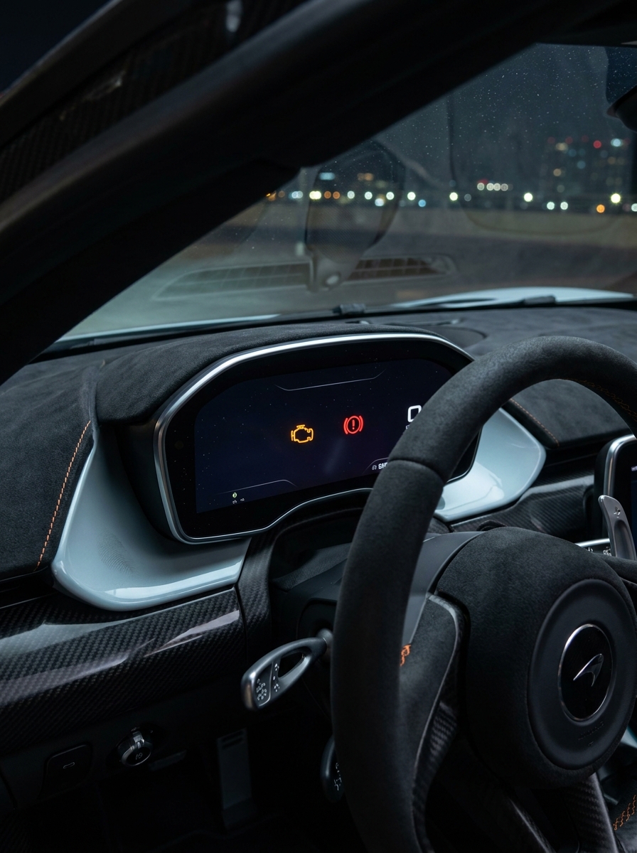
Warning Lights Are a Visual Language, Not Just Alerts
Every car dashboard runs on a shared visual vocabulary: color, shape, and motion all carry meaning before a driver reads a single word. Red means stop what you’re doing and address this now. Amber means something needs attention soon, but you’re not in immediate danger. This isn’t arbitrary — it borrows directly from traffic signal psychology, because the whole point is to be legible instantly, without conscious translation, the same way a stop sign works whether or not you can read the word “stop.”
The check engine light is the clearest example of how much this visual system has to communicate with almost no information. A single amber engine icon can mean a loose gas cap or a serious misfire, and the icon itself gives no clue which.
That ambiguity is actually a deliberate design trade-off: cramming diagnostic specificity onto a dashboard would create visual clutter that undermines the whole point of a warning system, which is fast recognition, not detailed explanation. The detail comes later, from a diagnostic scan — the dashboard’s job is just to say “something needs your attention,” clearly and immediately.

This design logic extends to shape and iconography too. Brake system warnings use a circular icon with an exclamation point specifically because the silhouette reads instantly at a glance, even in a driver’s peripheral vision at highway speed. Battery icons, tire pressure icons, and stability control icons all follow the same principle: simple, high-contrast, symbolic rather than literal, because literal illustration takes longer for the brain to parse under stress than an abstracted symbol does.
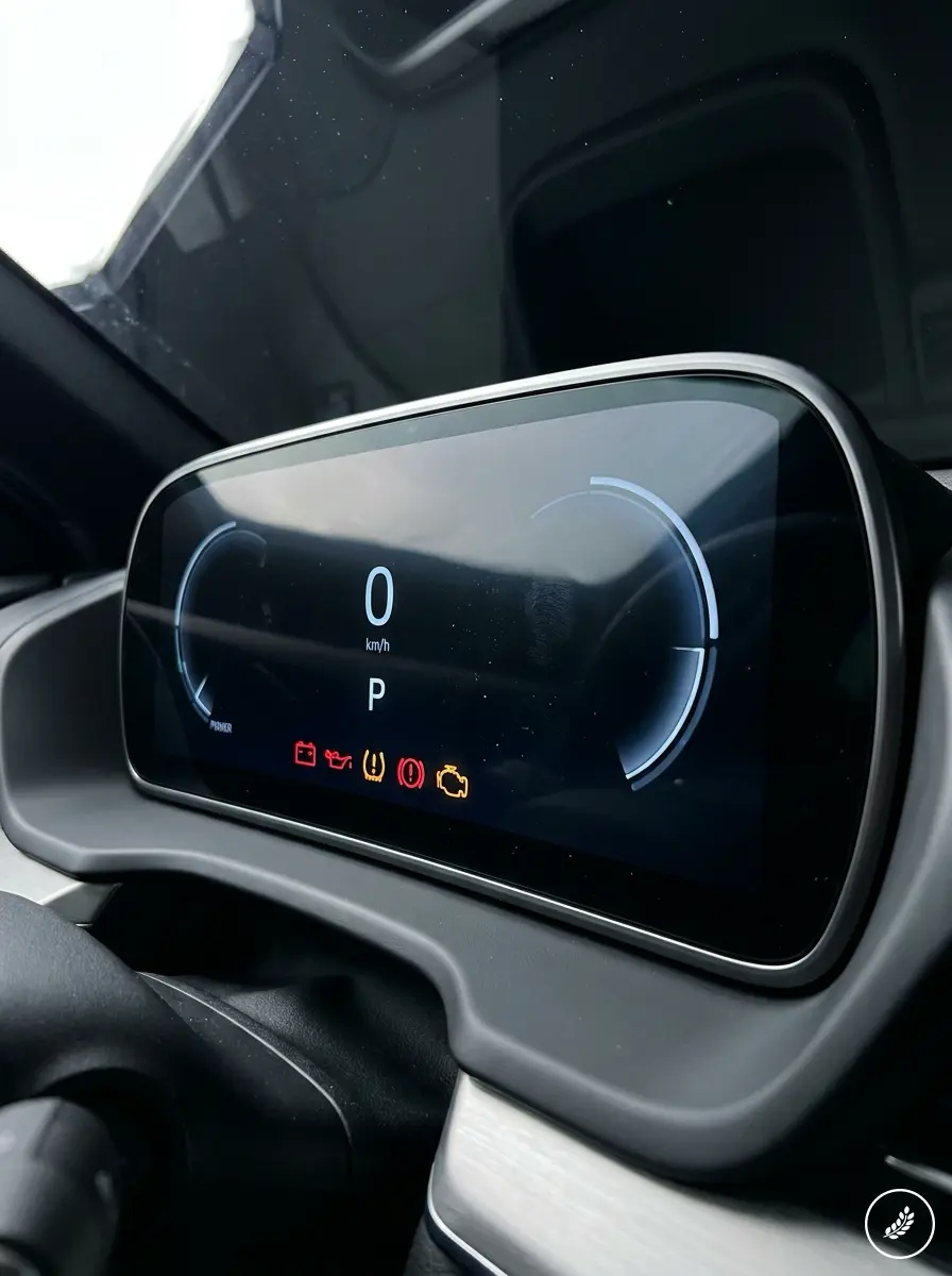
There’s an international standardization layer to this too, one most drivers never notice consciously. Dashboard symbols are largely consistent across manufacturers and countries specifically so a driver who’s never seen a particular car’s interior before can still recognize a critical warning within a fraction of a second.
That’s a deliberate design constraint, not an accident of convention — it’s the automotive equivalent of a universal exit sign, prioritizing instant recognizability over any individual brand’s visual identity. A manufacturer might style its dashboard typography or color palette distinctly, but the core warning icon set stays close enough to a shared standard that switching between a decade-old sedan and a brand-new SUV doesn’t require relearning what a red oil-can icon means.
Braking Systems Are Where Control Becomes Physical
Nowhere does automotive design turn abstract risk into physical feeling faster than the brake pedal. The entire braking system — pads, rotors, calipers, fluid lines — exists to translate a driver’s intent into deceleration with as little lag and as much predictability as possible, and the sensory feedback of that translation is itself a design choice, not an accident.

A soft or spongy brake pedal signals a breakdown in the feedback loop between intent and result — the driver presses, and the response feels uncertain, which is exactly the sensation automotive engineers spend enormous effort eliminating in a properly functioning system. Squealing or grinding sounds serve a similar communicative purpose, whether intentional or not: modern brake pads are frequently designed with a built-in wear indicator that produces a specific high-pitched squeal precisely so the system can “speak” to the driver before performance actually degrades.

The stakes behind getting this right are higher than most drivers register day to day. Vehicle defects contribute to 2% of auto accidents, a small-sounding number that represents a meaningful share of entirely preventable outcomes, and braking issues sit near the top of that list because stopping distance has zero margin for delayed communication. A brake system that clearly signals its own wear — through sound, through pedal feel, through a dashboard icon — is functioning exactly as its design intends, even when that signal is unwelcome news.
There’s a physical honesty to a well-engineered braking system that’s worth appreciating on its own terms. Rotors are designed to wear at a predictable, gradual rate specifically so pad replacement happens on a schedule rather than as a surprise. Brake fluid degrades slowly and measurably, which is why a soft pedal rarely appears out of nowhere — it’s usually the tail end of a slow-moving signal that started well before the driver consciously noticed anything different. Ignoring that early signal doesn’t make the underlying physics wait; it just means the eventual, unmistakable version of the warning arrives with less margin for a calm response.
Stability, Steering, and the Feeling of Control
Steering feel and vehicle stability are where automotive design gets closest to pure user experience work, because almost none of it is visible. A driver never sees the alignment geometry or the suspension geometry doing its job — they only feel the result, in how directly the car responds to input and how confidently it holds a line through a turn.

A vehicle that pulls to one side, or a steering wheel that vibrates at speed, is the physical equivalent of a UI element that’s slightly misaligned: technically the car still “works,” but the sensory mismatch between expected and actual response erodes trust immediately, often before a driver can articulate exactly what feels wrong.
This is intentional in reverse — a well-aligned, properly maintained steering and suspension system is engineered specifically to disappear, to give no feedback at all beyond confident, predictable response. The moment it starts generating unwanted feedback, that’s the system telling you something has shifted out of its intended tolerance.
Stability control systems extend this same logic electronically. When a stability system intervenes — a subtle pulse through the brake pedal, a slight power reduction, a dashboard light — it’s making an invisible physics problem (a wheel losing traction) suddenly perceptible to a driver who would otherwise have no direct sensory access to that information. That’s a genuinely elegant piece of interface design: translating a physical event happening at the tire contact patch into something a driver can feel and respond to in real time.

Tire condition sits underneath almost everything in this section, and it deserves its own mention because it’s the one component where the “communication” is often entirely visual and entirely the driver’s responsibility to read. Uneven wear patterns are essentially a diagnostic printout written directly onto the rubber — a tire wearing unevenly on one edge is telling a very specific story about alignment or suspension geometry, legible to anyone who knows to look.
Cracking, bulging, and sidewall damage are more urgent versions of the same visual language, and unlike a dashboard icon, nothing on the car is going to flag these for you automatically. That asymmetry is worth remembering: some of a car’s most important safety signals are silent and entirely visual, which is exactly why they’re the ones most often missed.
Lighting, Sensors, and the Expanding Sensory Layer
Headlights and taillights were the original vehicle safety interface, communicating a car’s presence and intent to everyone else on the road long before any electronic sensor existed. Modern lighting design has only expanded that communicative role — sequential turn signals, adaptive high beams, and daytime running lights all exist to make a vehicle’s next move legible to other drivers before it happens, the same design goal a blinking cursor or a loading indicator serves in a digital interface.

Sensor-based systems are the newest layer in this sensory stack, and they follow the same underlying design principle as everything else on this list: take information the driver can’t otherwise perceive and translate it into something immediate and actionable.
A blind-spot warning light in the side mirror, a proximity beep during a tight parking maneuver, a lane-departure vibration in the steering wheel — each one takes a piece of spatial awareness a human driver structurally cannot have (what’s directly behind the C-pillar, how close is that curb) and converts it into a sensory signal the driver’s attention system already knows how to process.

The channel each sensor uses matters as much as the information itself. A blind-spot warning lives in a mirror-mounted light because that’s already where a driver’s eyes go when checking that specific space — placing the same alert on the center dashboard would technically deliver the information but miss the moment it’s actually needed.
A lane-departure system uses steering-wheel vibration rather than a sound specifically because a driver’s hands are already in contact with the wheel at the exact moment the alert matters, making touch a faster and more reliable channel than sound competing with road noise and a stereo. This kind of channel-matching — choosing not just what to say but where and how to say it — is as central to good automotive design as anything happening under the hood.
None of these systems replace the driver’s judgment. The good ones are designed specifically not to — they’re meant to extend awareness, not override it, which is a genuinely different design philosophy than automation for its own sake. A well-designed sensor alert respects the driver’s role in the loop instead of trying to remove them from it.
Electrical health underpins every one of these systems, which is easy to forget because it’s the least glamorous part of the sensory stack. Dim headlights, slow engine cranking, or flickering dashboard lights are early symptoms of a battery, alternator, or wiring issue, and they matter well beyond the inconvenience of a car that won’t start.
Every sensor, every warning light, every piece of the layered communication system described in this article depends on stable electrical current to function at all. A car with a failing charging system risks more than stranding its driver in a parking lot — it risks losing its entire safety communication layer at the exact moment that layer might matter most.
When the System Needs a Diagnosis, Not a Guess
Every communication system eventually runs into ambiguity, and a car’s warning system is no exception — an amber check engine light really can mean a dozen different things, and that’s exactly where the system hands off from “communicate that something’s wrong” to “a trained professional needs to interpret this.” Diagnostic work is the translation layer between a vague dashboard symbol and an actual, specific answer.
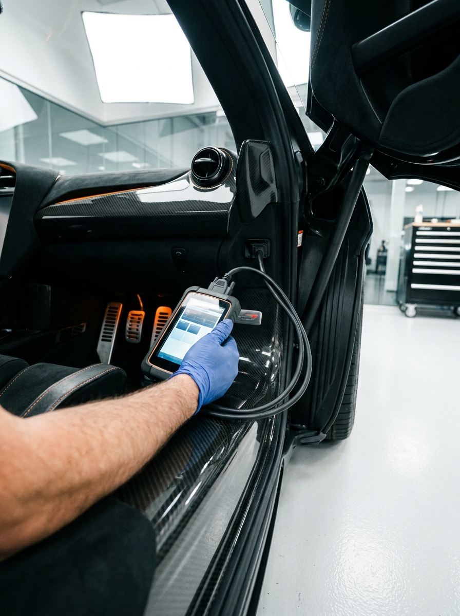
That translation isn’t free, and understanding roughly what it costs helps put the “just get it checked” advice into practical context. Basic diagnostic and repair service typically runs under $250, while more involved work — the kind needed when a warning points to something structural rather than a simple sensor fault — often falls in the $296 to $474 range. That gap is itself informative: it’s roughly the cost difference between catching an issue early, while the dashboard is still just flagging a symptom, versus waiting until the underlying mechanical problem has actually progressed into something more serious.
Framed this way, the cost spread functions almost like a design incentive built into the system, even if no one engineered it that way on purpose. Responding to the amber icon promptly keeps a driver on the lower end of that range. Waiting until the amber turns into something louder — a rougher idle, a loss of power, a second warning light joining the first — reliably pushes the repair toward the higher end, and often well beyond it. The dashboard isn’t trying to save the driver money directly, but the economics of ignoring it consistently punish delay in a way that reinforces the same lesson the visual design is already trying to teach.
This is also where the sheer scale of the professional support system behind these vehicles becomes relevant. There are 302,754 auto mechanics working in the U.S., a workforce that exists specifically to close the gap between a dashboard’s symbolic language and a driver’s actual mechanical understanding. A warning icon doesn’t need to explain itself completely, because it was never designed to work alone — it’s the first half of a two-part system, and a qualified technician is the second half.
That two-part structure is worth taking seriously rather than treating as an inconvenience. A driver isn’t expected to be fluent in the full mechanical vocabulary behind a dashboard symbol any more than someone using a smoke detector is expected to diagnose the exact electrical fault behind an alarm. The design goal in both cases is the same: alert quickly, then hand off to someone equipped to interpret and resolve. Skipping that handoff — ignoring the alert instead of routing it to a qualified diagnosis — is where the system’s careful design work gets undone by a decision that happens entirely outside the vehicle itself.
Designing Trust Into Every Warning
The deeper pattern across brakes, steering, lighting, and sensors is that good automotive safety design isn’t about eliminating risk information — it’s about presenting it at exactly the right moment, in exactly the right sensory channel, so a driver can act on it without being overwhelmed by it. Too little signal, and a real problem goes unnoticed until it’s serious. Too much signal, and drivers start tuning out warnings altogether, which defeats the entire system.
That balance is why a squealing brake pad, a pulsing stability control system, and a simple amber dashboard icon can all coexist in one vehicle without competing for attention: each one is calibrated to a different level of urgency and a different sensory channel, the same layered thinking that goes into any well-designed interface with multiple priority levels. A car that communicates well doesn’t shout about everything. It reserves its loudest signals for what actually deserves them.

This is also why the worst version of a warning system isn’t the one that goes off too often — it’s the one drivers stop trusting. A system that cries wolf, flagging minor issues with the same visual urgency as genuinely dangerous ones, teaches drivers to discount every alert equally, which is arguably more dangerous than having no warning system at all. Good automotive safety design has to earn a driver’s trust over thousands of miles of accurate, proportionate signaling, so that the one time it flags something serious, the driver actually believes it.

Understanding vehicle safety features this way changes what “staying on top of maintenance” actually means: respecting a communication system that was engineered, often at real design expense, to tell you exactly what it needs before it fails — and choosing to listen while the message is still a suggestion rather than an emergency.
- 29shares
- Facebook0
- Pinterest26
- Twitter3
- Reddit0