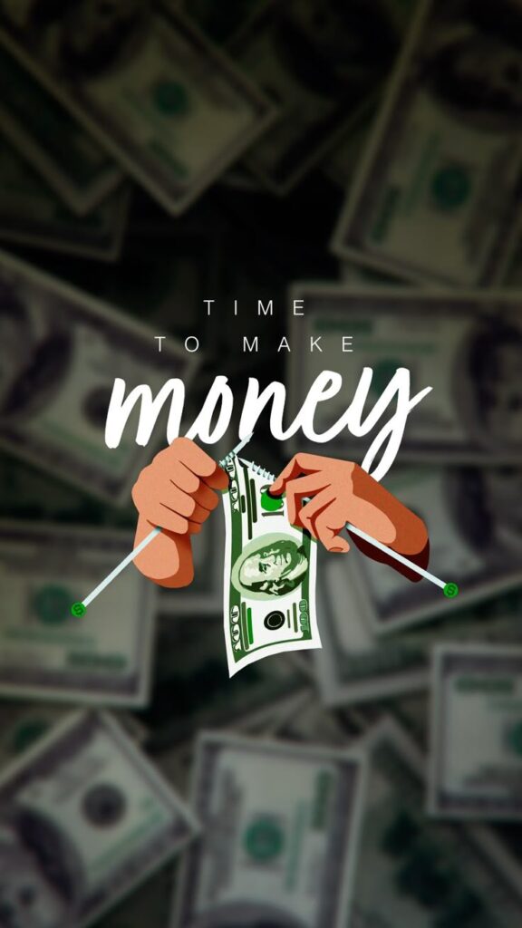
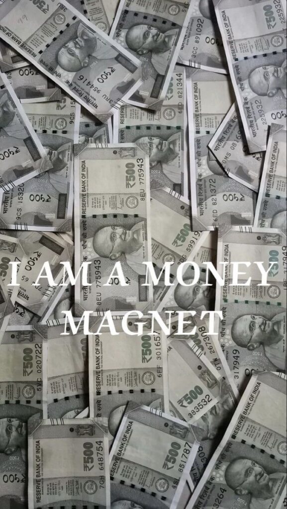
Money wallpaper iPhone designs work best when they feel motivating without making your screen hard to use. This collection has 40+ vertical wallpapers, from clean dollar signs and dark cash textures to gold coins, luxury flat lays, and money-magnet designs. I also added quick setup notes, resolution tips, and a simple lock-screen vs home-screen guide so you can pick a wallpaper that looks good after the clock, widgets, and app icons are on top of it.





What makes a good money wallpaper for iPhone
Not every money wallpaper works well as an iPhone background. The main issue is legibility. If the design is too busy, your app icons disappear into the noise. The best money wallpapers for iPhone usually have three things: a clear focal point, enough dark or light space where icons can still read clearly, and a resolution of at least 1170 x 2532 px for a sharp look on modern iPhones.
Minimalist designs tend to hold up best long-term. A single dollar symbol on a dark background, a clean gold texture, or a quiet pattern of coins will age better than a wall-of-cash photo after two weeks. That said, if you are using the image only as a lock screen, you can go bolder. For the home screen, keep it cleaner.
How to set a money wallpaper on iPhone
- Save the image you want. Press and hold on it, then tap Save to Photos.
- Open Settings, then go to Wallpaper and tap Add New Wallpaper.
- Select Photos and find the image you just saved.
- Pinch to zoom and reposition the image so the main focal point sits in the center.
- Tap Add and choose Lock Screen, Home Screen, or Both.
Tip: For the home screen, enable Blur in the wallpaper editor so your icons stay readable on top of a busy design.
Money wallpaper iPhone styles for lock screens and home screens
Money wallpapers are easy to overdo. A full frame of cash can look interesting in the gallery, but once it sits behind a clock, widgets, and app icons, the design can turn into visual static. I usually judge a phone wallpaper the same way I judge a poster thumbnail: squint at it first. If the main shape still reads when the details disappear, it has a better chance of working on a small screen.
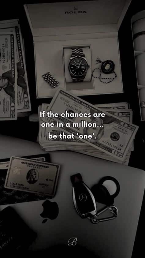
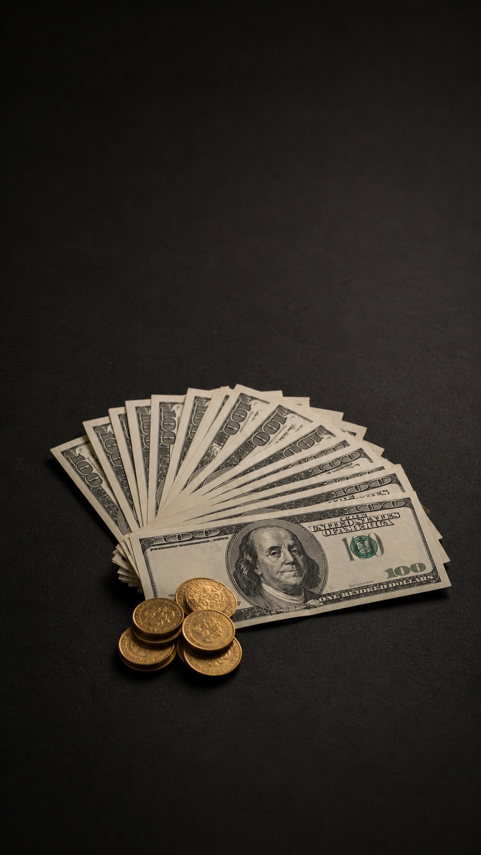
For a lock screen, you can be more dramatic. A close-up of folded hundred-dollar bills, a dark background with gold coins, or a luxury flat lay can work because the image only has to compete with the clock and maybe one widget. The strongest lock screen versions leave some breathing room near the top, so the time does not sit on top of the busiest part of the picture.
For a home screen, I would choose a cleaner design. Minimal dollar signs, soft gradients, black-and-gold textures, or a single focal object usually work better than a dense pile of notes. The goal is not to make the wallpaper boring. It is to keep the phone usable. If you cannot read app names or see notification badges, the wallpaper is doing too much.
What to avoid when choosing a money wallpaper
The biggest mistake is picking an image only because it looks expensive. Shiny watches, cars, bills, cards, and quotes all packed into one vertical frame can feel motivational for five seconds, then tiring after a day. Good wallpaper design has restraint. One strong idea beats six competing symbols.
Be careful with text-heavy money wallpapers too. Short words can work if they are part of the design, but long quotes usually sit exactly where the iPhone clock, widgets, or app icons need to go. If the image already contains words, preview it on both the lock screen and home screen before keeping it.
Also check the edges. iOS crops and zooms images depending on the model, so important details near the very top, bottom, or corners may disappear. A safe money wallpaper keeps the focal point closer to the center and uses texture, shadows, or simple color fields around it. That gives you room to reposition the image without losing the best part.
Lock screen vs home screen: which money wallpaper works best?
The same money wallpaper can feel completely different depending on where you use it. On the lock screen, the image has room to be dramatic. On the home screen, it has to behave. That difference matters more than most people expect.
If you want a bold cash photo, use it as a lock screen first. Stacks of bills, luxury desk scenes, gold coins, and high-contrast textures look strong there because the only major overlay is the clock. The image can be louder without making the phone annoying to use.
For the home screen, choose the calmer option. A darker background, a simple dollar sign, a soft gold gradient, or a pattern with low contrast will sit behind app icons without fighting them. I would rather have a slightly quieter wallpaper that works every day than a flashy one that makes every app folder hard to read.
| Use case | Best wallpaper style | Why it works |
|---|---|---|
| Lock screen | Bold cash photo or luxury flat lay | The clock has more space, so the image can carry more detail. |
| Home screen | Minimal dollar sign, dark texture, or soft gold pattern | App icons stay readable and the screen feels less cluttered. |
| Both screens | Centered focal point with quiet edges | The image can crop safely across different iPhone models. |
Quick resolution guide for money wallpapers
A wallpaper can have a great idea and still look cheap if the resolution is too low. iPhones are unforgiving because the screen is sharp and you often zoom the image while setting it. If the original file is already small, that zoom makes the texture soft fast.
As a safe rule, use at least 1170 x 2532 px for most modern iPhones. If you are using a Pro Max model, aim closer to 1290 x 2796 px or higher. Bigger is fine as long as the image remains clean and the file is not heavily compressed.
When you preview a money wallpaper, look at the edges of bills, coin highlights, and small shadows. If those details look smeared before you even set the wallpaper, they will look worse on the phone. Sharp does not mean over-processed; it means the texture still has a clean edge.
| iPhone type | Good minimum size | Best choice |
|---|---|---|
| Older iPhones and SE | 750 x 1334 px | Use simple designs that do not need heavy cropping. |
| Standard modern iPhones | 1170 x 2532 px | Use vertical 9:16 images with the focal point centered. |
| Pro Max models | 1290 x 2796 px | Use larger files so zooming does not soften the image. |
Useful iPhone wallpaper references
For setup details, Apple has a clear guide to change the wallpaper on iPhone. If you want to check the exact screen size for your model, use Apple’s iPhone technical specifications. For creators who care about image visibility, Google’s Google Images best practices are useful for understanding why descriptive filenames and alt text matter.
Frequently asked questions
Q: Are money wallpapers free to use?
A: All wallpapers on this page are for personal use on your own device. They are not licensed for commercial print, resale, redistribution, or use in a product pack. If you need a money image for a client project, use a stock or creator source with a clear license.
Q: What resolution do I need for a sharp iPhone wallpaper?
A: For iPhone 14 and newer, 1170 x 2532 px or higher is a good working target. Pro Max screens benefit from 1290 x 2796 px or larger. Older models such as iPhone SE or iPhone 11 can still look clean at 750 x 1334 px if the image is vertical and not heavily compressed.
Q: Can I use these as a home screen wallpaper?
A: Yes, but choose a simpler design for your home screen so app icons stay readable. Busy cash textures usually work better on the lock screen. If you use a detailed image behind apps, turn on Blur in the wallpaper editor or choose a darker version with quieter edges.
Q: What kind of money wallpaper works best on a lock screen?
A: A lock screen can handle a bolder money wallpaper because it only has to compete with the clock and a few widgets. Dark cash photos, gold coin details, clean dollar-sign graphics, and centered luxury flat lays usually work best. Avoid placing important text near the top where the clock sits.
Q: Is a money wallpaper good for motivation?
A: It can be, as long as the design feels like a useful visual cue rather than clutter. A simple money wallpaper can work like a tiny vision board on your phone. I would choose one clear idea, such as saving, focus, abundance, or financial freedom, instead of a crowded collage with too many quotes.
Q: How do I make a money wallpaper look less cluttered?
A: Use the crop tool before setting it. Keep the main subject near the center, leave calmer space around the clock and app icons, and avoid images with small text all over the frame. On the home screen, a dark background, soft blur, or single dollar symbol is usually easier to live with than a full pile of cash.
More iPhone wallpaper ideas
If you like customizing your iPhone screen, keep going with Car wallpaper iPhone, Batman iPhone wallpapers, lock screen wallpaper ideas, and iPhone black wallpaper ideas. For more visual directions, try dark phone wallpaper, wallpaper ideas for your phone, iPhone wallpaper inspirational designs, motivation wallpaper backgrounds, iPhone green aesthetic wallpaper, and abstract iPhone wallpaper art.
- 977shares
- Facebook0
- Pinterest974
- Twitter3
- Reddit0