Table of contents
- Why ui design vs ux design matters for your website
- What UI design actually covers
- What UX design actually covers
- UI vs UX at a glance
- How UI design impacts your website’s success
- How UX design impacts your website’s success
- UI and UX in the real world: examples to learn from
- How to decide where to invest first
- Practical steps to improve UI and UX on your site
- Working with designers: what to ask for
- FAQs about UI vs UX design
Why ui design vs ux design matters for your website


If you are comparing ui design vs ux design for your website, you are already asking a smart question. Both influence how your site looks, how it feels to use, and whether visitors stay, buy, or bounce.
Research shows that users can form an impression of your website’s visual appeal in as little as 50 milliseconds, which means your UI is under pressure from the first instant (Interaction Design Foundation). At the same time, poor UX drives 88% of users away from returning to a website (Terralogic).
You do not have to become a designer, but you do need to understand the difference between UI and UX so that you can make better decisions about budgets, priorities, and hiring.
This guide walks you through:
- What UI and UX each cover
- How ui design vs ux design impacts conversions, engagement, and growth
- Where you should invest first based on your goals
- Concrete steps you can take to upgrade both on your current site
By the end, you will know how to treat UI and UX as partners instead of choosing one over the other.
What UI design actually covers
UI design, or user interface design, is the layer of your website that people can see and tap or click. It is about the visual and interactive elements that help visitors understand where they are, what to do next, and how to do it.


Core focus of UI design
According to Figma, UI is about the interactivity, look, and feel of a product screen or web page (Figma). Onward Search describes UI as the visual look and layout of digital elements like:
- Buttons and links
- Form fields
- Drop-down menus
- Sliders and toggles
- Navigation bars and tabs (Onward Search)
Your UI designer decides how these pieces are arranged, how they respond when hovered or clicked, and how they behave on different screen sizes.
What good UI looks like in practice
Well designed UI tends to be:
Clear
Visitors instantly know what is clickable, what is important, and where to look.Consistent
Buttons look and behave the same across your site. Similar actions use similar patterns.Responsive
Pages and controls work smoothly on desktop, tablet, and mobile.Accessible
Color contrast, font sizes, and focus states support visitors with visual or motor impairments.


The Interaction Design Foundation notes that strong UI is not just about pretty screens. It merges aesthetics and efficiency so that navigation feels intuitive, color palettes evoke the right emotions, and layouts guide the user without friction (Interaction Design Foundation).
Tools UI designers tend to use
You will often see UI designers working in:
- Figma
- Sketch
- Adobe XD
- Illustrator
UX designers might use some of the same tools, but UI designers lean heavily on them for visual layout and interaction design (Onward Search).
What UX design actually covers
UX design, or user experience design, widens the lens. Instead of focusing only on screens, it focuses on the entire journey a person takes with your site or product.

Core focus of UX design
UX is about how your users feel before, during, and after they interact with your website. Onward Search frames it as mapping the entire digital journey, from first touchpoint to final interaction, so that it is usable, efficient, and enjoyable (Onward Search).
The UX Design Institute defines UX as creating products and services that solve specific user problems while staying easy and enjoyable to use (UX Design Institute).
In practice, UX design includes:
- Understanding your audience and their real problems
- Planning your navigation and information architecture
- Designing flows like signup, checkout, or onboarding
- Creating wireframes and prototypes
- Testing designs with real users
- Iterating based on research and analytics
Figma describes a five step UX process that covers research, structure, prototyping, testing, and ongoing improvement (Figma). That ongoing loop is what keeps UX aligned with reality instead of assumptions.
UX design principles that impact your site

Some of the most important UX principles for your website include:
Consistency
Keep visuals, functionality, and tone uniform across pages so visitors do not have to relearn patterns on each screen (UX Design Institute).Hierarchy
Make important elements stand out using size, placement, and contrast. This is how you guide visitors toward the next best step (UX Design Institute).User control
Let people fix errors with options like Undo, Cancel, and Back. Do not trap them in flows they cannot exit comfortably (UX Design Institute).Accessibility
Design so people with disabilities can use your site, for example with clear labels, correct semantic markup, and support for keyboard navigation (UX Design Institute).
Baymard’s research on ecommerce UX shows how crucial these principles are. For example, they found that the average checkout uses 11.8 form fields, and many sites could reduce that by 20 to 60 percent, which would cut frustration and improve conversions (Baymard).
UI vs UX at a glance
When you look at ui design vs ux design side by side, they overlap, but they are not the same job.


Here is a quick comparison:
| Aspect | UI design | UX design |
|---|---|---|
| Main question | How does it look and behave on screen? | Does this solve the right problem in the right way? |
| Focus | Layout, colors, typography, icons, microinteractions, responsiveness | Research, flows, information architecture, usability, satisfaction, long term engagement |
| Timeframe | Moment to moment interactions and impressions | Full journey, from discovery to repeat visits and advocacy |
| Typical outputs | High fidelity screens, design systems, interactive components | Personas, user journeys, sitemaps, wireframes, prototypes, test reports |
| Common tools | Figma, Sketch, Adobe XD, Illustrator (Onward Search) | Figma plus InVision, user testing platforms, analytics tools (Onward Search) |
| Business impact | First impressions, perceived credibility, visual consistency | Task completion, satisfaction, loyalty, word of mouth, long term revenue |
Figma notes that UI is essentially a specialized subset of UX that focuses on interactive design and emotional connection, while UX has a broader responsibility for the overall experience (Figma).
In other words, UI is one of the ways you deliver UX. You rarely get a great user experience without decent interface design, and a beautiful UI will not save a broken experience.
How UI design impacts your website’s success
Your interface is the first and most visible part of your website. It can build trust in a heartbeat, or it can drive people away just as fast.


First impressions and credibility
The Interaction Design Foundation highlights that users judge a website’s visual appeal in about 50 milliseconds. That quick snap judgment heavily shapes whether they keep exploring or bounce away (Interaction Design Foundation).
A strong UI gives you:
- Professional, cohesive visual identity
- Easy to read text and clear calls to action
- A layout that feels familiar but not generic
That combination signals that your brand is legitimate and that it cares about the details.
Conversion and engagement
According to Terralogic, a well designed UI can boost conversion rates by 200 percent, and when UI and UX work together, conversion can increase by up to 400 percent (Terralogic).
Your UI directly influences:
- How quickly visitors find your key calls to action
- Whether forms feel approachable or intimidating
- How comfortable people feel entering payment details
- Whether users understand your pricing or product tiers
Clean, purposeful UI removes visual friction so that your UX strategy can actually work.


Emotional connection and brand memory
Good UI is not neutral. Interaction Design Foundation emphasizes that UI uses color, typography, and small details to create emotional connections, keep navigation simple, and make the journey enjoyable (Interaction Design Foundation).
You can shape how people feel about your brand with:
- Friendly, legible typefaces
- A color palette that matches your personality
- Subtle animation that feels polished, not distracting
- Microinteractions that confirm actions, like a button state change
When users feel good while using your site, they are more likely to remember you and come back.
How UX design impacts your website’s success
If UI is the cover and pages of your book, UX is the story. It tells visitors whether your site is worth their time.

Problem solving and product market fit
UX starts with understanding your users and their goals. When you anchor your website around those goals, you are much more likely to build something that feels “made for them.”
The UX Design Institute puts user centricity at the core. UX is about solving specific user problems with solutions that are easy and pleasant to use (UX Design Institute).
When you get that right, you see:
- Fewer support requests
- Clearer product understanding
- Higher task completion rates, such as signups or purchases
Retention and loyalty
Terralogic reports that poor UX drives 88 percent of users to avoid returning to a website, while investment in UX can return an average of 100 times the initial cost (Terralogic).
UX keeps visitors coming back by:
- Reducing friction in critical flows like checkout and search
- Making it easy to recover from mistakes
- Keeping navigation predictable and consistent
- Making regular improvements based on feedback and analytics
Baymard’s ecommerce studies illustrate how small UX issues can hurt results. For example:
- 61 percent of site searches they studied did not match users’ real search behavior or expectations (Baymard). This kind of mismatch can quietly block users who are trying to find products.
- Most large sites they reviewed had accessibility issues with links, images, forms, and keyboard navigation (Baymard). That locks out users and creates legal risk.
You do not see these problems in a screenshot. You see them in your UX research.


Long term business growth
UX is not a launch task. Figma highlights that UX involves constant testing, troubleshooting, and updating based on real user behavior and feedback (Figma).
That ongoing work supports:
- Higher lifetime value per customer
- Better word of mouth
- More efficient marketing spend, since visitors convert and return at higher rates
UX is where you protect and grow the value that your brand creates over time.
UI and UX in the real world: examples to learn from
It can be easier to unpack ui design vs ux design by looking at products you probably use already.

Airbnb: designing for feelings, not just filters
Eleken points out that Airbnb organizes some of its categories around emotions and experiences, such as “cabins” or “caves,” instead of only technical property filters (Eleken).
- UI side: Clean cards, high quality photos, consistent typography, and accessible controls.
- UX side: The way search is framed connects directly to how users think about trips. Their filters speak to aspirations, not just square footage or bed counts.
This is UX shaping what UI needs to present, so the entire search experience feels more intuitive and inspiring.
Figma: listening and iterating based on users
Eleken also describes how Figma rolled back unpopular interface changes after strong user feedback (Eleken).
- UI side: Visual tweaks, rearranged toolbars, or new icons.
- UX side: The willingness to treat user feedback as critical product input, not an afterthought. The real experience is improved by listening, not just by shipping more features.
That approach keeps Figma aligned with how designers actually work, even as the interface evolves.

ChatGPT: a simple core interaction
ChatGPT itself is a good illustration. Eleken notes that its core experience is a single, simple input box, even as more options and features have been added (Eleken).
- UI side: A clean layout with a large text area, readable typography, and a clear “Send” button.
- UX side: The main user task, “ask something and get an answer,” stays front and center. Extra features are layered in without cluttering the main flow.
Here, strong UX priorities keep the UI honest and focused.
Netflix “Skip Intro”: small UI, big UX
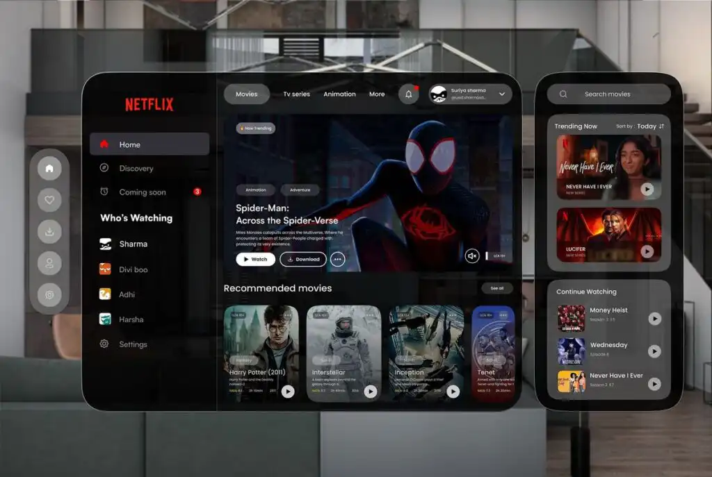
The Netflix “Skip Intro” button is tiny, but it is a classic UX win. Eleken highlights it as a small detail that removes friction without complicating the interface (Eleken).
- UI side: A small, clearly labeled button appearing at the right time.
- UX side: The design team noticed a repeated behavior, people skipping intros, and turned that into a single click option.
This is the sort of improvement you uncover by studying behavior patterns, not just polishing visuals.
Spotify, Discord, Netflix: UI that reinforces UX

The Interaction Design Foundation points to products like Spotify, Discord, and Netflix as strong UI examples. Their interfaces combine:
- Distinctive color palettes and typography
- Clear navigation and controls
- Responsive, device friendly layouts
These UI decisions support broader UX goals like discoverability, personalization, and ease of use (Interaction Design Foundation).
When you study these products, you can see that UI and UX are separate disciplines working side by side.
How to decide where to invest first


If you have a limited budget, you might feel pressure to choose between UI and UX. In reality, you are deciding where to lean first, not which to ignore.
Use the questions below to guide your priorities.
Signs you should focus on UI first
You may want to prioritize UI design if:
- Visitors bounce quickly from key pages, especially before scrolling
- Your site looks inconsistent or outdated
- Content is hard to read on mobile
- Buttons, links, or fields feel unclear or hard to tap
- There is a gap between your brand identity and the way your site looks
In these cases, improving visual clarity and polish can build trust and help existing UX decisions perform better.
Signs you should focus on UX first
You may want to prioritize UX design if:
- People confide that your site is confusing, even if it looks good
- You get many support tickets about “how do I find…” or “how do I change…”
- Cart abandonment, form abandonment, or step dropoffs are high
- Search results are often irrelevant, or people do not use search at all
- Users with disabilities struggle to use your site
Baymard’s research on search, checkout, and accessibility shows how often UX fundamentals are overlooked, even on large sites (Baymard).
Fixing information architecture, flows, and accessibility usually has a deep impact on long term performance.

When to invest in both together
If your website is central to revenue, for example a SaaS product or ecommerce store, treating UI and UX as one joint investment is usually the best move.
Terralogic underlines that combining effective UI and UX can raise conversions by up to 400 percent (Terralogic). That kind of lift rarely comes from visuals or UX work in isolation.
When you can, think in terms of “product design” rather than “UI versus UX” and look for teams or individuals who can handle both.
Practical steps to improve UI and UX on your site
You do not have to rebuild your site from scratch to see benefits. You can layer changes over time.

1. Run a quick experience review
Start by walking through your site as a new visitor. You can even record your screen to capture where you hesitate.
Look for:
- Pages that feel visually busy or hard to read
- Buttons or links that are not clearly clickable
- Flows like signup or checkout that feel longer than they should
- Any action where you are not sure what will happen next
Ask a few non technical people to do the same and talk through their thought process out loud. This gives you basic qualitative UX insight.
2. Prioritize your most critical flows
Identify the three or four tasks that matter most to your business. For example:
- Requesting a quote
- Signing up for a product
- Completing a purchase
- Booking an appointment
Then ask:
- How many steps does each task take?
- What is the minimum information you actually need to collect?
- Where are people currently dropping off?
Use Baymard’s finding about checkout fields as inspiration to trim anything that does not need to be there (Baymard).
3. Tighten your navigation and hierarchy

Improving your UX structure often makes your UI decisions clearer.
- Group related content together in your navigation
- Reduce the number of top level navigation items if they feel crowded
- Make sure each page has a clear, prominent heading and primary call to action
- Use consistent styles for headlines, subheadings, and body text
The UX Design Institute’s principle of hierarchy can guide you. Important items should be more prominent by size, color, or position (UX Design Institute).
4. Clean up your visual design
Once your structure is clearer, you can make relatively small UI changes that have a big impact:
- Use a limited, consistent color palette
- Choose one or two typefaces and stick to them
- Increase line spacing and contrast for better readability
- Align content on a simple grid so pages feel orderly
- Make sure buttons look like buttons and links look like links
Keep in mind that UI is part of UX. According to the Interaction Design Foundation, small UI touches like microinteractions, visual feedback, and consistent spacing help users move through tasks more smoothly (Interaction Design Foundation).


5. Address basic accessibility
Accessibility is both a UX and UI responsibility. Start with:
- Clear labels for form fields
- Adequate color contrast between text and background
- Keyboard navigable menus and controls
- Alt text for important images
Baymard found that 94 percent of top grossing ecommerce sites failed at basic accessibility requirements (Baymard). If you invest here, you put yourself ahead of the pack.
6. Set up simple measurement and feedback loops
You cannot improve UX if you are not listening.
Consider:
- Analytics goals for your key flows
- Heatmaps or session recordings to identify friction
- Short in page surveys about ease of use
- Periodic user interviews or usability tests
Figma’s UX process emphasizes ongoing updates based on user feedback and analytics, not just one time redesigns (Figma).
Working with designers: what to ask for
When you are ready to bring in help, a clear brief saves everyone time and gives you better results.


If you are hiring a UI designer
You might look for someone who can:
- Create or refine your visual identity
- Design cohesive desktop and mobile layouts
- Build a design system with reusable components
- Apply accessibility best practices in color and typography
Ask for:
- Portfolio examples that show consistent, readable interfaces
- Before and after examples, if they have them
- Evidence that they understand basic UX, not just aesthetics
Figma notes that UI designers often bring essential skills in accessibility and responsive design that graphic designers alone might not provide (Figma).
If you are hiring a UX designer
You might look for someone who can:
- Lead user research and synthesize insights
- Map user journeys and define information architecture
- Design and test wireframes or prototypes
- Recommend UX improvements based on data and best practices
Ask for:
- Case studies that show process, not just end screens
- Examples of measurable outcomes, like improved completion rates
- Experience with testing tools or methods
Baymard’s and UX Design Institute’s work shows how methodical UX processes can catch issues that visuals alone cannot solve.

If you are looking for a combined UX/UI role
Many job descriptions use “UX/UI designer” to indicate a hybrid. According to Figma, some product or UX designers also handle UI work, and many employers seek designers who can cover both interface aesthetics and broader experience design (Figma).
For this kind of hire, you should:
- Clarify which side is more important for your needs right now
- Ask for portfolios that include both wireframes and final screens
- Look for signs that they understand research, not just Dribbble worthy visuals
Treat this as building a long term partnership. UI and UX are ongoing, not one time checkboxes.
FAQs about UI vs UX design

1. Do you really need both UI and UX design for your website?
Yes. UI and UX solve different but connected problems. UI focuses on how your site looks and behaves on screen. UX focuses on whether the experience actually works for your users from start to finish. If you skip UX, you risk having a beautiful site that is frustrating to use. If you skip UI, you risk having a smart structure that people do not trust or enjoy.
2. Which should you invest in first, UI or UX?
It depends on your current situation. If your site is confusing, if users complain about navigation, or if key flows like checkout are painful, start with UX. If your structure is solid but your site looks outdated, inconsistent, or hard to read, a UI refresh can make a big difference. Ideally, you invest in both together, since Terralogic shows that combined UI and UX improvements can dramatically increase conversions (Terralogic).
3. Can one designer handle both UI and UX?
Often, yes. There is notable overlap between the roles, and some designers are comfortable handling both research and interface design. Figma notes that many employers seek “UX/UI” designers who can cover the full spectrum (Figma). If you choose a hybrid designer, be sure to review their process and output across both areas.
4. How do you measure the impact of UI and UX changes?
For UI, track metrics like bounce rate, time on page, and click through rates on key buttons, especially right after visual changes. For UX, watch task completion rates, error rates, and abandonment in flows like signup or checkout. User feedback, surveys, and usability tests are also crucial. Terralogic’s ROI figures for UX improvements show why it is worth connecting your design changes to concrete metrics (Terralogic).
5. Is UX design only about websites and apps?
The UX principles you apply online, such as consistency, hierarchy, user control, and accessibility, apply to almost any interaction your customers have with your brand. The UX Design Institute frames UX as solving user problems with solutions that are easy and enjoyable to use, not just digital screens (UX Design Institute). Your customer support, onboarding emails, and even physical product packaging are all part of the experience.
When you understand how ui design vs ux design each shape your website’s success, you can make more confident decisions about where to invest, what to fix first, and how to choose the right partners. Start with your users’ goals, then let UI and UX work together to support them at every step.
- 1share
- Facebook0
- Pinterest1
- Twitter0
- Reddit0


