Typography is an essential element of design that can make or break the impact of a visual composition. At its core, typography is the art of arranging type to make written language legible, readable, and appealing when displayed. The right typography can convey emotion, mood, and tone, and can capture the essence of a message in a single glance. In this article, we will explore the art of typography, its history, and evolution, and the practical techniques and creative applications that can help designers create impactful designs.

The history of typography dates back to the invention of writing itself, and its evolution has been shaped by the development of printing technology, the rise of mass media, and the influence of cultural and artistic movements. Understanding the fundamentals of typography, such as font selection, spacing, and hierarchy, is key to creating effective designs. Typography plays a crucial role in graphic design, where it can be used to create logos, posters, packaging, and other visual materials that communicate a brand’s identity and message.
To create impactful designs, designers must master practical typography techniques such as kerning, tracking, and leading, and be able to choose the right typography for a given project. They must also be able to think creatively about typography and use it in unexpected ways to create unique and memorable designs. In the digital age, typography has taken on new dimensions, with designers using it to create dynamic and interactive experiences that engage and delight audiences.
Key Takeaways
- Typography is the art of arranging type to make written language legible, readable, and appealing when displayed.
- Understanding the history and evolution of typography, as well as its fundamentals, is key to creating effective designs.
- To create impactful designs, designers must master practical typography techniques, choose the right typography, and think creatively about its applications.
History and Evolution of Typography


From Movable Type to Digital Typography
Typography has come a long way since the invention of movable type in the 15th century, which revolutionized the way books were printed. Movable type allowed for the mass production of books, making them more accessible to the general public. It wasn’t until the 19th century that typography began to evolve into an art form, with the introduction of new typefaces and the use of typography in advertising.
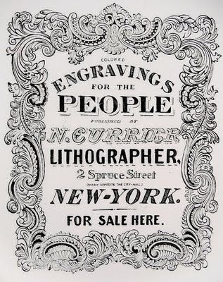
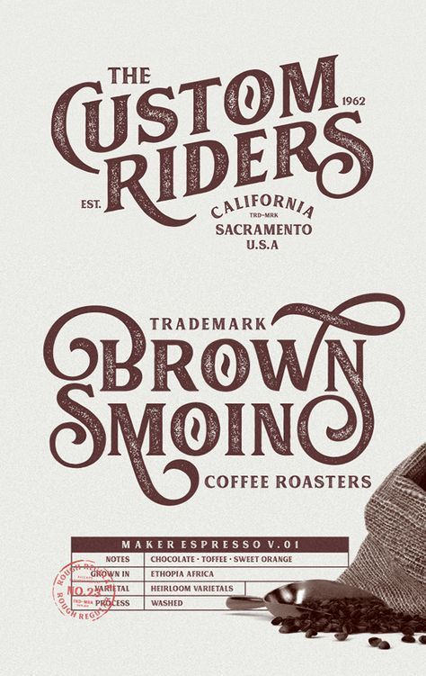
The advent of digital technology in the 20th century further revolutionized typography, allowing for greater precision and flexibility in design. With the rise of desktop publishing in the 1980s and 1990s, designers could create and manipulate type on a computer, opening up new possibilities for typography in print and digital media.
Influential Type Designers and Their Work
Over the years, many influential type designers have left their mark on the world of typography. One such designer is Claude Garamond, who created one of the first typefaces to be used in books. His typeface, Garamond, is still widely used today.
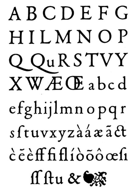
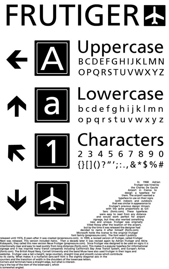
Another notable designer is Adrian Frutiger, who created some of the most popular typefaces of the 20th century, including Univers and Frutiger. His designs were known for their simplicity and readability, and they continue to be used in a variety of applications.
In recent years, type design has continued to evolve, with designers experimenting with new forms and styles. Old fonts are being revived and updated for modern use, while new typefaces are being created to meet the demands of digital media.
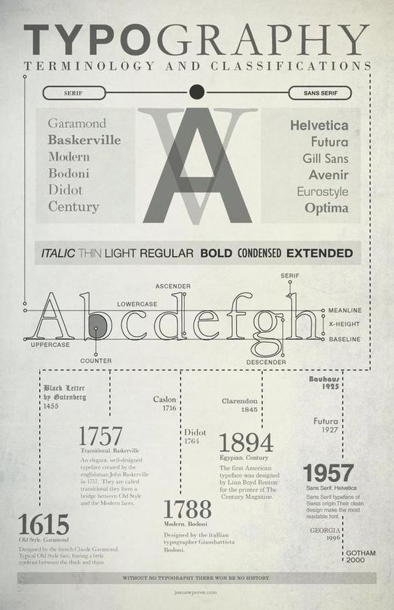
Overall, the history and evolution of typography is a fascinating subject, filled with rich history and inspiring examples. From the invention of movable type to the rise of digital typography, typography has played a crucial role in shaping the way we communicate and express ourselves through design.
Understanding Typography Fundamentals

Typefaces vs. Fonts
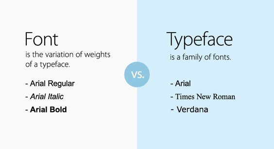

Typography is the art of arranging type to make written language legible, readable, and appealing when displayed. It involves the selection of typefaces, point sizes, line lengths, line-spacing, and letter-spacing. The terms “typeface” and “font” are often used interchangeably, but they have distinct meanings. A typeface is a set of one or more fonts that share a common design. A font, on the other hand, is a specific size, weight, and style of a typeface.
Anatomy of Letters
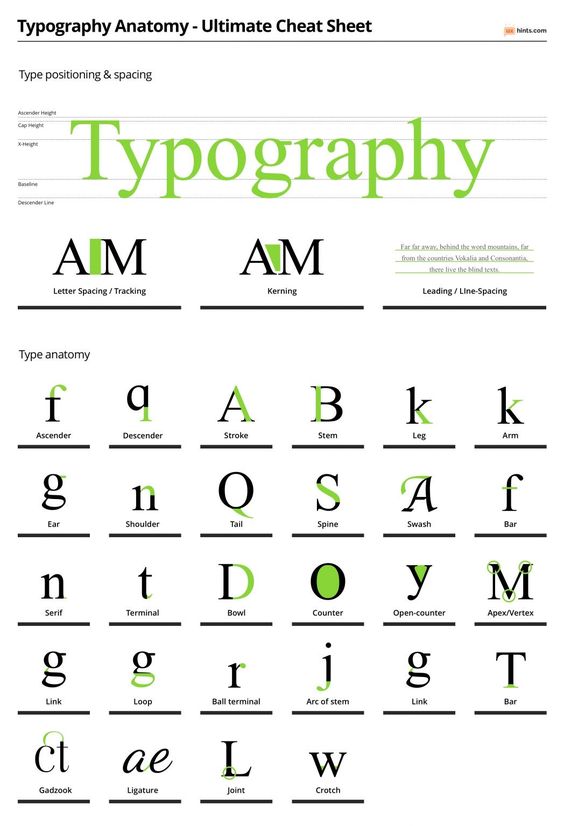
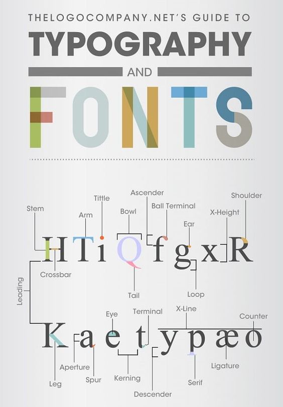
To understand typography, it is essential to understand the anatomy of letters. Each letter has specific elements that make it unique. The baseline is the imaginary line on which the letters sit. The x-height is the height of the lowercase letters without ascenders or descenders. The ascender is the part of a letter that extends above the x-height, and the descender is the part that extends below the baseline. The stem is the main vertical stroke of a letter, and the bowl is the curved part that encloses the circular or curved parts of letters like “o” or “d.”
The Importance of Font Size and Legibility
Font size and legibility are crucial factors in typography. Font size refers to the measurement of the typeface in points. The point is a unit of measurement used in typography to define the size of the font. Legibility is the ease with which a reader can distinguish one letter from another. Serif fonts have small lines or flourishes at the end of each stroke, while sans-serif fonts do not. Script fonts are designed to look like handwriting.
In conclusion, understanding typography fundamentals is essential for creating impactful designs. By knowing the difference between typefaces and fonts, the anatomy of letters, and the importance of font size and legibility, designers can make informed decisions when selecting typefaces and creating designs that are legible and visually appealing.
The Role of Typography in Graphic Design

Typography plays a crucial role in graphic design. It is the art of arranging type to make written language legible, readable, and appealing when displayed. Typography can be used to create a brand identity, enhance user experience, and communicate a message effectively. In this section, we will discuss the importance of typography in graphic design and its role in branding, logo design, and user experience.
Typography and Brand Identity
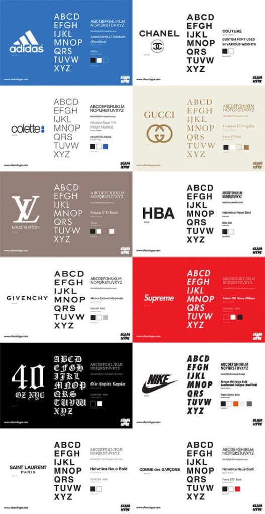
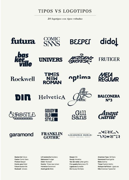
Typography is a critical component of brand identity. It can help communicate the personality and values of a brand. The right typography can make a brand easily recognizable and memorable. A consistent use of typography across all marketing materials can also help establish a strong brand identity.
Typography in Logo Design
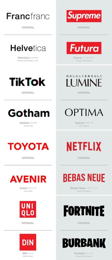
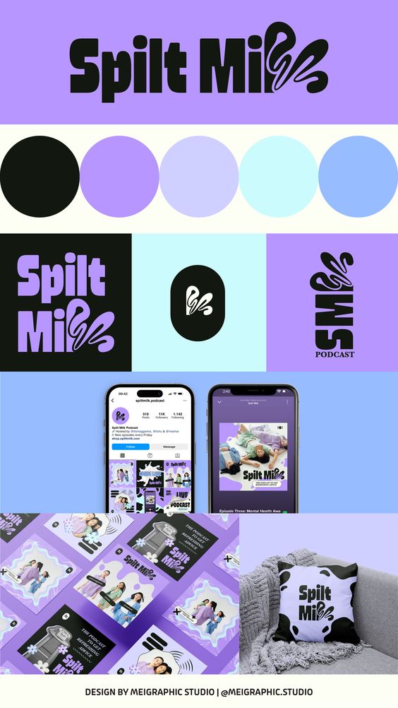
Typography plays a significant role in logo design. A logo is the face of a brand, and typography can help communicate the brand’s personality and values effectively. The right typography can make a logo more memorable and recognizable. It can also help differentiate a brand from its competitors.
Enhancing User Experience with Typography
Typography can enhance user experience by making content more readable and engaging. The right typography can make a website or app more user-friendly and accessible. It can also help guide the user’s eye to the most important information. A good use of typography can make the user experience more enjoyable and memorable.
In conclusion, typography is an essential element of graphic design. It can help create a strong brand identity, communicate a message effectively, and enhance user experience. A good use of typography can make a design more impactful and memorable.
Practical Typography Techniques

Mastering Kerning, Leading, and Tracking
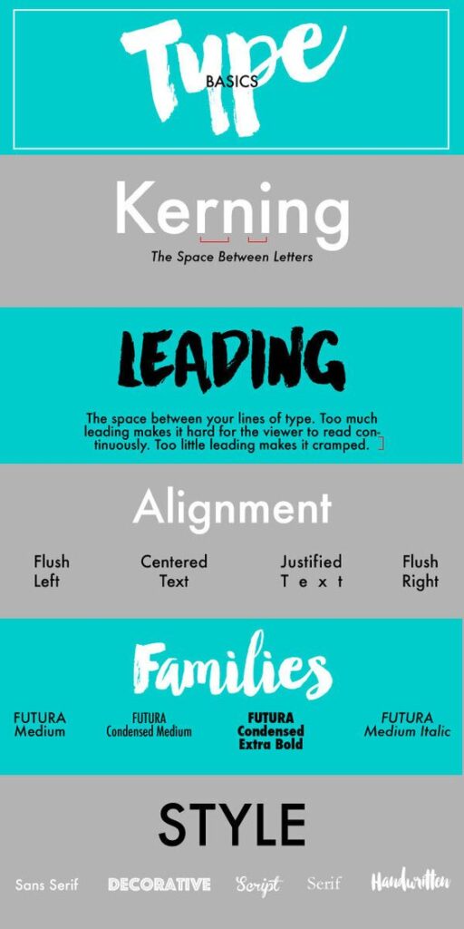
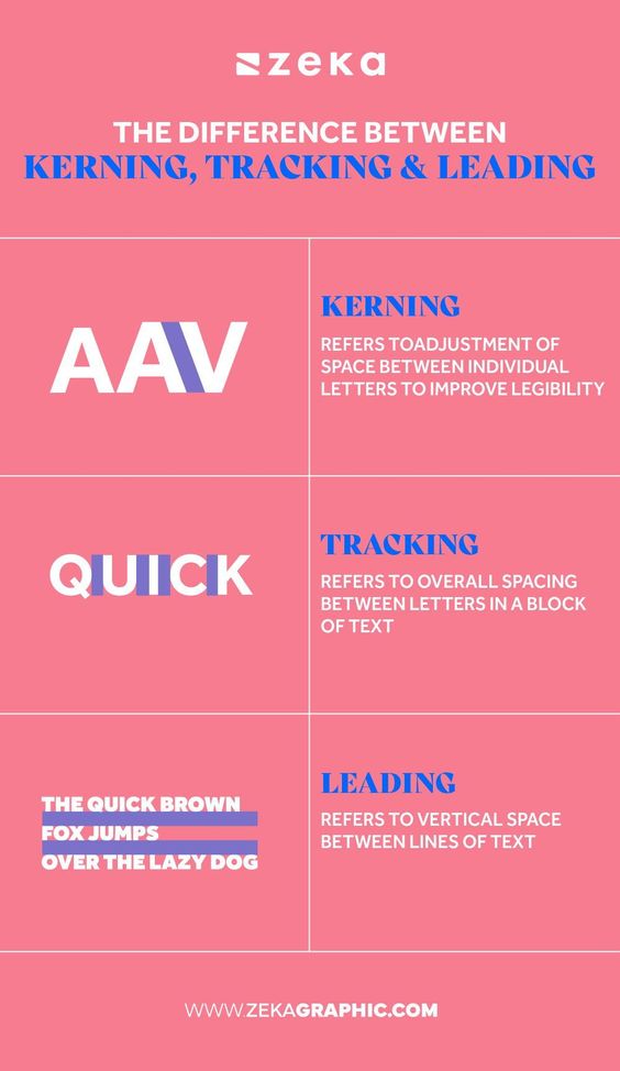
Kerning, leading, and tracking are essential elements of typography that can make or break a design. Kerning refers to the space between individual letters, while leading is the space between lines of text. Tracking, on the other hand, is the overall spacing between all the letters in a word or phrase.
To master these techniques, designers must pay attention to the details and adjust spacing as needed to ensure readability and visual appeal. For example, adjusting the kerning between two letters can make a significant difference in the overall look of a word or phrase. Similarly, adjusting the leading can help improve the readability of longer blocks of text.
Effective Use of Alignment and Spacing
Alignment and spacing are crucial components of typography that can help create a sense of balance and harmony in a design. By aligning text and other design elements, designers can create a sense of order and structure that is visually appealing and easy to read.
Spacing is also essential, as it can help create a sense of hierarchy and guide the reader’s eye through the design. By adjusting the spacing between elements, designers can create a sense of emphasis and draw attention to specific areas of the design.
Color and Contrast in Typography
Color and contrast are powerful tools that can be used to create impactful typography designs. By choosing the right colors and adjusting the contrast between elements, designers can create designs that are visually striking and easy to read.
When choosing colors, designers must consider the overall mood and tone of the design, as well as the readability of the text. Similarly, adjusting the contrast between elements can help create a sense of depth and dimensionality that is visually appealing.
Overall, mastering these practical typography techniques is essential for creating impactful designs that are visually appealing and easy to read. By paying attention to the details and adjusting spacing, alignment, color, and contrast as needed, designers can create designs that stand out and make a lasting impression.
Creative Applications of Typography

Typography is a powerful tool for designers to communicate with their audience. It is not only about choosing the right font, but also about how the text is arranged, how it interacts with other design elements, and how it conveys a message. In this section, we will explore some creative applications of typography in different design contexts.
Exploring Typography in Web Design
In web design, typography plays a crucial role in enhancing the user experience and conveying information effectively. It is important to choose the right font, size, and spacing to ensure readability and legibility. Moreover, designers can use typography to create a hierarchy of information and guide the user’s attention to the most important elements on the page.
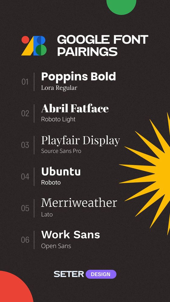
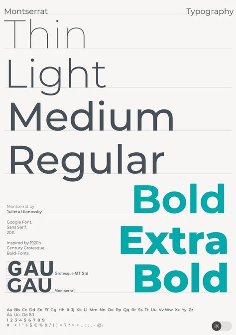
Some creative examples of typography in web design include using custom fonts, combining typography with illustrations or images, and experimenting with different font sizes and weights to create contrast and emphasis. Designers can also use typography to create a sense of movement and interaction, for example, by animating text on hover or scroll.
Typography in Advertising and Media
Typography is a crucial element in advertising and media design, as it can help to capture the viewer’s attention and convey a message effectively. In advertising, typography is often used to create a brand identity or to promote a product or service. Designers can use typography to create a memorable logo, a catchy tagline, or a striking headline.
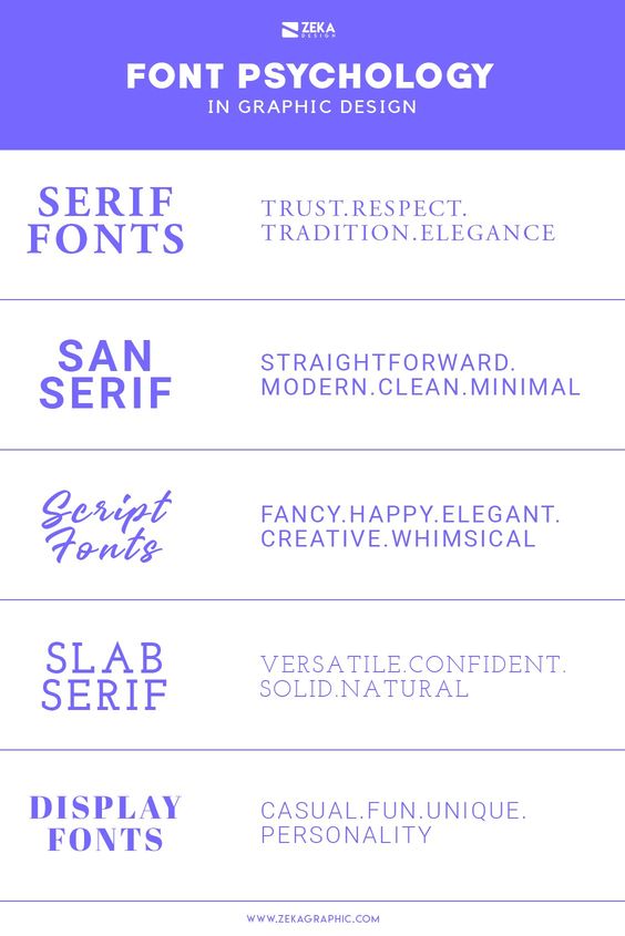
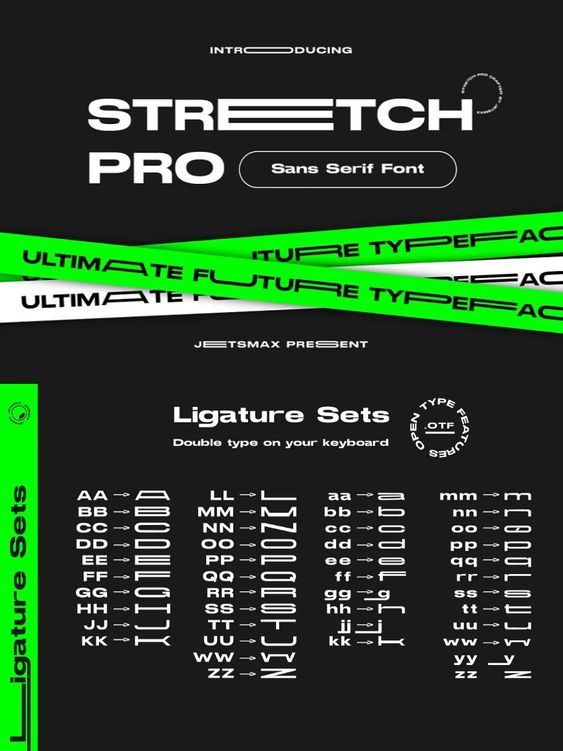
In media design, typography is used to enhance the visual appeal of magazines, newspapers, and books. Designers can experiment with different font styles, sizes, and layouts to create a unique and engaging reading experience. Moreover, typography can be used to convey a particular mood or tone, for example, by using a handwritten font to create a sense of informality or a bold font to create a sense of urgency.
Innovative Typography Effects and Animation
Typography effects and animation can add an extra layer of creativity and interactivity to a design. Designers can use effects such as 3D text, gradient fills, and shadow effects to create a sense of depth and dimension. Moreover, designers can use animation to create a sense of movement and dynamism, for example, by animating text on scroll or click.
Some innovative examples of typography effects and animation include the usage of text as a mask for images or videos, create posters like animated typography posters, and the usage of typography to create interactive games or quizzes. However, it is important to use these effects and animations judiciously, as they can also distract from the main message and make the design appear cluttered.
In conclusion, typography is a versatile and powerful tool for designers to create impactful and engaging designs. By exploring different applications of typography, designers can enhance their creativity and create designs that stand out from the crowd.
Choosing the Right Typography
Selecting Fonts for Different Purposes
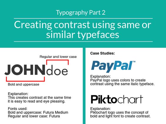
When it comes to selecting fonts for different purposes, it is important to consider the overall style and tone of the design. For example, serif fonts are often associated with more traditional or formal designs, while sans-serif fonts are typically used in modern and minimalist designs.
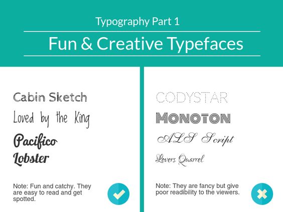
It is also important to consider legibility and readability, especially when it comes to body text. Fonts that are too complex or decorative can be difficult to read, and may not be appropriate for longer blocks of text.
Communicating the Right Message through Typography
Typography can play a significant role in communicating the right message to the audience. Different fonts can convey different emotions and attitudes, and it is important to choose fonts that align with the overall message of the design.
For example, a playful and whimsical design may benefit from the use of a handwritten or script font, while a more serious or professional design may require a more traditional or formal font.
Custom Typography for Unique Brands
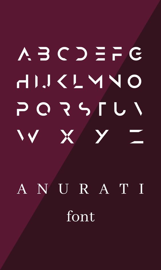
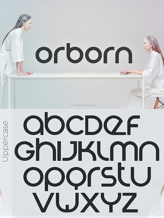
Custom typography can be a powerful tool for creating unique and memorable brands. By creating a custom font, designers can ensure that the typography aligns perfectly with the brand’s overall style and tone, and can help to differentiate the brand from its competitors.
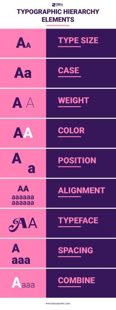
However, custom typography can be a more time-consuming and expensive process, and may not be necessary for all brands. It is important to consider the client’s budget and needs when deciding whether or not to create a custom font.
Overall, choosing the right typography requires careful consideration of the design’s purpose, message, and audience. By selecting fonts that align with these factors, designers can create impactful and effective designs that communicate the right message to the audience.
Typography in the Digital Age

With the increasing use of digital media, typography has become an integral part of the design process. In the digital age, typography has evolved to meet the needs of various devices and platforms. Here are some of the key considerations for typography in the digital age.
Responsive Typography for Various Devices
Responsive typography is an essential aspect of web design. With the rise of mobile devices, designers need to ensure that their typography is legible and readable on different screen sizes. Responsive typography involves using flexible font sizes and line heights that adjust to the screen size. This ensures that the typography remains legible and readable on different devices.
Typography and Accessibility
Accessibility is another critical consideration for typography in the digital age. Designers need to ensure that their typography is accessible to everyone, including people with visual impairments. This involves using appropriate font sizes, contrast ratios, and line spacing. Designers should also consider using web-safe fonts that are easily readable on different devices.
The Future of Typography in Digital Media
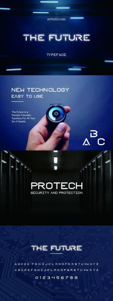
The future of typography in digital media is exciting. With the rise of new technologies such as virtual and augmented reality, typography will play a more significant role in the design process. Designers will need to create typography that is immersive and interactive, allowing users to engage with the content in new and exciting ways.
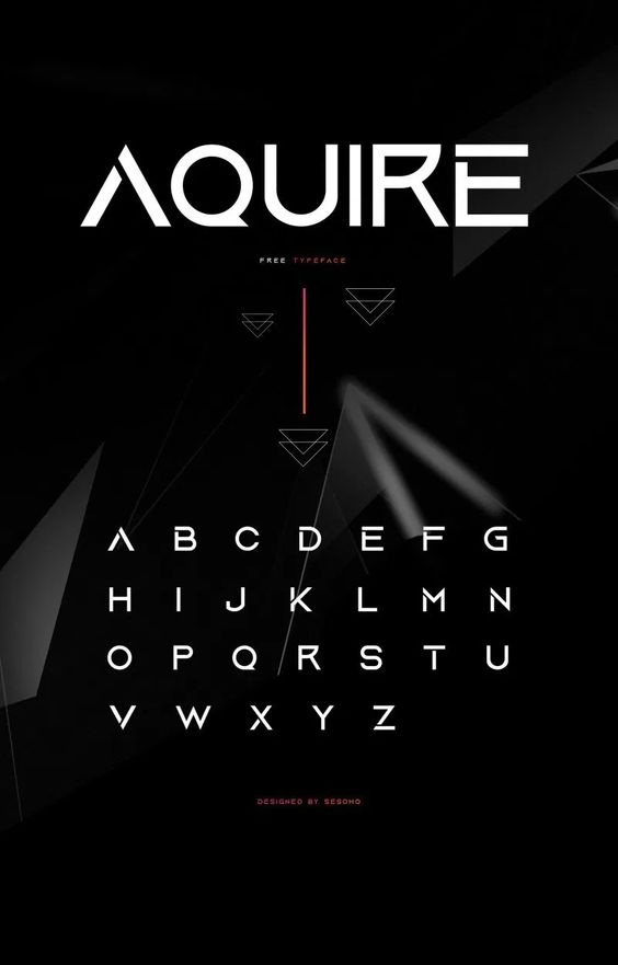
In conclusion, typography is an essential aspect of digital design. With the rise of new technologies and devices, designers need to ensure that their typography is responsive, accessible, and engaging. By considering these key factors, designers can create typography that is impactful and memorable.
Resources and Inspiration

Notable Typography Blogs and Websites
For those looking for a constant stream of typography inspiration, there are many blogs and websites that curate and showcase the latest and greatest in typography design. One such website is Typewolf, which features daily examples of typography usage in design, along with font recommendations and analysis. Another great resource is Creative Bloq, which has a dedicated typography section that covers everything from font trends to tutorials on how to create your own typeface.
Typography Books and Expert Articles
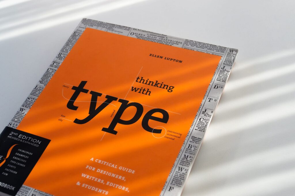
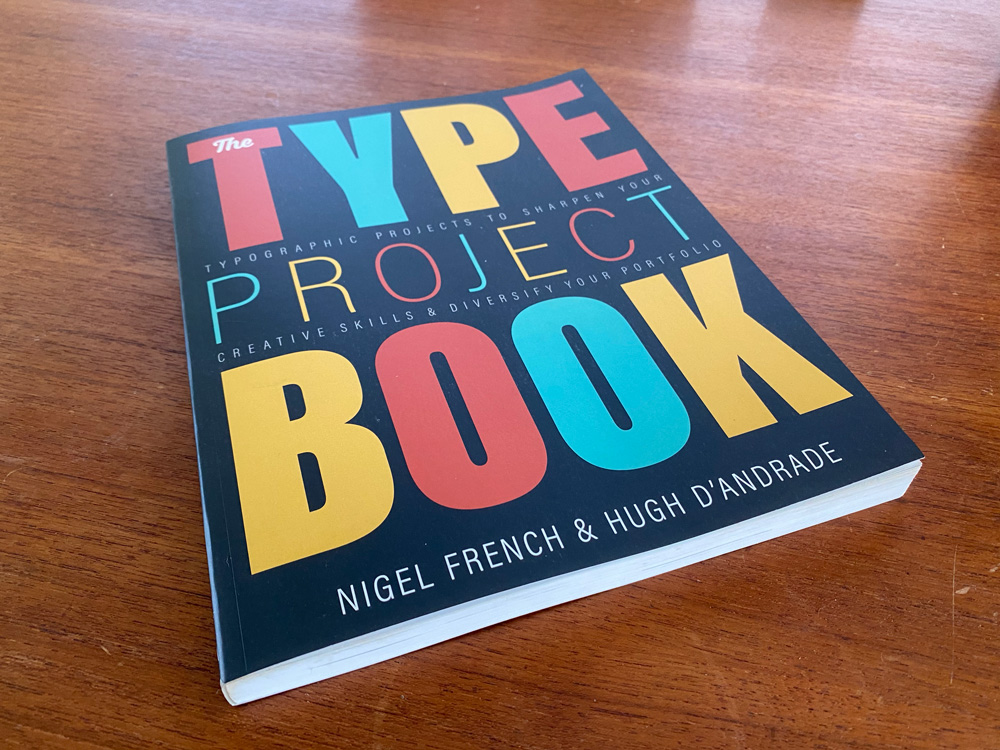
For those who prefer a more in-depth exploration of typography, there are many books and articles available that delve into the history, theory, and practice of typography. One such book is “Thinking with Type” by Ellen Lupton, which is a comprehensive guide to typography for designers, writers, editors, and students. Another great resource is “The Type Project Book” by Richard B. Doubleday, which features typographic projects to sharpen your creative skills and diversify your portfolio.
Finding Typography Inspiration Online
In addition to blogs, websites, and books, there are many other ways to find typography inspiration online. Social media platforms like Instagram and Pinterest are great places to discover new typography designs and trends. Additionally, design communities like Behance and Dribbble feature countless examples of typography usage in design, along with the ability to connect with other designers and receive feedback on your own work.
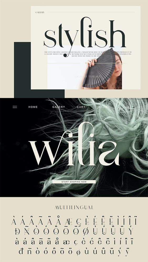
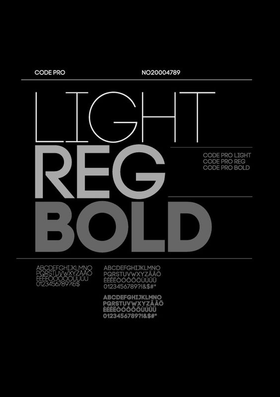
Overall, there are many resources and sources of inspiration available for those interested in typography design. Whether you prefer blogs, books, or social media, there is no shortage of ways to stay up-to-date on the latest typography trends and techniques.
Best Practices and Tips
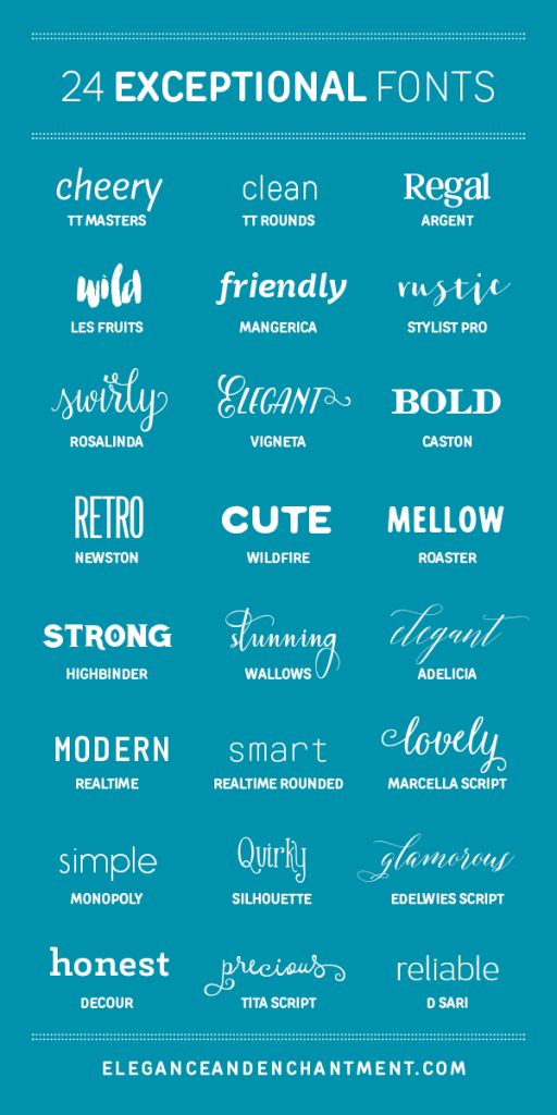
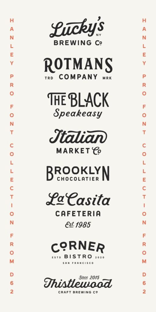
Typography Dos and Don’ts
When it comes to typography, there are certain dos and don’ts that designers should keep in mind. Here are some best practices to follow:
- Do choose a legible font that is appropriate for the project and target audience.
- Don’t use too many fonts in one design. Stick to two or three maximum.
- Do pay attention to spacing, kerning, and leading to ensure that the text is easy to read.
- Don’t stretch or distort fonts. This can make them difficult to read and unprofessional.
- Do use hierarchy to guide the reader’s eye and emphasize important information.
- Don’t use all caps for body text. It can be difficult to read and comes across as shouting.
Typography Case Studies and Reviews
One way to improve your typography skills is to study successful designs and learn from them. Here are some case studies and reviews to check out:
- “Thinking with Type: A Critical Guide for Designers, Writers, Editors, and Students” by Ellen Lupton. This book provides a comprehensive overview of typography principles and techniques.
- “Logo Design Love: A Guide to Creating Iconic Brand Identities” by David Airey. While this book focuses on logo design, it includes valuable information on typography as well.
- “The Type Project Book: Typographic Projects to Sharpen Your Creative Skills & Diversify Your Portfolio” by Richard B. Doubleday. This book provides hands-on exercises to help you practice typography techniques in a practical way.
Continuous Learning and Experimentation
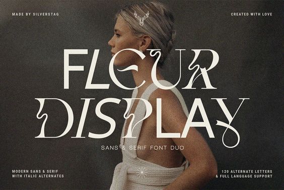
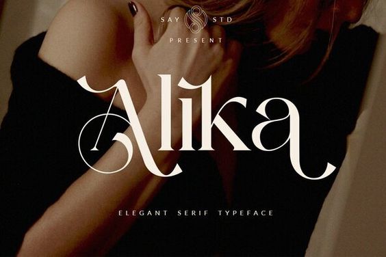
Typography is an ever-evolving field, so it’s important to stay up-to-date on the latest trends and techniques. Here are some tips for continuous learning and experimentation:
- Attend workshops, conferences, and other design events to learn from experts in the field.
- Join online communities and forums to connect with other typography enthusiasts and share knowledge.
- Experiment with different fonts, layouts, and color schemes to push the boundaries of traditional typography.
- Keep a sketchbook or digital notebook to jot down ideas and inspiration for future projects.
By following best practices, studying successful designs, and continuously learning and experimenting, designers can elevate their typography skills and create impactful designs.
- 1.0Kshares
- Facebook0
- Pinterest1.0K
- Twitter0
- Reddit0


