Minimalist web design emphasizes simplicity and clarity, enabling you to communicate your message more effectively. By reducing distractions and focusing on essential elements, you create a more engaging user experience. This approach not only enhances visual appeal but also improves site navigation, making it easier for visitors to find what they need.
Embracing a “less is more” philosophy can lead to stronger connections with your audience. When you prioritize essential content and design, users can absorb information quickly without feeling overwhelmed. Your website transforms into a powerful tool that conveys your values and purpose through clear, focused messaging.
Adopting minimalist principles allows for greater technical efficiency, ensuring that your site loads faster and performs better. This commitment to simplicity enhances user satisfaction, leading to increased engagement and conversions. Embrace the power of minimalist web design to make your message resonate.
Key Takeaways
- Minimalist design enhances clarity and user experience.
- Simplified content fosters stronger audience connections.
- Technical efficiency improves site performance and engagement.

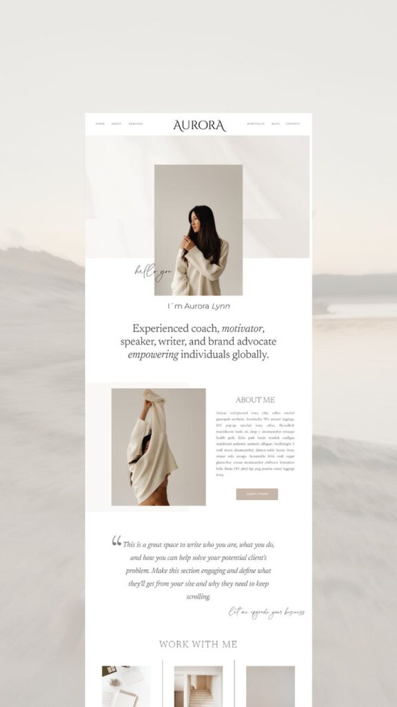

The Philosophy of Minimalism in Web Design
Minimalist web design emphasizes simplicity and functionality, allowing you to convey your message without unnecessary distractions. This approach focuses on reducing elements to their essentials, leading to a more effective user experience.
Essence of ‘Less Is More’
The phrase “less is more” encapsulates the heart of minimalist design. By stripping away non-essential components, you create a cleaner interface that enhances user focus. This concept originated from designers like Dieter Rams, who championed smooth, functional products stripped of excess.
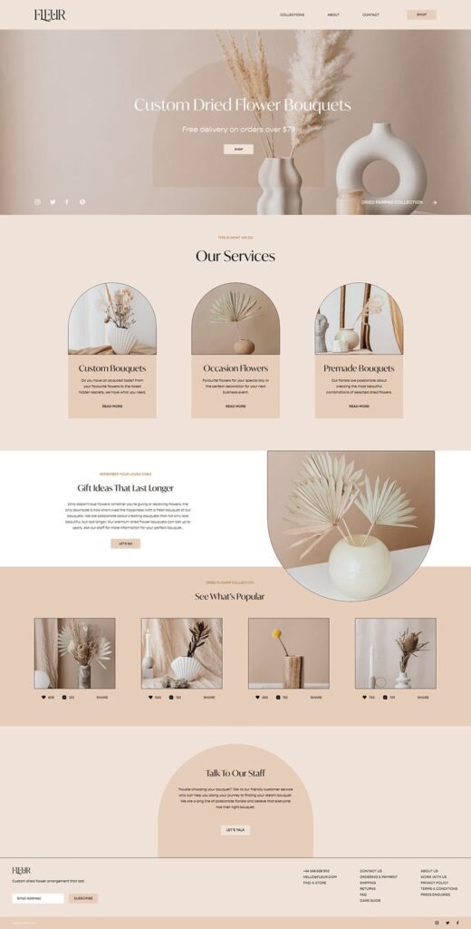
Practically, you achieve this by using limited color palettes, ample white space, and straightforward typography. These choices not only improve readability but also highlight your key messages. The result is a design where every element serves a purpose, encouraging users to engage meaningfully with your content.
Minimalism as an Art Form
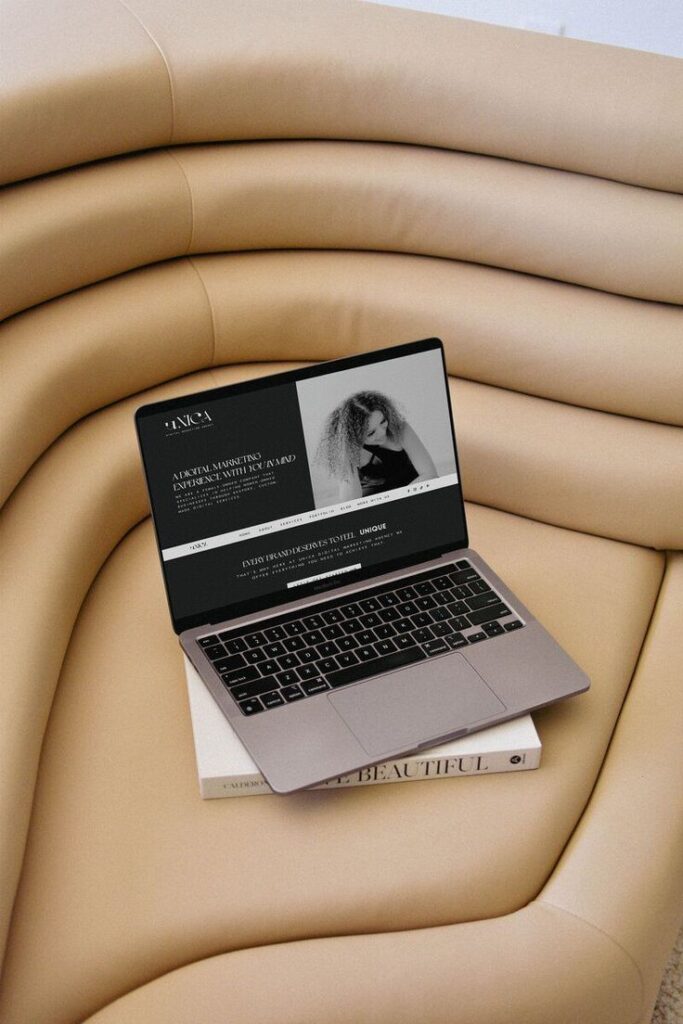
Minimalism in web design transitions from being merely functional to an expressive art form. This approach celebrates the beauty of simplicity, showcasing how less can indeed convey more. Timeless designs prioritize essential aesthetics, resulting in a sophisticated appearance that remains relevant over time.
Incorporating minimalist principles allows you to build interfaces that reflect clarity and coherence. By focusing on a few essential elements—like images, fonts, and colors—you can create striking compositions. This artistic approach elevates the design, making it visually appealing and more memorable for users.

Designing for User Experience
Creating a positive user experience involves focusing on readability, usability, and accessibility. Striking a balance between aesthetics and function enhances how users engage with your website.
Enhancing Readability and Clarity
Readability plays a crucial role in retaining visitors. Use clear typography with sufficient contrast to ensure content is easy to read. Consider the following tips:
- Font Size: Use a minimum font size of 16px for body text.
- Line Spacing: Maintain adequate line height (1.5x font size) for comfort.
- Contrast: Ensure contrast between text and background meets WCAG standards.
A clean layout reduces cognitive load, allowing users to absorb information without distraction. Use headings, bullet points, and whitespace to guide the eye. Break long blocks of text into shorter paragraphs, ideally 2-3 sentences, to enhance engagement.
Improving Usability and Accessibility
Usability is key to a successful web design. Focus on intuitive navigation that allows users to find information efficiently. Utilize responsive design to ensure optimal performance across devices. Key aspects include:
- Simple Menus: Limit the number of menu items to avoid overwhelm.
- Accessible Features: Implement alt text for images and ARIA labels for interactive elements.
- Feedback Mechanisms: Enable immediate feedback for user actions, such as form submissions.
Ensuring accessibility enhances user engagement and widens your audience. By adhering to WCAG guidelines, you make your content available to individuals with disabilities. Testing your site with various tools can help identify areas for improvement.

Visual Elements of Minimalist Web Design
In minimalist web design, visual elements play a crucial role in enhancing communication. Key aspects like negative space and color palette contribute significantly to clarity and effectiveness.
Implementing Negative Space
Negative space refers to the empty areas around your content. It allows your design to breathe and helps direct attention to important elements. Utilizing negative space effectively can create a sense of elegance and sophistication.
When your content is surrounded by ample space, it improves readability and focus. This enables users to navigate your site easily without feeling overwhelmed. You can achieve this by using generous padding and margins.
Tip: Use negative space to highlight key messages or calls to action. This creates a visual hierarchy that guides the viewer’s eye to what matters most.
Choosing the Right Color Palette
Your color palette significantly affects the mood and perception of your design. In minimalist web design, a limited color scheme enhances clarity and cohesion.
Opt for a few colors that complement each other well. Neutral colors such as whites, grays, and blacks can be effective in creating a clean aesthetic. You can add a pop of color for emphasis, but use it sparingly.
Consider: Each color’s psychological impact. For example, blue can evoke trust and calmness, while red can signify urgency. Align your choices with your brand message to communicate effectively.
Technical Benefits of Reducing Complexity
Reducing complexity in web design offers clear technical advantages that enhance user experience and site effectiveness. By simplifying elements, you can achieve faster performance and create layouts that adapt seamlessly across devices.
Enhancing Performance and Load Time
Simplifying design elements leads to improved performance metrics. By reducing HTTP requests, you minimize the number of separate files the browser must fetch. This directly contributes to faster load times, as fewer files mean quicker server responses.
Utilizing browser caching can further enhance performance. When your site has fewer components, the likelihood of users interacting with cached versions increases. As a result, repeat visitors experience quicker access to content.
Optimizing image sizes and employing clean code also play significant roles. By focusing on essential elements, you create a lightweight design that boosts speed, making your website more effective in retaining users.
Meeting the Challenges of Responsive Design
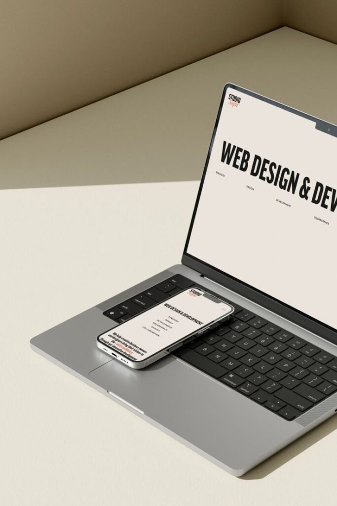
A minimalist approach simplifies the creation of responsive layouts. With fewer design elements, you have the flexibility to adjust content across various screen sizes without clutter. This ensures a consistent user experience on mobile, tablet, and desktop devices.
This reduction in visual clutter allows for clearer prioritization of key information. You can allocate larger portions of screen space to relevant content, improving readability. Responsive design becomes more manageable when you maintain a focus on essential pieces.
Additionally, minimal designs often load faster on mobile networks. This is crucial for maintaining user engagement as mobile users typically expect quick access. By addressing these challenges, you set the stage for effective communication of your message across all platforms.
- 0shares
- Facebook0
- Pinterest0
- Twitter0
- Reddit0


