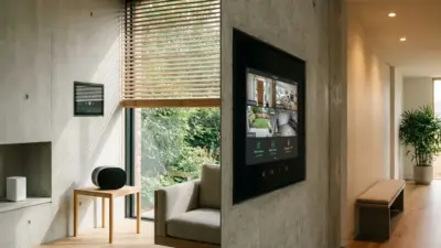
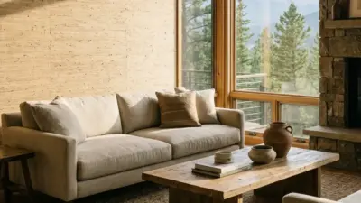
You’ll find luxury in colors that feel warm, personal, and carefully chosen for each space. Expect rich, soothing greens, deep plums, terracotta, and grounded neutrals that pair with tactile finishes to make rooms feel both elegant and lived-in. 2026 luxury interior colors means warm, restorative tones—think jewel greens, mellow reds, and plush neutrals—that create calm, refined spaces you want to spend time in.
This post will show you how to use those colors with textures, finishes, and smart pairings so your rooms look intentional and high-end. You’ll also see which sustainable pigments and global influences are shaping top-brand palettes, and learn simple techniques to apply these trends in living rooms, kitchens, and bedrooms.
Top Luxury Interior Color Trends for 2026
Expect bold, elegant choices that mix strong single colors with soft grounding tones. Designers favor deep, jewel-like hues, warm, earthy neutrals, and expert-picked palettes from color houses that guide high-end projects.
Statement Shades
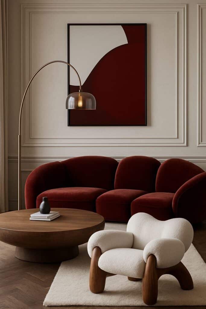
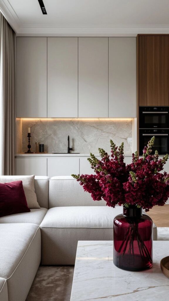
You’ll see rich, saturated colors used as focal points. Think velvet teal, deep plum, and brick red on walls, cabinetry, or a single accent ceiling. These colors create drama without clutter when paired with luxe materials like marble, brass, or hand-stitched leather.
Use statement shades in measured doses: one painted wall, a paneled feature, or built-in shelving. That keeps rooms feeling intentional. Lighting matters—soft, warm bulbs deepen jewel tones, while cooler light can mute them.
Neo-Neutral Palettes
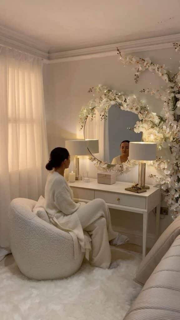
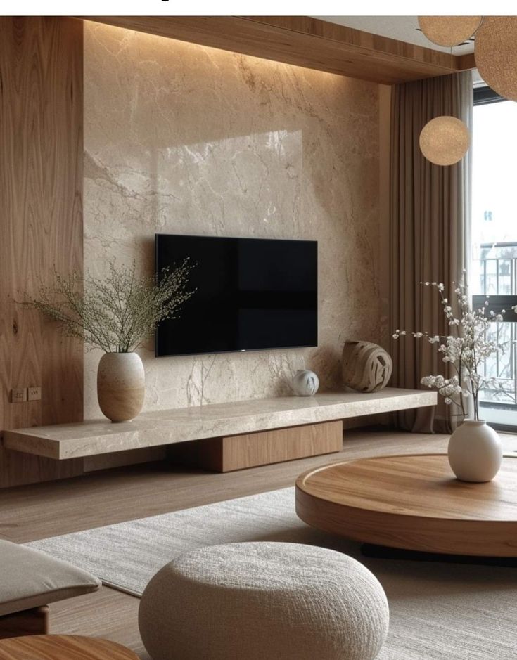
Neo-neutrals give luxury a calmer side. Expect warm greiges, honeyed beiges, and muted mushroom tones that feel cozy and expensive. These colors work as a backdrop for textured finishes like plaster, suede, and matte metals.
Layer neo-neutrals with low-contrast trim and natural wood to keep spaces serene. Add small pops of muted color—sage, dusty rose, or soft terracotta—to stop the palette from feeling flat. This approach suits living rooms, bedrooms, and kitchens that need a timeless base.
Color Forecasters’ Insights
Color houses and top designers point to four key moods: dreamy pastels, vibrant reds, rich earthy darks, and warm neutrals. Brands name specific tones each year, so you’ll often see curated palettes that include one strong hue, one grounding neutral, and one soft accent.
When you pick colors, check paint samples under your room’s light at different times of day. Follow palette sets from trusted manufacturers to keep undertones consistent across paint, fabric, and flooring. This ensures your chosen trend reads as intentional and high-end.
Harmonizing Color Schemes
Pick a dominant base, add one or two supporting accents, and use texture to tie them together. Aim for a calm, lasting mix that feels intentional in every room.
Layering Accents and Base Hues
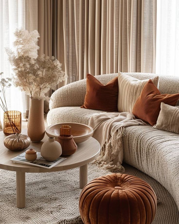

Choose a main wall color first — for luxury 2026 looks, consider soft sage, warm terracotta, or deep navy. Use that as your anchor and introduce accents in smaller doses: cushions, art, or a statement rug.
Keep contrast clear. Pair a muted base with one bright accent and one deeper neutral. For example:
- Base: soft sage
- Accent 1: burnt orange pillows
- Accent 2: charcoal wood trim
Vary finishes to add depth. Matte paint on walls, a satin finish on trim, and textured fabrics create layers without extra color. Repeat an accent color in three places to make the scheme feel cohesive: a throw, a vase, and a lamp.
Balancing Warm and Cool Tones
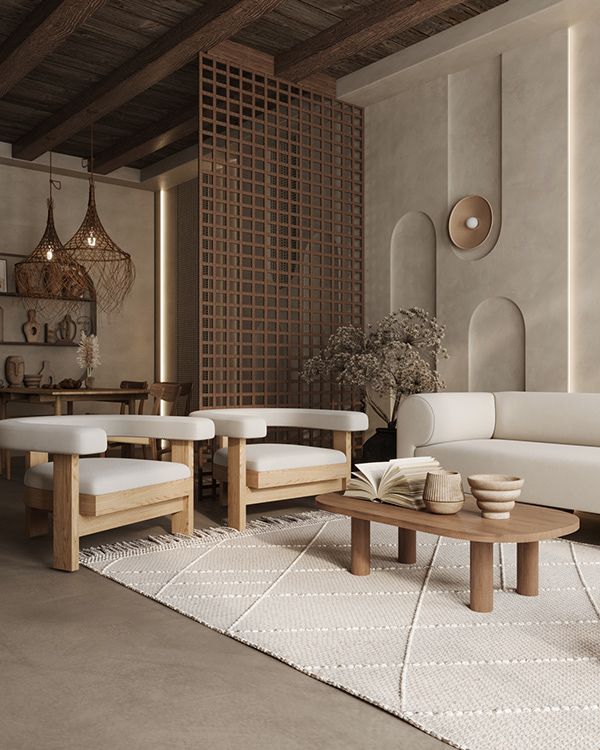

Decide the mood you want: warm tones (mustard, terracotta) create comfort; cool tones (olive, slate blue) feel calm. Combine them by assigning roles: let the warm color lead in textiles and lighting, and let the cool color dominate large surfaces like walls or sofas.
Use temperature-neutral elements to bridge the gap. Natural wood, stone, and warm metals like brass help blend warm and cool hues. Test a small area first — paint swatches and place fabric samples together under your room’s light. Adjust saturation rather than hue when one color feels too strong; a desaturated mustard will sit better with sage than a neon yellow.
Emerging Sustainable Color Choices
You’ll find paint and finish options that cut environmental harm while keeping a high-end look. Focus on pigments with low VOCs, recycled content, and colors drawn from natural dyes and minerals.
Eco-Conscious Pigments
Choose low-VOC and zero-VOC pigments to reduce indoor air pollution. Brands now offer titanium dioxide alternatives and stabilized iron oxides that give rich earth tones without high emissions. These pigments work well in matte and satin luxury finishes.
Look for products with third-party certifications like GreenGuard or Cradle to Cradle. Certified pigments often use recycled raw materials or cleaner manufacturing methods. That means you get deep greens, warm ochres, and muted blues that last without off-gassing.
Pay attention to pigment concentration and opacity. High-opacity eco pigments let you use fewer coats, saving paint and labor. For metallic or pearlescent looks, seek waterborne metallic dispersions made for premium surfaces instead of solvent-based options.
Organic and Natural Influences
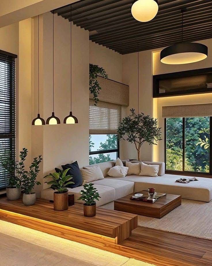

You can pull color directly from nature for an upscale, calm palette. Think olive greens, burnt sienna, and soft moss tones derived from plant, mineral, and clay sources that pair well with wood and stone.
Natural dyes and mineral pigments often create subtle variation and texture, which reads as intentional luxury. Use them in plaster, limewash, or clay-based paints to highlight depth and hand-crafted character. These finishes age gracefully and can be refreshed without stripping.
If you prefer solids, mix plant-derived binders and natural pigments in high-quality formulations. That gives you consistent color with lower chemical load. Match those paints to sustainable textiles and finishes for a cohesive, eco-forward interior.
Signature Colors for Luxury Spaces
Choose warm, tactile hues and broad accents that add depth and comfort. Pair rich earth tones with a single bold color for drama, and use textured finishes to make paint feel like a material.
Living Room Mastery
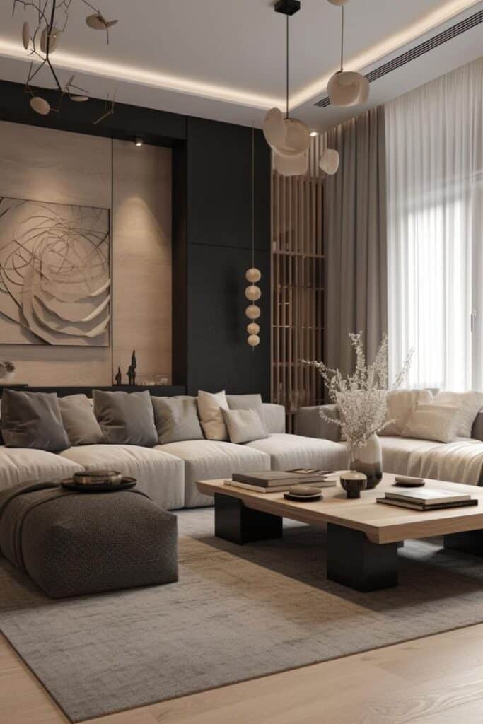
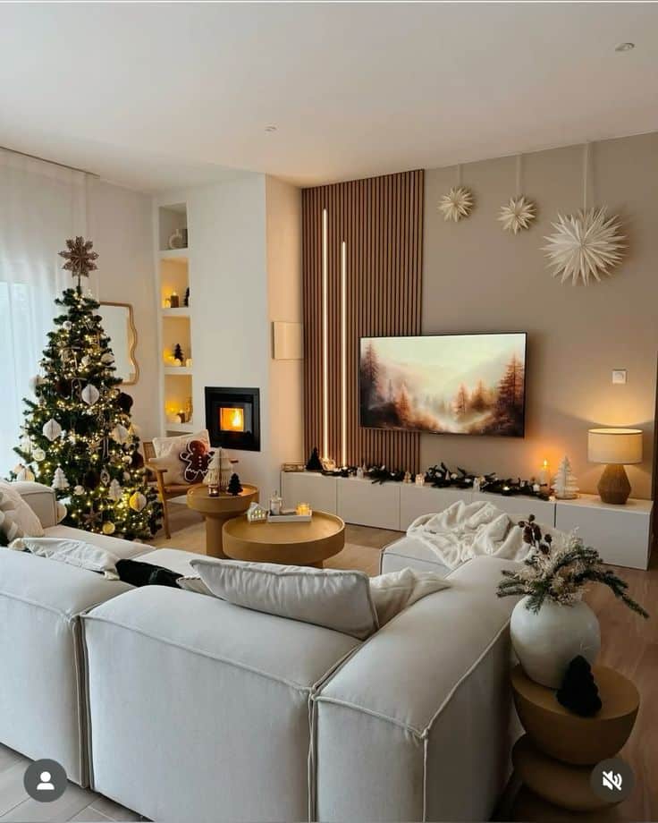
Select a grounded base like terracotta, warm greige, or dusty emerald to anchor your seating area. These colors read as luxurious because they feel lived-in and pair well with leather, walnut, and brass.
Add a single accent wall in periwinkle, deep teal, or oxblood to create a focal point without overpowering the room. Keep upholstery in muted tones and layer with velvet pillows or silk drapery for contrast.
Use high-sheen trim or satin on built-ins to reflect light while leaving walls matte or eggshell to show texture. Consider testing swatches at different times of day to see how natural light warms the shades.
Exquisite Bedroom Tones


Choose calming yet rich shades: smoky plum, warm mocha, or soft sage give bedrooms a private, upscale feel. These hues make textiles and headboards stand out and support restful lighting.
Keep the ceiling a tone lighter than the walls to open the space visually. Use two or three coordinated colors—one dominant wall color, a secondary shade for bedding, and a small accent for trim or a chair.
Pair paints with layered fabrics: linen sheets, a velvet throw, and a wool rug. Soft metallic accents in bedside lamps or mirror frames add subtle shine without competing with the main colors.
Opulent Bathroom Palettes
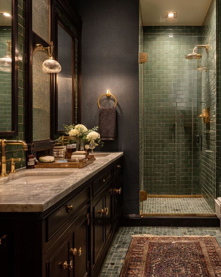
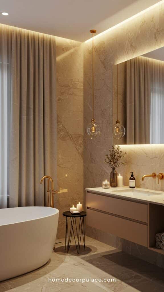
Pick saturated darks or pale, mineral tones for a spa-like look—think charcoal, deep forest, seafoam, or warm clay. These colors hide water marks and read as high-end when balanced with polished fixtures.
Combine color with texture: honed stone tiles, matte-painted cabinets, and glossy porcelain fixtures. Use a lighter grout or marble veining to create visual lines that feel intentional.
Limit your palette to two main colors and one metal finish. Brass or brushed gold hardware pairs beautifully with warm tones, while chrome or nickel complements cooler greens and blues.
Texture and Finish Pairings
Pair textures with finishes to make colors feel rich and intentional. Choose contrasts that highlight your chosen palette and match the room’s light and use.
Matte Versus Gloss
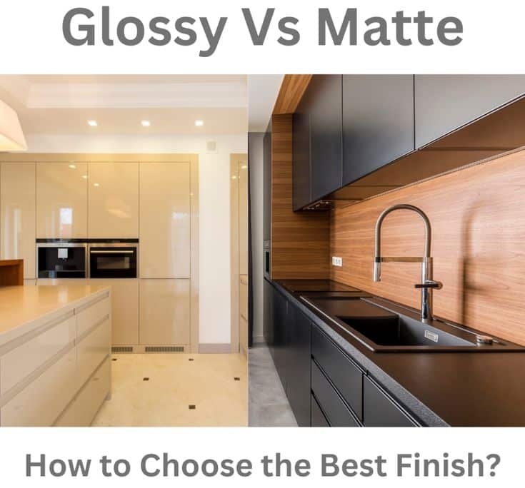
Matte paints hide wall imperfections and give deep colors a velvety, modern look. Use matte finishes for olive greens, burnt oranges, or warm neutrals on large wall planes to keep color saturated without glare. Matte works well in living rooms and bedrooms where you want a calm, cozy vibe.
Gloss finishes reflect light and make colors pop. Use high or semi-gloss on trim, doors, and cabinetry in jewel tones or mustard accents to add polish and visual contrast. Gloss also cleans more easily, so place it where scuffs or fingerprints are likely, like kitchens and hallways.
Pairing tip:
- Matte walls + gloss trim create depth and a tailored edge.
- Use a satin finish between them for furniture or built-ins to bridge the texture difference.
Metallic Accents
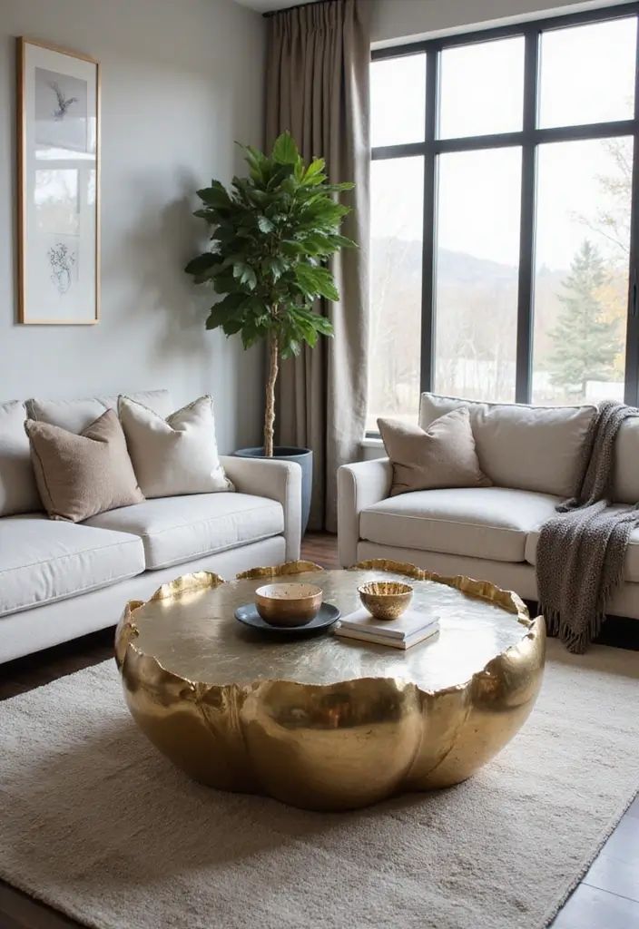
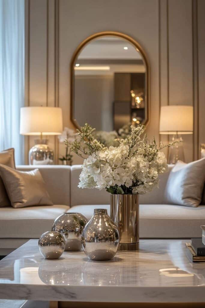
Metallics add luxury by catching light and drawing the eye. Choose warm metals—brass, bronze, or aged gold—against olive, mustard, or terracotta to reinforce warmth. Cooler metals—brushed nickel or pewter—work with muted blue-greens and gray-based palettes for a restrained look.
Apply metallics in controlled doses: light fixtures, hardware, mirror frames, and narrow picture frames. Too much metal competes with textured finishes like plaster or matte paint. For balance:
- Match the metal tone to a small fabric detail (pillow trim or rug thread).
- Use matte metal finishes if you want subtlety, or polished metal for a bolder, glamorous touch.
Consider scale: large metallic surfaces read strong and formal; thin accents feel modern and refined. Choose based on how dramatic you want the room to feel.
High-End Color Application Techniques
These methods help you use bold, luxurious color with clarity and control. They focus on clean edges, layered texture, and techniques you can replicate from room to room.
Color Blocking in Modern Interiors
Color blocking uses large, solid fields of contrasting hues to make rooms feel intentional. Pick two or three colors from your palette—often a deep, grounded tone, a mid-tone, and a bright accent. Use painter’s tape and a level to mark crisp edges where walls meet or where a painted “panel” sits behind furniture.
Balance scale: paint the largest wall in the dominant color, then block a single adjacent wall or door in the accent shade. Keep trim neutral or match it to the dominant hue for cohesion. For ceilings, try a lighter tint of the dominant color to lift the space.
Materials matter. Use satin or eggshell for walls and a higher-gloss for small details to catch light. Test samples at different times of day to confirm contrast and warmth before you commit.
Hand-Painted Wall Art
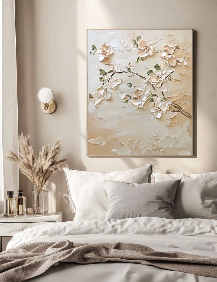
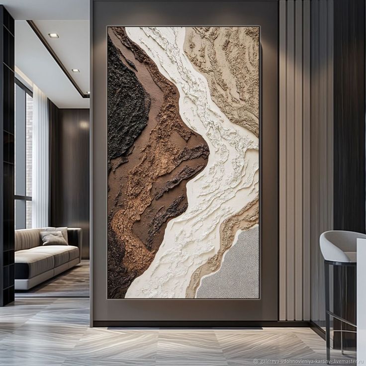
Hand-painted wall art adds a bespoke, high-end touch you can tailor to room colors. Start with a scaled sketch and choose paints formulated for walls, like acrylic or limewash, for different surface effects. Mix pigments to match your room’s main tones for harmony.
Prep the surface: sand, prime, and use an undercoat that complements your final color to reduce the number of paint layers. Work in sections, glazing with translucent washes for depth, or layering opaque strokes for graphic motifs. Use fine brushes for details and larger rollers or brushes for backgrounds.
Seal the finished work with a clear matte or satin varnish to protect it and to match the sheen of surrounding walls. If you want a repeatable motif, photograph the piece and have a muralist scale it for other rooms.
Luxury Brand Influences on Interior Colors
Luxury fashion and lifestyle brands shape which colors feel current and premium. Expect curated palettes, heritage tones, and seasonal capsule shades to guide what you pick for high-end rooms.
Designer Collaborations

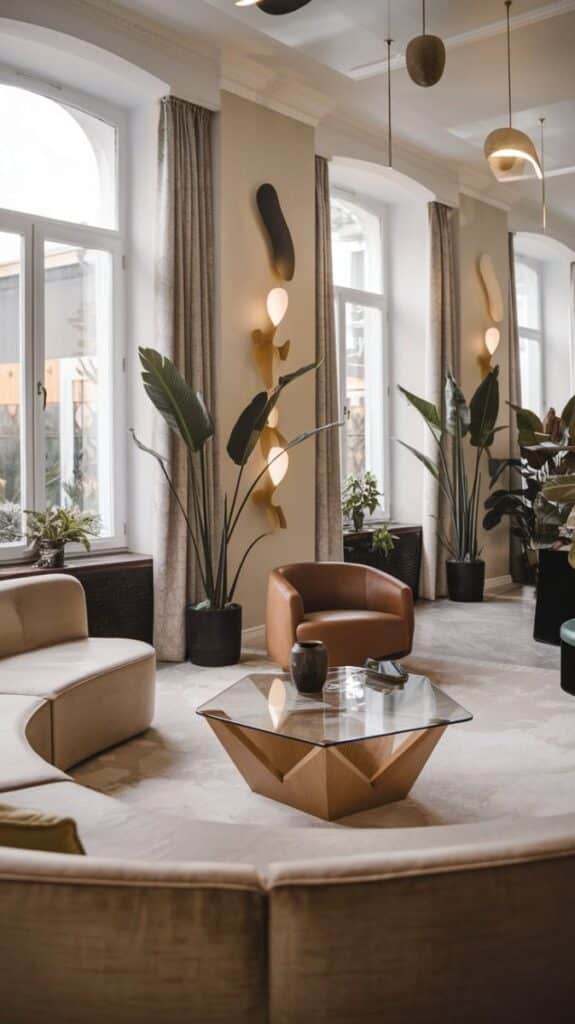
High-fashion houses now team with paint makers and furniture brands to create exclusive color lines you can use at home. When a brand like a couture house releases a palette, you get tones that match runway fabrics and accessory leathers. These colors often include nuanced blues, warm terracottas, and muted greens that read as both fashionable and timeless.
You should watch for limited-edition releases. They usually come with styling guides and fabric pairings that make it easy to match walls, upholstery, and trim. Collaboration collections also push texture choices—matte plasters, suede paints, and velvety finishes—so your color feels rich and tactile.
Influential Color Collections
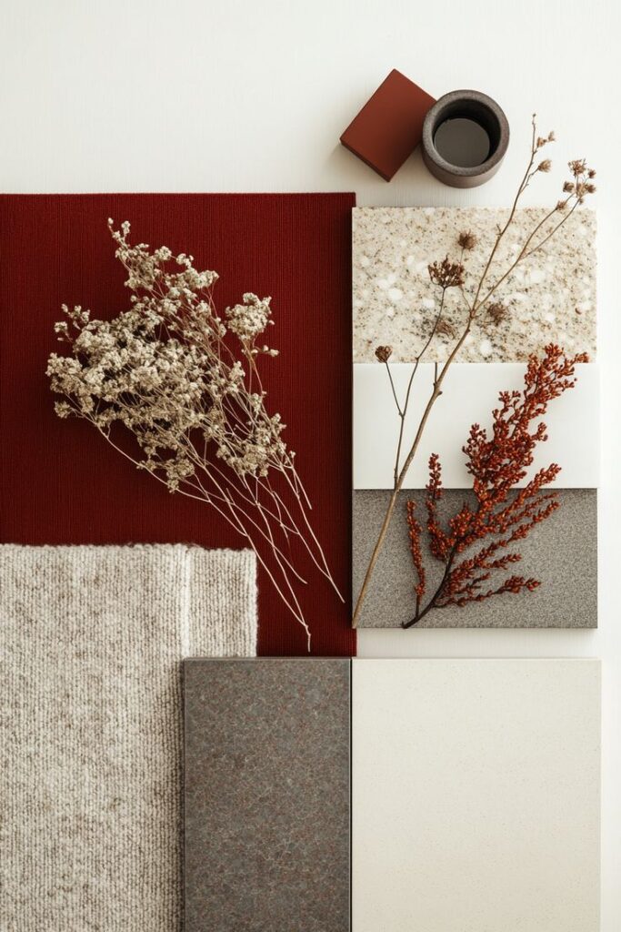
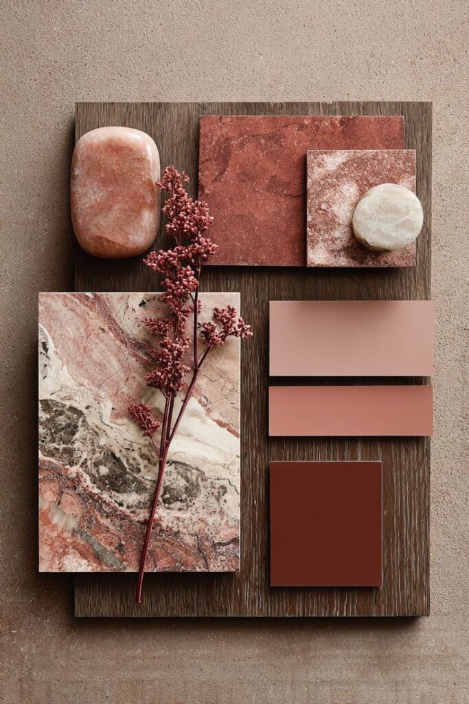
Some named collections set the season’s mood and sell broadly to designers and homeowners. Look for palettes labeled with clear themes—“heritage”, “coastal dusk”, or “organic opulence”—that list 6–12 coordinating hues. These collections help you build a full-room scheme without guessing.
Practical tips: pick one dominant shade, one supporting color, and one accent from the same collection. Use samples on large boards and view them at different times of day. Brand collections also include recommended trim and metal pairings, so you can match paint to brass, bronze, or black hardware confidently.
Global Inspirations for 2026 Interiors
Expect colors that balance mood and material. You’ll see palettes rooted in tradition but tuned for modern comfort, with focused use of bold accents, earthy bases, and tactile finishes.
European Elegance
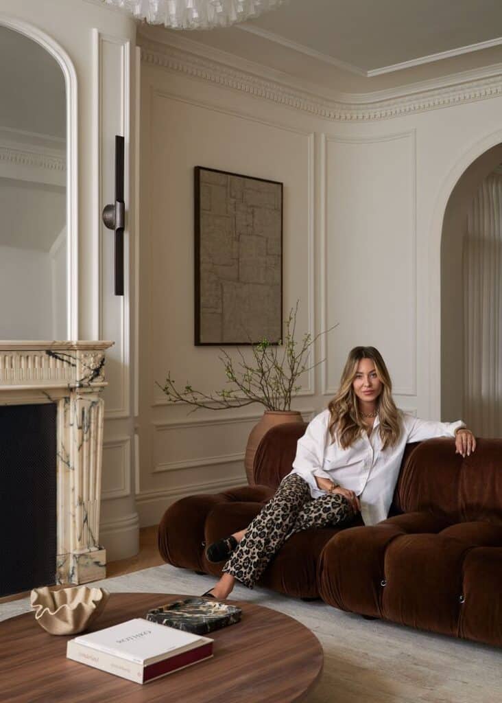
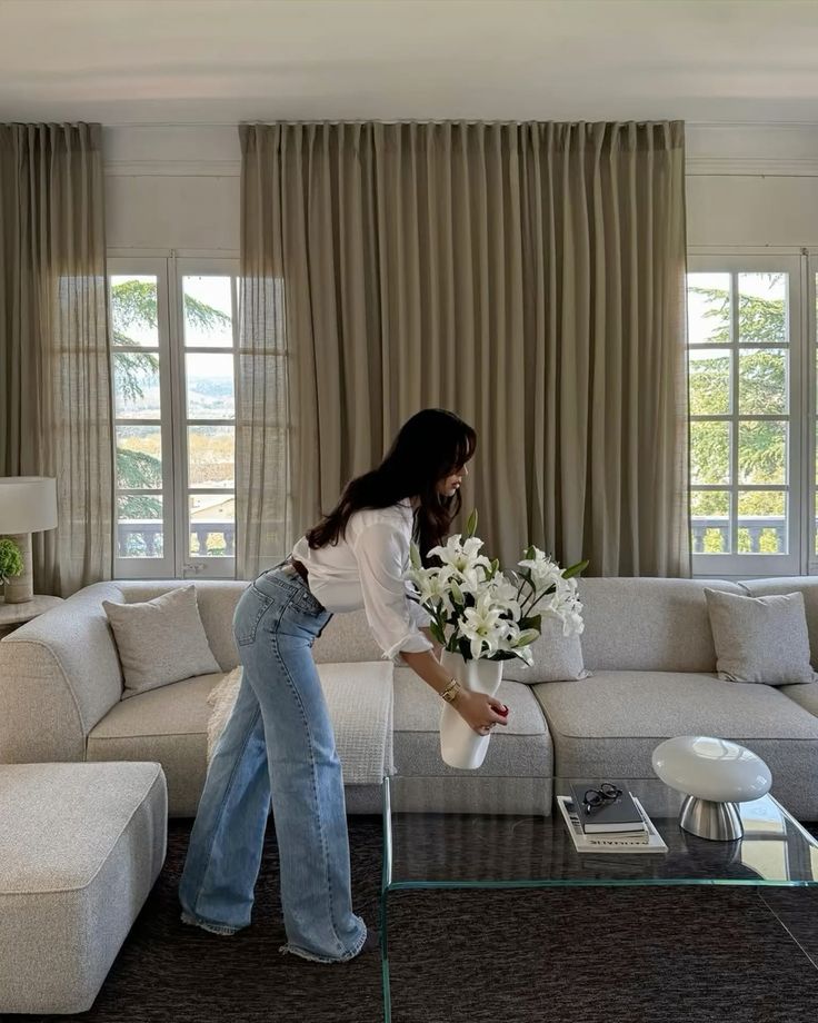
You’ll find muted jewel tones like dusty emerald and terracotta used with warm plaster walls and soft matte finishes. Pair a deep, desaturated green on cabinetry with honey oak floors to create a sense of age and quiet luxury. Brass or burnished gold hardware keeps the look refined without flashiness.
Think layered neutrals: oatmeal linens, mushroom-gray sofas, and cream-painted moldings. Use colour-drenching on a single wall or an entire room for drama, then soften it with linen curtains and textured rugs. Details matter — hand-blown glass, carved wood, and artisanal tiles bring subtle craftsmanship into a modern layout.
Asian-Inspired Hues
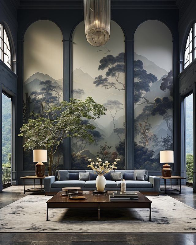
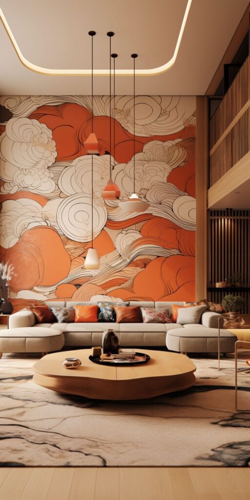
You can use colors like ink blue, tea-green, and warm umber to create calm, harmonious rooms. Combine a low-sheen indigo wall with natural bamboo blinds and lacquered furniture for contrast between matte and glossy surfaces. Porcelain, rattan, and paper-textured lamps add tactile layers.
Focus on balance: a single vivid accent — such as vermilion cushions or a jade vase — anchors a neutral setting. Apply color thoughtfully in small architectural elements like alcoves, screens, or a painted ceiling to guide sightlines and keep spaces serene.
What are the main luxury color trends for interiors in 2026?
The main luxury color trends for 2026 include bold statement shades like velvet teal, deep plum, and brick red used as focal points, as well as neo-neutral palettes featuring warm greiges, honey beiges, and muted mushroom tones that create calm, sophisticated atmospheres.
How can I effectively use statement shades in my home decor?
You can use statement shades by applying rich, saturated colors as focal points—such as on a single wall, cabinetry, or a ceiling—paired with luxe materials like marble, brass, or hand-stitched leather, ensuring the colors are used in measured doses to keep rooms feeling intentional.
What are neo-neutral palettes, and how do they contribute to a luxurious interior?
Neo-neutral palettes consist of warm greiges, honeyed beiges, and muted mushroom tones that provide a cozy, high-end backdrop, especially when layered with textured finishes like plaster, suede, and matte metals, creating serene and timeless spaces.
What sustainable pigments are recommended for luxury interior design?
For sustainable luxury interiors, look for low-VOC or zero-VOC pigments, natural dyes, and mineral pigments from brands with third-party certifications like GreenGuard, which use recycled materials and cleaner manufacturing methods to provide rich earth tones and muted blues without off-gassing.
How should I harmonize different color schemes for a balanced and intentional look?
Begin by selecting a dominant base color, then add one or two supporting accents, and use texture to unify them. Pair a main wall color with smaller accents like cushions or artwork, vary finishes to create depth, and balance warm and cool tones by assigning roles to each—warm tones for textiles and lighting, cool tones for large surfaces, using natural materials to bridge the temperature gap.
- 331shares
- Facebook0
- Pinterest328
- Twitter3
- Reddit0
