Color is a powerful tool in design, capable of evoking emotions, communicating messages, and influencing behavior. Understanding color psychology is essential for any designer looking to create effective and impactful designs. By harnessing the power of color, designers can create designs that not only look aesthetically pleasing but also communicate the intended message and elicit the desired emotional response.

The fundamentals of color psychology are rooted in the way humans perceive color and how it affects our emotions and behavior. By understanding the psychological effects of specific colors, designers can strategically use color to influence their audience. Additionally, understanding color harmony and how different design elements interact with color is crucial for creating designs that are visually balanced and cohesive.
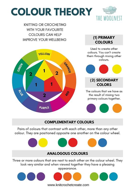
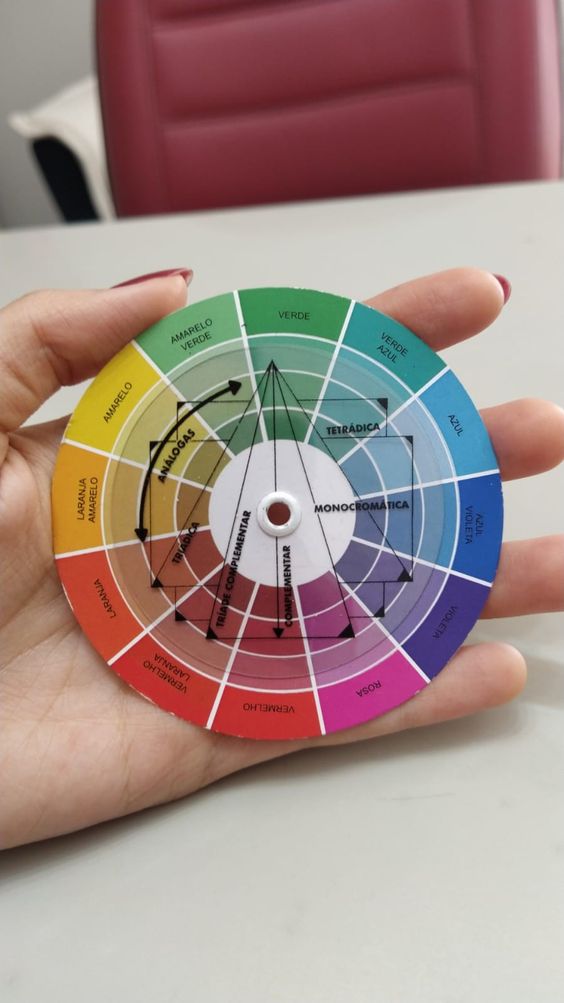
Applying color psychology in design requires a deep understanding of both the theory and practical application. Through case studies and practical examples, designers can see firsthand how color can be used to communicate different messages and evoke specific emotions. By mastering the use of color, designers can create designs that not only look visually stunning but also effectively communicate the intended message.
Key Takeaways
- Understanding color psychology is essential for effective and impactful design.
- Designers must understand the psychological effects of specific colors and how they interact with design elements to create visually balanced and cohesive designs.
- Applying color psychology in design requires both a deep understanding of theory and practical application through case studies and examples.
The Fundamentals of Color Psychology
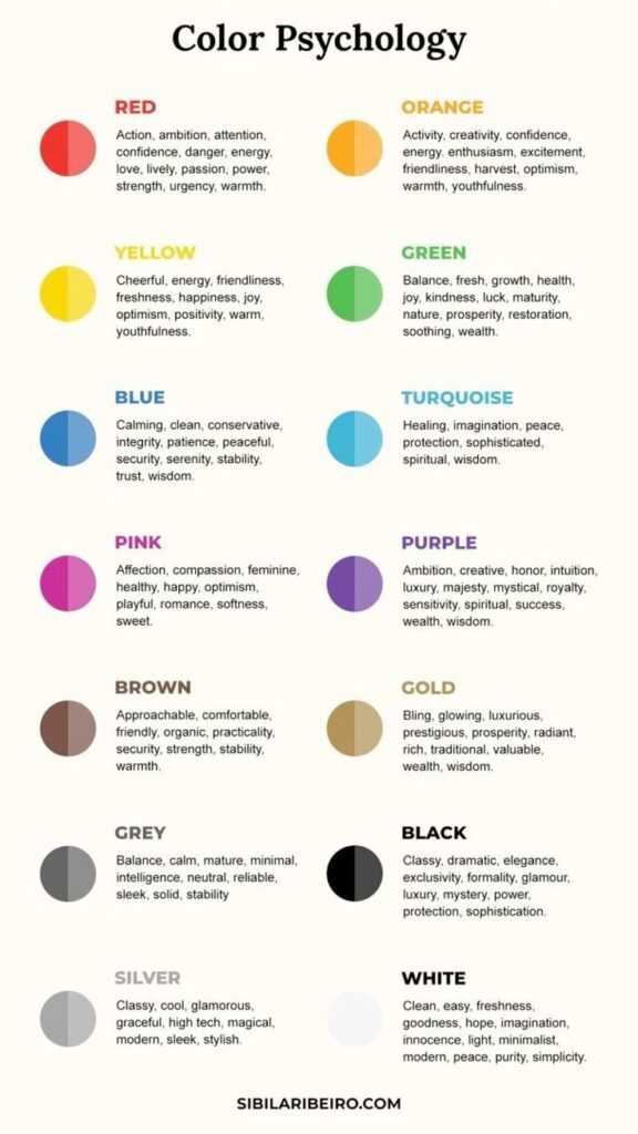
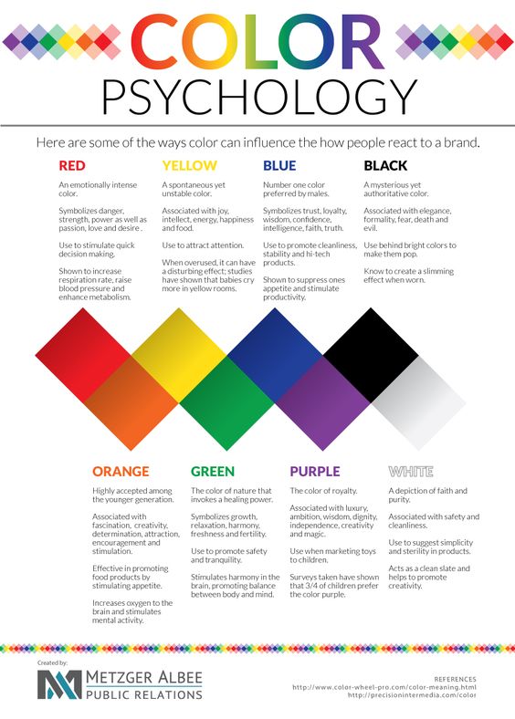
Understanding Color Psychology
Color psychology is the study of how colors affect human behavior and emotions. It is a field that has been extensively researched and applied in various fields, including marketing, advertising, and design. Understanding color psychology is essential in creating effective designs that can convey the desired message to the target audience.
Color and Perception

Perception is the process of interpreting sensory information, including colors. Different colors can evoke different emotions and reactions from people.
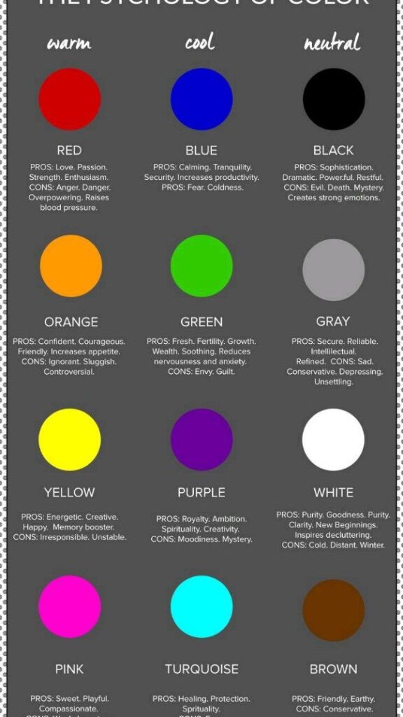
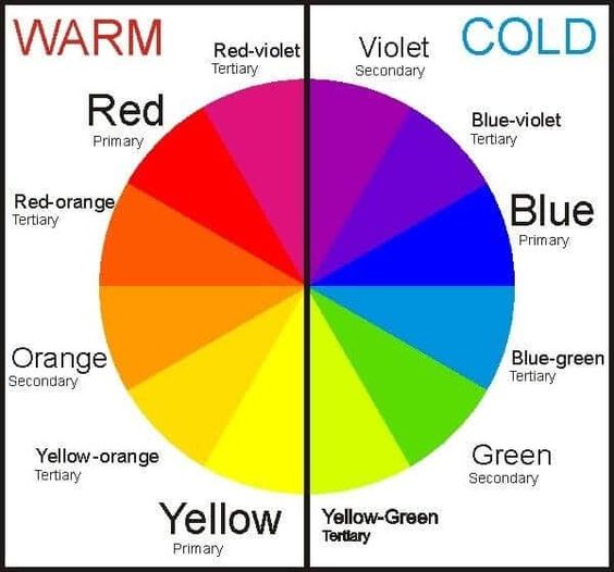
For example, warm colors such as red, orange, and yellow are associated with energy, excitement, and warmth, while cool colors such as blue, green, and purple are associated with calmness, relaxation, and serenity.
Cultural Significance of Colors
Colors also have cultural significance and associations. For instance, in Western cultures, white is associated with purity and innocence, while in some Eastern cultures, white is associated with death and mourning. Similarly, red is associated with luck and prosperity in Chinese culture, while in some African cultures, red is associated with danger and warning.
Understanding the cultural significance of colors is essential in creating designs that are culturally appropriate and sensitive to the target audience.
Overall, color psychology is an important aspect of design that can greatly influence the effectiveness of a design in conveying the desired message to the target audience. By understanding the emotional, cultural, and perceptual associations of colors, designers can create designs that are visually appealing and effective in achieving their intended purpose.
Applying Color Psychology in Design

Color in Branding
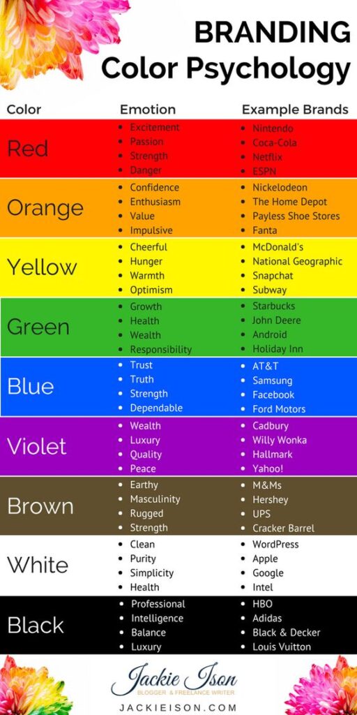
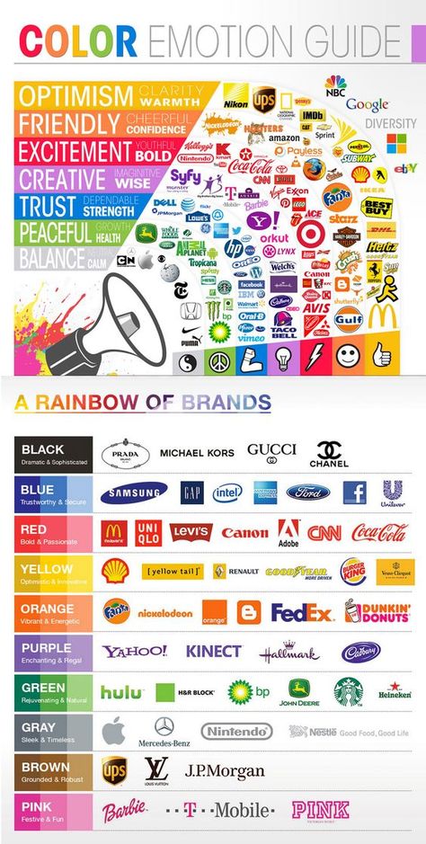
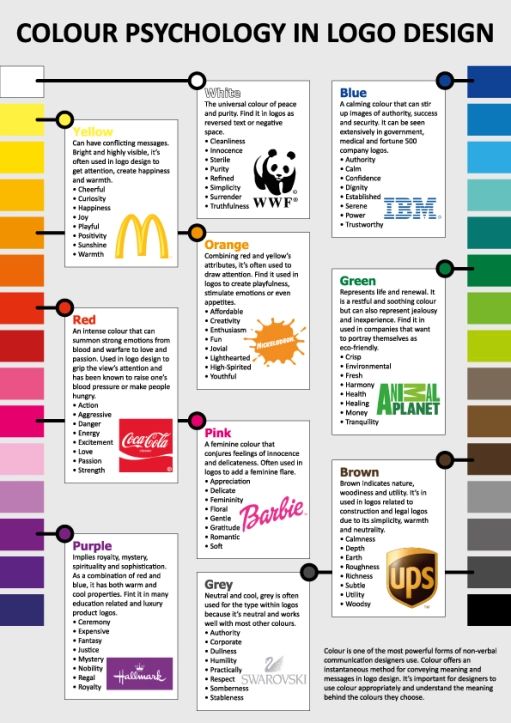
Color is an essential aspect of branding. Brands use color to create a unique identity that helps them stand out from the competition. The use of color can evoke emotions, create associations, and influence consumer perception. For example, blue is often associated with trust and reliability, while red is associated with excitement and passion. When designing a brand identity, it is essential to consider the psychological impact of color and choose colors that align with the brand’s values and goals.
Designing for User Experience

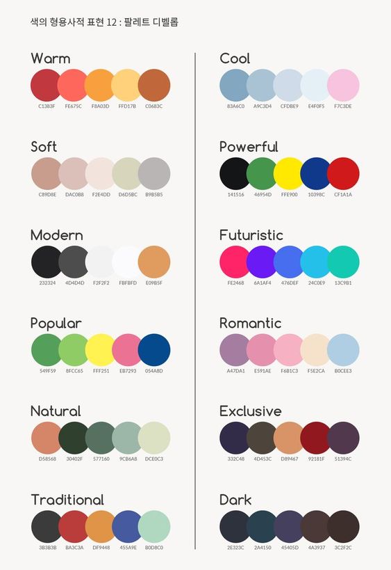
Color can significantly impact user experience in design. The right color scheme can make a design more visually appealing, improve usability, and increase engagement. Designers must consider the target audience and the context of the design when choosing colors. For example, a website designed for children may use bright and playful colors, while a financial website may use more muted and professional colors. The use of color can also affect the usability of a design, such as using color to indicate interactive elements or highlight important information.
Color and Marketing
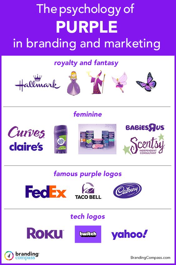
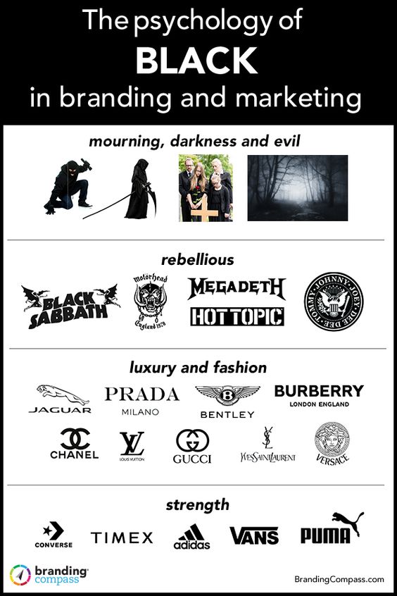
Color can be a powerful tool in marketing. It can grab attention, create associations, and influence purchasing decisions. Brands use color to create a visual identity that aligns with their messaging and values. For example, green is often associated with environmentalism and sustainability, while black is associated with luxury and sophistication. The use of color in marketing can also help create a sense of brand recognition and loyalty.
In conclusion, understanding color psychology is essential for designers and marketers alike. By harnessing the power of color, brands can create a unique identity, improve user experience, and increase engagement and conversions.
Psychological Effects of Specific Colors
Warm Colors
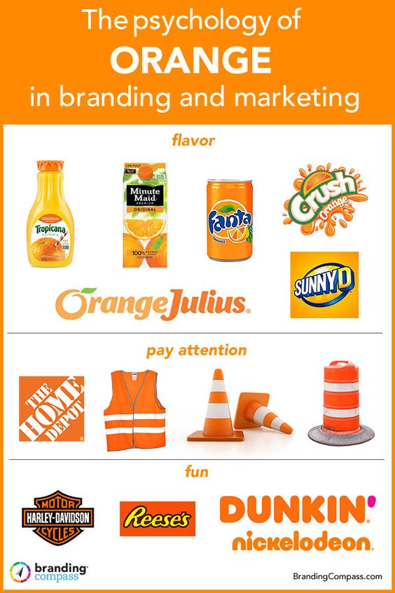
Warm colors such as red, orange, and yellow are often associated with passion, warmth, and optimism. Red, in particular, is known to increase heart rate and blood pressure, making it a popular choice for creating a sense of urgency or excitement in marketing materials. Orange is often used to convey a sense of friendliness and warmth, while yellow is associated with happiness and positivity.
Cool Colors
Cool colors such as blue and green are often associated with trust and calmness. Blue is a popular choice for corporate branding as it conveys a sense of professionalism and reliability. Green is often associated with nature and is used to create a sense of calmness and relaxation. Both blue and green are also known to have a calming effect on the mind and body.
Neutral Colors
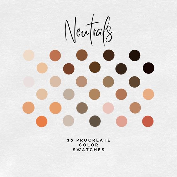
Neutral colors such as black, white, and gray are often associated with simplicity, sophistication, and purity. Black is often used to create a sense of elegance and sophistication, while white is associated with purity and cleanliness. Gray is often used as a neutral background color in design as it doesn’t draw attention away from other elements.
Overall, understanding the psychological effects of specific colors can be a powerful tool in design. By choosing the right colors, designers can create a specific mood or emotion that resonates with their target audience.
Design Elements and Color Harmony

Creating a Color Palette
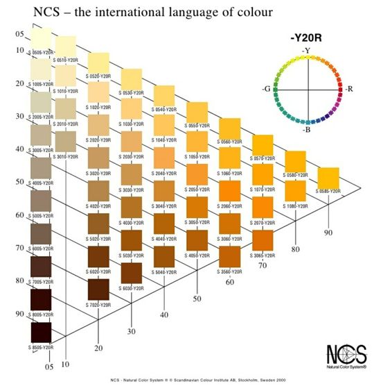
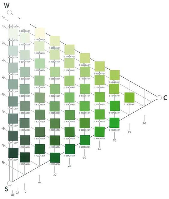
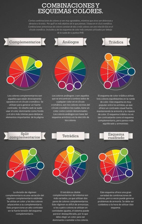
When it comes to designing a website or any other visual medium, choosing the right color palette is crucial. A well-designed color palette can help create a cohesive look and feel, evoke emotions, and convey a message. To create a color palette, a designer needs to consider factors such as the brand’s personality, target audience, and the message they want to convey.
Contrast and Accessibility
Contrast is an essential element of design that helps create a visual hierarchy and guide the user’s eye. It also plays a critical role in making a design accessible to everyone, including those with visual impairments. A designer needs to ensure that there is enough contrast between the text and background color to make it easy to read. They can use tools such as color contrast checkers to ensure that the contrast meets accessibility standards.
Visual Hierarchy and Color
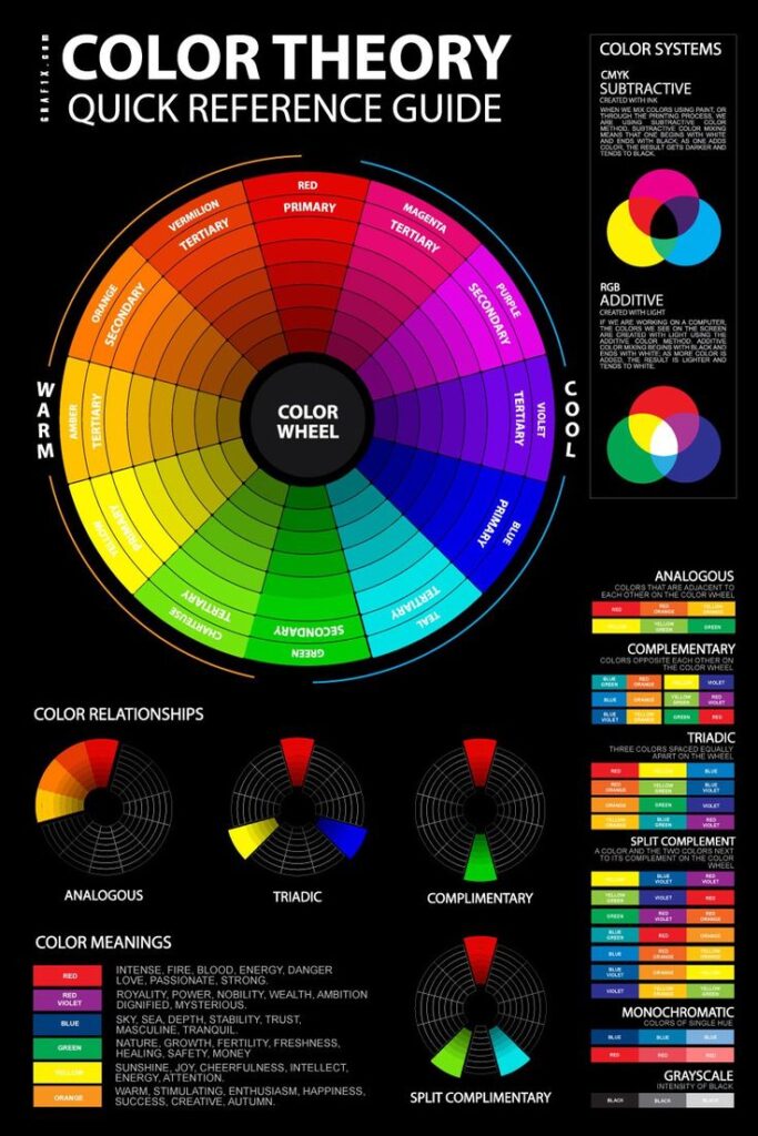
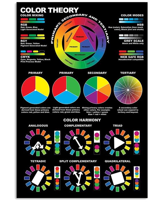
Visual hierarchy is the arrangement of elements in a design that guides the user’s eye and helps them understand the content’s importance. Color plays a crucial role in creating visual hierarchy. For instance, using bold and bright colors for important elements and muted colors for less important ones can help create a clear visual hierarchy. A designer needs to consider the content’s structure, the user’s needs, and the design’s aesthetics when creating a visual hierarchy.
In summary, creating a color palette, ensuring contrast and accessibility, and using color to create a visual hierarchy are essential elements of designing with color. A designer needs to balance aesthetics, balance, contrast, accessibility, and visual hierarchy to create a visually appealing and functional design.
Practical Application and Case Studies
Effective Call-to-Action Buttons
Call-to-action (CTA) buttons are crucial elements in web design that encourage users to take action. The effective use of color in CTA buttons can significantly increase click-through rates and drive conversions. Red and orange are popular choices for CTA buttons as they create a sense of urgency and action. However, it is important to consider the overall color scheme of the website to ensure the CTA buttons stand out and are easily identifiable.

In addition to color, the wording of the CTA button is also important. Using action-oriented language such as “Buy Now” or “Sign Up” can increase the sense of urgency and encourage users to take action.
Website Color Schemes
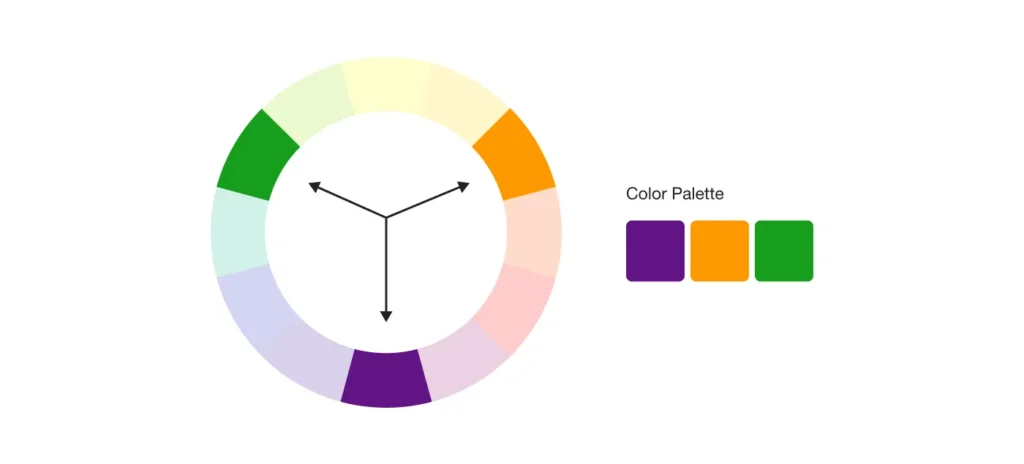
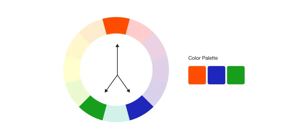
Choosing the right color scheme for a website is essential in creating a visually appealing and effective user interface. The use of color can affect the readability of the website and convey certain emotions and messages to the user. For example, Coca-Cola’s red and white color scheme conveys a sense of energy, excitement, and happiness.
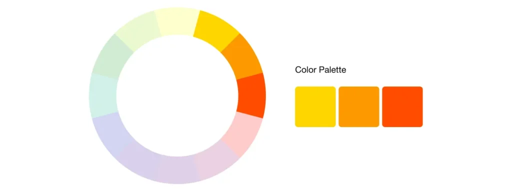
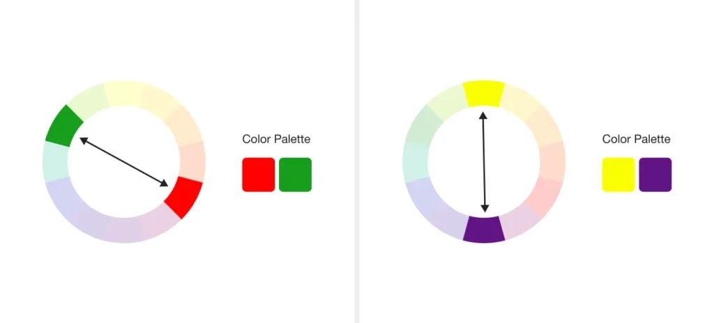
When selecting a color scheme, it is important to consider factors such as the target audience, the brand’s personality, and the desired emotional response from the user.


Neutral colors such as gray and white can convey a sense of professionalism and luxury, while bright and bold colors can create a sense of energy and excitement.
Real-World Brand Examples

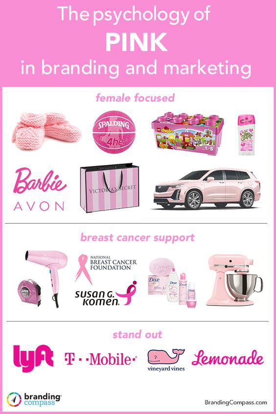
Many successful brands have harnessed the power of color psychology in their branding and marketing efforts. Coca-Cola’s use of red and white has become iconic and instantly recognizable, conveying a sense of energy, excitement, and happiness. The luxury brand Tiffany & Co. uses a signature shade of blue to convey elegance and sophistication.
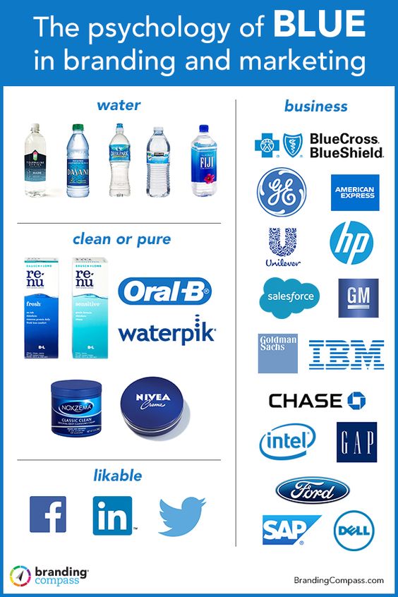
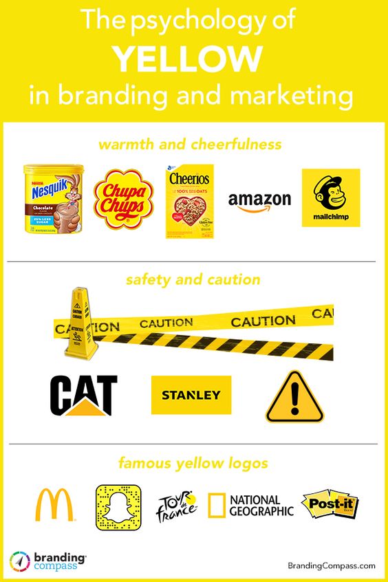
In conclusion, understanding color psychology in design can have a significant impact on the effectiveness of a website or brand.
By carefully selecting color schemes and utilizing effective CTA buttons, designers can create a visually appealing and engaging user experience that drives conversions and communicates the desired message to the user.

Frequently Asked Questions
How does color psychology impact consumer behavior?
Color psychology is the study of how color affects human behavior, cognition, and emotion. In design, color choices can influence a consumer’s perception of a brand, product, or service. For example, warm colors like red and orange may evoke feelings of excitement and energy, while cool colors like blue and green may create a sense of calmness and relaxation. Understanding the psychological impact of color can help designers make informed choices that resonate with their target audience.
What are the emotional responses associated with different colors in design?
Different colors can evoke different emotions and associations. For instance, blue is often associated with trust, reliability, and security, while yellow is associated with happiness and optimism. It’s important to note that cultural and personal experiences can also influence emotional responses to color. Designers should consider the intended audience and context when selecting colors to elicit specific emotional responses.
Can color choices enhance the usability of a design?
Color choices can impact the usability of a design by improving legibility, contrast, and visual hierarchy. For example, using high contrast colors for text and background can improve readability, while using color to differentiate between important and secondary information can improve visual hierarchy. However, designers should also be mindful of color blindness and other visual impairments that may affect color perception.
What cultural considerations should be taken into account when applying color psychology in design?
Color meanings and associations can vary across different cultures and regions. For example, in Western cultures, white is often associated with purity and weddings, while in Eastern cultures, it may be associated with mourning. Designers should research and consider the cultural context of their target audience to avoid unintended meanings or associations.
How do color schemes influence brand identity and perception?
Color schemes can play a significant role in building brand identity and perception. Consistent use of color can help establish brand recognition and differentiate a brand from competitors. For example, the use of red and white is strongly associated with Coca-Cola, while the use of blue and white is associated with Facebook. However, color alone cannot create a strong brand identity and should be used in conjunction with other branding elements.
What are the best practices for integrating color psychology into user interface design?
When integrating color psychology into user interface design, designers should consider the intended emotional response, cultural context, and usability implications. It’s important to use color intentionally and avoid overwhelming or distracting color schemes. Additionally, designers should consider the accessibility implications of color choices and ensure that designs are usable for all users, regardless of color perception.
- 899shares
- Facebook0
- Pinterest899
- Twitter0
- Reddit0


