Over 60 percent of designers admit that mastering the basics takes years of trial and error. While creativity often grabs the spotlight, the real magic lies in understanding the building blocks that lead to clear, captivating visuals. If you want your work to stand out and connect with people, these time-tested design principles offer practical guidance for both beginners and seasoned creators, giving every project a polished, professional edge.
Table of Contents
- 1. Understand Balance For Harmonious Designs
- 2. Use Contrast To Make Elements Stand Out
- 3. Apply Alignment For Clean Visual Order
- 4. Create Focus With Emphasis Techniques
- 5. Achieve Unity For A Cohesive Look
- 6. Use Repetition To Strengthen Identity
- 7. Harness Space For Better Composition
Quick Summary
| Takeaway | Explanation |
|---|---|
| 1. Use balance for visual harmony | Balance arranges elements to create a satisfying composition, ensuring stability and visual peace. |
| 2. Employ contrast to draw attention | Contrasting sizes, colors, and textures helps create emphasis and guides the viewer’s gaze. |
| 3. Implement alignment for organization | Intentional alignment brings professionalism and guides the viewer’s flow within the design. |
| 4. Create focus through emphasis | Emphasizing key elements with size, color, or position directs attention to the most important parts. |
| 5. Harness space for clarity | Proper use of positive and negative space is essential for creating depth and enhancing visual clarity. |
1. Understand Balance for Harmonious Designs
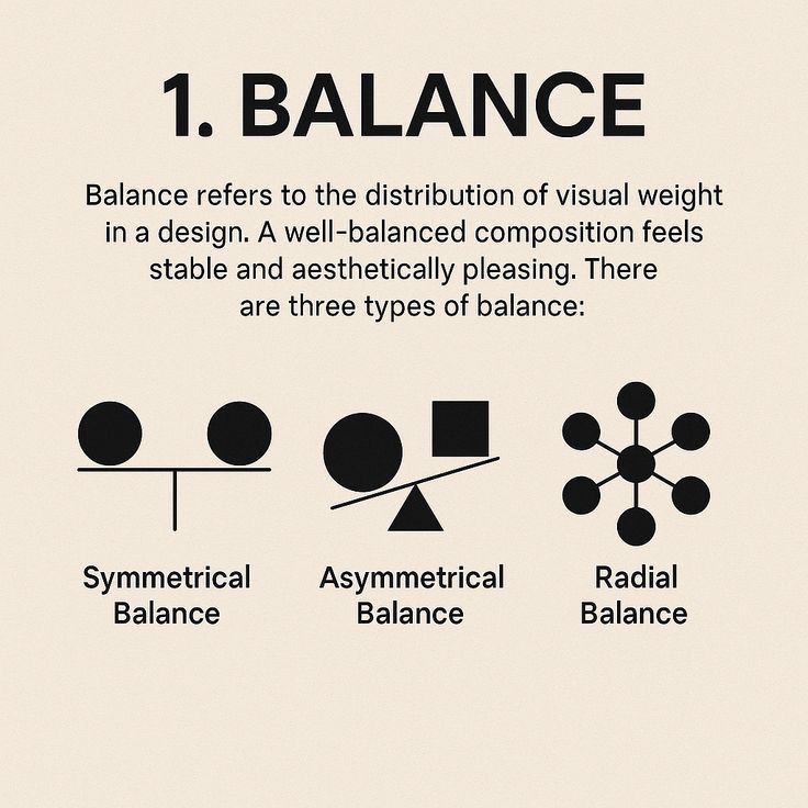
Balance is the secret sauce that transforms good design into great design. Imagine your visual composition as a delicate dance where every element plays a crucial role in creating visual harmony.
According to research from the University of Central Arkansas, balance refers to the equal distribution of weight or force among visual units, which creates a sense of equilibrium and visual peace. This means strategically arranging elements so they feel visually satisfying and stable.
Think of balance like arranging furniture in a room. You want things to feel intentional yet comfortable. There are three primary types of balance you can explore:
- Symmetrical Balance: Elements are mirrored precisely on both sides
- Asymmetrical Balance: Different elements create visual weight through strategic placement
- Radial Balance: Elements radiate from a central point
To practice balance, start by squinting at your design. If everything feels visually comfortable and nothing seems like it might topple over, you are on the right track. Professional designers often use visual weight techniques like color intensity, size, and positioning to create perfect balance.
Pro tip: Experiment with different balance approaches in your next project. Move elements around, play with their sizes, and see how each adjustment impacts the overall feel of your composition. Balance is not about rigid perfection but about creating a visual experience that feels naturally harmonious.
2. Use Contrast to Make Elements Stand Out
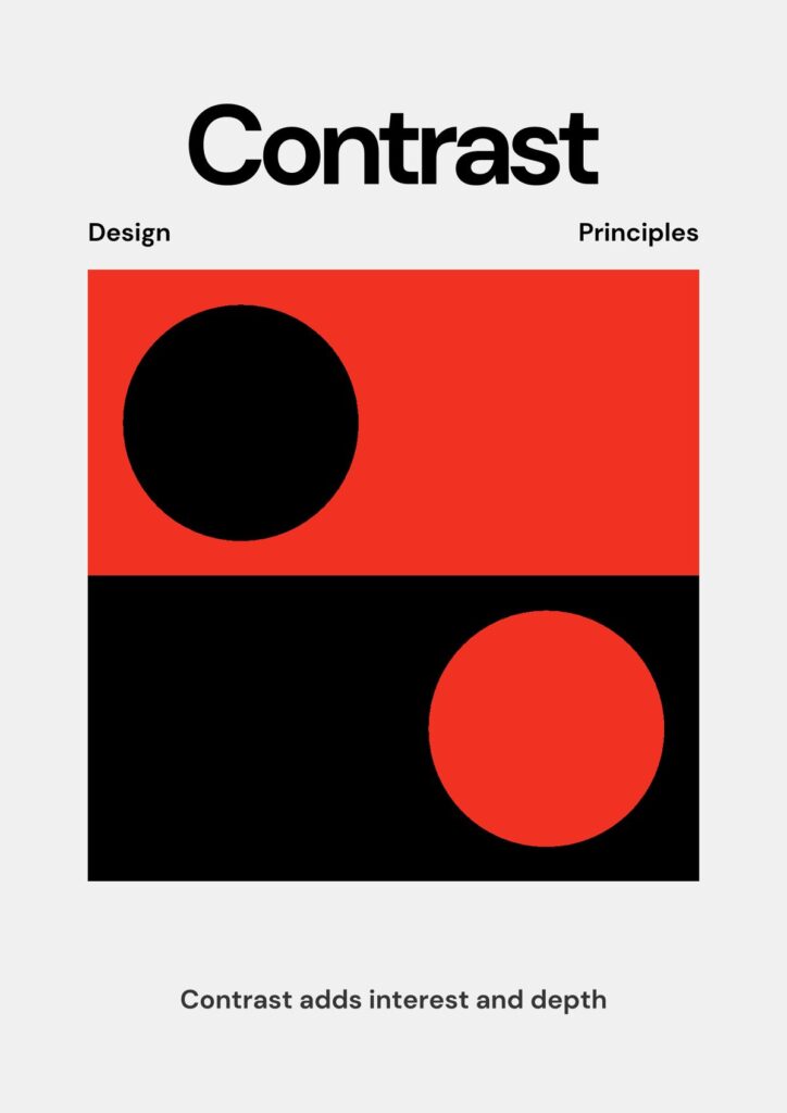

Contrast is the design world’s spotlight that helps you instantly guide viewers’ attention and create visual drama. Think of it as the secret weapon that makes your designs pop and communicate more effectively.
According to research from the Getty Education, emphasis can be achieved by making one area stand out through dramatic differences in size, color, texture, or shape. The Denton Independent School District explains that contrast involves arranging opposite elements to generate visual interest.
To implement contrast effectively, consider these powerful strategies:
- Color Contrast: Place complementary or opposing colors next to each other
- Size Contrast: Mix large and small elements to create visual hierarchy
- Texture Contrast: Combine smooth and rough surfaces for tactile interest
- Shape Contrast: Blend geometric and organic forms
Imagine your design as a visual story where contrast acts like strategic pauses and emphasis. A small red element among gray tones will instantly draw the eye. A bold geometric shape nestled within organic forms creates intrigue. The key is intentional difference.
Practical tip: Start by selecting a focal point in your design. Then strategically use contrast to lead viewers exactly where you want their attention. Experiment with pushing and pulling visual weight until your composition feels dynamic and purposeful.
3. Apply Alignment for Clean Visual Order
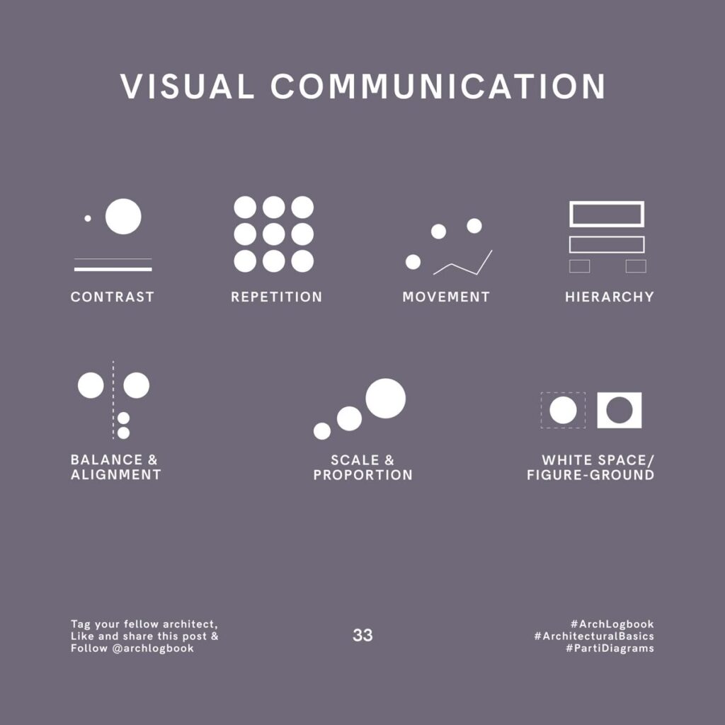
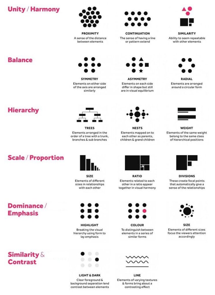
Alignment is the invisible grid that transforms scattered design elements into a polished visual masterpiece. Think of it as the secret organizational tool that brings instant professionalism to your creative work.
Research from Platt College highlights that alignment ensures elements are kept in line horizontally, vertically, and across linear planes, contributing to a clean and organized design. According to UCF Press Books, consistency through repetition aids audience understanding and creates visual familiarity.
Mastering alignment means understanding these key approaches:
- Left Alignment: Creates a sharp clean edge and structured look
- Center Alignment: Provides symmetry and balance
- Right Alignment: Offers a more dynamic and modern feel
- Grid Based Alignment: Provides precise mathematical precision
When you align elements intentionally, you create visual paths that guide your audience’s eye exactly where you want it to go. Imagine your design as a well organized bookshelf where everything has its perfect place. Subtle grid lines or invisible connection points can transform seemingly random elements into a cohesive visual story.
Practical tip: Use software guides or digital grids to help you align elements precisely. Start by selecting a primary alignment strategy and stick with it consistently throughout your design. Small adjustments can make a massive difference in perceived professionalism and visual appeal.
4. Create Focus with Emphasis Techniques
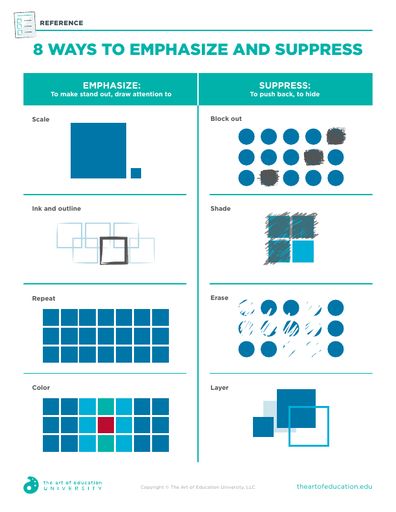

Emphasis is the spotlight of your design world that instantly guides viewers’ attention and communicates what matters most. It transforms a good design into a captivating visual story that speaks directly to your audience.
According to research from the University of Central Arkansas, emphasis is about creating a center of interest that brings the most important part of a design into sharp focus. The Getty Education explains that this can be achieved by contrasting elements through size, color, texture, or shape.
Master emphasis with these strategic techniques:
- Size Variation: Make key elements significantly larger or smaller
- Color Intensity: Use bright or contrasting colors to draw attention
- Isolation: Place important elements in open space
- Positioning: Strategically place crucial elements at visual intersection points
Think of emphasis like a director guiding an audience’s gaze. A single red object in a grayscale composition will instantly become the star. A slightly larger headline among smaller text creates immediate hierarchy. The magic is in subtle yet intentional differences.
Practical tip: Always ask yourself what the most important message in your design is. Then use emphasis techniques to ensure that message jumps out and captures attention. Remember that subtlety often speaks louder than overwhelming graphics.
5. Achieve Unity for a Cohesive Look
Unity transforms a collection of random design elements into a harmonious visual symphony that feels intentional and complete. It is the secret ingredient that makes your design feel like a thoughtful composition rather than a scattered collection of parts.
Research from the Getty Education defines unity as the feeling of harmony between all parts of an artwork, creating a sense of completeness. The University of Central Arkansas explains that unity holds a design together, preventing it from appearing random or disconnected.
Create unity through these powerful strategies:
- Color Consistency: Use a limited color palette throughout
- Repetitive Elements: Repeat specific shapes or design motifs
- Consistent Typography: Maintain similar font styles and weights
- Thematic Alignment: Ensure all elements support a central concept
Think of unity like composing a musical piece where every instrument contributes to the overall sound. If you create a stunning fashion design portfolio, each element should feel like it belongs to the same visual story.
Practical tip: Squint at your design. If it still looks cohesive and balanced when blurred, you have successfully achieved unity. The goal is not sameness but a deliberate connection that guides the viewer’s eye through your creative narrative.
6. Use Repetition to Strengthen Identity
Repetition is like the rhythm in a musical composition that transforms scattered notes into a memorable melody. It turns disconnected design elements into a cohesive visual language that speaks with clarity and purpose.
According to Platt College, the repetition principle suggests consistently using elements like color or font throughout a design to unify the work and strengthen branding. Research from the Getty Education highlights that repetition makes artwork feel active and creates internal unity.
Apply repetition through these strategic approaches:
- Color Repetition: Use a consistent color palette across elements
- Typography Consistency: Maintain similar font styles and weights
- Shape Echoing: Repeat geometric or organic shapes subtly
- Graphic Element Reuse: Create visual motifs that recur throughout the design
Think of repetition like a signature. Just as a musician has a recognizable style, your design should have a distinctive rhythm that makes it instantly identifiable. When used thoughtfully, repetition transforms individual components into a powerful visual narrative.
Practical tip: Create a design style guide for yourself. Document your color palette, preferred fonts, and graphic elements. This ensures consistency across all your creative work and helps build a strong visual identity.
7. Harness Space for Better Composition
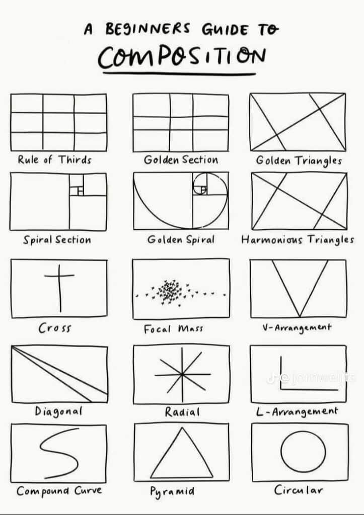
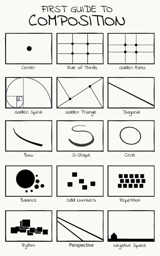
Space is the invisible framework that breathes life into your design, transforming a collection of elements into a meaningful visual experience. Think of space as the silent storyteller that guides viewers’ eyes and creates emotional depth.
According to research from Ohio State University, space is defined as the area either taken up by an object or the area surrounding it. The Human LibreTexts highlights that design principles like balance, harmony, and contrast govern how elements are organized within a space.
Master space with these strategic techniques:
- Positive Space: Areas occupied by design elements
- Negative Space: Empty areas around and between elements
- White Space: Strategic emptiness that creates visual breathing room
- Depth Perception: Creating layers and dimension through spatial relationships
Imagine space like a musical composition where silence is as important as sound. Too many elements create noise while thoughtful spacing creates clarity. The goal is finding a balance that allows each design element to sing.
Practical tip: Experiment with spacing by squinting at your design. If it feels cluttered when blurred, you need more breathing room. Great design is often about what you choose not to include.
Below is a comprehensive table summarizing the key design principles and techniques discussed in the article.
| Design Principle | Description | Key Techniques |
|---|---|---|
| Balance | Equal distribution of visual weight for equilibrium | Symmetrical, Asymmetrical, Radial |
| Contrast | Emphasizing differences to highlight design elements | Color, Size, Texture, Shape |
| Alignment | Organizing elements for a polished look | Left, Center, Right, Grid-based |
| Emphasis | Guiding attention to focal points | Size Variation, Color Intensity, Isolation, Positioning |
| Unity | Creating a cohesive visual composition | Color Consistency, Repetitive Elements, Thematic Alignment |
| Repetition | Consistent use of elements to strengthen identity | Color Repetition, Typography Consistency, Shape Echoing |
| Space | Arrangement of elements to create depth and order | Positive/Negative Space, White Space, Depth Perception |
Master the Art of Design Principles with Sky Rye Design
Struggling to balance your creative ideas with clean, compelling visuals Wondering how to make your designs stand out with clear focus and unity The “7 Key Design Principles Explained Simply for Creatives” delivers essential insights to solve these exact challenges. Now you can deepen your understanding and see these principles in action by exploring expert content on Graphic | Sky Rye Design and sharpen your skills with practical UX concepts at UX / UI | Sky Rye Design.
Take your creative projects to the next level by turning theory into practice with inspiration from Sky Rye Design. Don’t miss your chance to craft balanced, eye-catching, and cohesive visuals today. Visit Sky Rye Design now and start mastering the design principles that bring your ideas to life.
Frequently Asked Questions
What are the basic principles of design?
The basic principles of design include balance, contrast, alignment, emphasis, unity, repetition, and space. To understand each principle, review examples and explore how they can enhance your creative projects.
How can I achieve balance in my designs?
To achieve balance, experiment with symmetrical, asymmetrical, and radial placements of design elements. Start by squinting at your design; if it feels comfortable and visually stable, you’re on the right track.
What are effective ways to use contrast in my designs?
You can use contrast by varying sizes, colors, textures, and shapes to create visual interest. For instance, place a bold color next to a muted shade to draw attention and emphasize key areas.
How do I create focus using emphasis techniques?
Create focus by using size variation, color intensity, or isolation of important elements in your design. Identify the central message you want to convey, and apply emphasis to ensure it stands out.
Why is unity important in design, and how can I achieve it?
Unity creates a cohesive look in your design and prevents it from feeling disjointed. Achieve unity by using a consistent color palette and repeating shapes or motifs throughout your composition.
What role does space play in effective design composition?
Space helps organize elements and creates clarity in your design. To effectively use space, ensure there’s enough negative or white space around elements so they can breathe and be easily understood.
Recommended
- Typographic Design Explained: Core Elements and Uses | Sky Rye Design
- UI/UX Design Trends: What to Expect in 2024 | Sky Rye Design
- Casual Color Theory for UI/UX Design Explained |
- Role of Patterns in Design: Complete Guide | Sky Rye Design
- 7 Essential User Experience Best Practices for Success
- How Fast Design Debt Forms When Design Responsibility Spreads Too Thin | The Good Side Blog
- 124shares
- Facebook0
- Pinterest121
- Twitter3
- Reddit0


