Over 90 percent of the information we take in online comes from reading words, yet few people realize how much typography shapes every message. Every font choice and layout decision influences both what we understand and how we feel about it. When the right design creates a visual path for your eyes, words become more than information. They become engaging and memorable experiences that hold your attention.
Table of Contents
- Defining Typographic Design and Its Purpose
- Major Types of Typography and Their Roles
- Core Principles of Effective Typographic Design
- Applications in Digital, Print, and Everyday Life
- Common Mistakes and Best Practice Guidelines
Key Takeaways
| Point | Details |
|---|---|
| Purpose of Typography | Typography enhances readability, creates visual hierarchy, and communicates brand personality, transforming text into engaging visual narratives. |
| Font Families and Their Uses | Understanding various font families, such as serif and sans-serif, allows designers to choose the right typeface for specific communication goals across digital and print mediums. |
| Core Design Principles | Effective typographic design relies on principles like hierarchy, contrast, and readability that ensure clear communication and accessibility for all users. |
| Common Mistakes to Avoid | Design pitfalls include excessive styling, inconsistent font choices, and poor contrast, which can detract from the effectiveness of typographic communication. |
Defining Typographic Design and Its Purpose


Typography is the artful science of arranging text to transform written communication from mere words into powerful visual experiences. According to research from Yale, typography involves strategically designing text to ensure clarity, readability, and effective communication.
At its core, typographic design serves multiple critical purposes. It goes beyond simply selecting fonts – it’s about creating visual hierarchies that guide readers’ eyes, establish emotional connections, and communicate messages with precision. Design hierarchy helps viewers understand which information matters most, using variations in size, weight, and spacing to prioritize content.
The fundamental goals of typographic design include:
- Enhancing readability and comprehension
- Establishing visual structure and organization
- Conveying mood and brand personality
- Creating visual interest and engagement
As research indicates, typography plays a crucial role in graphic design by dramatically influencing how information is perceived and understood. Role of Patterns in Design can provide additional context on how visual elements like typography contribute to overall design strategies. Masterful typography transforms text from passive information into an active, compelling visual narrative that speaks directly to the viewer’s aesthetic and intellectual sensibilities.
Major Types of Typography and Their Roles


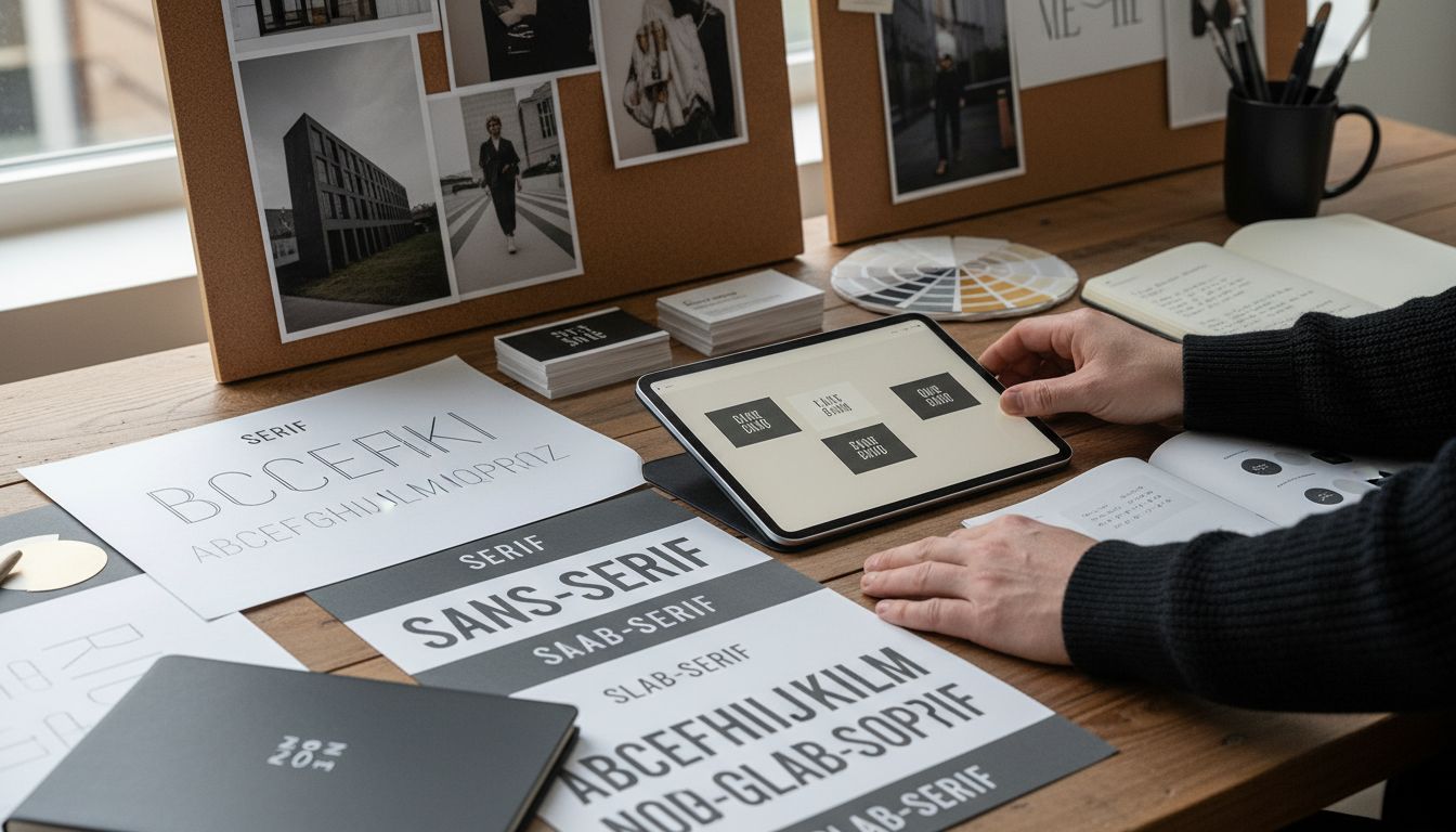
Typography is a rich landscape of font families, each with unique characteristics and design purposes. According to research from the University of Wisconsin, two primary categories dominate the typographic world: serif and sans-serif fonts, each serving distinct communication goals.
The major typography families include:
Serif Fonts: Traditional typefaces with small decorative lines (serifs) at the end of letter strokes. These fonts are commonly used in print publications like books and newspapers, conveying a sense of elegance and formality. Classic examples include Times New Roman and Georgia.
Sans-Serif Fonts: Clean, modern typefaces without decorative lines, offering superior readability on digital screens. Helvetica and Arial are popular sans-serif choices frequently used in web design and digital interfaces.
Additionally, research highlights several nuanced type classifications:
Here’s a comparison of the main typography font families and their typical uses:
| Font Family | Key Characteristics | Common Uses |
|---|---|---|
| Serif | Decorative end strokes (serifs) Elegant, formal | Print publications Books Magazines |
| Sans-Serif | Clean lines No decorative strokes Modern appearance | Digital interfaces Websites Apps |
| Old Style | Calligraphic influence Organic shapes | Traditional designs Classic branding |
| Transitional | Bridges old and modern styles Moderate contrast | Editorial layouts Modern print |
| Modern | Geometric shapes High stroke contrast | Luxury brands Headlines |
| Slab Serif | Thick, block-like serifs Strong appearance | Marketing materials Posters |
- Old Style: Traditional fonts with organic, calligraphic influences
- Transitional: Fonts bridging classic and modern design aesthetics
- Modern: Sleek, geometric typefaces with high contrast between thick and thin strokes
- Slab Serif: Bold, block-like serifs often used in headings and marketing materials
Understanding these typography variations helps designers craft business card designs that communicate brand personality effectively.
 By selecting the right typeface, designers can evoke specific emotions, enhance readability, and create powerful visual narratives that resonate with their intended audience.
Core Principles of Effective Typographic Design


Typographic design is more than just selecting attractive fonts – it’s a strategic approach to visual communication. According to research from digital design systems, effective typography hinges on several critical principles that transform text from mere words into powerful visual experiences.
The fundamental principles of typographic design include:
- Hierarchy: Creating visual structure that guides the reader’s eye
- Readability: Ensuring text is easily comprehensible and accessible
- Contrast: Using font weights, sizes, and styles to create visual interest
- White Space: Providing breathing room between text elements
- Alignment: Maintaining consistent and purposeful text positioning
Accessibility is paramount in modern typographic design. Research from Section 508 emphasizes the importance of choosing fonts that are readable for all users, including those with visual disabilities. This means selecting typefaces with clear letterforms, maintaining sufficient color contrast, and ensuring text remains legible across different devices and screen sizes.
When designers approach typography thoughtfully, they can navigate complex design challenges with greater precision. By understanding these core principles, designers can create typographic compositions that not only look visually appealing but also effectively communicate their intended message, making every character count.
Applications in Digital, Print, and Everyday Life


Typography is a versatile art form that seamlessly integrates into nearly every aspect of our visual communication landscape. According to research from government design standards, typographic design plays a crucial role across multiple mediums, transforming how we perceive and interact with information.
In digital interfaces, typography is the backbone of user experience. Digital applications rely on clear typographic hierarchies to guide users through complex information landscapes. Websites, mobile apps, and digital platforms use strategic font choices, sizes, and weights to create intuitive navigation and enhance readability.
Print media continues to leverage typography in powerful ways:
- Magazine and book layouts use sophisticated type arrangements
- Branding materials like posters and brochures communicate identity through font selection
- Newspapers and journals employ typography to create visual structure and guide reader attention
Everyday life is saturated with typographic design. From street signs and product packaging to restaurant menus and smartphone interfaces, typography silently communicates essential information. Research from accessibility guidelines emphasizes that good typography isn’t just about aesthetics – it’s about creating inclusive, readable content that works for everyone. Explore creative design approaches to see how typography can transform visual communication across different mediums.
Common Mistakes and Best Practice Guidelines
Typographic design demands precision and thoughtful execution. According to research from digital design systems, even subtle mistakes can dramatically undermine the effectiveness of your visual communication, transforming potentially powerful text into a confusing visual mess.
Common typographic pitfalls designers frequently encounter include:
- Excessive Styling: Overusing bold or italic text that reduces readability
- Inconsistent Font Choices: Mixing too many typefaces without a clear hierarchy
- Poor Contrast: Selecting color combinations that strain the reader’s eyes
- Inappropriate Line Spacing: Creating text that feels cramped or overly dispersed
- Ignoring Accessibility: Designing without considering users with visual disabilities
Research from Section 508 emphasizes that best practices revolve around creating accessible and readable typography. This means choosing fonts with clear letterforms, maintaining sufficient color contrast, and ensuring text remains legible across different devices and contexts. Designers should aim to use no more than 2-3 complementary fonts per project, prioritize readability over decorative complexity, and always test their designs with diverse user groups.


Navigate complex design challenges by remembering that great typography is invisible – it guides readers effortlessly without drawing attention to itself. The most effective typographic designs communicate clearly, create visual harmony, and make information consumption feel natural and intuitive.
Elevate Your Visual Storytelling with Expert Typographic Design
Struggling to make your message clear and captivating through text alone? The art of typographic design offers the key to transform simple words into compelling visual narratives that engage and guide your audience. This article unpacks essential concepts like hierarchy, readability, and font families that help you avoid common pitfalls such as poor contrast and inconsistent font choices. Whether you want to establish a strong brand personality or enhance user experience, understanding these core elements is crucial.
Explore how thoughtful typography shapes impactful graphics and logos by visiting our Graphic | Sky Rye Design and Logotypes | Sky Rye Design collections.
Ready to make every letter count and create designs that truly resonate? Dive deeper into professional typographic strategies and creative inspiration at Skyrye Design. Start crafting visuals that speak louder than words and transform your projects today.
Frequently Asked Questions
What is typographic design?
Typographic design is the art of arranging text to create a powerful visual experience, ensuring clarity, readability, and effective communication through careful selection of fonts and design hierarchies.
What are the main types of typography and their uses?
The main types of typography are serif and sans-serif fonts. Serif fonts are often used in print publications for a traditional feel, while sans-serif fonts are more commonly used in digital interfaces due to their superior readability.
What are the core principles of effective typographic design?
The core principles include hierarchy, readability, contrast, white space, and alignment. Understanding these principles helps create visually appealing and communicatively effective typographic compositions.
How does typography impact user experience in digital design?
Typography enhances user experience by providing clear visual hierarchies that guide users through information, making websites and apps more intuitive and engaging while ensuring readability across devices.
Recommended
- Role of Patterns in Design: Complete Guide | Sky Rye Design
- Casual Color Theory for UI/UX Design Explained |
- Why Your Logo Brief Might Be Confusing Your Designer
- Boost Your Networking: Choosing the Right Business Card Size
- How Fast Design Debt Forms When Design Responsibility Spreads Too Thin | The Good Side Blog
- Modern Website Design Explained: Key Elements & Trends – Lind Creative
- 27shares
- Facebook0
- Pinterest24
- Twitter3
- Reddit0