Creating an engaging user interface is essential for any app looking to capture its audience’s attention. UI design is not just about making an app look good; it’s about making it function smoothly and intuitively for users. For businesses looking to stand out, mastering the art of UI design can transform a simple app into a must-have tool for users.
Design plays a powerful role in how users perceive an app’s value. By understanding basic principles, developers can enhance the user experience, ensuring that apps are not only practical but also enjoyable to use. This is the key to building apps that people love to interact with regularly.
1. Prioritize Simplicity
Simplicity in UI design means presenting users with a clean and straightforward interface. It helps users find what they need quickly without feeling overwhelmed. This approach leads to better user experiences and can increase satisfaction and engagement.
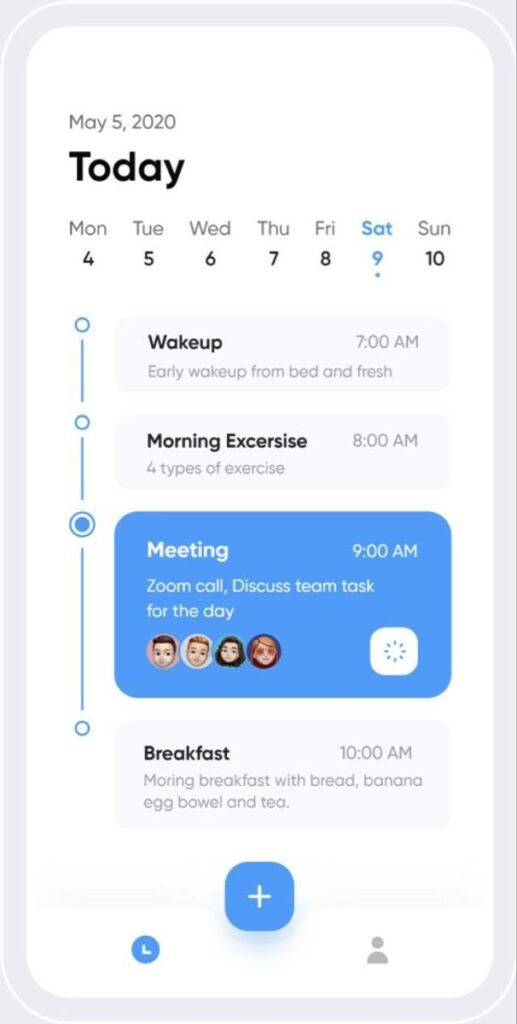
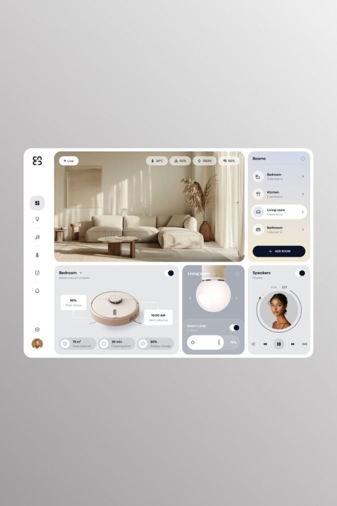
Clear navigation is crucial when prioritizing simplicity. Menus should be intuitive with clearly labeled options. Avoid clutter by minimizing unnecessary features and focusing only on essential elements.
Design consistency also plays a vital role. Elements like colors, buttons, and fonts should be uniform across the app to make it easy for users to understand and predict how the interface works. Consistency reduces confusion and builds trust.
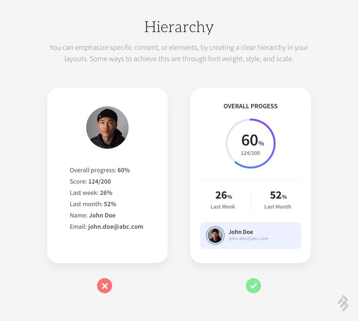
Visual hierarchy is another aspect of simplicity. Use size, color, and spacing to guide users’ attention to important information. This helps them process the content more efficiently.
Finally, avoid overloading users with too much information at once. Break down complex tasks into smaller steps and use progressive disclosure to reveal more options as needed. This keeps users focused and reduces cognitive load.
2. Leverage Whitespace Effectively
Whitespace, also known as negative space, is crucial in design. It helps direct the user’s attention by highlighting important elements on the screen. When used well, it can make an app feel open and uncluttered.
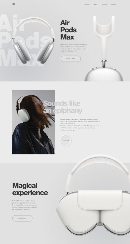
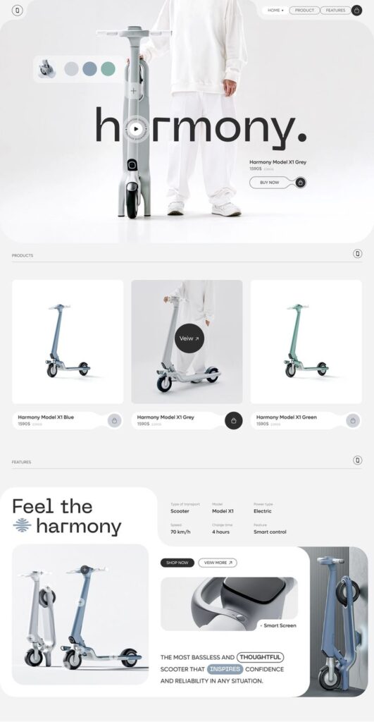
Designers use whitespace to improve readability. By spacing out elements like text and images, users find it easier to focus on content without feeling overwhelmed. This makes navigation smoother and more intuitive.
Whitespace is not just empty space. It can provide balance and harmony to a layout. Well-placed whitespace can draw attention to buttons or calls to action a user needs to see.
It’s important to remember that more whitespace doesn’t mean less content. It means content is easier to digest. Good use of whitespace can make even a content-rich app look appealing and user-friendly.
3. Implement Intuitive Navigation
Navigation is a key part of any app. It should be easy for users to find their way around. Menus should be clear and simple to understand.
Icons and labels should guide users smoothly. Use familiar symbols that people already know. This makes it easier for them to know what to do next.
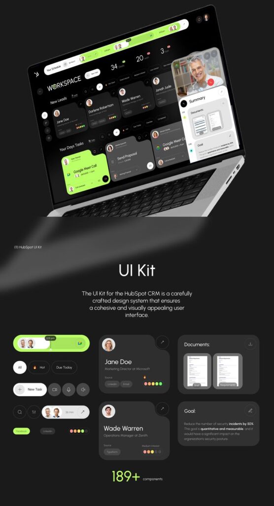
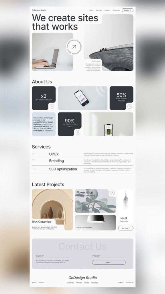
Consider keeping navigation options visible at all times. This helps users see where they are and where they can go.
Organizing content in a logical order is important. Place the most accessed features at the top or front. This saves users time and effort.
Provide feedback to users when they interact with the app. Highlighting the current section or using animations can help them feel more connected.
Simple navigation makes users feel more comfortable. With fewer obstacles, they are more likely to return and explore further.
4. Use Consistent Color Schemes
Using consistent color schemes is crucial in UI design. It builds familiarity and trust with users. When the same colors are used across an app, users can easily navigate and understand the interface.
Colors should reflect the brand’s identity. Each app has a unique look and feel, and the choice of colors helps convey this. Consistent colors also make the app appear more professional.
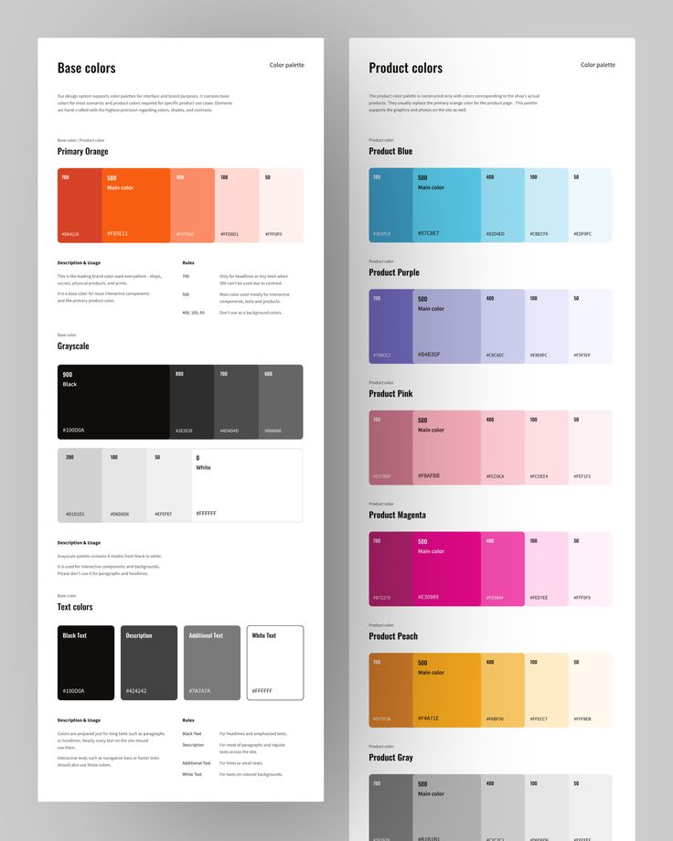
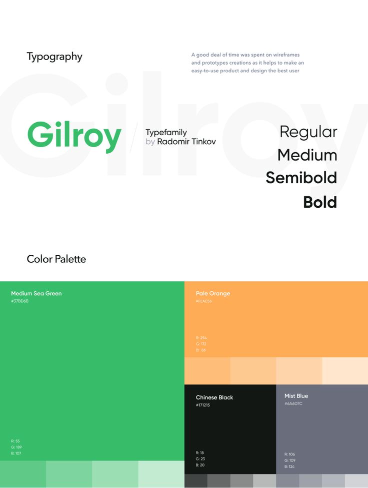
Accessibility is important. Colors should contrast well so that everyone can read text and see buttons. This ensures the app is usable for people with visual impairments.
Colors can influence emotions, too. Blues can be calming, while reds can create a sense of urgency. Choosing colors carefully is part of designing an effective user experience.
Finally, test the color scheme on different devices. Colors can look different from one screen to another. By testing, designers can make sure the colors are consistent in every situation, keeping the experience the same for all users.
5. Emphasize Typography Hierarchy
Typography hierarchy is crucial for app design. It helps users know what’s important. Assign different sizes and weights to text based on its role. This creates a clear visual guide.
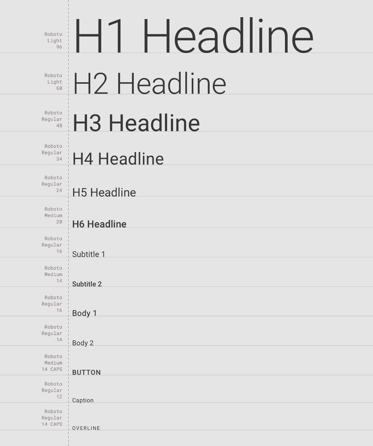
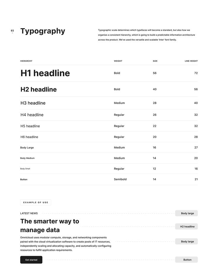
Headings should be larger and bolder. They act as signposts. Subheadings can be slightly smaller, guiding users without overpowering the main title.
Body text needs to be easily readable. Use a legible font and size. Line spacing is important too. It prevents text from feeling cramped.
Consistency is key. Use the same typefaces across the app. Change sizes or weights only to highlight information. This helps users understand content quickly.
Finally, use color to add another layer to your hierarchy. Different shades can separate headings from subheadings. This draws attention effectively.
6. Optimize for Touch-Friendly Design
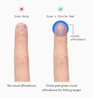
A touch-friendly design is important for any app. Users often interact with apps on smartphones and tablets using their fingers. Designers should ensure that buttons and links are large enough for a finger to tap easily.
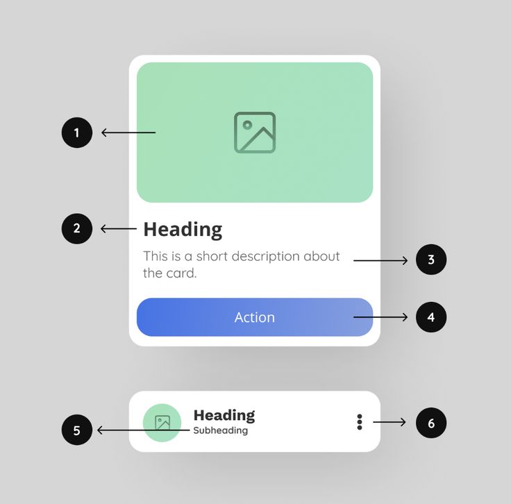
Spacing is crucial. Enough space between elements prevents users from tapping the wrong button. Designers should aim for at least 44×44 pixels for interactive elements.
Swipe and gesture controls add convenience. Users appreciate when they can perform actions through quick swipes. For instance, swiping left to delete an item simplifies interaction and saves time.
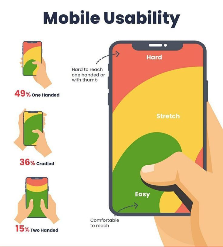
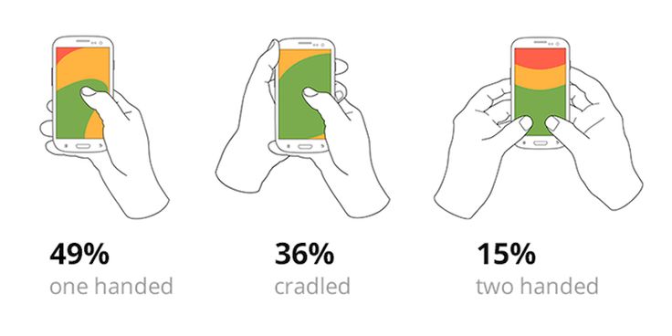
Consider finger movements when designing. A thumb often reaches the bottom center of the screen easily. Placing the most-used controls there can enhance usability.
Visual feedback helps users know their actions are recognized. Buttons should change color or animate when tapped. This assures users their input is registered.
Overall, focus on simplicity and ease of use in touch design. Touch-friendly interfaces improve the user experience, making the app more enjoyable and efficient to use.
7. Incorporate Feedback Mechanisms
Incorporating feedback mechanisms is essential for any app. It allows users to share their experiences, helping developers understand what works and what doesn’t. This process makes apps better by highlighting areas that need improvement.
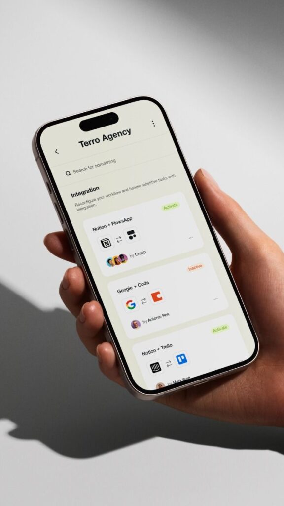
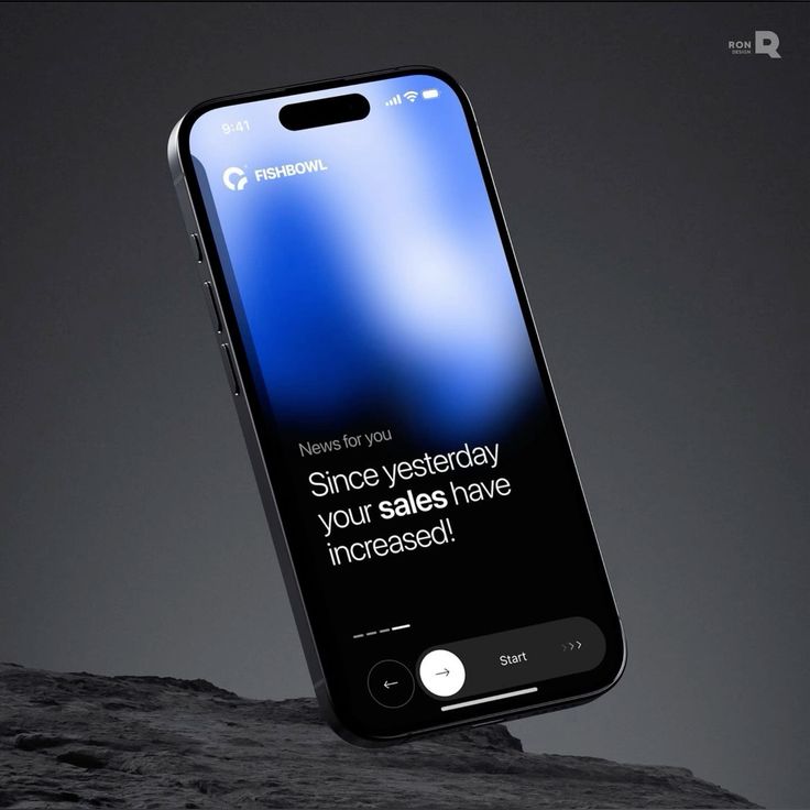
Feedback options can include ratings, comments, or surveys. By making these options easy to find, users are more likely to participate. This interaction makes them feel heard and valued.
Regularly reviewing feedback can give developers valuable insights. It helps in identifying common issues or features users want. This information can guide future updates and enhancements.
Implementing quick responses to feedback can also boost user satisfaction. When users see their suggestions are acted upon, they feel like part of the app’s community. This connection can increase user loyalty.
In-app chat support can provide real-time feedback opportunities. Users can address issues immediately, which can improve their overall experience. It also helps in resolving problems before they result in negative reviews.
8. Ensure Accessibility Standards
Designing for accessibility means making sure everyone can use apps, including people with disabilities. This is an important step in the design process.
Apps should have features like screen readers and text-to-speech to assist users. Designers should also use high-contrast colors for better visibility.
Text size is crucial too. Users should be able to adjust font sizes for easier reading. Clear and simple language helps everyone understand the app easily.
Consistent navigation is key. Users should find it easy to move through each screen. Labels should be clear and buttons easy to find.
Inclusive design benefits all users. When apps are accessible, they reach a wider audience and make a positive impact.
9. Utilize Microinteractions Wisely
Microinteractions are small animations that guide users through an app. They help to make navigating and using the app intuitive. These interactions include tiny details like a button changing color when clicked or a notification gently fading in.
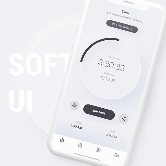
Designers should keep microinteractions simple. Overusing them can overwhelm users and make the app feel cluttered. It’s essential to pick moments that truly enhance the user experience.
Timing is also important. Each microinteraction should be quick, usually lasting just a second or two. If they take too long, users might get frustrated waiting for each action.
Microinteractions can provide feedback, such as an icon shaking when a password is wrong. This helps users quickly understand and fix their mistakes without disrupting their flow. It creates an efficient and enjoyable app experience.
These small details add personality to the app, making it feel lively and engaging. Users often remember these tiny touches and feel more connected to the app. Well-chosen microinteractions improve not just the app’s usability but also its overall appeal.
10. Design with scalability in mind
Scalability ensures that an app can grow along with its user base. A scalable design can handle larger loads without breaking or slowing down. It’s crucial to plan for wider use from the start.
Components should be modular. This means each part of the app can be updated or improved without needing a total redesign. Modular designs are also easier to test and debug.
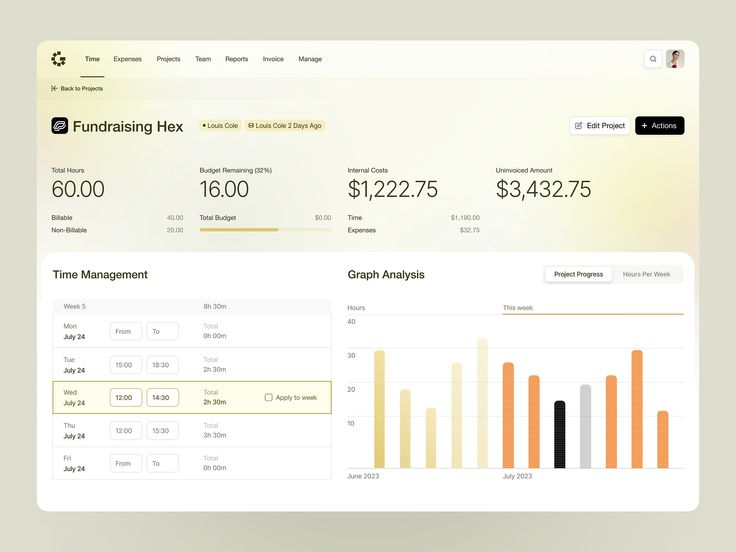
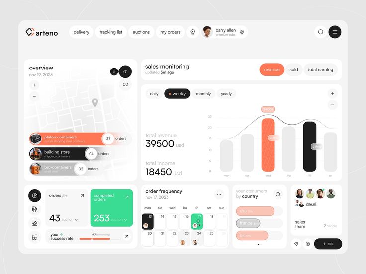
Designers should use flexible layout components. These components help apps automatically adjust to different screen sizes and resolutions. This maintains a consistent user experience across all devices.
Color schemes and typography should be clear and consistent. This makes adding new features simpler. New elements can fit in seamlessly without disrupting the existing design.
Finally, always consider future data needs. As users grow, the amount of data an app processes can increase. Planning for efficient data management is key to keeping performance smooth.
Understanding User Psychology
Mastering user psychology is key for creating engaging and successful app designs. Focusing on cognitive load and emotional design helps to keep users satisfied and coming back for more.
Cognitive Load and Simplicity
Reducing cognitive load means making interfaces easy to use. Users should grasp how an app works without thinking too hard. Simple layouts guide them naturally to their tasks.
Key tactics include:
- Consistent Elements: Use familiar icons and terms.
- Clear Navigation: Ensure menus are straightforward.
- Minimal Choices: Limit options to avoid overwhelming users.
Reducing clutter helps users focus on important tasks. They appreciate when designs consider their effort levels.
Emotional Design Principles
Emotional design appeals to users’ feelings. An app that evokes positive emotions tends to attract more engagement. Colors, images, and text all play roles in shaping mood.
Key tactics include:
- Color Psychology: Use colors to convey emotions.
- Personalization Options: Allow customization to improve connection.
- Friendly Language: Use casual, welcoming tone.
Encouraging positive emotional responses can turn users into loyal fans. Well-designed interfaces can make users feel good, leading to more usage and preference.
Implementing Responsive Design
Responsive design ensures that apps look great on any device. It focuses on creating a seamless experience for users by adjusting layouts and content to fit different screen sizes.
Mobile-First Approach
The mobile-first approach starts with designing for smaller screens before scaling up to larger devices. Developers prioritize essential features, ensuring they work on mobile devices first. This method helps to ensure that the user experience is not compromised on smaller screens.
Designers often simplify interfaces for mobile. This includes using larger buttons and keeping text readable without zooming. By starting with mobile, the design stays clear and focused. As the screen size increases, additional features and content can be gradually incorporated.
A mobile-first strategy helps in tackling real constraints, such as slower network speeds and limited screen space. It pushes developers to focus on core functionalities and content that is absolutely necessary for users, which leads to a more efficient design process.
Adaptive vs. Fluid Layouts
Understanding the difference between adaptive and fluid layouts is key. Adaptive layouts use fixed design blocks that adapt to specific screen sizes. This means the app uses breakpoints to switch layouts for different devices, like mobile, tablet, or desktop. It provides control over how the app appears on each device type.
In contrast, fluid layouts adjust proportionally to any screen size using percentage-based widths, ensuring the app fills the screen. While fluid layouts can offer a more consistent experience across various devices, they may pose challenges in maintaining consistent element spacing and proportion.
The choice between adaptive and fluid layouts can impact how responsive an app feels. Both approaches have their pros and cons, so designers often combine them to achieve the best results for their specific application needs.
- 6.4Kshares
- Facebook0
- Pinterest6.4K
- Twitter0
- Reddit0


