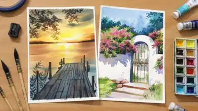
Watercolor landscape illustration captures the essence of nature through fluid brushstrokes and translucent colors. This art form allows artists to express the beauty of mountains, forests, and seascapes with a dreamy, atmospheric quality that other mediums struggle to achieve. Mastering watercolor landscapes requires understanding the delicate balance between control and spontaneity, where water becomes both your tool and your partner in creation.
In 2025, watercolor landscapes continue to gain popularity, with over 50,000 free illustrations available on platforms like Pixabay alone. These artworks range from traditional pastoral scenes to contemporary abstract interpretations featuring mountains, hills, and skylines. You’ll find that combining line art with watercolor washes has emerged as a particularly trending technique, offering both structure and fluid expression.
Whether you’re a beginner looking to start your creative journey or an experienced artist seeking fresh inspiration, watercolor landscape illustration offers endless possibilities for artistic growth. From the soft blending of sky and water to the textured representation of trees and terrain, this medium invites you to explore the natural world through a lens of color and emotion.
Key Takeaways
- Watercolor landscape illustration combines fluid techniques with careful composition to capture nature’s beauty in a distinctive, atmospheric style.
- Understanding color theory and water control are foundational skills that will significantly improve your landscape painting results.
- You can develop your unique artistic voice by studying various watercolor landscape styles and experimenting with different techniques and subjects.
Fundamentals of Watercolour Landscape Illustration
Creating watercolour landscapes requires understanding the medium’s unique properties, having the right tools, and mastering specific techniques to capture the beauty of natural scenes effectively.
What Is Watercolour Landscape Illustration
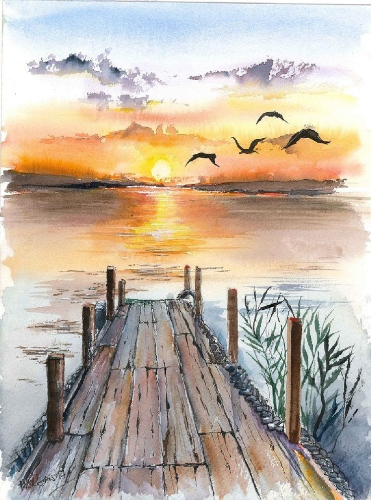
Watercolour landscape illustration involves using water-based pigments to depict natural or urban outdoor scenes. This versatile medium allows artists to capture the subtle interplay of light, atmosphere, and texture found in landscapes.
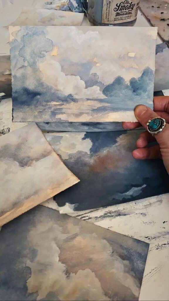
The translucent quality of watercolour makes it ideal for rendering skies, water, and distant elements with a sense of depth and atmosphere. Unlike other painting mediums, watercolour’s fluid nature creates unique effects that can beautifully represent natural elements.
When approaching a landscape, begin by observing your scene carefully. Start with establishing the horizon line, which serves as an anchor for your composition. This fundamental element helps organize the spatial relationships in your painting.
Essential Materials and Tools
Basic Watercolour Supplies:
- Quality watercolour paints (professional or student grade)
- Watercolour paper (140lb/300gsm or heavier)
- Assorted brushes (rounds, flats, and wash brushes)
- Palette for mixing colours
- Water containers
- Paper towels or cloth for blotting
Your choice of paper significantly impacts your results. Cold-pressed paper offers a moderate texture ideal for most landscape work, while hot-pressed provides a smoother surface for detailed illustrations.
Invest in a limited palette of quality paints rather than many inferior ones. Essential colours include ultramarine blue, burnt sienna, yellow ochre, cadmium red, and a cool yellow.
Synthetic brushes work well for beginners, while sable brushes offer superior water-holding capacity for more experienced painters.
Key Watercolour Painting Techniques
Wet-on-Wet: Apply paint to dampened paper, allowing colours to blend and create soft, atmospheric effects perfect for skies and water. This technique creates those characteristic soft edges that give watercolour its unique quality.
Wet-on-Dry: Apply paint to dry paper for more controlled, defined lines and shapes. Use this for adding details and defining elements in your landscape.
Layering: Build depth by applying transparent layers, allowing each to dry completely before adding the next. This technique, also called glazing, creates luminosity and richness in your landscapes.
Dry Brush: Use a nearly dry brush with minimal water to create texture, especially effective for rendering foliage, rocks, or textured surfaces in your landscapes.
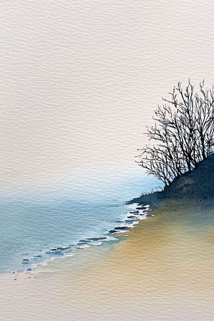
Practice creating gradients for skies and water by starting with a water-diluted wash at the top, gradually adding more pigment as you move downward. This creates the illusion of depth essential in landscape painting.
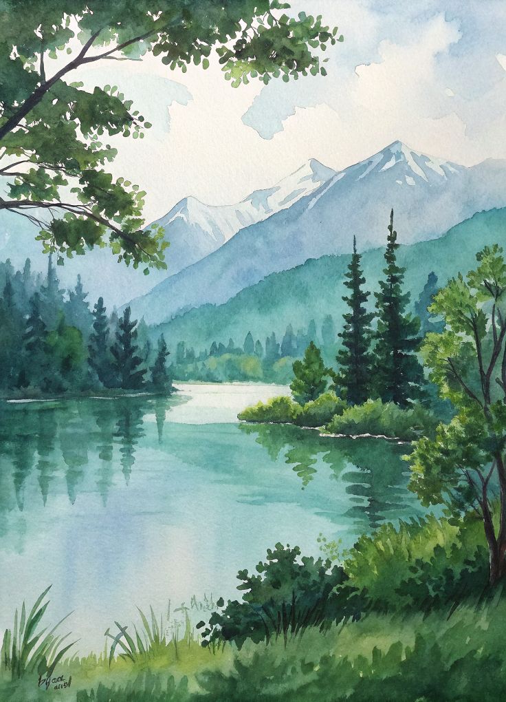
Color and Composition in Watercolour Landscapes
The successful creation of watercolour landscapes depends on thoughtful color selection and strategic compositional arrangements. Mastering these elements will transform your paintings from simple scenes to compelling visual narratives.
Choosing and Mixing Colors
Watercolour landscapes come alive through intelligent color choices that reflect natural harmony. Experiment with analogous color schemes (colors adjacent on the color wheel) for peaceful scenes or complementary colors (opposite on the wheel) for dynamic contrast.
When mixing colors, start with a limited palette of 5-7 core pigments. This constraint actually improves color harmony while simplifying your decision-making process.
Consider these essential watercolor landscape pigments:
- Blues: Ultramarine, Cerulean
- Yellows: Cadmium Yellow, Yellow Ochre
- Reds: Alizarin Crimson, Cadmium Red
- Earth tones: Burnt Sienna, Raw Umber
Mix secondary colors from these primaries rather than using pre-mixed options. This creates more nuanced, cohesive results. Remember that watercolors dry lighter than they appear when wet, so mix slightly more intense colors than your target shade.
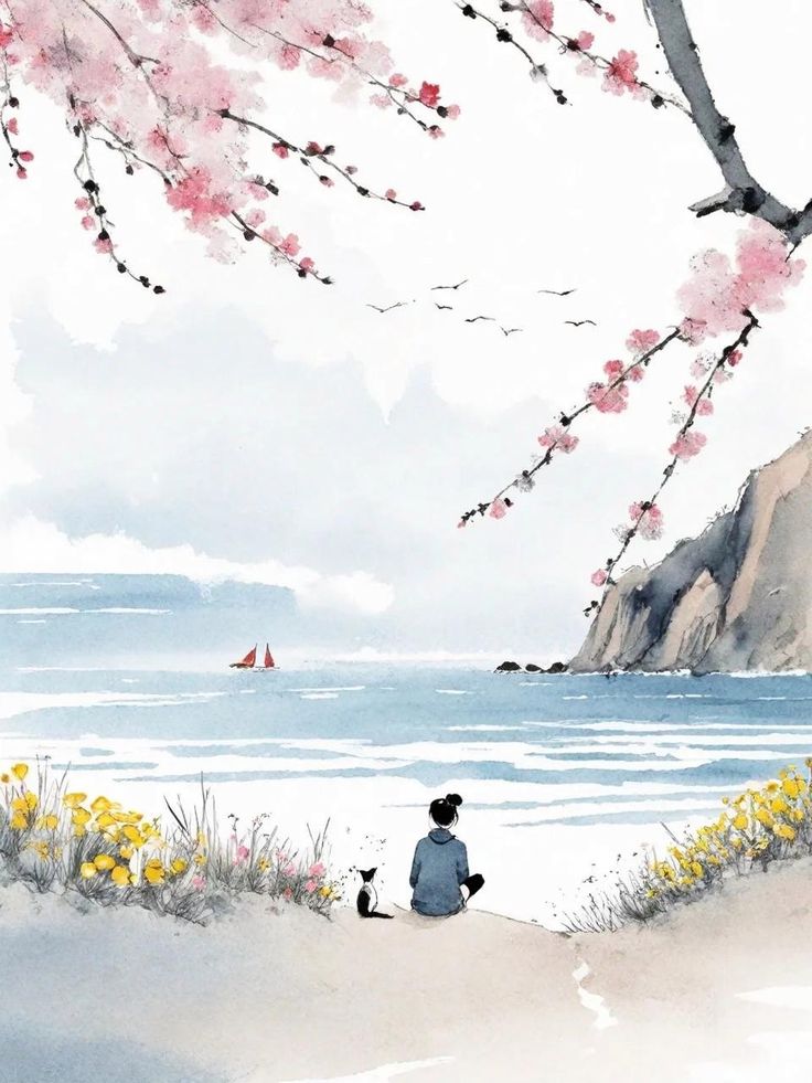
Understanding Composition Principles
Strong composition forms the skeleton of any successful landscape painting. The rule of thirds remains fundamental—imagine dividing your paper into a 3×3 grid and placing key elements along these lines or at their intersections.
Create a clear focal point where you want viewers’ eyes to land first. This could be a distinctive tree, a bright reflection, or an interesting architectural element.
Balance is crucial but doesn’t necessarily mean symmetry. Distribute visual weight across your composition through contrasting elements or complementary shapes.
Use a viewfinder (a simple cardboard rectangle) to isolate and evaluate potential compositions before painting. This helps eliminate distracting elements and strengthens your final design.
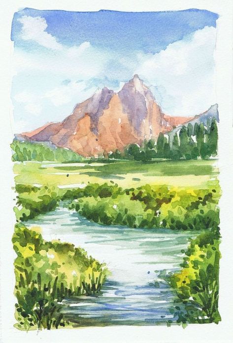
Consider leading lines—roads, rivers, fences—to guide viewers through your landscape. These elements create visual pathways that enhance the narrative quality of your painting.
Creating Depth and Perspective
Depth transforms flat paintings into immersive experiences. Implement atmospheric perspective by making distant objects lighter, bluer, and less detailed than foreground elements.
Layer your washes strategically:
- Begin with light, transparent washes for distant areas
- Add mid-ground elements with medium-value washes
- Finish with darker, more detailed foreground elements
Size and overlap relationships reinforce depth—larger objects appear closer, while overlapping elements clearly establish spatial relationships.
Value contrast also signals proximity; stronger contrasts appear closer to the viewer. Maintain softer edges in background elements and crisper edges in the foreground.
Use your brush handling to support depth. Apply looser, wetter techniques for distant areas and more controlled, detailed strokes for nearby elements. This technical variation naturally reinforces the illusion of three-dimensional space.
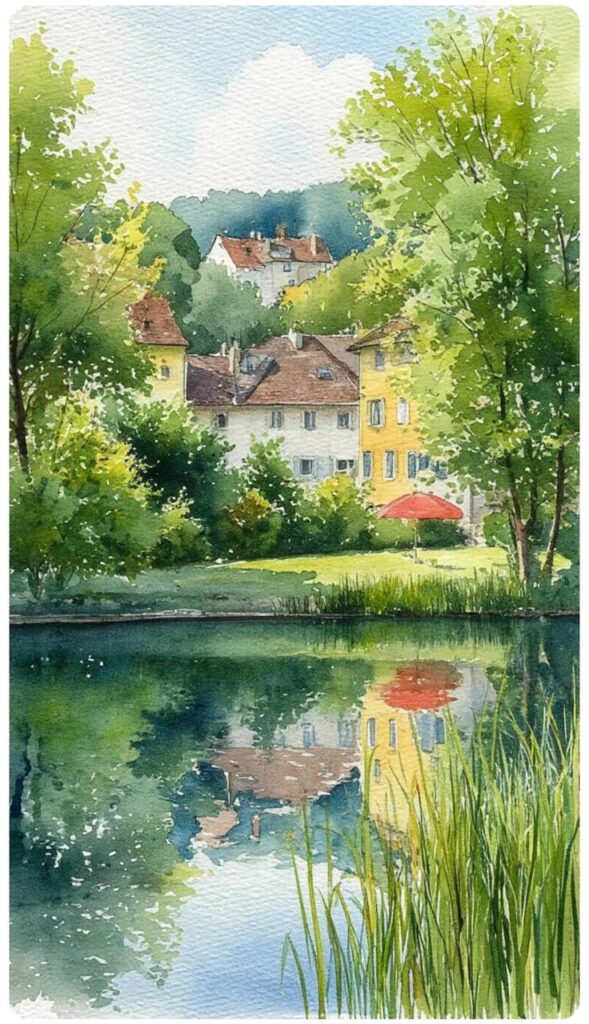
Popular Styles and Formats
Watercolor landscape illustration offers remarkable versatility in both style and presentation. Artists today have access to numerous approaches that extend traditional watercolor techniques into the digital realm, alongside various orientation options that can dramatically impact the final composition.
Vector and Digital Watercolor Effects
Vector-based watercolor illustrations combine the precision of digital art with the organic feel of traditional watercolor. You can achieve this style using software like Adobe Illustrator or Affinity Designer by working with precise shapes and bold colors. This approach is particularly effective for modern web-based projects and infographics.
Digital watercolor effects allow you to maintain clean edges while still capturing the fluid nature of watercolor. Many artists use custom brushes in programs like Procreate or Photoshop that simulate watercolor textures and behaviors.
The flat illustration style has become increasingly popular for watercolor landscapes, offering a contemporary twist on traditional techniques. You can recognize this style by its simplified forms, minimal shading, and vibrant color palettes.
Filters and Editing Tools for Watercolor Art
Post-processing filters can transform ordinary digital artwork into pieces that appear hand-painted. Software like Photoshop offers specialized watercolor filters that simulate paint diffusion and paper texture effects.
Texture overlays add authentic paper grain and pigment granulation to digital watercolor works. You can apply these as separate layers with various blending modes to achieve realistic results.
Color adjustment tools help you capture the characteristic luminosity of watercolor. Adjusting saturation, brightness, and contrast can enhance the translucent quality that makes watercolor so distinctive.
Masking tools are invaluable for preserving white space or creating clean edges in digital watercolor work, mimicking traditional techniques like masking fluid.
Orientation: Vertical, Square, and More
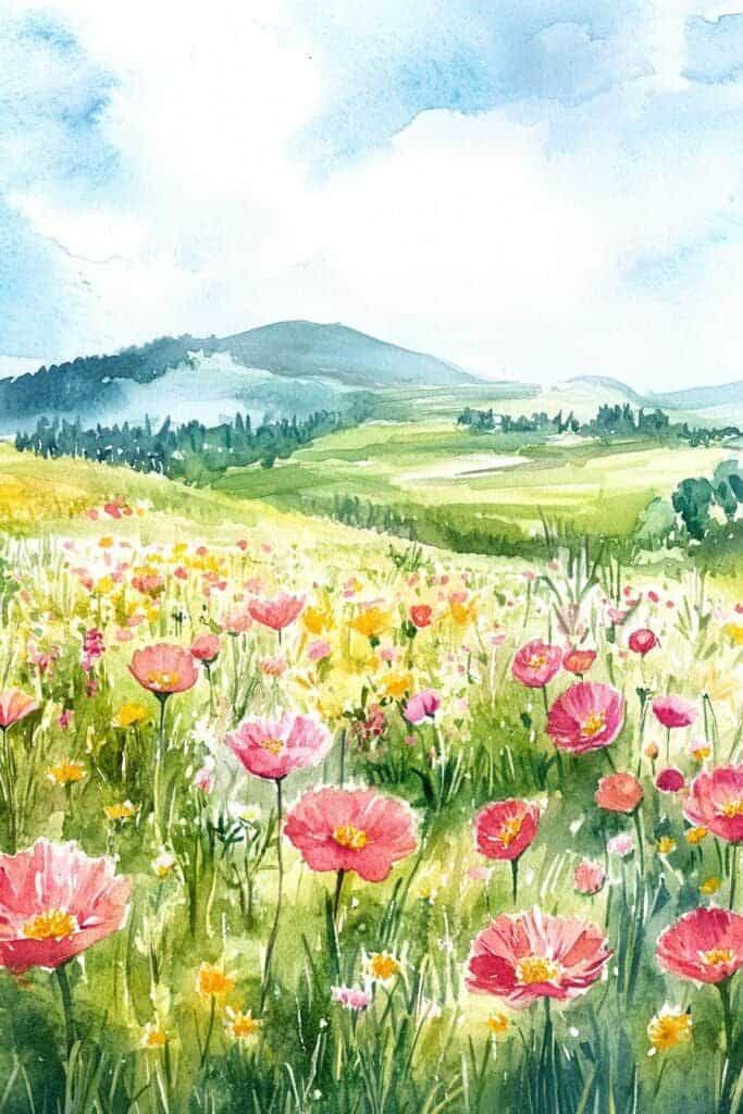
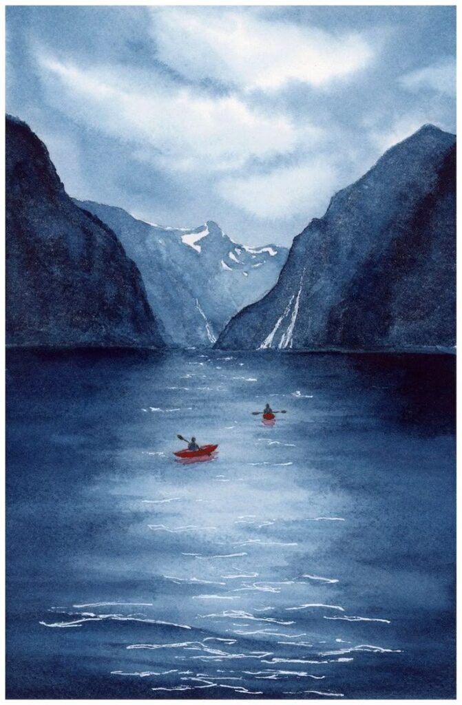
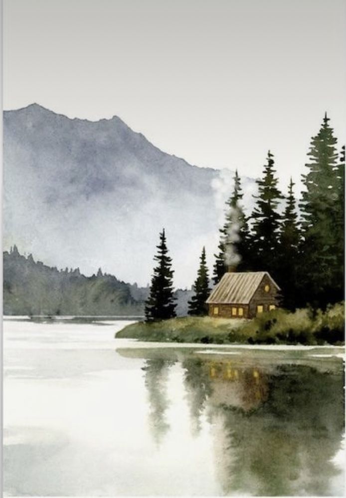
Vertical orientation works exceptionally well for watercolor landscapes featuring tall elements like mountains, waterfalls, or trees. This format creates a sense of height and majesty in your compositions.
Square formats have gained popularity with social media platforms like Instagram. You can design watercolor landscapes specifically for these dimensions to maximize visual impact when viewed on mobile devices.
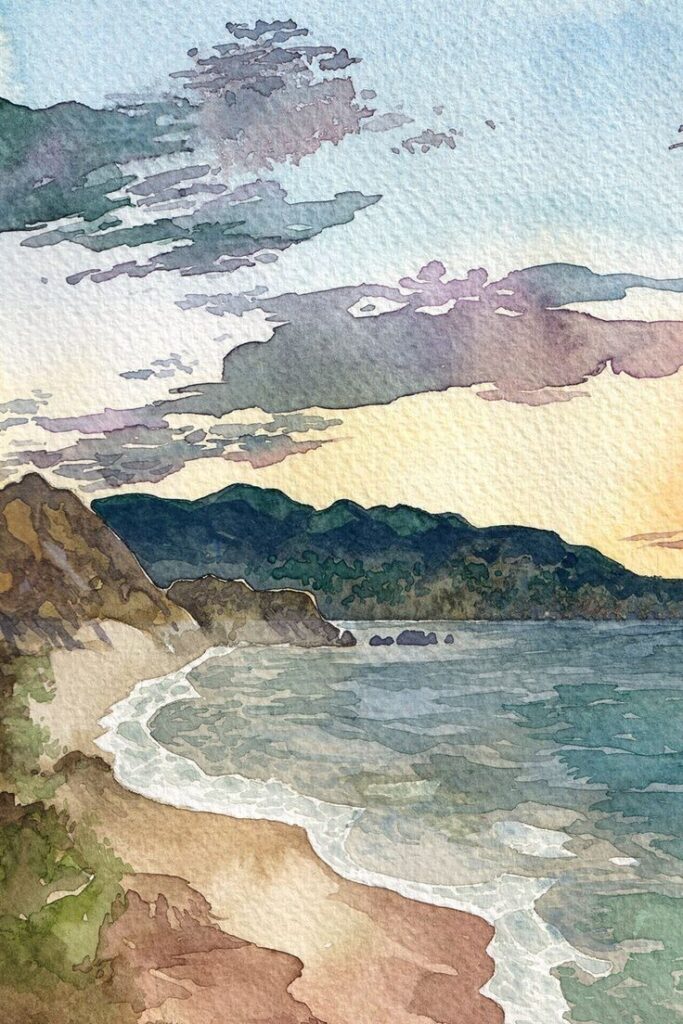
Panoramic horizontal layouts allow you to capture expansive landscape views that convey a sense of distance and space. This orientation is ideal for scenes with strong horizontal elements like horizons or coastlines.
Non-standard orientations like circular or irregular shapes create unique viewing experiences. These unconventional formats can make your watercolor landscapes stand out in digital portfolios or printed materials.
Showcasing and Selling Watercolour Landscape Illustrations
Successfully marketing your watercolour landscapes requires proper documentation and understanding potential markets. The right presentation can significantly increase the perceived value of your artwork in both digital and physical marketplaces.
Creating and Optimizing Photos and Videos
High-quality photos are essential for showcasing your watercolour landscapes online. Use natural lighting to capture accurate colors and textures without glare. Position your camera directly above flat artwork to avoid distortion.
Consider creating process videos that show your technique from sketch to completion. These videos perform well on social media and help potential buyers connect with your creative process. Time-lapse formats work particularly well for watercolour demonstrations.
When uploading to stock sites or portfolios, optimize your images with descriptive keywords like “abstract watercolour landscape” or “framed watercolour field with clouds.” This improves discoverability among the millions of available illustrations.
Maintain a consistent style in your documentation. Photograph all pieces with the same lighting and background to create a cohesive portfolio appearance.
Editorial and Commercial Uses
Watercolour landscapes have significant commercial value in various markets. Editorial uses include magazine illustrations, book covers, and website headers where artistic imagery enhances written content.
You can license your work through stock platforms that host millions of watercolour illustrations. Platforms like Shutterstock, Freepik and Pixabay offer different compensation models—from royalty payments to upfront purchases.
Consider packaging your illustrations for specific commercial applications. Create collections targeted at greeting card companies, interior designers, or textile manufacturers.
Pricing should reflect usage rights. Editorial one-time use typically commands lower fees than commercial rights that allow reproduction on products. Research standard rates in your target markets to price competitively.
Offer different resolution options for various client needs. Editorial clients may require high-resolution files, while web-based applications can use lower-resolution versions.
Inspiration and Further Resources
Finding fresh inspiration and quality resources can dramatically elevate your watercolor landscape illustrations. The right influence can transform your artistic approach and help you develop a distinctive style.
Learning from Notable Artists
J.M.W. Turner revolutionized landscape painting with his atmospheric watercolor techniques that captured light and mood. His work demonstrates how to create depth through color gradients and subtle washes.
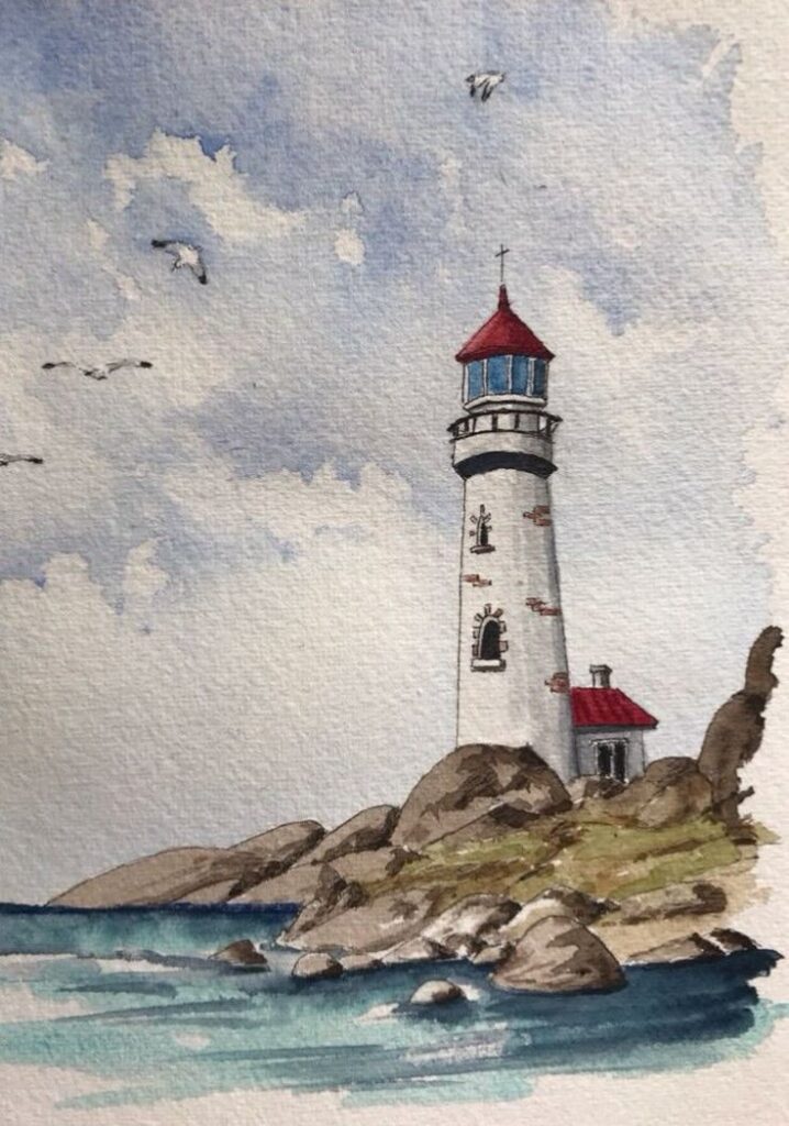
Winslow Homer’s coastal scenes showcase the power of selective detail and strategic negative space. Study his compositions to understand how to balance detailed focal points with simplified backgrounds.
Contemporary artists like Thomas Schaller and Joseph Zbukvic offer modern interpretations of traditional techniques. Schaller’s urban landscapes highlight the interplay between architecture and natural elements, while Zbukvic’s rural scenes demonstrate masterful wet-on-wet techniques.
Instagram accounts like @watercolor_illustrations and @landscape_watercolors provide daily inspiration from artists worldwide. Many artists also share process videos that reveal their techniques step by step.
Expanding Your Creative Horizons
Join online communities such as WetCanvas or Reddit’s r/Watercolor to share your work and receive constructive feedback. These platforms host discussions on techniques, materials, and approaches specific to watercolor landscapes.
Consider participating in virtual workshops or courses offered by established artists. Platforms like Skillshare and Domestika feature comprehensive tutorials focusing specifically on watercolor landscape illustration.
Reference collections from Pixabay and Freepik provide over 50,000 free watercolor landscape illustrations for study and inspiration. Analyzing these works can help you identify effective composition strategies and color combinations.
Travel whenever possible, even locally. Direct observation of landscapes offers insights no photograph can capture. Sketch on location to develop your understanding of natural light, atmospheric perspective, and the essential elements that create a compelling scene.
- 1.2Kshares
- Facebook0
- Pinterest1.2K
- Twitter3
- Reddit0

