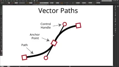
Illustration shapes the way you connect with visuals, whether on a website, in an ad, or across social media. Each style carries its own personality, giving you tools to communicate ideas in a way that feels clear and engaging. Understanding the most popular illustration styles helps you choose the right approach for your own creative projects.
As you explore different techniques, you’ll see how some styles keep things simple, while others lean into detail, boldness, or playful exaggeration. This variety gives you flexibility to match visuals with the tone and purpose of your work, making your designs more effective and memorable.
1) Minimalist Illustration
When you use minimalist illustration, you focus on simplicity. Clean lines, basic shapes, and limited colors help you communicate ideas without extra detail. This makes your work easy to understand at a glance.
You often see this style in branding, editorial layouts, and digital interfaces. By removing unnecessary elements, you guide attention to the essential message. It works well when you want clarity and impact.
Negative space plays a big role in this approach. You can use empty areas to balance your composition and make the main subject stand out more.
Minimalist illustration also adapts well across different platforms. Whether you design for print, web, or mobile, the reduced details keep your artwork flexible and consistent.
If you want to experiment, try limiting your color palette to just two or three shades. This helps you focus on form and structure instead of decoration.


2) 3D Illustration
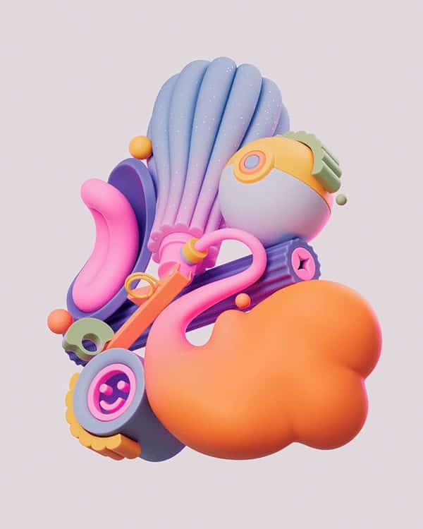
You see 3D illustration everywhere today, from product mockups to app interfaces. This style gives your work depth and dimension, making it feel more tactile than flat graphics. It works well when you want to create visuals that feel modern and polished.
You can use 3D to highlight details that might get lost in 2D. Rounded shapes, soft shadows, and realistic textures help your design stand out. Even simple objects can look more engaging when you build them in three dimensions.
You don’t need to go for hyper-realistic results. Many designers use stylized 3D with bold colors or simplified forms. This approach keeps the look playful while still benefiting from the depth and perspective of the medium.
You also have more flexibility with lighting and angles. By adjusting these elements, you can guide the viewer’s focus or create a specific mood. This makes 3D illustration useful in branding, advertising, and digital products.
You’ll notice that 3D continues to grow in popularity because software tools are more accessible. With easier workflows, you can experiment and bring ideas to life quickly without needing advanced technical skills.

3) Retro Illustration
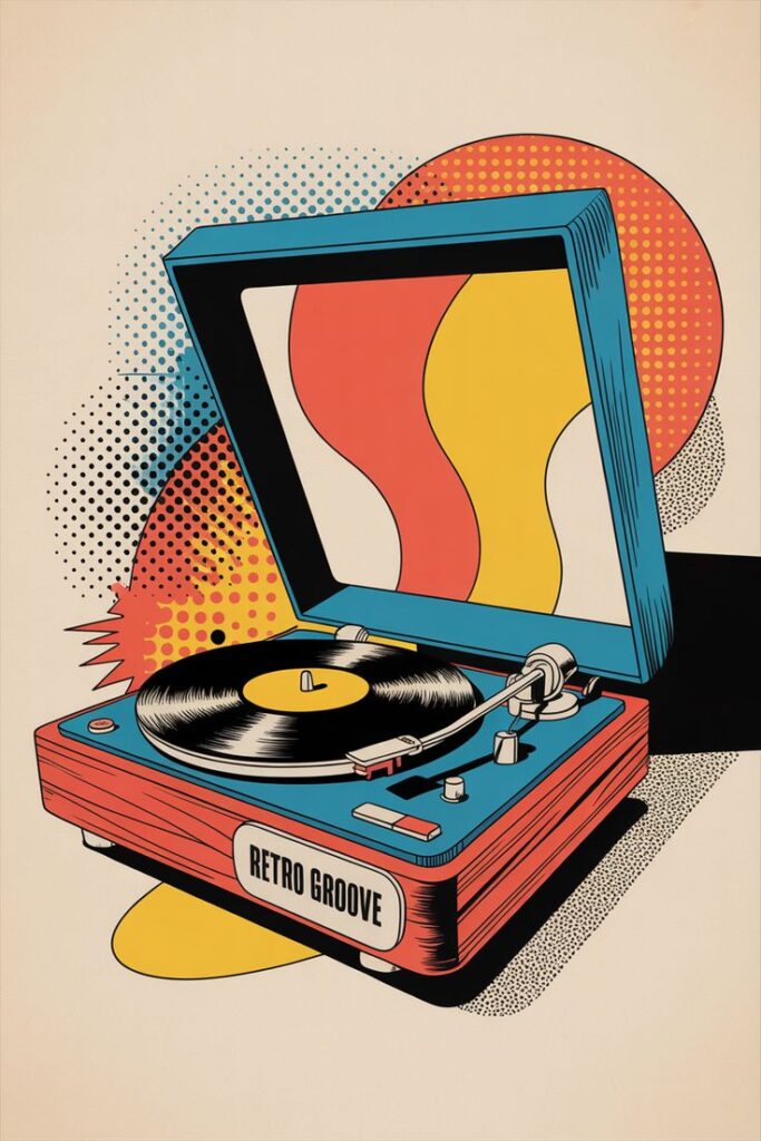
You can use retro illustration to bring a sense of nostalgia into your work. This style draws inspiration from past decades, especially the mid-20th century, and often reflects the look and feel of the 1950s through the 1980s.
When you explore retro styles, you’ll notice bold colors, geometric shapes, and vintage textures. These elements give your designs a familiar charm that feels both classic and timeless.
You might also experiment with influences like Art Deco, Pop Art, or old advertising posters. Each of these provides distinct visual cues that can help you capture the mood of a specific era.
Retro illustration works well when you want your audience to connect with a design on a more personal level. By referencing visual trends from the past, you can create a sense of comfort and recognition.
If you’re designing for branding, packaging, or editorial projects, this style can help your work stand out. It combines historic aesthetics with modern applications, making it versatile without losing its vintage appeal.

4) Geometric Illustration
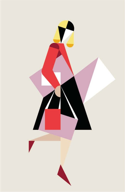
You use geometric illustration when you want clean, structured visuals built from basic shapes like circles, squares, and triangles. This style often feels organized and balanced, making it easy for viewers to follow.
You can combine shapes in different sizes, colors, and patterns to create variety. Even simple elements can form complex images when arranged thoughtfully. This makes the style flexible for both minimal and detailed designs.
You often see geometric illustration in branding, posters, and digital interfaces. Its clarity works well for modern design projects where you want to communicate ideas quickly.
You don’t need advanced tools to start experimenting. By focusing on symmetry, repetition, and alignment, you can create professional-looking results with just a few shapes.
5) Big and Bold Illustration
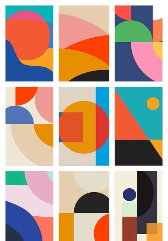
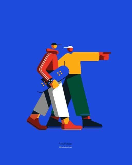
You use big and bold illustration when you want your visuals to grab attention quickly. This style relies on strong shapes, vibrant colors, and high contrast to make your work stand out. It works well when you need to communicate a message clearly without relying on small details.
You often see this approach in advertising, posters, and branding because it delivers impact at a glance. The large forms and confident lines make it easy for viewers to understand the subject, even from a distance.
When you create in this style, you focus on clarity and energy rather than fine textures or subtle shading. Your illustrations become more memorable because the bold design sticks in people’s minds.
You can experiment with oversized elements, exaggerated proportions, or thick outlines to emphasize your subject. This gives your work a playful and approachable feel, while still keeping it visually strong.
If you enjoy working with color, this style lets you explore bright palettes and striking contrasts. You get the freedom to push your designs in a way that feels expressive, modern, and easy to recognize.

6) Typography Illustration
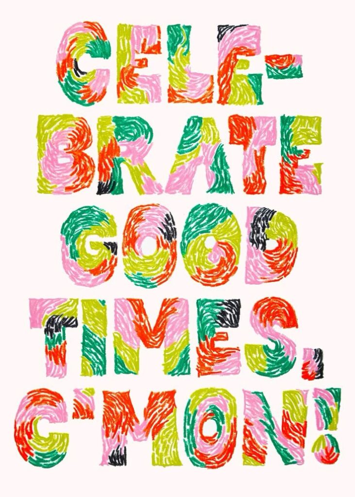
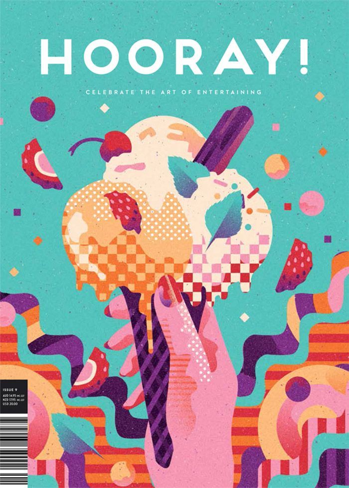
Typography illustration combines text with visual design, turning words into artwork. Instead of using letters only for reading, you use them as shapes, patterns, and design elements. This approach makes type both functional and decorative.
You can experiment with different fonts, hand-drawn lettering, or custom type to create unique visuals. By adjusting scale, spacing, and color, you give words more personality and impact. This style works well when you want your message to stand out clearly.
Many designers use typography illustration in posters, book covers, and branding. It helps communicate tone while keeping the design visually engaging. You can make type playful, bold, or elegant depending on your project’s goal.
If you enjoy blending language with design, this style gives you a lot of freedom. You can treat letters as illustrations themselves or combine them with other graphics for added depth.
7) Caricature Style
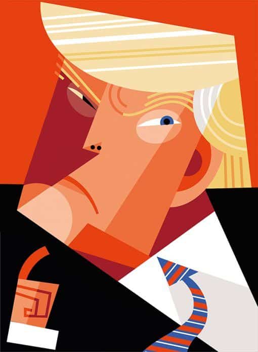
You’ll recognize caricature style by its playful exaggeration of features. This approach often highlights facial expressions, proportions, or gestures in a way that feels humorous or lighthearted.
When you use caricature in your work, you can focus on amplifying one or two traits while keeping the rest simple. This lets you capture personality quickly without needing too much detail.
Caricature works well in both traditional hand-drawn formats and digital tools. You can sketch with pencils or brushes, or create polished versions using illustration software.
You’ll also find variations within this style. Some artists lean toward realistic exaggeration, while others prefer cartoon-like simplicity. Both methods allow you to adapt the style to different audiences or projects.
This style often appears in editorial pieces, event portraits, or entertainment contexts. You can use it to add humor, create memorable characters, or make complex subjects feel more approachable.
If you want to experiment, try exaggerating one feature—like eyes, hair, or posture—and see how it changes the overall effect. This helps you practice balance between humor and recognition.

How Illustration Styles Influence Visual Communication
Illustration styles shape how messages are received by affecting both the identity of a brand and the way viewers emotionally respond. The choices you make in style can determine whether your visuals feel trustworthy, playful, serious, or approachable.
Impact on Branding
When you choose an illustration style for branding, you set a visual tone that communicates your company’s personality. A flat illustration style often suggests simplicity and clarity, while 3D or hyper-detailed designs can signal innovation and sophistication.
Consistency matters. Using the same style across packaging, websites, and campaigns helps people recognize your brand quickly. This repetition builds familiarity and makes your visuals easier to associate with your products or services.
Different industries also lean on different styles. For example:
- Tech companies often use minimal or geometric illustrations to highlight clarity.
- Lifestyle brands may prefer hand-drawn or textured styles to feel more personal.
- Media outlets rely on editorial illustrations to add context or commentary.
By aligning style with brand values, you create visuals that support your positioning without needing extra explanation.
Emotional Connection with Audiences
Illustration styles also influence how people feel when they interact with your content. Bright, bold colors and playful shapes can make your message feel energetic and fun, while muted palettes and softer lines can create a sense of calm and trust.
You can use style as a tool to evoke specific emotions. For example, pop art illustrations often feel lively and nostalgic, while minimalist illustrations feel modern and straightforward.
Audiences tend to respond more strongly when the visual tone matches the context of the message. If you’re telling a serious story, a detailed and realistic style can add weight. If you’re promoting a lighthearted campaign, a whimsical or cartoon-like approach can make it more approachable.
By choosing carefully, you encourage viewers to form a stronger connection to the story you’re telling.

Tips for Choosing the Right Illustration Style
The best style depends on how well it supports your project’s purpose and how effectively it connects with the people you want to reach. Clear goals and audience awareness help you narrow down the options and make confident design choices.
Aligning Style with Project Goals
Start by defining what your project should achieve. A marketing campaign may need bold, eye-catching visuals, while an educational guide might benefit from simple, clear illustrations. Your goals act as a filter that rules out styles that don’t serve the message.
Think about the tone you want to communicate. For example:
- Playful tone → cartoon or whimsical styles
- Professional tone → clean vector or technical drawings
- Artistic tone → painterly or textured styles
Also consider the medium. A style that works well in print may not translate effectively to digital screens. Flat illustrations often adapt well to web and mobile, while detailed hand-drawn work shines in large-format posters or books.
By matching style to purpose, you avoid visuals that feel out of place and keep your project consistent from start to finish.
Considering Target Audience Preferences
Your audience’s expectations strongly influence how they respond to visuals. Children usually engage with colorful, simplified illustrations, while adults may prefer sleek, minimal, or realistic designs. Choosing a style that resonates with your audience makes your work more relatable.
Demographics play a role too. Younger audiences often enjoy bold, trendy digital styles, while older groups may connect better with traditional or classic approaches.
It helps to research what your audience already consumes. Look at popular media, apps, or books they use. This gives you a reference point for styles they find familiar and appealing.
By focusing on audience preferences, you create illustrations that feel tailored, increasing the chance your message is understood and remembered.
- 0shares
- Facebook0
- Pinterest0
- Twitter0
- Reddit0

