A tech logo does more than decorate your brand—it communicates clarity, innovation, and trust in a single glance. A strong tech logo design creates instant recognition while aligning with your company’s values and future goals. When you focus on structure, balance, and adaptability, your logo becomes a lasting asset across digital platforms and physical materials.
You need more than just a stylish symbol; you need a design that reflects your identity in a competitive industry. With the right principles, you can combine modern aesthetics, scalable design, and clear typography to build a logo that works everywhere—from websites to mobile apps to business cards.
Online tools and customizable templates make the process easier, but understanding how to apply design best practices ensures your logo feels original and professional. By blending creativity with function, you can craft a tech logo that stands out and grows with your brand.
Key Takeaways
- A tech logo should clearly represent your brand’s identity
- Strong design principles ensure versatility and recognition
- Accessible tools help you create professional, adaptable logos

Understanding Tech Logo Design
A technology logo works as a visual identifier that communicates innovation, trust, and clarity. It not only represents your tech business but also helps establish recognition in a competitive market where design choices influence how people perceive your brand.
What Defines a Tech Logo
A tech logo is more than a graphic symbol. It functions as a concise representation of your company’s values, industry focus, and personality. Unlike decorative images, it serves a practical role: quick recognition and consistent brand association.
You often see technology logos use geometric shapes, clean lines, and modern typography. These design features reflect qualities such as precision, efficiency, and forward-thinking. For example, a software company may use abstract icons to signal digital innovation, while a hardware brand might lean on bold, solid forms to suggest reliability.
Color selection also plays a defining role. Many technology logos use blues and grays to signal trust and professionalism, while startups may choose brighter tones like green or orange to show energy and creativity. The design should align with your audience’s expectations while staying distinct from competitors.
In short, a tech logo is defined by its ability to merge visual clarity with brand meaning, creating a recognizable identity that works across both digital and physical platforms.
Importance of Tech Logos for Businesses
Your business logo is often the first element people notice about your tech brand. In fast-moving industries, where customers make quick judgments, the logo becomes a shorthand for who you are and what you deliver.
A strong technology logo improves brand recall and builds trust. When people repeatedly see a consistent mark across websites, apps, and devices, they begin to associate it with reliability. This recognition can influence purchasing decisions and long-term loyalty.
Logos also help differentiate your company in crowded markets. With many tech businesses offering similar services, your visual identity can highlight what makes you unique. A well-designed mark signals professionalism and shows attention to detail, qualities that customers expect from technology-driven companies.
For startups, an effective logo can provide legitimacy. It communicates that your business is serious, organized, and ready to compete with established players. Without it, you risk appearing generic or unprofessional.
Key Elements of Technology Logo Design
Several design components consistently shape successful technology logo design. Each element should be chosen deliberately to support your brand’s identity.
Core elements include:
- Typography: Sans-serif fonts are common for tech logos because they suggest clarity and modernity. Custom lettering can further distinguish your brand.
- Color: Blue, gray, and black often convey trust and stability, while brighter colors express innovation and approachability.
- Symbols: Abstract shapes, circuits, or digital-inspired icons can communicate technology without relying on literal imagery.
- Scalability: A good logo must remain clear whether displayed on a smartphone app icon, a website header, or printed on hardware.
Balance is critical. Overly complex designs may look impressive at large sizes but fail when scaled down. On the other hand, overly simple marks can appear generic if they lack distinctiveness.
When you combine typography, color, and symbols with careful attention to scalability, you create a technology logo that works across platforms and communicates your business values effectively.

Design Principles for Tech Logos
A strong technology logo design relies on clarity, scalability, and relevance. The choices you make in typography, color, and symbols directly affect how your brand communicates trust, innovation, and professionalism.
Typography and Font Choices
Typography sets the tone of your tech logo. Clean, sans-serif fonts often work best because they convey modernity and efficiency. Serif fonts, while less common in tech, can suggest reliability and tradition if you want to emphasize stability.
You should avoid overly decorative or complex typefaces that reduce readability at smaller sizes. Consistency across digital and print applications is essential, so test how your font scales on screens, business cards, and app icons.
Pairing typefaces can create hierarchy. For example, a bold primary font for the company name and a lighter secondary font for a tagline. Limit the palette to two fonts to maintain cohesion and avoid visual clutter.
Typography should also reflect your brand’s positioning. A cybersecurity firm might use sharp, geometric fonts to suggest precision, while a consumer tech startup may choose rounded typefaces to appear approachable.
Selecting Logo Colors
Color plays a central role in technology logo design. Different hues carry associations that influence how your brand is perceived. For instance, blue often signals trust and professionalism, making it a common choice in software and IT logos. Green can suggest growth, sustainability, or innovation, while orange adds energy and creativity.
When selecting logo colors, consider the digital context. Your design must remain legible on dark and light backgrounds, across mobile apps, and in grayscale. Test how the colors look on both small and large displays to ensure adaptability.
A simple palette of one to three colors usually works best. Too many shades can overwhelm the design and dilute recognition. Use contrast strategically to highlight key elements, such as pairing a bold accent color with a neutral base.
Color psychology should align with your brand identity. A fintech company may lean toward cooler tones for stability, while a gaming startup might benefit from vibrant gradients that suggest energy and innovation.
Symbolism and Iconography
Symbols help your tech logo stand out and communicate meaning quickly. Abstract shapes, geometric patterns, and circuit-inspired designs are common in technology logo design because they suggest connectivity, precision, and digital innovation.
You should choose symbols that directly support your brand’s message. A cybersecurity firm might use shield-like imagery, while a cloud services company may integrate simplified cloud shapes. Avoid generic or overused icons, as they reduce distinctiveness.
Scalability is critical. Icons must remain recognizable at small sizes, such as app icons or website favicons. Overly detailed illustrations often lose clarity when scaled down, so keep forms simple and balanced.
Consider cultural interpretations of symbols. Shapes or marks that are neutral in one region may carry unintended meanings elsewhere. Testing designs across different audiences ensures your iconography communicates effectively.
Combining text with a well-chosen symbol can create a flexible logo system. You can use the icon alone in digital spaces while keeping the full wordmark for formal or large-scale applications.
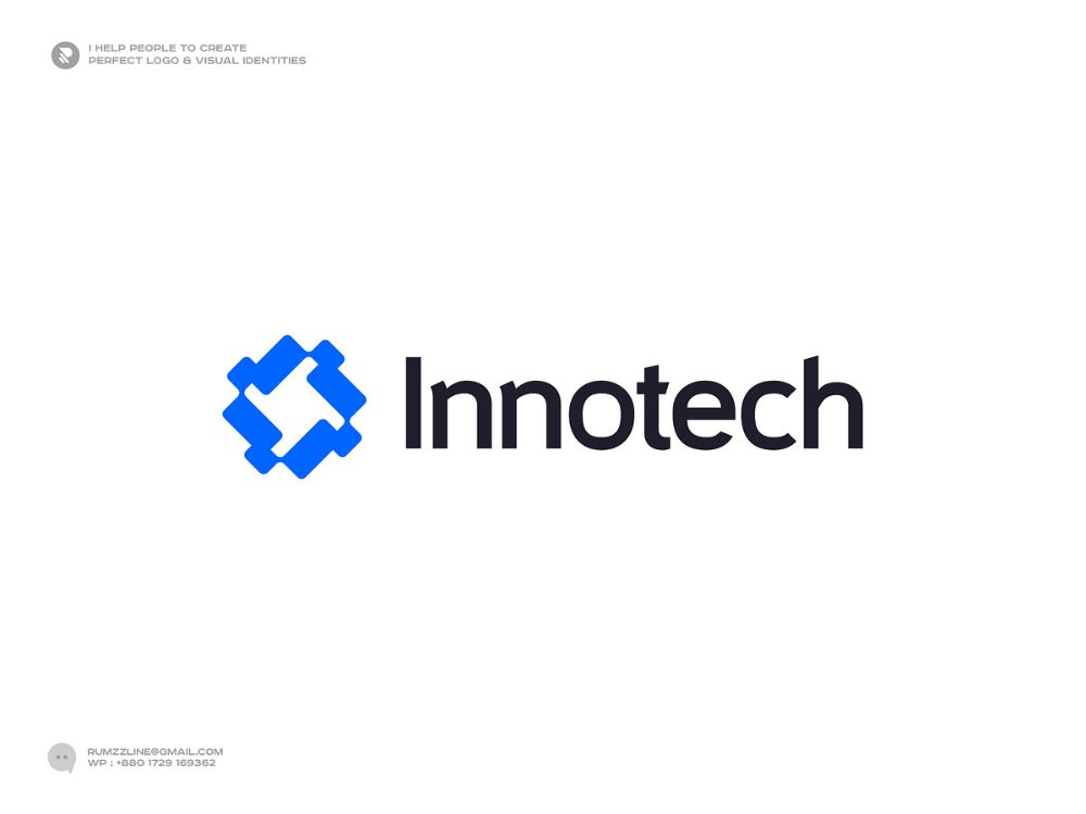
Building Brand Identity with Tech Logos
A tech logo does more than identify your company. It defines how people perceive your brand, communicates values clearly, and creates recognition across digital environments. The design choices you make influence trust, credibility, and long-term brand identity.
Aligning Logos with Brand Values
Your logo should reflect what your tech business stands for. If innovation drives your work, you might use minimal, forward-looking shapes and clean typography. If reliability is central, solid forms and balanced proportions can communicate stability.
Color plays a major role in shaping perception. For example:
| Value | Possible Color Choice | Effect on Audience |
|---|---|---|
| Innovation | Blue, Green | Suggests progress, growth |
| Security | Dark Blue, Gray | Conveys trust, authority |
| Creativity | Orange, Purple | Signals originality, energy |
Typography also reinforces values. Sans-serif fonts often suggest clarity and modernity, while geometric typefaces can emphasize precision. By aligning visual elements with your values, you create a consistent brand identity that feels authentic to your audience.
Consistency Across Digital Platforms
Your logo needs to work across websites, apps, social media, and even physical products. A design that looks sharp on a desktop site but loses clarity in a mobile app icon weakens brand recognition.
Use scalable vector formats to preserve quality at any size. Create variations such as:
- Full logo with text and symbol for websites.
- Icon-only version for app stores and profile images.
- Monochrome version for print or dark mode interfaces.
Maintaining consistent proportions, spacing, and colors ensures your brand identity remains recognizable. Even small inconsistencies in shade or font weight can dilute trust. A clear brand style guide helps your team apply the logo correctly across all touchpoints.
Evolving Your Tech Logo Over Time
Technology businesses often outgrow their original logos as products and audiences change. Updating your logo doesn’t mean abandoning recognition—it means refining it to stay relevant.
Subtle adjustments, like modernizing typography or simplifying shapes, keep your design fresh without alienating existing users. Major redesigns should be considered only when your brand identity or market position shifts significantly.
You can study how leading tech companies have evolved their logos with cleaner lines and reduced complexity. This trend reflects the need for logos that adapt well to digital platforms and smaller screens. By planning updates carefully, you ensure your logo evolves with your business instead of falling behind.

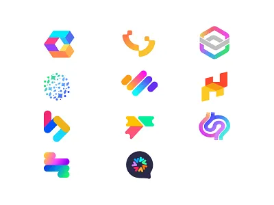
Logo Makers and Design Tools
When you design a tech logo, you need tools that balance efficiency with flexibility. Online logo makers and design platforms give you ways to create professional visuals quickly while still allowing room for customization and brand alignment.
Benefits of Using a Logo Maker
A logo maker helps you generate a professional-looking tech logo without requiring advanced design skills. You can start by entering your company name and industry, and the tool will generate layouts that give you a foundation to build on.
This approach saves time compared to traditional design processes. Instead of working from a blank canvas, you receive ready-made options that can be refined to suit your brand identity.
Cost is another advantage. Many platforms offer free versions or low-cost downloads, making them accessible for startups and small businesses. You can also preview multiple variations before committing to a final design.
For tech companies, speed matters. A logo maker allows you to quickly test different styles, colors, and icons that align with digital products or services, ensuring your brand visuals stay consistent across platforms.
Customization Features
Most logo makers provide customization tools that let you adjust fonts, color schemes, and layouts. This ensures your technology logo reflects your brand’s tone, whether you want a minimalist look or a bold, futuristic style.
You can often choose from icon libraries that include tech-related graphics such as circuits, abstract shapes, or digital symbols. These elements help communicate your company’s focus without requiring complex design work.
Some platforms also allow you to fine-tune spacing, alignment, and proportions. Small adjustments like these make your logo appear more polished and professional.
To keep your logo adaptable, you can usually download it in multiple formats such as PNG, SVG, or vector files. This flexibility ensures the design works on websites, apps, and printed materials without losing quality.
Popular Tech Logo Generators
Several tools stand out for creating technology logos. Canva, Placeit, and VistaCreate provide user-friendly interfaces with templates tailored for tech companies. They focus on simplicity and quick results.
Looka and Design.com use AI-driven suggestions to generate logos based on your inputs. These options are useful if you want a starting point that feels more personalized.
LogoMaker and LogoDesign.net emphasize scalability, letting you create a logo and then apply it across business cards, websites, and other brand assets. This helps maintain visual consistency as your business grows.
| Tool | Key Strength | Notable Feature |
|---|---|---|
| Canva | Easy customization | Wide range of templates |
| Placeit | Fast design process | Tech-focused layouts |
| Looka | AI-driven personalization | Quick logo previews |
| VistaCreate | Flexible design objects | Tech icon libraries |
These platforms give you practical options to design a tech logo that fits your brand without requiring advanced design expertise.


Best Practices and Trends in Tech Logo Design
Strong technology logo design depends on clarity, adaptability, and relevance. You need to focus on styles that communicate innovation, colors that reinforce trust and recognition, and formats that scale across digital and physical environments.
Minimalism and Modern Styles
Minimalist design remains one of the most effective approaches in technology logo design. By using clean lines, simple shapes, and limited details, you make your logo more recognizable across devices and platforms. This approach also ensures faster loading on digital interfaces, which is critical for apps and websites.
Modern styles often combine flat design with subtle geometric elements. For example, a tech startup may use a simplified circuit pattern or abstract symbol that suggests connectivity without overwhelming the viewer. This balance between simplicity and relevance makes your logo professional and future-proof.
You should also consider typography. Sans-serif fonts with balanced spacing work well for technology companies because they look modern and scale cleanly. Avoid overly stylized fonts that lose readability at smaller sizes. A minimalist logo paired with straightforward typography helps you maintain a consistent and professional brand identity.

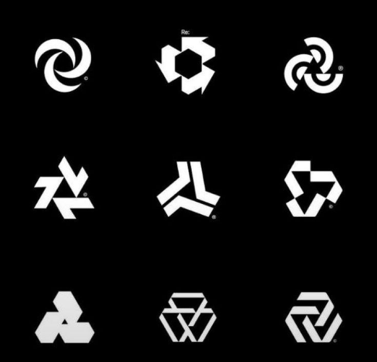
Color Gradients and Effects
Logo colors play a central role in how people perceive your brand. In technology, blue and green often signal trust, stability, and growth, while bold tones like purple or orange can emphasize creativity and innovation. Choosing the right palette helps you align your logo with the values you want to represent.
Gradients have become more common in tech logos. A smooth transition from one shade to another can create a sense of depth and motion without complicating the design. For example, a blue-to-purple gradient works well for cybersecurity or digital identity companies because it conveys both security and forward-thinking qualities.
When applying effects, keep them subtle. Overly complex shadows or textures reduce clarity when your logo is displayed on smaller screens. Stick to clean gradients, restrained highlights, or flat color variations that maintain visual impact while staying versatile across applications.
Adaptive Logo Formats
Your logo must adapt to different formats without losing clarity. A strong technology logo design should have multiple variations: a full version for websites, a simplified icon for apps, and a monochrome version for printing or small-scale use.
Scalability is essential. A logo that looks sharp on a billboard should also remain recognizable on a smartwatch screen. This requires testing at different resolutions and ensuring fine details do not disappear at smaller sizes.
You should also prepare responsive versions. For example:
- Primary logo: Full design with typography and symbol
- Secondary logo: Simplified mark or initials
- Icon: Minimal version for app buttons or favicons
By planning adaptive formats, you create consistency across touchpoints while ensuring your brand remains recognizable in every context.
- 35shares
- Facebook0
- Pinterest32
- Twitter3
- Reddit0


