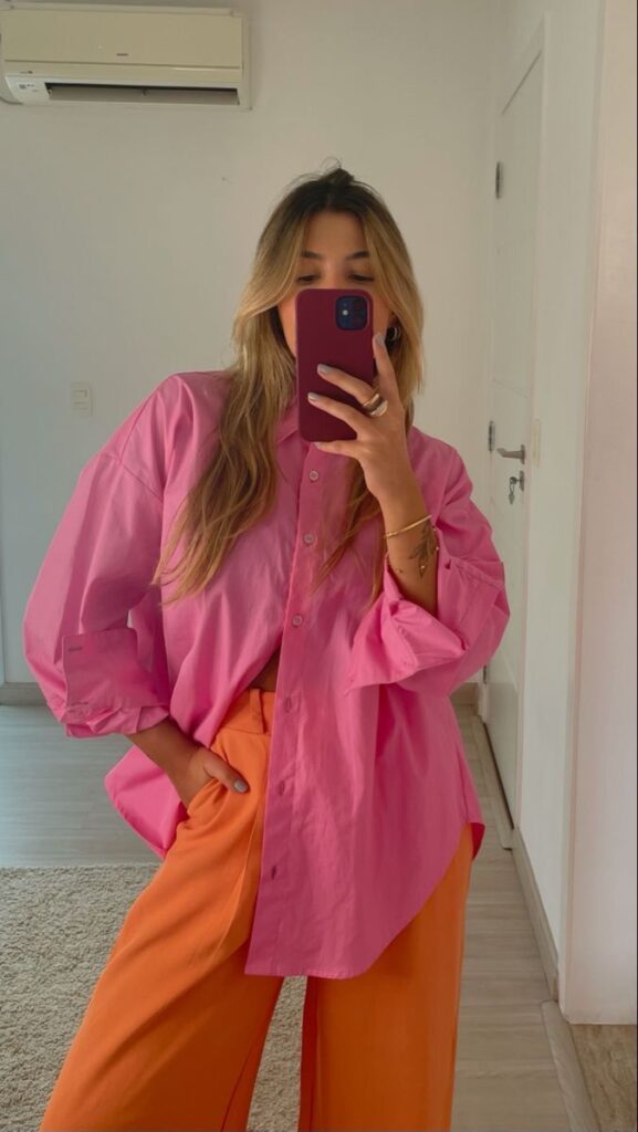
Bold color combinations can make any outfit stand out and show confidence. Using bright, contrasting colors together creates eye-catching looks that express personality and style. Knowing how to mix these colors helps avoid clashing and keeps the outfit balanced.
Many people think bold colors are hard to wear, but the right pairings can feel natural and fun. Learning simple rules and experimenting helps build unique outfits that attract attention for the right reasons. This article will help readers understand how to use bold colors effectively.
Key Takeaways
- Combining bright colors correctly makes outfits more striking.
- Simple rules help avoid color clashing in bold looks.
- Trying bold colors builds confidence and personal style.
Understanding Bold Color Combinations
Bold color combinations use strong and contrasting shades to create eye-catching outfits. These pairings rely on both color theory and cultural meanings. Their history shows how fashion has embraced daring looks over time.
What Defines a Bold Color Combination
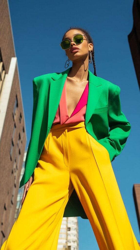
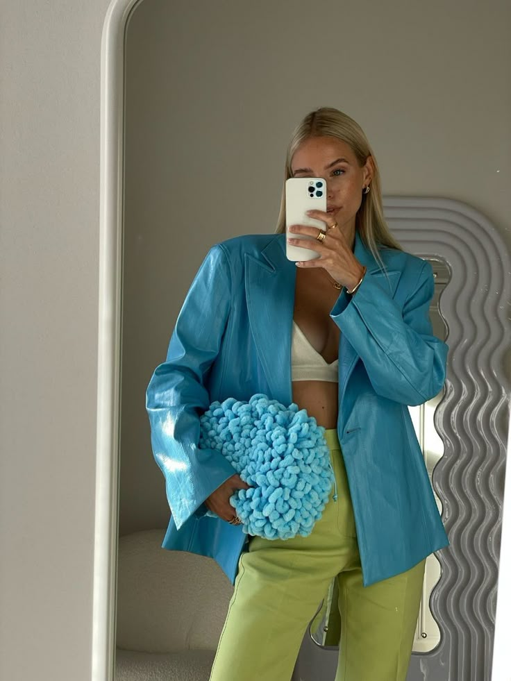
Bold color combinations mix colors that stand out from each other. These often include bright reds with blues, yellows with purples, or oranges with greens. The contrast is usually high, meaning the colors do not blend but instead highlight each other.
Bold combos can also mean using intense versions of one color, like neon green with bright pink. The key is that both colors draw attention and make the outfit memorable. It is not about matching but about creating visual impact.
Psychology of Bold Colors in Fashion
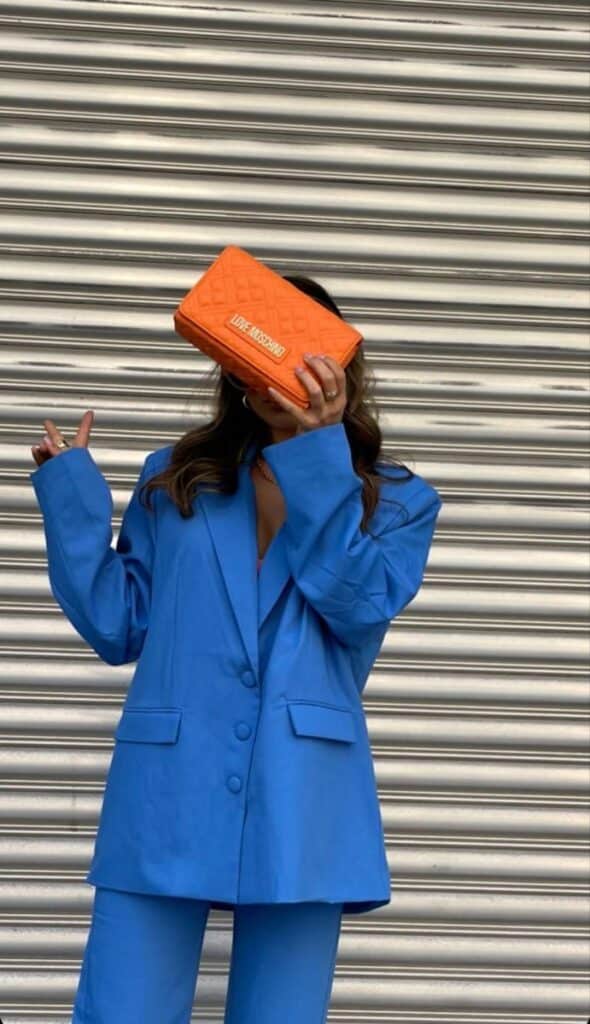
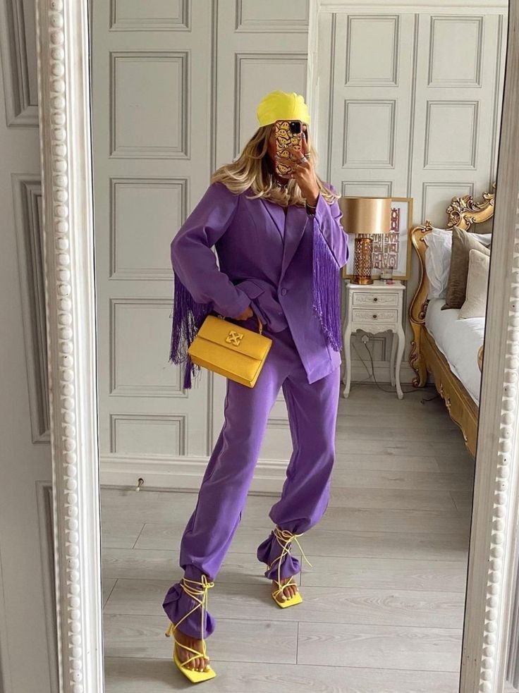
Bold colors affect how people feel and perceive others. Bright reds can signal confidence and energy. Yellows may suggest optimism and warmth. These colors often make the wearer appear more outgoing.
Using bold colors can also influence mood. People might feel happier or more excited when wearing or seeing strong hues. Fashion designers use these effects to highlight personality or grab attention in social settings.
History of Bold Color Pairings
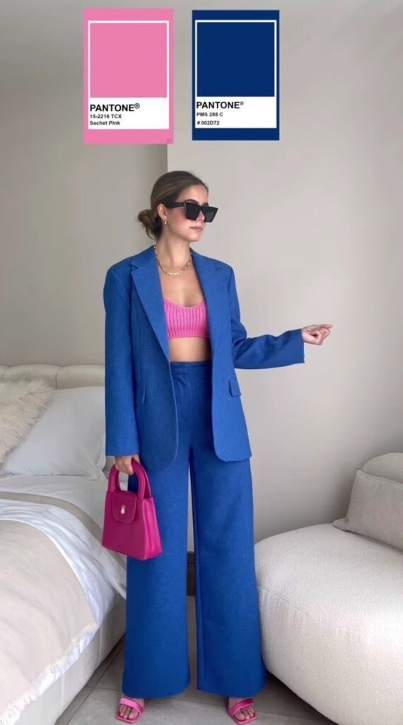
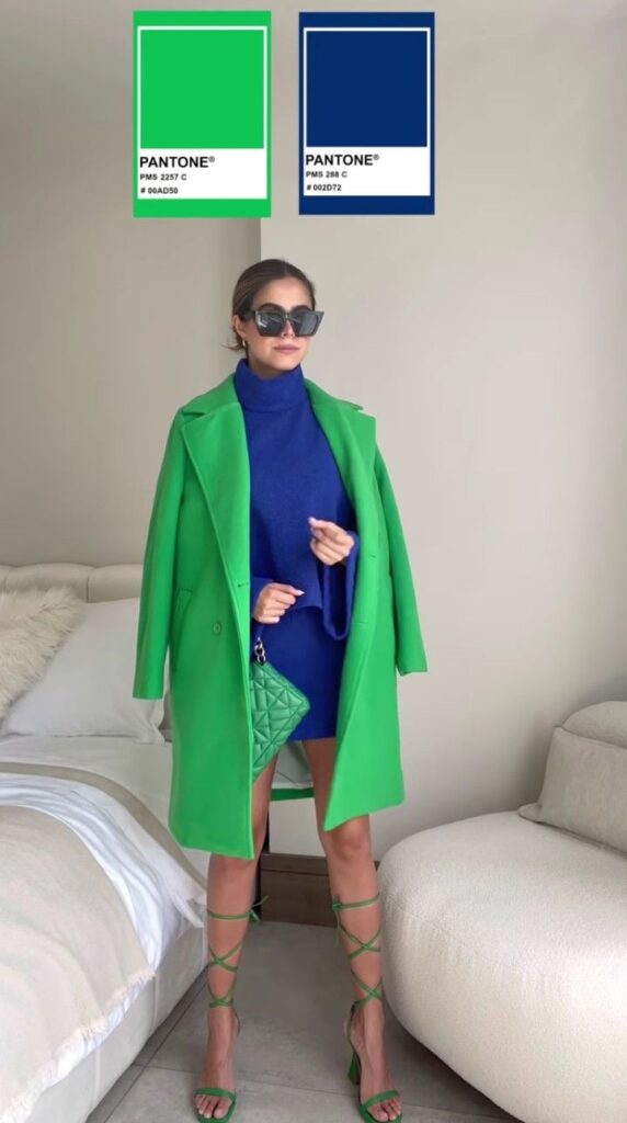
Bold color pairs have been popular at various times in fashion history. In the 1960s, bright and clashing colors matched the era’s free spirit. The 1980s brought neon colors combined in bold ways to reflect loud and dynamic styles.
Fashion always returns to bold combinations when seeking to break conventional ideas. Designers often use these pairs to innovate and create statements. This tradition shows that bold color use is both a fashion risk and a form of expression.
Creating Striking Bold Color Outfits
Bold color outfits stand out when colors work well together, balance each other, and fit the season. Using the right mix of colors helps create looks that are eye-catching but not overwhelming.
Color Wheel Principles for Pairing
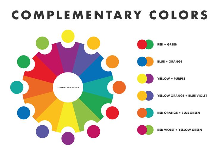
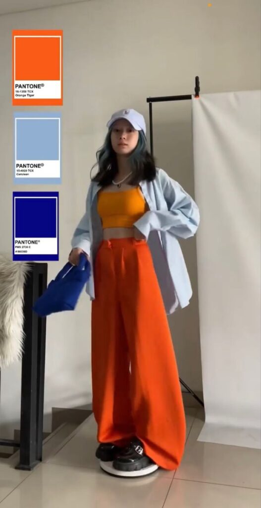
Understanding the color wheel is key to combining bold colors. Colors opposite each other—called complementary colors—create strong contrast. For example, pairing a bright blue with orange makes each color pop.
Analogous colors sit next to each other on the wheel and give a more harmonious look. Combining red, red-orange, and orange offers boldness with less contrast.
Triadic schemes use three colors evenly spaced on the wheel, like green, purple, and orange. This creates balanced energy. Using one main color with two accents keeps the outfit sharp and colorful.
Balancing Statement and Neutral Colors
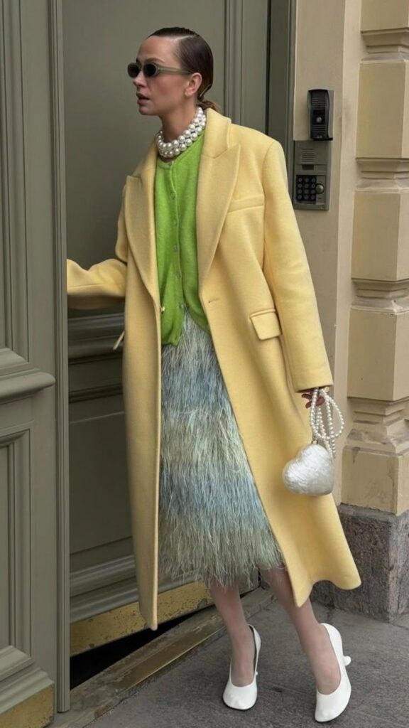
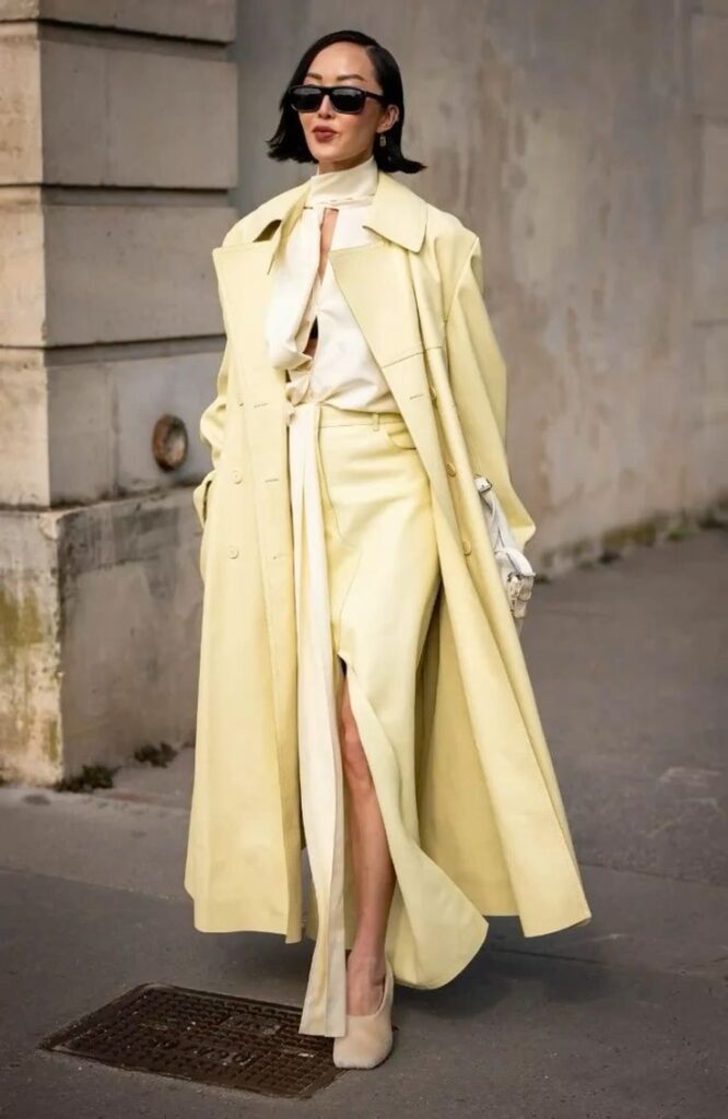
Pairing bold colors with neutrals tones down the outfit without losing impact. Beige, white, black, or gray can be used alongside strong hues to create focus.
For example, a bright yellow jacket looks striking with black pants. This balance keeps the outfit from being too busy.
Limit bold colors to one or two pieces. The rest of the outfit should be neutral. This helps highlight the statement color and maintain a polished look.
Seasonal Application of Bold Hues
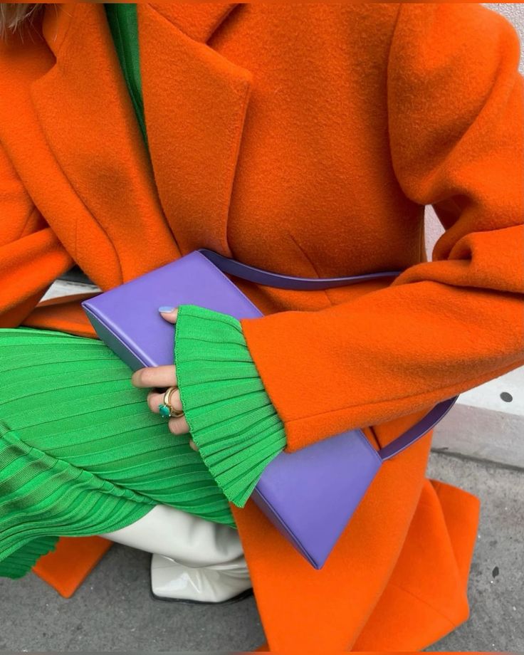
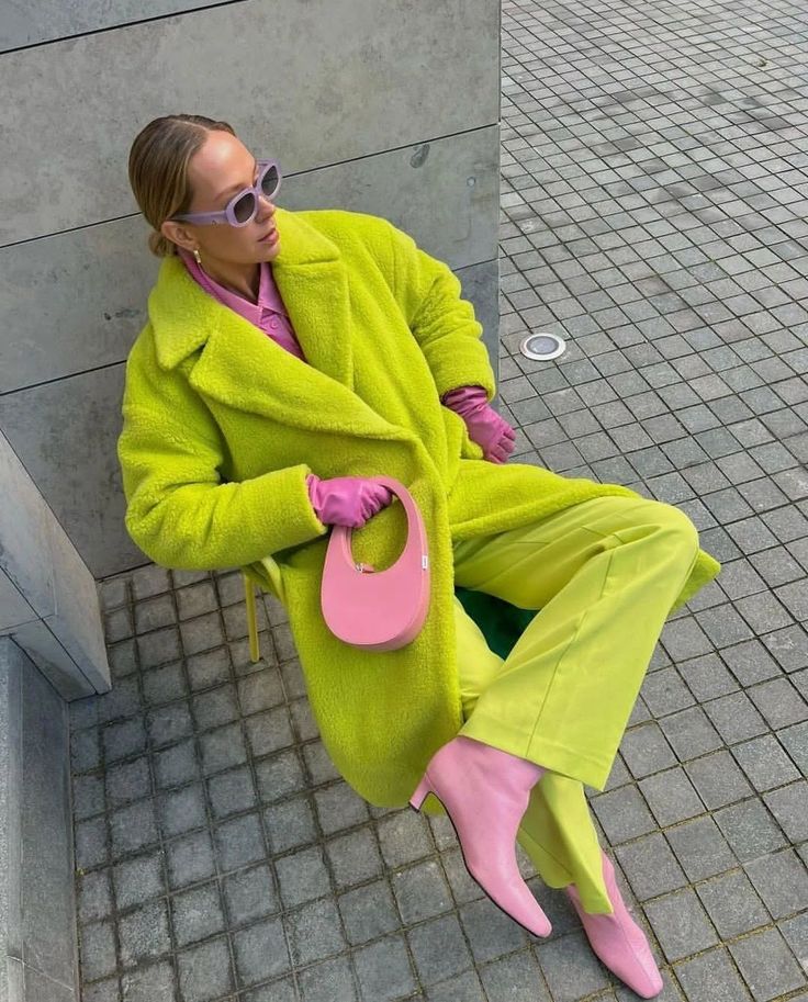
Colors feel different depending on the season. Warm colors like red, orange, and mustard suit fall and winter because they add warmth.
In spring and summer, bright hues like turquoise, lime green, and coral work well. These colors reflect the season’s light and energy.
Choosing colors that match the season helps the outfit feel natural and comfortable. Seasonal trends often shift these colors but sticking to the seasonal palette improves style.
Popular Bold Color Outfit Combinations
Bold color outfits often combine strong hues to create eye-catching looks. Some pairs use classic color rules, while others mix unexpected shades to add energy. Different ways to pair colors include using primary colors, shades close to each other, or sharp contrasts.
Primary Color Pairings
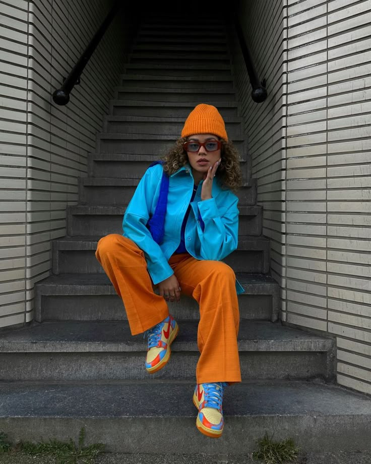
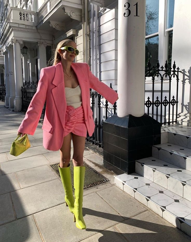
Primary colors—red, blue, and yellow—are popular for bold outfits. These colors are bright and pure, making them stand out when worn together. Using red and blue or yellow and red creates strong, clean combinations that feel balanced.
For example, a red top with blue pants brings a vibrant look that keeps a classic feel. Yellow shoes or accessories can add extra pop while staying simple. These combinations are easy to style and work well for many occasions.
Monochromatic and Analogous Looks
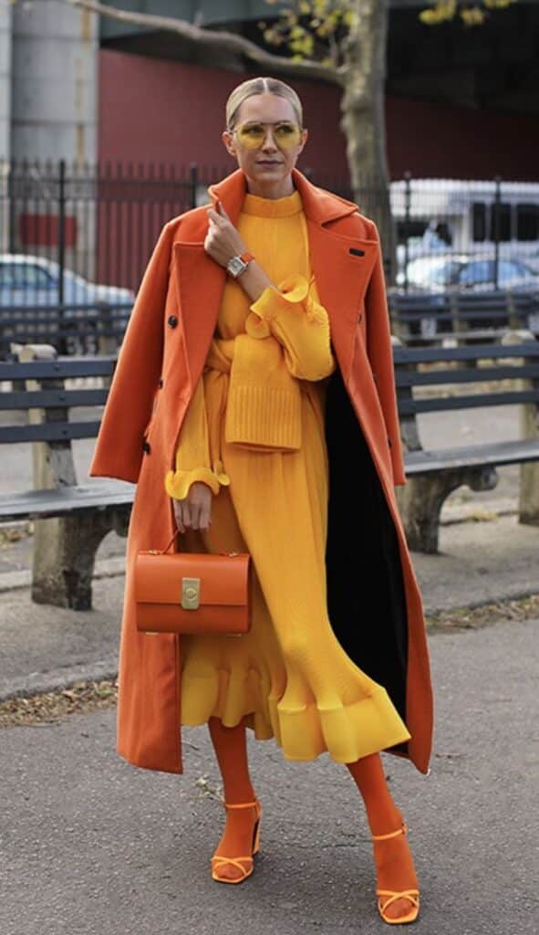
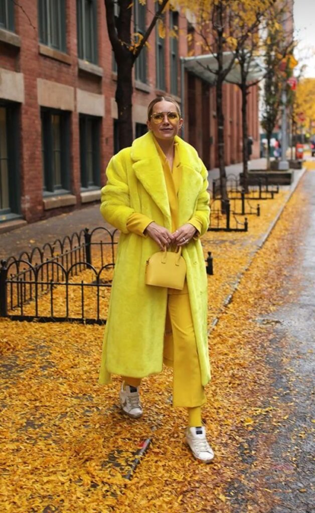
Monochromatic outfits use different shades of the same color. This approach lets one color shine without clashing. For instance, pairing light blue jeans with a dark blue jacket creates a smooth, bold outfit.
Analogous colors are next to each other on the color wheel, like green and yellow or blue and purple. These combos are colorful but blend well because they share similar tones. Wearing a green shirt with yellow accessories feels bold but not too loud.
Unexpected Color Contrasts
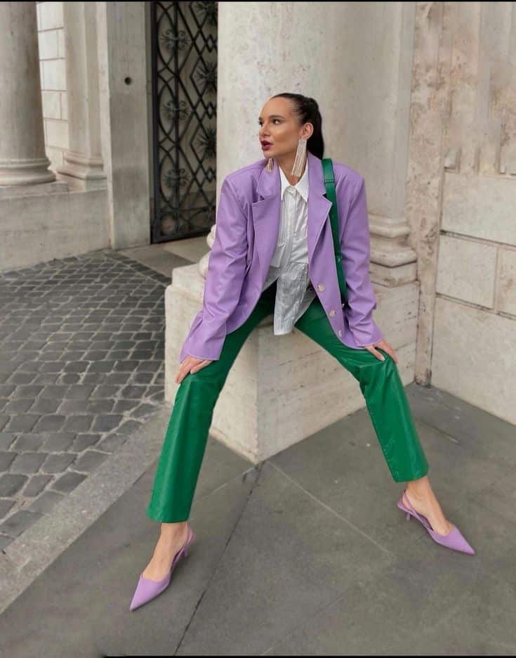
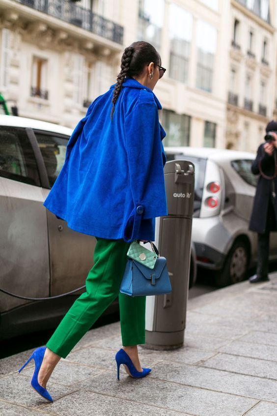
Some outfits gain attention by pairing colors not usually seen together. For example, pink with orange or purple with lime green can surprise the eye. These contrasts bring strong energy and freshness to an outfit.
To pull this off, one color is usually dominant, and the other acts as an accent. A purple dress with lime green shoes creates a bold contrast without overwhelming the whole look. Accessories are often easier spots to add these unexpected colors.
Styling Tips for Wearing Bold Colors
Bold colors can make a strong statement when chosen and styled carefully. Balancing these vibrant hues with the right accessories, layering options, and consideration of skin tone helps create a polished look. Attention to detail is key to keeping the outfit harmonious and eye-catching.
Choosing Accessories for Vibrant Outfits
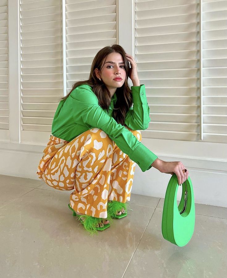
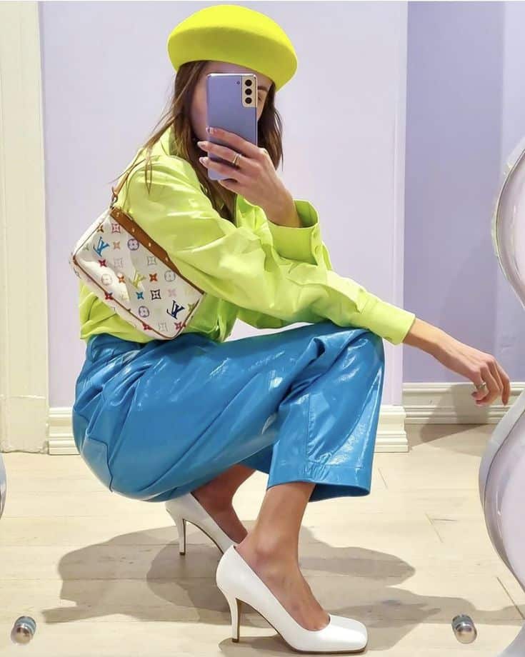
When wearing bright colors, accessories should either complement or tone down the outfit. Neutral-colored accessories like black, white, beige, or metallics usually work well. For example, a bright red dress pairs nicely with gold or silver jewelry.
Bold-colored outfits can also be matched with accessories in similar shades to create a unified look. However, using too many bold pieces together may overwhelm the wearer.
Simple bags, shoes, and belts help focus attention on the main bold item. Avoid overly patterned or brightly colored accessories to keep the outfit balanced and pleasing to the eye.
Layering Techniques with Intense Tones
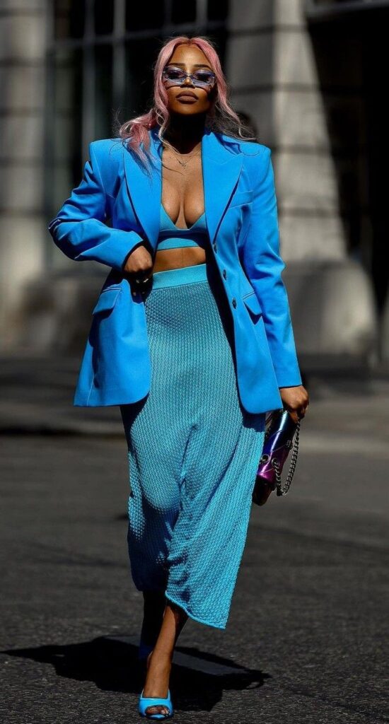
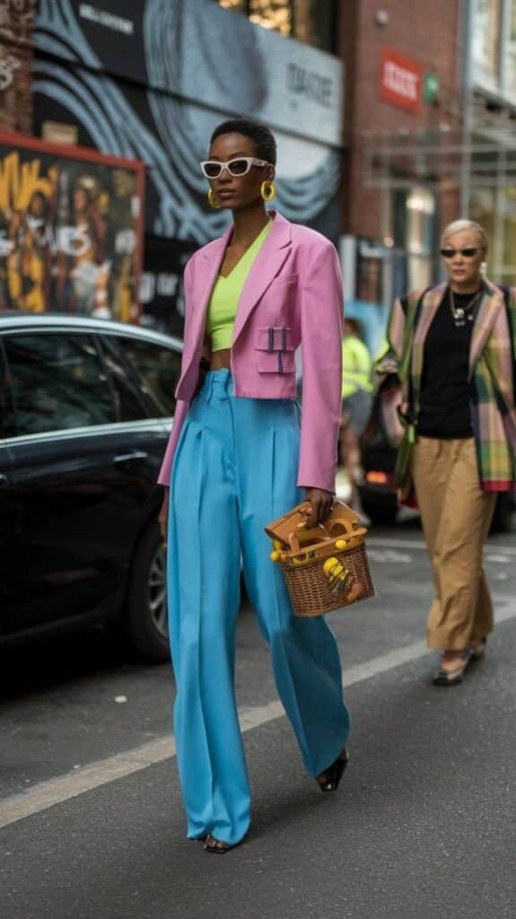
Layering bold colors requires selecting pieces that either contrast softly or blend smoothly. Neutral layers like denim jackets, white shirts, or beige coats can calm down an intense outfit.
Another option is to layer with colors that are adjacent on the color wheel, such as pairing a bright orange top with a red jacket. This creates harmony without clashing.
Use layers to break large areas of color into smaller sections. This helps the eye move comfortably across the outfit without feeling overwhelmed.
Tips for Different Skin Tones
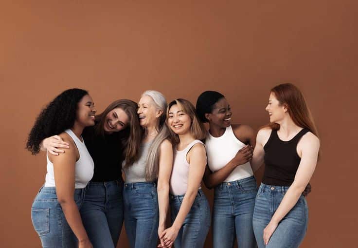
Skin tone plays a role in how bold colors appear on an individual. Generally, warm skin tones look best with warm colors like orange, yellow, and coral. Cool skin tones suit shades like blue, purple, and emerald green.
Neutral skin tones can wear a wider range of bold colors, including both warm and cool shades.
Testing colors near the face is a good way to check if a bold hue flatters the wearer. If the color highlights the natural complexion without making it look dull, it is a good choice.
| Skin Tone Type | Best Bold Colors |
|---|---|
| Warm | Orange, red, yellow, coral |
| Cool | Blue, purple, emerald green |
| Neutral | Most bold colors from both warm and cool |
Inspiration from Designers and Influencers
Bold color combinations often come from creative sources that set trends and inspire outfit choices. Designers, celebrities, and social media play big roles in showing how to pair strong colors effectively.
Runway Trends Featuring Bold Colors
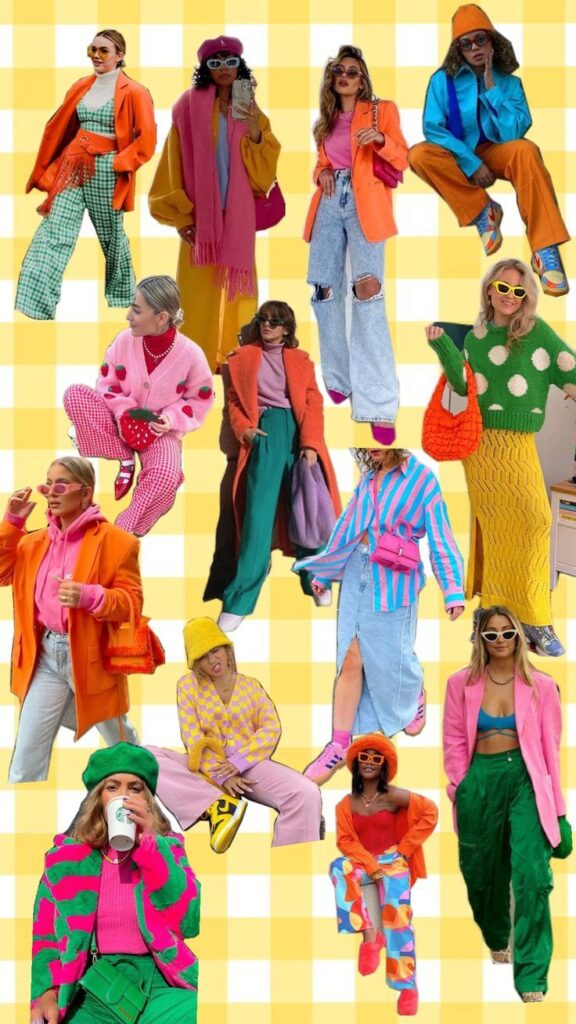
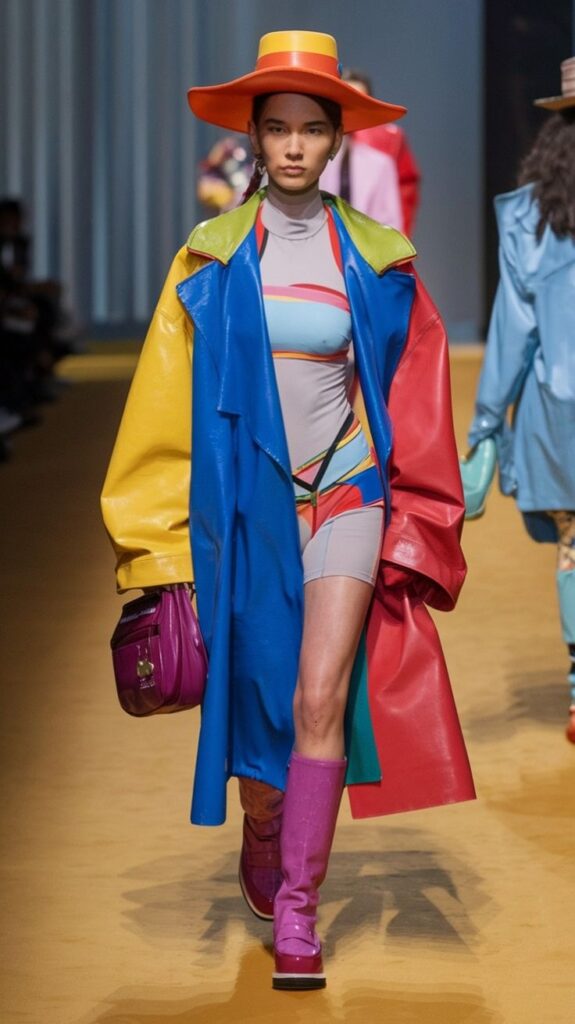
Designers like Christopher John Rogers and Balmain frequently showcase bright and clashing colors on the runway. They mix hues like electric blue with sunflower yellow or bright red with hot pink, making outfits eye-catching and vibrant. These bold looks encourage experimenting beyond safe combinations.
Runways often blend classic and unexpected colors in structured garments. For example, layering a neon green blazer over a red dress highlights confidence and sharp style. Textures like silk or leather also help bold colors stand out more.
Fashion weeks from New York to Paris continue to feature striking palettes, influencing what stores stock and what consumers wear.
Iconic Celebrity Looks
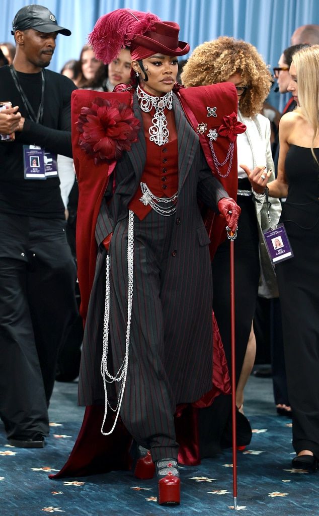
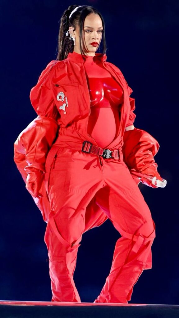
Celebrities such as Zendaya and Harry Styles are known for daring color combos. Zendaya paired a bright orange suit with a purple top on a red carpet, showing fearless style. Harry Styles often mixes pastel and neon tones, like mint green with coral, breaking traditional menswear rules.
These celebrity outfits show how bold colors can work for formal and casual events. Their stylists typically balance the colors by adjusting accessories, like neutral shoes or simple jewelry.
Their looks set examples that are widely copied. Fans often recreate these combos for events, making celebrities trendsetters in bold color fashion.
Social Media Inspiration
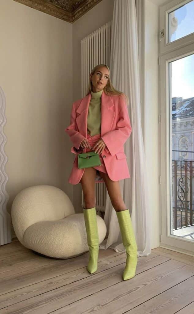
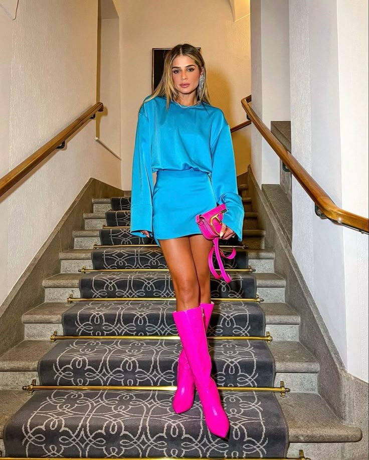
Platforms like Instagram and TikTok highlight influencers who specialize in color blocking. Influencers such as Karen Blanchard and Wisdom Kaye post daily outfit ideas using bold color mixes. They often explain how to combine colors using simple rules, like pairing complementary or analogous colors.
Social media allows quick sharing of trends and tips on mixing prints with bright hues. Influencers show viewers how to use bold colors at any age or style preference.
Hashtags like #ColorBlocking and #BoldColors help users find fresh ideas and build confidence in trying new color combinations.
Common Mistakes to Avoid in Bold Outfits
Bold outfits need careful choices to look put together. Some avoidable errors can make the look messy or inappropriate. Paying attention to patterns, occasion, and fabric can improve the outfit’s impact.
Overdoing Patterns and Colors
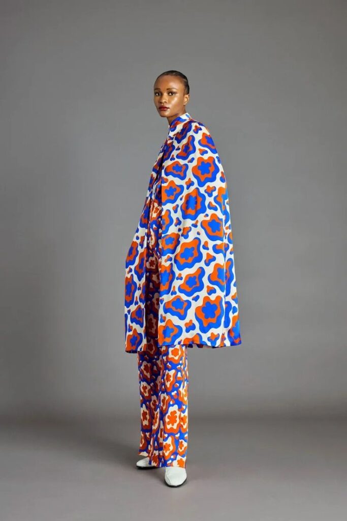
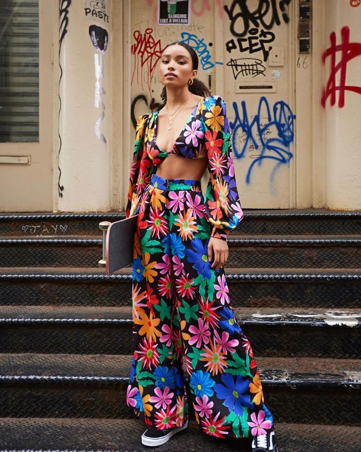
Using too many bright colors or clashing patterns can overwhelm the outfit. Bold outfits should balance one or two strong hues with simpler tones.
Combining a loud floral print with stripes, for example, often looks chaotic. Instead, pair one statement pattern with solid colors to create harmony.
Color matching matters too. Avoid putting together neon green and bright red as they fight for attention. Choose colors that complement or contrast well without clashing.
Ignoring Occasions or Settings
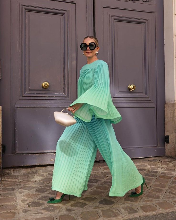
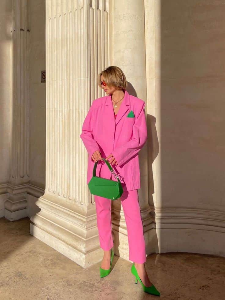
Bold outfits are not always right for every place or event. Wearing vivid, attention-grabbing clothes to formal or somber events can seem out of place.
For work or business meetings, bold pieces should be toned down with neutral items. In casual or creative settings, there’s more room for boldness.
Knowing the event’s dress code helps. If unsure, it is safer to add bold touches rather than go all out.
Clashing Fabrics and Textures
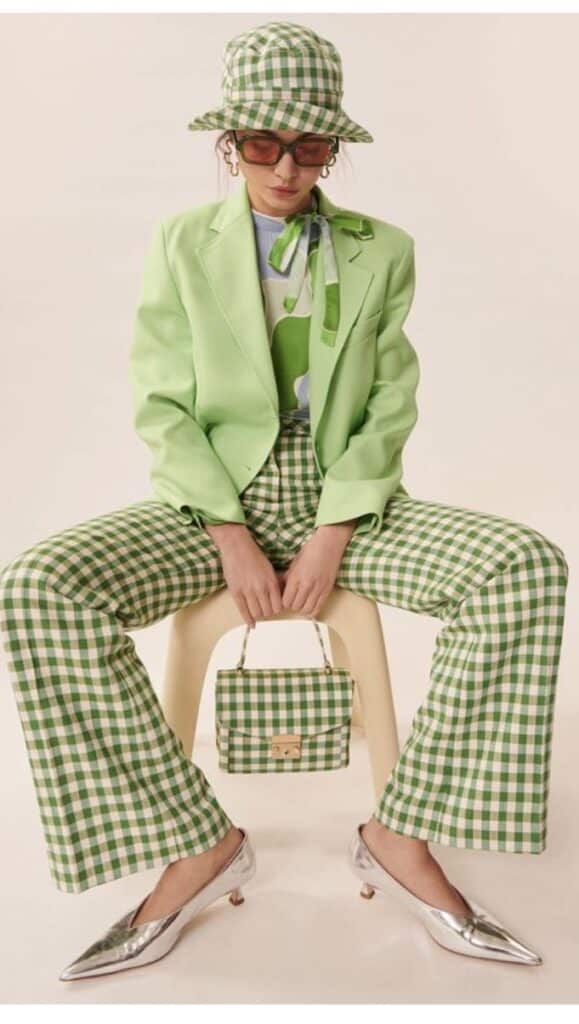
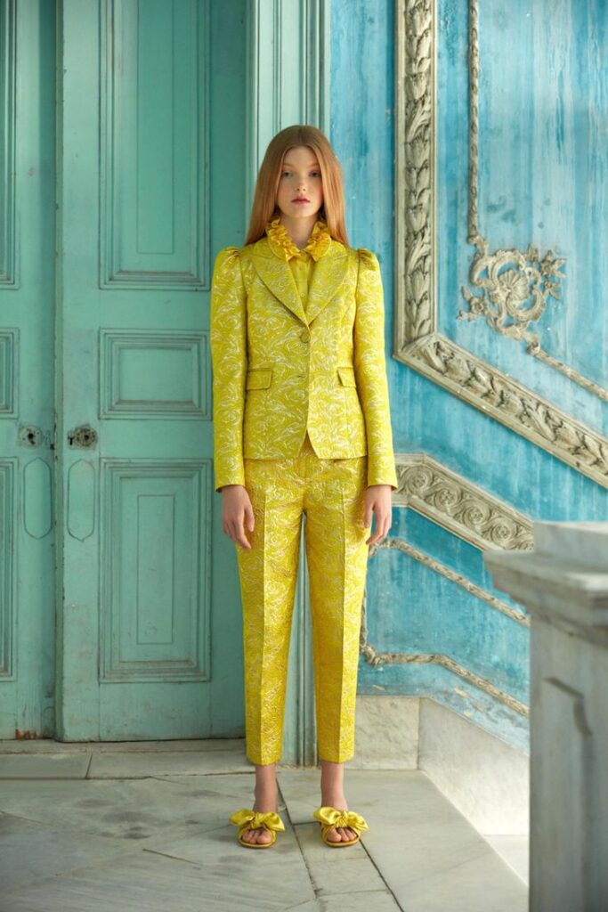
Mixing many bold fabrics can make an outfit look busy and uncomfortable. Pairing shiny materials like satin with heavy knits often clashes.
Bold looks work best when textures complement each other. For example, smooth leather with soft cotton creates interest without overwhelming the eyes.
Avoid pairing stiff fabrics with flowy ones if they don’t match in tone or style. Keeping texture choices simple supports the bold colors and patterns.
Sustainable and Ethical Bold Fashion Choices
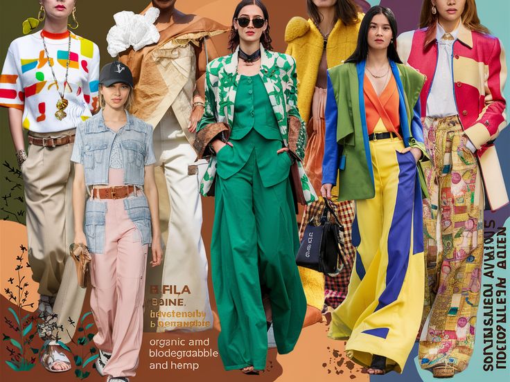
Choosing bold colors does not mean ignoring sustainability. Many brands now offer bright, eye-catching clothes made with eco-friendly materials. These include organic cotton, recycled polyester, and natural dyes.
Consumers can look for certifications like GOTS (Global Organic Textile Standard) or Fair Trade. These labels show that the clothes were made with care for both the environment and workers.
Supporting local or small businesses also helps reduce the carbon footprint. These brands often focus on quality and ethical production rather than mass manufacturing.
Bold color outfits can be crafted from thrifted or upcycled garments. This reduces waste and gives old clothes new life with striking color combinations.
Here’s a quick checklist for sustainable bold fashion:
| Tip | Description |
|---|---|
| Choose natural fabrics | Cotton, linen, and hemp are better |
| Avoid toxic dyes | Look for non-toxic or plant-based dyes |
| Buy from ethical brands | Check for fair labor practices |
| Shop second-hand | Thrift or vintage stores |
Using these tips helps people make bold choices while caring for the planet and workers. Sustainable fashion can be colorful, ethical, and stylish.
- 483shares
- Facebook0
- Pinterest480
- Twitter3
- Reddit0
