Designing your home office with Pantone colors allows you to create a workspace that is both visually appealing and highly functional. By thoughtfully selecting Pantone shades, you can personalize your environment to boost productivity, creativity, and well-being. Whether you want your workspace to feel calm and focused or vibrant and inspiring, Pantone hues offer the flexibility to match your needs and style.
You’re not limited to just painting walls; Pantone colors can be included in everything from accent pieces and office furniture to artwork and accessories. With a few well-chosen touches, you can carry the spirit of your Pantone-inspired office into other living spaces, creating unity and harmony throughout your home.
Staying up to date with the latest Pantone trends means you can refresh your space easily and keep it feeling modern. Explore how simple updates using color can transform your daily work life.
Key Takeaways
- Pantone colors set the tone for a productive and creative home office.
- Incorporate Pantone shades in decor and accessories for personal style.
- Updating your workspace with Pantone trends keeps your home feeling fresh.
Pantone Color Influence in Home Office Design
Pantone colors guide how you set the mood, productivity, and visual harmony in your home office. Their choices and annual trends have a direct impact on workspace design, from furniture to accessories.
Understanding the Pantone Color Institute
The Pantone Color Institute is the authority in color forecasting and trend analysis. Its experts research global color influences, including art, fashion, and socio-economic conditions, to predict what colors will shape the coming year.
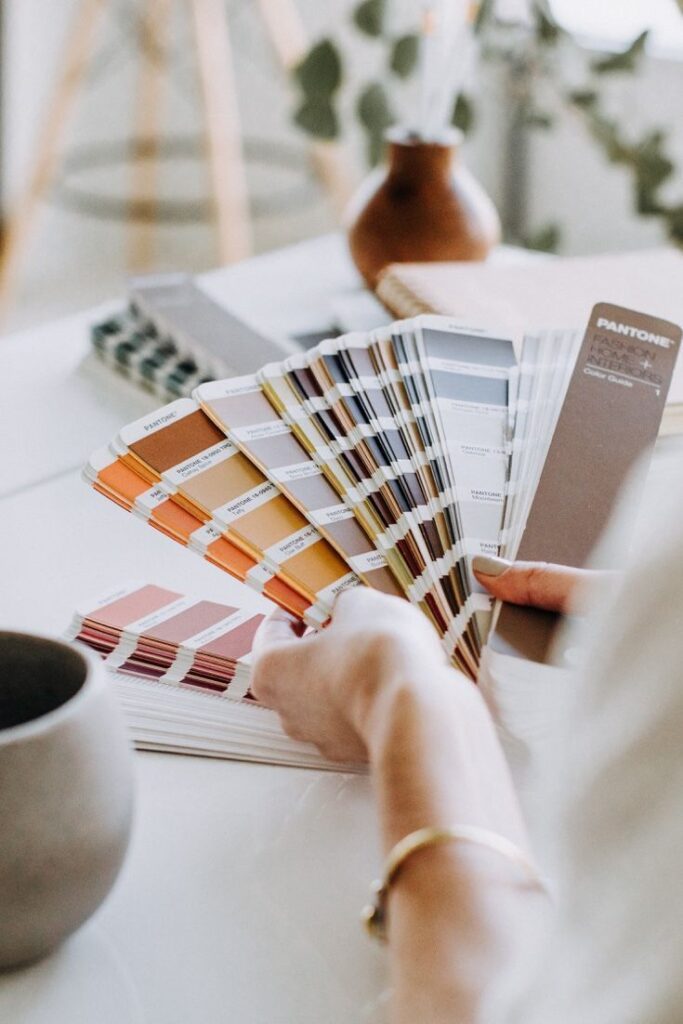
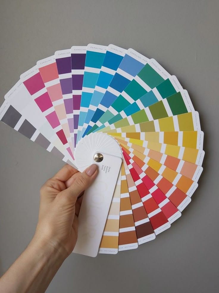
By establishing color standards, the Institute helps you ensure consistency whether you’re choosing paint, furniture, or even digital elements for your office. The Pantone Matching System (PMS) and the Fashion, Home + Interiors (FHI) system are the two main tools offered, helping you match decor precisely.
Their guidance is both practical and creative. You get clear codes to communicate exact colors and ideas to designers, suppliers, or even to reference in future office updates.
How Colors Shape Office Spaces
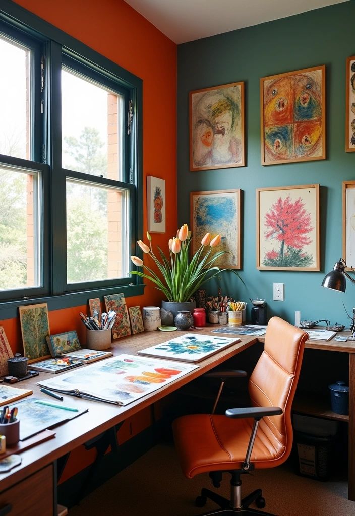
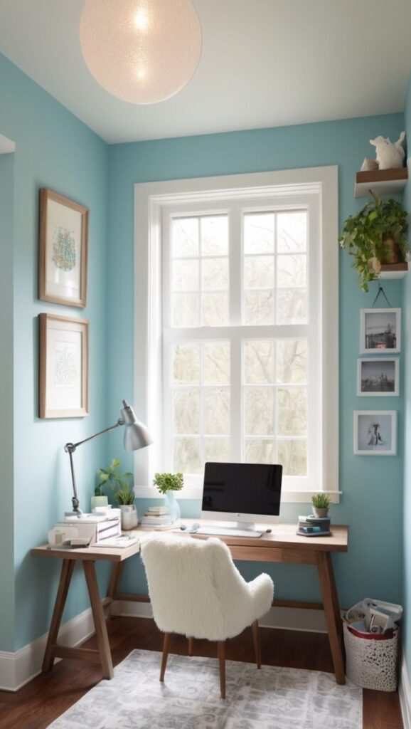
Colors affect how energized, focused, or calm you feel at work. For example, Pantone experts highlight that soft blues and greens foster concentration and reduce stress. Warm yellows and oranges can add a sense of optimism and creativity.
Below is a simplified guide to some key color choices:
| Color | Effect in Office |
|---|---|
| Soft Blue | Calming, increases focus |
| Warm Yellow | Optimistic, creative |
| Neutral Gray | Balanced, supports productivity |
| Green | Refreshing, reduces fatigue |
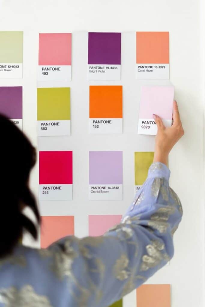
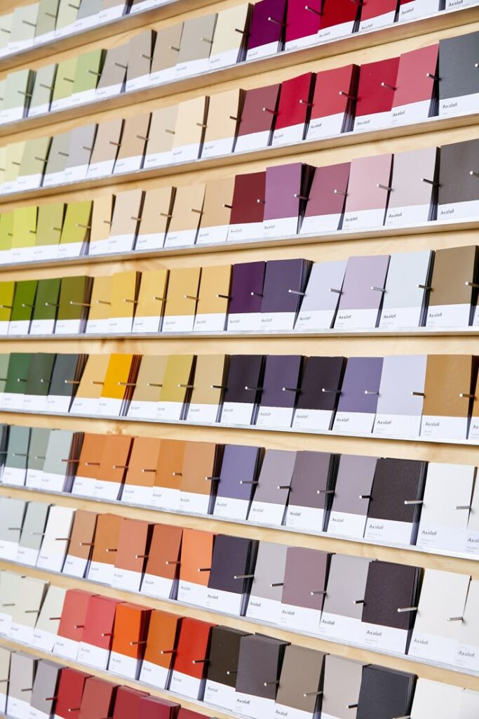
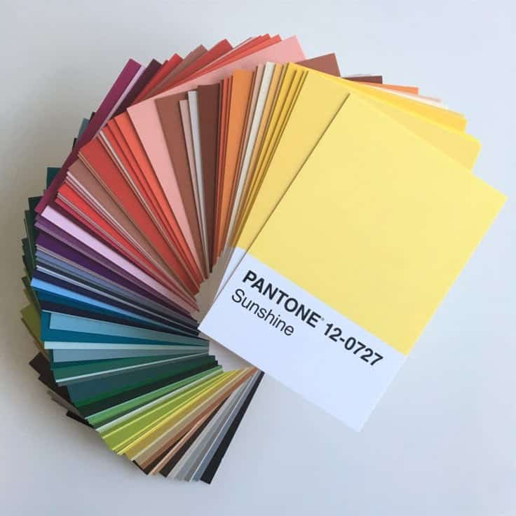
Pantone provides the language and standards needed to coordinate such effects confidently. You can use their physical or digital samples to compare different shades and visualize outcomes in your home office before committing.
Pantone Color of the Year and Its Impact on Design Trends
Each year, Pantone announces a Color of the Year that influences everything from office supplies to wall colors. These selections, like Ultimate Gray and Illuminating (yellow) for 2021, reflect broader cultural moods and aspirations.
Design brands and furniture makers often tailor their collections around these annual picks. If you incorporate the Color of the Year, your space will look contemporary and in tune with broader design movements.
You can use the Color of the Year as an accent—on an office chair, rug, or feature wall—to keep your workspace feeling current and inspired. Some people choose matching accessories or artwork to coordinate, creating a cohesive and updated home office.
Selecting Pantone Colors for Your Home Office
The right Pantone colors can set the mood, support productivity, and reflect your style in your workspace. By blending trending hues with time-tested combinations, you create an environment that suits both work and relaxation.
Incorporating Very Peri, Olive Green, and Mocha Mousse
Very Peri is a vibrant periwinkle blue with violet-red undertones. Its energetic yet calming vibe makes it perfect for sparking creativity. Use it for accent walls, desk accessories, or artwork in your office for a fresh and inviting look.
Olive Green delivers a sense of tranquility. As a muted earth tone, olive green can reduce stress and promote focus. Consider using olive in areas where you want to encourage concentration or as a background color on walls.
Mocha Mousse offers warmth and subtle sophistication. This neutral brown shade is flexible and pairs easily with richer colors. Use Mocha Mousse on shelving, cabinets, or textiles to ground bolder hues like Very Peri or to soften the vibrancy of olive green.
Creating Inspiring Color Combinations
Combining Pantone colors thoughtfully can transform your home office. Balance cool tones like Very Peri with warm neutrals or earth tones for a grounded effect. For example:
| Main Color | Accent 1 | Accent 2 |
|---|---|---|
| Very Peri | Mocha Mousse | Olive Green |
| Olive Green | Soft White | Very Peri |
| Mocha Mousse | Pale Peach | Olive Green |
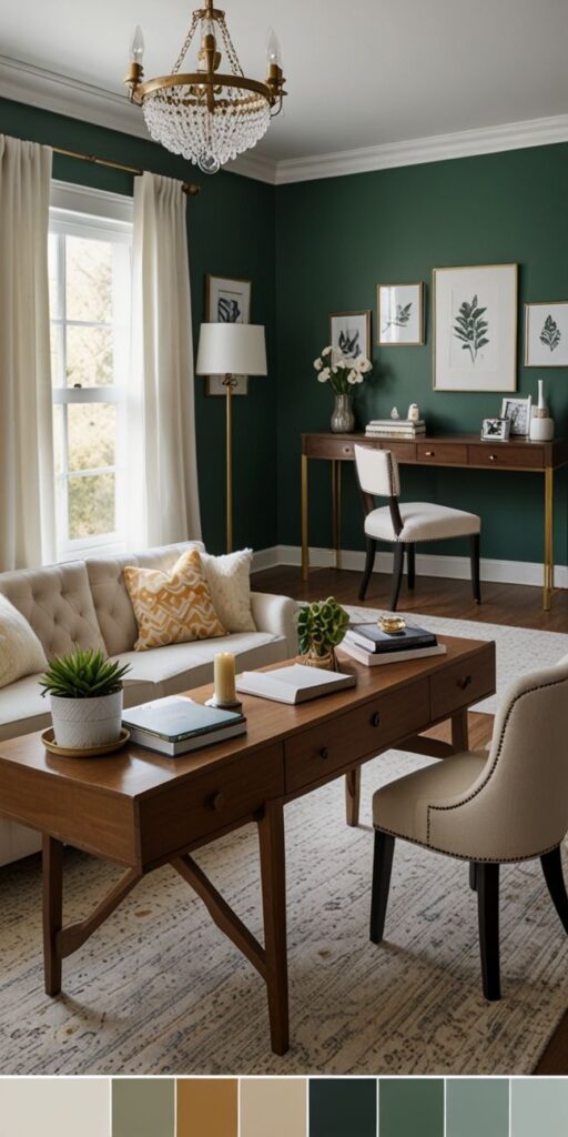
Layer textures and materials using your chosen colors. For instance, pair a Very Peri chair cushion with mocha-hued wooden shelves and olive green planters. Mixing materials like painted metal, wool, or bamboo also adds dimension without overwhelming the space.
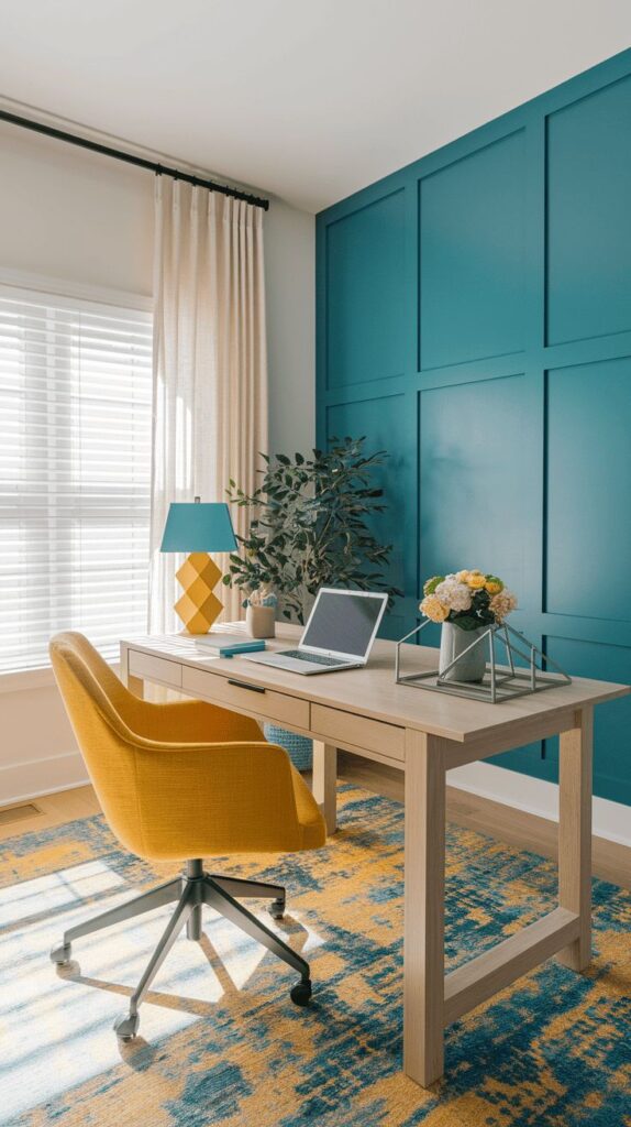
Balancing Neutrals and Bold Tones
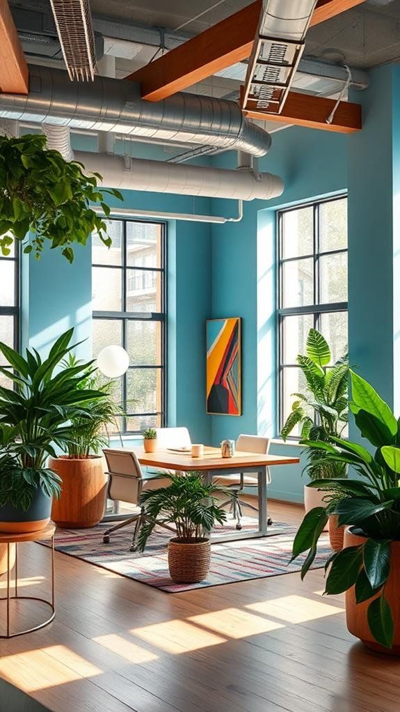
You don’t have to choose between a calming atmosphere and vibrant energy. Neutrals like Mocha Mousse, soft grays, or off-whites help tone down bright shades and keep your office from feeling chaotic.
Try this approach:
- Start with a base of neutral colors on walls or large furniture.
- Add bold accents, like a Very Peri lamp or olive green organizer.
- Use metallic or natural finishes for extra texture.
This strategy ensures the space feels welcoming while still allowing your favorite Pantone shades to stand out. Select neutrals that suit your lighting and combine them with confident touches of vibrant color to personalize your work environment.
Styling Your Workspace for Creativity and Productivity
Choosing the right Pantone colors, quality materials, and striking metallic details can transform your home office into a productive and creative environment. The right design not only shapes your mood but also supports your workflow and brings out your personal style.
Maximizing Productivity Through Color Psychology
Color plays a major role in how you focus and stay motivated. Pantone’s curated palette offers a range of shades that support various moods. Soft blues and cool greens are known to promote calm and concentration, while brighter yellows and corals can spark creativity and optimism.
To help guide your choice, consider these effects:
| Color | Productivity Impact | Mood Influence |
|---|---|---|
| Blue | Increases focus | Calming, stable |
| Green | Reduces stress | Refreshing, balanced |
| Yellow | Boosts energy | Cheerful, optimistic |
| Coral | Inspires creativity | Invigorating, lively |
Sticking to one or two dominant Pantone shades keeps the space cohesive. If working long hours, avoid harsh reds or overly dark tones which may cause fatigue or tension.
Furniture and Upholstery Selection for Pantone Themes
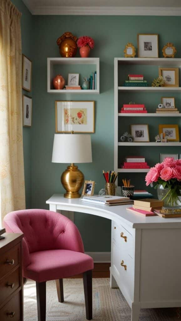
The materials and colors you choose for furniture have a direct impact on comfort and aesthetic. Opt for ergonomic chairs with upholstery options available in Pantone-matched fabrics. For instance, a soft blue or sage green seat can subtly reinforce your theme and mood.
Choose desks with smooth, matte finishes in neutral or light Pantone-inspired tones. Pair upholstered chairs and cushions that feel comfortable during long sessions without clashing with your main palette. Accent storage pieces using coordinated tones, such as light wood finishes with colored drawer fronts.
Velvet or high-quality wool upholstery enhances tactile comfort while supporting Pantone color schemes. Keep the workspace clutter-free by incorporating storage that blends with your chosen shades, helping maintain both organization and visual harmony.
Adding Gold Accents and Decorative Elements
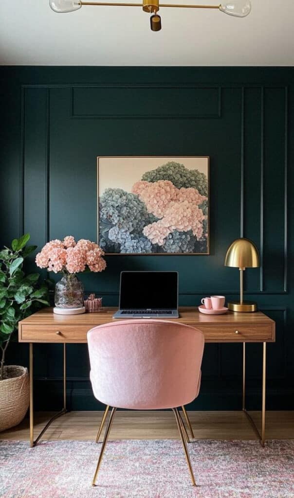
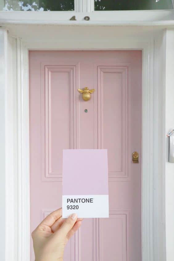
Gold accents can elevate a Pantone-themed workspace, adding warmth and a contemporary feel. Incorporate gold through desk lamps, picture frames, or drawer pulls to create a subtle yet sophisticated contrast against Pantone base colors.
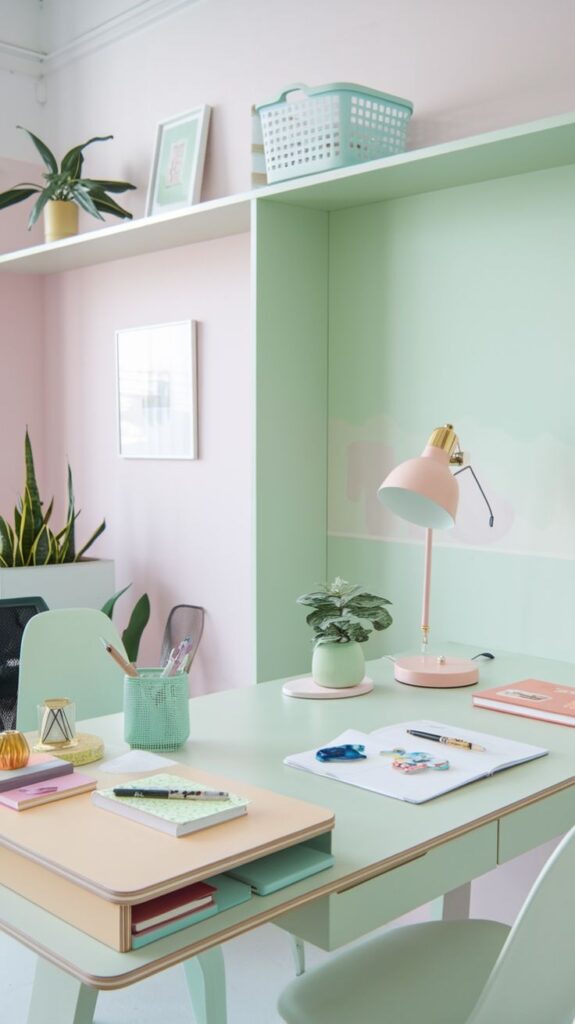
Use metallic organizers, pen holders, or even small statues to add visual interest. Gold pairs particularly well with both deep shades (such as classic blue) and lighter hues (like pastel pink or mint). Place gold-accented details sparingly to avoid an overwhelming look.
Mix gold with soft textiles, such as a Pantone-colored throw pillow with thin gold thread or edging. This keeps the space feeling refined and ties together the creative and productive atmosphere you want to achieve.
Integrating Pantone Home Office Ideas into Other Living Spaces
Pantone-inspired home office design elements can easily cross into other rooms for a harmonious interior. Focusing on color palettes, texture, and accent choices helps unify your living environment with visual flow and comfort.
Transitioning Design Elements to the Living Room
To bring Pantone office inspiration into your living room, start by using similar accent colors or focal pieces. If your home office features Peach Fuzz, try adding a pillow, throw, or wall art in the same shade to the living area. This creates subtle links between spaces.
Mixing Pantone colors, like Classic Blue or earthy tones, can add personality to modern or classic living rooms. Consider the following ideas:
- Area rugs that repeat office hues
- Coordinating curtains or bookshelves
- Throw blankets and decorative vases
Matching finishes or patterns—like metallic frames or geometric shapes—make the transition seamless. The goal is to create continuity without duplication, letting each space retain its own function and mood.
Creating a Cohesive Aesthetic with Bedroom and Shared Spaces
Carrying Pantone-driven design into bedrooms and shared spaces means rethinking how colors affect mood and relaxation. In a bedroom, Ultra Violet or Mocha Mousse can serve as either a calming wall color or a unifying accent in linens and decor.
For shared spaces such as hallways or dining rooms, apply Pantone’s key color as a subtle trim, or in artwork that echoes your home office style.
- Bedside lamps or cushions in coordinating Pantone shades
- Art prints and gallery walls that mirror the office color story
By repeating certain Pantone elements—whether it’s a signature color, a type of fabric, or a distinctive texture—you keep all your interior design choices connected. This makes your home feel both intentional and inviting without unnecessary repetition.
Embracing Future Trends in Pantone Home Office Design
Pantone’s direction for 2025 home office design centers on refined color choices, a growing emphasis on flexibility, and practical style. Incorporating these thoughtful updates keeps your workspace functional, relevant, and visually appealing.
Anticipating Upcoming Pantone Innovations
Each year, the Pantone Color Institute identifies key colors that influence office design. For 2025, Mocha Mousse is highlighted as a leading choice. This warm, adaptable shade creates a professional yet welcoming atmosphere, providing the right backdrop for productivity.
Current design trends show a move toward harmonizing earth tones, retro pastels, and muted colors influenced by media and pop culture. You’ll notice palettes inspired by recent films—think soft, sandy shades and deeper, “murky” colors for accent walls or furniture.
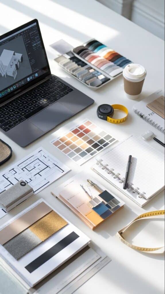
Pantone’s forecast tools—including guides like the FHI Color Specifier—make it easier to develop and communicate cohesive palettes. Using these resources helps keep your workspace fresh, and supports clear decision-making when selecting paint, furniture, or accessories.
Long-Term Style Adaptability
Creating a home office that adapts to changing styles starts with investing in timeless elements. Neutral Pantone tones, like Mocha Mousse, pair well with both new and classic accents. You can update small décor items—pillows, desk organizers, or wall art—without overhauling the entire room.
Flexible, modular furnishings fit evolving trends, allowing you to swap out colors or materials as new Pantone palettes emerge. Sustainable and ergonomic options are increasingly popular in home offices; these choices coordinate easily with most color forecasts.
A simple table to illustrate adaptable elements:
| Element | Adaptable Choice | Why It Works |
|---|---|---|
| Wall Color | Neutral Pantone shade | Matches evolving palettes |
| Desk Accessory | Swappable color accents | Easy seasonal updates |
| Furniture | Modular/Neutral finish | Supports style changes |
- 278shares
- Facebook0
- Pinterest278
- Twitter0
- Reddit0


