Color theory is a set of simple rules that helps designers choose colors that look good together. It explains how colors work, what feelings they can create, and how to mix them for eye-catching designs. Understanding color theory helps anyone create better visuals by making smart color choices.
Designers use different color schemes like complementary, triadic, and analogous to find combinations that balance well. Knowing these schemes makes it easier to create harmony and contrast in a design, so it feels clear and attractive.
This cheat sheet breaks down the basics of color theory into easy tips. It’s a handy guide for anyone who wants to improve their designs, whether for websites, print, or art projects.
Color Theory Fundamentals
Color theory helps designers choose and combine colors in ways that look good and make sense. It involves understanding the color wheel, the types of colors, and how colors change based on their qualities.
The Color Wheel

The color wheel is a circle that shows the relationship between colors. It was created to organize colors visually and make it easier to find combinations that work well.
The wheel is divided into segments representing colors arranged in a specific order. Colors next to each other on the wheel are called analogous colors and usually match well. Colors opposite each other are complementary and create strong contrast.
Using the color wheel, designers can plan palettes that either blend smoothly or stand out. It’s a basic tool every designer uses to understand how colors relate.
Primary, Secondary, and Tertiary Colors
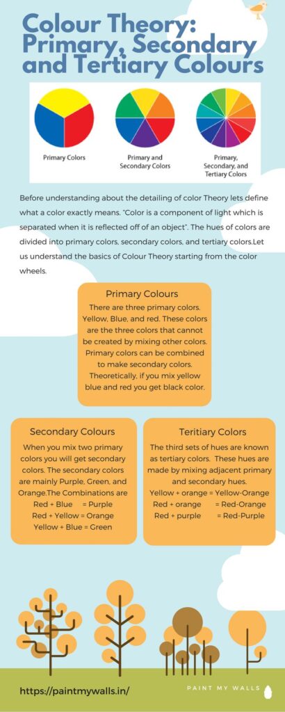
Colors on the wheel fall into groups based on how they are made.
- Primary colors are red, blue, and yellow. These cannot be made by mixing other colors.
- Secondary colors come from mixing two primary colors. They are green, orange, and purple.
- Tertiary colors are made by mixing a primary color with a nearby secondary color. Examples include blue-green and red-orange.
These groups help designers combine colors while keeping balance. Knowing these basics is useful when creating color schemes.
Hue, Saturation, and Brightness

Colors can change depending on three main qualities: hue, saturation, and brightness.
- Hue is the basic color type, like red or blue.
- Saturation measures how intense or pure a color is. High saturation means bright, clear color. Low saturation means the color looks dull or grayish.
- Brightness (or value) is how light or dark a color appears.
By adjusting these, designers can create colors that feel calm, exciting, or dark. These qualities allow more control over color choices beyond just picking a color from the wheel.
Core Color Harmonies
Color harmonies are built by combining colors in specific ways on the color wheel. These combinations create balance and interest in designs. Understanding how colors work together helps avoid clashing and makes visuals more pleasing.
Complementary Scheme
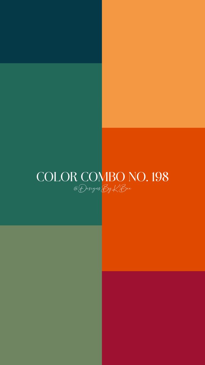

The complementary color scheme uses two colors directly opposite each other on the color wheel. For example, red and green or blue and orange. These pairs create strong contrast, which draws attention and makes elements stand out.
Designers often use one color as the main shade and the opposite as an accent. This keeps the design balanced and avoids overwhelming the viewer. Complementary schemes work well for bold and energetic looks but need careful use to prevent visual tension.
Analogous Scheme

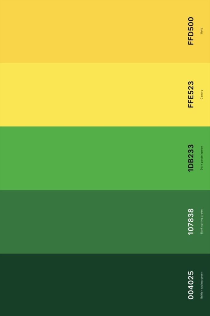
Analogous colors sit next to each other on the color wheel. An example is yellow, yellow-green, and green. These colors usually match well and create smooth, natural transitions in a design.
Because they are similar in hue, analogous schemes feel calm and harmonious. They are ideal for softer, less contrasting designs. The key is to pick one dominant color and use the others as support to keep the layout clear and easy on the eyes.
Triadic and Tetradic Schemes


Triadic schemes use three colors evenly spaced around the color wheel. An example is purple, green, and orange. These colors offer vibrant contrast while maintaining harmony.
Tetradic schemes combine two sets of complementary colors, forming a rectangle on the wheel, like blue, orange, red, and green. This creates rich, lively palettes but requires more skill to balance.
Both schemes give designs variety without losing unity. Designers usually choose one color to dominate and let the others enhance the look carefully.
Color in Design Practice
Color plays a key role in making designs work well. It helps guide the viewer’s eye, sets moods, and ensures the message is clear. Choosing the right colors requires careful thought about how they interact, what feelings they evoke, and how easy they are to see.
Choosing Color Palettes

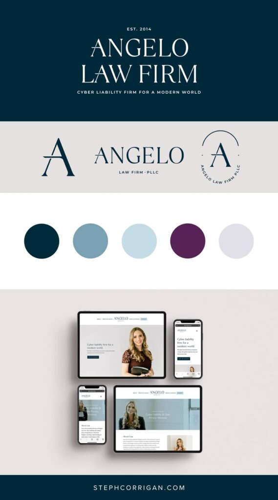
When designers pick color palettes, they often start with basic color schemes like complementary, analogous, or triadic colors. These schemes create balance and harmony.
Designers consider the project’s purpose before choosing colors. For example, a brand targeting kids might use bright and playful colors, while a law firm might use calm, professional tones like blue or gray.
It also helps to limit the palette to three or four colors. This keeps designs simple and avoids clutter. Sometimes, designers use a main color and add shades or tints of it to create variety without losing cohesion.
Color Psychology
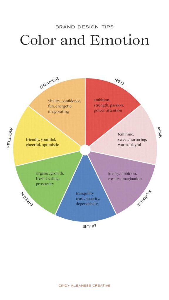
Colors can trigger different emotions in people. For example, red often feels energetic or urgent. Blue is usually calming and trustworthy. Yellow can feel cheerful but might also cause anxiety if overused.
Designers use these feelings carefully to support the message. If a campaign wants to make people feel safe, designers might choose blue or green.
Understanding these effects can improve how people respond to the design. It’s not just about pretty colors—it’s about connecting with the audience on an emotional level.
Accessibility and Contrast
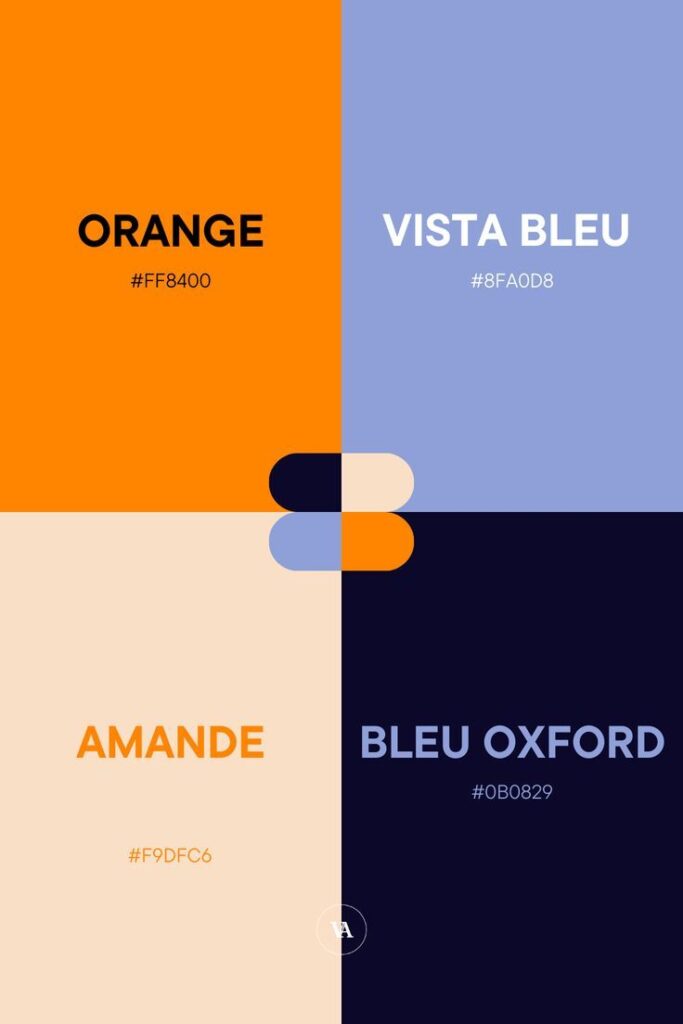

Making sure colors work for everyone is important. Some people have difficulty seeing certain colors or differences between them. Designers check the contrast between text and backgrounds to ensure readability.
Tools like contrast checkers help designers meet accessibility standards. Good contrast means dark text on a light background or vice versa.
Using color alone to show important information can be risky. Designers often add shapes, patterns, or labels to help people who can’t rely on color. This makes designs usable for more people.
- 4.2Kshares
- Facebook0
- Pinterest4.2K
- Twitter0
- Reddit0


