In today’s data-driven world, dashboard design plays a critical role in how organizations understand and act on information. A well-designed dashboard transforms complex data into accessible insights, allowing you to make informed decisions quickly and effectively. Whether you’re creating dashboards for business intelligence, personal productivity, or customer-facing applications, the principles of good design remain consistent.
Effective dashboard design balances visual appeal with functional clarity, presenting only the most relevant information in a way that’s immediately understandable to your target audience. This balance isn’t achieved by accident—it requires intentional choices about layout, color schemes, typography, and visualization types that work together to tell a coherent data story without overwhelming the user.
Your dashboard should serve as a communication tool that answers key questions at a glance. By following established design principles and best practices, you can create dashboards that not only look professional but also drive meaningful action. The difference between a mediocre dashboard and an exceptional one often comes down to thoughtful design decisions that prioritize user needs over unnecessary complexity.
Understanding Dashboard Fundamentals
Before diving into advanced dashboard design techniques, it’s essential to grasp the core principles that make dashboards effective communication tools. Dashboards serve as visual interfaces that transform complex data into actionable insights through deliberate design choices.
Defining a Dashboard
A dashboard is a visual display of key information needed to achieve specific objectives, consolidated on a single screen for quick monitoring. Dashboards distill complex data into easily digestible visual elements that enable users to understand performance at a glance.
Effective dashboards organize related metrics together and use appropriate visualizations to represent different types of data. You should consider three primary dashboard types when planning your design:
- Operational dashboards track real-time performance and immediate actions
- Analytical dashboards focus on trends, comparisons, and deeper analysis
- Strategic dashboards monitor key performance indicators against business goals
The most successful dashboards maintain clarity by limiting content to only the most relevant metrics. You’ll want to avoid the common pitfall of overcrowding, which can confuse users and dilute the dashboard’s purpose.
The Importance of Dashboard Design
Dashboard design directly impacts how effectively users can interpret and act on data. When designed properly, dashboards reduce cognitive load and accelerate decision-making processes.
Poor dashboard layout creates friction between users and information, potentially leading to missed insights or incorrect interpretations. You need to pay attention to visual hierarchy, using size and position to guide users to the most critical information first.
Color choices matter significantly in dashboard design. Use color purposefully to:
- Highlight important metrics requiring attention
- Group related information visually
- Create consistent meaning across the dashboard
The arrangement of elements should follow logical patterns that mirror how users think about their data. Consider user workflow when determining dashboard layout, placing frequently accessed information in prominent positions.
Testing your dashboard with actual users provides invaluable feedback on its effectiveness. You should iterate your design based on how users actually interact with the interface rather than assumptions about what they need.
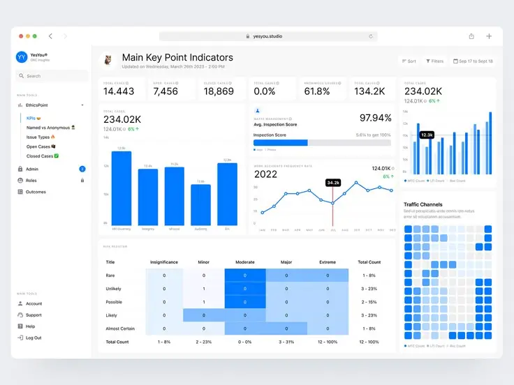
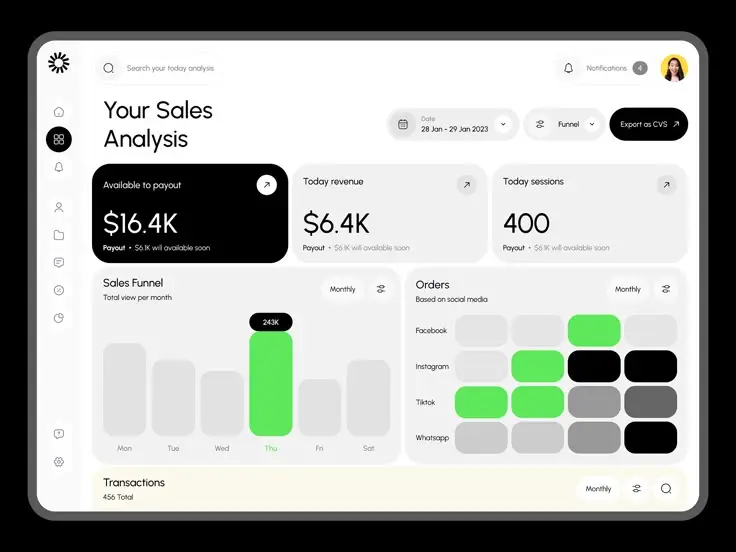
Design Principles for Effective Dashboards
Effective dashboards transform complex data into actionable insights through thoughtful visual design. Successful implementations balance visual clarity with information density, ensuring users can quickly extract meaningful patterns without becoming overwhelmed.
Applying Color and Contrast
Color selection dramatically impacts dashboard effectiveness. Choose a limited palette of 3-5 colors that align with your brand while ensuring sufficient contrast for readability.
Reserve bright, saturated colors for highlighting critical metrics or anomalies. Soft, neutral tones work best for background elements and secondary information.
Apply color consistently to represent specific data categories or value ranges. Color-coding similar elements creates intuitive visual patterns that users quickly comprehend.
For accessibility, never rely solely on color to convey information. Always pair color distinctions with additional visual cues like patterns, labels, or icons to accommodate color-blind users.
Test your color choices against different backgrounds to ensure adequate contrast ratios. Text elements should maintain a contrast ratio of at least 4.5:1 against their backgrounds for optimal readability.
Prioritizing Alignment and Hierarchy
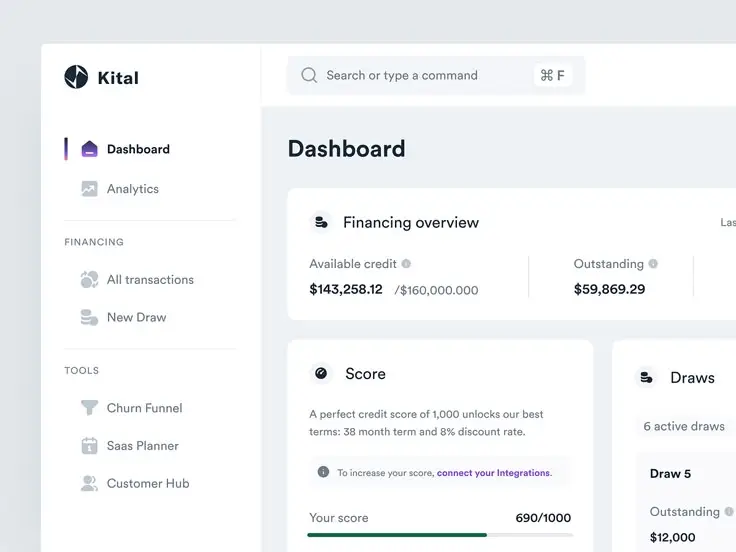
Organize dashboard elements along invisible grid lines to create visual order. Consistent alignment reduces cognitive load and helps users navigate complex information efficiently.
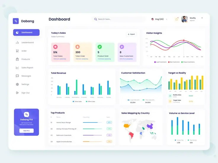
Establish clear visual hierarchy by sizing elements according to their importance. The most critical metrics should command immediate attention through prominent placement and larger display.
Group related information visually using proximity, shared backgrounds, or borders. This spatial organization helps users understand relationships between different data points.
Consider the natural reading patterns of your audience (left-to-right, top-to-bottom for Western users) when arranging dashboard elements. Place high-priority items where eyes naturally land first.
White space isn’t wasted space—it’s essential for creating separation between distinct information groups and preventing visual clutter that can overwhelm users.
Consistency and Repetition
Maintain consistent formatting for similar elements throughout your dashboard. When charts, labels, and interactive controls share visual properties, users develop familiarity that speeds comprehension.
Standardize your visualization types for comparable metrics. If you use bar charts for one set of comparative data, use the same chart type for similar comparisons elsewhere.
Repeat visual patterns and color schemes to reinforce meaning. Users learn these visual shorthand cues, enabling faster information processing with each dashboard interaction.
Establish and follow clear guidelines for typography. Limit your dashboard to 2-3 font families, using variations in weight and size rather than different fonts to indicate importance.
Document your design decisions in a simple style guide. This ensures consistency across multiple dashboards and makes future updates more efficient.
Strategic Use of Labels and Size
Apply clear, concise labels that directly communicate what each visualization represents. Avoid technical jargon and abbreviations that might confuse non-specialist users.
Size visualizations proportionally to their importance. Your most critical KPIs deserve the largest real estate, while supporting metrics can appear in smaller formats.
Use direct labeling within charts when possible rather than separate legends. This reduces eye movement and speeds comprehension by placing information exactly where it’s needed.
Consider these label placement guidelines:
- Horizontal labels are easier to read than vertical or diagonal text
- Place axis labels outside the data area to prevent clutter
- Use consistent terminology across all labels
Implement responsive sizing that adapts to different screen dimensions. Test your dashboard across multiple devices to ensure critical information remains visible regardless of display size.
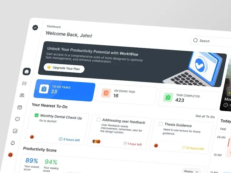

Selecting the Right Components and Tools
Dashboard effectiveness hinges on selecting appropriate visual components and implementing them with the right tools. The right choices will simplify data interpretation and enhance overall user experience.
Choosing Components for Dashboard Utility
Selecting the right visual elements is crucial for creating functional dashboards. Charts and graphs should match your specific data types and user needs. Bar charts work well for comparisons, while line charts effectively display trends over time.
Consider using gauges and meters for key performance indicators that have defined ranges or targets. These provide quick visual feedback on current status against goals.
Tables remain valuable when users need to see precise values, but avoid overwhelming dashboards with dense grids of numbers. Instead, highlight key metrics and use conditional formatting to draw attention to important data points.
Heat maps and scatter plots can display correlations between variables more effectively than tables or basic charts. For geographic data, maps with color overlays provide intuitive spatial context.
Remember that white space is also a critical component. Cluttered dashboards confuse users, so maintain breathing room between elements.
Tools to Enhance Dashboard Creation
Modern dashboard creation tools offer varying capabilities to suit different project needs. Full-featured business intelligence platforms like Tableau, Power BI, and Qlik provide comprehensive solutions with robust data connection options and extensive visualization libraries.
For web-based dashboards, frameworks such as D3.js offer tremendous flexibility but require more technical expertise. Simpler options like Google Data Studio or Looker provide user-friendly interfaces with drag-and-drop functionality.
Consider these factors when selecting tools:
- Data connectivity: Ensure the tool connects easily to your data sources
- Customization options: Look for flexibility in visual styling and layout
- Collaboration features: Check if multiple team members can work together
- Publishing capabilities: Verify that dashboards can be shared appropriately
Cloud-based solutions often provide better scalability and accessibility across devices. Many tools now incorporate AI-powered features that can suggest optimal visualizations based on your data structure.
For specialized needs, industry-specific dashboard tools may offer pre-built templates and components designed for particular use cases.
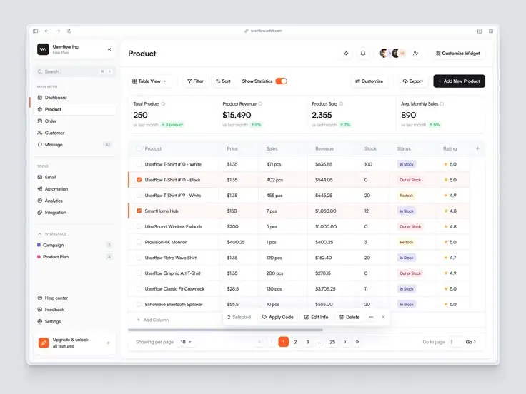
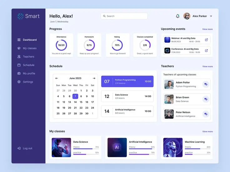
Visual Encoding and Data Representation
Visual encoding transforms raw data into graphical elements that users can quickly interpret. Thoughtful representation choices significantly impact how effectively viewers absorb and understand information on your dashboard.
Effective Use of Color Schemes
Color serves as one of the most powerful encoding tools in dashboard design. Your color palette should be purposeful rather than decorative. Choose color schemes that support data interpretation—use sequential colors for numerical ranges, diverging colors to highlight deviations from a midpoint, and categorical colors for distinct groups.
Ensure accessibility by selecting color combinations with sufficient contrast. When displaying critical metrics, consider using red for negative values and green for positive ones, but be mindful of cultural differences in color interpretation.
Best practices for color use:
- Limit your palette to 5-7 colors to avoid overwhelming viewers
- Maintain consistency across related visualizations
- Consider color-blind friendly options when possible
- Use intensity to represent data magnitude
Incorporating Visual Encoding Techniques
Visual encoding extends beyond color to include position, size, shape, and orientation. Position is your most precise encoding method—users interpret data points along an axis more accurately than they compare sizes or colors.
Line charts effectively encode continuous data, showing trends over time. For geographic data, choropleth SVGs allow you to encode values through color intensity across regions.
Match encoding techniques to data types:
| Data Type | Recommended Encodings |
|---|---|
| Categorical | Color, shape, position |
| Numerical | Position, length, size |
| Temporal | Position (x-axis), connecting lines |
When designing complex dashboards, layer your encodings thoughtfully. Position should encode your most important variables, with secondary encodings like color and size supporting additional dimensions.
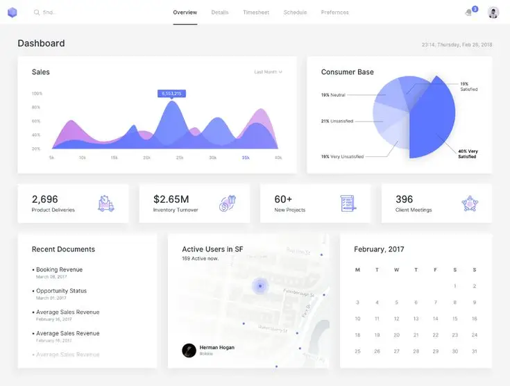
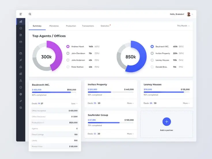
Dashboard Layout and Platform Considerations
Dashboard layout directly impacts user comprehension and efficiency. Effective layouts prioritize critical information with easy scanning patterns and adapt seamlessly across different devices and platforms.
Designing for Different Platforms
When creating dashboards, consider how your design will appear across various platforms. Desktop dashboards can display more information simultaneously, while mobile interfaces require simplified layouts with focused metrics.
Responsive design principles are essential for multi-platform dashboards. Use flexible grid systems that allow content to resize and reorder based on screen dimensions. Many platforms, including Splunk Dashboard Studio, offer responsive templates that automatically adjust to different screen sizes.
For touch interfaces, ensure interactive elements are appropriately sized (at least 44×44 pixels) and well-spaced to prevent accidental selections. Consider platform-specific interactions like swipe gestures on mobile or hover states on desktop.
Test your dashboard on actual devices rather than just browser simulations. This reveals real-world performance issues and interaction problems that might not be apparent during development.
Setting Thresholds and Dashboards Metrics
Thresholds transform raw data into actionable insights by providing visual cues when metrics cross predetermined boundaries. In Splunk dashboards, you can establish color-coded thresholds that instantly communicate status.
Common threshold indicators include:
- Green: Normal/good performance
- Yellow: Warning level
- Red: Critical issues requiring immediate attention
Threshold settings should reflect business requirements rather than arbitrary numbers. Consult stakeholders to determine meaningful boundaries that align with organizational goals and operational needs.
Consider using dynamic thresholds that adjust based on historical patterns rather than static values. This approach accounts for expected fluctuations and highlights genuine anomalies more effectively.
Implement progressive disclosure techniques where detailed threshold information appears on demand. This keeps the interface clean while allowing users to access specific threshold details when needed.
- 2.0Kshares
- Facebook0
- Pinterest2.0K
- Twitter3
- Reddit0

