A moving illustration can hold a visitor's attention, but the clip can also hide the drawing that made the project worth opening. In a portfolio, show the finished still first or beside a short motion study. Then explain what moved, what stayed fixed, and what the experiment reveals about the original composition. That gives a viewer two ways to judge the work: the image at their own pace, and the design choices that unfold over time.
This is a presentation decision as much as a production one. If you need the generation steps, our guide to preparing an illustration for motion covers the source file and style checks. Here the question is what deserves to appear on the portfolio page once you have both versions.
Let the still establish the work
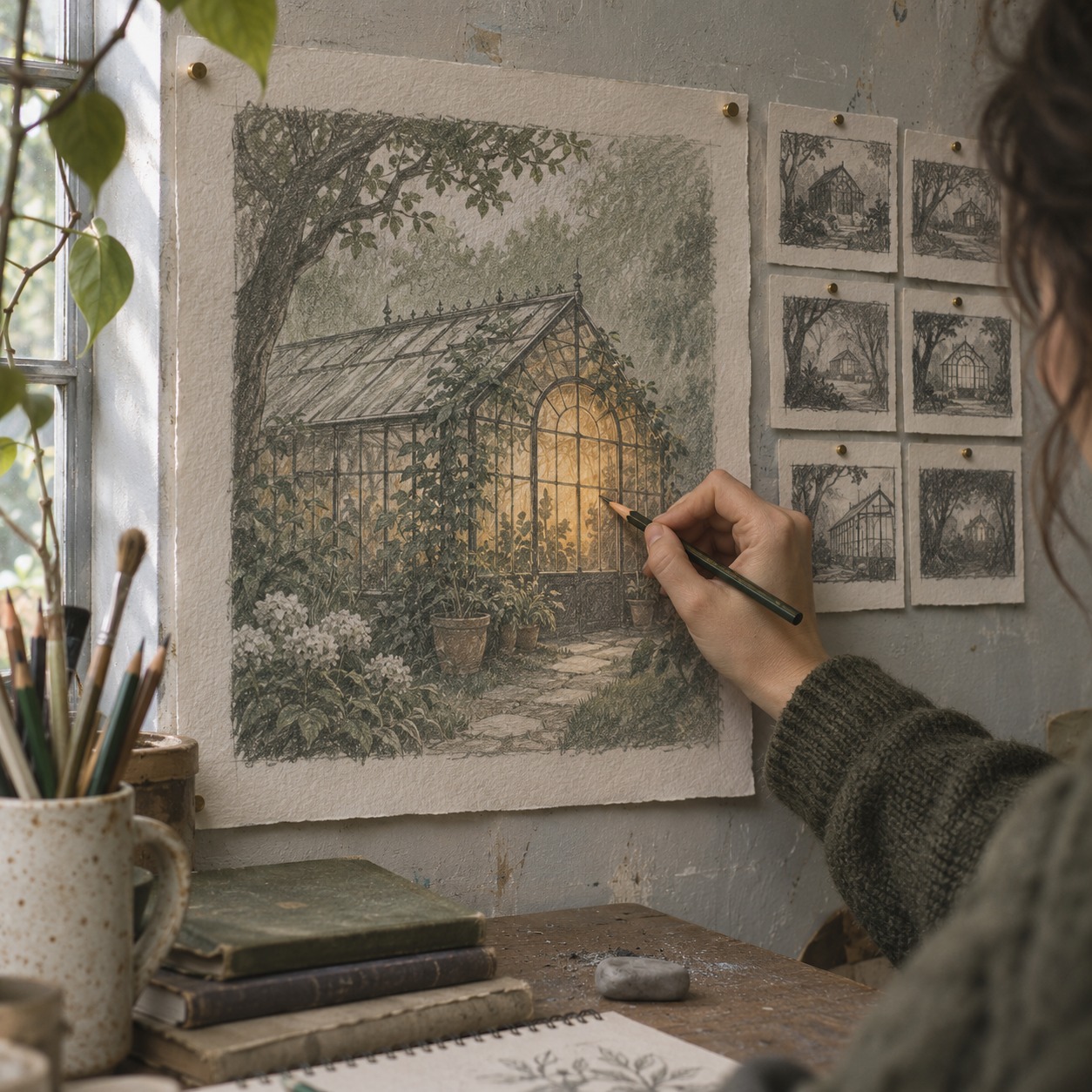
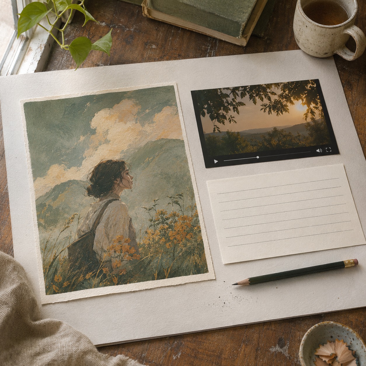
An illustration has a particular way of welcoming the eye. A bright shape provides an entrance, a curve leads towards the subject, and a quieter area gives the composition room to breathe. When that illustration becomes a video, the designer gains another material to work with: time. The still should remain available because it lets the visitor see those relationships without waiting for a clip to finish.
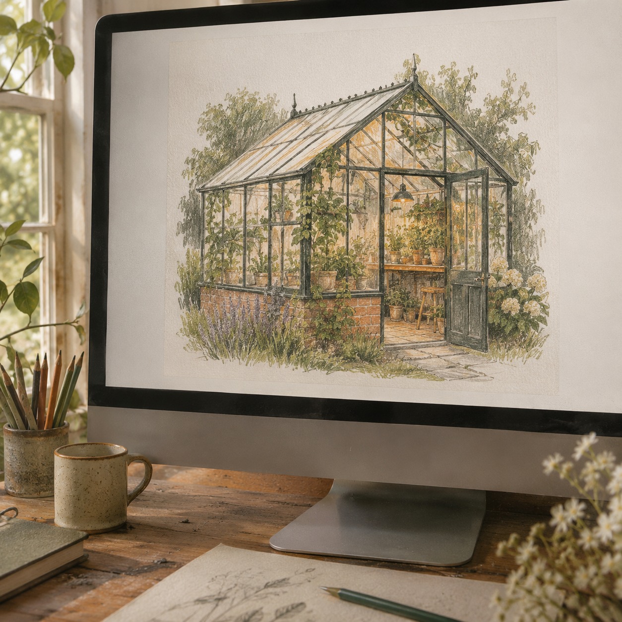
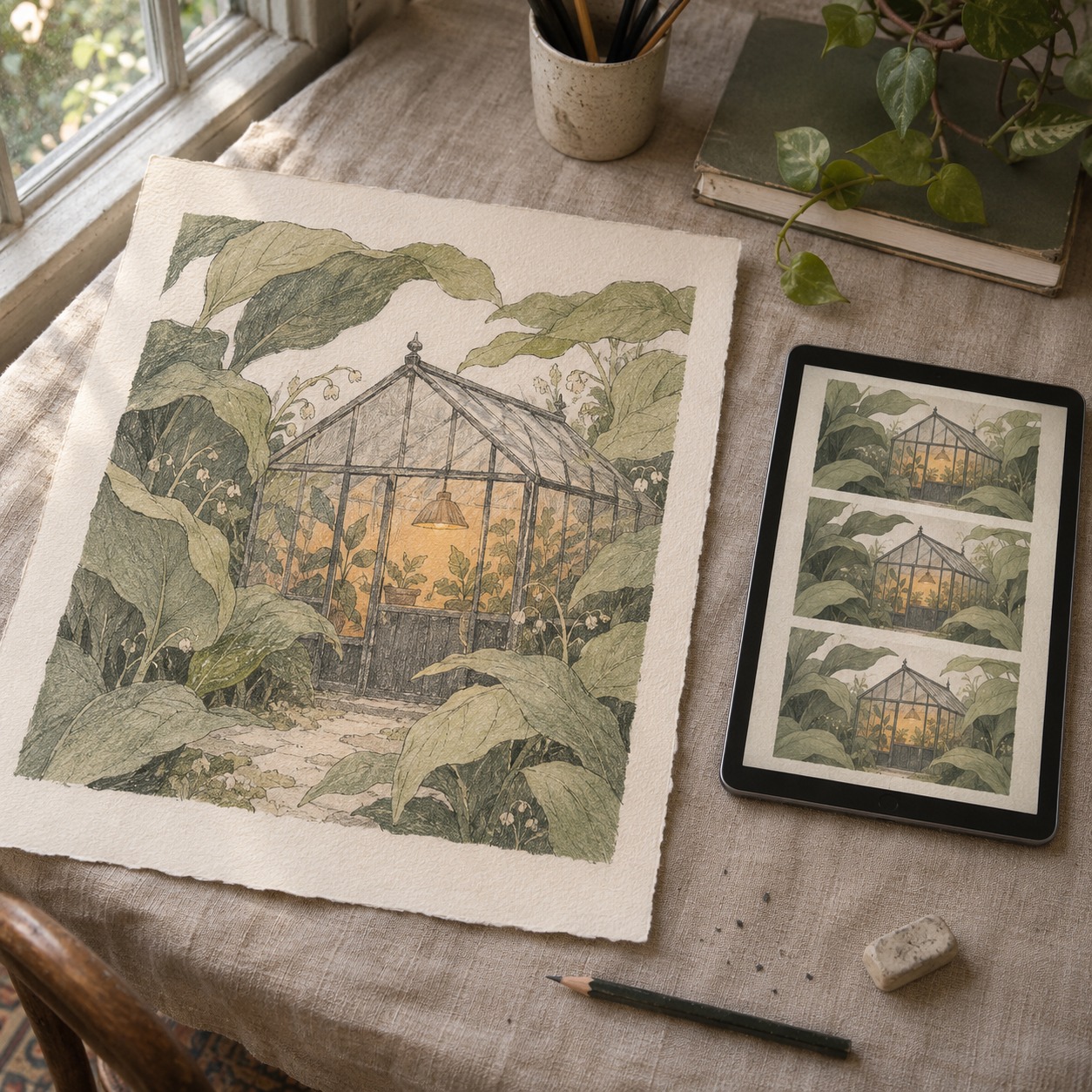
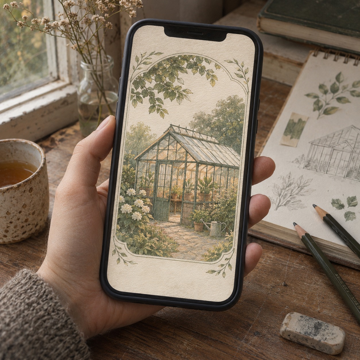
Imagine an illustration of a small greenhouse surrounded by oversized leaves. The warm window is the first thing you notice. On a project page, place the complete still where its shape, color, and crop are easy to inspect. Put the motion study next or immediately below it. A moving thumbnail may attract attention in a grid, but it should lead to a project page that shows the original artwork clearly.
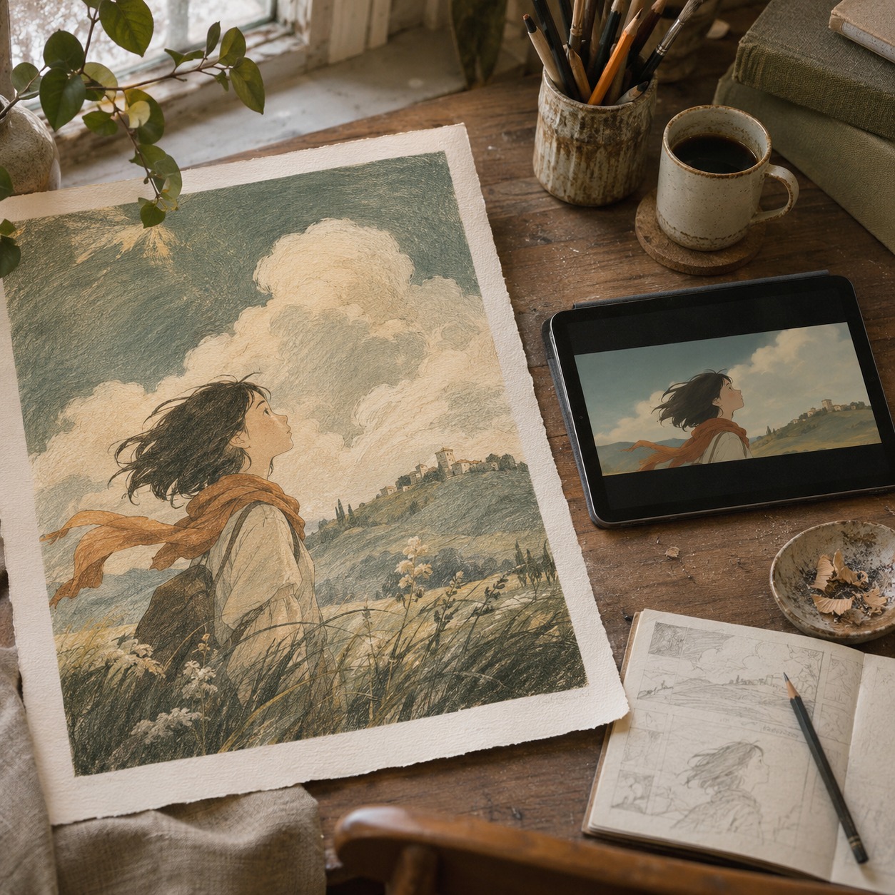
If the clip opens on a close-up leaf and reveals the greenhouse later, that is a different reading of the image. It may suit a longer case study. If the portfolio grid has to explain the work at a glance, a steady opening frame with the window already visible is easier to parse. Neither version is automatically better; choose the one that fits where it will be seen.
Decide what the eye should follow
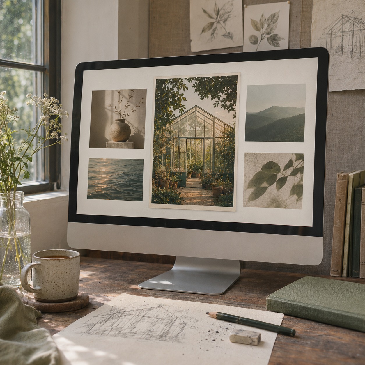
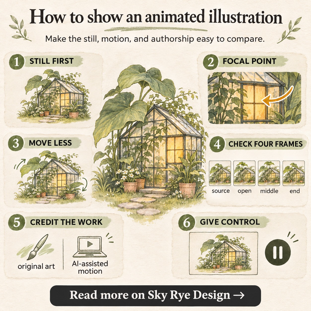
Before animating, write a one-sentence attention plan: “The viewer sees the warm window first, then notices a slight leaf movement at the edges.” This is more useful than “make the scene feel alive.” It names the focal point, the secondary motion, and the intended order.
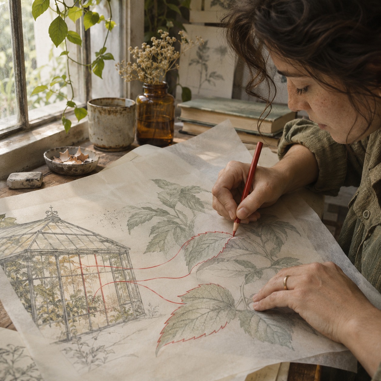
In the greenhouse scene, keep the window's position and brightness stable. Let one or two leaves move gently. A shadow can cross the path toward the greenhouse if it reinforces the same reading. If a new movement pulls the eye away from the window, remove it or delay it. The original hierarchy is a useful test for every motion choice.
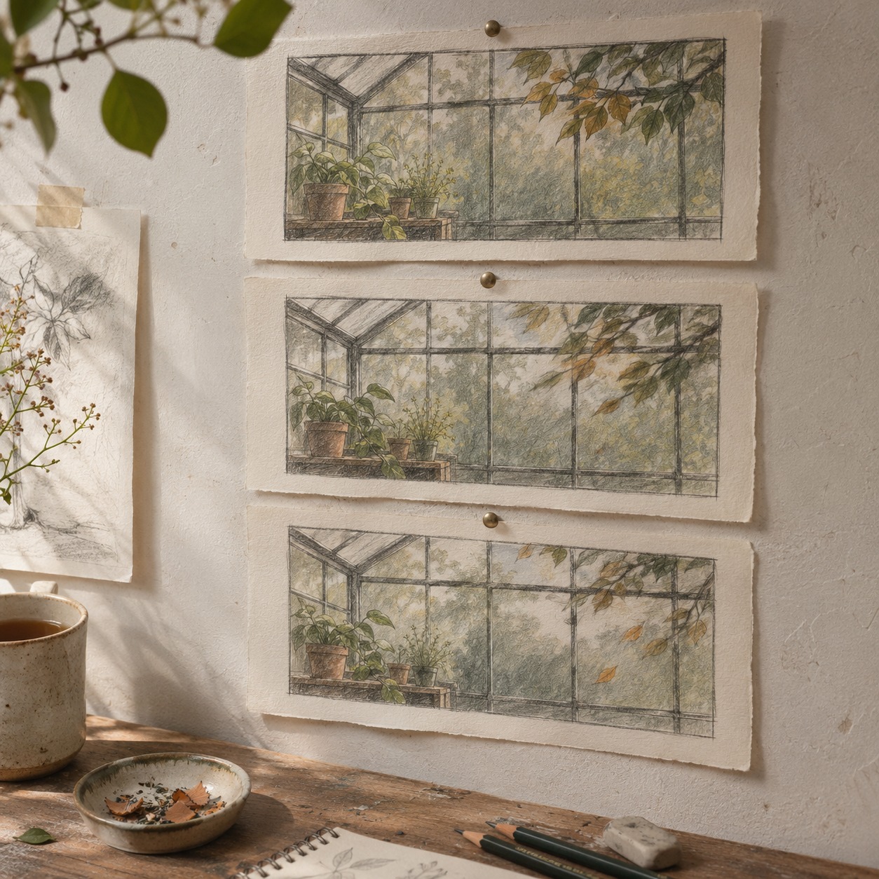
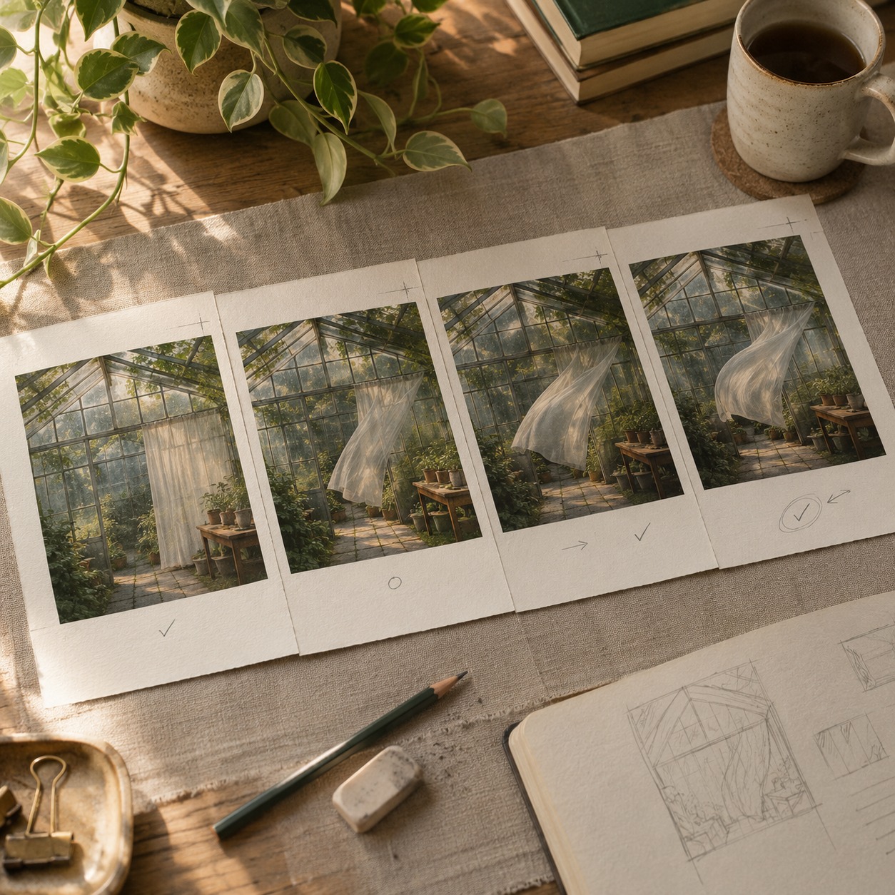
You can check a candidate without technical scoring. Watch it once at normal size without pausing. Ask where your eye goes first. Then pause at the opening, middle, and final frames. If the most important shape changes size, color, or silhouette, the clip may be telling a different story from the still.
Keep texture and edges recognizable
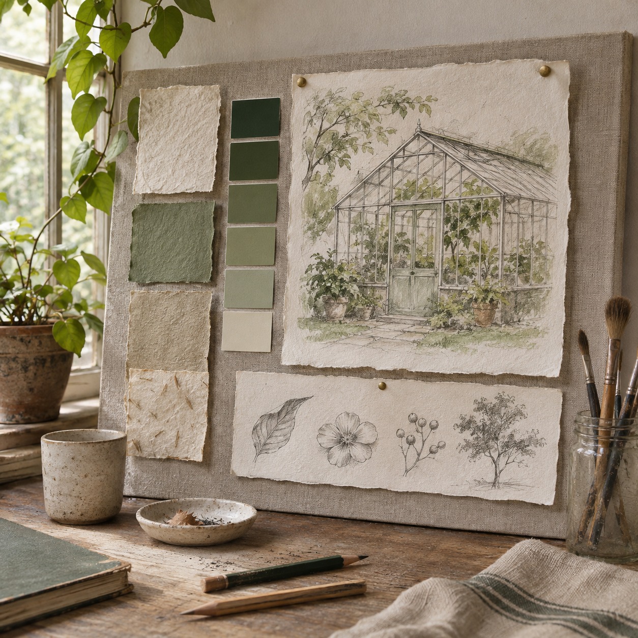
A rough pencil line has a different identity from a polished render. If motion smooths the marks into plastic surfaces, the experiment may no longer represent the illustration. Give the moving study a short preservation note: retain the paper grain, irregular contours, flat color areas, and the exact silhouette of the greenhouse. These are visual checks, not a promise that a generator will obey every instruction.
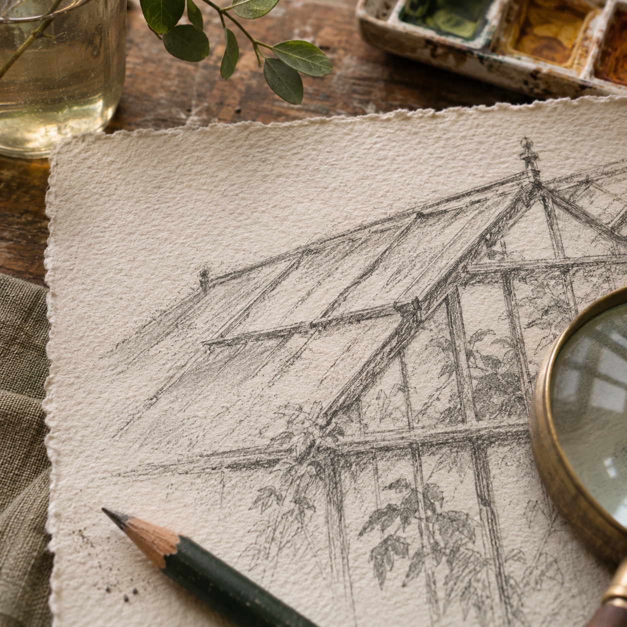
The frame has edges for a reason. A sideways camera move may expose scenery that was never drawn. A slow approach can also enlarge the greenhouse until the leaves no longer frame it. For this image, a fixed camera and a small change in atmosphere may preserve more of the original design than a panoramic move. If the camera must travel, let it follow an existing line in the composition and stop before the crop loses its balance.
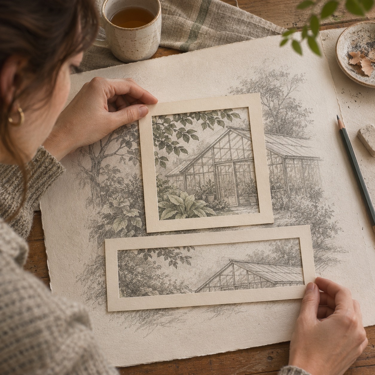
Compare four images side by side: source illustration, opening frame, middle frame, and final frame. Look at line weight, the window's color, leaf shapes, and negative space. This makes style drift easier to see than scrubbing back and forth through a video. The broader AI video workflow for designers can help when the motion study becomes part of a larger campaign or presentation.
What the Seedance 3.0 label means here
The source article refers to seedance 3.0 as an image-to-video option. The linked site uses that name, but the official ByteDance model list checked for this article shows Seedance 2.5 and does not list a 3.0 release. Treat the name and any feature claims on the linked service as something to verify before you use it for client work. The portfolio method here applies to a short image-to-video study regardless of the service used.
Build a case study that explains the decision
A useful project page can be short. Lead with the finished illustration. Follow with the moving study, then a small set of frames or one comparison image if the change is subtle. Finish with a caption that says what was original, what was generated, and what you selected or edited. For example: “Original greenhouse illustration and art direction by the illustrator. AI-assisted motion study: gentle leaf movement and a stable camera. Final clip chosen for its preserved line texture and focal point.” Use only the roles that match the actual project.
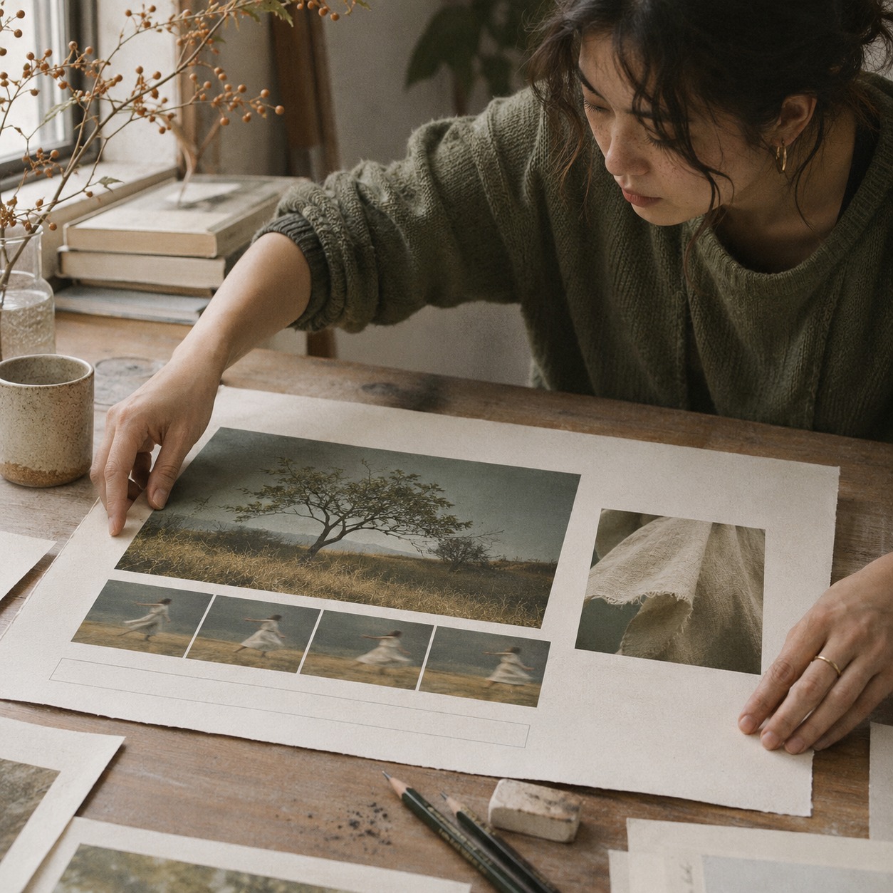
That caption does more than name a tool. It helps a prospective client see which decisions belong to the artist. It also prevents the clip from implying that the generated frames were all hand-drawn. If you need ideas for the surrounding project structure, these portfolio case-study examples show different ways to organize work and process.
| Placement | What to show first | What the motion should do | What the viewer still needs |
|---|---|---|---|
| Portfolio grid | A clear still or poster frame | Signal that a moving version exists | A route to the full project |
| Project page | Original illustration | Reveal one deliberate motion choice | A caption naming the source and your role |
| Presentation or pitch | The full still, then the clip | Give the audience time to compare | A return to the still for questions |
The poster frame matters. If it shows a distorted mid-motion moment, the project may look weaker before playback begins. Choose a frame that reads as an illustration on its own. Test the page on a phone as well as a desktop; fine movement and pencil grain may disappear at thumbnail size.
Give the viewer control over motion
Do not require a visitor to watch the video to understand the artwork. Keep the still visible, make playback easy to stop, and avoid several moving tiles competing on one screen. The W3C guidance on pause, stop, and hide states that automatically starting movement lasting more than five seconds alongside other content needs a mechanism to pause, stop, or hide it, except when the movement is essential. A still poster frame also gives people who prefer less motion a way into the project.
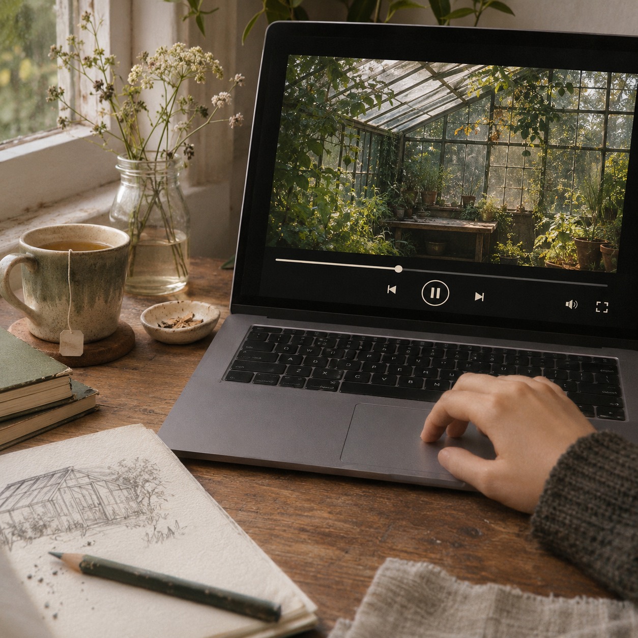
For a silent loop, inspect the join between the first and last frames. A sudden change in brightness or position becomes more obvious after a few repeats. If the loop cannot close cleanly, let the clip end and offer replay instead of forcing a jump. The aim is to leave room for looking.
A final portfolio check
Before adding the motion study, answer five questions:
- Can someone understand the original illustration without pressing play?
- Does the first moving frame preserve its focal point and crop?
- Do line texture, key colors, and silhouettes hold from start to finish?
- Does the caption separate the original artwork from generated or edited motion?
- Can the viewer pause the clip and return to the still?
If the answers are clear, motion adds evidence of your design thinking. If they are not, the still may be the stronger portfolio piece for now. Explore the animation guides for other ways to make movement serve the drawing.
- 0shares
- Facebook0
- Pinterest0
- Twitter0
- Reddit0