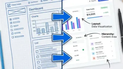
UI design patterns are key building blocks for creating effective user interfaces. They help designers solve common problems and create intuitive experiences for users. Good UI patterns make apps and websites easier to use.
Knowing essential UI design patterns can greatly improve a designer’s skills and the quality of their work. These patterns have been tested and refined over time. They give designers proven solutions to apply across different projects. Learning them helps create better digital products faster.
1) Modal Dialogs
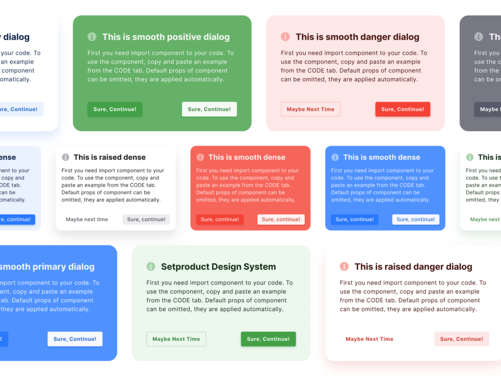
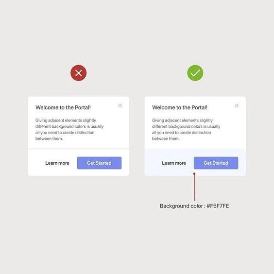
Modal dialogs are pop-up windows that appear on top of the main content. They grab the user’s attention and require action before returning to the main screen. These dialogs are useful for important messages, confirmations, or quick tasks.
Designers use modal dialogs to focus users on specific information or actions. They often have a dimmed background to highlight the pop-up window. This helps users understand they need to interact with the dialog before moving on.
Modal dialogs should be used sparingly. Too many can annoy users and disrupt their flow. It’s best to save them for critical interactions or information that can’t wait.
When designing modal dialogs, keep them simple and clear. Use concise text and obvious buttons. Make sure users can easily close the dialog if needed.
Modal dialogs work well for login forms, error messages, and confirmation prompts. They can also display additional details without leaving the current page. This keeps users in context while completing necessary tasks.
2) Hamburger Menu
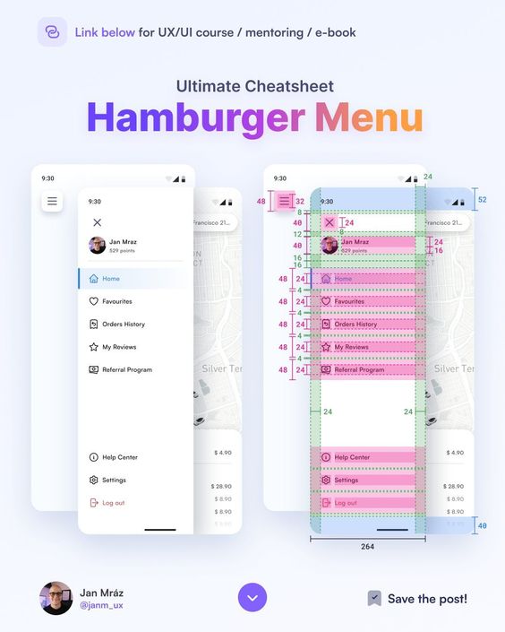
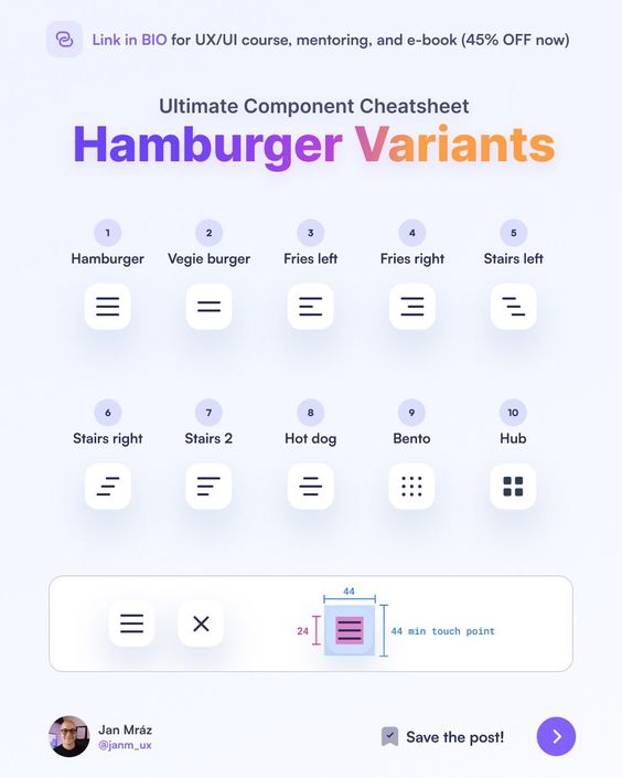
The hamburger menu is a widely recognized UI design pattern. It consists of three horizontal lines stacked on top of each other, resembling a hamburger. This icon is typically placed in the top corner of a mobile app or website.
When users tap or click the hamburger icon, it reveals a hidden menu. This menu contains navigation options and other important links. The hamburger menu helps save screen space, especially on mobile devices with limited real estate.
Many popular apps and websites use this pattern. It allows designers to keep the main interface clean and uncluttered. At the same time, it provides easy access to additional content and features.
Some designers argue that the hamburger menu can hide important navigation options. This may lead to lower discoverability and engagement. As a result, some apps now use alternative navigation patterns.
Despite criticisms, the hamburger menu remains a common UI element. It offers a simple solution for organizing complex navigation structures. Designers should consider their specific app or website needs when deciding whether to use this pattern.
3) Infinite Scrolling
Infinite scrolling is a UI design pattern that loads content continuously as users scroll down a page. It eliminates the need for pagination buttons. This pattern is common on social media platforms and news websites.
Infinite scrolling keeps users engaged by providing a seamless browsing experience. It works well for content-heavy sites with lots of information to display. Users can effortlessly explore large amounts of data without clicking through multiple pages.
This pattern can increase time spent on a site and improve user retention. It’s particularly effective on mobile devices, where screen space is limited. Users can simply swipe to load more content, making navigation easier.
Despite its benefits, infinite scrolling isn’t suitable for all websites. It can cause issues with finding specific content or returning to a previous spot. Some users may feel overwhelmed by the endless stream of information.
Designers should consider their site’s goals and user needs when deciding to implement infinite scrolling. They should also include visual cues to indicate when new content is loading. A “back to top” button can help users navigate long pages more easily.
4) Progress Indicators
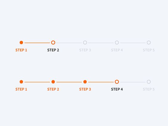
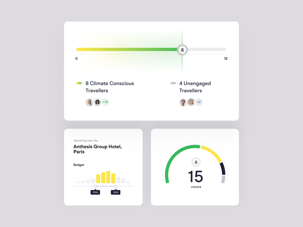
Progress indicators show users how much of a task has been completed. They help reduce uncertainty and anxiety during wait times. These visual cues let people know the system is working.
There are two main types of progress indicators: determinate and indeterminate. Determinate indicators show the exact percentage of completion. They work well for tasks with a known duration.
Indeterminate indicators don’t show specific progress. They’re used when the total time is unknown. These often appear as spinning wheels or loading bars that animate continuously.
Progress indicators should be placed near the action that triggered them. This creates a clear connection between the user’s input and the system’s response.
Designers can enhance progress indicators with additional information. Estimated time remaining or number of steps left can provide more context. This extra detail helps set accurate expectations for users.
Color and animation can make progress indicators more engaging. But it’s important to keep them simple and easy to understand at a glance.
5) Pull to Refresh
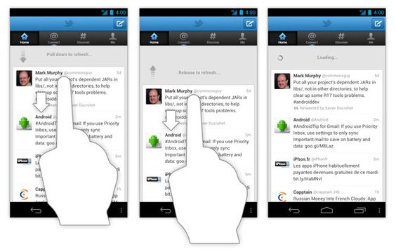
Pull to Refresh is a popular UI design pattern used in mobile apps. It lets users update content by pulling down on the screen with their finger. This action triggers a refresh of the displayed information.
The pattern started with Twitter’s mobile app in 2010. It quickly spread to other apps and became a standard feature. Users find it intuitive and easy to use.
Pull to Refresh works well for apps with frequently changing content. News apps, social media feeds, and email clients often use this pattern. It gives users control over when they want to see new information.
The visual feedback is an important part of Pull to Refresh. As users pull down, they usually see an animation or icon. This shows that the refresh action is in progress. Once the new content loads, the screen updates automatically.
Designers should consider a few things when using Pull to Refresh. The gesture should be smooth and responsive. The refresh indicator should be clear and match the app’s style. It’s also good to show when the content was last updated.
6) Skeleton Screens
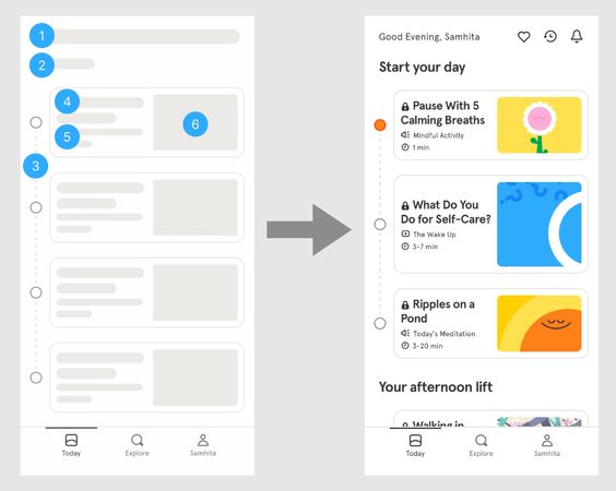
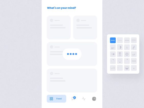
Skeleton screens are UI design patterns that show a simplified layout of a page while content loads. They use placeholder shapes to represent where text, images, and other elements will appear.
These screens give users a preview of the page structure before the actual content arrives. This helps reduce perceived loading times and keeps users engaged during short waits.
Designers often use gray boxes or lines to create the skeleton layout. As data loads, the placeholders are replaced with real content. This creates a smooth transition effect.
Skeleton screens work well for content-heavy pages like social media feeds, product listings, or article pages. They’re especially useful on slower internet connections.
When designing skeleton screens, it’s important to match the general layout of the final page. This prevents jarring visual shifts as content loads in.
Some apps use animated skeleton screens with subtle movement or fading effects. This can make the loading process feel more dynamic and responsive to users.
7) Off-Canvas Panels
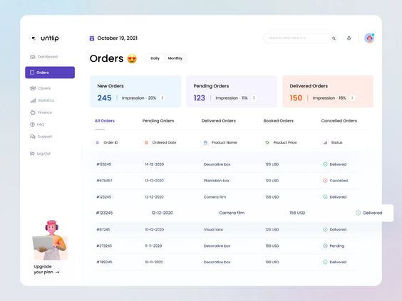
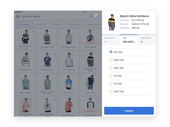
Off-canvas panels are hidden sections of a website that slide into view when needed. They are often used for menus, search bars, or additional content. These panels save screen space on smaller devices.
Designers use off-canvas panels to keep the main content area clean and uncluttered. When users tap a button or icon, the panel appears from the side of the screen. This creates a smooth transition and keeps users focused on the main content.
Off-canvas panels work well for mobile designs. They allow designers to hide large menus or extra features without removing them completely. Users can easily access these hidden elements when they need them.
Some common uses for off-canvas panels include navigation menus, shopping carts, and user profiles. They can also display settings, filters, or related content. This pattern helps create a more organized and user-friendly interface.
When designing off-canvas panels, it’s important to make them easy to open and close. Clear icons or labels help users understand how to access the hidden content. The panel should also be visually distinct from the main content area.
8) Form Validation Patterns
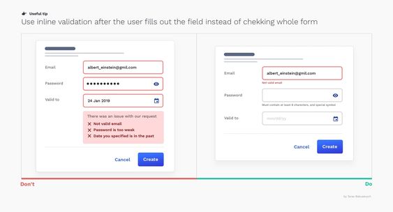
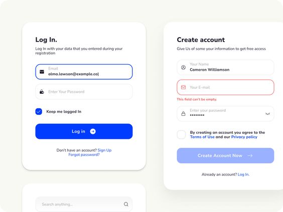
Form validation patterns help designers create user-friendly and error-free input experiences. These patterns guide users as they fill out forms and provide feedback on their entries.
One common pattern is inline validation. This checks user input in real-time and shows instant feedback. It can highlight errors or confirm correct entries as the user types.
Another useful pattern is field masking. This automatically formats input like phone numbers or credit card details. It makes it easier for users to enter information correctly.
Error messages are a key part of form validation. Clear, specific messages help users understand and fix mistakes quickly. Placing these messages near the relevant fields is most effective.
Progress indicators are valuable for multi-step forms. They show users how far along they are and what’s left to complete. This can reduce form abandonment rates.
Responsive validation adapts to different screen sizes. It ensures that error messages and feedback are visible on both desktop and mobile devices.
Password strength meters give users visual feedback on their chosen passwords. This encourages the creation of more secure passwords.
These patterns work together to create a smooth form-filling experience. They reduce errors, save time, and improve overall user satisfaction.
9) Swipe to Delete
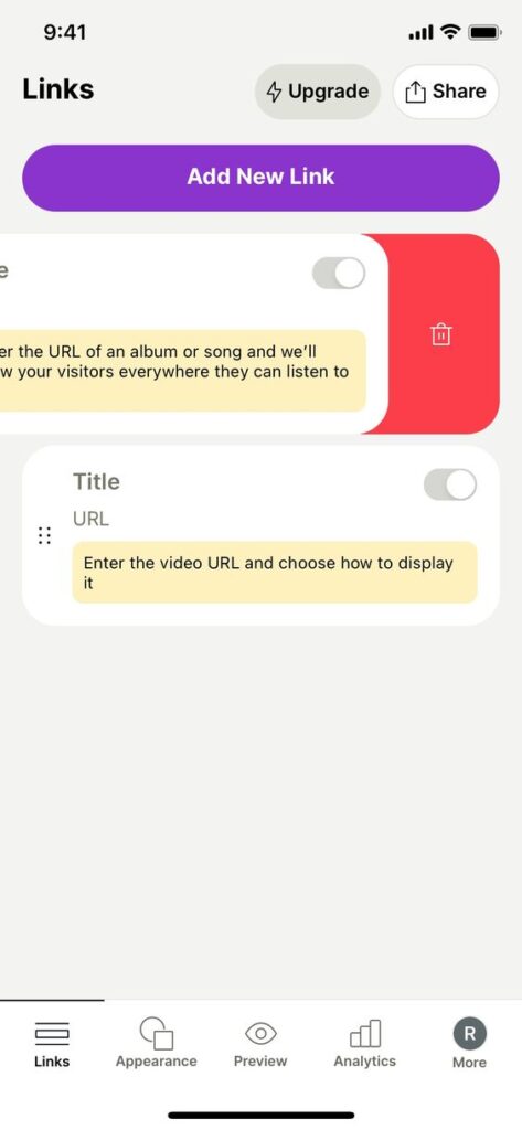
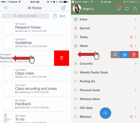
Swipe to delete is a popular mobile UI pattern. It lets users remove items from a list by swiping left or right on the screen. This action reveals a delete button or option.
Many apps use this pattern for managing emails, messages, and to-do lists. It’s a quick and easy way to clean up content without extra taps or menu navigation.
The swipe gesture feels natural on touchscreens. It mimics the physical act of pushing something away. This makes the delete action feel more intuitive for users.
Good design includes clear visual cues. A red background or trash can icon often appears as the user swipes. This helps confirm the delete action before it happens.
Some versions offer multiple options when swiping. Users might see choices to archive, flag, or move items in addition to deleting. This adds flexibility to the pattern.
Swipe to delete saves screen space. It hides actions until needed, keeping the main interface clean and uncluttered. This is especially useful on small mobile screens.
10) Lazy Loading
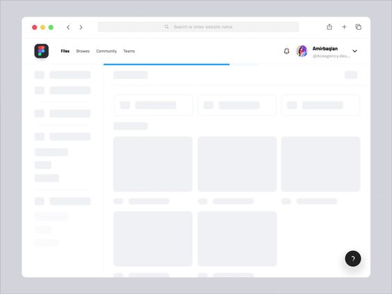
Lazy loading is a UI design pattern that improves website performance. It works by loading content only when needed. This saves bandwidth and speeds up initial page loads.
Images are a common use case for lazy loading. Instead of loading all images at once, only those in view are loaded. As users scroll, more images appear.
This technique is useful for long web pages or image galleries. It’s also helpful for mobile users with limited data plans. Lazy loading can be applied to other content types too, like videos or comments.
Designers can implement lazy loading with placeholders. These show where content will appear once loaded. Placeholders maintain the page layout and prevent jarring shifts.
Many modern web frameworks include lazy loading features. This makes it easier for designers to add this pattern to their projects. When used well, lazy loading creates a smoother, faster user experience.
Understanding UI Design Patterns
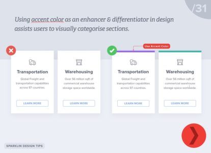
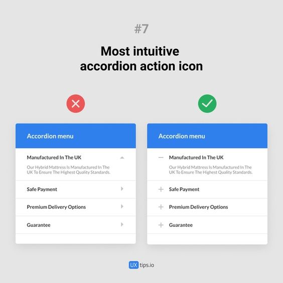
UI design patterns are key tools for creating effective user interfaces. They help designers solve common problems and create intuitive experiences for users.
Definition of UI Design Patterns
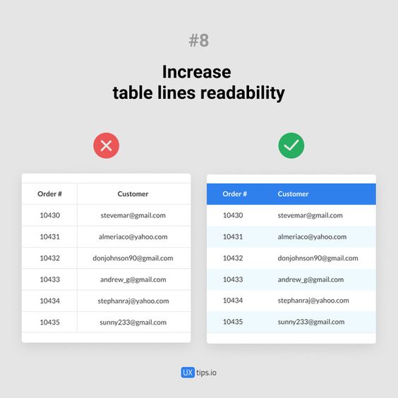
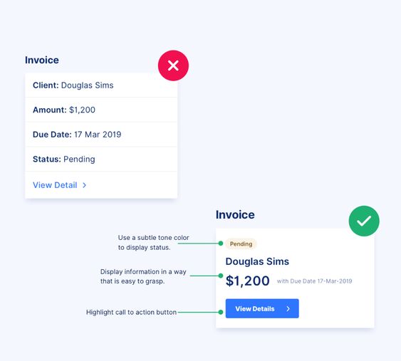
UI design patterns are reusable solutions to common design challenges. They are tried-and-tested approaches that work well in specific situations. These patterns can include things like navigation menus, search bars, and forms.
Designers use these patterns as building blocks for their interfaces. They save time and effort by not having to reinvent the wheel for every project. UI patterns also help create consistency across different apps and websites.
Some popular UI patterns include:
- Hamburger menus
- Infinite scroll
- Modal windows
- Breadcrumbs
- Carousels
Importance of UI Design Patterns
UI design patterns are vital for creating user-friendly interfaces. They make websites and apps easier to use and understand. Users feel more comfortable when they see familiar patterns across different platforms.
These patterns also boost efficiency in the design process. Designers can focus on solving unique problems instead of basic interface elements. This leads to faster development and better results.
UI patterns help with:
- Usability
- Consistency
- Efficiency
- User satisfaction
By using proven patterns, designers can create interfaces that feel natural and easy to navigate. This results in happier users and more successful products.
Applying UI Design Patterns
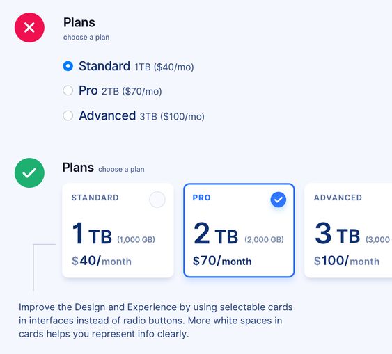
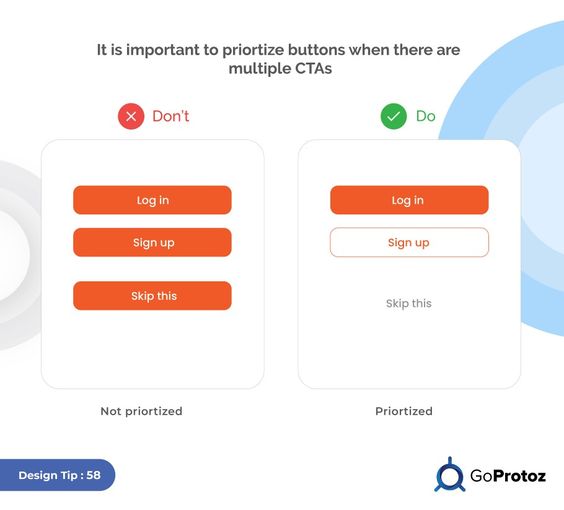
UI design patterns help create better user experiences when used correctly. They can streamline design workflows and improve usability. But careful implementation is key to their success.
Best Practices for Implementation
Start by identifying the problem you’re trying to solve. Choose patterns that fit your specific use case and target audience. Don’t force a pattern where it doesn’t belong.
Consistency is crucial. Use patterns in a uniform way across your interface. This helps users learn and remember how to interact with your design.
Test your implementation with real users. Get feedback and make adjustments as needed. UI patterns should enhance the user experience, not confuse it.
Customize patterns to match your brand and style guide. This creates a cohesive look and feel throughout your product.
Common Mistakes to Avoid
Overusing patterns can lead to a cluttered interface. Pick only the most relevant ones for your project. Too many patterns can overwhelm users.
Don’t copy patterns blindly. Understand why they work and how they fit your specific needs. Adapt them to your unique context.
Ignoring mobile considerations is a frequent error. Ensure patterns work well on smaller screens and touch interfaces.
Failing to update patterns as user needs change is another pitfall. Regularly review and refine your design choices. What worked before might not work now.
- 2.4Kshares
- Facebook0
- Pinterest2.4K
- Twitter0
- Reddit0
