Most people choosing a branded mug spend real time on the logo file and almost none on the mug’s own colour. That’s backwards. Good mug design treats the ceramic body as part of the identity, not as a blank carrier for a mark. I’ve spent fifteen years doing brand identity work across products, packaging and jewellery, and the lesson repeats in every category: the object’s colour is doing at least as much brand work as the logo printed on it.
The good news is that mug colour is one of the cheapest, highest-impact design choices you’ll make all year. The mug costs roughly the same whether it ships plain white or is matched carefully to your palette. What changes is whether it reads as generic promotional stock or as something clearly made for your brand.
This guide covers body colour, interior colour, rim and handle, contrast against your logo, and the production details that keep the hundredth mug looking like the first.
- Start with the mug as part of the brand system
- Why white mugs remain the safest design baseline
- Choose between a coloured body, interior, rim and handle
- Match logo colour and mug colour as one composition
- Use colour psychology without turning it into a cliché
- Design for real desks, kitchens and changing light
- Check consistency across a production run
- A pre-order checklist for branded mug design
- Colour is the cheapest upgrade in the whole order
- Mug design FAQ
- What's the safest mug colour choice for a first branded order?
- Should the mug interior match the exterior colour?
- How do I know if my logo will print well on a coloured mug?
- Does mug colour affect how customers perceive a brand?
- How much colour variation is normal across a large mug order?
- Are two-tone mugs more expensive than a single-colour mug?
Start with the mug as part of the brand system
Before touching a colour picker, treat the mug the way you’d treat any other brand touchpoint: a business card, van livery or packaging box. It isn’t a separate decision made in isolation. It’s one more surface your identity has to survive on.

Translate brand guidelines into a physical object
If your brand already has a defined palette, perhaps a primary colour, a secondary and an accent, that palette is your starting point. I’ve worked on identity systems where the brand book specifies exact colour values for everything from a website button to a vehicle wrap, and a mug is no different in principle.
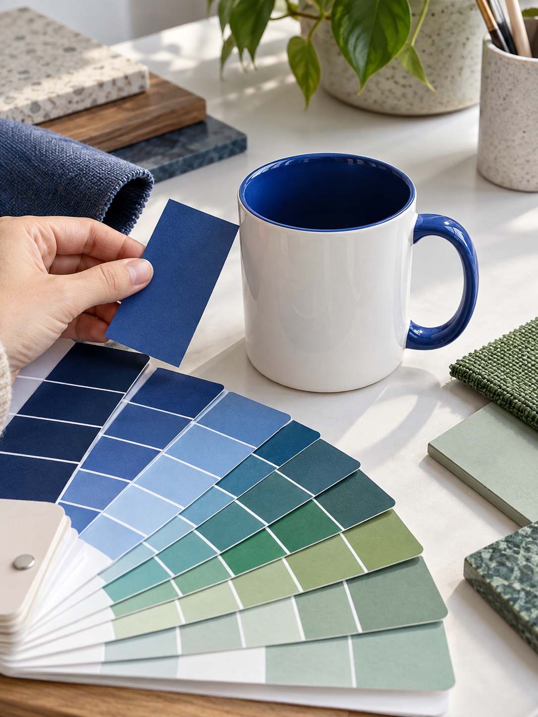
The translation challenge is that a screen-defined hex value and a fired ceramic glaze are two different physical materials, and they don’t always agree. A brand blue that looks crisp and saturated on a monitor can shift warmer or duller once it’s a glaze fired at high heat. Ask your supplier for a physical colour sample against your Pantone or hex reference before committing to a full run. This is standard practice in product design generally, and ceramic manufacturing is no exception.
Decide whether the mug should blend in or stand out
Not every brand wants a loud mug, and that’s a legitimate design decision rather than a missed opportunity. A minimalist identity with a clean sans-serif logo and restrained palette often reads better on a white or muted-colour mug than on something with four colour zones competing for attention. A bolder, more energetic brand can carry a full-colour body and still look intentional.
The useful question is simple: does the identity’s strength come from restraint or colour confidence? The mug should answer in the same way the rest of the brand does.
Why white mugs remain the safest design baseline
There’s no shame in a white mug, and there are plenty of design reasons to choose one deliberately rather than by default.
Contrast, print accuracy and budget advantages
White is the most economical option across most suppliers, it suits virtually any logo without a colour-clash risk, and it gives the highest-contrast, most accurate printing surface available on ceramic. If your priorities are budget and broad appeal, such as a mug going to a wide mailing list, a trade-show giveaway or an all-staff gift, white remains a genuinely sound choice. It’s the default for mass promotional runs because it performs reliably for almost every logo that lands on it.
When white looks deliberate rather than generic
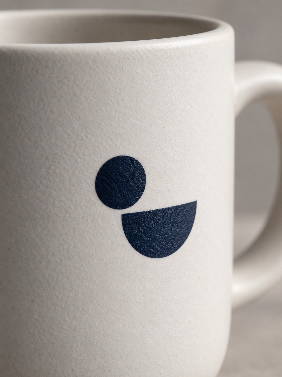
The difference between a white mug that looks like an afterthought and one that looks chosen comes down to how the logo sits on it. A logo dropped dead centre at a default size, with no consideration for scale, margin or placement against the handle, reads as generic regardless of the mug’s colour. A logo sized and positioned with the composition in mind, with proper margin from the rim and alignment that accounts for the handle, reads as deliberate even on plain white.
I’d rather see a brand spend its design effort on placement and scale than assume colour alone will do the work of looking considered.
Choose between a coloured body, interior, rim and handle
This is where the real design decisions live, and where a mug stops being a generic object and starts becoming a specific one.
Full-colour mugs for bold visual impact
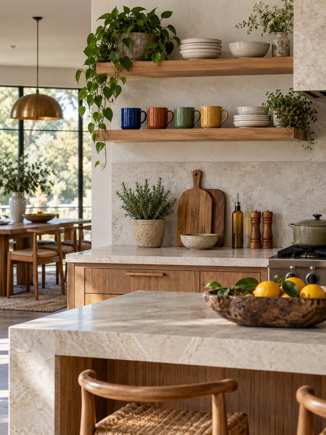
A mug with a fully coloured exterior is the boldest option and the one with the most visual impact from across a room or desk. It commits the whole object to your palette rather than treating colour as an accent, which suits brands with strong, confident colour identities. The trade-off is print contrast, so a full-colour body needs to be chosen alongside the logo colour, not before it.
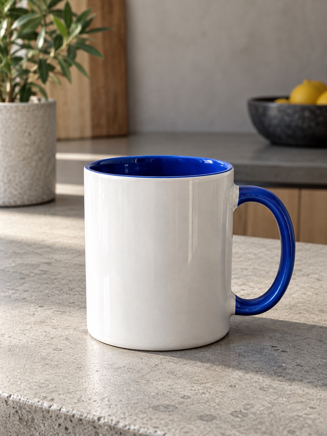
Coloured inner-and-handle mugs for contrast and recognition
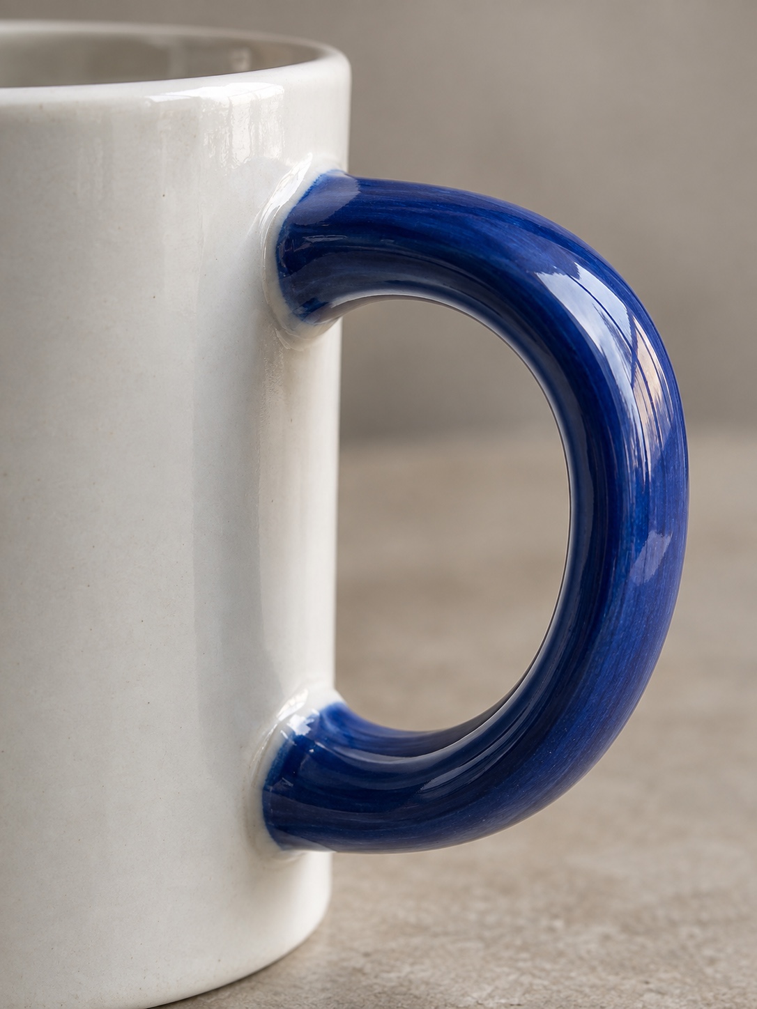
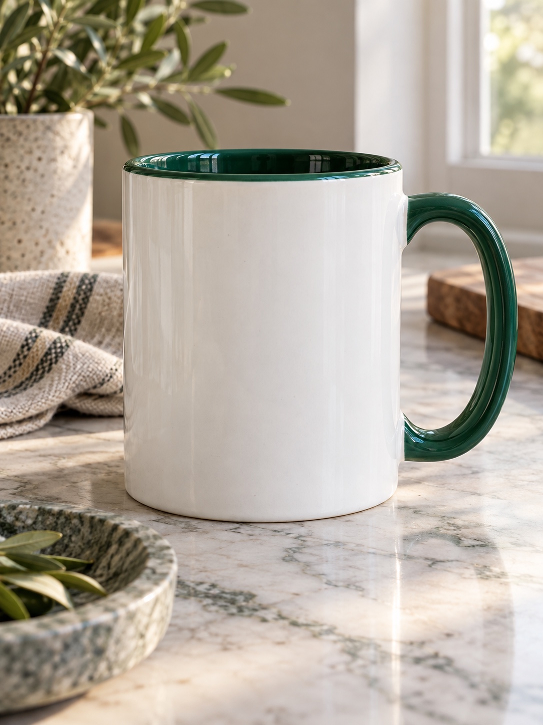
This is consistently the most balanced option, and it’s worth knowing about even if you end up choosing something else. The exterior stays white, keeping the cleanest, highest-contrast surface for the printed logo, while the interior and handle carry a bold brand colour. Browsing GoPromotional’s branded mug options is a quick way to see how this combination looks across different colour pairings before committing to one.
The result gives you recognition through the interior colour and a reveal moment when someone picks up the mug, while the exterior keeps the print crisp. It’s a smart middle ground, which is why it’s so widely chosen.

Two-tone mug designs and controlled accent colour
A two-tone mug, with colour on the rim and handle, a white body, or a split body in some configurations, gives you an accent without the full commitment of a solid-colour exterior. This works especially well for brands with one strong accent they want represented without covering the whole object in it. Think of it like trim colour on a product housing: enough to register the association, but not so much that it competes with the printed mark.
Match logo colour and mug colour as one composition
A logo and a mug colour aren’t two independent decisions. They’re one composition, and treating them that way from the start avoids production headaches later. If your logo palette hasn’t been formally decided, sort that out before the mug conversation begins. How to Choose the Right Colors for Your Logo Design covers the groundwork that makes every downstream merchandise decision easier.
Contrast and legibility on light and dark ceramic
A logo reads most crisply against a light or genuinely contrasting background. A dark or strongly saturated mug body can make detailed or pale artwork disappear, especially fine linework or thin letterforms designed with a white background in mind. This doesn’t rule out coloured mugs. It means the logo colour and mug colour need to be chosen as a pair.
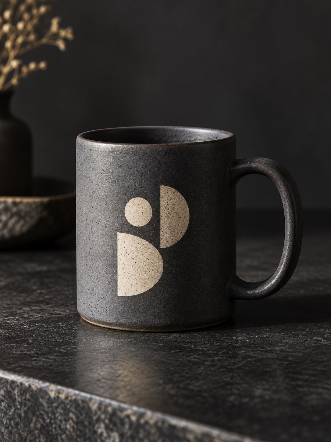
I think about this the way I’d think about paint and trim colour on a vehicle concept. A pale grey badge disappears against a light silver body just as a pale logo disappears against a light mug. The surfaces have to be planned together, not designed in isolation and hoped into compatibility later.
Protect fine detail, pale artwork and small typography
If your logo has a thin outline, small supporting type or a gradient, a strongly coloured or dark body is the riskiest choice for keeping that detail legible at production scale. Either simplify the mark for this application, perhaps with a single-colour, bolder version reserved for merchandise, or use the white-body, coloured-interior configuration that protects the printing surface while carrying brand colour elsewhere.
I’ve had to make this same call on packaging work more than once. A beautifully detailed mark on a business card doesn’t always survive being printed at two inches on a curved ceramic surface, and it’s better to plan for that upfront than discover it after a production run ships.
Run simple colour-pairing checks before production
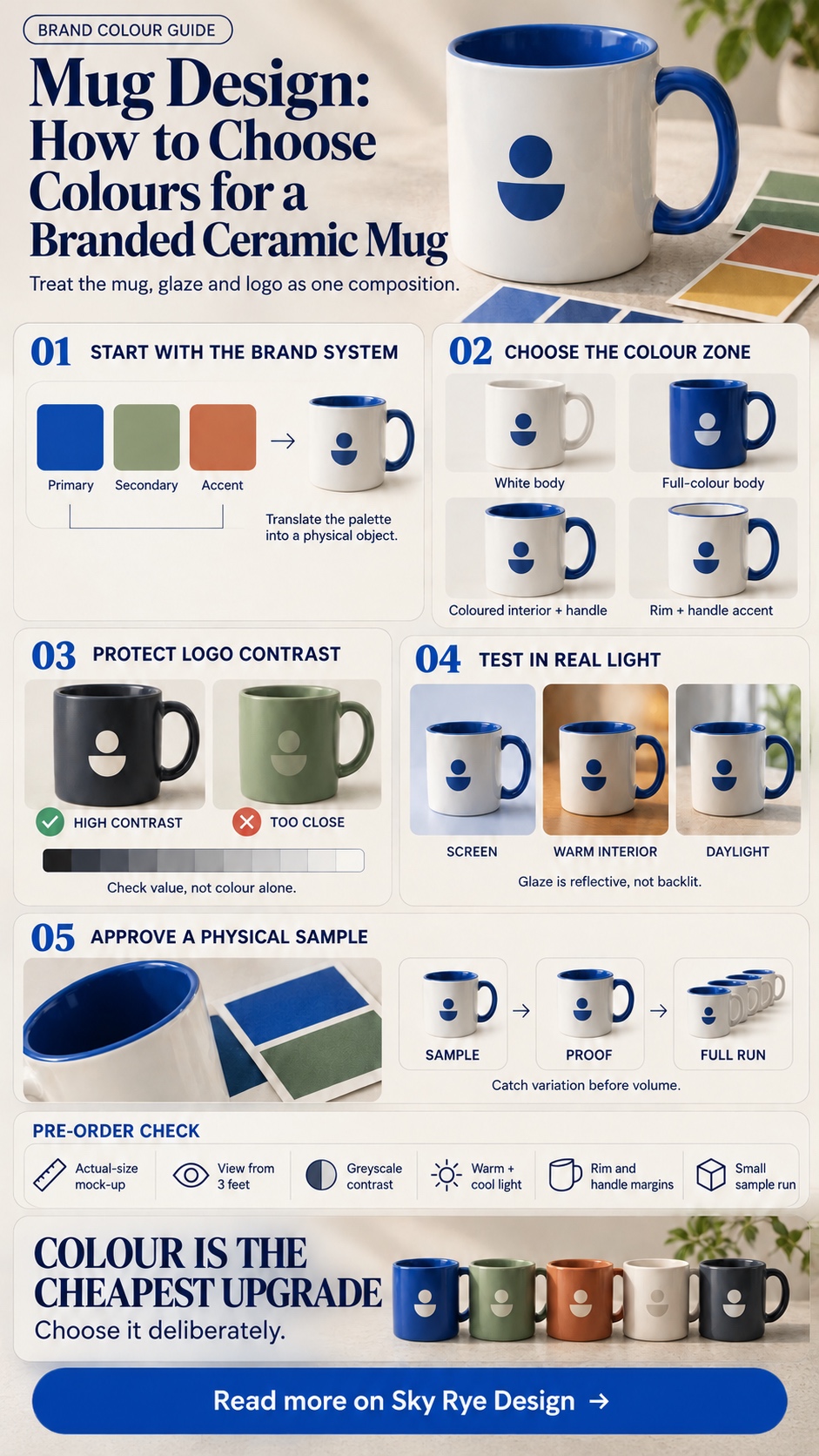
A few low-effort checks catch most problems. Print a mock-up at actual size and view it from three feet away, roughly how far most people will be when they notice the mug. Convert the mock-up to greyscale and see if the logo remains legible through value contrast rather than colour contrast alone. If it disappears, the design relies entirely on colour separation, which glaze variation can undermine. Finally, check it under both warm indoor light and cooler daylight, since ceramic glaze can shift noticeably between the two.
Use colour psychology without turning it into a cliché
Colour carries real associations, and it’s worth using that knowledge lightly rather than treating it as a formula.
Calm, energetic, natural and premium palettes
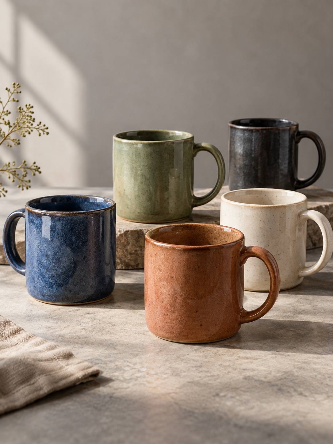
A mug in a colour that matches your brand’s character quietly reinforces the impression you’re already trying to give: calm and trustworthy in a soft blue or sage, energetic in a saturated orange or red, natural and understated in an earthy neutral, or premium and considered in deep charcoal or forest green. It isn’t a heavy-handed effect and shouldn’t be treated as one. For a deeper look at how these associations work and where the research gets oversold, Color Psychology in Design offers the useful version rather than the listicle version.
Let existing brand guidelines lead the decision
If your identity already has a defined palette, colour psychology isn’t a decision you need to make again for the mug. Your guidelines already made it when they established the palette. The mug’s job is to carry that decision through consistently, not reopen the question. If you’re still building the palette, How to Choose the Perfect Color Palette for Your Brand is a better starting point than picking a mug colour first and working backwards.
Design for real desks, kitchens and changing light
A mug doesn’t live on a screen. It lives on a desk under office fluorescents, in a kitchen under warm bulbs, and outside in daylight when someone carries it to a car. Design for all three, not just the render.

Screen colour versus glazed ceramic in person
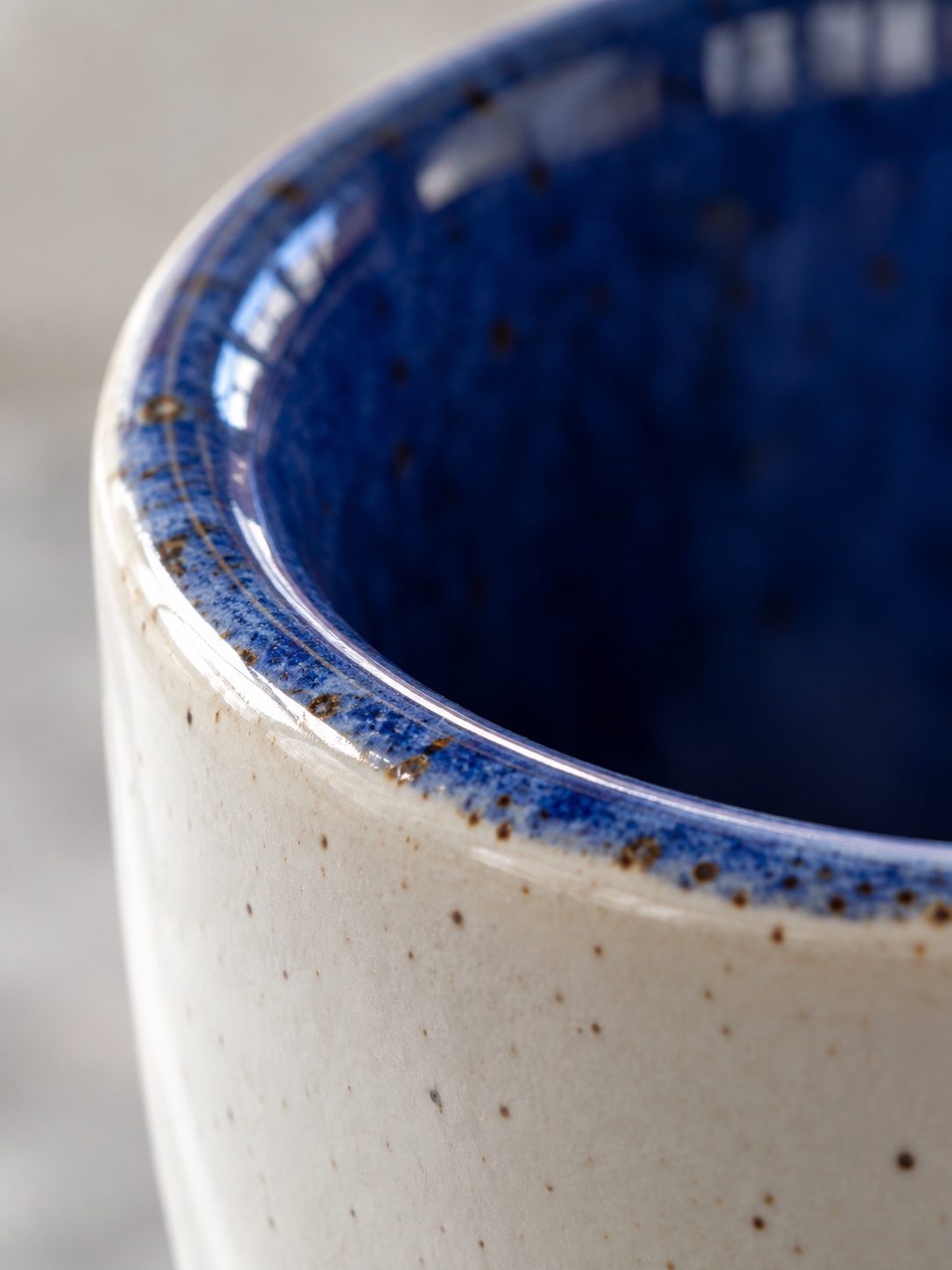
A colour that looks striking and saturated on a monitor can read as flat, dull or slightly off once it’s a fired glaze in your hand. Screens are backlit and emissive. Ceramic glaze is reflective and depends entirely on ambient light. I’ve seen this gap trip up product colour decisions in far more expensive categories than mugs. Automotive paint, for example, behaves differently under controlled showroom lighting than it does outside on a grey afternoon. The fix is the same: check a physical sample under several light sources before signing off, never a screen render alone.
How surroundings affect perceived colour
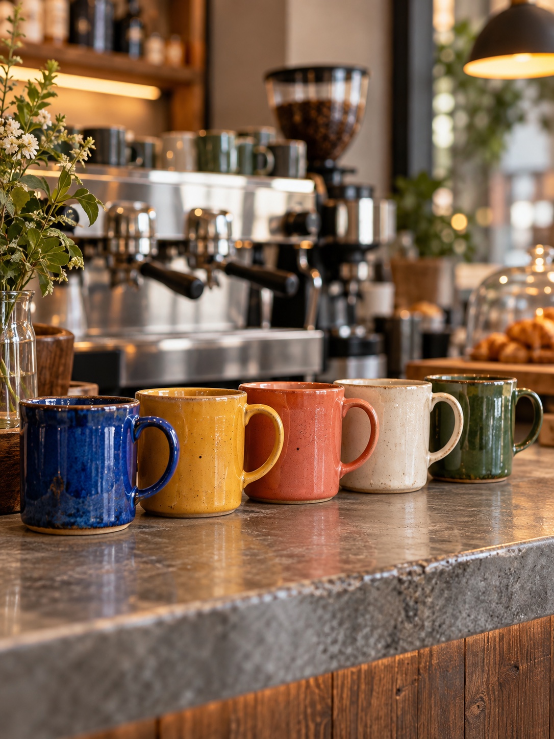
Colour perception shifts depending on what’s around it. A mug that looks bold sitting alone against a white photography background can look muddy or clash next to a busy desk, other merchandise or a kitchen counter in another colour family. Imagine, or better still test, the mug in the places where it will spend most of its life, not just in the clean studio shot shown in a supplier catalogue.

Check consistency across a production run
The design work isn’t finished when the file is approved. It’s finished when the thousandth mug off the line still matches the first.
Samples, glaze variation and print proofs
Always request a physical sample before a full production run, and check it against the actual brand reference rather than only the supplier’s digital proof. Glaze colour can vary between manufacturing batches even with the same specified code, and print proofs sometimes shift in the jump from a digital mock-up to fired ceramic. Catching a mismatch on a sample of five costs a small delay. Catching it on a completed run of five hundred costs the whole order.
Make the hundredth mug match the first
Colour consistency at volume depends on the supplier’s manufacturing quality, and this is one place where a reputable vendor earns its keep. A batch of branded mugs whose colour visibly drifts from one unit to the next undermines the polish you were trying to buy. It reads as cheap even if each mug was reasonably priced. A well-run production process keeps that drift small enough that nobody outside a quality-control check would notice it.
A pre-order checklist for branded mug design
Before signing off on a production run, use this short checklist:
- Match colour against a physical sample. Don’t rely only on a screen render or digital proof. Check the sample under at least two different light sources.
- Confirm logo legibility in greyscale. The design shouldn’t rely entirely on colour separation that glaze variation could undermine.
- Choose the configuration deliberately. Pick a full-colour body, white body with coloured interior, or two-tone accent according to how bold or restrained the brand identity is, not whatever happens to be the catalogue default.
- Review placement and scale. Leave real margin from the rim and handle rather than dropping the logo at a default size and centring it without thought.
- Order a small sample run first. Check it against brand reference colours before committing to full volume.
- Consider sustainability if it matters to the brand. Recycled or lower-impact options are a separate sourcing decision from the colour and print questions covered here. Our guide to customized eco-friendly mugs for events, cafes and corporate gifts explores that side in more detail.
- Picture the everyday context. Judge the mug on a desk, a kitchen counter and in someone’s hand, not only in a studio photograph.
Colour is the cheapest upgrade in the whole order
The mug costs roughly the same whether it ships plain white or carefully matched to your identity. That’s worth sitting with for a second. Among every decision in a merchandise order, colour is one of the highest-impact and lowest-cost, and it’s the one many buyers skip on the way to approving the logo file.
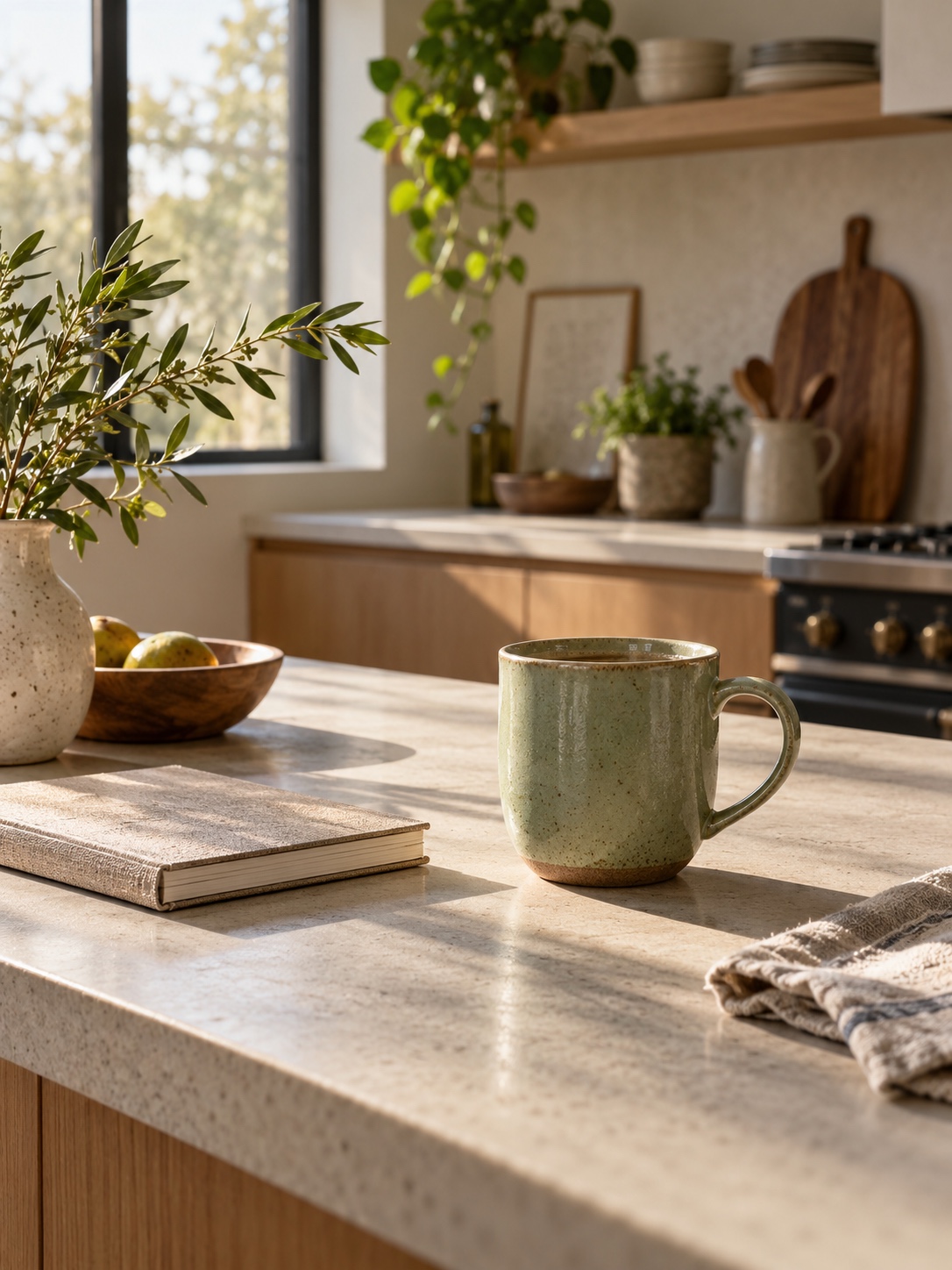
A well-chosen colour, paired thoughtfully with your logo and checked against a physical sample before the full run ships, turns the most everyday of Gopromotional items into something that reads as genuinely yours rather than generic stock. White will always remain the dependable default, and there’s no design failure in choosing it deliberately. But treating mug colour as a decision worth making on purpose is what separates a mug people keep from one that ends up at the back of a cupboard.
Mug design FAQ
What’s the safest mug colour choice for a first branded order?
White remains the safest baseline. It’s the most economical option, suits nearly any logo without a contrast risk, and gives the most accurate print surface. It’s a legitimate deliberate choice, not just a fallback for a limited budget.
Should the mug interior match the exterior colour?
Not necessarily. A white exterior with a coloured interior and handle is popular precisely because it keeps the printing surface crisp while carrying brand colour prominently on the object.
How do I know if my logo will print well on a coloured mug?
Convert the logo mock-up to greyscale and check whether it’s still legible on value contrast alone. If it disappears without colour to separate it from the background, a dark or saturated mug body is a real risk for that design.
Does mug colour affect how customers perceive a brand?
In a small but real way, yes. Colour carries associations such as calm, energetic, premium or natural. A mug that fits the brand’s character reinforces an impression you’re probably building elsewhere. It’s a subtle effect, but it costs nothing extra to get right.
How much colour variation is normal across a large mug order?
Some minor variation between manufacturing batches is common even with an identical colour code, which is why a physical sample and proof check before a full run matter. Meaningful, visible drift across one batch is a supplier quality issue worth raising before you order at volume.
Are two-tone mugs more expensive than a single-colour mug?
Pricing varies by supplier, but a two-tone or coloured-interior configuration is usually a modest step up from plain white rather than a major cost increase. Colour is one of the more affordable upgrades available on a standard ceramic mug.
- 2shares
- Facebook0
- Pinterest2
- Twitter0
- Reddit0