Honda has a design philosophy most drawing tutorials never mention: “man maximum, machine minimum,” the idea that mechanical parts should take up as little space as possible so the cabin and the driver get the rest. I ran into a version of this same constraint doing production surfacing work on the Mazda CX-5 and the Jaguar F-Pace: every millimeter of sheet metal has to justify itself, structurally and visually, before it earns a place on the car. Honda just applies that discipline more visibly than almost any other mainstream brand.
That’s why Honda models are deceptively hard to draw well. They look simple in photos, all clean surfaces and tight panel gaps, but that simplicity is the result of restraint, not a lack of detail. Skip the proportion work and you’ll end up with something that reads as “generic hatchback” instead of “Civic.” Get the proportions right first, and the details practically place themselves.
- Start with Honda's design language before you draw a single line
- 1. Honda Civic (1972) — the hatchback that defined the brand
- 2. Honda Civic Type R (FL5) — aggressive aero as function
- 3. Honda NSX (NA1) — the everyday supercar
- 4. Honda S2000 — roadster proportions
- 5. Honda Prelude — pop-up headlight coupe
- 6. Honda Integra Type R (DC2) — JDM lightweight icon
- 7. Honda Accord — mainstream sedan mastery
- 8. Honda CR-V — crossover volume
- 9. Honda Ridgeline — unibody truck proportions
- 10. Honda e — retro-modern EV
- Common mistakes when drawing Honda models
- Frequently Asked Questions
- What's the easiest Honda model to start drawing?
- How do I make my Honda drawings look less generic?
- Do I need to know Honda's actual design history to draw these well?
- What tools work best for these drawings?
- Which Honda model on this list is hardest to draw?
- Should I draw Honda models from photos or from memory?
- Final thoughts
This isn’t a beginner’s box-and-circle tutorial. It’s ten models chosen to cover ten different design problems: hatchback stance, aggressive aero, mid-engine proportions, roadster balance, pop-up headlight geometry, crossover volume, and more. Work through even half of these and you’ll understand car proportion better than most people who’ve been drawing vehicles for years.
I still keep a small sketchbook of proportion studies from my automotive design coursework, mostly quick block-ins done before any surfacing work started. That habit is the whole point of this article: the ten models below aren’t meant to be copied line for line. They’re meant to teach you the specific proportion problem each one solves, so the next Honda you draw, one that isn’t even on this list, comes out looking right on the first pass instead of the fifth.
Start with Honda’s design language before you draw a single line
Every Honda on this list shares a few habits worth internalizing before you sketch anything. The beltline (the horizontal line where the doors meet the glass) tends to sit lower than on most competitors, which is part of why Honda interiors feel airy and why the cars read as lighter in a drawing. The wheel arches are usually tight to the tire, with less visual “fender flare” than a German or American design would use. And the greenhouse (the glass area) is often larger in proportion to the body than you’d expect, especially on older models.
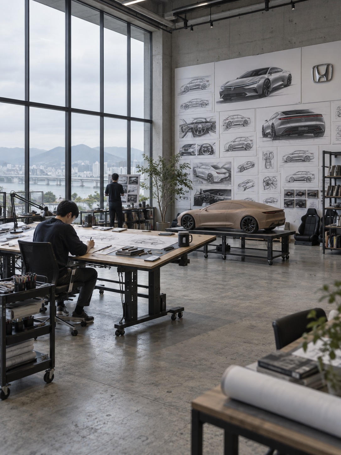
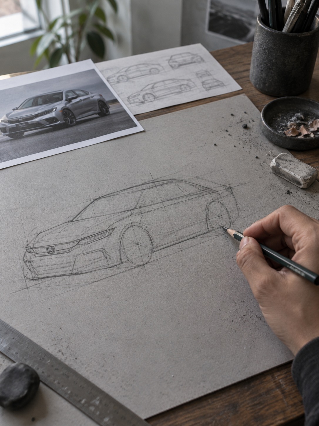
I’d start every one of these drawings the same way: block in the wheelbase as two circles first, then connect the beltline as a single confident stroke before adding a single character line. Confirm the proportions read correctly at the block-in stage. Adding surface detail to a car with the wrong stance just makes the mistake harder to fix later, the same lesson that applies whether you’re sketching a Civic or blocking out a production vehicle in CAD.
Reference photos matter more here than for most subjects, since Honda’s surfacing relies on subtle, easy-to-miss transitions rather than dramatic creases you can eyeball from memory. I’d pull at least three angles (front three-quarter, straight profile, rear three-quarter) for any model before starting, and check your block-in against all three before moving to detail work. A proportion that looks right from one angle and wrong from another usually means the wheelbase or greenhouse size needs adjusting, not the detail you’re currently working on.
1. Honda Civic (1972) — the hatchback that defined the brand
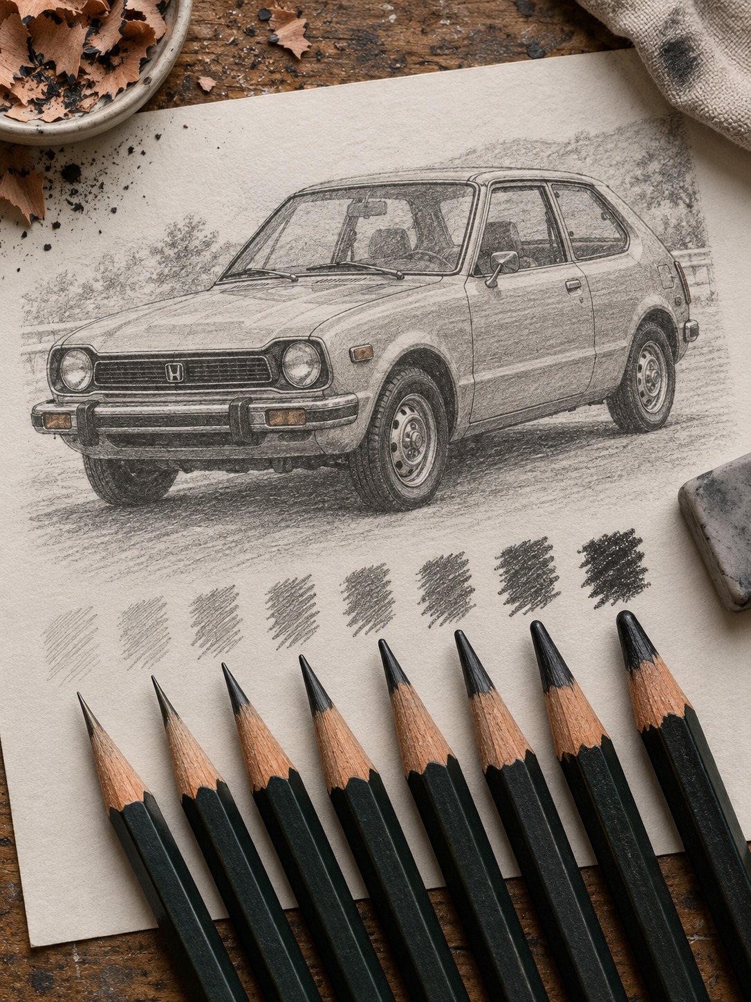
The original Civic is a study in restraint: a short front overhang, a nearly vertical hatch, and a greenhouse that takes up close to half the car’s side profile. Drawing it convincingly means resisting the urge to add curves that weren’t there. The body panels are almost flat, with character lines doing more work than surfacing.
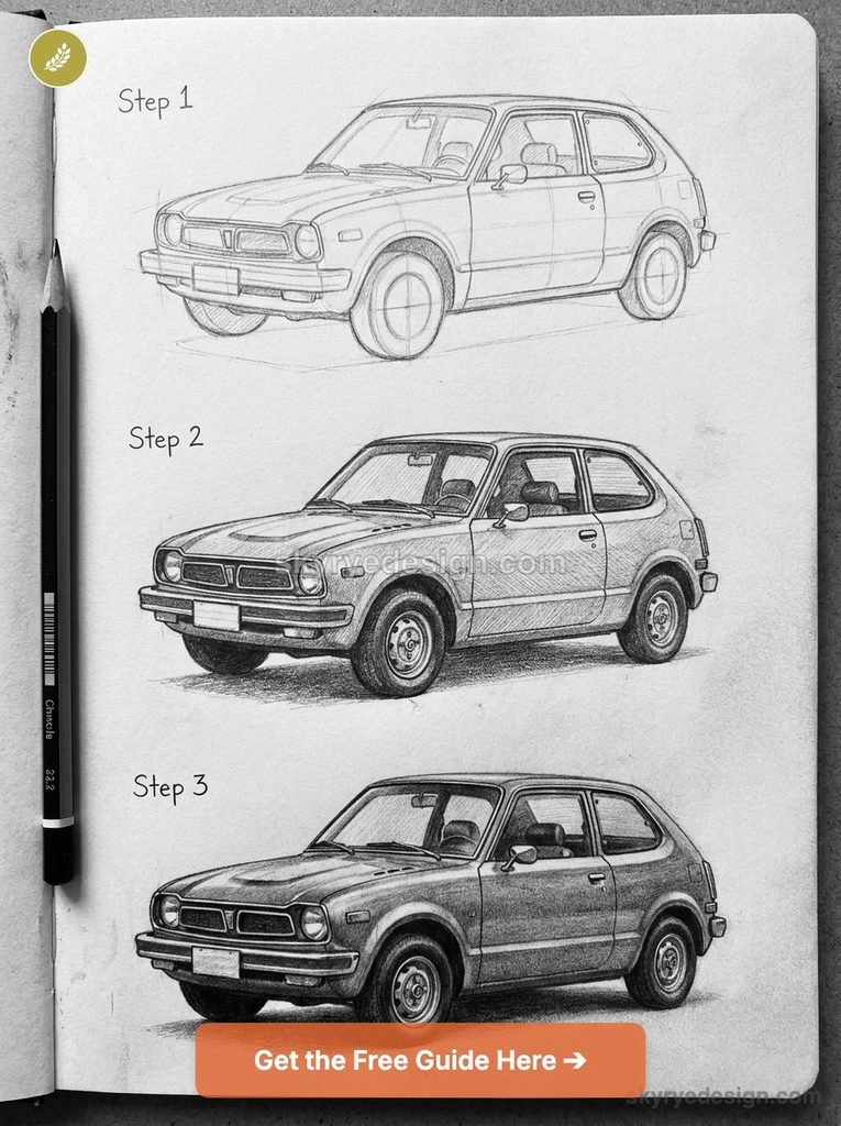
Start with a simple box proportioned roughly 1:0.4 (length to height), then carve the hatchback’s steep rear glass angle before anything else, since that angle defines the whole silhouette. The wheels sit close to the corners, smaller in diameter than modern proportions would suggest. I’ve noticed most people draw the original Civic’s wheels too large out of habit from sketching contemporary cars, which throws off the whole scale.
2. Honda Civic Type R (FL5) — aggressive aero as function
The current Type R looks aggressive, but every vent, wing, and duct on it earns its place aerodynamically rather than existing for show, which is worth remembering as you draw it.
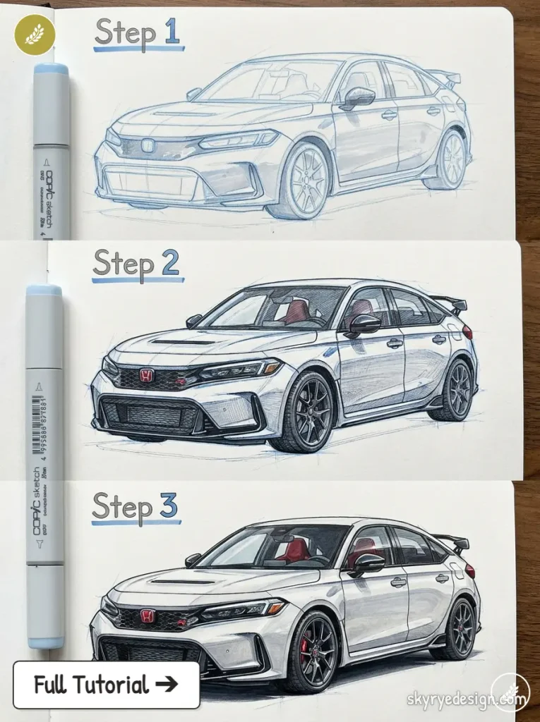
The front bumper’s intakes are deep and asymmetric in shading even when symmetric in shape, since airflow doesn’t care about visual balance.
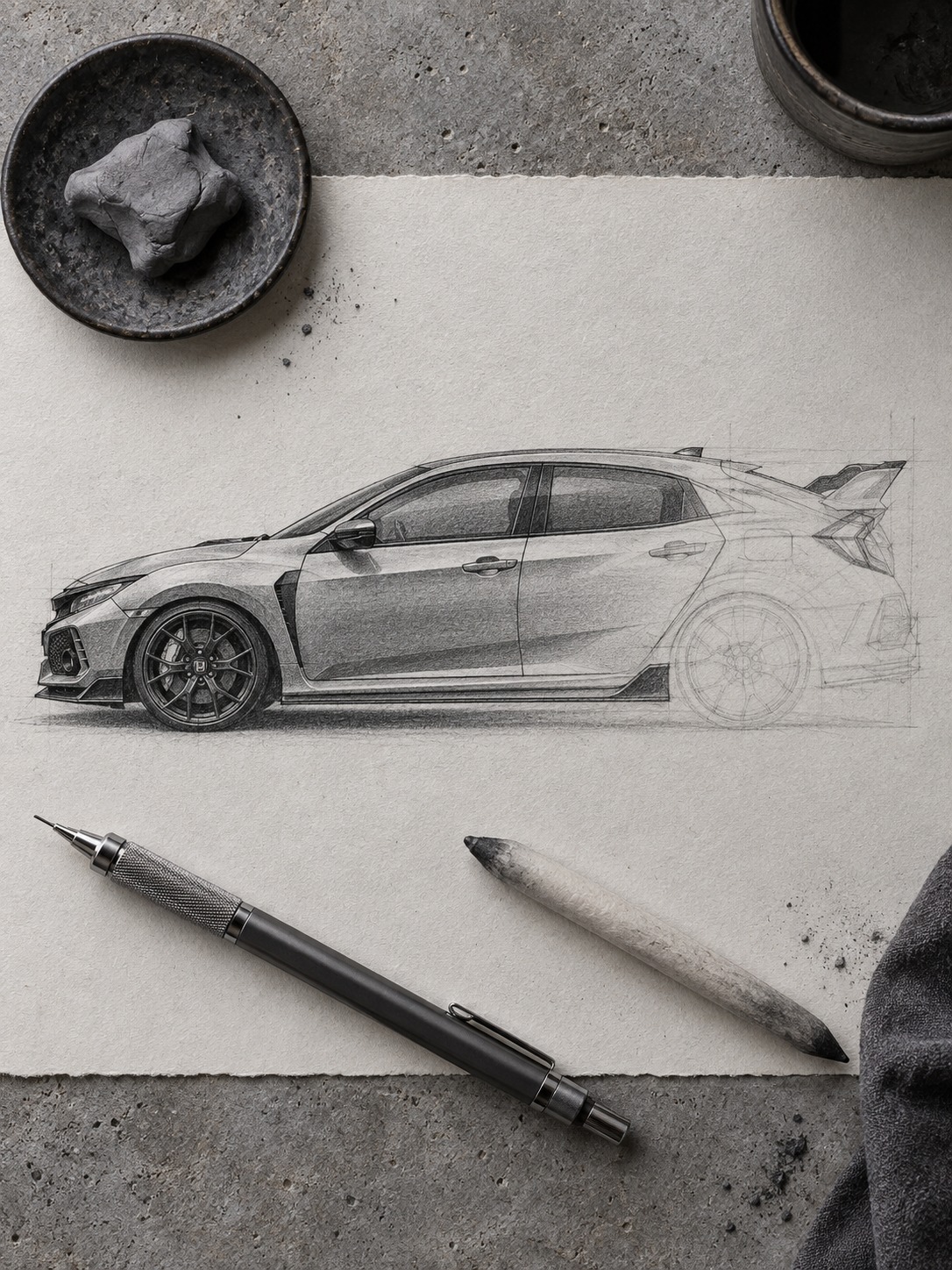
Block in the wide front track first (wider than the rear on this model, unusually), then build the hood’s power dome as a single raised plane rather than a rounded bulge. The rear wing sits high and flat, not curved, mounted on struts you should draw as thin, precise lines rather than thick brackets. Get the wing’s angle wrong and the whole rear three-quarter view reads as toy-like instead of purposeful.
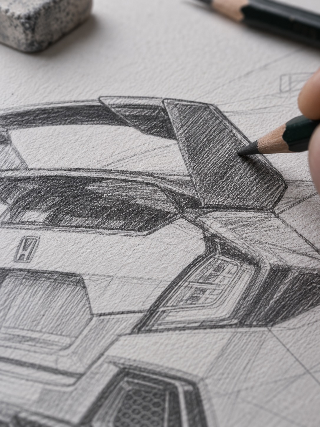
The side skirts and lower body cladding deserve more attention than most people give them. They’re not decorative trim; they visually lower the car’s center of gravity in a drawing the same way they help manage airflow underneath the real thing. Keep that lower cladding as a distinct, slightly darker plane from the main body color, since the contrast is part of what sells the car’s aggressive stance.
3. Honda NSX (NA1) — the everyday supercar
Ayrton Senna reportedly influenced the NSX’s chassis tuning during development, which tells you everything about the car’s priorities: usability married to genuine performance. Visually, that translates into a low beltline (for supercar-level visibility, unusual in the category) and a cabin pushed forward over the front axle with the engine behind it.
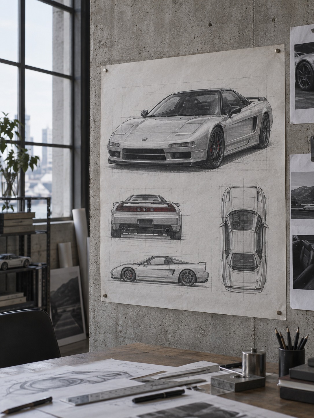
Draw the greenhouse first here, since it’s larger and more upright than a Ferrari or Lamborghini of the same era, then build the low, wide body around it. The side intake behind the door is a single clean scoop, not a complicated vent cluster. Keep the surfacing simple in your shading; the NSX’s confidence comes from clean, uninterrupted panels, not busy detailing.
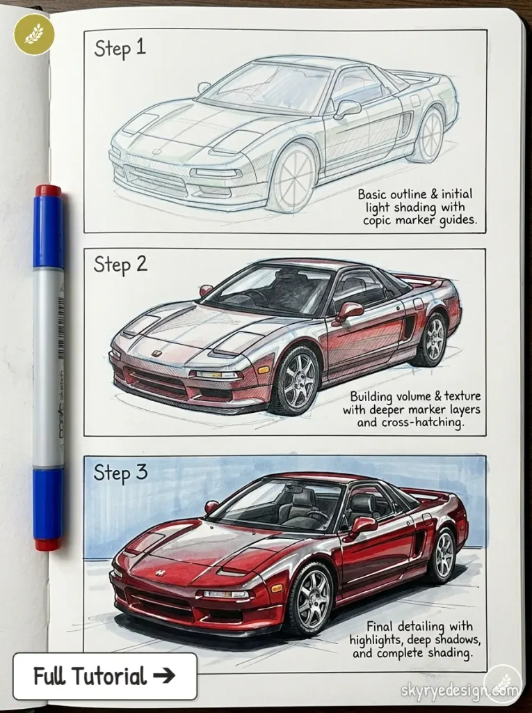
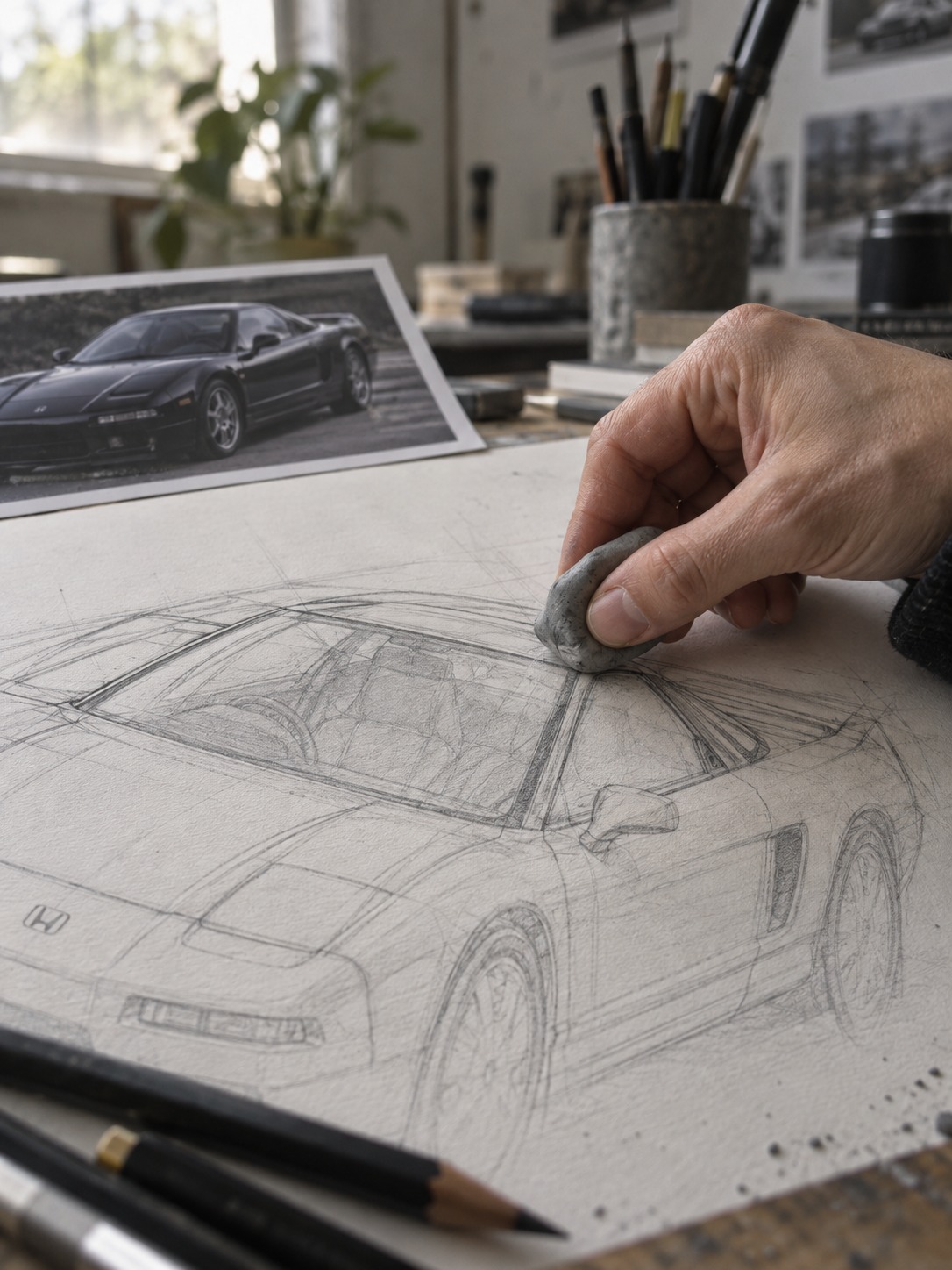
Pay attention to the pop-up headlights here too, closed for the cleanest silhouette, and to the way the hood line drops lower than you’d expect for a car with a front-mounted trunk. That low hood is possible because the engine sits behind the cabin, which is exactly the kind of packaging detail that separates a convincing supercar drawing from a merely low, wide car with a badge on it.
4. Honda S2000 — roadster proportions
A proper roadster has a long hood-to-cabin ratio, and the S2000 pushes that further than most, with the cabin set well back near the rear axle. That’s the first thing to nail in your block-in: the front wheel-to-windshield distance should look almost too long before you’ve added any detail.
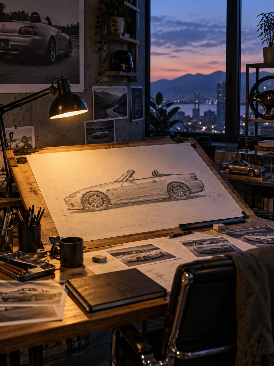
The character line running from headlight to taillight sits high and stays remarkably consistent in height, which is part of what makes the S2000 look so taut in profile. Draw it as one continuous stroke rather than several shorter ones stitched together, or the surface will look segmented instead of stretched. The rear haunches (the muscular curve over the rear wheels) are subtle here, not exaggerated like an Italian roadster’s.
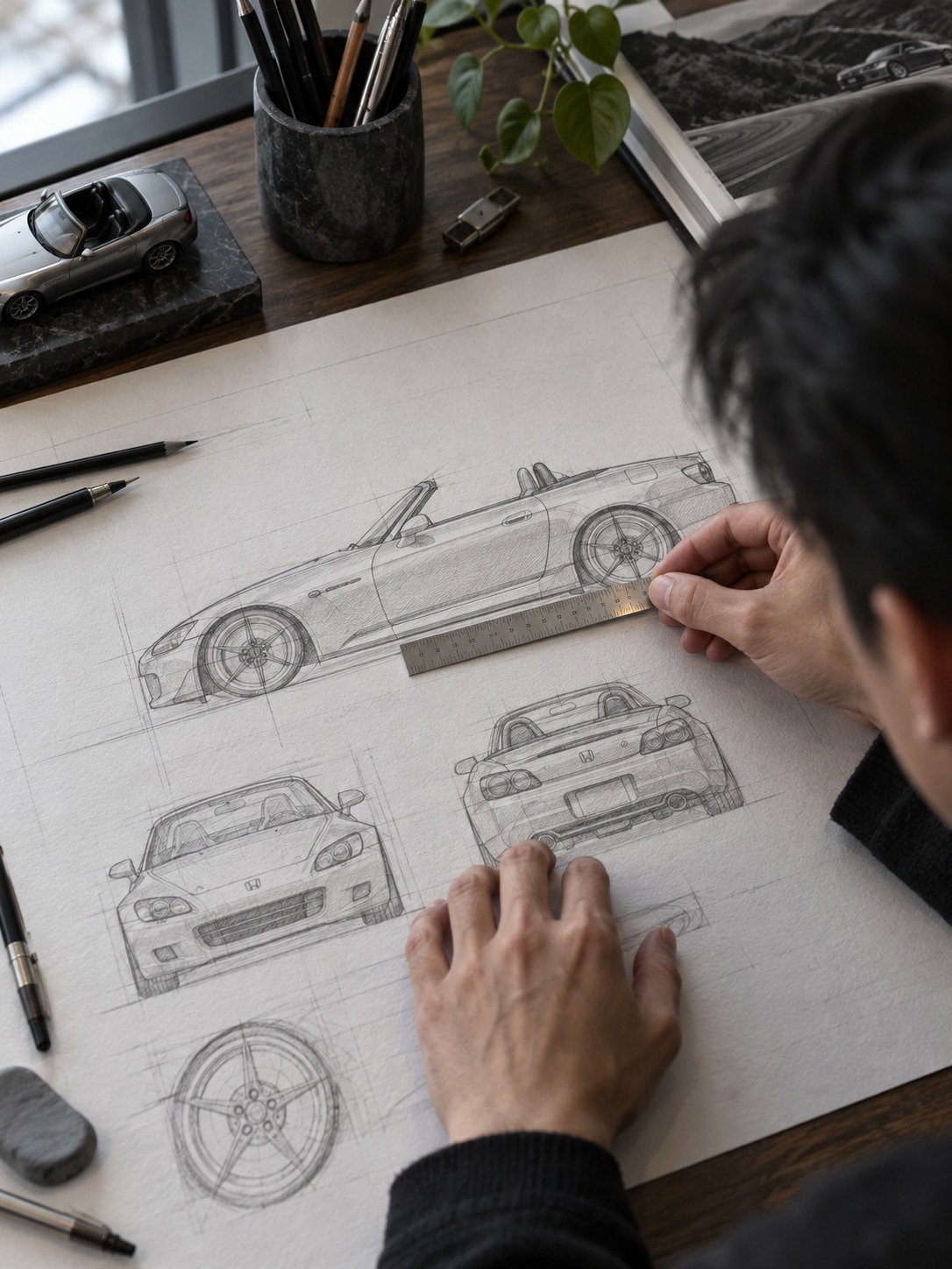
The windshield rake is steeper than you might assume from photos, and getting that angle right does more for the car’s sporting stance than any other single line.
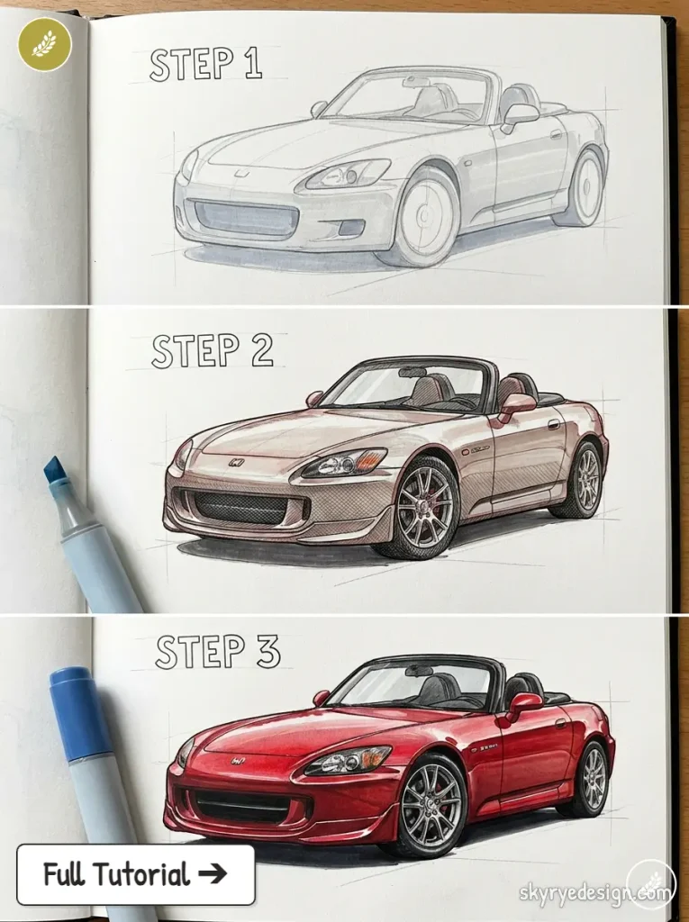
I’d sketch the windshield as one of the first elements after the wheelbase, treating it almost like a fixed anchor point that the rest of the cabin’s proportions build outward from.
5. Honda Prelude — pop-up headlight coupe
Pop-up headlights are a specific drawing challenge: you’re essentially drawing two different front-end states depending on whether they’re raised. For a static illustration, draw them closed for a cleaner, more iconic silhouette, with the headlight covers as a smooth continuation of the hood’s surface rather than an obvious seam.
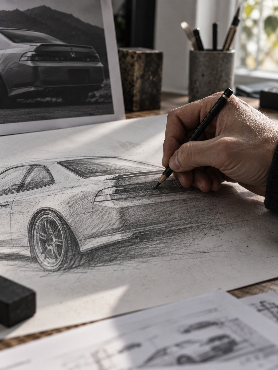
The Prelude’s roofline drops in a long, low arc from windshield to trunk, giving it a more coupe-like stance than its Civic-based underpinnings would suggest.
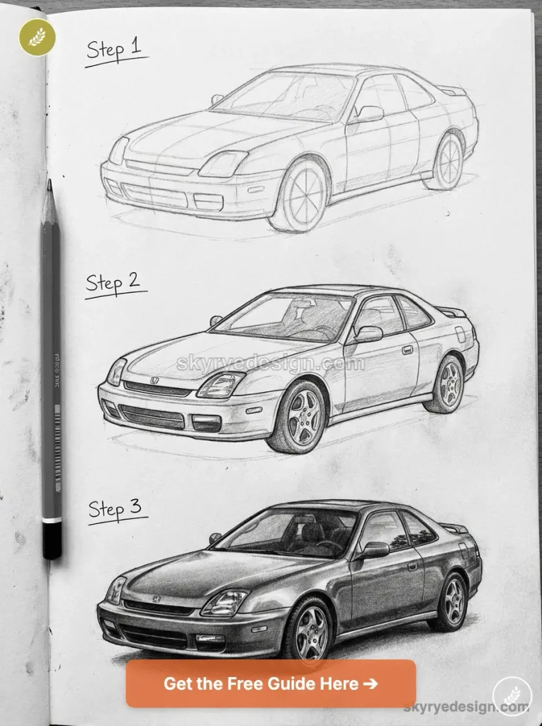
Block the roofline first as a single sweeping curve, then position the wheel arches underneath it, since getting the roof arc right determines whether the proportions read as sporty or awkward.
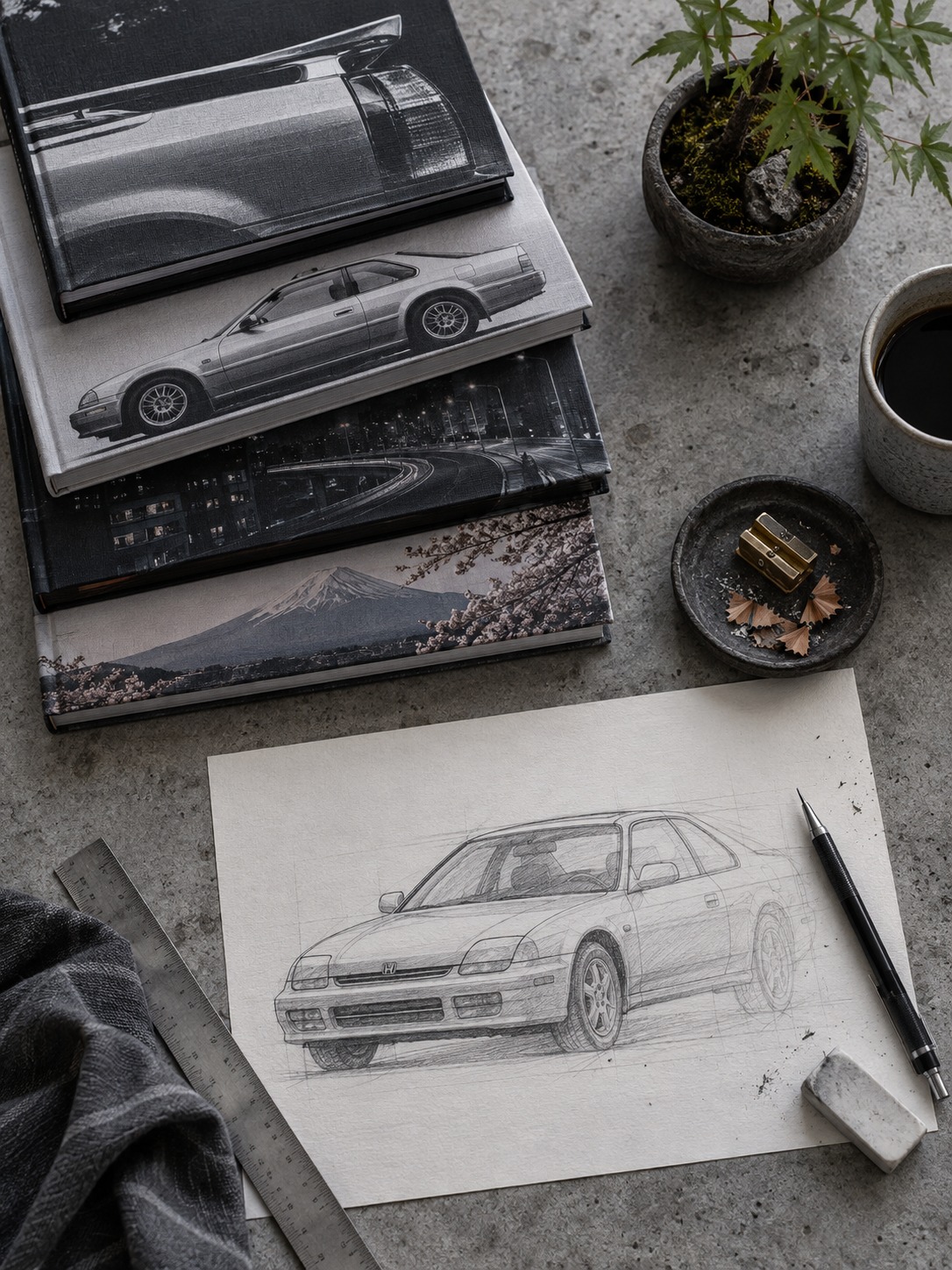
The pop-up housings themselves are worth studying separately from the rest of the hood surface. Even closed, they leave a faint seam and a slight change in surface angle that a fully modern headlight design wouldn’t have. Include that subtle break in your linework rather than smoothing it away entirely; it’s a small detail, but it’s part of what makes a Prelude drawing read as period-accurate instead of generic.
6. Honda Integra Type R (DC2) — JDM lightweight icon
The DC2 Integra Type R is famous among enthusiasts for what it doesn’t have: sound deadening, extra trim, anything that adds weight without adding performance. That philosophy shows up visually as a car with unusually clean, unadorned surfaces for its era, closer in spirit to a race car with license plates than a typical 90s coupe.
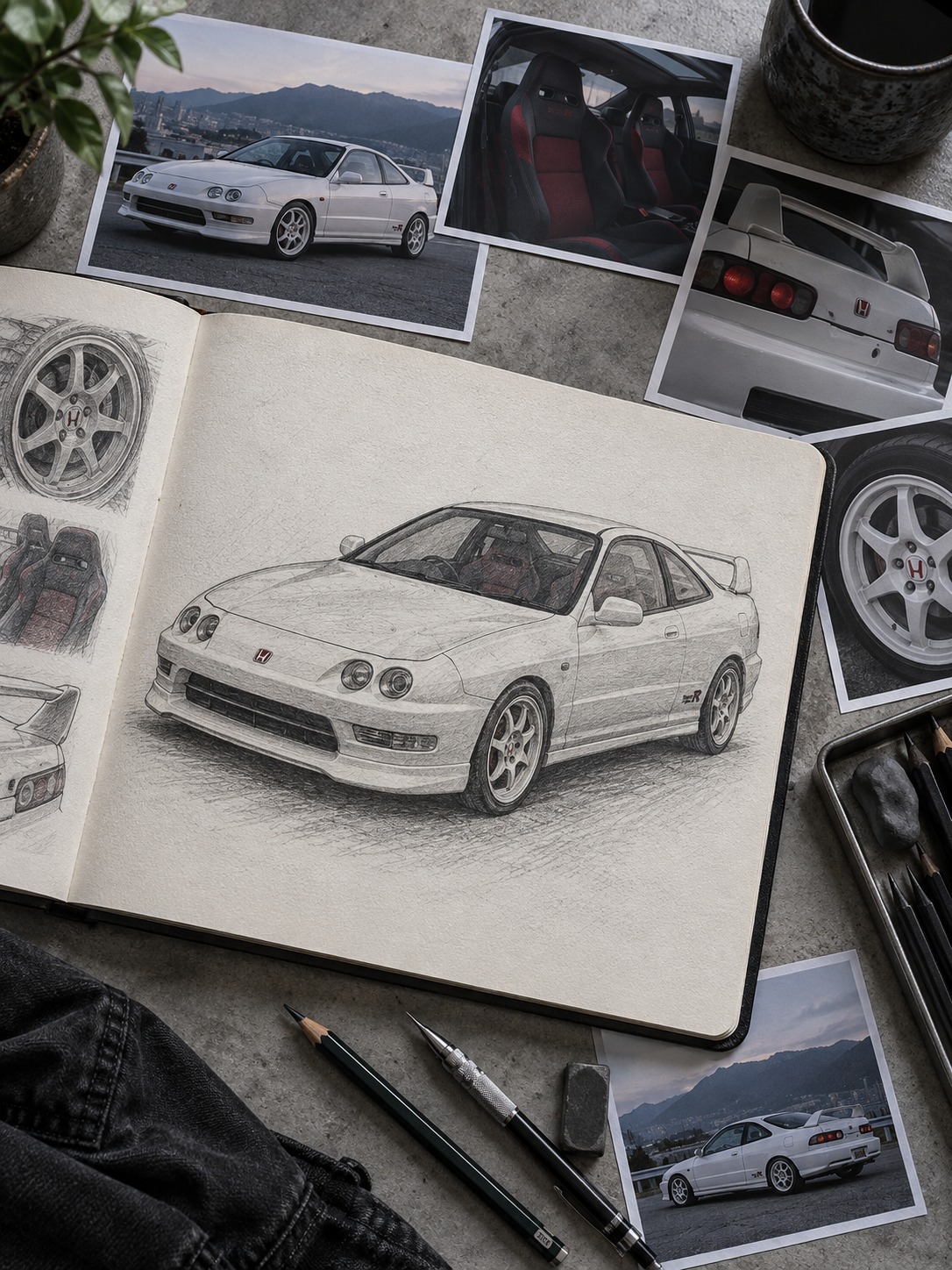
Focus your linework on the front fascia’s honeycomb grille and the subtle front lip, drawn as a distinct but thin element rather than an aftermarket-style add-on.
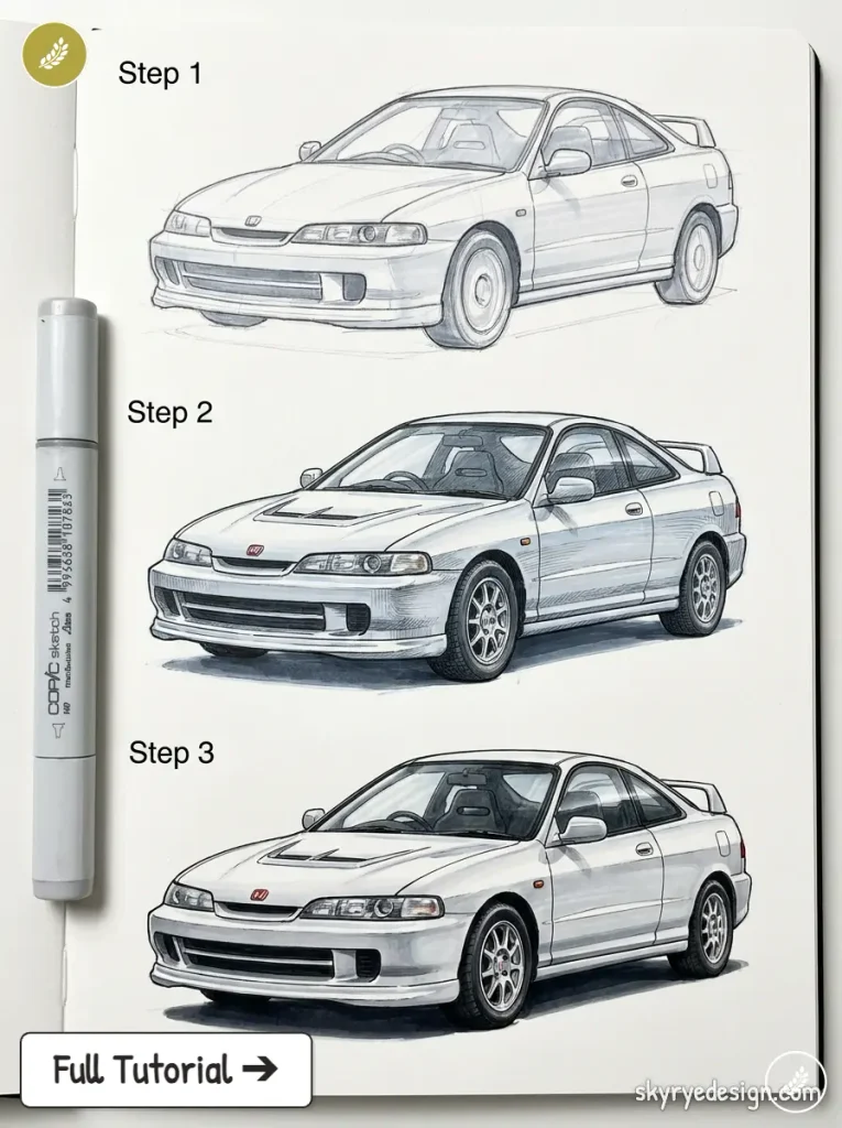
The rear spoiler is small and integrated, not the oversized wing you’d expect from the same period’s tuner culture. Precision matters more than flourish on this one; every line should look deliberate.
7. Honda Accord — mainstream sedan mastery
Drawing a well-proportioned mainstream sedan is harder than it looks, precisely because there’s nothing dramatic to hide behind. The current Accord’s success as a design comes from a long wheelbase relative to overall length and a roofline that tapers gradually rather than dropping sharply, giving it a confident, planted stance without resorting to aggressive character lines.
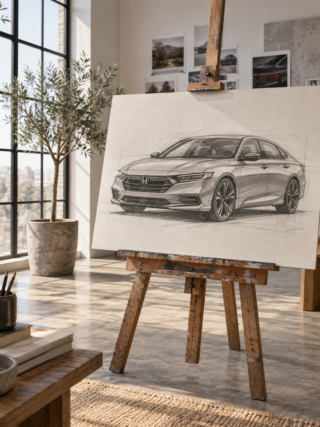
Block the greenhouse taper first, since it’s subtle: the rear glass angle is only slightly steeper than the front windshield, not dramatically different. Keep your shoulder line (the character line above the door handles) simple and continuous from front fender to taillight. Sedans reward restraint in a drawing the same way they do in the actual design process.
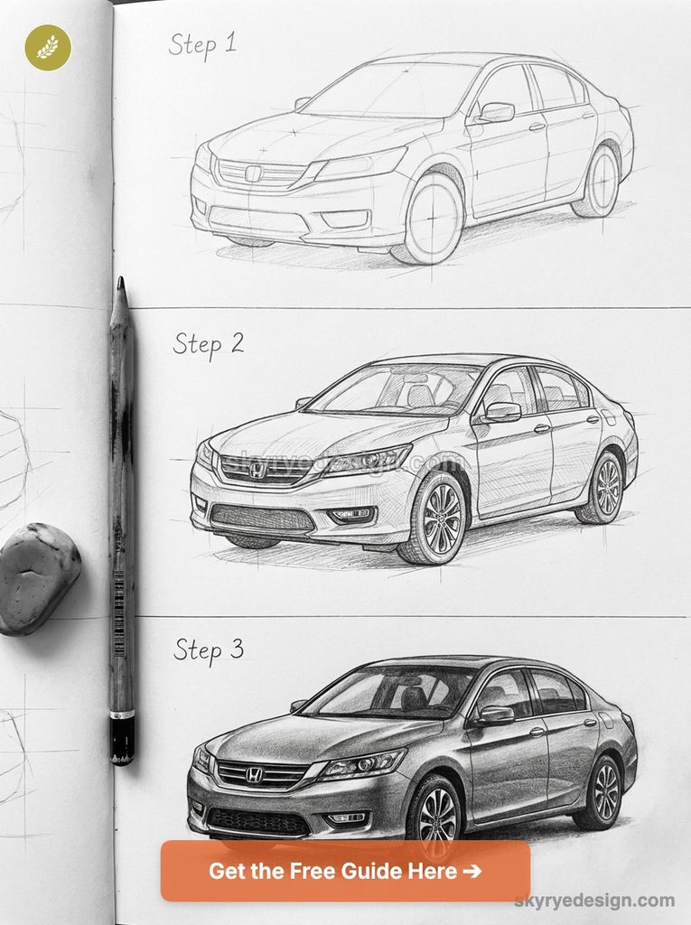
The front fascia is where a lot of the Accord’s visual confidence lives, wide, low intakes and a grille that spans nearly the full width of the car. Draw that width deliberately; a narrow, timid front end is the fastest way to make a well-proportioned sedan look uncertain instead of composed.
8. Honda CR-V — crossover volume
Crossovers live or die on how they handle visual mass, since the body sits taller and boxier than a sedan’s by definition. The CR-V manages this by keeping its greenhouse tall relative to the lower body, which reads as “upright and confident” rather than “bulky” when you get the ratio right.
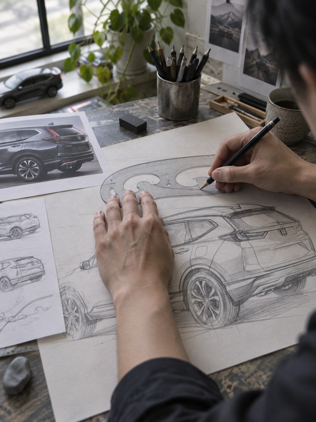
Start with the beltline higher than you would on a sedan, then build the roofline as a nearly flat plane with gentle curvature only at the corners.
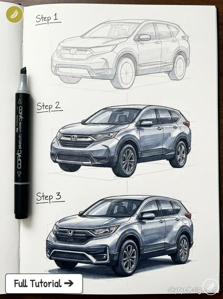
The wheel arches need to look substantial, slightly flared, to visually anchor the taller body to the ground. Skip this step and the CR-V will look like it’s floating above its wheels instead of sitting on them.
9. Honda Ridgeline — unibody truck proportions
The Ridgeline breaks truck-drawing conventions because it’s built on a unibody platform instead of a body-on-frame chassis, which shows up as smoother transitions between cab and bed than a traditional pickup has. There’s no separate bed rail sitting proud of the body; it’s one continuous surface.
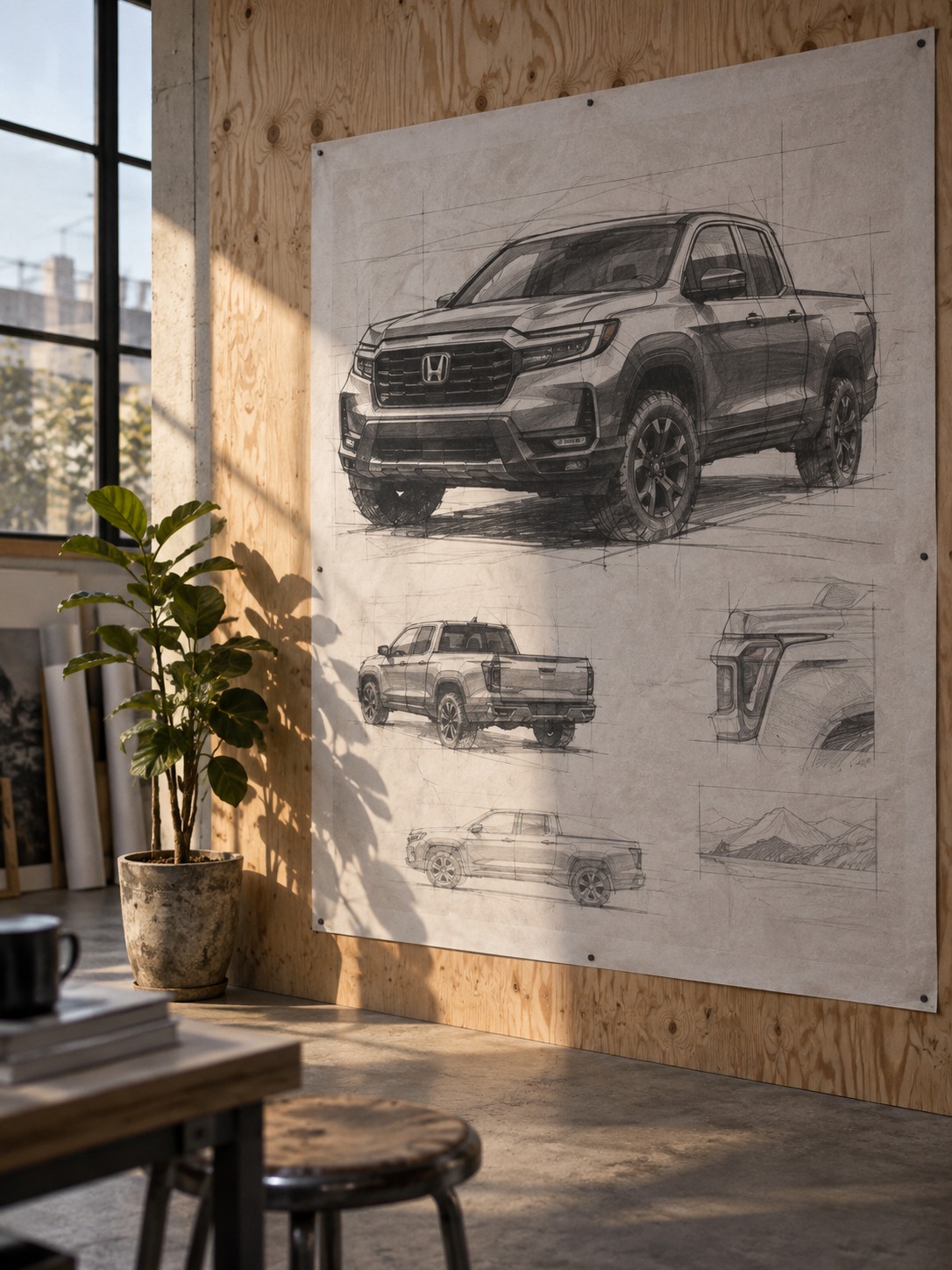
Draw the C-pillar (the roof support behind the rear doors) flowing directly into the bed’s side panel without a visible seam, since that continuity is the Ridgeline’s defining trait.
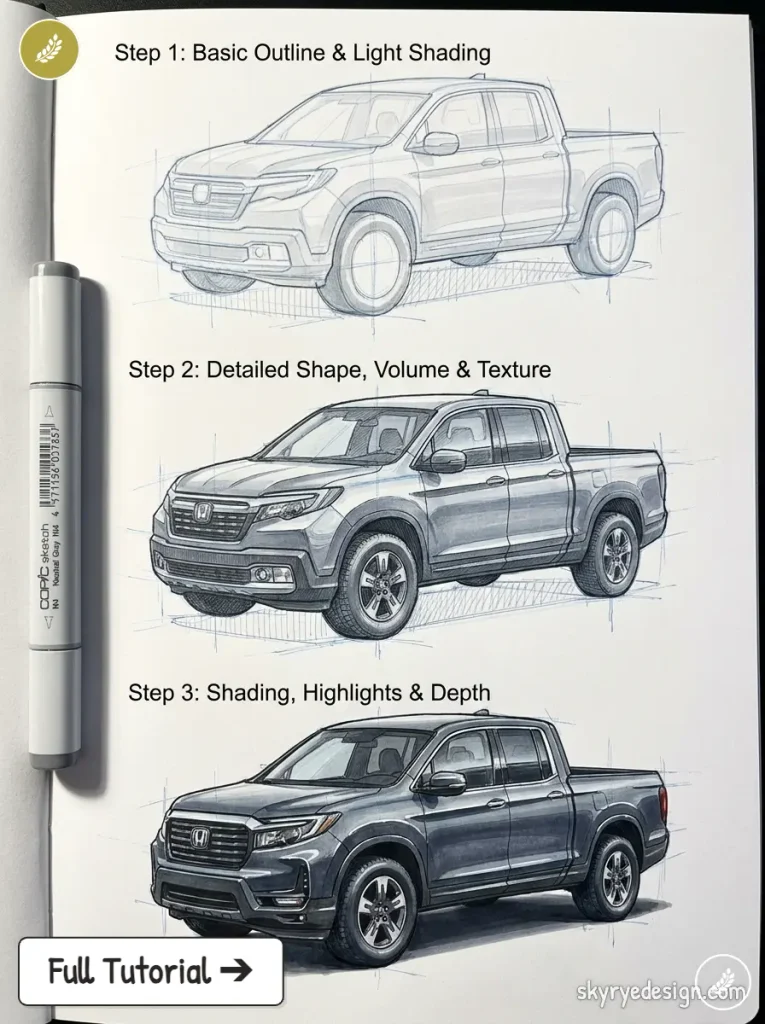
The bed itself reads shorter and more integrated than a traditional truck bed, closer in proportion to an SUV’s cargo area than a Silverado’s. Get the cab-to-bed transition right and the rest of the truck falls into place easily.
10. Honda e — retro-modern EV
The Honda e borrows its rounded, friendly proportions from decades of Civic hatchbacks while going fully modern underneath, and that tension between retro and futuristic is exactly what makes it interesting to draw.
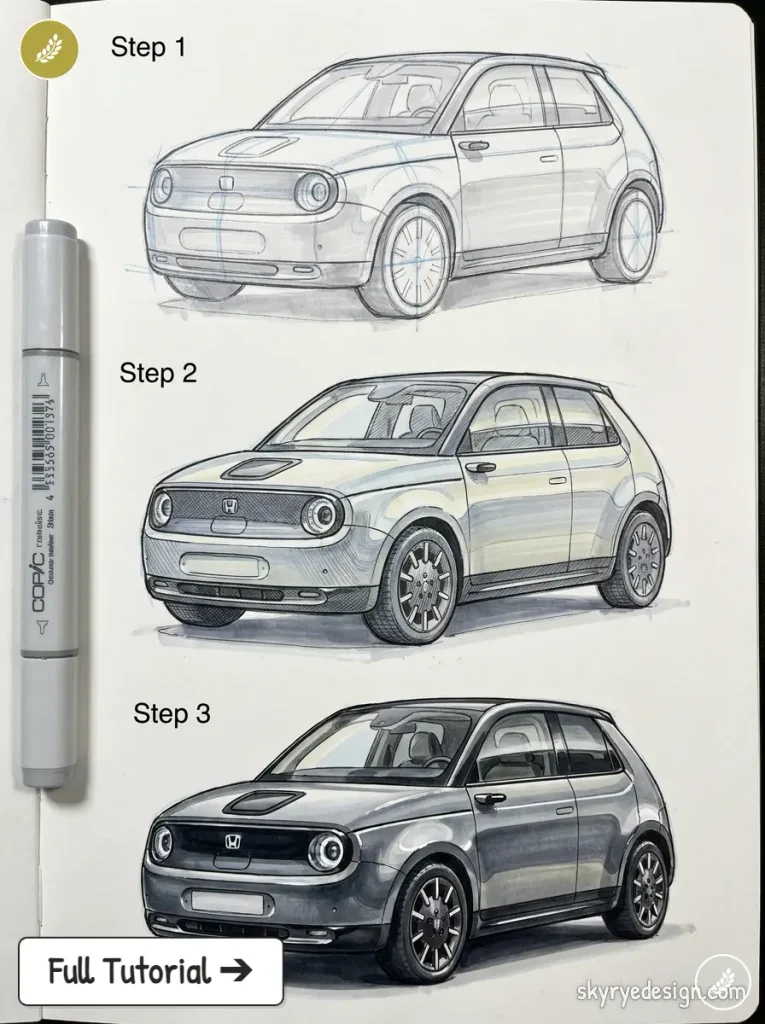
The front end has no traditional grille, just a smooth, nearly flat panel with small circular headlights set into it like the original Civic’s round lamps, reinterpreted.
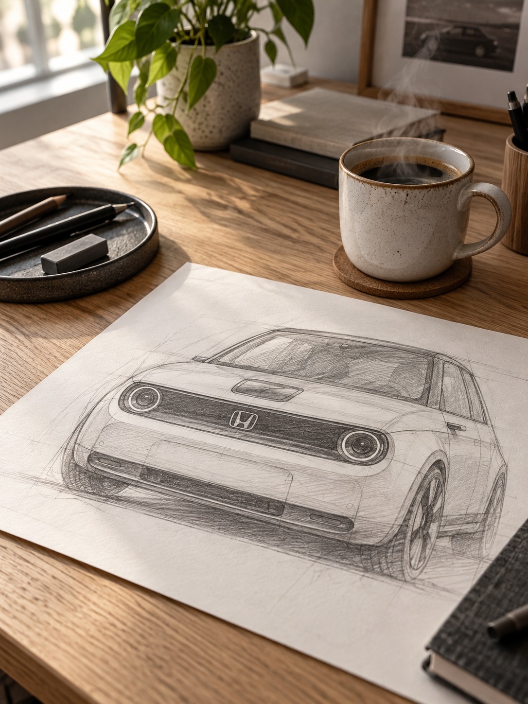
Keep the body surfacing soft and rounded throughout, since sharp character lines would fight the car’s whole design premise. The wheels sit close to the very corners of the body, more so than on any other car on this list, which gives the Honda e its distinctively compact, toy-like stance without actually looking cheap. Draw the door handles flush with the body, since they retract, and any visible handle will throw off the clean surface you’re going for.
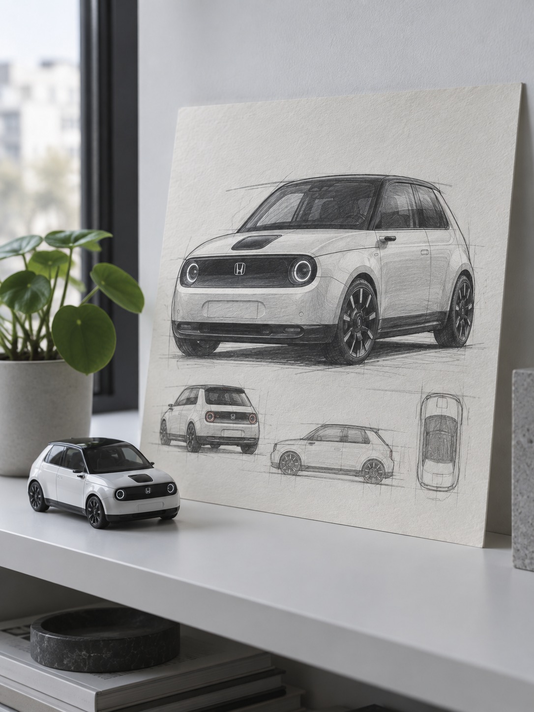
DESIGN TIP: Block-in first, always: wheelbase, beltline, greenhouse. If the silhouette isn’t reading correctly at that stage, no amount of shading later will fix it.
Common mistakes when drawing Honda models
The single biggest mistake I see: treating every Honda the same way, defaulting to generic “sporty hatchback” proportions regardless of which model you’re actually drawing. A Prelude and a Civic share DNA but read completely differently in silhouette, and flattening that difference is what makes a drawing feel generic instead of specific.
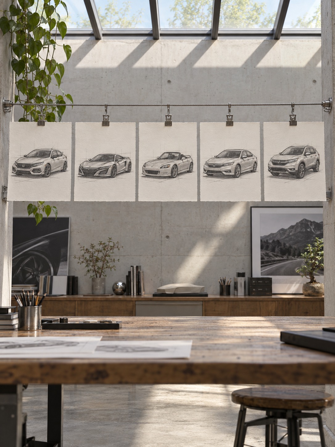
The second mistake is over-detailing the surfacing before the proportions are locked. Honda’s design language relies on restraint, so adding extra character lines to compensate for uncertain proportions makes the problem worse, not better. If a drawing isn’t reading correctly, the fix is almost always in the block-in stage, not the shading pass.
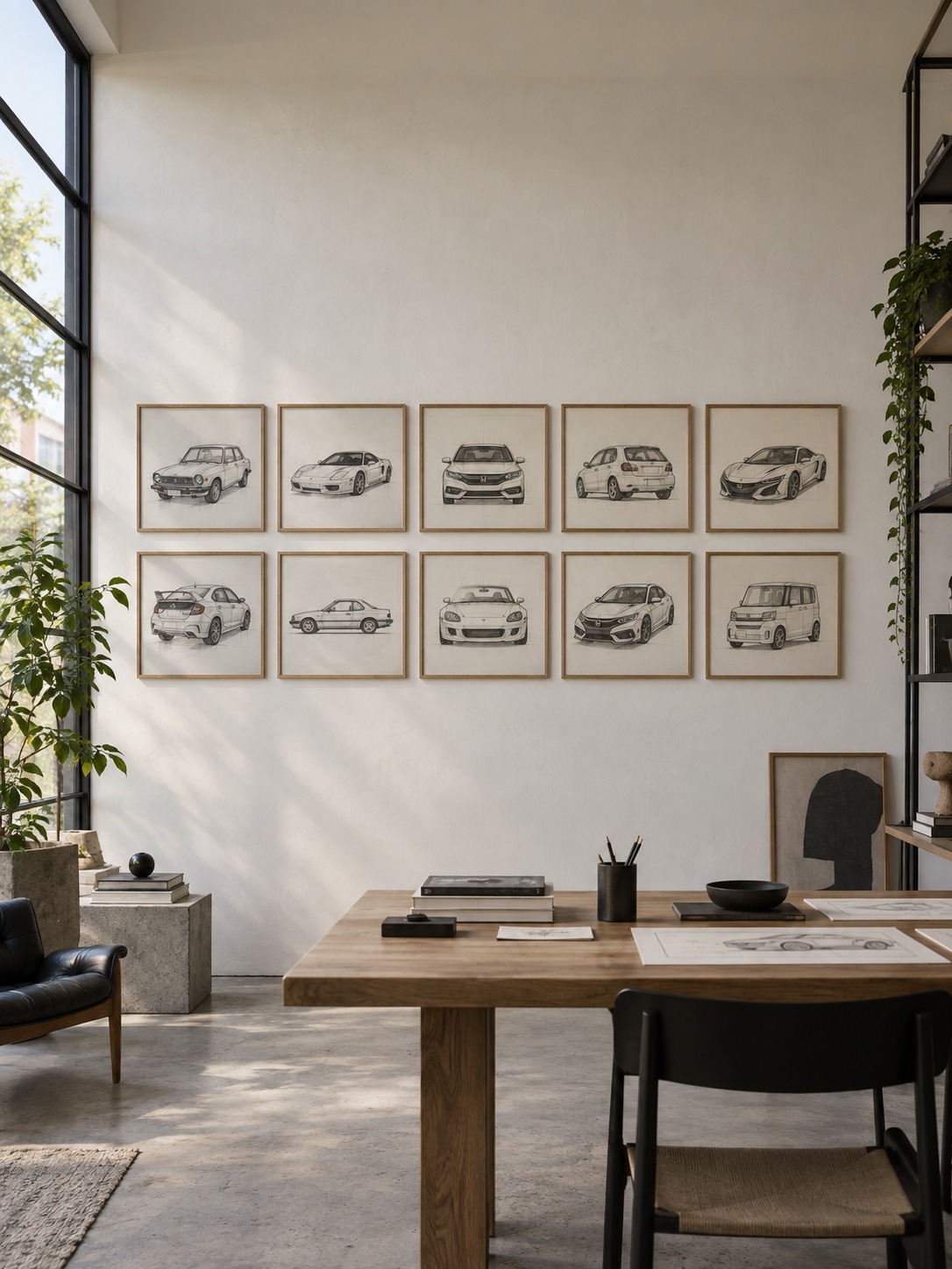
A third, smaller mistake: wheel size. Honda’s design across most of these models keeps wheels proportionally modest compared to current aftermarket trends, especially on anything before the 2010s. Oversized wheels are an easy way to accidentally make a Civic look like a completely different car.
A fourth mistake worth flagging: rushing the greenhouse. It’s tempting to treat the glass area as an afterthought once the body’s blocked in, but on most Hondas the greenhouse size and shape carry as much of the car’s identity as the body panels do. The NSX’s upright cabin and the Civic e’s rounded glass area aren’t small details; they’re central to why those cars read correctly in a drawing. Give the greenhouse the same care you give the wheel arches, and the whole drawing gets easier from there.
Frequently Asked Questions
What’s the easiest Honda model to start drawing?
The original 1972 Civic. Its flat panels and simple hatchback silhouette make the proportions easier to read and correct than a car with complex modern surfacing, like the current Type R. It’s also the best model for practicing basic block-in technique before moving to anything more detailed.
How do I make my Honda drawings look less generic?
Nail the proportions specific to that model before adding any surface detail: beltline height, greenhouse size, wheel-to-body ratio. Most generic-looking car drawings come from skipping this step and jumping straight to character lines and shading on an unconfirmed silhouette.
Do I need to know Honda’s actual design history to draw these well?
No, but understanding the “man maximum, machine minimum” philosophy helps explain why Honda cars read the way they do: larger greenhouses, lower beltlines, less visual bulk than competitors. Knowing the reasoning behind a design choice makes it easier to draw convincingly, even if you never mention it in the final piece.
What tools work best for these drawings?
A mechanical pencil (0.5mm HB) for block-in work, a softer pencil like a 2B for character lines and shading, and a kneaded eraser for lightening guidelines without smudging. Digital artists can use the same logic: a hard, precise brush for structural lines and a softer one for surface shading.
Which Honda model on this list is hardest to draw?
The NSX and the Honda e, for opposite reasons. The NSX demands confident, uninterrupted surfacing that’s unforgiving of small proportion errors. The Honda e’s rounded, minimal surfacing makes every line’s placement more visible than on a car with more character lines to distract the eye.
Should I draw Honda models from photos or from memory?
Start from photo reference, especially for proportion accuracy on models you don’t know well. Once you understand why a car’s proportions work, you can start varying angles and details from memory with much better results.
Final thoughts
Drawing ten different Honda models back to back is a fast way to understand car proportion in general, since it forces you to notice what actually changes between a hatchback, a roadster, a crossover, and a coupe, rather than defaulting to one generic “car” template for everything. That’s a more useful skill than mastering a single model’s specific lines.
Pick two or three models from this list that feel furthest apart, the original Civic and the NSX, say, or the S2000 and the Ridgeline, and draw them back to back in the same sitting. The contrast forces your eye to notice proportion differences you’d otherwise gloss over, and that comparison is worth more practice time than drawing the same model five times in a row.
If you want to keep building this same proportion sense with a different brand’s design language, I covered the same approach for Mazda’s ten most iconic models and for Toyota’s design history, each with its own set of stance and surfacing habits worth understanding. For general car-drawing fundamentals before tackling brand-specific proportions, my car drawing guide for beginners covers the block-in method referenced throughout this piece in more depth.
- 12shares
- Facebook0
- Pinterest12
- Twitter0
- Reddit0