My first attempt at an eagle looked like an angry pigeon. I’d followed one of those circle-and-oval tutorials — draw a circle for the head, an egg for the body, add a triangle beak — and the result had all the right shapes and none of the right feeling. It took me a while to figure out why: those tutorials teach you shapes, not structure.
An eagle reads as fierce and precise because of specific anatomical decisions — the brow ridge that shadows the eye, the forward-set gaze, the way a beak curves instead of just pointing. Skip those and you get a generic bird with a hook glued on. This guide walks through the actual construction, the same way I’d approach any subject from academic drawing training: structure first, detail second.
- How to Draw an Eagle in 5 Steps
- The Eagle in Art and Symbolism
- Different Angles and Poses
- Technique — Making Feathers Read as Feathers, Not Scribbles
- Materials That Actually Help
- Common Mistakes (and How to Fix Them)
- Conclusion
- FAQ
- How do you draw an eagle step by step for beginners?
- How do you draw a realistic eagle head?
- What's the hardest part of drawing an eagle?
- How do you make feathers look realistic instead of scribbled?
- How do you draw an eagle's eyes?
- What pencils are best for drawing eagles?
- How do you draw an eagle flying?
By the end you’ll have a full step-by-step method, a look at how the eagle’s image has been used in art and symbolism for centuries, a few different angles to practice, and the specific mistakes that make most eagle drawings look flat — plus how to fix them.
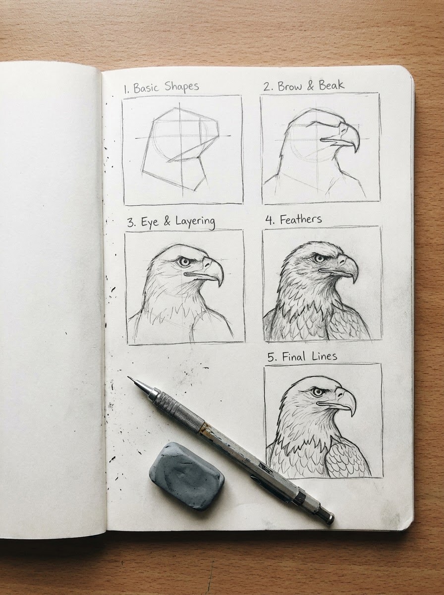
How to Draw an Eagle in 5 Steps
Forget the circle-and-oval method for a second. Here’s the version that actually gets you to something that looks like an eagle instead of a cartoon bird with a hook taped on.
Step 1: Block in the basic shapes
Start with a rough oval for the body, tilted slightly depending on the pose, and a smaller circle for the head — but don’t stop there. Add a center line running down the head into the body; it’s the single most useful guide line in the whole drawing, because it tracks which way the eagle is facing and keeps both sides symmetrical as you build outward. Sketch two loose wing masses as elongated triangles if you’re doing a perched pose, or wide sweeping arcs if you’re going for flight.
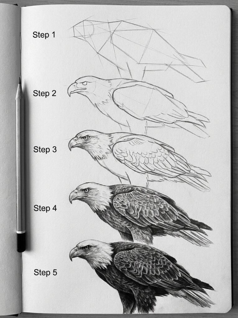
I keep this stage loose on purpose — light pencil, 2H if you’ve got one, barely pressing. In my experience, the drawings that end up looking stiff are almost always the ones where someone committed to hard lines too early. You want room to shift the head angle by a few degrees once you can see the whole composition.
Step 2: Build the head structure and brow ridge
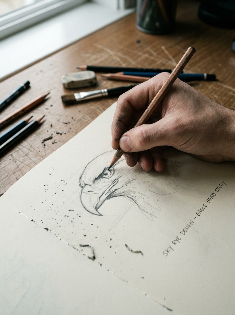
This is where most tutorials skip straight to the eye, and it’s the mistake that makes everything look wrong later. Before the eye goes anywhere, block in the brow ridge — a hard bony shelf above where the eye will sit. Raptors have a pronounced supraorbital ridge (the same bone structure that gives owls and hawks their intense look), and it casts a shadow directly onto the top of the eye. Skip this step and you’ll draw a round, friendly eye no matter how hard you try to make it look fierce later.
Sketch the ridge as a firm angled line, slightly overhanging the eye socket. Everything about the “glare” people associate with eagles comes from this one structural decision.
Step 3: Place the eye and beak
Eagle eyes sit forward and slightly angled, not round and centered like a cartoon bird’s. Draw the eye as a narrowed almond shape tucked under that brow ridge, with the iris nearly filling the visible eye — real raptors have very little white showing.
For the beak, resist the urge to draw a flat triangle. An eagle’s upper beak is a curved hook that starts at a fleshy cere (the waxy patch where the nostril sits) and curves down into a sharp point well past the lower beak. Sketch the curve first, then add the hook — drawing it as one straight-angled shape is the fastest way to end up with a plastic-looking beak.
Step 4: Layer the feathers
Feathers aren’t a texture you apply at the end — they follow the form underneath, and they layer in a specific order. Start with the smaller contour feathers around the head and chest, working from the back of each feather group forward, each row overlapping the one behind it like roof shingles. Then move to the larger flight feathers on the wings, which run in a completely different direction, radiating outward from the wing bones.
I’ve noticed the biggest giveaway in beginner feather work is uniform scribbling in every direction at once. Real feathers have a direction, and that direction changes across the body — chest feathers point down and back, wing coverts point outward, primary flight feathers point along the wing’s length.
Step 5: Finalize linework and add shading
Once the feather layers are blocked in, go back with a slightly darker pencil (I use around a 4B for this pass) and commit to your final lines, cleaning up the loose construction marks as you go. Add shading under the brow ridge, along the underside of the beak’s hook, and in the gaps between feather layers — that’s where the real depth comes from, not from outlining every single feather in black.
TIP: step back from the drawing (or shrink the image if you’re working digitally) every few minutes. Feather detail up close can look convincing while the overall head shape reads wrong from a distance — and distance is how most people will actually see the finished piece.
The Eagle in Art and Symbolism
Long before anyone was drawing eagles in sketchbooks, someone was carving them into standards and coins — and understanding why tells you a lot about what makes an eagle silhouette actually work as an image.
Heraldry and national symbols
The eagle shows up as a power symbol across an unusually wide range of cultures with no shared origin: the Roman legions carried eagle standards into battle, the Byzantine Empire adopted the double-headed eagle, and it’s the central figure on the Great Seal of the United States, formalized in 1782.
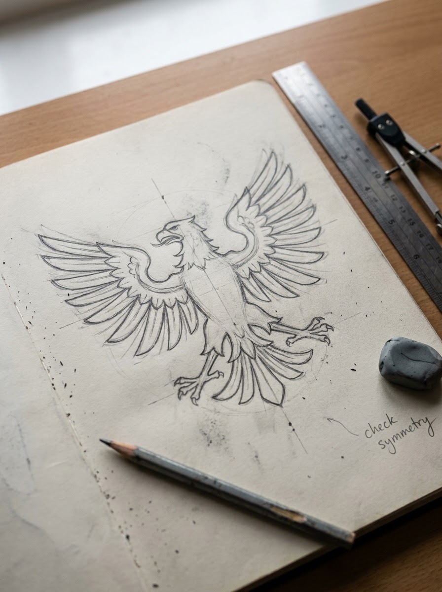
What’s interesting from a design standpoint is how consistently these emblems simplify the same features — the hooked beak, the spread wings, the forward-set eyes — because those are the shapes that read as “eagle” even at a tiny scale or from a distance. That’s not an accident. It’s the same principle behind any strong logo: reduce a subject to the two or three shapes that carry all the recognition, and the rest is noise.
From Native American art to modern brand design
The eagle carries deep symbolic weight in many Native American traditions, particularly among Plains nations, where eagle feathers are earned and carry specific meaning tied to honor and achievement — a very different relationship to the image than the heraldic “power symbol” use in Western coats of arms. Worth knowing if you’re drawing eagle imagery with any cultural context attached, rather than just as a generic strength symbol.
That same simplified-eagle logic is exactly what shows up in modern branding and tattoo work today. I’ve done identity work where a client wanted “an eagle, but not the bald-eagle-clipart eagle” — and the answer is almost always the same: push the brow ridge and beak curve harder, since those two shapes do more work than any amount of feather detail. It’s a useful thing to know before you even start sketching: decide how much of the eagle’s “meaning” you want the drawing to carry, because that decision changes which anatomical details you emphasize.
Different Angles and Poses
Every tutorial online shows you exactly one angle — usually a head-on portrait — and calls it done. That’s a problem, because the construction logic changes depending on the pose, and knowing that difference is what lets you actually draw an eagle instead of just copying one photo.
Head close-up / portrait angle
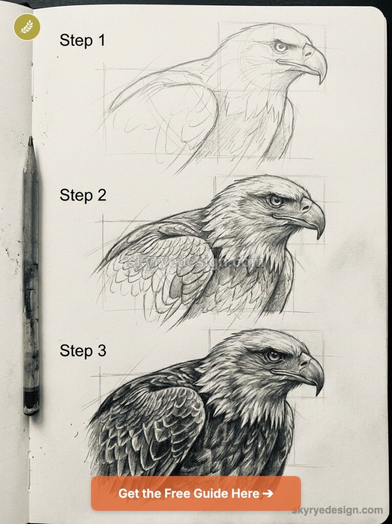
This is the version most people start with, and for good reason — it’s the pose from Steps 1 through 5 above. The center line runs straight down through the beak, both eyes are roughly level, and the brow ridge reads as a symmetrical shadow on both sides. Easiest angle to get proportions right on, which is exactly why it’s worth mastering before moving to anything harder.
Perched, talons gripping a branch
Turn the eagle to a three-quarter angle and the body compresses — the near wing tucks tight against the body while the far wing barely shows past the silhouette. The talons become a real compositional element here, wrapped around a branch with the weight visibly settled into the grip. I always block the branch in first at this pose, then build the foot around it, rather than drawing the foot in isolation and trying to wrap a branch underneath afterward — it never sits right that way.
Flying, wings spread
This is the hardest of the three, because you’re dealing with real foreshortening. A wing angled toward the viewer doesn’t get longer — it gets wider and shorter, with the flight feathers fanning out in a way that can look confusing if you draw them as flat shapes instead of following the wing’s curve through space. Sketch the wing as a simplified 3D form first (think of it as a curved plane, not a flat triangle) before adding a single feather. Skip that step and the wings tend to flatten out like paper cutouts no matter how much feather detail you add on top.
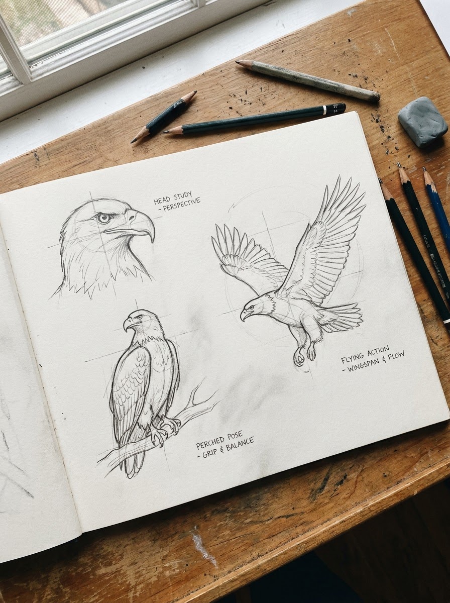
TIP: if a pose feels off and you can’t figure out why, check the center line first. Nine times out of ten, an eagle drawing that “looks wrong” has an inconsistent center line between the head and body — the two ends up facing slightly different directions.
Technique — Making Feathers Read as Feathers, Not Scribbles
Feathers are the detail that makes or breaks a realistic eagle drawing, and they’re also where I see the most beginners lose the plot completely — usually by treating them as a texture to fill in rather than a structure to follow.
Contour vs. flight feathers — different direction, different rendering
Contour feathers are the small, soft feathers covering the head, chest, and body — they overlap like shingles, each one covering the base of the one behind it, and they follow the curve of the body closely. Flight feathers are a different animal entirely: long, stiff, and radiating outward from the wing bones in a fan pattern, with a visible central shaft (the rachis) running down each one.
Mixing these up is the single fastest way to make a drawing look wrong. I’ve seen plenty of otherwise solid sketches fall apart because someone rendered the wing feathers with the same soft, overlapping shingle technique they used on the chest — flight feathers need harder edges and visible shaft lines, or the wing reads as fur instead of feathers.
A layering method: back to front, light to dark
Work in passes rather than trying to finish each feather individually. First pass: block in the direction and overlap pattern for an entire feather group with light pencil strokes — just the boundaries, no detail. Second pass: add the central shaft line to each feather, which does more to sell “feather” than any amount of edge texture. Third pass: shade the overlap areas where one feather casts a shadow on the one beneath it — that’s where the real dimensionality comes from.
For actual texture within each feather, alternate between hatching (short parallel strokes following the feather’s direction) for the stiffer flight feathers, and soft blending with a tortillon or your finger for the downier contour feathers near the head. Same bird, two different techniques, and using the wrong one in the wrong spot is exactly what makes a drawing read as “off” without anyone being able to say why.
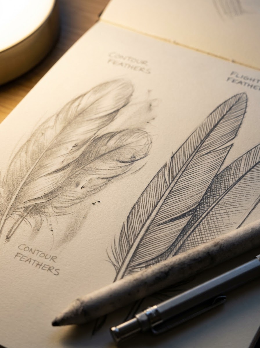
TIP: draw the shaft line down the center of a flight feather before you touch the edges. It anchors the whole feather’s direction and keeps you from drifting into random scribble strokes as you add texture.
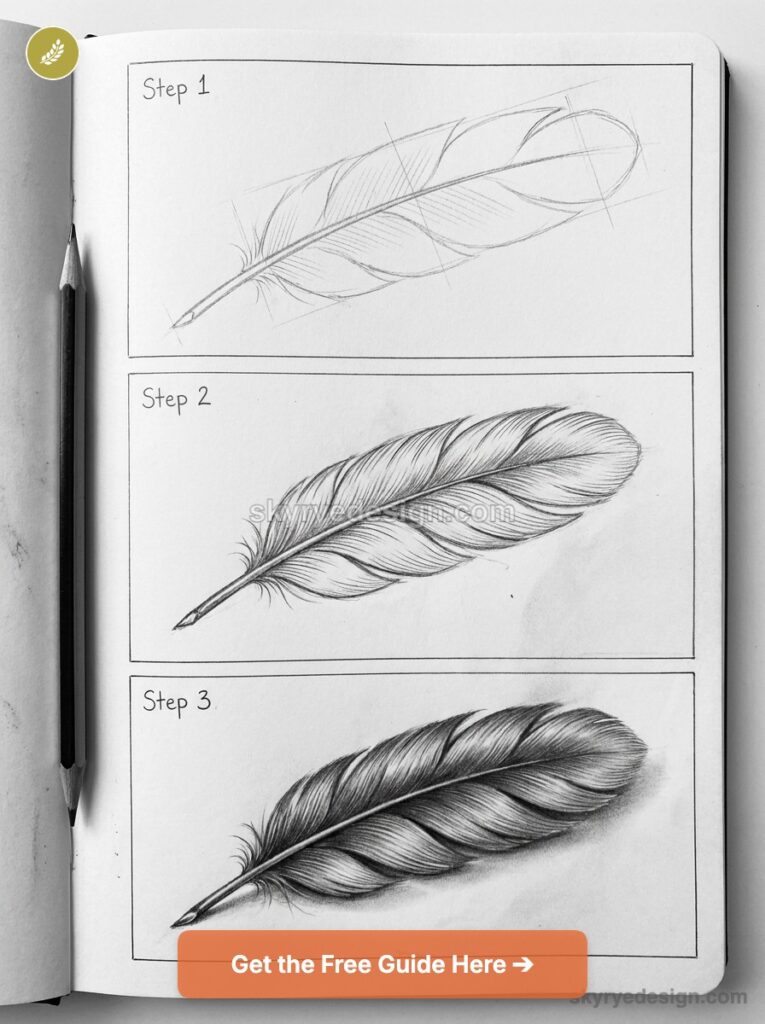
Materials That Actually Help
You don’t need an expensive kit to draw a convincing eagle, but a few material choices make the feather work genuinely easier instead of fighting you the whole way.
Pencil grade range and why hardness matters
I work across a fairly wide range for this subject — a 2H for the loose construction stage, since it’s light enough to erase cleanly without ghosting through the final linework. Then an HB to 2B range for most of the feather layering and general shading. And a 4B to 6B for the darkest values: the pupil, the deep shadow under the brow ridge, the gap between overlapping wing feathers. Trying to do all of this with one mid-range pencil is exactly why a lot of feather work ends up looking muddy and flat — you need the hardness range to get both the crisp, light construction lines and the genuinely dark accents in the same drawing.
Paper tooth and blending tools
A paper with some visible tooth (texture) actually helps here, counterintuitively — it grabs graphite in a way that mimics the slightly irregular edge of real feather barbs, especially for the softer contour feathers. Completely smooth paper tends to push you toward overly clean, almost airbrushed-looking feathers, which is the opposite of what you want.
For blending, I reach for a tortillon on the soft contour feathers around the head and chest, and I deliberately avoid blending on the stiffer flight feathers at all — those need to keep their hard hatched edges to read as rigid rather than downy. A kneaded eraser is worth having specifically for pulling out highlights in the eye and along feather edges after you’ve laid down shading, rather than trying to plan around the white of the paper from the start.
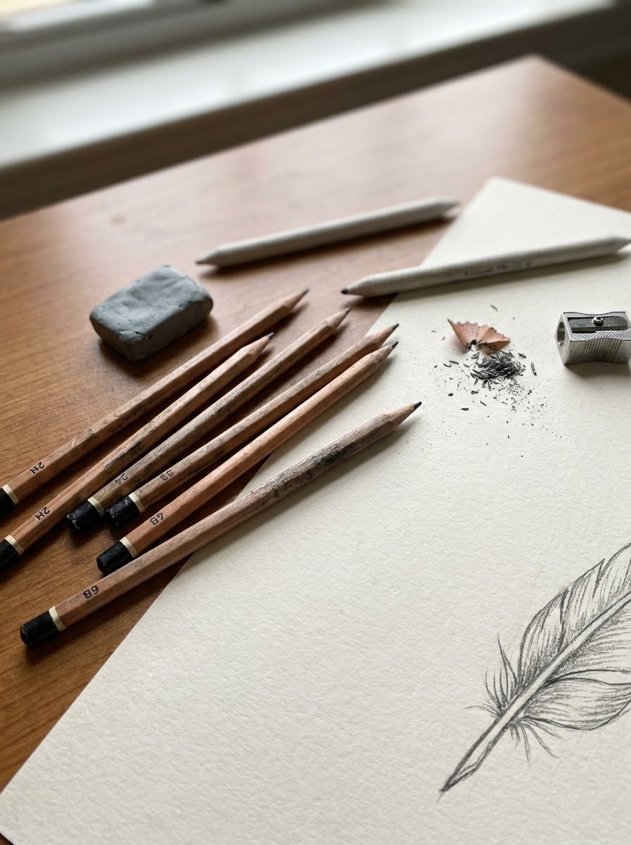
TIP: test your pencil range on a scrap of the same paper before starting the actual drawing. Paper tooth changes how dark a given pencil grade actually reads, and it’s a five-minute check that saves you from redoing a section that came out lighter or darker than planned.
Common Mistakes (and How to Fix Them)
Most eagle drawings that “look off” without an obvious reason come down to one of three fixable problems. Here’s what to check.
Cartoonish round eyes vs. forward-set predatory gaze
The mistake: drawing the eye as a simple round circle, centered in an open socket with lots of white showing — the default “friendly bird” eye shape. It reads as approachable, which is exactly wrong for an eagle.
The fix: narrow the eye into more of an angled almond shape, tuck it under the brow ridge from Step 2, and let the iris fill almost the entire visible eye. Barely any white should show. That combination — narrowed shape, heavy shadow above, minimal sclera — is what creates the forward, predatory stare people associate with raptors.
Flat triangle beaks vs. curved hook with cere
The mistake: drawing the beak as a straight-edged triangle stuck onto the face, with no curve and no transition into the feathered part of the head.
The fix: start the beak at the cere (that fleshy patch where the nostril sits, right where feathers end and beak begins), then curve the upper beak downward into a sharp hooked point that extends past the lower beak. The curve is the whole trick — a beak built from straight lines reads as plastic no matter how much you shade it afterward.
Claw-like feet vs. anatomically correct talons
The mistake: drawing the foot as a simple set of curved claws radiating from a point, like a cartoon dinosaur foot, with no sense of the actual leg structure gripping something.
The fix: eagles have three forward-facing toes and one strong rear toe (the hallux), and in a gripping pose that rear talon is often doing the most visible work, wrapped hard around whatever the eagle is perched on. Build the branch or surface first, then wrap the toes around it with the weight visibly settled into the grip — a foot drawn in isolation almost never looks like it’s actually holding onto anything.
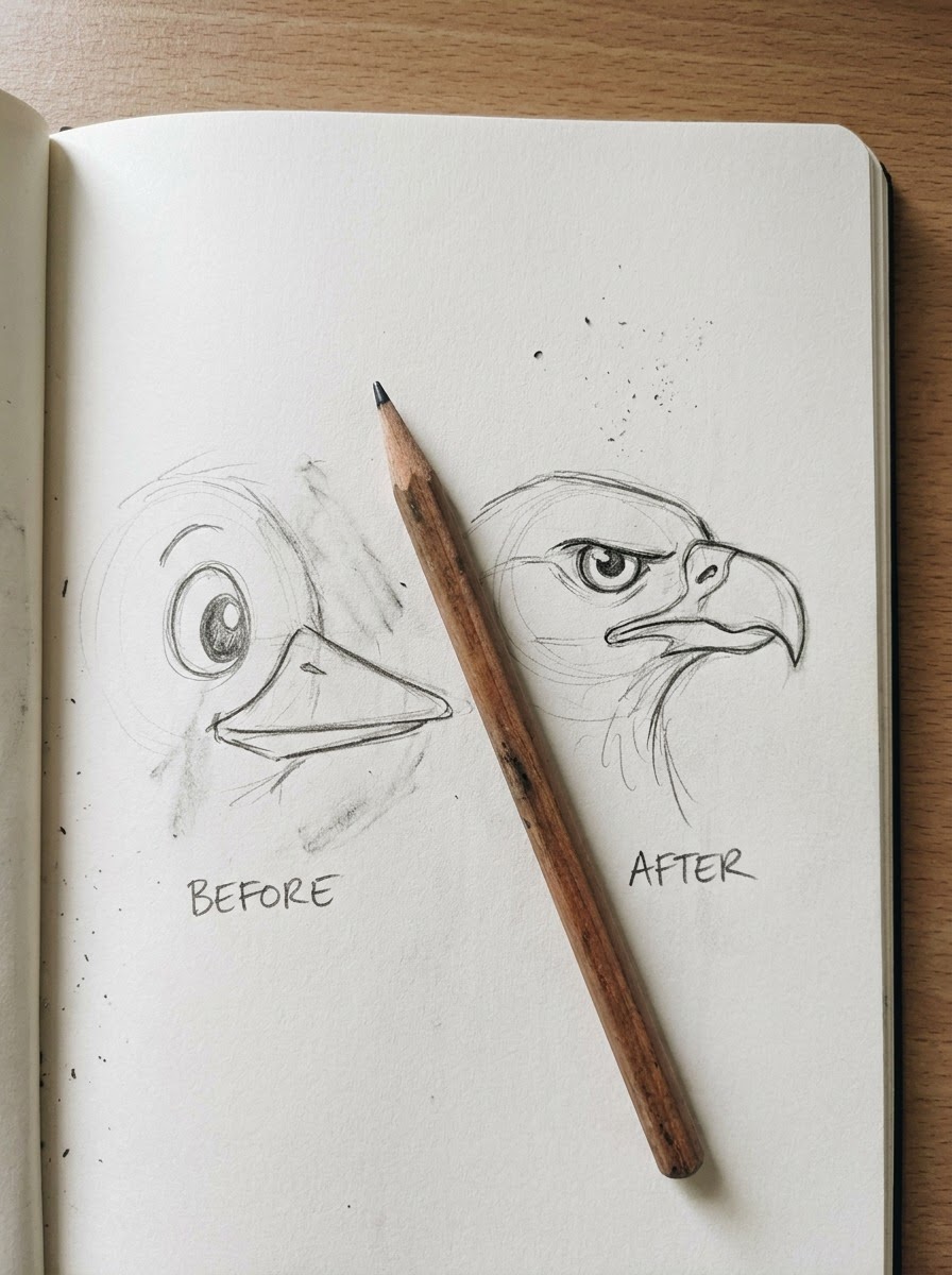
TIP: if a finished drawing still feels “off” and you can’t pinpoint why, check these three spots first — eye shape, beak curve, foot structure — before touching anything else. They’re responsible for most of the difference between a convincing eagle and a generic bird.
Conclusion
An eagle looks convincing when the structure underneath is right — the fierce look isn’t decoration you add at the end, it’s the brow ridge, the forward-set eye, the curved beak, and feathers that actually follow the form of the body. Get those anatomical decisions right and the drawing reads as an eagle even with minimal detail. Get them wrong and no amount of feather texture will fix it.
You don’t need to master all five steps and every angle in one sitting.
Pick one reference photo this week and do just the construction pass — basic shapes, center line, brow ridge — and stop there. Get comfortable with the structure before you chase feather detail. That’s the actual difference between tutorials that teach you to copy one image and actually learning to draw an eagle.
FAQ
How do you draw an eagle step by step for beginners?
Start with loose basic shapes — an oval body, a smaller circle for the head, and a center line running down through both to track direction and symmetry. Build the brow ridge before the eye, since it’s what creates the fierce expression. Then place the eye and beak, layer the feathers from contour to flight feathers, and finish with darker linework and shading. Keep early stages light (a 2H pencil works well) so you can adjust proportions before committing to final lines.
How do you draw a realistic eagle head?
The key is building structure before detail. Block in the skull shape and, critically, the brow ridge — a hard bony shelf above the eye that most tutorials skip entirely. That ridge casts the shadow responsible for an eagle’s intense look. Only after that goes in should you place the eye (narrow and forward-set, not round) and the beak (a curved hook starting at the cere, not a flat triangle).
What’s the hardest part of drawing an eagle?
Feather layering, without question. Contour feathers and flight feathers move in completely different directions and need different rendering techniques — soft blending for the downy contour feathers, harder hatched edges with visible shaft lines for the stiff flight feathers. Mixing up which technique goes where is the most common reason an otherwise solid eagle drawing looks off.
How do you make feathers look realistic instead of scribbled?
Work in passes instead of finishing each feather individually. First block in the overlap pattern and direction for a whole feather group, then add the central shaft line to each feather, then shade the overlap areas where feathers cast shadows on each other. Random multi-directional scribbling is the single biggest giveaway of a beginner feather pass.
How do you draw an eagle’s eyes?
Skip the round, centered “friendly bird” eye shape — that’s what makes eagle drawings look cartoonish. Draw a narrowed, angled almond shape tucked under a heavy brow ridge, with the iris filling nearly the entire visible eye and very little white (sclera) showing. That combination of narrow shape, heavy shadow, and minimal white is what creates the forward, predatory stare.
What pencils are best for drawing eagles?
A range works better than one pencil. Use a 2H for loose construction lines that erase cleanly, an HB to 2B range for general feather layering and shading, and a 4B to 6B for the darkest accents — the pupil, the shadow under the brow ridge, and gaps between overlapping feathers. Paper with some visible tooth also helps, since it mimics the slightly irregular texture of real feather edges.
How do you draw an eagle flying?
Start by sketching the wing as a simplified curved 3D form, not a flat triangle — a wing angled toward the viewer gets wider and shorter due to foreshortening, not longer. Only add flight feathers once that basic wing shape is right; skipping this step is why flying eagle drawings often look like flat paper cutouts no matter how much feather detail gets added afterward.
- 225shares
- Facebook0
- Pinterest225
- Twitter0
- Reddit0