Designing a website can sometimes feel like juggling a hundred different tasks at once. From laying out pages and defining color schemes to coordinating with developers, there are countless details to manage. That is where Figma for website design steps in, offering an all-in-one solution that streamlines your workflow and keeps everyone on the same page. In this ultimate guide, you will discover why Figma has become a top choice for building modern, responsive websites. You will also learn how features like Figma Sites, Dev Mode, real-time collaboration, and advanced prototyping tools completely transform your approach to web design.
Whether you are a seasoned UX designer, a creative developer, or someone curious about bringing a website idea to life, Figma’s intuitive platform and powerful capabilities can help you produce sleek, user-friendly websites with less stress. Best of all, Figma’s browser-based environment invites you and your team to collaborate effortlessly and make decisions faster. By the end of this guide, you will understand how Figma tools fit together, how to harness them for maximum efficiency, and the best practices that lead to truly remarkable web experiences.
Below, we will break down each essential aspect of Figma’s platform, highlight how it supports your website projects, and show you how you can put these tools to work right away. Welcome to your comprehensive resource for next-level website design with Figma.

Explore the benefits of Figma
Figma is a vector-based interface design and prototyping tool, well-known for its ability to handle websites, mobile apps, and various other digital experiences. You can get to work using its robust free tier if you are just starting out, or choose from paid plans when you need more advanced functionality. But what really sets Figma apart?
Browser-based and cross-platform
Figma runs primarily in your web browser, so you do not need to worry about installing heavy software on every machine. This approach means your project files, design libraries, and collaboration features are available on any device. Whether you run Windows, macOS, or even Linux, you can jump into your designs from just about anywhere. If you prefer a desktop environment, Figma also provides desktop apps for Mac and Windows, giving you the flexibility to work however you want.
- Real-time updates: When you open a Figma file in multiple browser windows (or with multiple collaborators), you see changes as they happen, minimizing version control issues.
Rich collaboration features
Since it is easy for everyone to access Figma, you can collaborate in real time or leave asynchronous feedback. Designers, developers, product managers, writers, and stakeholders can all gather around the same file and make decisions without endless email threads. This immediacy speeds up your timeline and keeps the entire team aligned.
- Commenting and annotations: Voice your thoughts directly on elements within a design.
- Version history: Track design iterations and roll back to previous states if you need to.
Integrated design and prototyping
Figma allows you to stay in one place during both design and prototyping. This continuity means you can polish the look and feel of your website, then link frames and elements to create realistic prototypes without jumping between multiple apps. It is easy to show how users can navigate from one page to another or how a button interaction should behave when clicked.
- Reduce complexity: One tool covers interface design, prototyping, and even developer handoff.
- Faster iteration: Quickly create prototypes to test ideas before coding begins.
From the moment you begin working in Figma, you will see how it eliminates many of the small headaches associated with traditional design software. Its smooth, intuitive functionality and web-based collaboration make it a natural fit for website projects of all sizes.
Use Figma Sites for responsive websites
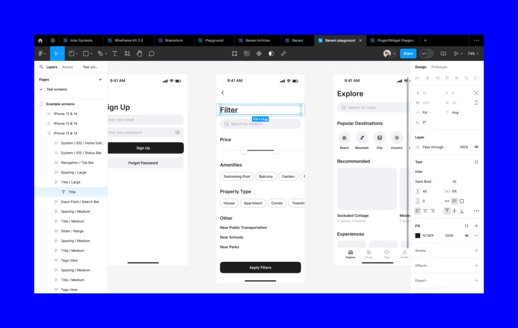
One of the most significant recent evolutions is Figma Sites, which enables you to design, prototype, and even publish fully responsive websites directly from Figma. If you have ever dreamed of a seamless path between your website mockups and an actual, live webpage, this feature closes that gap.
Paste existing designs for instant layouts
Figma Sites allows you to paste existing frames from your Figma Design file into a site template. The system immediately translates your existing layout and typography, so you do not have to rebuild everything from scratch. This means:
- Your original design details remain in place.
- You can quickly produce pages, gather team feedback, and make changes without juggling multiple software platforms.
- It feels seamless to convert a high-fidelity design into a functional site.
Figma Sites includes pre-built blocks and auto layout settings to help you structure pages in a snap. Need a header, footer, or a series of responsive image blocks? Drag them in or paste them straight from a design system you have already set up. Figma will preserve your font choices, color schemes, and spacing so that your final site looks exactly like your original vision.
(Figma)
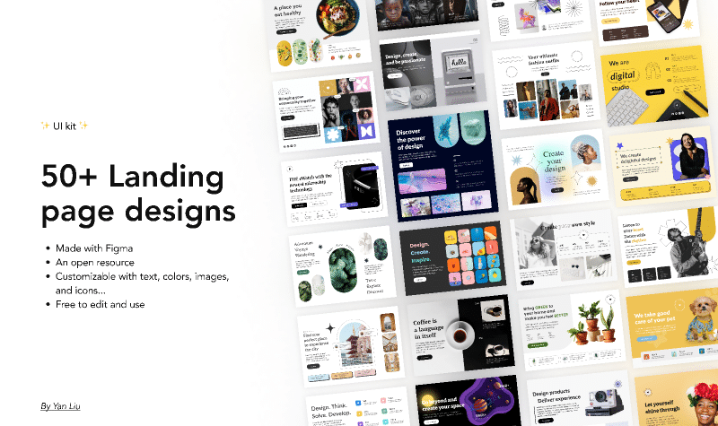
Connect a built-in CMS
Publishing a website is great, but what about managing content? Figma Sites features an optional built-in CMS (Content Management System). That means you (or your collaborators) can add, edit, and publish page content from a dedicated view, separate from the design canvas. Nobody has to risk damaging the layout by moving elements accidentally. Instead, they can update text, photos, and more while you retain control over the look and structure.
(Figma)

Deploy your site effortlessly
Figma Sites also lets you publish your project to the web without complicated setups. It supports custom domains and offers an AI-assisted approach to generating interactions or refining site functionality, so you can truly customize your site’s behavior and user journeys. By tying these processes together into a single pane, Figma Sites takes website creation from design concept to live, responsive site faster than ever.
(Figma Help Center)
Simplify handoff with Dev Mode
Designing a website is only half the job. That design must eventually become code. In many traditional workflows, you might export assets, annotate designs, and pass them to developers through file-sharing services. In Figma, Dev Mode completes the circle, ensuring your team can transform well-thought-out visuals into polished, accurate code.
Direct design-to-code capabilities
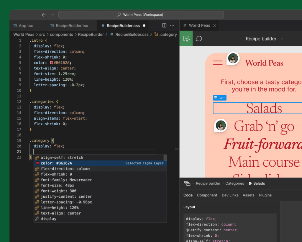
Dev Mode helps you minimize guesswork on the developer’s side. Rather than receiving a static PDF or image, your developer can open the same Figma file, inspect layers, see spacing, and copy code snippets that match the layout exactly. You can even define interactions and states, giving a much clearer vision of the intended experience.
- Fewer mistakes: Developers see exactly which font sizes, hex codes, and component variants to use.
- Smoother validation: Any changes are visible in real time, so you can confirm the final product is correct.
Live specification updates
Since Dev Mode is integrated directly into Figma Design, your developers never have to chase the latest specs or re-check Slack threads. When you finalize a design, the Figma file itself is the single source of truth. Everyone can see the final versions of components, icons, and color styles, which helps unify brand identity across every page.
(Figma Help Center)
In short, Dev Mode frees you from many of the headaches that come with bridging the design-development gap. If your team previously struggled with endless back-and-forth, you will likely see immediate improvement by placing Dev Mode at the heart of your website design process.
Collaborate in real time
Collaboration may be one of the biggest reasons to move your projects into Figma. The platform’s real-time editing feature is a game-changer if you need to keep marketing, design, product, and development teams aligned. No more exchanging file versions or dealing with “Who has the latest iteration?” moments.
- Follow the cursor
If you are handing off a design or presenting it in a meeting, your collaborators can follow your cursor movements around the canvas. This helps them see exactly which element you are referencing. - Brainstorm with FigJam
Beyond direct collaboration in design files, Figma also provides FigJam, a digital whiteboard for brainstorming, sketching user flows, or outlining site content. (Figma)
Because all changes show up in real time, you can fix issues, clarify intentions, and finalize design decisions without walking through a dozen versions. This may be especially helpful in agile teams or remote setups where quick feedback loops are the key to meeting deadlines.

Design components for consistency
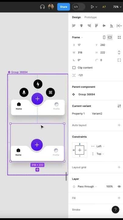
When you are building a website, inconsistent elements can quickly dilute your brand message and confuse users. That is why Figma encourages you to create and maintain a library of reusable components. Components can range from small items like buttons and icons to entire layout patterns like navigation bars or footers.
Establish a design system
A design system is a shared library of components, text styles, and color palettes. In Figma, you can turn often-used widgets (cards, form fields, headers) into main components. Then, each instance of that component in your design can be customized with overrides such as images, labels, or color tweaks.
- Faster updates: When you edit the main component, Figma will automatically propagate changes to every instance.
- Reduced errors: Designers and developers no longer rely on guesswork because they can pick from a consistent set of brand-approved elements.
If you want to go a step further, you can store these components in a dedicated team library. Team members can browse and import what they need for each project, ensuring consistent design across multiple websites, apps, or marketing campaigns.
(Reddit)
Use auto layout for responsiveness
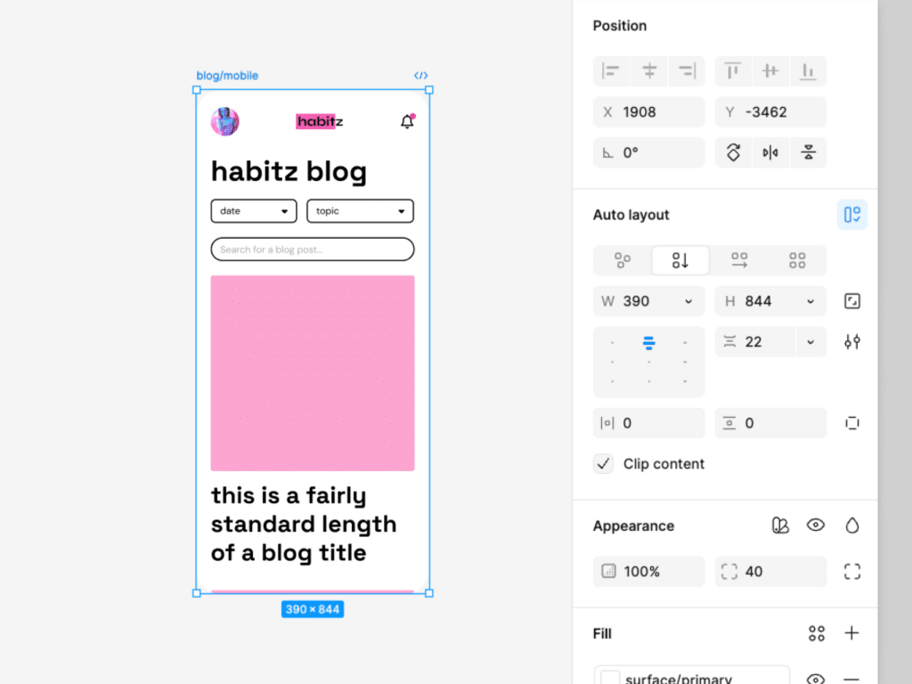
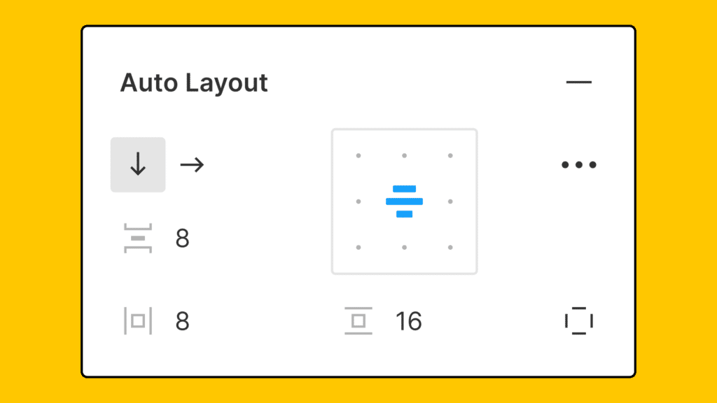
Website content often needs to adjust to different devices and screen sizes. Figma’s auto layout feature can handle this gracefully by dynamically adapting columns, spacing, and alignment as elements change or as the frame resizes.
- Add vertical or horizontal padding to your frames.
- Define spacing and alignment rules that respond to different content.
- Effortlessly test how your design will look at various breakpoints before you proceed to full coding.
Once you are comfortable with auto layout, you can speed up your process significantly, especially if you frequently build responsive pages.
(Designlab)
Prototype and test effectively
Prototyping is an essential phase in modern website design, allowing you to validate your ideas and gather feedback without fully coding an entire site. Figma’s prototyping capabilities are extensive and built right into the design environment.
Create interactive flows
By linking frames and setting up transitions, you can simulate how users navigate through your site. You might set up interactions for a homepage button, transitions to a product page, or even an animated hover effect. This hands-on approach helps stakeholders and team members walk through the site’s user experience as if it were live.
- Clickable prototypes for user testing
- Hotspot hints to guide testers
Validate early and often
Prototypes let you test and refine user flows, gather input on visual hierarchy, and check brand consistency. Instead of waiting until coding is almost finished, you can create thorough prototypes and share them with your development team or clients. You save time, reduce rework, and spot potential usability issues well before launch.Simulate mobile or desktop
You can switch between different device frames and see how your design translates to mobile screens. This is especially useful for responsive sites where user experiences can vary significantly between smartphones, tablets, and large desktops. By exploring different viewport sizes early, you will protect yourself from unwelcome layout surprises during development.
(Figma)
Compare Figma to Adobe XD
While there are multiple design tools available, two of the most frequently compared solutions are Figma and Adobe XD. Both target similar tasks, but there are key differences that might suggest Figma is the more robust choice for website design.
| Feature | Figma | Adobe XD |
|---|---|---|
| Collaboration | Real-time, browser-based collaboration, no file re-invitations required. | Collaborators must synchronize cloud documents manually. |
| Free version availability | Offers a robust free tier ideal for individuals and small teams (Designlab). | Phasing out its free plan, transitioning to a limited trial. |
| Auto layout vs. Responsive resize | Flexible auto layout that handles vertical/horizontal spacing (Designlab). | Responsive resize not as powerful, with fewer dynamic layout features. |
| Developer handoff | Integrated Dev Mode, inspect layers, copy code in real time. | External shareable CSS links, less integrated approach. |
| Platform support | Runs in the browser, also desktop apps for Mac/Windows. | Desktop app only, no native Linux support. |
Overall, if you need a solid, cross-platform environment that eliminates friction during handoff, Figma stands out. Its real-time collaboration also sets it on a different level, encouraging a more unified workflow for global teams.

Apply best practices now
Getting comfortable with Figma’s features is the first step, but you can take your efficiency to the next level by following some proven best practices. You will discover that a more structured approach reduces the time it takes to build consistent and bug-free websites.
Explore branching
Branching in Figma allows you to experiment with new design options without creating chaos for other collaborators. When you make a branch, you can test alternate layouts, color schemes, or brand elements in a safe “sandbox.” If you like what you see, merge it back into the main file. Otherwise, discard the branch and protect the working design.
(Figma)
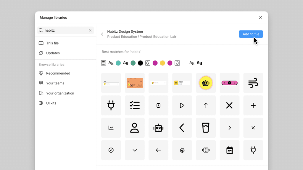
Build shared libraries
When you create a library of components, text styles, and color tokens, you are basically writing the “official” rulebook for your website. Everyone pulls from the same library, so your site feels cohesive from start to finish. Plus, if you need to adjust styling (like updating accent colors across dozens of pages), you only have to make the change once.
- Icon frames with consistent sizes (e.g., 24×24)
- Text styles for headings, paragraph text, and SEO-friendly subheadings
- Master components for frequently used elements (buttons, navigation items)
These practices help you maintain a tidy project file, ensure brand consistency, and make it faster to build and edit multiple pages.
Bring it all together
Designing a website with Figma is a holistic experience. By tying your creative designs directly to the logic of a responsive layout, you can ensure you never lose track of crucial details. You also get the power to refine interfaces, test interactions, and collaborate with your team in a single ecosystem.
When you adopt features like Figma Sites, auto layout, and Dev Mode, you shorten the gap between the design studio and the live site environment. You can publish a site that remains true to your original vision, complete with easy content updates via the built-in CMS. Meanwhile, real-time collaboration and branching keep everyone on task without stepping on toes.
If you are looking to bring website ideas to life in a clean, efficient way, Figma might be the perfect solution. You will not need multiple tools to design, illustrate, prototype, and develop. Instead, Figma’s streamlined purpose is to help you deliver top-notch results and maintain consistency long after launch. Start exploring these tools now, and watch as your creative flow and output both improve dramatically.
Frequently asked questions
How do I publish a fully responsive website with Figma?
You can use Figma Sites (Beta) to publish directly from your existing designs. Simply paste your Figma frames into a responsive site template, adjust layout settings, and connect a custom domain if you like. Figma’s built-in CMS lets you switch out text and images without altering the design itself.Is Figma only for designers, or can developers use it too?
Developers benefit greatly from Figma thanks to real-time collaboration and Dev Mode. In Dev Mode, they can inspect layers, copy code snippets, and view exact spacing and color details. This seamless handoff reduces confusion around implementation and ensures your team can build websites that stay true to the original designs.Can I run Figma on my operating system?
Figma is browser-based, so you can open it on any platform—Windows, macOS, or Linux. A desktop app is also available for Mac and Windows users. All files live in the cloud, making it easy to switch devices without losing your progress.How does Figma compare to Adobe XD in website design?
Figma’s real-time collaboration, auto layout, and robust free tier often give it the edge. While Adobe XD is a solid tool, it has fewer features for shared libraries and focuses more on offline workflows. Figma is ideal for flexible, remote teams that appreciate continuous updates and the convenience of working entirely in a web browser.Do I need coding skills to use Figma for website design?
No, you do not. Figma’s interface is intuitive for visual designers, and Figma Sites allows you to publish websites with minimal coding. However, basic familiarity with HTML, CSS, or JavaScript can be helpful if you plan to edit custom interactions or utilize AI-assisted features for advanced site functionality.
By learning best practices, establishing shared libraries, and experimenting with new Figma features, you will discover a faster, more connected approach to building modern websites. With Figma, you keep your designs unified, your communication transparent, and your end results consistently impressive.
- 3shares
- Facebook0
- Pinterest0
- Twitter3
- Reddit0

