Do you want your website or app to provide a smooth user experience? If so, you must pay close attention to typography when designing the layout. While many other factors contribute to building a good interface and making the details accessible, the way or style you present the information also matters a lot.
In this article, we will walk you through the effects of typography on overall readability in UI/UX so that you can understand its importance. Plus, we will also provide you with some tips to achieve a user-friendly interface with the help of typography. So, let’s get started.


Role Of Typography In Readability And Accessibility Of UI/UX Design
Typography is more than just making the interface suitable. It’s about conveying the message in an interactive and accessible way. The right typographic choices make a difference in the overall responsiveness of your digital design. Here is what excellent typography can do to enhance the look and readability of your site or app:
Creates Strong First Impression
Users first interact with text when they land on a site or app. Rightly styled text creates a strong first impression. On the other hand, cluttered and unorganized written material, no matter what font is used, hurts users. Font choice, size, and spacing make or break the first impression. That’s why it’s necessary to use typography to grab users’ attention upon landing properly.
Makes Content Easily Readable & Digestible
At their core, everyone aims to convey the message clearly on their website or application. Typographic elements matter a lot in defining the overall readability and accessibility of content. Well-chosen fonts, rightly spaced text, and correctly positioned information are more likely to be easily read and understood. On the other hand, a lack of typographic consistency can create complexities for users, who may struggle to comprehend things properly.
Produces Informational Hierarchy
Another way the right typography improves readability and accessibility in UI/UX is by helping to establish an information hierarchy. The varied font sizes and typefaces logically guide the users through the headings, allowing them to connect ideas to understand the context better. Apart from that, appropriately used font weights help you to emphasize essential things, which enables users to spot the key details in every section. Together, these things create an easily understandable information architecture, which assists the readers throughout the page.
Reduces Search Friction
When typography in a design is illegible, it becomes difficult for users to navigate to the required information. They must closely examine each part to find the necessary details among the clutter. However, readers don’t have to be involved in this search friction if the right typographic choices are made. When everything is displayed and adequately placed, users quickly reach the sections to gain the information they want. That’s how typography provides a smooth user experience.
Best Practices For Typography In UI/UX Design
By now, we hope you have understood how typography affects the responsiveness of a design. Now, let’s learn some practical practices that will help you enhance the readability and accessibility of UI/UX designs:
Choose The Right Font Type
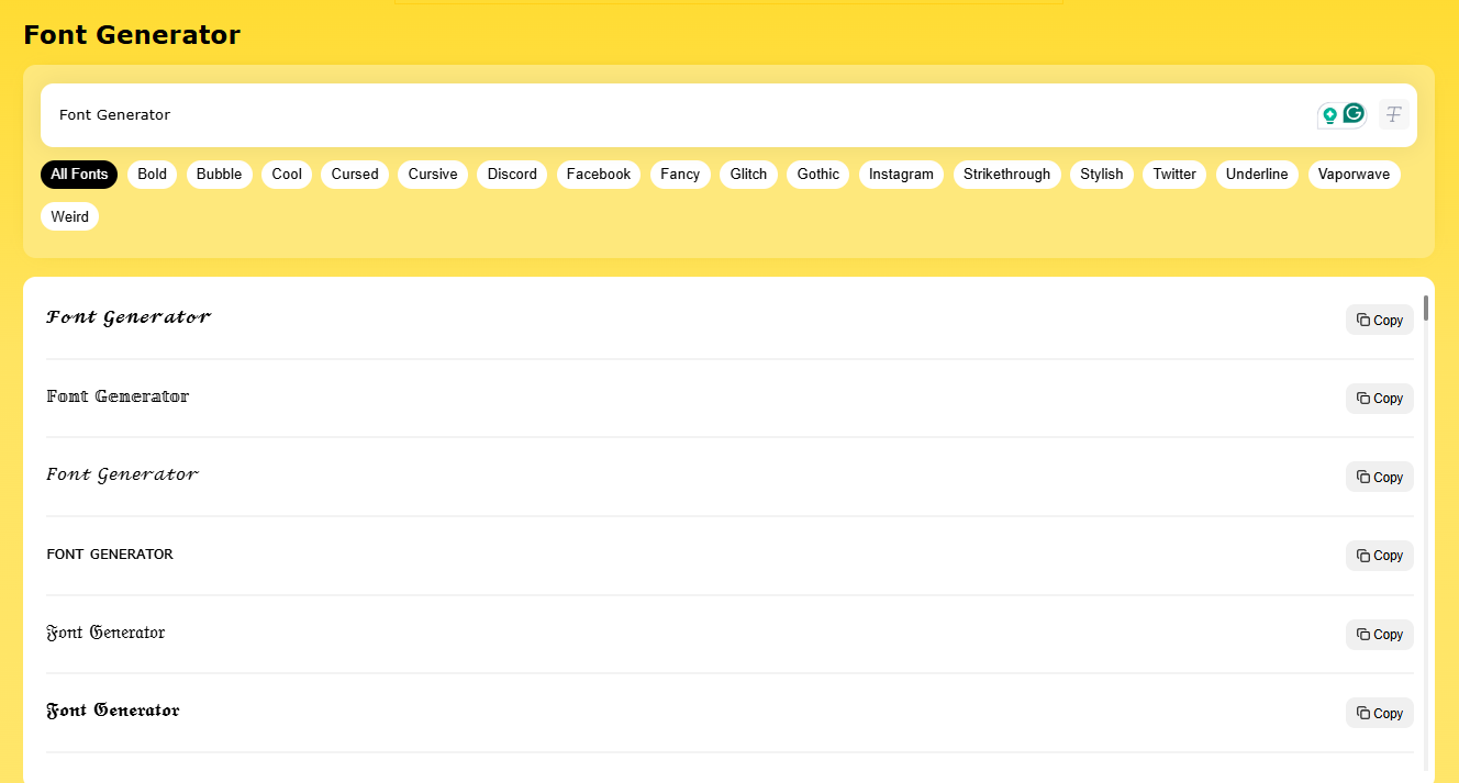
The font choice is a key element in typography. To have an exemplary user interface, choose the correct font. Find different typefaces and analyze which is more readable and aligns with your brand’s personality. For quicker and better analysis about which font you should choose, you can insert a few lines in an online font generator to explore multiple options in various font categories. Exposure to a wide range of typefaces will help you select the proper font.
Ensure Proper Spacing & Alignment
Choosing the right font is not enough; you must ensure that anything you use on your web or app layout is well aligned. Usually, you can align the text to the left, right, or middle. Utilize these options for your benefit and adjust the position of the text appropriately. Remember, the better you align the text, the more precise the design. Moreover, don’t overlook the spacing issues between letters and lines. Each letter and line should be spaced to create enough white space to relieve the user’s eyes.
Utilize Font Size & Weight Wisely
The ability to change the size and weight of the font allows you to create a logical flow in the information, which is essential for UX. Therefore, keep the text size of headings, subheadings, and body so that the user can easily differentiate between them. If you want to highlight something, make it bold, but avoid using excessive bold text in the content. The size and weight of text must be optimized for all kinds of screens for web and mobile responsiveness.
To Sum Up
In short, typography is a key factor defining the overall responsiveness of UI/UX designs. That’s why you should be careful when choosing fonts, aligning text, spacing between lines, and adjusting the font size. All these things collectively contribute to creating an exemplary user interface. A bonus tip in this regard is to choose the colors carefully. Using a color that contrasts nicely with the background can make your design more elegant and user-centric.
- 10shares
- Facebook0
- Pinterest7
- Twitter3
- Reddit0


