A well-designed CTA (Call-to-Action) button is essential for guiding users to take the next step on your website or app. The effectiveness of your CTA button hinges on clear visibility, intuitive design, and compelling copy that encourages users to act without hesitation.
Choosing the right size, color, shape, and placement can make your button stand out while fitting naturally within your layout. You also need to craft concise, action-driven text that immediately communicates the benefit or next step.
By understanding these key elements and combining design with psychology, you can create CTA buttons that not only attract attention but also drive higher engagement and conversions.
Key Takeways
- Make your CTA button clear and visually distinct to encourage clicks.
- Use concise, action-oriented text to communicate the next step quickly.
- Place and design buttons strategically to fit user flow and boost engagement.
Core Principles of CTA Button Design
Effective CTA buttons guide users to take specific actions by combining clear purpose, thoughtful design, and an understanding of user behavior. Your goal is to create buttons that stand out visually and motivate clicks through precise messaging and placement.
Understanding the Purpose of Calls to Action
The primary goal of a CTA is to direct users toward a desired action, such as signing up, purchasing, or downloading. Your CTA should answer the question: What do you want users to do next? Every button needs a specific, singular purpose to avoid confusion.
Your call-to-action buttons should be tightly aligned with your overall user experience goals. Ambiguous or overloaded CTAs reduce conversion rates. Keep your focus narrow and relevant to the context where the button appears.
Key Elements of Effective Button Design
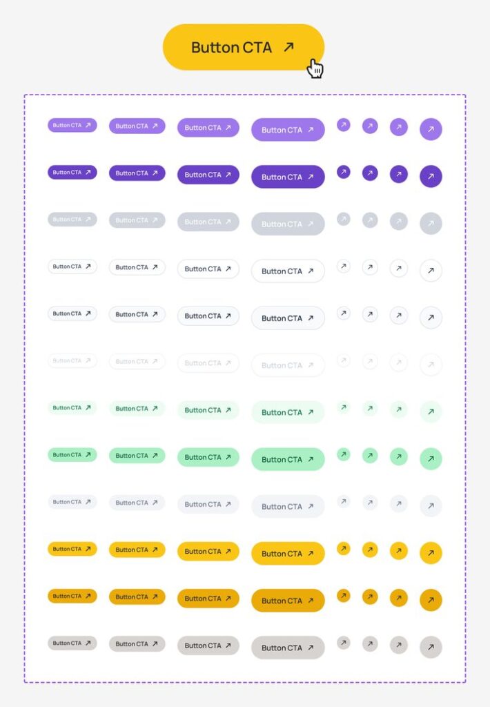
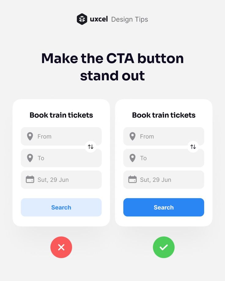
Focus on five essential aspects: color, size, placement, shape, and copy. Use a contrasting color that stands out from your page’s background to immediately draw attention.
The button size matters—make it large enough to tap or click easily but not so big it overwhelms other content. Position buttons where users naturally look, such as near key information or at the end of a section.
Your microcopy should be concise and action-oriented. Words like “Buy Now”, “Get Started”, or “Download” clarify what happens when users click. The shape should feel clickable; rounded corners often work well.
| Element | Best Practice |
|---|---|
| Color | High contrast, noticeable |
| Size | Large enough for easy tap |
| Placement | Near relevant content |
| Shape | Rounded for intuitiveness |
| Copy | Clear, action-driven |
Psychology Behind CTA Engagement
User behavior is influenced by urgency, clarity, and perceived value. You can increase clicks by creating a sense of urgency with words like “Now” or “Limited Time”. This nudges users to act immediately rather than postponing.
The human brain responds to simplicity. When a CTA is straightforward and visually distinct, users instinctively understand what to do next. Confusing or cluttered buttons cause hesitation and reduce conversions.
Design also influences trust. Buttons that look standard and familiar avoid suspicion. Quick decisions come easier when users don’t second-guess the CTA’s legitimacy or destination. Your design should make action feel safe and easy to execute.
Optimizing CTA Button Appearance and Copy
To make your CTA button stand out and drive action, focus on clear visual signals and concise, persuasive text. The right color, wording, and cues will guide users toward clicking while building trust and urgency.
Button Color and Visual Hierarchy
Choose a button color that contrasts strongly with your page background to ensure visibility. Colors like red, orange, or bright green often perform well because they grab attention without clashing with your overall design.
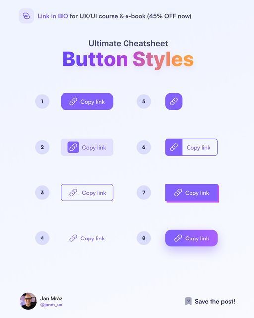
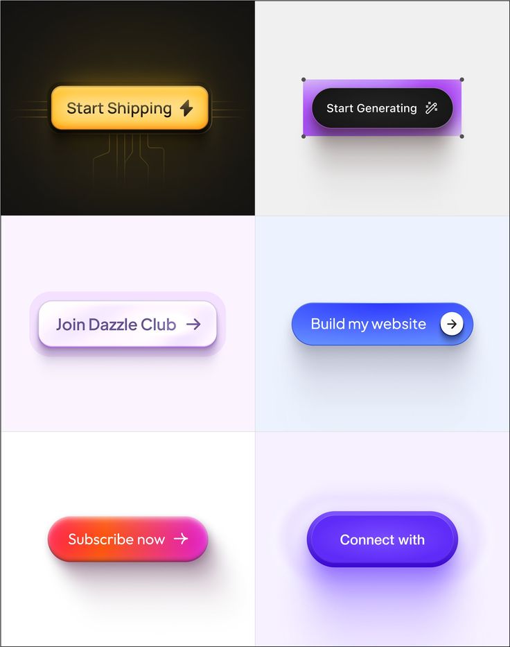
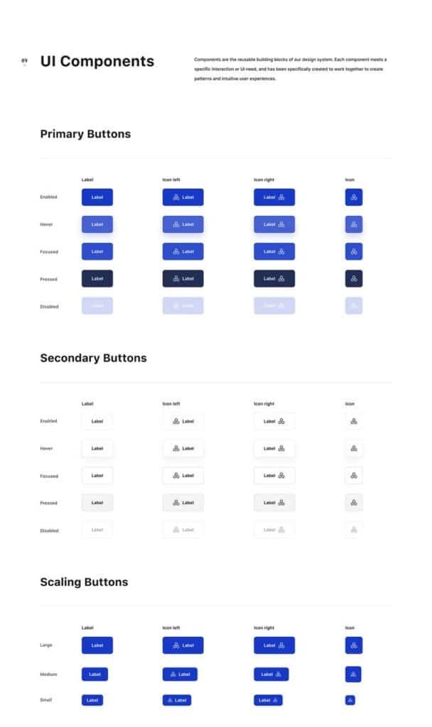
Use the size and shape of your button to establish visual hierarchy. Primary CTAs should be larger and bolder than secondary buttons or links. Rounded corners can improve clickability by making the button appear more tactile.
Position your button where users expect it, such as near key content or at the end of an offer. Maintain enough whitespace around the button so it doesn’t get lost among text or images.
Creating Compelling Button Text
Your button copy should be clear and specific about the action users will take. Avoid vague terms like “Submit” or “Click Here.” Instead, use phrases such as “Get Your Free Trial” or “Download the Report” to communicate value.
Keep the text brief—ideally 2-5 words. This brevity increases readability and encourages quick decisions. Always use active voice to maintain urgency and authority in your message.
Focus on the benefit for the user rather than the action itself to make the text more persuasive. For example, “Start Saving Now” highlights the result, not just the process.
Utilizing Power Words and Strong Verbs
Incorporate power words like now, free, exclusive, or instantly to evoke urgency or exclusivity. These words increase emotional engagement and prompt faster action.
Use strong verbs such as download, claim, discover, or join to clarify exactly what the user should do. These verbs reduce ambiguity and strengthen the sense of control.
Avoid overly technical or complicated wording; instead, focus on simple yet motivating language. This ensures your CTA resonates with a broad audience.
Incorporating Social Proof and Visual Feedback
Adding social proof near your CTA, like “Join 10,000+ subscribers,” increases credibility and reduces hesitation. Users feel safer clicking when they see others have already acted.
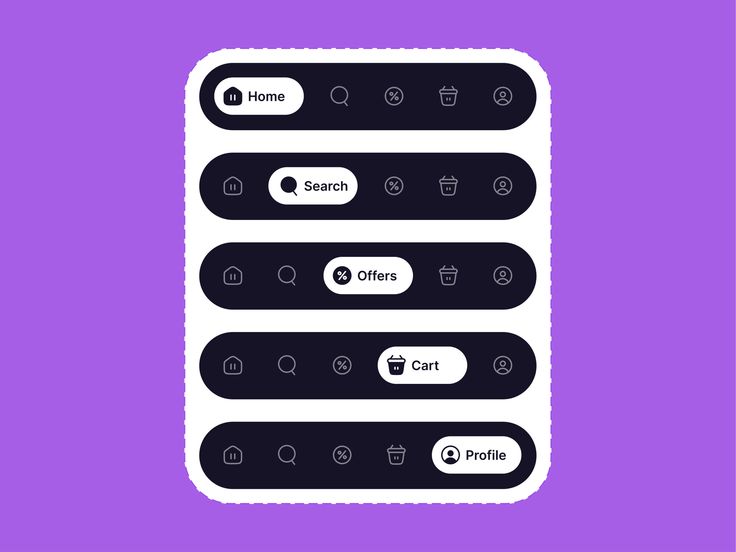
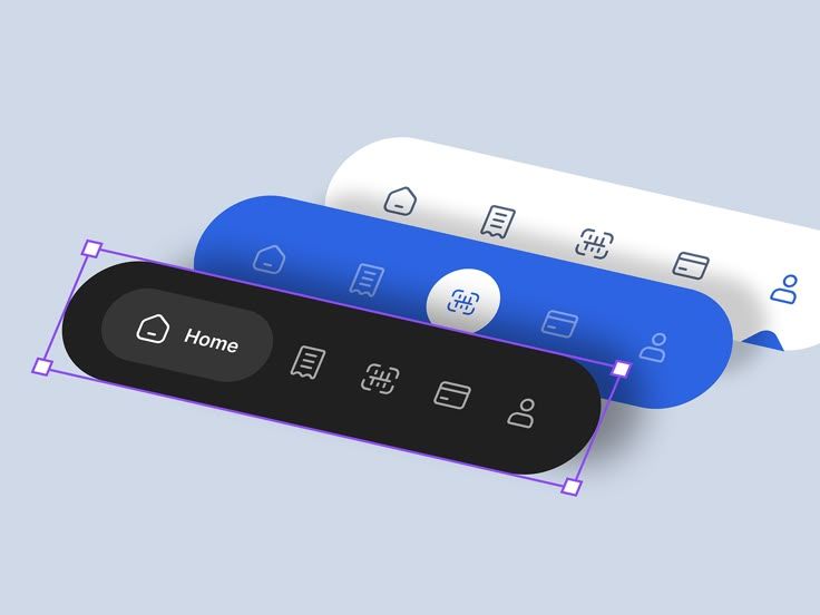
Provide immediate visual feedback upon clicking, such as changing button color or showing a loading animation. This confirms the action has been registered, improving user trust.
Consider subtle animations or hover effects that signal interactivity without being distracting. These small cues reinforce the button’s purpose as clickable and important.
Strategies to Maximize Conversion and Engagement
To increase your CTA button’s effectiveness, focus on placement, size, and clarity across all devices. You should also distinguish between primary and secondary CTAs to guide users clearly toward desired actions. Each of these factors plays a direct role in boosting click-through rates and overall conversions.
Best Practices for Button Placement
Place your CTA buttons where they are immediately visible without scrolling, often referred to as “above the fold.” Positioning CTAs near relevant content or at natural decision points encourages timely user action.
Avoid clutter around the button to make it stand out. Use whitespace strategically to draw attention to the CTA. Repeated CTAs can be used on long pages, but the first or most important button should always be the most prominent.
Consider placing buttons near contrasting elements or images that direct attention toward them. Testing multiple placement options can help identify the highest converting spots on your page.
Optimizing for Mobile Devices
Your CTA buttons must be easily clickable on smaller screens to maintain high engagement. Use responsive design so buttons resize automatically without losing visibility.
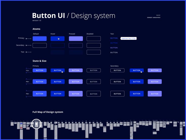
Ensure buttons are at least 40-48 pixels in height and width to accommodate finger taps comfortably. Place CTAs where thumbs naturally reach—often near the bottom or center of the screen.
Simplify button text for quick comprehension on mobile. Avoid multiple CTAs that could overwhelm or frustrate users. Fast loading times also contribute to better engagement on mobile devices.
Choosing the Right Button Size
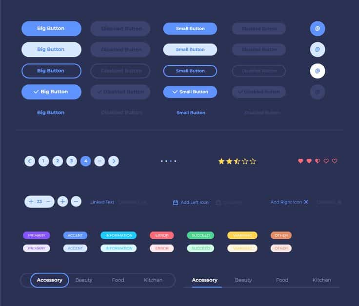
Button size directly affects conversion rates by impacting visibility and usability. A button that is too small may be overlooked or difficult to click, reducing engagement.
Aim for dimensions large enough to distinguish the CTA from other page elements but avoid oversized buttons that disrupt layout balance. A minimal size of about 44×44 pixels is recommended for touch targets.
Test different sizes to find the best fit for your design and audience. Larger buttons in primary positions often lead to increased clicks, but size should complement your overall interface, not overpower it.
Primary CTA vs. Secondary CTA Buttons
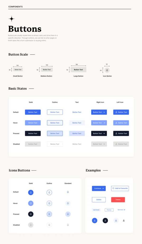
Your primary CTA should clearly represent the main action you want the user to take, such as “Buy Now” or “Sign Up.” It must be visually distinct through color, size, or style to draw immediate attention.
Secondary CTAs support alternative but less critical actions, like “Learn More” or “Contact Us.” These buttons should be subtler to avoid competition with the primary CTA.
Use contrasting colors between primary and secondary buttons to signal their importance. Keep primary CTAs consistent in placement to build user expectations and improve conversion rates over time.
CTA Button Design in Marketing Contexts
To create effective CTA buttons, focus on clarity, placement, and alignment with your overall marketing goals. The design should work seamlessly within various platforms, especially where conversions matter most, like landing pages and emails.
Examples of Effective Calls to Action
Effective CTAs are concise and action-oriented. Use clear verbs like Buy Now, Subscribe, or Get Started to encourage immediate action. The button’s size should be large enough to stand out but not overwhelm other page elements.
Contrast between the button color and background enhances visibility. For example, a bright button on a neutral background draws the eye. Position CTAs where users naturally pause or decide, such as the center of a landing page or just below persuasive content.
You can also add urgency through phrases like Limited Time Offer or Only a Few Left. Testing variations with A/B methods helps identify which wording, color, or positioning drives better results.
CTA Button Design for Email Campaigns
In email marketing, your CTA buttons must perform on diverse devices and email clients. Keep the design simple, using a single primary CTA per email to avoid confusing your audience.
Use colors that contrast with your email template but remain consistent with your brand. Button text should be short, relevant, and actionable like Shop Now or Claim Your Discount.
Place the CTA above the fold and near compelling copy or images to increase click-through rates. Also, ensure your buttons are large enough to tap easily on mobile screens, typically at least 44×44 pixels.
Use best practices like including descriptive alt text for accessibility and linking the button directly to a relevant page. Regularly test your emails to optimize load times and responsiveness across devices.
- 2.6Kshares
- Facebook0
- Pinterest2.6K
- Twitter3
- Reddit0

