A UI/UX design portfolio isn’t just a collection of polished screens—it’s a window into how you think, solve problems, and create real value. Hiring managers aren’t only looking for beautiful interfaces; they want to see clear thinking, strong structure, and real-world impact. A great portfolio tells the story behind the design, showing why decisions were made and how those decisions delivered results.
After reviewing hundreds of successful portfolios across product design, UX research, and UI-focused roles, clear patterns emerge. The strongest portfolios tell a story, reduce friction for reviewers, and make the designer’s value obvious in minutes — not hours.
Below are 10 standout UI/UX design portfolio examples, along with exactly why they work and what you can borrow for your own portfolio.
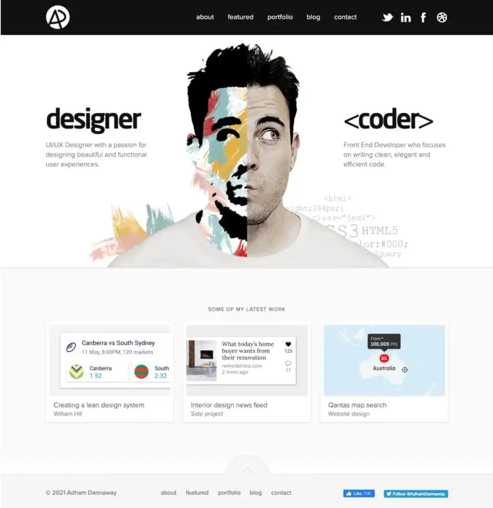
1. Adham Dannaway — The Split-Screen Personal Brand
Why it works
Adham’s portfolio famously uses a split-screen layout that instantly communicates his dual skill set: UI and UX. Within seconds, visitors understand who he is and what he does — no scrolling required.
Key takeaways
- Immediate positioning beats clever intros
- Strong visual identity builds memorability
- Clear navigation reduces bounce rates
Steal this idea: Use your homepage to answer “Who is this for?” and “Why should I care?” in under 5 seconds.
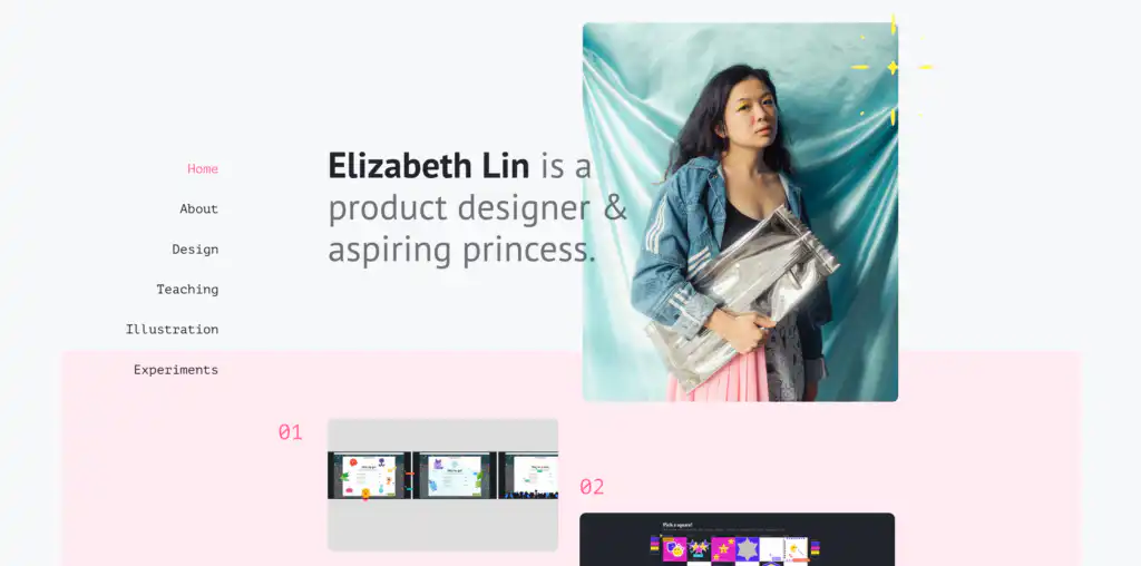
2. Elizabeth Lin — Case Studies That Read Like Stories
Why it works
Elizabeth’s portfolio excels at narrative. Each case study follows a clean arc: problem → constraints → exploration → decisions → outcome. The reader never feels lost.
Key takeaways
- Storytelling beats long explanations
- Context helps reviewers understand tradeoffs
- UX thinking is visible at every step
Steal this idea: Write your case studies as if the reader has no background on the project.
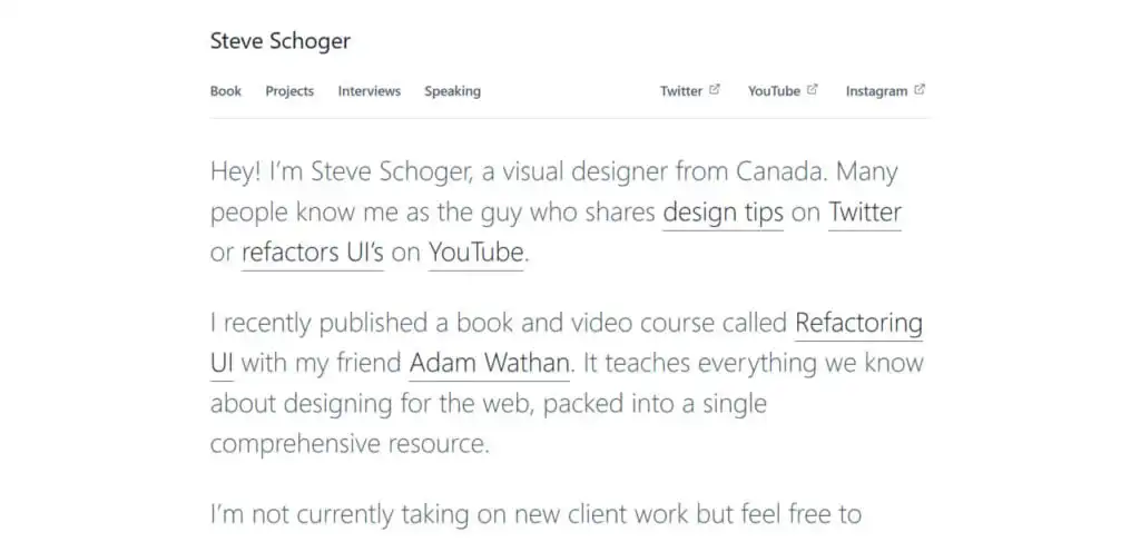
3. Steve Schoger — Authority Through Craft
Why it works
Steve’s portfolio is understated but powerful. It emphasizes design systems, consistency, and execution — reinforcing his authority without overselling.
Key takeaways
- Clean presentation builds trust
- Depth matters more than volume
- Design systems signal seniority
Steal this idea: Show fewer projects, but go deeper into your design decisions.
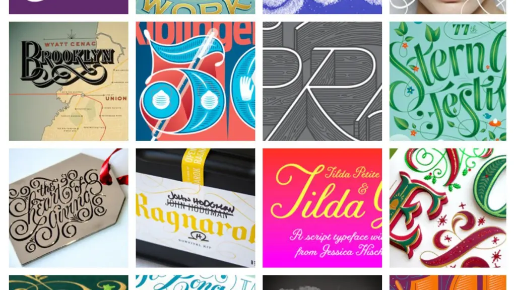
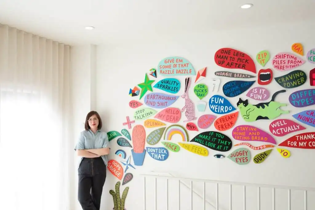
4. Jessica Hische — Personality Without Chaos
Why it works
Jessica’s portfolio proves personality doesn’t have to hurt usability. The site feels human, confident, and playful — yet remains easy to navigate.
Key takeaways
- Personality is a differentiator
- Voice matters as much as visuals
- Usability should never be sacrificed
Steal this idea: Let your tone shine, but test your navigation like a product.
5. Pablo Stanley — Community-Driven Design
Why it works
Pablo’s work highlights open-source contributions and community impact. This signals collaboration, leadership, and scale — qualities hiring managers love.
Key takeaways
- Community work increases credibility
- Side projects can outweigh client logos
- Teaching reinforces expertise
Steal this idea: Include projects that show how others use your work.
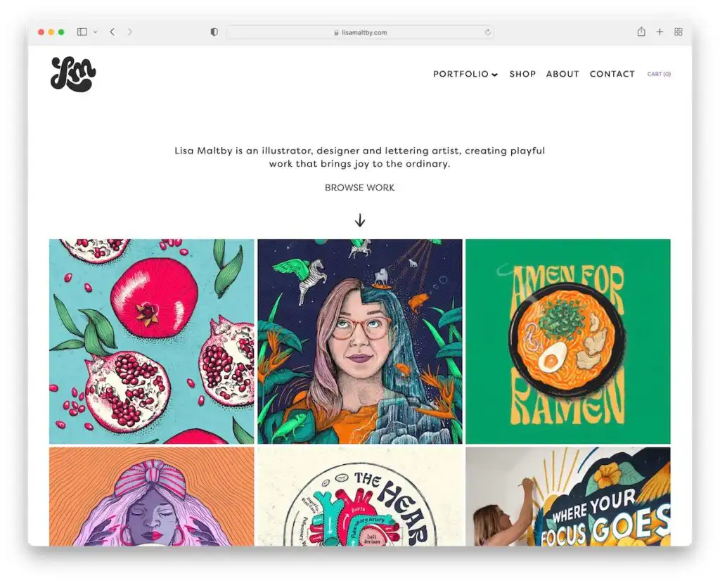

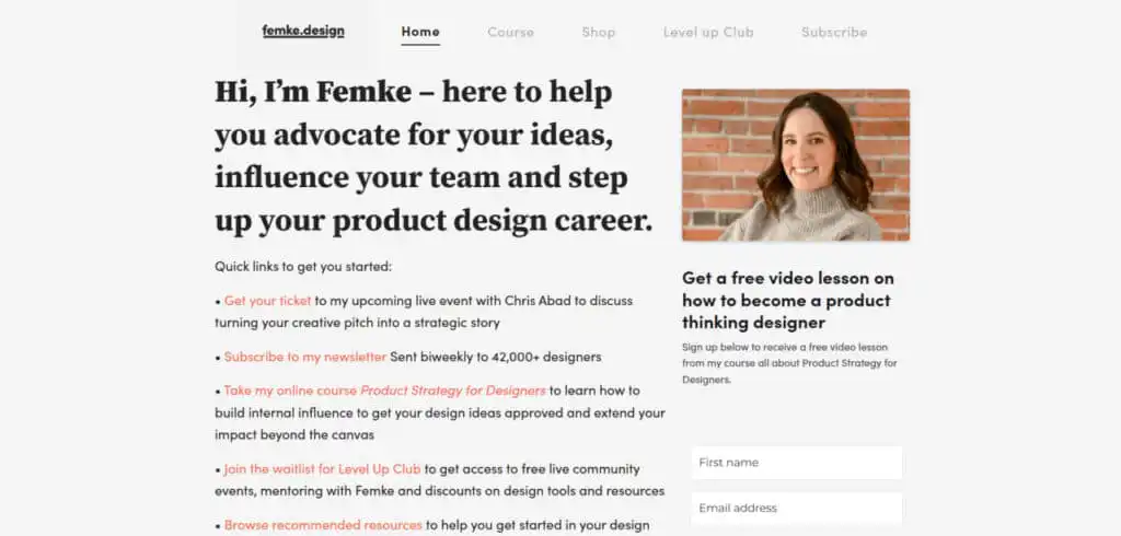
6. Femke van Schoonhoven — Education as Authority
Why it works
Femke’s portfolio teaches as much as it showcases. Her explanations are concise, structured, and insightful — positioning her as both a practitioner and a thinker.
Key takeaways
- Teaching builds instant trust
- Clear frameworks elevate perceived skill
- Writing clarity mirrors UX clarity
Steal this idea: Explain why you chose a solution, not just what you built.
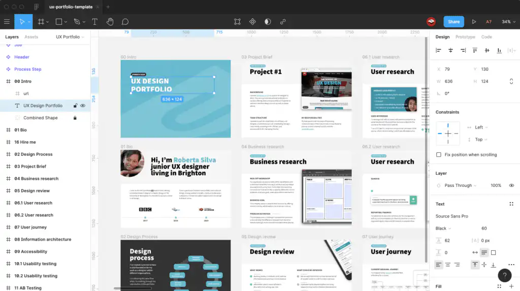
7. Tobias van Schneider — Strategic Minimalism
Why it works
Tobias removes everything unnecessary. The portfolio focuses on outcomes, leadership, and product impact — not decorative flair.
Key takeaways
- Less content, more signal
- Strategic restraint feels confident
- Impact beats aesthetics
Steal this idea: Ask yourself what you can remove without losing meaning.
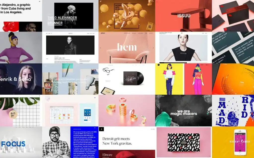
8. Julie Zhuo — Thought Leadership Meets UX
Why it works
Julie integrates writing, leadership, and design thinking into a cohesive personal brand. Her portfolio attracts opportunities beyond traditional UX roles.
Key takeaways
- Writing multiplies visibility
- Leadership content broadens roles
- Portfolios can evolve with careers
Steal this idea: Add essays, talks, or frameworks if you’re targeting senior roles.

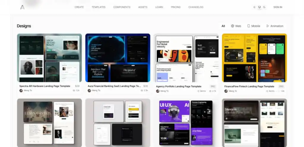
9. Meng To — Motion & Interaction Mastery
Why it works
Meng’s portfolio uses motion intentionally. Animations clarify interactions instead of distracting from them.
Key takeaways
- Motion explains complex ideas
- Subtle animations feel premium
- Interaction design is a differentiator
Steal this idea: Use motion to teach, not impress.
10. Charli Prangley — Career Transparency
Why it works
Charli openly documents her career journey, making her portfolio relatable and authentic — especially for growing designers.
Key takeaways
- Transparency builds connection
- Growth stories feel human
- Authenticity beats perfection
Steal this idea: Share evolution, not just highlights.
What All Great UI/UX Portfolios Have in Common
Across all ten examples, patterns emerge:
- Clear positioning within seconds
- Strong case study structure
- Evidence of thinking, not just visuals
- Intentional personality
- Outcome-focused storytelling
How to Apply This to Your Own Portfolio (Without Starting Over)
Instead of rebuilding everything:
- Rewrite one case study using storytelling
- Simplify your homepage message
- Remove one unnecessary section
- Add context to design decisions
- Clarify outcomes and results
Small changes compound.
Final Thought
Your portfolio isn’t competing with every designer — it’s competing for attention in a 60–90 second scan. The portfolios above succeed because they respect that reality.
Design your portfolio like a product. Optimize it like a funnel. And measure what actually converts.
- 23shares
- Facebook0
- Pinterest23
- Twitter0
- Reddit0

