Hero images are a crucial element in web design, serving as the first visual encounter a visitor has with your site. These images not only create a striking first impression but also effectively communicate your brand identity and message. When used correctly, hero images can captivate visitors, drawing them into your content while enhancing their overall experience.
In an online landscape where attention spans are short, the right hero image can make all the difference. You have the opportunity to showcase your brand’s values, products, and services right from the homepage. By optimizing these images for different devices and ensuring they load quickly, you can improve user engagement and retention significantly.
Exploring various styles and functions of hero images will help you understand what resonates best with your audience. Whether you prefer static visuals, dynamic content, or interactive elements, implementing best practices will maximize the potential of your hero images and elevate your website’s effectiveness.


Key Takeaways
- Hero images create powerful first impressions that can enhance brand identity.
- Best practices in design improve engagement and accessibility on your site.
- Different genres of websites leverage hero images for unique visitor experiences.
The Role of Hero Images in Web Design
Hero images serve as a vital component of web design, capturing visitor attention while conveying brand messages. Their strategic use enhances user engagement and establishes an emotional connection, making them essential for creating memorable first impressions.
Defining Hero Images and Their Purpose
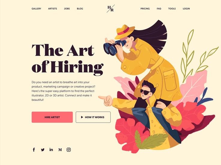
A hero image is a large, prominent visual element placed at the top of a website’s homepage or landing page. This image is typically the first thing users see, designed to grab attention and quickly communicate your brand message.
The purpose of a hero image includes setting the mood and tone of your site, integrating with your color palette, and reinforcing your value proposition. It should align with your branding while evoking emotions that resonate with your target audience. By engaging visitors from the onset, hero images play a critical role in encouraging further exploration of your site.
The Impact of Hero Images on User Experience
Hero images significantly influence user experience by guiding visual navigation and enhancing overall aesthetics. A well-chosen image can simplify complex ideas, allowing users to grasp your message at a glance.
Additionally, they can improve usability by providing landmarks that help visitors find their way around your site. When combined with clear call-to-action buttons, hero images can increase user engagement and conversion rates. Ensuring that these visuals are optimized for different devices also maintains a seamless experience across platforms.
Creating a Strong First Impression With Hero Images
The first impression a visitor forms can determine their willingness to stay or leave your website. Hero images are crucial in establishing an initial emotional connection, as they convey what your brand stands for in an instant.
To maximize their impact, select images that reflect your brand’s core values and mission. Use imagery that speaks to your audience’s emotional triggers, whether through vibrant colors, compelling subjects, or relevant themes. Properly sized hero images enhance visual appeal while avoiding distortion, ensuring they make a positive, lasting impression user engagement.
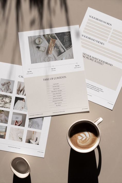

Best Practices for Hero Image Design and Implementation
Creating impactful hero images requires a strategic approach that balances aesthetics with functionality. You can optimize user engagement by focusing on high-quality visuals, effective text overlays, and brand alignment while ensuring responsiveness and quick loading times.
Choosing the Right Visual Elements
When selecting visual elements, prioritize high-quality images that resonate with your audience. Whether you opt for photography or 3D graphics, clarity and professionalism are crucial. The imagery should reflect your unique selling point and convey the essence of your brand.
Consider the emotional impact of colors, shapes, and compositions. Ensure that visual elements are relevant to your message and straightforward, facilitating easy understanding. Using a consistent style across your visuals can help reinforce brand perception and trust.
Incorporating Text Overlay and Call-to-Action
Text overlays must be concise and impactful. A compelling tagline or brief statement should highlight your key message or value proposition without overwhelming the visual element. Use legible fonts and contrasting colors to ensure readability.
Call-to-action buttons are essential. Place them prominently within the hero image to encourage user interaction. Use action-oriented language that prompts users to engage, such as “Get Started” or “Learn More.” This can significantly influence click-through rates and enhance overall site performance.
Ensuring Hero Images Complement Brand Identity
Hero images should reflect your brand identity and values. Consistency in style, colors, and themes aligns with your brand perception and strengthens user connections. Cultural relevance and emotional resonance are vital, as they can enhance the impact of your visuals.
Consider the core elements of your brand and how they translate into visual form. Every hero image should communicate brand messaging effectively, showcasing your unique attributes while appealing to your target demographic.
Responsive Design and Mobile Optimization
Responsive design is critical for hero images, especially for users accessing your site on mobile devices. Ensure that your images resize appropriately to maintain their visual impact across different screen sizes.
Focus on aspect ratios that work well for both desktop and mobile views. Test your hero images on various devices to guarantee that they are visually appealing and functional. An optimized mobile experience can lower bounce rates and improve user engagement.
Loading Times and Their Effect on User Engagement
Loading times directly impact user engagement and retention. Large hero images can slow down your site, leading to higher bounce rates. Optimize images through compression techniques while maintaining quality to enhance loading speeds.
Consider using lazy loading for hero images, where visuals load only as users scroll. This approach not only improves initial load times but also provides a smoother user experience. Fast loading times contribute to increased user satisfaction and better overall performance metrics.


Analyzing the Efficacy of Hero Images
Hero images play a crucial role in web design by influencing conversion rates and user behavior. Evaluating their effectiveness involves understanding key metrics, recognizing common design pitfalls, and implementing strategies like A/B testing.
Understanding Conversion Rates and User Behavior
Conversion rates are a vital metric to assess the effectiveness of your hero images. A well-designed hero section can significantly increase user engagement and reduce bounce rates. Users are more likely to stay on your site if they immediately resonate with the image and message.
Metrics to Monitor:
- Conversion Rate: Percentage of visitors who take a desired action.
- Bounce Rate: Percentage of visitors who leave after viewing only the homepage.
High conversion rates coupled with low bounce rates typically indicate that your hero image is effectively captivating visitors. Regularly analyzing these metrics allows you to make data-driven adjustments to enhance performance.
Common Mistakes to Avoid in Hero Image Design
Avoiding common mistakes in hero image design can make a significant difference. One prevalent issue is relying on stock images that lack authenticity. Users can often identify stock photos, which may disengage them from your site.
Other Mistakes to Consider:
- Cluttered Design: Too much text or too many elements can confuse visitors.
- Slow Load Times: Large images can slow down your site, negatively impacting user experience.
Ensuring that your hero image is relevant, high-quality, and aligns with your message will significantly boost its efficacy and your site’s overall effectiveness.
The Importance of A/B Testing for Hero Sections
A/B testing is essential for optimizing your hero section. By comparing two versions of a hero image, you can determine which one resonates better with your audience. This process allows you to refine your design based on actual user behavior rather than assumptions.
Key Elements to Test:
- Image Variants: Use different images to see which generates more engagement.
- Text and CTA Changes: Experiment with different calls to action or text placements.
Implementing A/B testing ensures your hero images are not only visually appealing but also effective at converting visitors. Regular testing keeps your site aligned with user preferences and improves overall user experience.

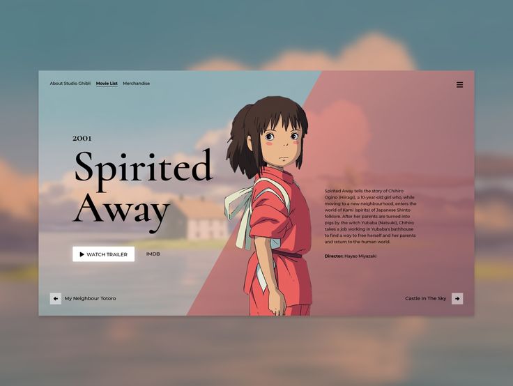
Hero Images in Different Website Genres
Hero images play a vital role across various website genres. They serve to enhance visual appeal, communicate brand messages effectively, and impact user engagement. Here’s how they differ in approach and function.
E-commerce and the Role of Hero Images in Sales
In e-commerce, hero images are critical for driving conversions. A well-designed hero image can highlight products and create a sense of urgency. This can be achieved through strategic use of color, placement, and emotional appeal.
For instance, showcasing a featured product with a bold, eye-catching image can draw attention immediately. Adding a call-to-action button, such as “Shop Now,” reinforces the message. High-quality images that display a product’s details can significantly influence buying decisions.
The alignment with brand identity fosters trust. Customers are more likely to purchase from a site that visually resonates with them. Hero images can thus enhance the shopping experience, improving overall conversion rates.
Portfolio Websites and the Showcase of Work
For portfolio websites, hero images serve as the first impression of your skills and creativity. You want to showcase your best work prominently to capture the visitor’s attention. A striking hero image can communicate your style and effectively represent your brand identity.
Using a carousel or a grid format in the hero section lets you display multiple projects at once. This not only enhances your visual appeal but also provides a narrative of your capabilities. High-resolution images that highlight project details are essential for making your work stand out.
Clear labeling and succinct descriptions can enhance user engagement. Simple, uncomplicated designs help avoid distractions. These elements work together to present a professional image, fostering confidence in potential clients.
Small Business Sites: Balancing Branding and Functionality
For small business websites, the hero image is crucial for balancing branding with functionality. You aim to convey your brand message clearly while ensuring easy navigation. A relevant hero image can encapsulate your business’s essence, making visitors feel connected immediately.
Integrating simplicity in hero image design helps maintain focus on essential elements. For example, using a tagline that expresses your value proposition alongside the hero image can be highly effective. This approach reinforces your brand identity while making clear what you offer.
Utilizing calls-to-action related to your services ensures visitors know what to do next. This balance between aesthetic appeal and functional elements can drive user engagement. By focusing on these aspects, you create a memorable experience for visitors.

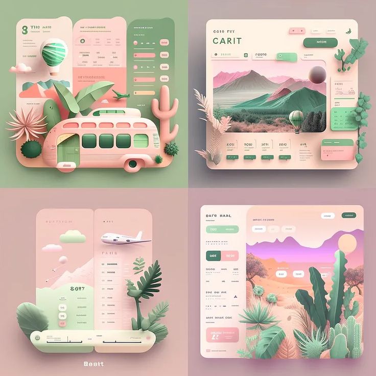
Interactive and Dynamic Hero Images
Interactive and dynamic hero images elevate user experience by providing engaging, memorable visuals. These elements can capture attention and communicate your brand message effectively, offering visitors a more immersive experience.
Advancing Beyond Static Images to Interactive Elements
Static images can only do so much in capturing user attention. By integrating interactive elements, you enhance user engagement significantly. Features such as sliders, hover effects, and clickable areas draw users into the hero section, fostering exploration.
Interactive elements can also direct navigation, encouraging visitors to engage with your content. For example, including hotspots for additional information about your services can lead to a deeper understanding of your offerings. This active participation not only keeps users on your site longer but also strengthens their connection to your brand.
The Use of Video Backgrounds and Motion Graphics
Video backgrounds and motion graphics have become essential tools in modern web design. They add a layer of depth and intrigue that static images cannot achieve. A video background can visually narrate your brand’s story in seconds, creating a compelling user experience.
When deploying videos, consider maintaining clarity and focus. Choose clips that align with your brand message while avoiding clutter. Effective use of negative space ensures that your branding remains prominent and users can absorb information without distraction. Motion graphics also allow for animated text or imagery, further enhancing engagement and retention.
The Role of Emotional Connection in Interactive Hero Sections
Forming an emotional connection with your audience is crucial. Interactive elements can evoke feelings that resonate with users, fostering loyalty and interest. Techniques such as storytelling through visuals or incorporating relatable characters can effectively draw in visitors.
Crafting your hero section with emotional appeal augments your brand message. Engaging imagery or videos that connect with users’ experiences establishes a bond. This connection can be a powerful motivator, pushing visitors toward desired actions like signing up or making a purchase. By prioritizing emotional relevance, you can create memorable interactions that enhance user experience.

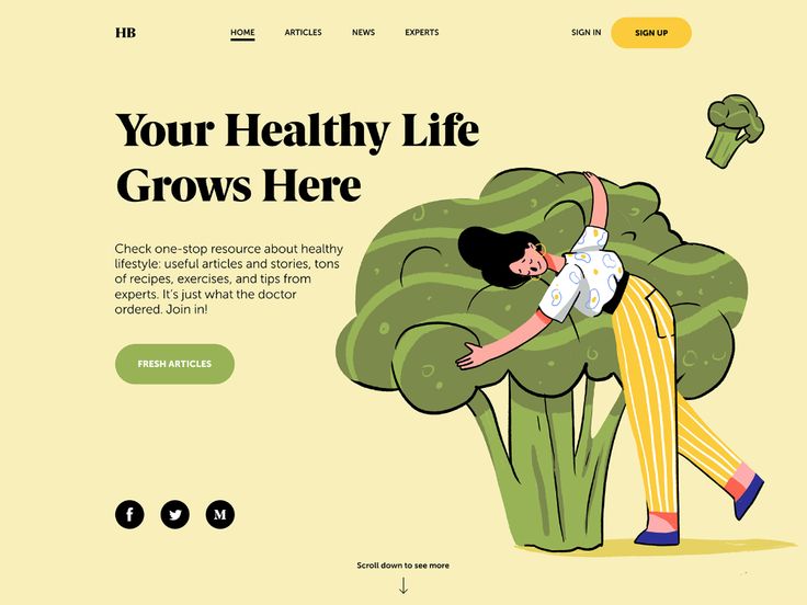
Technical Aspects and Accessibility
When incorporating hero images into web design, both technical performance and accessibility play crucial roles in enhancing user experience. Focusing on image size, file type, and optimization ensures quick loading times while maintaining visual impact. Additionally, understanding accessibility considerations helps create an inclusive environment for all users.
Image Size, File Type, and Load Optimization
Selecting the appropriate image size and file type is vital for efficient loading times. Large images slow down page performance, negatively impacting user experience. The recommended width for hero images typically ranges from 1200 to 1920 pixels. This size accommodates most screens without sacrificing quality.
Using formats like JPEG for photographs and PNG for graphics with transparency strikes a balance between quality and file size. Implementing compression techniques can further reduce loading times without visibly degrading image quality. Tools such as TinyPNG or ImageOptim assist in this optimization process.
For responsive design, consider using CSS media queries to serve appropriately sized images for different devices. This enhances relevance and ensures that the user experience remains consistent across platforms.
Accessibility Considerations for All Users
Accessibility is paramount in creating a web experience for diverse users. You must ensure that your hero images communicate the intended message clearly. Use descriptive alt text to provide context for screen reader users. This practice helps visually impaired users understand the content.
Contrast between the hero image and overlay text is essential. A good color palette improves readability and accessibility. Using tools like the WebAIM Contrast Checker can help confirm compliance with WCAG guidelines.
Simplicity in design also aids in accessibility. Avoid cluttered visuals that can distract users. Clear, focused images allow visitors to engage with your message without unnecessary confusion.
- 174shares
- Facebook0
- Pinterest174
- Twitter0
- Reddit0


