Choosing colors for your home can feel overwhelming, but understanding Pantone color psychology transforms the process into a creative tool for shaping mood and atmosphere. Pantone color psychology helps you select specific hues that can make a room feel more calm, energetic, or inviting based on how those colors affect human emotions. Instead of just picking shades you like, you’ll be able to craft intentional spaces that truly support your lifestyle.
Whether you want your living room to spark conversation or your bedroom to feel restful, using color psychology gives you the insight to make those choices confidently. By learning how Pantone colors influence feelings and behavior in interior design, you can take control of your space and create a home that suits your unique needs.
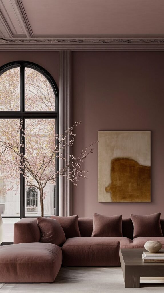
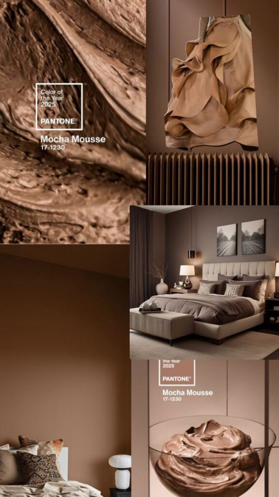
Key Takeaways
- Pantone color psychology guides purposeful color choices for your space
- Understanding color impact helps create the right mood in each room
- Practical tips make it easier to select hues that fit your style and needs
Understanding Pantone Color Psychology
Color choices shape how you feel in a space and influence your well-being, productivity, and comfort. Pantone color psychology gives you practical tools to select colors that match the mood and function of any room.
The Science Behind Color Psychology
Color psychology studies how color impacts your feelings, thoughts, and behaviors. Different shades can either calm you, energize you, or even make you feel more focused. This approach in interior design goes beyond decoration—it helps align a room’s atmosphere with its purpose.
For example, soft blues and greens are known to reduce stress and create a tranquil environment. On the other hand, hues like bright red or orange tend to boost energy and social interaction. Understanding these effects helps you make intentional choices that support daily activities.
Color interactions are not only psychological but also physiological. Exposure to certain colors can impact heart rate, alertness, or relaxation levels. Using this knowledge, you can set the foundation for a healthy and harmonious home.
Pantone and Its Role in Interior Design
Pantone offers a standardized color matching system that helps you achieve consistency and precision when choosing colors. Unlike generic paint samples, Pantone colors are globally recognized and used by designers to ensure specific, repeatable results.
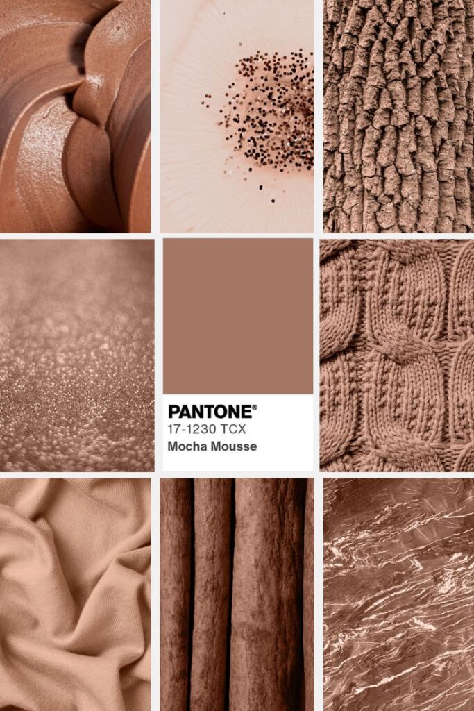
For interior design, using Pantone allows you to confidently build palettes that coordinate across textiles, wall colors, and décor. The annual Pantone Color of the Year also influences trends, often introducing unique shades that inspire new design ideas and moods.
Table: Pantone’s Key Roles in Design
| Pantone Role | Benefit for You |
|---|---|
| Standardization | Consistent colors across materials |
| Trend Guidance | Stay updated with new palettes |
| Psychological Influence | Choose colors that evoke desired moods |
Choosing Pantone colors is about clarity, predictability, and the ability to communicate your vision to manufacturers, contractors, or clients.
How Color Influences Our Emotions
Colors evoke emotions in direct and subtle ways. Warm colors like reds, yellows, and oranges can create excitement, warmth, or even hunger, making them suitable for social spaces such as kitchens and dining rooms. Cooler tones such as blue and green promote relaxation and focus, ideal for bedrooms and home offices.
Understanding which colors to use lets you shape emotional responses. For instance, soft neutrals can give a sense of cleanliness and openness, while deep jewel tones might make a room feel cozy and intimate. Lists like the one below can guide your initial palette decisions:
Blue: Calm, trust, focus
Yellow: Optimism, energy
Green: Balance, renewal
Red: Passion, stimulation
Gray: Neutral, modern
Each color has distinct psychological associations. By selecting Pantone shades with these qualities in mind, you can craft interiors that feel truly tailored to your needs.
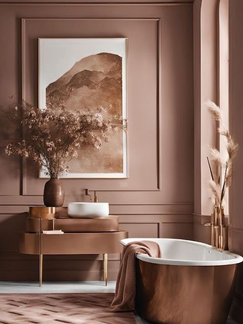
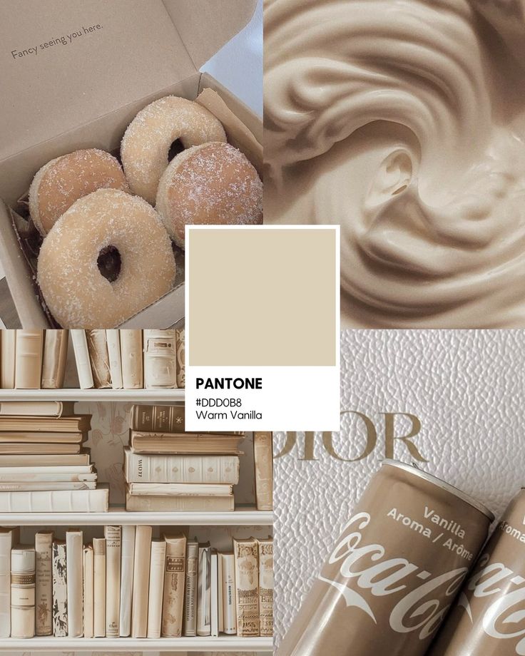
Key Pantone Color Families and Their Psychological Impact
Pantone color families play a powerful role in shaping the atmosphere and mood in any space you design. Understanding how warm colors, cool tones, and neutrals influence emotions lets you create an environment that feels intentional and cohesive.
Warm Colors: Energy and Comfort
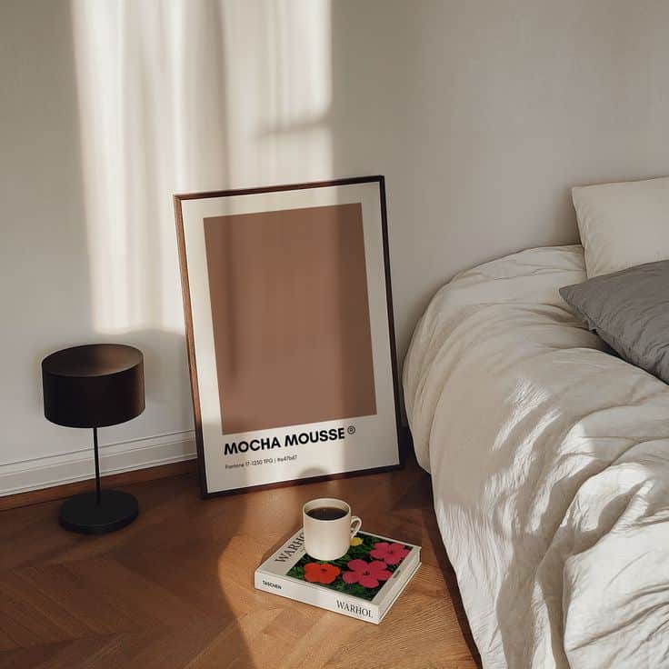
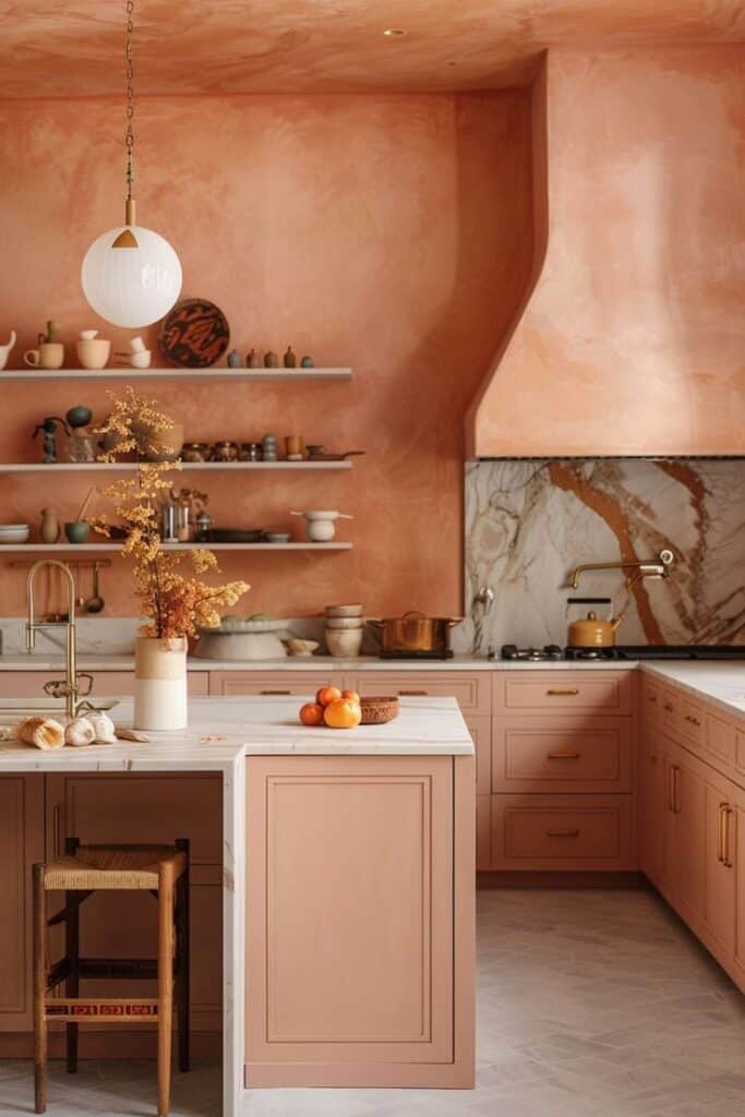
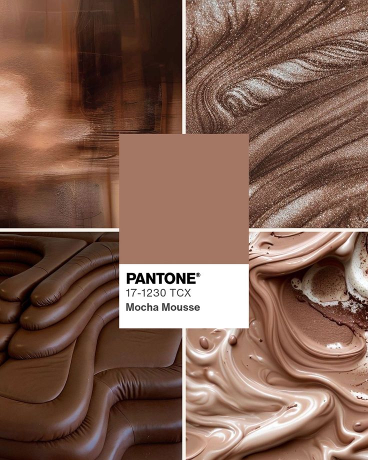
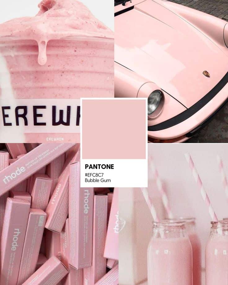
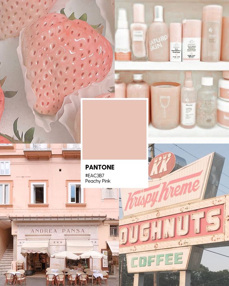
Warm colors in the Pantone system—such as reds, oranges, and yellows—are associated with lively, energetic feelings. These hues can make a room feel more inviting and stimulate interaction and creativity. For example, a living room or dining area featuring Pantone Red 032 or Living Coral brings a sense of excitement and warmth.
In interior design, you often use warm colors to create visual focus or highlight architectural elements. Bold shades like Pantone Flame or Pantone Tangerine add vibrancy and make a space feel more intimate. However, if overused, these shades can feel overwhelming. Pairing them with softer, neutral tones helps achieve a balanced effect.
Key Emotions Warm Colors Evoke:
- Energy
- Comfort
- Sociability
A thoughtful warm color palette enhances hospitality and creates a welcoming experience every time you enter.
Cool Colors: Calm and Serenity
Pantone’s cool colors—blues, greens, and certain purples—are ideal for crafting serene, relaxed environments. Classic Blue and Pantone Aqua are popular choices for bedrooms or bathrooms because they help lower stress and promote calmness.
Cool tones are linked to feelings of trust, clarity, and tranquility. In workspaces, using muted blue or green shades can improve focus and reduce tension. You might choose Pantone’s Tranquil Blue or Seafoam Green to evoke a gentle, peaceful vibe.
Best Spaces for Cool Colors:
- Bedrooms
- Offices
- Meditation rooms
If you’re aiming for a restful ambiance, cool color palettes play a key role in promoting relaxation and emotional balance.
Nuanced Tones and Neutrals: Balance and Sophistication
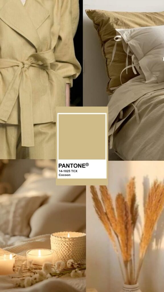
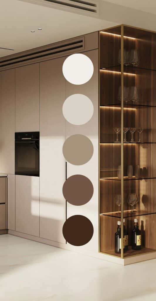
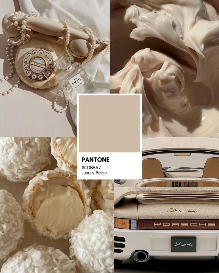
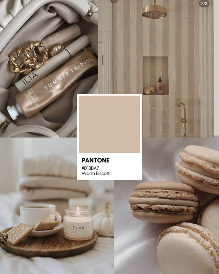
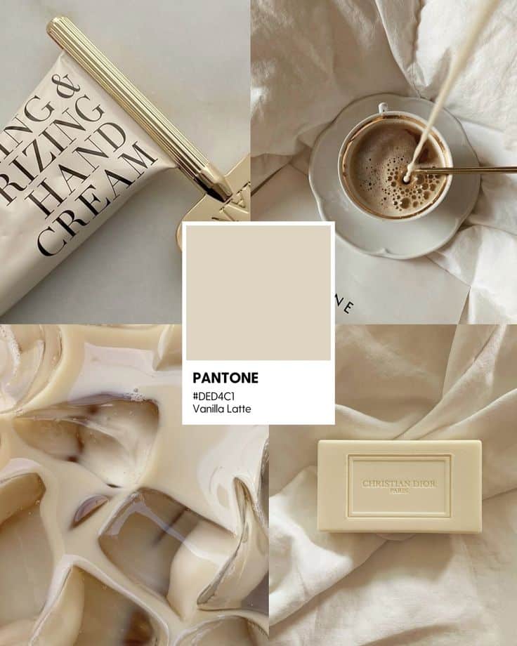
Nuanced tones and neutrals—like Pantone Warm Gray, Mushroom, or Ivory—offer versatility and understated elegance. These shades serve as a subtle backdrop, allowing bolder accents to stand out or letting your furnishings and textures take the spotlight.
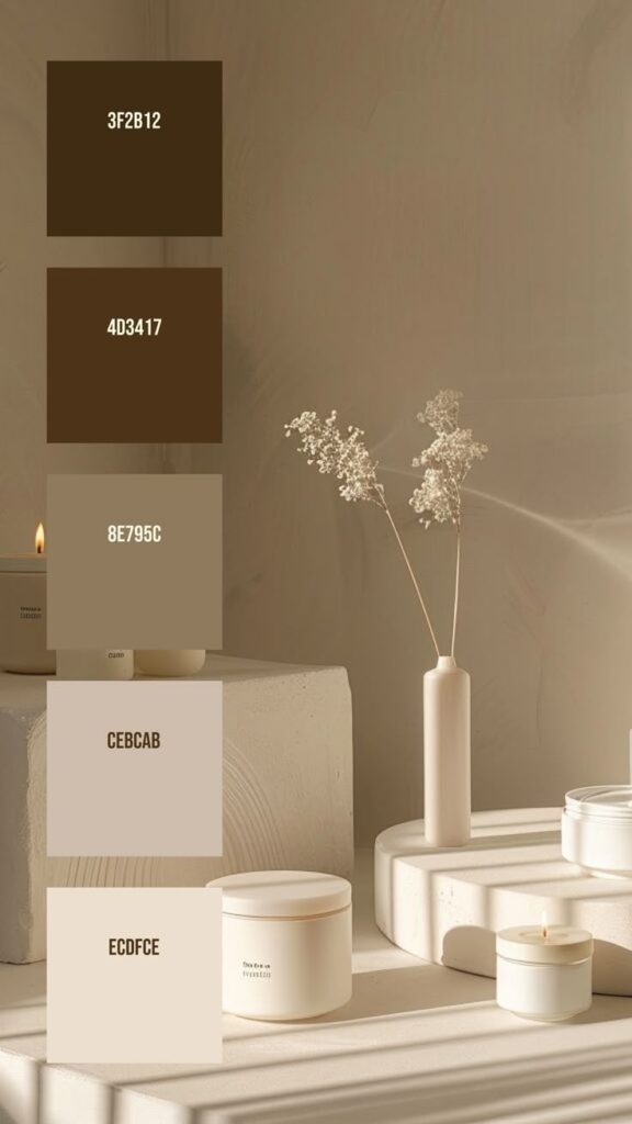
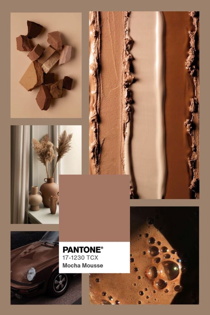
Neutrals foster balance and clarity, making spaces look clean and sophisticated. They work especially well in open-concept layouts, helping to tie together multiple zones without overwhelming the senses. Pairing Pantone’s gentle beiges or cool greys with accent colors can create a harmonious, modern feel.
Popular Neutral Tones:
| Neutral Color | Psychological Impact |
|---|---|
| Warm Gray | Calm, Stable, Adaptable |
| Oatmeal | Inviting, Cozy |
| Pure White | Clean, Fresh, Minimalist |
Including nuanced neutrals in your palette lets you update a space easily and ensures the design remains timeless.
Practical Applications of Pantone Color Psychology in Interior Spaces
Using Pantone colors in your interior design helps you intentionally shape the mood, function, and comfort of your rooms. By paying close attention to the psychology behind each shade, you can create thoughtful, harmonious spaces that support daily living and personal well-being.
Room-by-Room Mood Setting
Pantone’s universal color system makes it easy to select shades that align with your desired atmosphere in every area of your home.
- Living Room: Choose warm tones like Pantone’s Classic Blue or Buttercup to encourage relaxation and meaningful conversation. Earthy neutrals help put guests at ease, while muted greens foster a sense of calm.
- Bedrooms: Soft hues such as Pale Dogwood or Serenity from Pantone’s palette are linked to restful sleep and tranquility. Avoid intense reds or yellows, which can be too stimulating.
- Kitchens and Dining: Energetic colors like Coral or vibrant yellow shades can increase appetite and create a welcoming, lively space for gathering.
Think about how each room is used daily and let your color selection reflect its primary functions for maximum comfort and effectiveness.
Choosing Accent Walls and Colors
Accent walls let you showcase bold Pantone hues without overwhelming the entire room. This approach can add both visual interest and targeted mood effects.
Select a single wall—behind a bed or sofa is popular—and paint it with a standout color, such as Pantone Living Coral or Greenery. This draws attention and influences the emotional feel of the space.
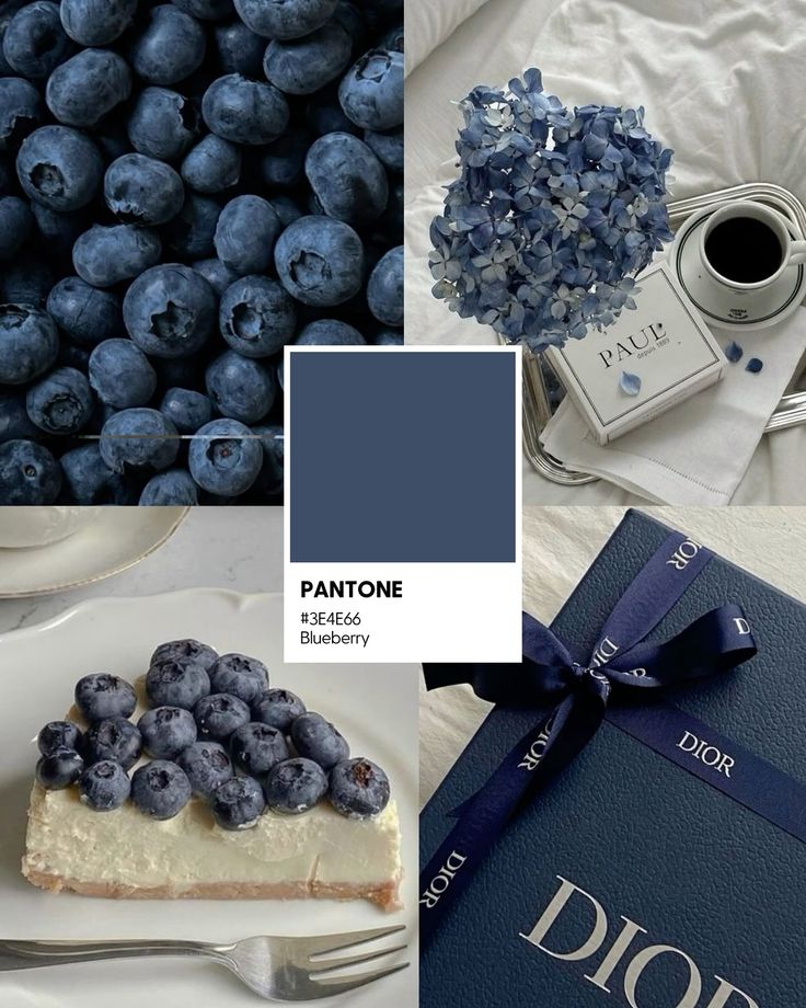
Pair accent colors with complementary neutrals from the Pantone range to maintain harmony. For example, a navy accent wall balances well with whites, beiges, or pale gray.
Accent colors are also useful for visually defining open-plan layouts, or highlighting architectural features like fireplaces and built-in shelves.
Incorporating Decorative Accessories
Accessories offer a flexible, non-permanent way to experiment with Pantone color psychology in your interiors.
Try introducing cushions, throws, rugs, and artwork in trending or seasonal Pantone shades. This helps you refresh the mood of a room without committing to a full-scale paint job.
Use a mix of textures and materials—like velvet pillows in Jade Green or ceramic vases in Flame Orange—to subtly layer color. Group small items in similar hues to create cohesion.
Key tip: Swap accessories by season or mood changes to keep your space feeling current and comfortable year-round. Use Pantone’s annual color guides for easy inspiration when choosing decorative pieces.
Fundamental Color Theory for Interior Designers
Understanding how colors interact gives you a practical foundation for creating cohesive and comfortable interiors. The essentials cover how colors relate, ways to form palettes, and simple rules for applying color theory in real-world spaces.
Color Wheel Essentials
The color wheel is your essential tool for understanding the relationships between colors. It maps out primary (red, blue, yellow), secondary (green, orange, purple), and tertiary colors in a visual format. These relationships let you quickly identify complementary, analogous, and triadic color schemes.
- Complementary: Colors directly across from each other (like blue and orange); create contrast and energy.
- Analogous: Colors next to one another (think green, teal, blue); feel harmonious and calm.
- Triadic: Three colors evenly spaced around the wheel (such as red, yellow, blue); generate lively, balanced palettes.
Using the color wheel helps you avoid clashing combinations and builds a solid base for your interior palettes.
Creating Harmonious Color Palettes
Building a harmonious color palette starts with determining how you want your space to feel. For a peaceful room, choose muted tones and gentle contrasts with analogous colors. For vibrancy, select bolder, complementary pairings.
Most designers use tools like Pantone swatches and digital color pickers to curate color palettes that reflect both function and emotion. Break your palette into three main color roles:
- Dominant color: Sets the overall mood.
- Secondary color: Adds visual interest.
- Accent color: Provides contrast or highlight.
Tip: Test paint samples and swatches in your space, since lighting conditions impact how colors appear. Keep color meanings and color psychology in mind to support the intended atmosphere.
The 60-30-10 Rule in Practice
The 60-30-10 rule is an easy formula for distributing color throughout a room. You assign:
- 60%: Dominant color (walls or large furniture)
- 30%: Secondary color (upholstery, rugs, drapery)
- 10%: Accent color (pillows, artwork, small decor)
This breakdown keeps rooms visually balanced and prevents color overload. For example, you might use a soft neutral for 60%, a mid-tone blue for 30%, and a bright yellow as your 10% pop. Adjusting the shades and intensities within these percentages can bring personality to your design while maintaining harmony.
Selecting the Right Pantone Colors for Your Style and Space
Picking Pantone colors for your interior is more than matching paint swatches. Your choices will shape the mood, reflect your personality, and affect how you experience your space every day.
Understanding Your Personal and Cultural Associations
Your color choices often reflect personal memories or cultural meaning. For example, blue may feel relaxing to you, but in some cultures, it is associated with sadness or tranquility.
When choosing Pantone colors, ask yourself what each color means personally. Make a shortlist of hues that make you feel at ease or inspired. Test them with furniture and materials already at home.
Here are some things to consider:
- Personal favorites: Which colors do you gravitate toward in other parts of your life?
- Cultural context: Certain shades might have special meanings in your background.
- Emotional impact: Does a color help you feel energised, calm, or focused in a room?
Take time to see how light and space affect your perceptions throughout the day.
Trends vs. Timelessness
Trendy Pantone colors are popular, but they can go out of style quickly. Timeless colors like off-whites, greys, and deep blues tend to outlast changing fashions.
To find balance, use trendy colors as accents—such as pillows or artwork—while keeping main surfaces more neutral. This approach helps your space stay flexible and current without needing a major makeover every year.
Pros and cons of each approach:
| Approach | Pros | Cons |
|---|---|---|
| Trend-driven | Fresh, up-to-date look | Can feel dated over time |
| Timeless | Long-lasting appeal | May lack excitement |
Choose what matches your comfort level and willingness to refresh your space.
Working with Pantone Color of the Year
Pantone Color of the Year often sets the tone for new design projects. Using this color can instantly make your space feel modern and connected to broader trends.
If you enjoy experimenting, try small-scale uses—think vases, cushions, or even a single accent wall. Match the Color of the Year with your existing palette and make sure the mood fits the room’s function (for example, calming shades in a bedroom).
There’s no need to overhaul your entire space. Use the Color of the Year as an inspiration, not a rule, and modify it to reflect your own style.
- 2.4Kshares
- Facebook0
- Pinterest2.4K
- Twitter0
- Reddit0
