Creative grid layouts offer a simple yet powerful way to organize design elements. They help designers balance visuals and text, making the entire design clearer and more attractive. Using grids creatively means knowing when to follow the structure and when to break it for unique effects that catch the viewer’s eye.
A grid is like an invisible framework made of columns, rows, and spaces. It guides where to place pictures, text, and other elements. When designers use grids thoughtfully, their work looks neat and professional, but also flexible enough to be fresh and interesting.
By combining order with creativity, grid layouts make it easier to communicate ideas clearly while standing out visually. This balance is key to creating designs that are not only beautiful but also easy for people to understand and enjoy.
Understanding Creative Grid Layouts
Creative grid layouts use structure to bring order and clarity to design. They guide how text, images, and other elements fit together. Understanding grids helps designers achieve balance, organize information clearly, and create visual flow.
Core Principles of Grid Design
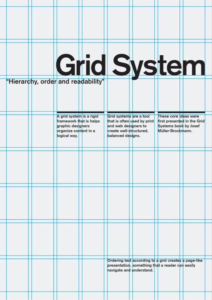
Grids are built from three main parts: columns, gutters, and margins. Columns divide the space vertically. Gutters are the spaces between columns, keeping elements separate. Margins frame the whole design, providing breathing room.
Consistency is key. Using equal columns and gutters throughout a design makes it look tidy and professional. Flexibility also matters. Designers often choose grids with different numbers of columns to match their project’s needs.
Grids help align elements, improving readability and user experience. They also speed up the design process by setting clear rules for where content goes.
Types of Grids Used in Graphic Design
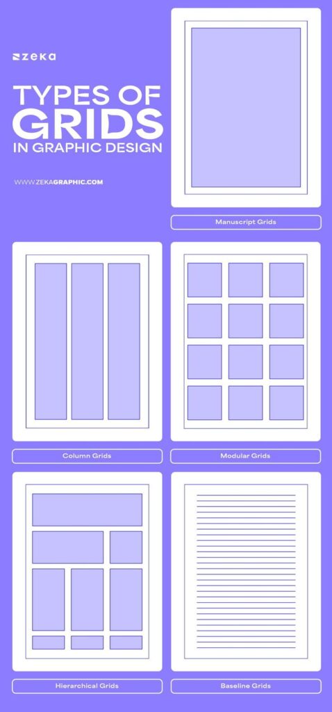
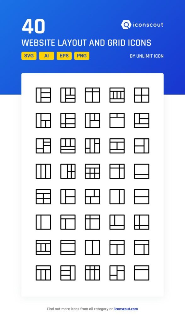
There are several types of grids, each fitting different design goals.
- Manuscript grid: One large block, useful for long text like books or articles.
- Column grid: Multiple columns that divide content, great for magazines or websites.
- Modular grid: Combines columns and rows, making it ideal for complex layouts like dashboards.
- Hierarchical grid: Less rigid, based on content importance, allowing more freedom.
Choosing the right type depends on the project’s purpose. For example, a website might use a column grid for easy reading, while a poster might use a hierarchical grid for bold, eye-catching design.
Visual Hierarchy and Balance
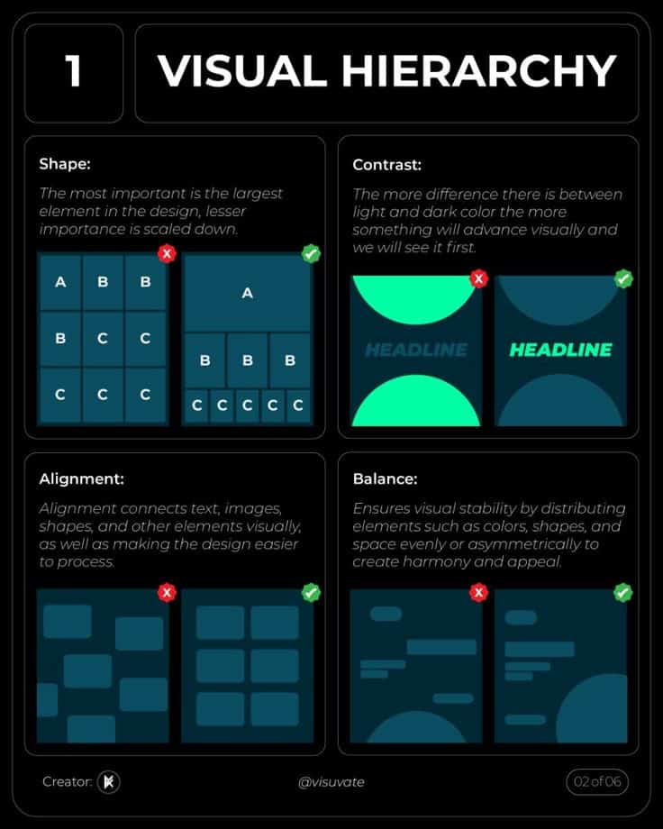
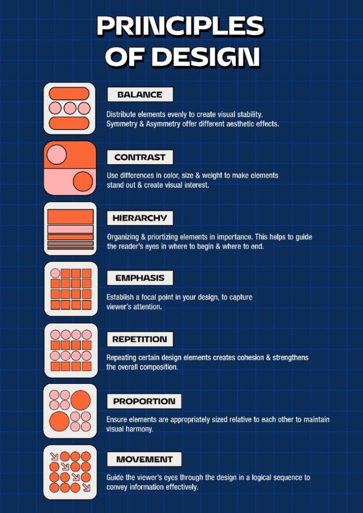
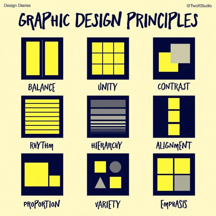
Visual hierarchy means arranging elements so viewers know what to look at first, second, and so on. Grids help by offering a clear structure.
Balance is about distributing elements evenly, avoiding a cluttered or lopsided look. Designers use the grid to place text and images in a way that feels steady and natural.
Using varying column widths or breaking the grid in certain spots can create interest without losing order. This mix of structure and creativity keeps the design engaging but easy to navigate.
Inspiring Applications of Creative Grid Layouts
Creative grid layouts bring structure and style to many design fields. They help organize information clearly while adding visual interest. These layouts can be flexible, adapting to different needs and media.
Editorial and Magazine Layouts
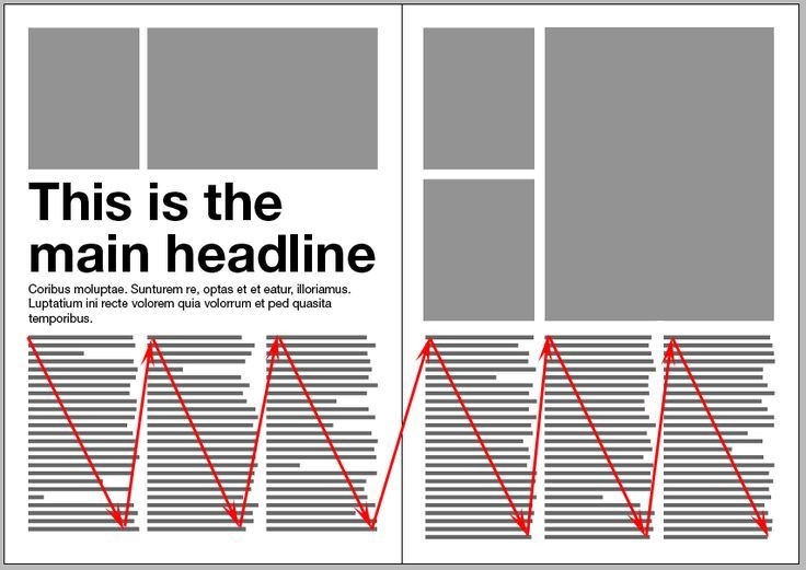
In editorial design, grids help arrange text, images, and headlines consistently. This creates a clean reading experience that guides the eye smoothly across pages. Designers often use modular grids to vary column widths or image sizes, which keeps layouts fresh without losing order.
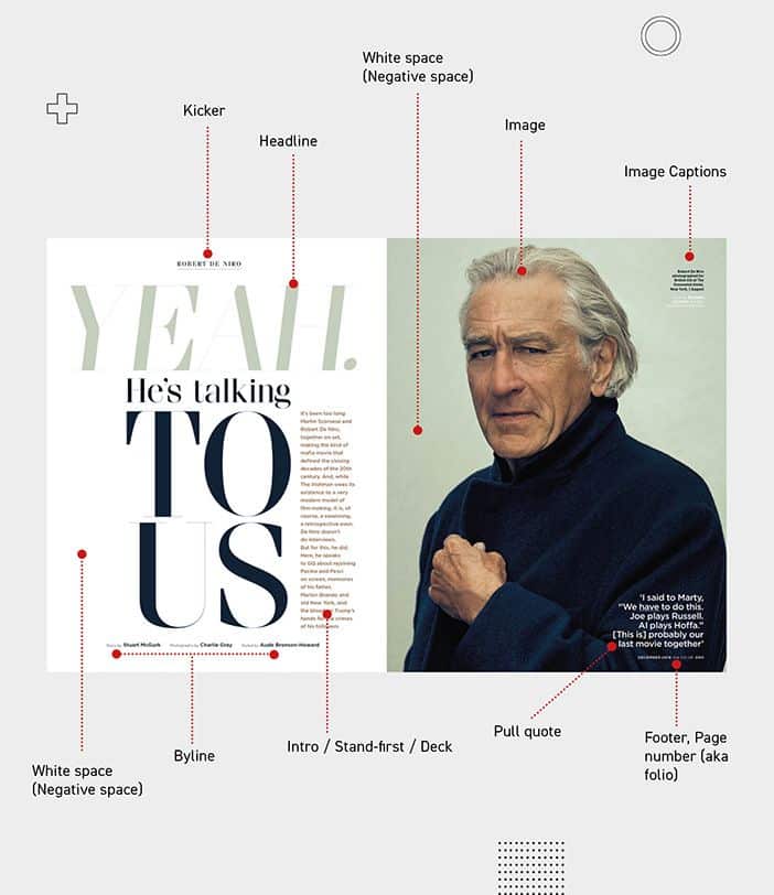
Breaking the grid intentionally can highlight important content, such as quotes or feature articles. White space within the grid adds breathing room, making dense text easier to read. These techniques let magazines balance creativity with clarity.
Web and UI Design
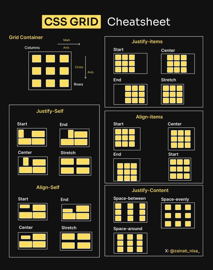
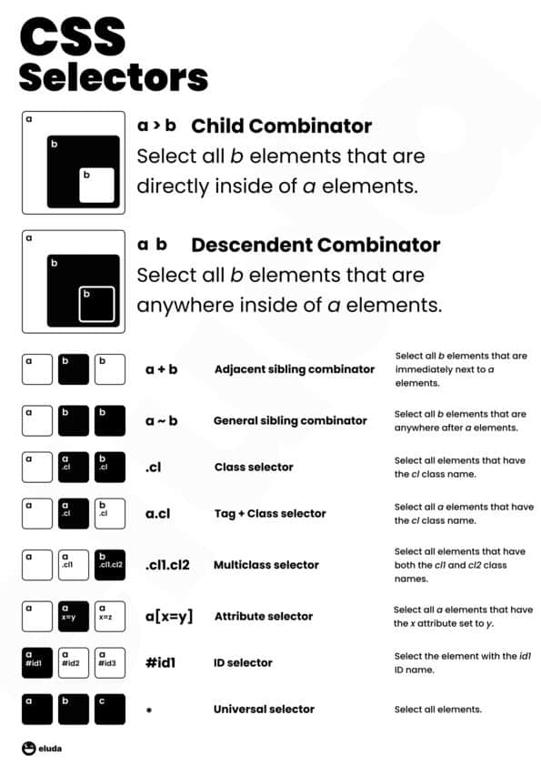
Web designers use grid layouts to build responsive pages that look good on all devices. CSS Grid makes placing elements in rows and columns simple and precise. This helps align buttons, images, and text logically, improving user navigation.
Creative grids in UI design can mix fixed and flexible columns to emphasize key features or calls to action. Grids also allow consistent spacing and sizing, which enhances usability. Using contrasting colors within grids highlights important areas without clutter.
Branding and Advertising Materials
Grids support clear messaging in branding by organizing logos, text, and images neatly. They provide a framework that keeps all design elements balanced and aligned. This consistency improves brand recognition across flyers, posters, and social media ads.
Designers may alter grid patterns to create dynamic visuals that capture attention. Combining bold typography with structured grids makes headlines stand out. Grids also help integrate multiple images or icons evenly, maintaining a professional look.
Tips and Techniques for Effective Grid Implementation
Using grids well means balancing structure and creativity. It’s about making sure elements align clearly while also keeping the design fresh. Knowing when to stick to the grid or mix things up helps create strong visual interest.
Breaking the Grid for Visual Impact
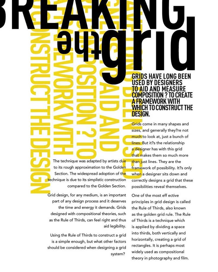

Breaking the grid means purposely placing some elements outside the structure. This can draw attention to key parts of the design and add energy. It works best when used sparingly, so the overall layout doesn’t feel chaotic.
Designers often pull images, text, or buttons out of their usual columns to create a focal point. For example, an image might stretch across several grid spaces or overlap another section. This contrast highlights important information or adds style without losing overall balance.
Combining Traditional and Modern Approaches
Traditional grids use clear, fixed columns and rows to organize content. Modern approaches bring flexibility by allowing more fluid and dynamic placements. Combining these helps create organized designs that still feel spontaneous.
A designer might start with a 12-column grid for structure and then vary column widths or use nested grids. This mix keeps the layout clean and adaptable for different screen sizes or creative needs. Using guides and alignment tools also improves consistency across the design.
Common Mistakes to Avoid
A common mistake is relying too heavily on the grid, which can make layouts feel boring or rigid. Another is breaking the grid too much, causing confusion and visual clutter.
Failing to account for different screen sizes is also an issue. Grids should be responsive, adjusting to keep content readable on phones, tablets, and desktops.
Finally, ignoring whitespace reduces clarity. Proper spacing around grid elements keeps the design open and easy to follow.
- 0shares
- Facebook0
- Pinterest0
- Twitter0
- Reddit0


