I studied realistic anatomy for two years before attempting anime—and my first anime bodies looked worse than my realistic ones. Stiff. Awkward. Somehow both too detailed and not detailed enough. I knew where every muscle attached, but my anime characters stood like they were waiting for a bus in the rain.
The problem? Anime anatomy isn’t simplified realistic anatomy. It’s a completely different system with its own rules, proportions, and shortcuts. Professional manga artists don’t draw realistic bodies and then “anime-ify” them. They work from stylized proportion templates that have evolved over decades of Japanese comic and animation production.
- Understanding Anime Anatomy
- Anatomy Basics for Male and Female Characters
- Constructing the Body Framework
- Drawing Specific Body Parts
- Posing and Movement
- Styling Hair and Clothing
- Shading and Finishing
- Common Mistakes and How to Fix Them
- Frequently Asked Questions
- How do I start drawing an anime body for beginners?
- What are the steps to draw an anime male body?
- What is the process for drawing an anime girl's body?
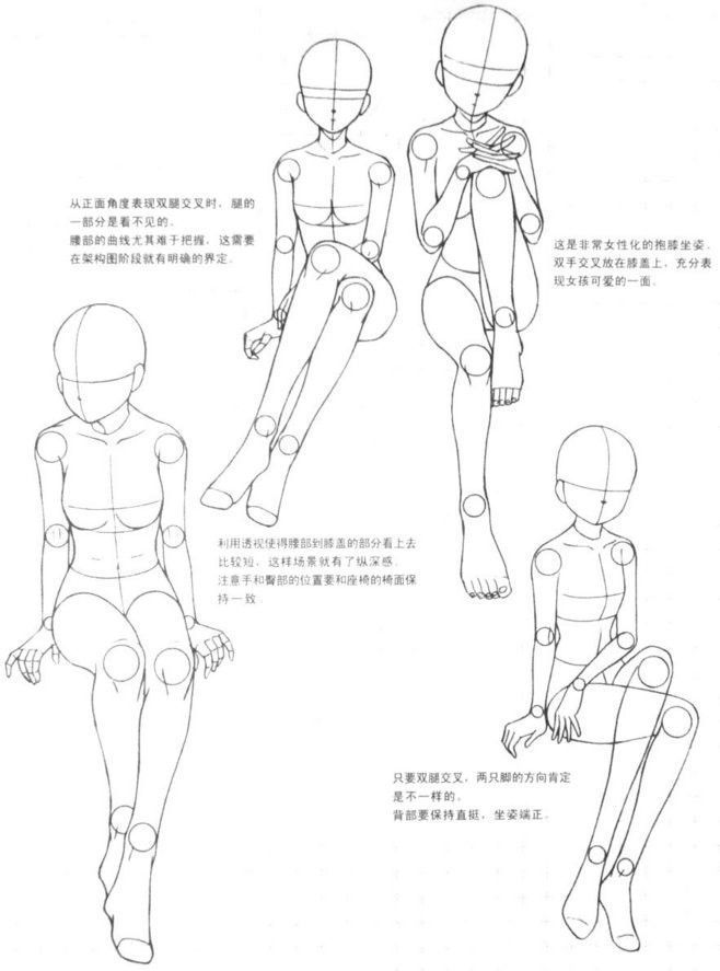
- How can I draw anime body poses accurately?
- Can you draw anime bodies with clothes on, and how?
- Are there tips for drawing anime bodies easily for novice artists?
- Conclusion
Here’s what separates professional anime bodies from amateur ones: understanding that anime proportions are intentionally unrealistic—and knowing exactly how they’re unrealistic. The head-to-body ratio is different. The joint placement follows different rules. The way lines flow through the figure follows conventions that realistic anatomy doesn’t use.
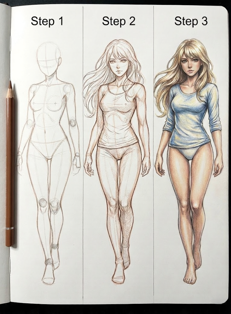
This guide breaks down anime body construction from first principles. Not “draw an oval for the torso”—actual proportion systems, joint mechanics, and the gender-specific conventions that make anime bodies read as anime rather than as bad realistic drawing.
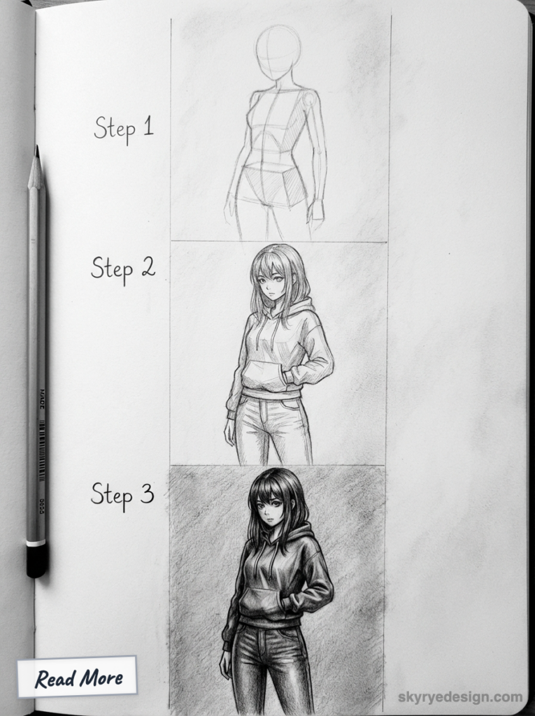
About this guide: I’ve drawn anime and manga professionally for over eight years, working on both original projects and commercial illustration. These techniques come from studying Japanese source materials, professional workshops, and thousands of hours of figure drawing that specifically targets anime conventions. The proportions and methods here reflect how working manga artists actually construct bodies—not how Western tutorials imagine they do.
Understanding Anime Anatomy
Anime anatomy operates on different rules than realistic anatomy. Before drawing anything, you need to understand what those rules are and why they exist.
Why Anime Proportions Exist
Anime proportions developed for practical reasons in Japanese animation and manga production:
Readability at small sizes: Manga panels are often tiny. Exaggerated features (large eyes, simplified bodies) read clearly even when printed small.
Emotional expression: Large eyes and faces relative to bodies allow for expressive emotional range that realistic proportions can’t achieve.
Production efficiency: Simplified body shapes with clear landmarks can be drawn consistently across thousands of frames by multiple animators.
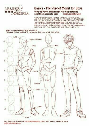
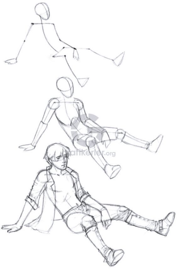
Cultural aesthetic preference: Japanese visual culture has different beauty standards than Western art, favoring certain proportions (longer legs, smaller faces) that anime exaggerates further.
Understanding why these proportions exist helps you apply them intentionally rather than randomly.
The Anime Head-Count System
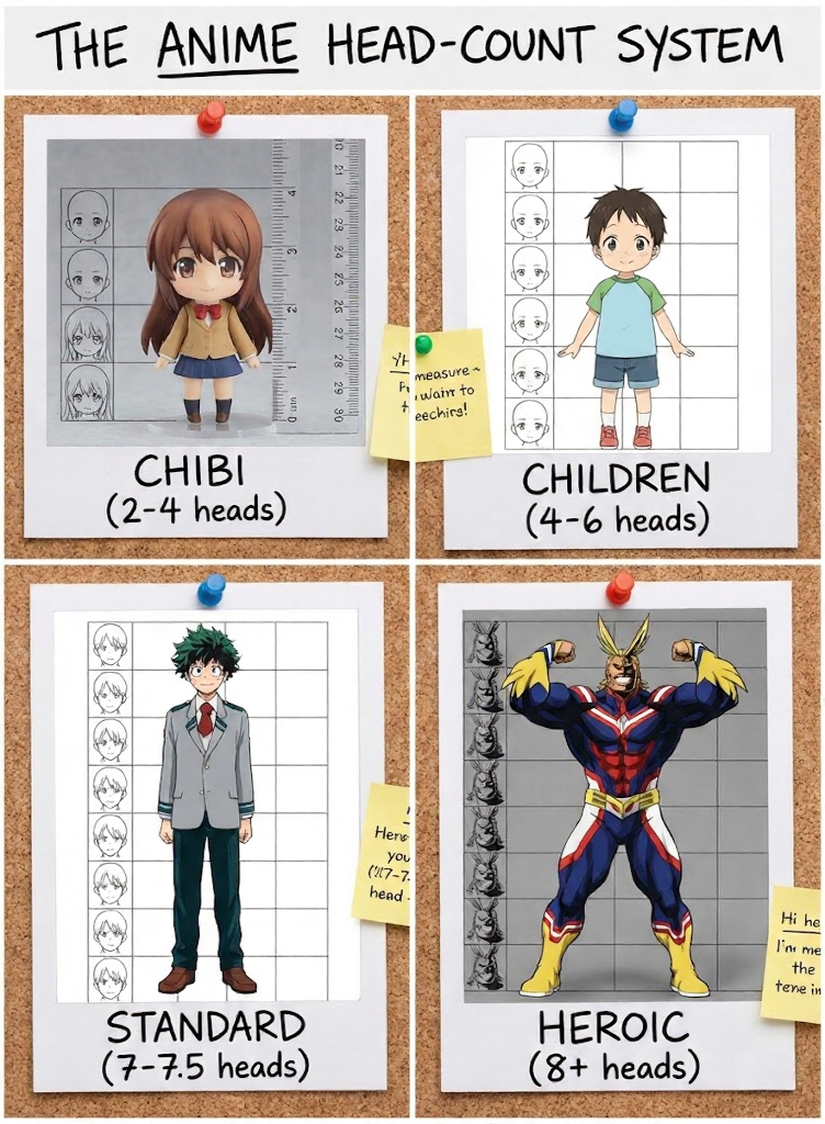
Realistic adult bodies are approximately 7.5-8 heads tall. Anime uses different systems depending on style and character age:
Standard anime (7-7.5 heads): Slightly shorter than realistic, with proportionally larger heads. This is the most common proportion for teenage and adult characters in shounen and shoujo manga.
Heroic/idealized (8+ heads): Taller, more dramatic proportions used for action heroes, villains, and characters meant to appear powerful or beautiful. Common in seinen manga and action anime.
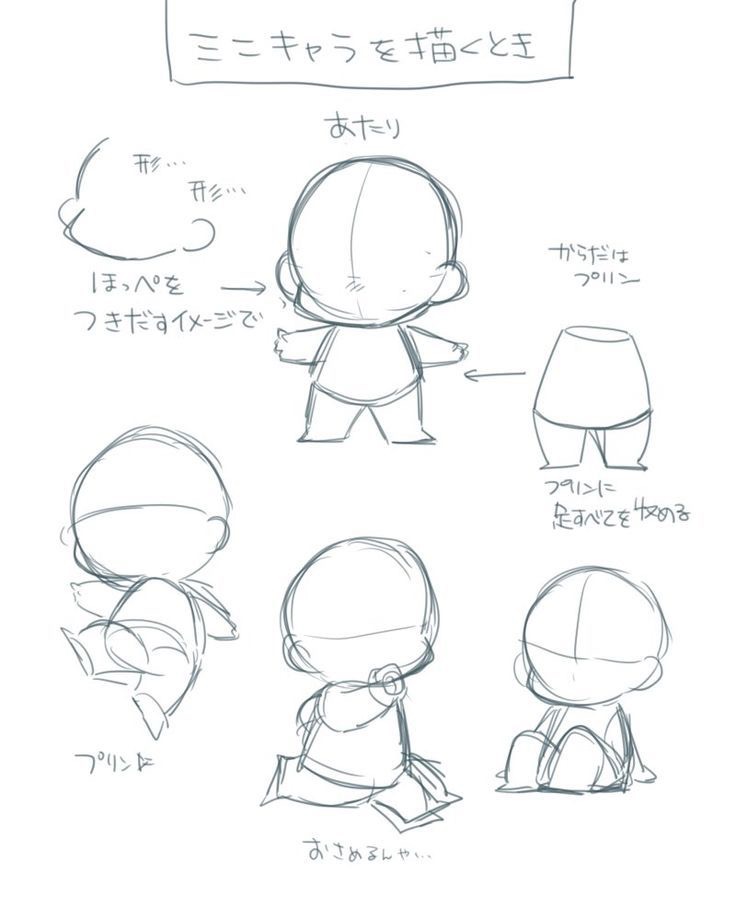
Chibi/super-deformed (2-4 heads): Extremely compressed proportions for comedic effect or cute appeal. The head becomes the dominant feature.
Children (4-6 heads): Proportionally larger heads reflect actual child anatomy but are stylized further for anime aesthetics.
The key insight: These aren’t approximations—they’re specific choices. Decide your character’s head count before you start drawing, and maintain it consistently.
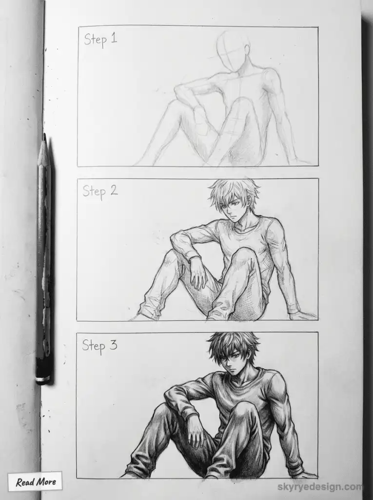
Where Anime Differs from Realistic Anatomy
Specific differences to internalize:
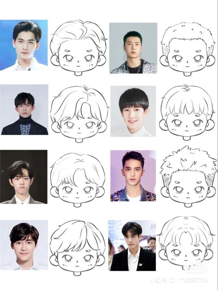
Head and face: Proportionally larger, with features (especially eyes) taking up more of the face than realistic anatomy allows. The face is often flatter (less three-dimensional) from front view.
Neck: Thinner and longer than realistic, especially for female characters. The connection to shoulders is often simplified.
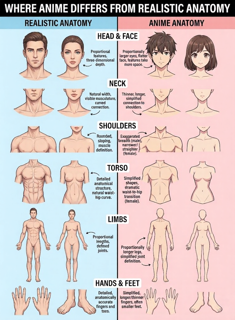
Shoulders: Male shoulders are exaggerated broader; female shoulders are often narrower than realistic. The shoulder line is frequently straighter than realistic anatomy shows.
Torso: Simplified into cleaner shapes. The waist-to-hip transition is often more dramatic (especially for females) than realistic anatomy.
Limbs: Legs are proportionally longer in most anime styles. Arms maintain roughly realistic proportions but with simplified joint definition.
Hands and feet: Simplified significantly. Fingers may be longer and thinner than realistic. Feet are often drawn smaller than anatomically correct.
Anatomy Basics for Male and Female Characters
Male and female anime bodies follow different conventions. Understanding these differences is essential for convincing character design.
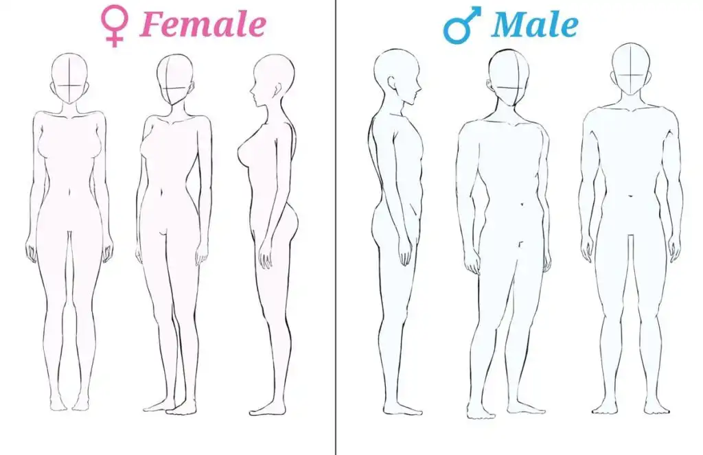
Male Anime Body Proportions
Male anime bodies emphasize strength and angularity:
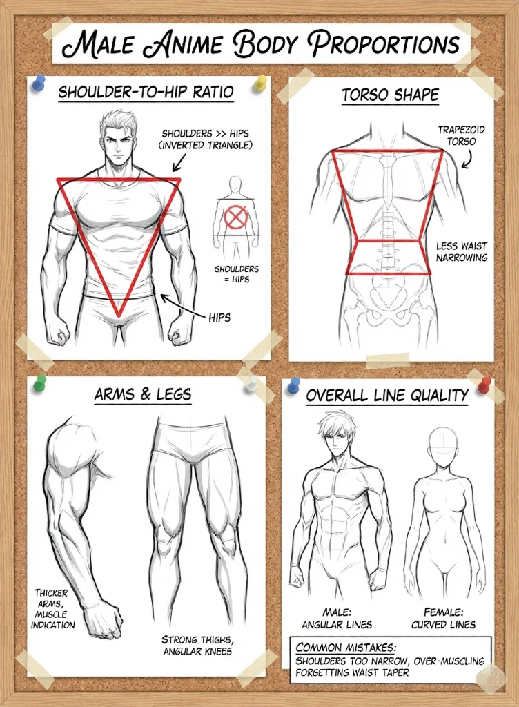
Shoulder-to-hip ratio: Male shoulders are significantly wider than hips—approximately 2:1 or even 2.5:1 for heroic characters. This creates the classic “inverted triangle” silhouette.
Torso shape: The male torso forms a trapezoid or rectangle, with the chest broader than the waist. The waist narrowing is less dramatic than for females.
Chest: Pectoral muscles are often indicated with simple curved lines. Avoid over-detailing unless drawing specifically muscular characters.
Arms: Proportionally thicker than female arms, with visible (but simplified) muscle indication at biceps and forearms.
Legs: Strong thighs tapering to defined calves. Knees are angular rather than rounded.
Overall line quality: More angular, with straighter lines and sharper transitions between body parts.
Common mistakes:
- Making shoulders too narrow (characters look weak)
- Over-muscling (unless intentional, this looks like Western superhero art, not anime)
- Forgetting to taper the waist (creates boxy, unappealing silhouette)
Female Anime Body Proportions
Female anime bodies emphasize curves and softness:
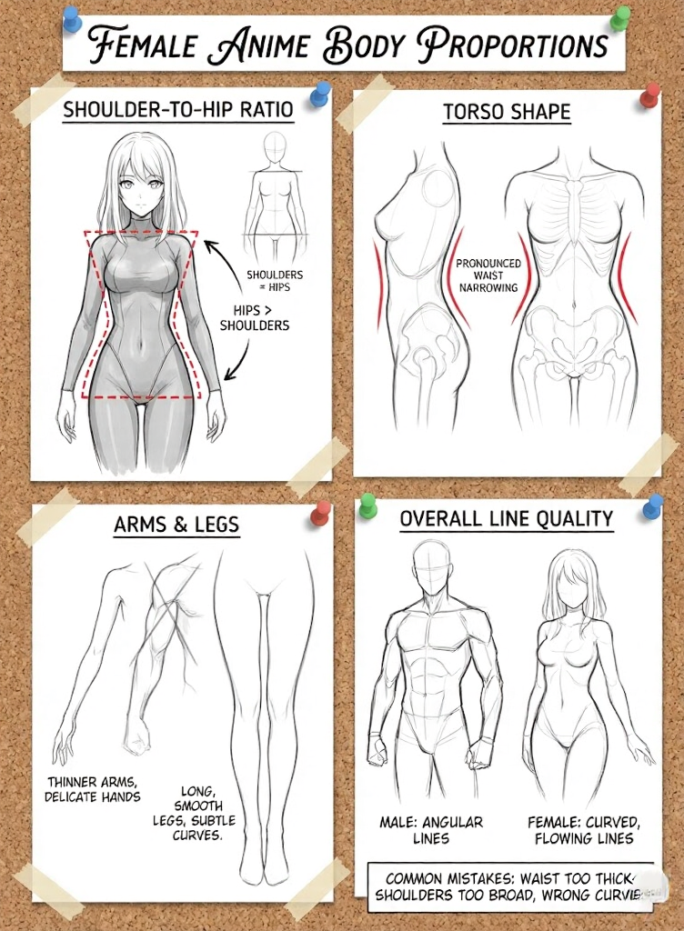
Shoulder-to-hip ratio: Hips are typically wider than shoulders, or shoulders and hips are roughly equal. This creates the “hourglass” silhouette.
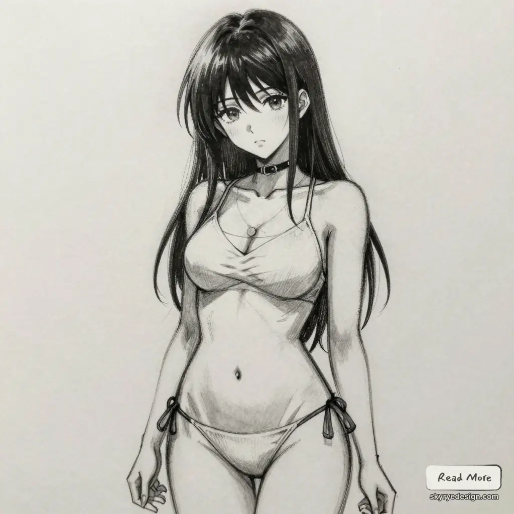
Torso shape: The female torso has a pronounced waist narrowing between ribcage and hips. This creates the classic anime feminine figure.
Chest: Varies by character design, from minimal to exaggerated. Regardless of size, the construction follows similar breast placement rules (on the ribcage, affected by gravity and pose).
Arms: Thinner than male arms with minimal muscle definition. Wrists are narrower; hands are often smaller and more delicate.
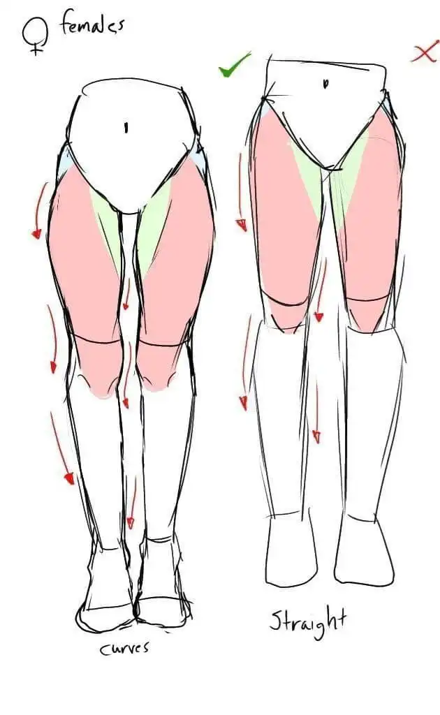
Legs: Long and smooth, with subtle curves at thighs and calves. Less angular than male legs.
Overall line quality: More curved, with flowing lines and softer transitions. Even angular poses use gentler line quality than male characters.
Common mistakes:
- Waist too thick (loses feminine silhouette)
- Shoulders too broad (reads as masculine)
- Curves in wrong places (study actual anime reference to see where curves occur)
Facial Features and Expressions
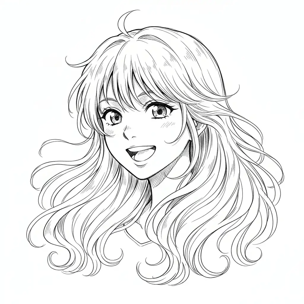
The face is where anime diverges most dramatically from realistic anatomy.
Eye placement: Eyes sit lower on the face than realistic anatomy—often at or below the midline. This creates the large forehead/small face ratio that reads as youthful.
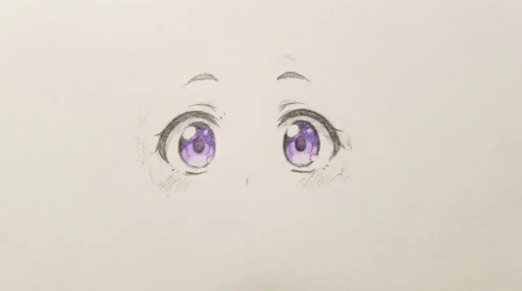
Eye size: Much larger than realistic, taking up 1/4 to 1/3 of the face width (per eye). The iris is large relative to the eye opening.
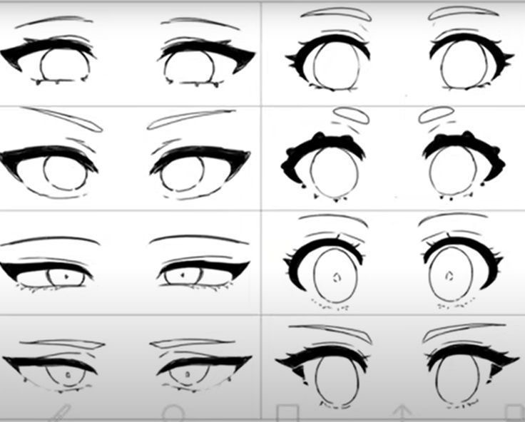
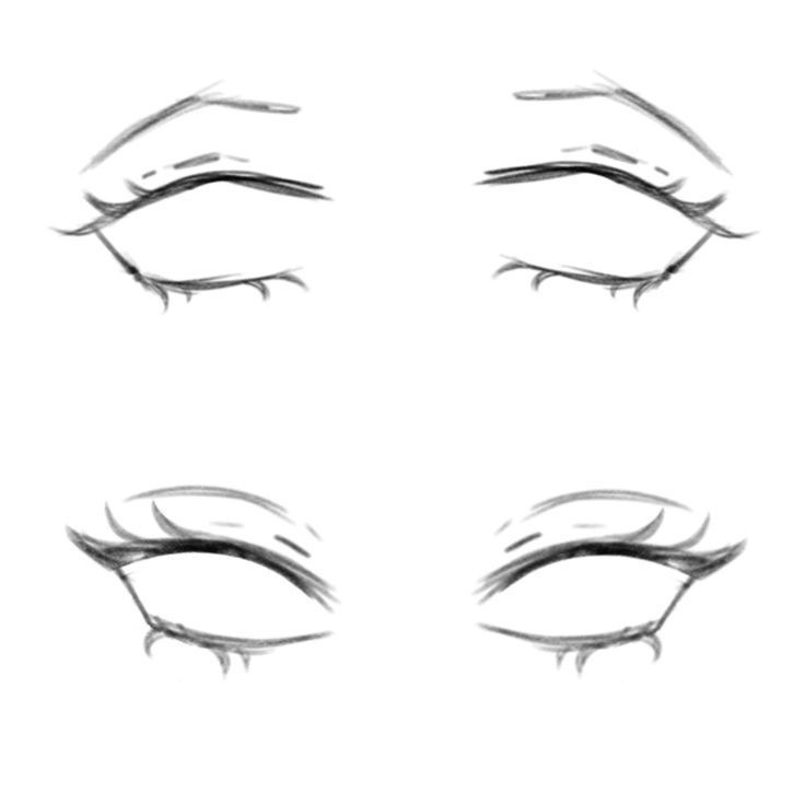
Eye construction: Anime eyes have multiple layers: outer shape, iris, pupil, highlights, and often additional detail. These aren’t random—study specific anime styles to see their eye conventions.
Nose: Extremely simplified. Often just a small shadow, line, or dot. Almost never drawn with realistic nostril detail.
Mouth: Simplified but expressive. Size varies dramatically with expression—small and subtle when neutral, large and exaggerated when emotional.
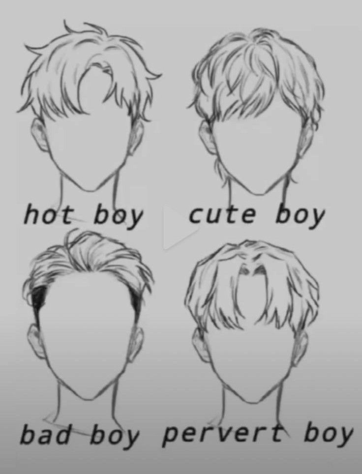
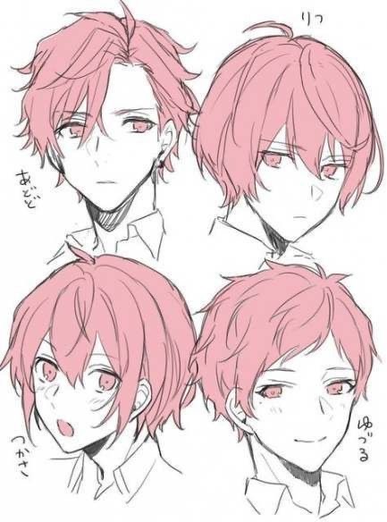
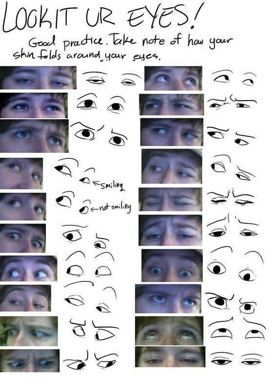
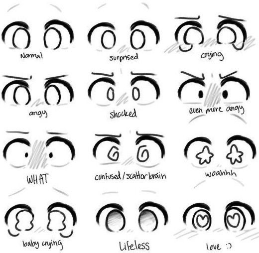
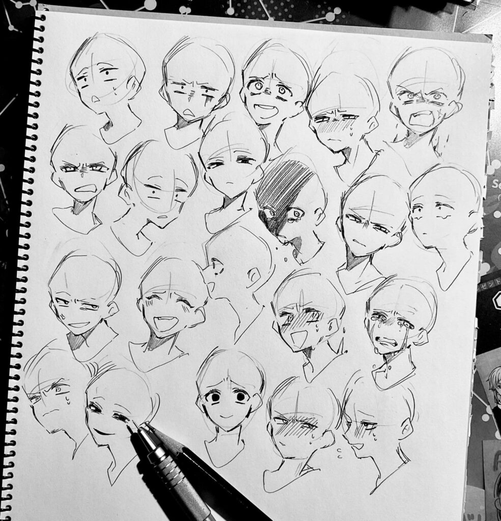
Expression through shape: Unlike realistic faces where muscle movement creates expression, anime faces express emotion through eye shape changes, eyebrow position, and mouth shape. Learn these specific shape conventions for different emotions.
Constructing the Body Framework
Now that you understand what anime proportions look like, here’s how to construct them.
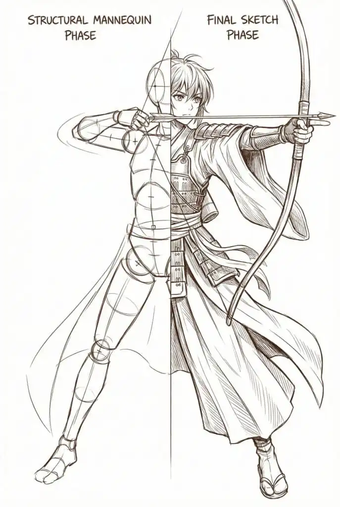
The Skeletal Foundation
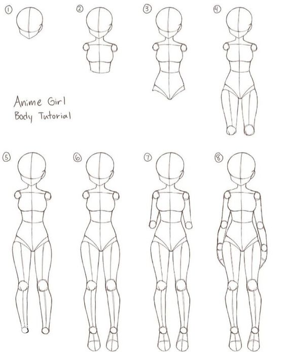
Start every anime body with a simplified skeletal structure:
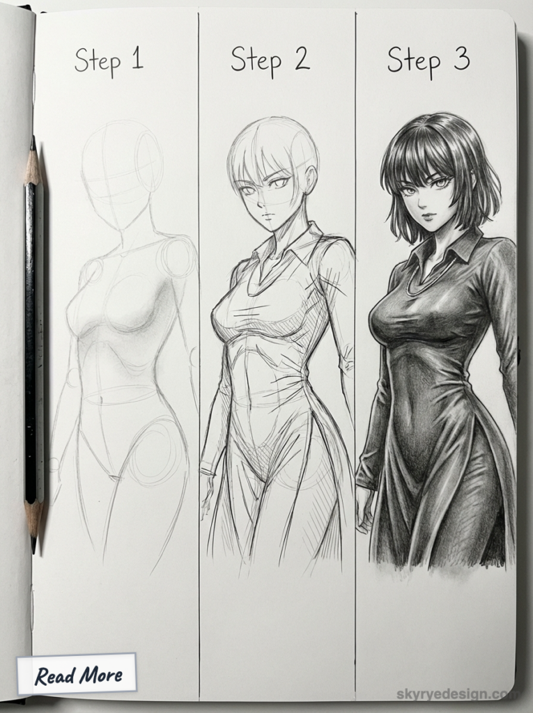
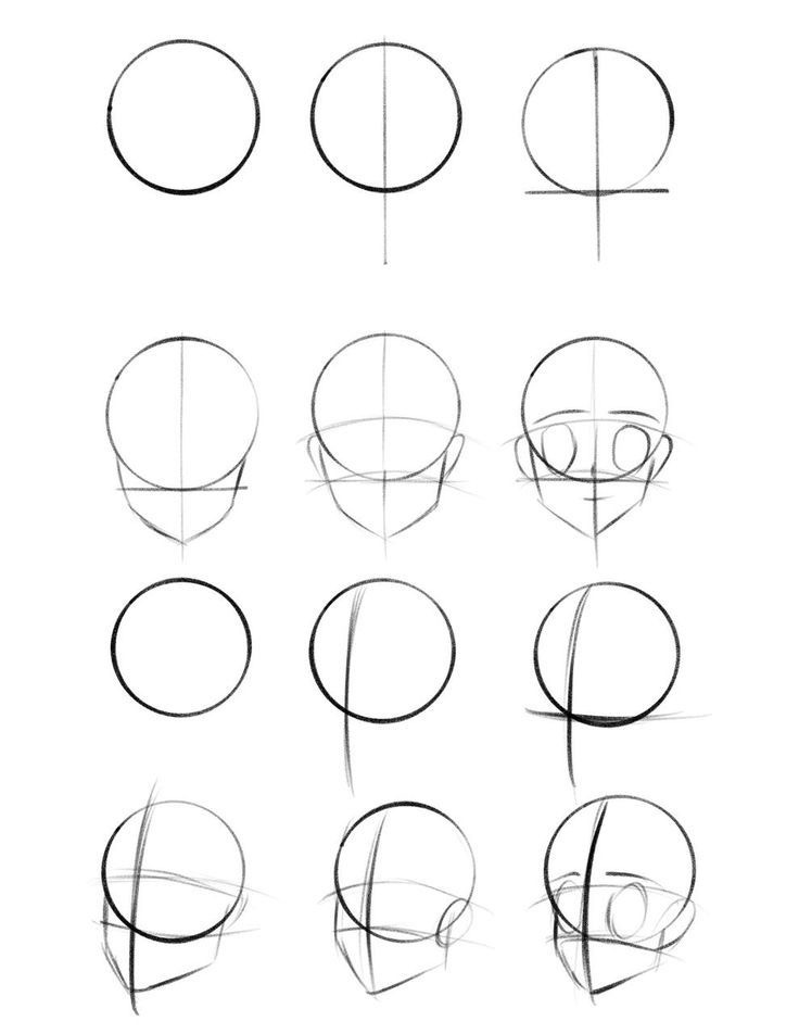
Step 1: Establish the head and centerline Draw an oval for the head and a vertical line extending downward for the spine. This centerline guides your entire figure’s balance.
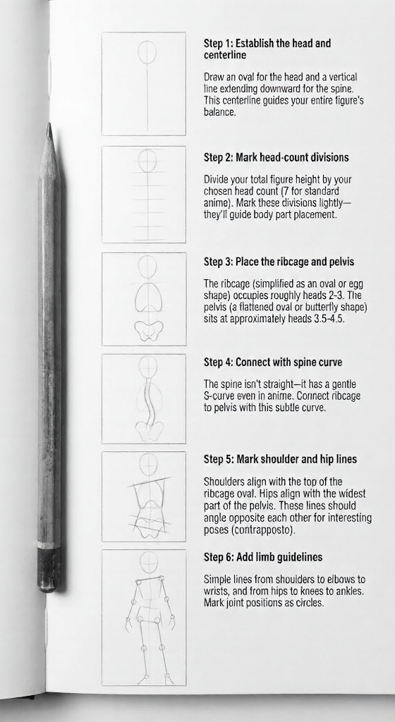
Step 2: Mark head-count divisions Divide your total figure height by your chosen head count (7 for standard anime). Mark these divisions lightly—they’ll guide body part placement.
Step 3: Place the ribcage and pelvis The ribcage (simplified as an oval or egg shape) occupies roughly heads 2-3. The pelvis (a flattened oval or butterfly shape) sits at approximately heads 3.5-4.5.
Step 4: Connect with spine curve The spine isn’t straight—it has a gentle S-curve even in anime. Connect ribcage to pelvis with this subtle curve.
Step 5: Mark shoulder and hip lines Shoulders align with the top of the ribcage oval. Hips align with the widest part of the pelvis. These lines should angle opposite each other for interesting poses (contrapposto).
Step 6: Add limb guidelines Simple lines from shoulders to elbows to wrists, and from hips to knees to ankles. Mark joint positions as circles.
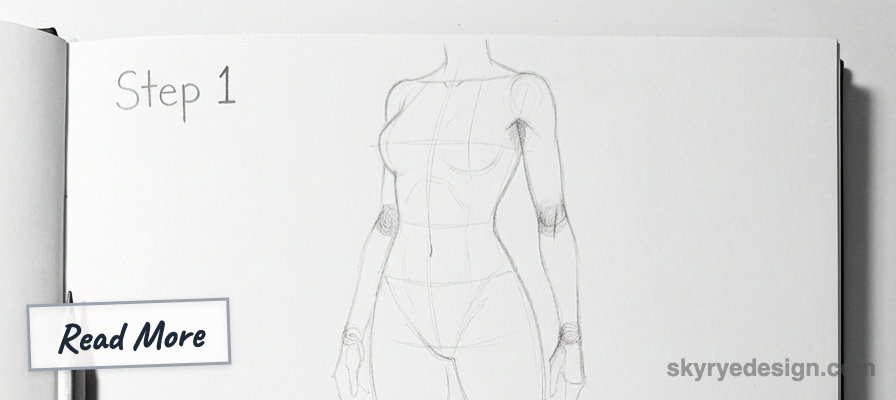
Joint Placement and Movement
Proper joint placement makes or breaks anime bodies. Key landmarks:
Shoulders: The shoulder joint sits at the outer edge of the ribcage oval, not at the corner of the shoulder line. This distinction affects arm attachment angle.
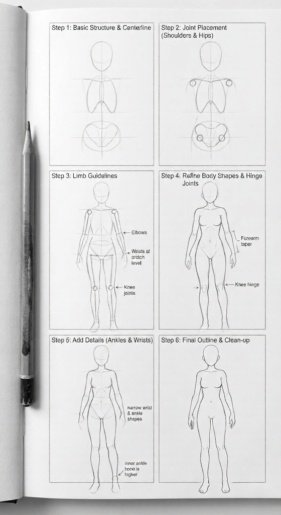
Elbows: Fall at waist level when arms hang naturally. The forearm is slightly shorter than the upper arm.
Wrists: Fall at crotch level when arms hang naturally. Wrists are narrow—thinner than the forearm.
Hips: The hip joint sits inside the pelvis oval, not at its outer edge. This affects leg attachment angle and walking/running poses.
Knees: Fall at approximately head 5.5-6 in a 7-head figure. The knee is a hinge joint—it only bends one direction.
Ankles: The ankle sits above the foot, with the inner ankle bone higher than the outer ankle bone.
Movement principles: Joints rotate in specific ways. The shoulder ball-and-socket allows circular movement. The elbow hinge only flexes forward. The wrist rotates and flexes. Understanding these constraints prevents impossible poses.
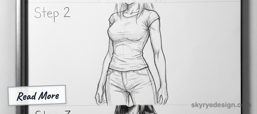
Adding Volume and Form
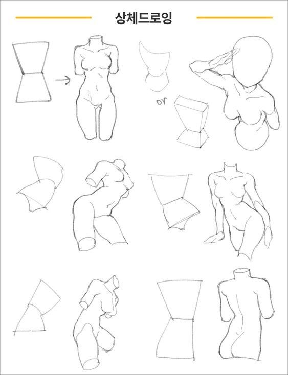
Once your skeleton is established, add simplified muscle and body volume:
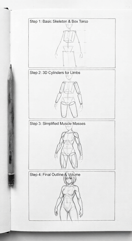
Think in 3D cylinders: Limbs are cylinders that taper toward joints. The torso is a box with rounded corners. Thinking dimensionally prevents flat-looking figures.
Follow the skeleton: Your volume wraps around the skeletal structure you’ve established. If the skeleton is wrong, no amount of rendering fixes it.
Simplify muscle groups: Anime doesn’t show every muscle. Instead, indicate major masses: deltoids at shoulders, biceps/triceps in upper arms, forearm mass, pectorals and ribcage in torso, glutes and thighs in legs.
Maintain consistent width: If you established broad shoulders in your skeleton, your volume should reflect that. Don’t contradict your initial proportion choices.
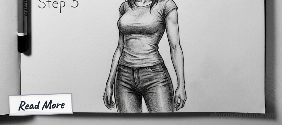
Drawing Specific Body Parts
Arms and Hands
Arms follow a specific construction in anime:
Upper arm construction: A tapered cylinder, wider at the shoulder attachment and narrower toward the elbow. The bicep creates a subtle bulge on the front; the tricep creates a subtle bulge on the back.
Forearm construction: Slightly thicker near the elbow, tapering to the wrist. The forearm twists (pronation/supination), which affects the shape depending on whether the palm faces up or down.
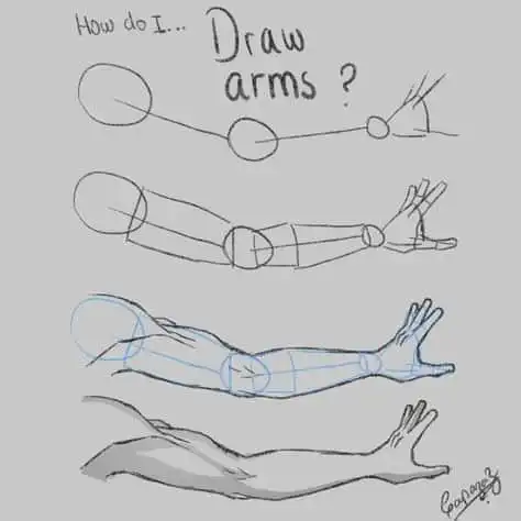
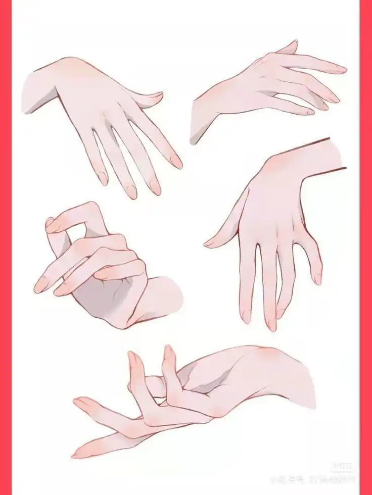
Hand construction: Start with a simple pentagon or mitten shape for the palm. The palm is roughly square—as wide as it is long (to the base of fingers).
Finger construction: Fingers extend from the palm as tapered cylinders. In anime, fingers are often simplified to three visible segments. The middle finger is longest; ring and index are similar; pinky is shortest.
Anime hand shortcuts:
- Fingers can be grouped together rather than drawn individually
- Pointing or gesturing poses emphasize one or two fingers
- Fists simplify the hand to a rounded rectangle with knuckle indication
- From distance, hands become simple shapes—don’t over-detail
Common hand mistakes:
- Fingers too short or too long
- Thumb placement wrong (the thumb connects at the wrist side of the palm, not the bottom)
- All fingers the same length
- Palm too small relative to fingers
Legs and Feet
Legs are simpler than arms in anime:
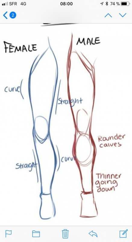
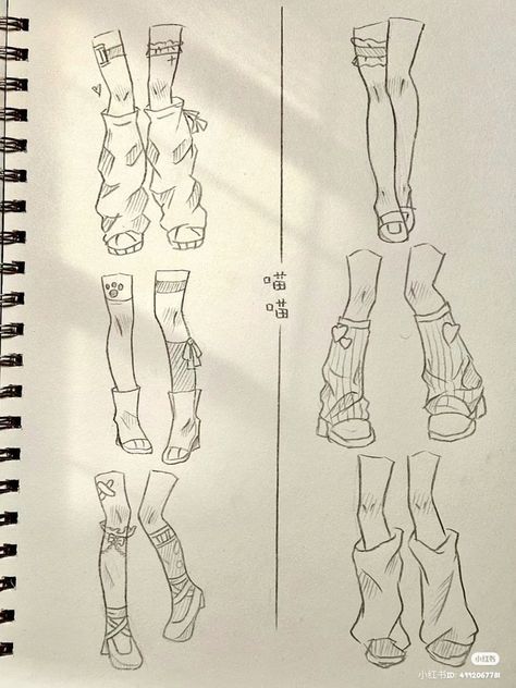
Thigh construction: The thigh is a tapered cylinder, widest at the hip attachment. The front surface (quadriceps) is relatively flat; the back surface (hamstring) curves more.
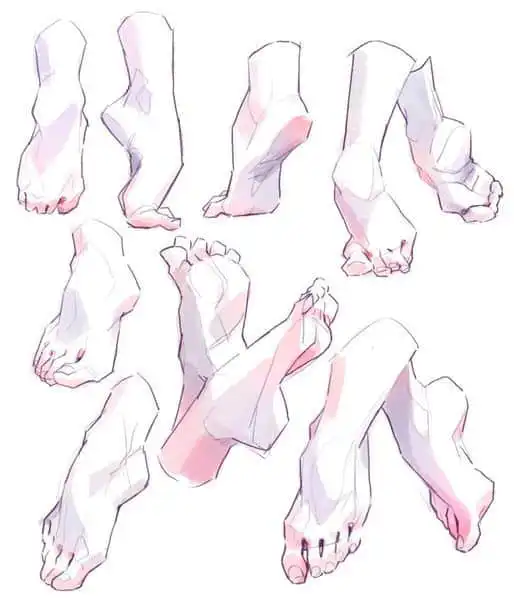
Lower leg construction: The calf creates a gentle curve on the back of the lower leg, higher up than beginners usually place it. The front of the shin is relatively flat.
Knee construction: A subtle bump marking the transition between thigh and lower leg. Don’t overdefine—anime knees are simple.
Foot construction: Start with a triangular wedge shape for the side view. The foot is longer than beginners usually draw it—approximately the same length as the forearm.
Anime foot shortcuts:
- Shoes often replace detailed foot anatomy
- Simplified toes or completely smooth foot surfaces are common
- Side view is the easiest angle for feet
- Three-quarter views can show simplified toe suggestion
Torso Details
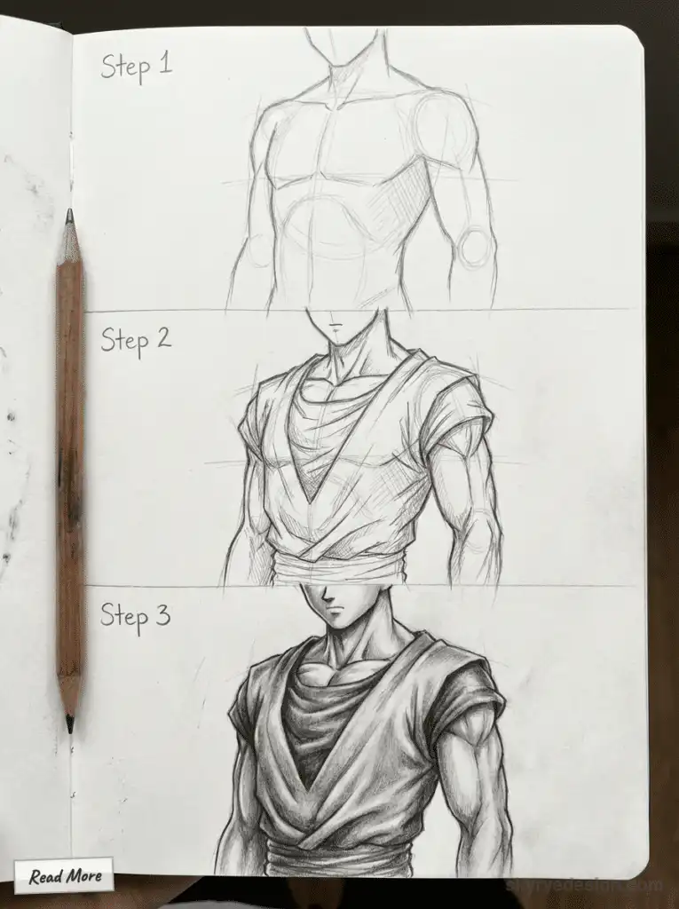
The torso connects everything and carries the most stylistic variation:
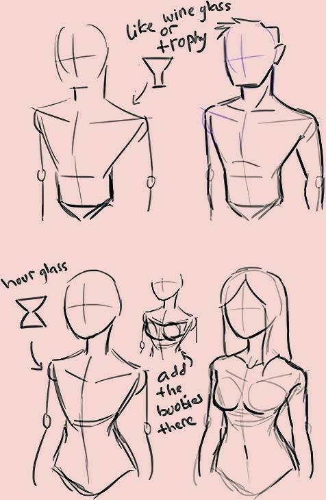
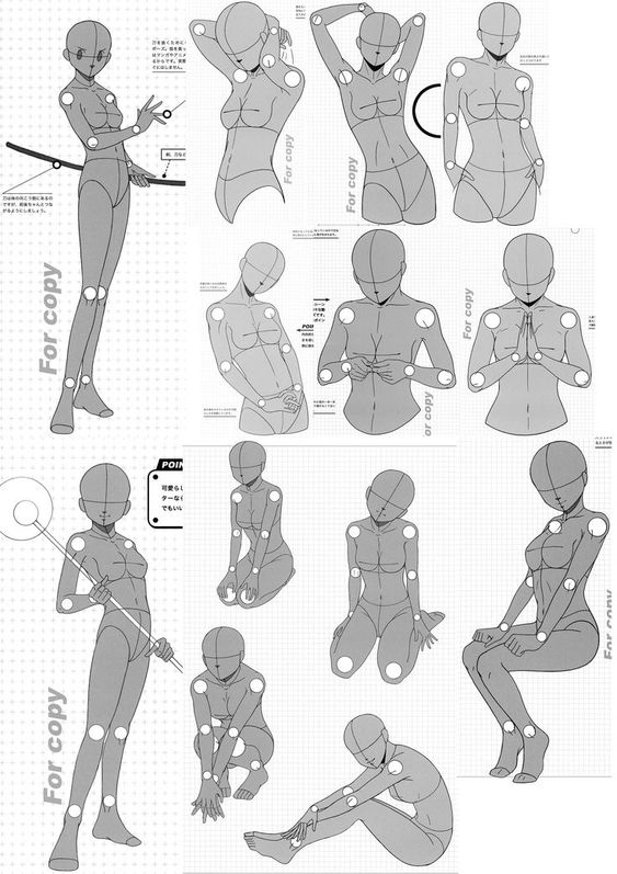
Male torso construction:
- Establish ribcage as an egg shape, broader at top
- Narrow to waist (not dramatically for males)
- Pelvis attaches below, slightly narrower than ribcage
- Indicate pectorals with curved lines from armpit toward center
- Suggest abdominal definition with minimal lines (if visible)
- Side view shows chest forward, back curved slightly
Female torso construction:
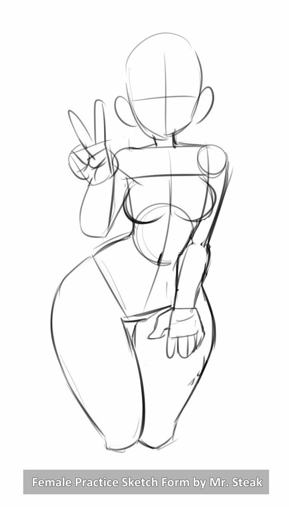
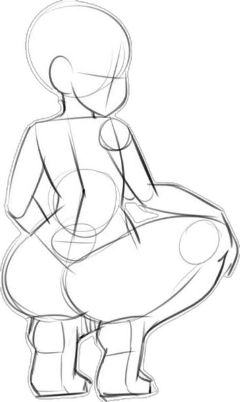
- Establish ribcage as an egg shape, moderately broad
- Dramatic waist narrowing
- Pelvis attaches below, wider than ribcage
- Breast placement follows ribcage curve, affected by pose
- Waist curves inward from ribcage, then outward to hips
- Side view shows pronounced chest and hip curves
Cloth interaction: Torso construction matters even under clothing because fabric follows body contours. Understand the body shape to draw clothing that wraps realistically.
Posing and Movement
Static bodies are boring bodies. Dynamic posing brings anime figures to life.
The Line of Action
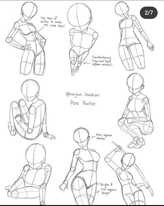
Every dynamic pose starts with a line of action—a single curved line that captures the figure’s overall gesture and energy.
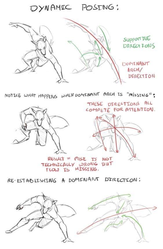
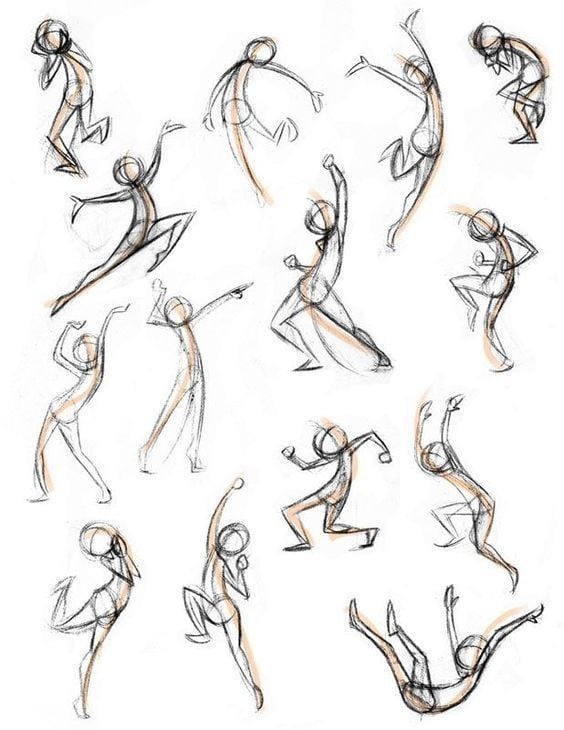
Creating the line of action:
- Before drawing anything, decide the pose’s energy direction
- Draw a single flowing curve representing that energy
- The curve can be C-shaped, S-shaped, or have multiple bends
- The entire body’s construction follows this line
Line of action principles:
- Curved lines suggest movement and energy
- Straight lines suggest stiffness or tension
- The line doesn’t follow the spine literally—it captures the feeling of the pose
- All major body parts should relate to this line
Common mistake: Skipping the line of action and going straight to skeleton. This produces static, lifeless poses even when the anatomy is correct.
Dynamic vs. Static Poses
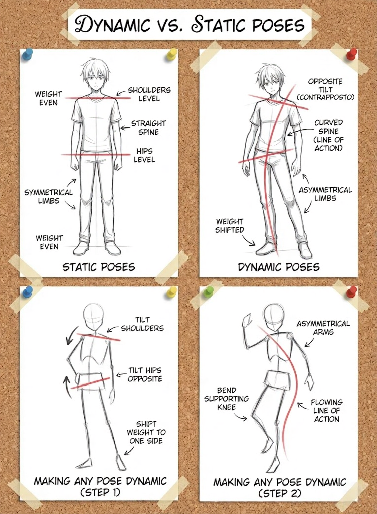
Characteristics of static poses:
- Weight evenly distributed on both legs
- Shoulders and hips level (parallel to ground)
- Spine straight or barely curved
- Limbs symmetrical
Characteristics of dynamic poses:
- Weight shifted to one leg
- Shoulders and hips tilted opposite directions (contrapposto)
- Spine curved along line of action
- Limbs asymmetrical
Making any pose more dynamic:
- Tilt the shoulder line
- Tilt the hip line opposite to shoulders
- Shift weight to one side
- Bend the supporting knee slightly
- Allow one arm to move differently than the other
Gesture and Flow
Gesture drawing captures movement essence before detail. Practice with timed gesture drawings:
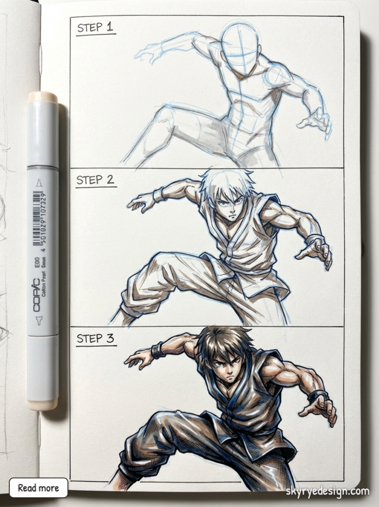
30-second gestures: Capture only the line of action and basic body shape. No detail.
1-minute gestures: Add simplified skeleton with joint positions.
2-minute gestures: Add basic volume, keeping forms simple.
5-minute gestures: Develop forms further, adding anatomical indication.
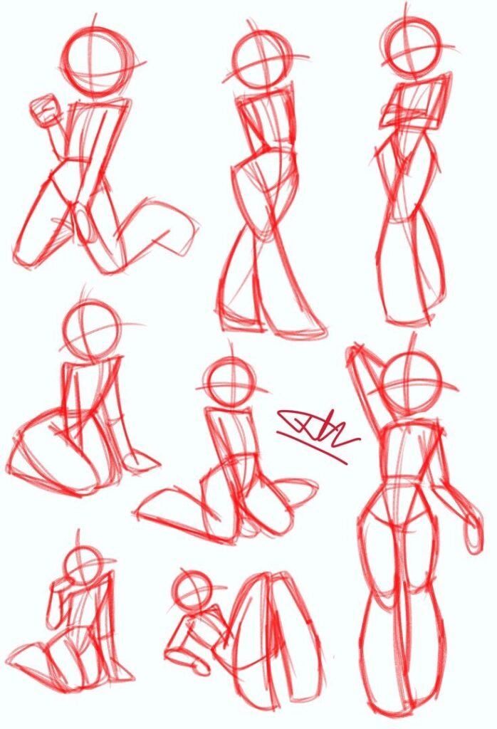
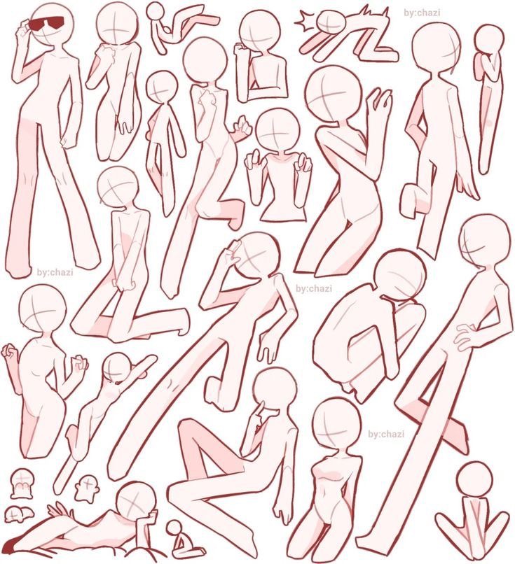
Why gesture matters for anime: Anime characters often have exaggerated, expressive poses. Gesture practice trains you to see and capture these dynamic qualities before getting lost in proportion details.
Styling Hair and Clothing
Hair and clothing define character personality and complete the figure.
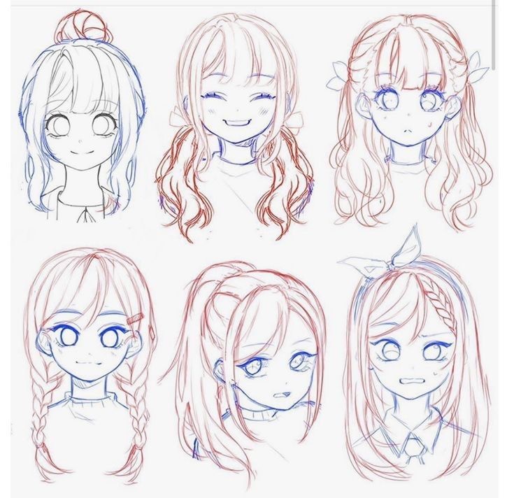
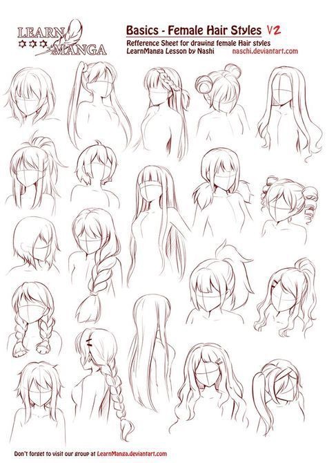
Anime Hair Construction
Anime hair follows recognizable conventions:
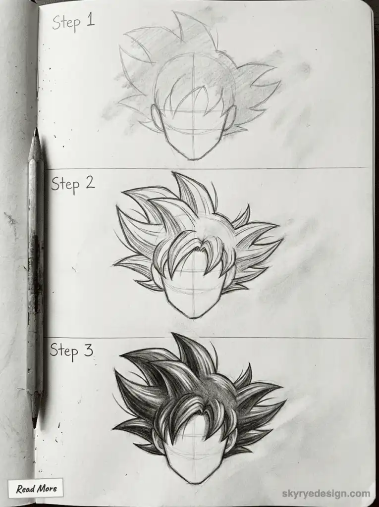
Construction approach:
- Start with the skull shape (hair doesn’t stick directly to the head—there’s volume)
- Establish the hairline
- Block in major hair masses as simple shapes
- Add directional flow lines within each mass
- Detail individual strands or strand groups last
Hair mass principles:
- Hair falls in groups, not individual strands
- Gravity affects hair direction (down unless wind or movement)
- Hair has volume—it lifts off the head
- Different hair types (straight, wavy, curly) have different mass shapes
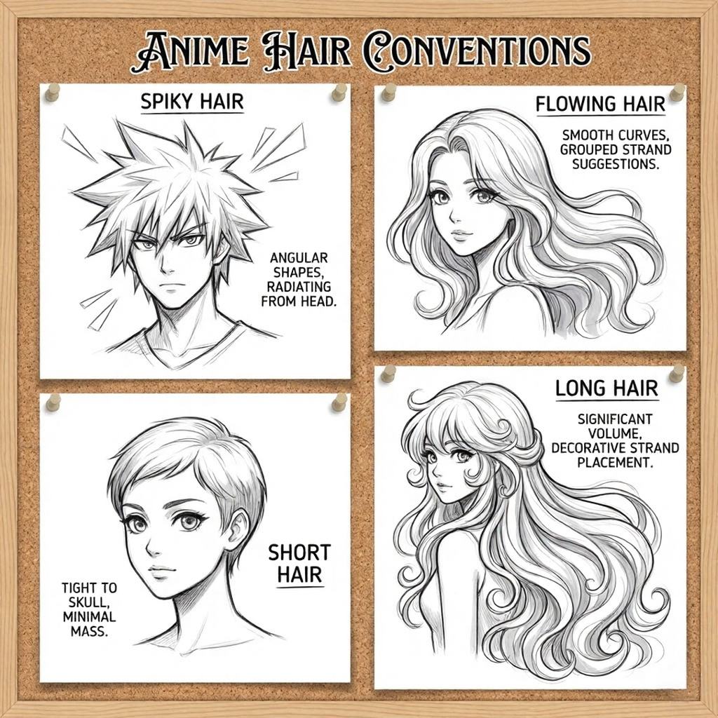
Anime hair conventions:
- Spiky hair: angular shapes radiating from the head
- Flowing hair: smooth curves with grouped strand suggestions
- Short hair: tight to skull with minimal mass
- Long hair: significant volume, often with decorative strand placement
Clothing and Fabric
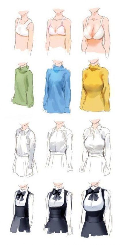
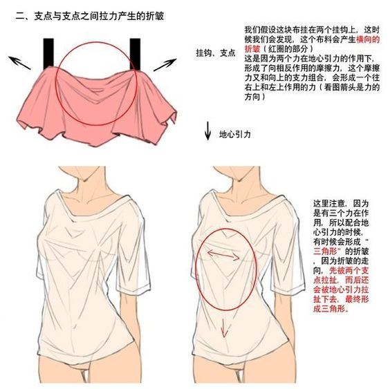
Clothing follows the body underneath while adding its own behavior:
Fabric principles:
- Fabric stretches at joints (elbows, knees, shoulders)
- Fabric bunches at compression points
- Fabric drapes according to gravity and support points
- Tight clothing follows body contours; loose clothing hangs from support points
Common clothing wrinkle patterns:
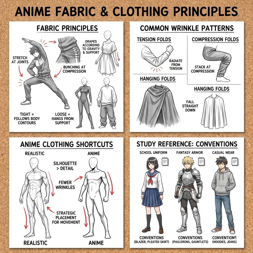
- Tension folds: Radiate outward from points of tension (bent elbow creates radial folds)
- Compression folds: Stack at compression points (bunched fabric at bent knee)
- Hanging folds: Fall straight down from support points (cloak hanging from shoulders)
Anime clothing shortcuts:
- Clothing silhouette matters more than wrinkle detail
- Fewer wrinkles than realistic drawing
- Strategic placement emphasizing movement direction
- School uniforms, fantasy armor, and casual wear each have conventions—study reference
Shading and Finishing
Anime Shading Conventions
Anime uses cel-shading—distinct shadow shapes rather than smooth gradients:
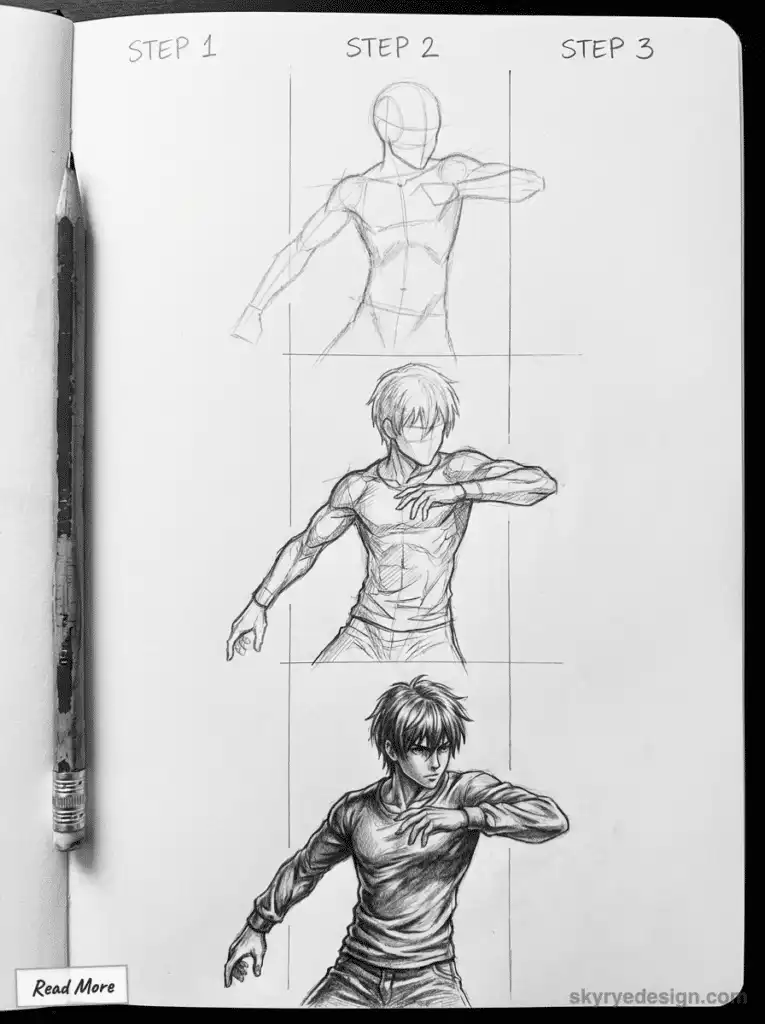
Two-tone shading: The simplest approach uses one shadow value and one light value. This mimics traditional animation cel painting.
Shadow placement:
- Identify light source direction
- Block in shadow shapes on surfaces facing away from light
- Keep shadow shapes simple and graphic
- Shadows often have hard edges in anime (unlike realistic soft shadows)
Where to shade:
- Under hair (shadow on face and neck)
- Under chin (shadow on neck)
- At neck-shoulder junction
- Under chest/bust
- On side of torso opposite light
- Under and behind limbs
Line Weight and Clean-Up
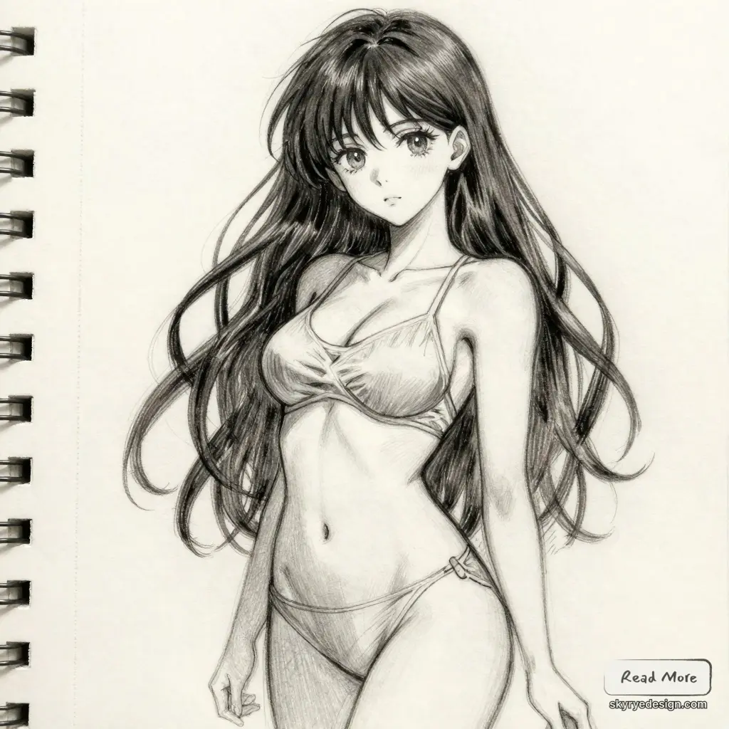
Professional anime art uses varied line weight:
Line weight principles:
- Thicker lines for outer contours
- Thinner lines for interior details
- Thicker lines where forms overlap (creating depth)
- Consistent line weight within each category
Clean-up process:
- Remove construction lines
- Draw construction loosely
- Refine pose and proportions
- Create final line art with confidence
- Vary line weight deliberately
Common Mistakes and How to Fix Them
Proportion Errors
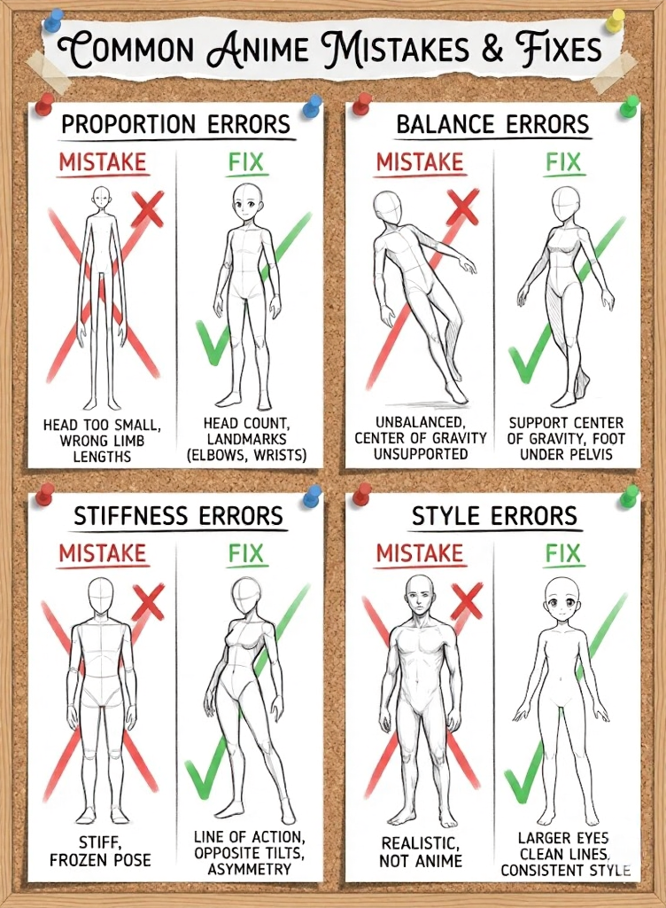
Problem: Head too small or too large. Fix: Establish head count before drawing. Use your head measurement as a ruler throughout.
Problem: Limbs wrong length. Fix: Elbows at waist, wrists at crotch, fingertips at mid-thigh. Check these landmarks.
Problem: Body looks unbalanced. Fix: The center of gravity (roughly at the pelvis) must be supported. If weight is on one leg, that foot must be under the pelvis.
Stiffness Errors
Problem: Figures look frozen. Fix: Start with line of action. Tilt shoulders and hips opposite directions. Make limbs asymmetrical.
Problem: Poses feel unnatural. Fix: Try the pose yourself or use reference. If a pose is physically uncomfortable, it usually looks wrong.
Style Errors
Problem: Figures look realistic, not anime. Fix: Check head size (larger), eye size (much larger), line quality (cleaner, more consistent). Anime is a style—commit to its conventions.
Problem: Figures look inconsistent. Fix: Establish your proportions before starting and maintain them. Measure against your head unit throughout drawing.
Frequently Asked Questions
This section addresses common inquiries related to drawing anime bodies. It covers essential techniques, different body types, and practical tips to facilitate the drawing process for artists at various skill levels.
How do I start drawing an anime body for beginners?
Beginners should start by understanding basic anatomy and shapes. Using simple geometric forms, such as circles and cylinders, helps in establishing the proportions and posture of the body. Practice sketching these shapes lightly before adding details.
What are the steps to draw an anime male body?
To draw an anime male body, follow these steps: first, create a basic skeleton to define posture. Next, outline the shapes representing the chest, waist, and limbs. Afterward, refine the outline by adding muscle definition and facial features. Lastly, incorporate additional details such as hair and clothing.
What is the process for drawing an anime girl’s body?
The process for drawing an anime girl’s body involves similar steps to drawing a male body. Start with a rough skeletal framework, then sketch the torso and hips, noting differences in proportions. Add defining features such as curves and softer lines to the outline, and finish with hair and outfit details.
How can I draw anime body poses accurately?
To draw accurate body poses, observe reference images or use mannequins for guidance. Understanding the natural movement of the body is crucial. Break the pose down into simple shapes and lines, adjusting proportions to match the desired action or stance.
Can you draw anime bodies with clothes on, and how?
Drawing anime bodies with clothes involves layering the clothing over the sketched body structure. Start with the body outline, then sketch the clothing’s basic shapes and folds while considering movement. Pay attention to how the fabric drapes to maintain a realistic appearance.
Are there tips for drawing anime bodies easily for novice artists?
Novice artists should focus on practicing regularly and studying anatomy. Simplifying complex forms into basic shapes helps in understanding proportions. Additionally, using online tutorials and reference images can provide guidance and inspiration for improving drawing skills.
Conclusion
Drawing anime bodies isn’t about simplifying realistic anatomy—it’s about learning a different system with its own rules, proportions, and conventions. Professional manga artists don’t guess at these conventions; they’ve internalized specific proportion systems, joint mechanics, and stylistic choices through years of practice.
The fundamentals covered here—head-count proportions, male/female differences, skeletal construction, joint placement, dynamic posing—form the foundation everything else builds on. You can’t shortcut these basics. Every professional anime artist has drawn thousands of figures working these exact principles until they became automatic.
This week: Draw 10 figure skeletons using the 7-head system. No detail, no rendering—just skeleton framework with proper joint placement. Check each one against the proportion landmarks in this guide.
This month: Complete 30 full anime figures from reference, focusing on different poses. Apply line of action to every single one. Ask yourself before each drawing: where is the energy flowing?
Ongoing: Build a reference library of anime art you admire. Study how different artists handle the same challenges—body proportions, dynamic poses, hair and clothing. The more examples you internalize, the more fluent your own work becomes.
The 62,000+ people who’ve shared this article were looking for the same thing you are: bodies that look right, feel dynamic, and read as professional anime rather than amateur attempts. That quality comes from understanding the principles and practicing them until they’re automatic.
Every professional anime artist drew thousands of stiff, awkward figures before their work became fluid. The difference between them and people who gave up? They kept drawing.
Start with a skeleton. Add the line of action. Build from there.
- 71.8Kshares
- Facebook0
- Pinterest71.8K
- Twitter0
- Reddit0

