An architecture portfolio examples is no longer just a gallery of finished projects. Today, it’s a conversion tool, a brand story, and often the first point of trust between an architect and a potential client.
Whether you’re an independent architect, a boutique studio, or a global firm, your portfolio website must do more than look beautiful—it must communicate expertise, process, and value in seconds.
In this guide, we break down 10 architecture portfolio examples that consistently impress, convert, and inspire. More importantly, we explain why they work, what design and strategy principles they use, and how you can apply those lessons to your own portfolio.
What Makes a Great Architecture Portfolio Website?
Before diving into examples, let’s define the core traits shared by high-performing architecture portfolios:
- Clear positioning: Visitors instantly know what kind of work you do
- Strong visual hierarchy: Projects are easy to scan and explore
- Narrative depth: Case studies explain how and why decisions were made
- Human credibility: Faces, philosophy, and process are visible
- Fast performance: Clean code, optimized images, and intuitive UX
- Search visibility: SEO-friendly structure that surfaces expertise
The following examples excel not because they’re trendy—but because they combine design excellence with strategic storytelling.
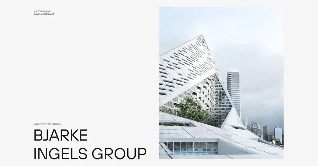
1. Bjarke Ingels Group (BIG)

Why it works:
BIG’s portfolio balances bold visual impact with clarity of purpose. Projects are presented with cinematic imagery, but each page includes concise explanations that translate complex architecture into accessible ideas.
Key strengths:
- Clean project categorization by scale and typology
- Strong editorial-style headlines
- Clear philosophy embedded throughout the site
Takeaway:
Don’t just show what you built—explain what problem it solved. Clients want confidence in your thinking, not just your aesthetics.
2. Snøhetta

Why it works:
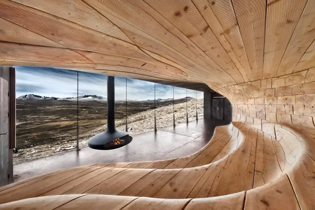
Snøhetta’s portfolio reflects its multidisciplinary ethos. Architecture, landscape, interiors, and design coexist seamlessly, showing range without confusion.
Key strengths:
- Minimalist interface that prioritizes imagery
- Rich project narratives with cultural context
- Strong emphasis on sustainability and impact
Takeaway:
If you work across disciplines, structure your portfolio so diversity feels intentional—not scattered.
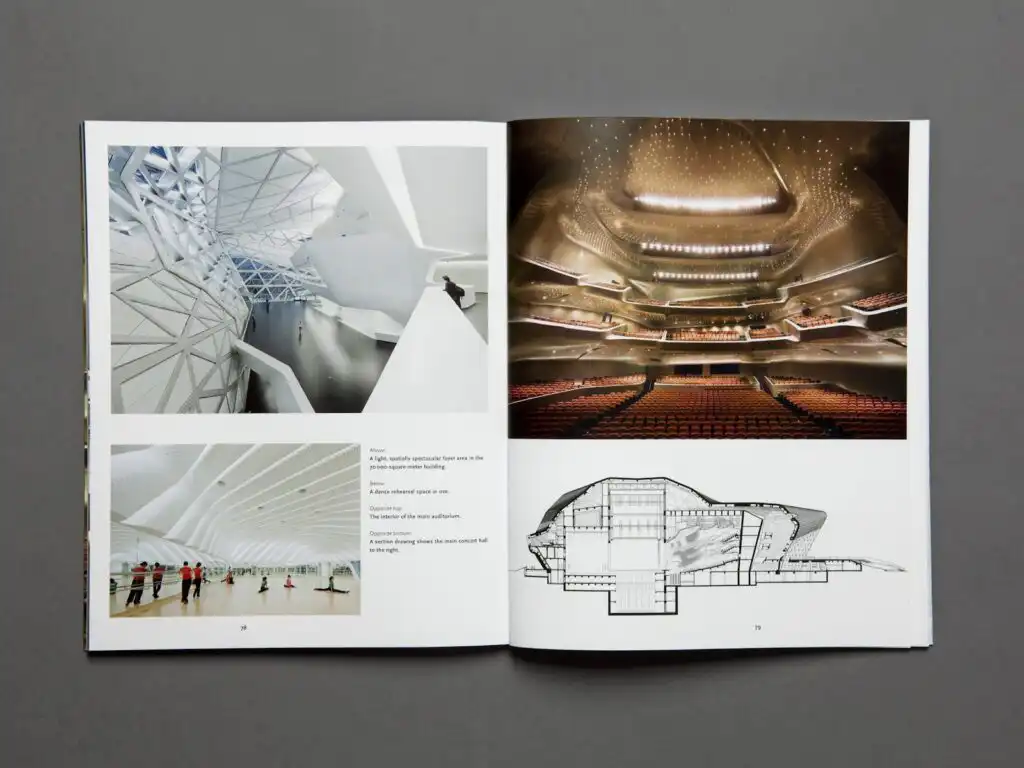
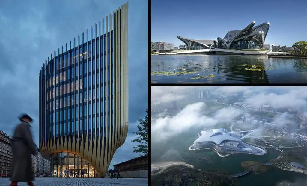
3. Zaha Hadid Architects


Why it works:
This portfolio is unapologetically iconic. ZHA uses motion, scale, and geometry to reinforce its brand as a pioneer of parametric and futuristic design.
Key strengths:
- Striking full-screen visuals
- Strong brand consistency
- Clear separation between research, practice, and projects
Takeaway:
If your style is distinctive, lean into it fully. A portfolio should repel the wrong clients as confidently as it attracts the right ones.
4. Studio Gang


Why it works:
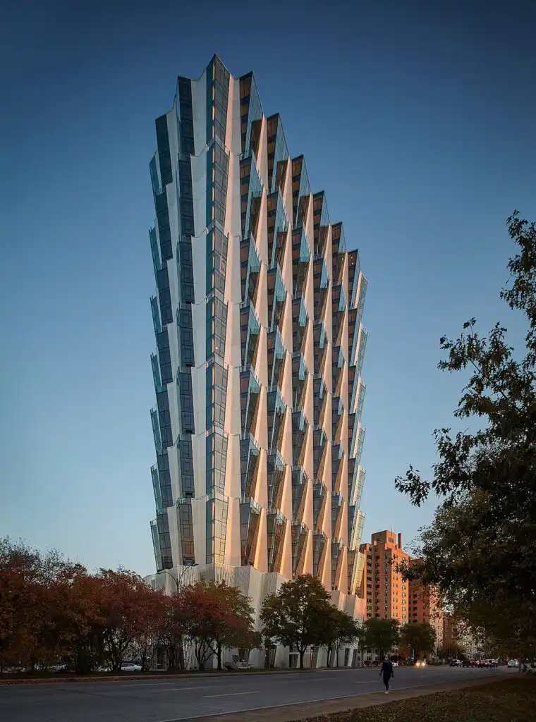
Studio Gang’s portfolio emphasizes process and people as much as form. Each project tells a story rooted in community, ecology, and research.
Key strengths:
- Deep case-study-style write-ups
- Diagrams and sketches alongside photos
- Clear articulation of design intent
Takeaway:
Clients increasingly value how you work. Showing your process builds trust and authority.
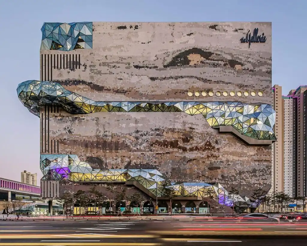
5. OMA
Why it works:
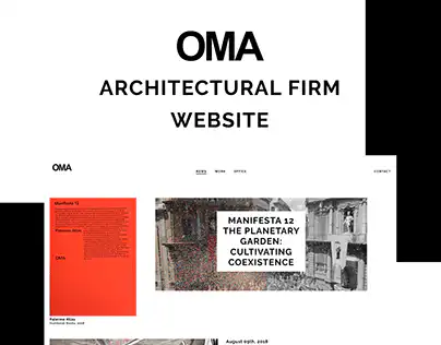
OMA’s portfolio feels editorial and intellectual. Projects are framed as ideas, not just objects, reinforcing the firm’s thought-leadership positioning.
Key strengths:
- Essay-style project descriptions
- Research-driven categorization
- Strong archival depth
Takeaway:
If your firm is concept-driven, let your portfolio read like a publication—not a brochure.
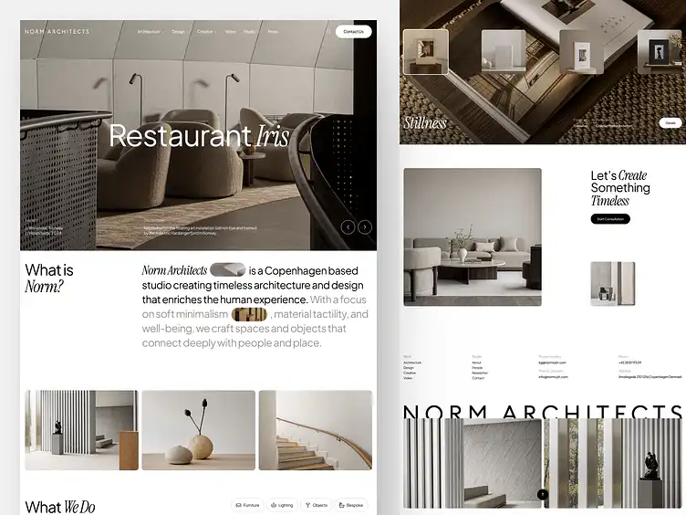
6. Norm Architects


Why it works:
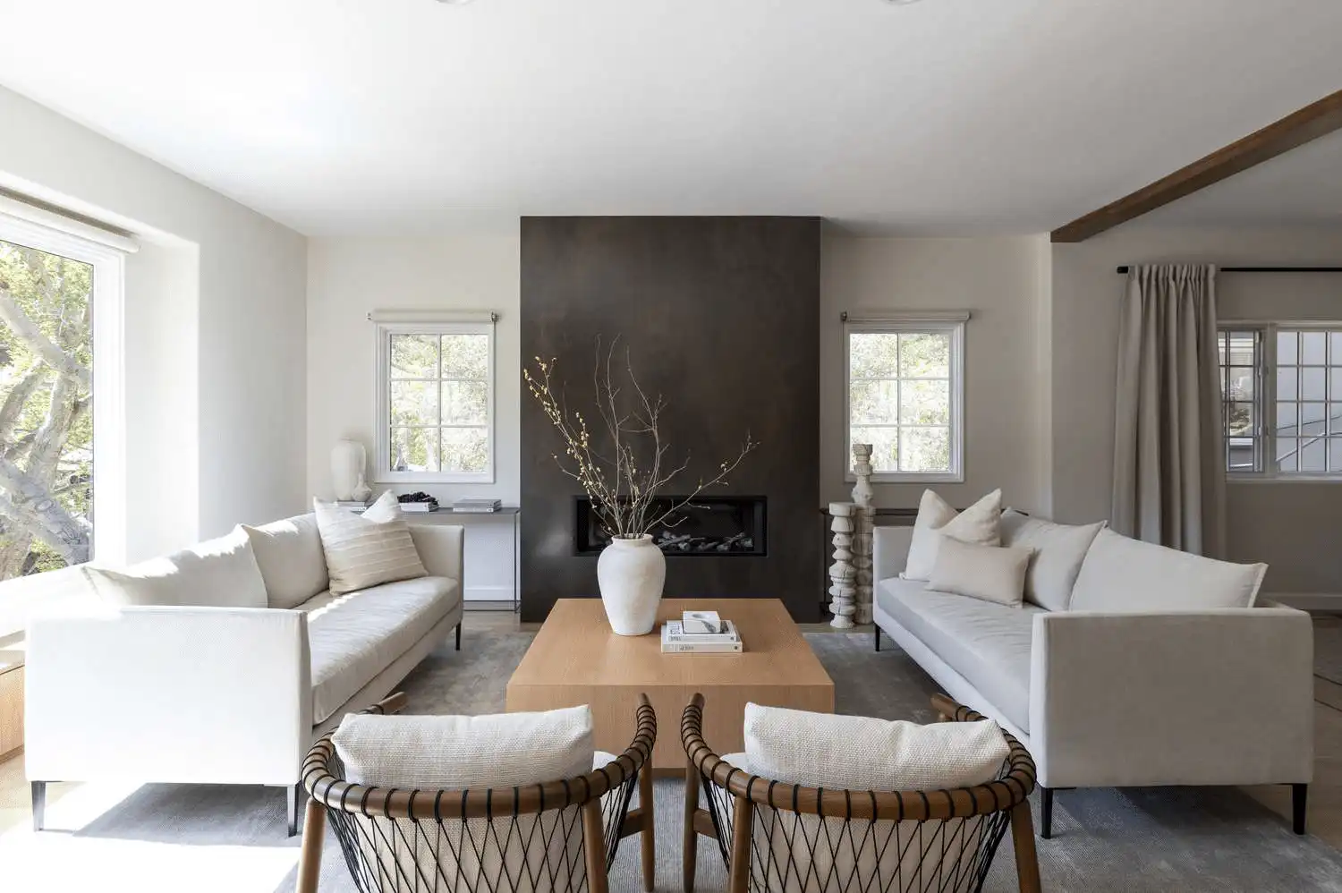
Norm Architects’ portfolio embodies restraint. White space, muted tones, and calm pacing mirror the firm’s philosophy.
Key strengths:
- Consistent visual language
- Lifestyle-forward photography
- Strong emotional resonance
Takeaway:
Your portfolio should feel like your architecture. Design coherence builds memorability.
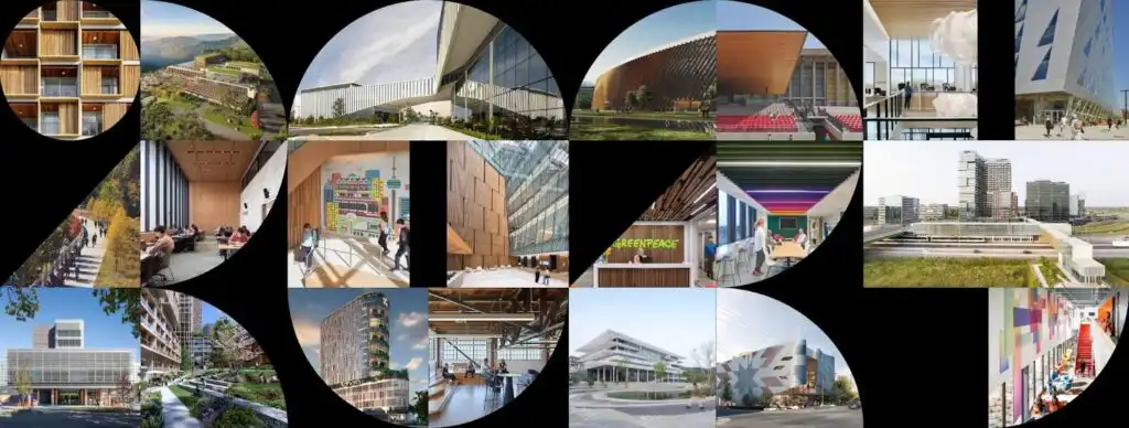
7. Perkins&Will


Why it works:
Perkins&Will balances scale with accessibility. Despite its size, the portfolio remains navigable and human-centered.
Key strengths:
- Smart filtering by sector and expertise
- Strong sustainability storytelling
- Clear calls to action
Takeaway:
Large or small, your portfolio should guide users toward the next step—contact, inquiry, or consultation.
8. Lake|Flato Architects


Why it works:
Lake|Flato’s portfolio excels at connecting architecture with place and climate. Sustainability isn’t a buzzword—it’s visible in every project.
Key strengths:
- Climate-responsive narratives
- Regional clarity
- Awards and recognition are integrated naturally
Takeaway:
If sustainability is core to your practice, show it through real outcomes—not marketing language.
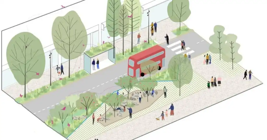
9. Allies and Morrison
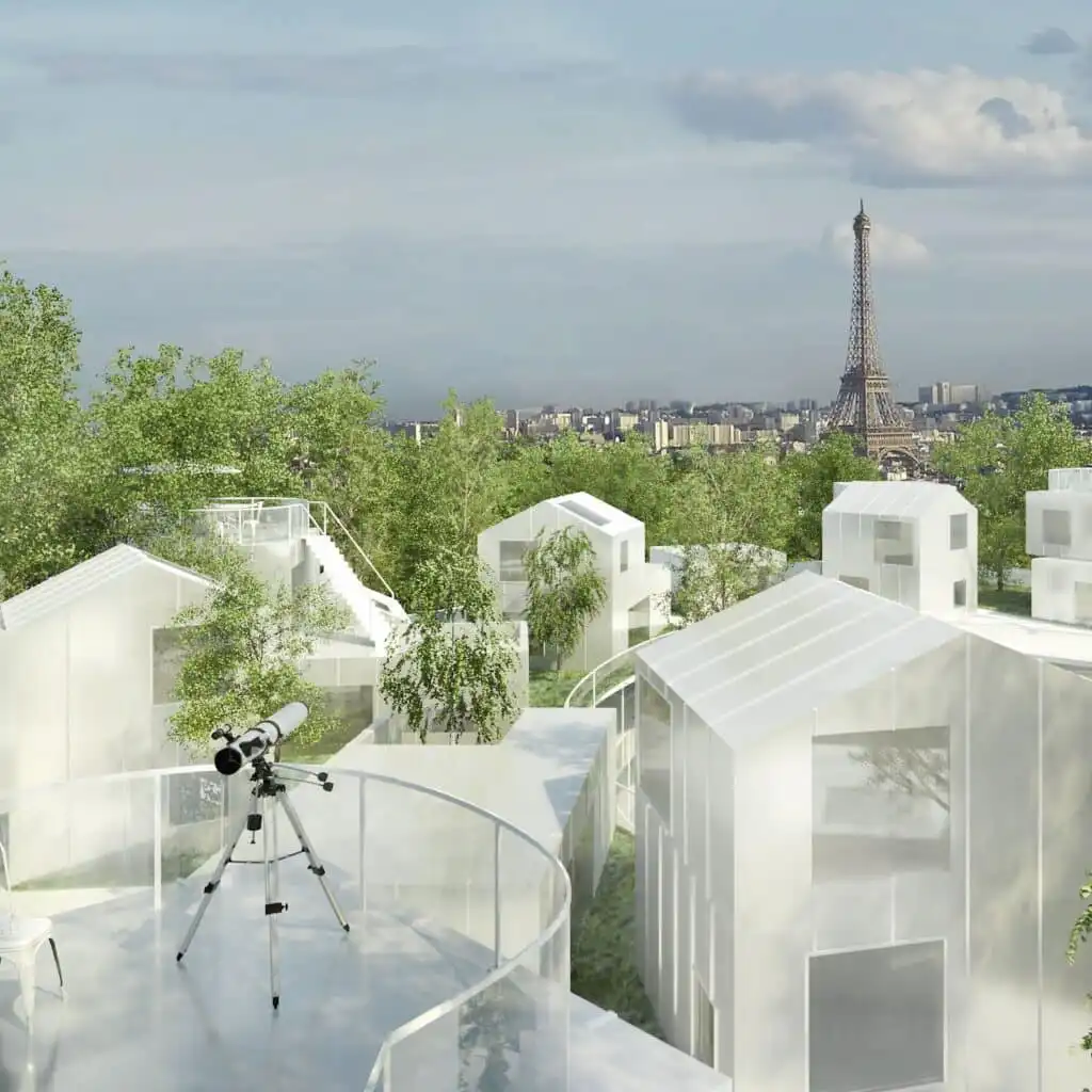

Why it works:
This portfolio is understated but authoritative. It communicates longevity, reliability, and urban expertise.
Key strengths:
- Structured, logical navigation
- Strong urban context photography
- Clear project timelines
Takeaway:
Not every portfolio needs drama. Clarity and credibility often win institutional clients.
10. Sou Fujimoto Architects



Why it works:
Sou Fujimoto’s portfolio embraces experimentation. Sketches, models, and speculative work are treated with equal importance as built projects.
Key strengths:
- Concept-first presentation
- Playful navigation
- Strong artistic identity
Takeaway:
If innovation defines your practice, your portfolio should feel exploratory—not rigid.
Common Patterns Across the Best Architecture Portfolios
Across all ten examples, several patterns repeat:
- Projects are stories, not slideshows
- Design philosophy is visible, not hidden
- Navigation is intentional and minimal
- Imagery is curated, not exhaustive
- Authority is built through clarity, not hype
A successful architecture portfolio doesn’t overwhelm—it guides.
How to Apply These Lessons to Your Own Portfolio
If you’re refining or rebuilding your portfolio, start here:
- Audit your homepage: Can someone understand your focus in 5 seconds?
- Reduce project count: Quality beats quantity
- Add context: Who was the client? What constraints existed?
- Optimize for search: Project titles, locations, and services matter
- Make contact easy: Every page should invite connection
Tools like diib® help identify where your site may be losing visibility, engagement, or conversions—so your portfolio works as hard as your designs do.
Final Thoughts
The best architecture portfolios don’t just display work—they communicate confidence.
They show potential clients not only what the architect can build, but also how they think, collaborate, and solve problems. Whether your style is minimalist, experimental, or deeply contextual, your portfolio should be a clear extension of your professional identity.
If you treat it as a living growth asset—not a static gallery—you’ll attract better clients, better projects, and better opportunities.
FAQ
What makes a great architecture portfolio website?
A great architecture portfolio website clearly communicates your positioning, has a strong visual hierarchy, offers narrative depth with case studies, builds human credibility with faces and philosophy, ensures fast performance, and is SEO-friendly.
How can I make my portfolio more effective in communicating my expertise?
Focus on explaining your design decisions, showcasing your process, and highlighting your problem-solving abilities to build trust and demonstrate your expertise to potential clients.
What design principles should I follow for my architecture portfolio?
Use a clean and intentional layout, curate imagery thoughtfully, keep navigation minimal, and ensure your portfolio reflects your unique style while making information easy to find.
How important are storytelling and narratives in an architecture portfolio?
Storytelling is crucial as it helps clients understand the context, challenges, and solutions behind each project, making your portfolio engaging and memorable.
What are some common mistakes to avoid when creating an architecture portfolio?
Avoid overwhelming viewers with too many projects, neglecting context and process, using poor-quality images, and having a confusing or cluttered navigation. Instead, focus on quality, clarity, and narrative coherence.
- 3shares
- Facebook0
- Pinterest3
- Twitter0
- Reddit0

