Ever noticed how some websites just feel right? Or how an app instantly makes you feel calm, energized, or even excited? A lot of that magic comes down to `color theory ui ux`. It’s not just about picking pretty shades; it’s a deep dive into how colors influence our emotions, guide our actions, and ultimately define our experience with a digital product. If you’re building a website, designing an app, or just curious about what makes good design tick, understanding color theory is like unlocking a superpower. It’s about making your UI/UX pop in a way that’s intuitive, engaging, and truly effective. So, let’s ditch the intimidation factor and get cozy with the basics, because mastering color is easier and more impactful than you might think!
The Why: Beyond Aesthetics – The Power of Color in UI/UX
Before we dive into the nitty-gritty of hues and palettes, let’s talk about why color matters so much in UI/UX. It’s not just a decorative layer; it’s a fundamental element that directly impacts usability, brand perception, and user engagement. Think about it:
- Emotional Connection: Colors evoke feelings. A vibrant red can signal urgency, while a serene blue can inspire trust. Your color choices set the emotional tone for your product.
- Information Hierarchy: Colors help users navigate. They can draw attention to important elements (like a call-to-action button) or group related content, making complex interfaces feel simple.
- Brand Identity: Colors are often the first thing people remember about a brand. Think of the iconic red of Coca-Cola or the deep blue of Facebook. Consistent color use builds recognition and reinforces your brand’s personality.
- User Experience (UX): Poor color choices can lead to confusion, eye strain, or even prevent users from completing tasks. Good color choices create a smooth, intuitive, and enjoyable experience.
- Accessibility: This is huge. Ensuring your colors are perceivable by everyone, including those with color blindness or low vision, is not just good practice – it’s essential for inclusive design.
In essence, color isn’t just paint; it’s a powerful communication tool. Neglect it, and your UI risks feeling flat, confusing, or even off-putting. Embrace it, and you create an experience that resonates deeply with users.
The Building Blocks: Understanding Core Color Theory Concepts
Alright, let’s get down to the fundamentals. You don’t need an art degree to grasp these, just a curious mind.
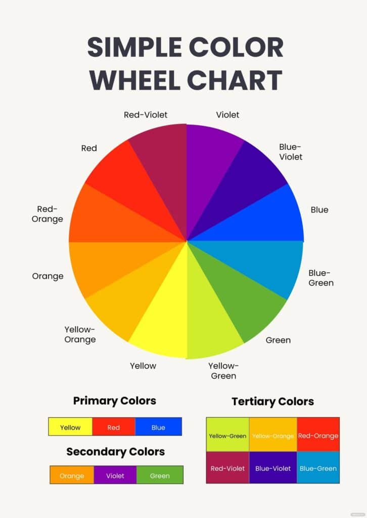
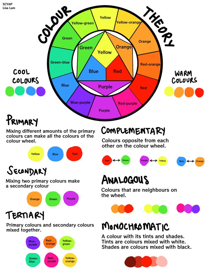
#### The Color Wheel: Your Best Friend The color wheel is the bedrock of color theory. It’s a visual representation of colors arranged according to their chromatic relationship.
- Primary Colors: Red, Yellow, Blue. These are the foundation. You can’t mix other colors to create them.
- Secondary Colors: Orange (Red + Yellow), Green (Yellow + Blue), Purple (Blue + Red). These are formed by mixing two primary colors.
- Tertiary Colors: Red-Orange, Yellow-Orange, Yellow-Green, Blue-Green, Blue-Violet, Red-Violet. These are created by mixing a primary and a secondary color.
Understanding their arrangement on the wheel helps you identify harmonious combinations easily. Colors opposite each other are complementary, while those next to each other are analogous.
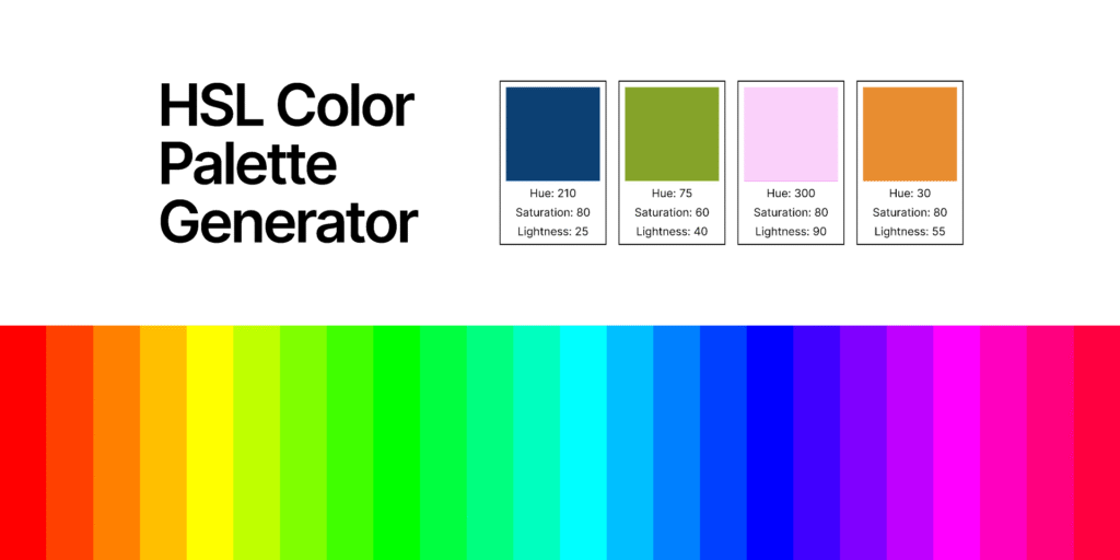
#### Hue, Saturation, and Luminance (HSL) When talking about color, these three terms are your bread and butter for describing and manipulating colors with precision:
- Hue: This is the pure color itself – what we typically refer to as “red,” “blue,” or “green.” It’s the position of the color on the color wheel.
- Saturation: This refers to the intensity or purity of a color. A highly saturated color is vivid and bright, while a desaturated color appears duller, closer to gray. Think of it as how much “color” is in the color.
- Luminance (or Brightness/Lightness): This is how light or dark a color appears. Adding white increases lightness (tint), while adding black decreases it (shade). A color’s luminance significantly impacts its readability and visual weight.
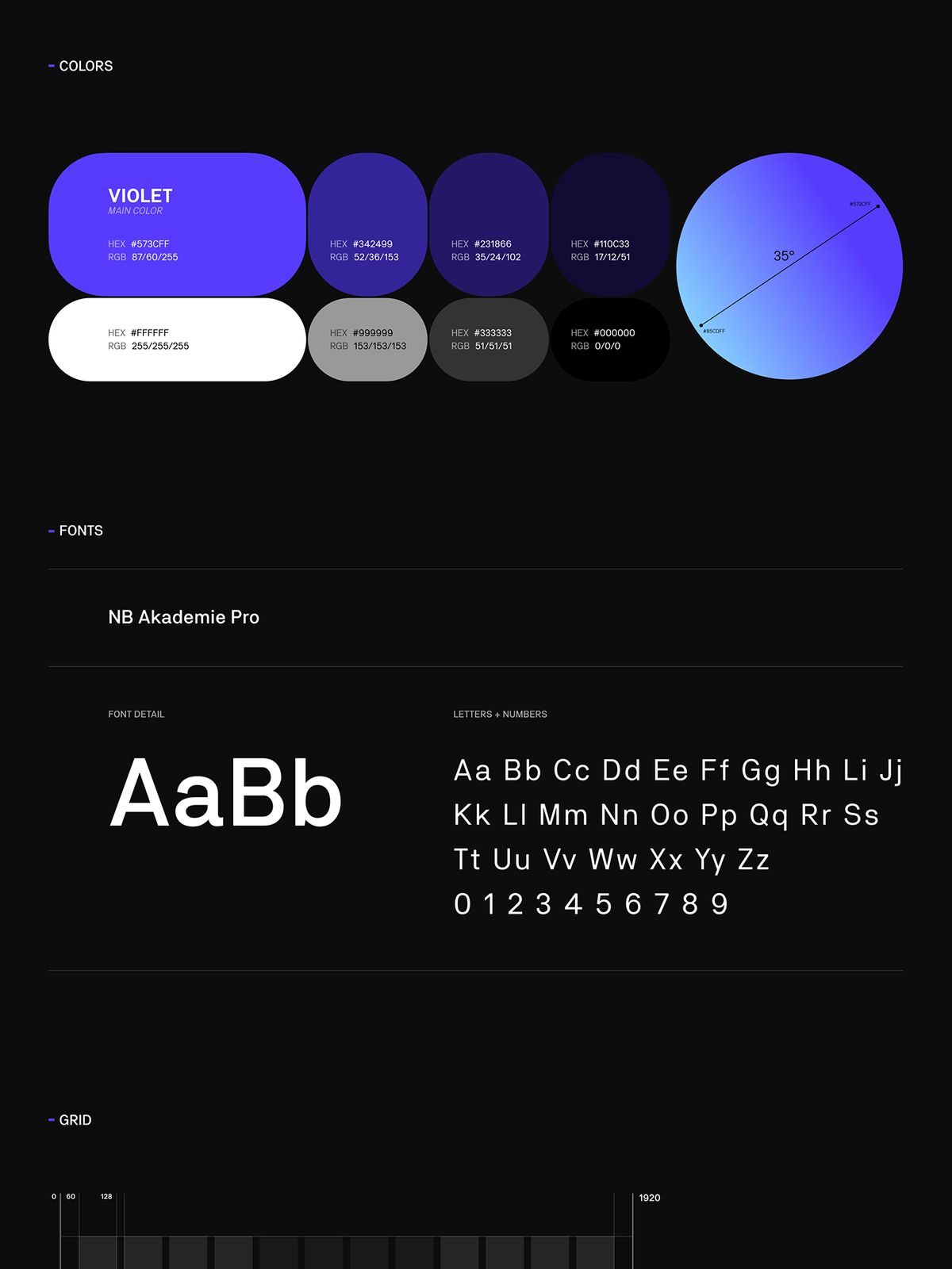
Many design tools also use the RGB (Red, Green, Blue) or CMYK (Cyan, Magenta, Yellow, Black) models, but HSL often feels more intuitive for designers because it aligns with how humans perceive and describe color.
#### Tints, Shades, and Tones These are crucial for expanding your palette from a single hue:
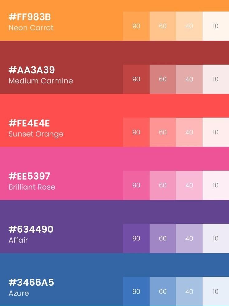
- Tint: A hue with white added. Tints are lighter and softer. (e.g., pink is a tint of red).
- Shade: A hue with black added. Shades are darker and deeper. (e.g., maroon is a shade of red).
- Tone: A hue with gray added. Tones are less vibrant, more muted, and often sophisticated. (e.g., a dusty rose is a tone of red).
By playing with tints, shades, and tones, you can create a rich and varied palette from just a few base colors, ensuring visual interest without overwhelming the user.
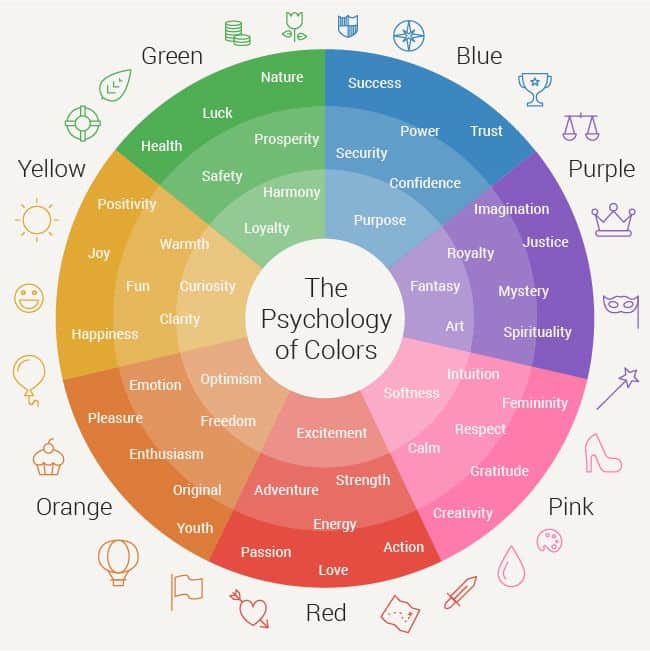
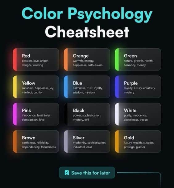
The Psychology of Color: What Your UI Colors Say (Without Words)
Colors speak volumes, often unconsciously, influencing how users perceive your product and brand. Leveraging color psychology is key to creating an intuitive and emotionally resonant UI/UX.
- Red:
Associations: Passion, energy, urgency, danger, excitement, importance. UI Use: Call-to-action buttons (e.g., “Buy Now,” “Sign Up”), alerts, error messages, warning signs. It grabs immediate attention. Think of a “Stop” button or an “Add to Cart” button that demands action.
- Blue:
Associations: Trust, stability, calm, professionalism, intelligence, security. UI Use: Corporate websites, financial apps, tech platforms, social media (Facebook, LinkedIn). It’s excellent for backgrounds, links, and elements that require a sense of reliability. It’s why so many financial institutions use blue in their branding.
- Green:
Associations: Nature, growth, freshness, health, wealth, peace, success, go. UI Use: “Success” messages, confirmation buttons, environmental themes, financial apps (for profit/growth), wellness apps. It’s often used for positive feedback or indicators.
- Yellow:
Associations: Happiness, optimism, warmth, caution, playfulness. UI Use: Highlights, warnings (often combined with black for high contrast), navigational elements, children’s apps, creative platforms. Use sparingly, as bright yellow can be overwhelming.
- Orange:
Associations: Enthusiasm, creativity, friendliness, adventure, affordability. UI Use: Call-to-action buttons (less aggressive than red), navigation, youthful brands, creative apps. Often a good choice when you want energy without the urgency of red.
- Purple:
Associations: Luxury, royalty, creativity, imagination, spirituality. UI Use: High-end brands, creative portfolios, luxury products, mystical themes. Can be used for accents to add sophistication.
- Black:
Associations: Sophistication, power, elegance, mystery, formality. UI Use: Text, backgrounds (especially for dark mode), luxury brands. Can make other colors pop, but overuse can feel heavy or oppressive.
- White:
Associations: Purity, cleanliness, simplicity, minimalism, freshness. UI Use: Backgrounds, negative space, modern interfaces. Essential for readability and creating a sense of openness.
- Gray:
Associations: Neutrality, balance, sophistication, formality, practicality. UI Use: Text (secondary, less important), UI elements that are not primary actions (disabled buttons), shadows, backgrounds. A versatile color for providing contrast without being too dominant.
Cultural Nuances: Remember that color meanings aren’t universal! For example, white is associated with purity in Western cultures but can signify mourning in some Eastern cultures. Red might mean luck in China but danger in others. Always consider your target audience’s cultural background when making color decisions. This is where researching your user base becomes critical.
Crafting Harmony: Exploring Color Schemes for UI/UX
Choosing individual colors is one thing; combining them into a cohesive and pleasing palette is where the real design magic happens. Color harmony refers to the aesthetic relationship between colors, creating a sense of order and balance.
#### 1. Monochromatic
- How it works: Uses different tints, shades, and tones of a single hue.
- Why it’s great for UI/UX: It’s incredibly simple, elegant, and harmonious. It creates a unified look and is very safe for maintaining consistency. Great for minimalist designs or as a base for a more complex palette.
- Example: Using various shades of blue for a corporate app – light blue for backgrounds, medium blue for primary elements, and dark blue for text.
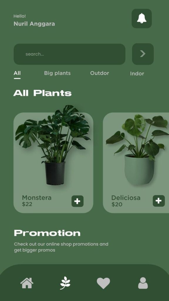
#### 2. Analogous
- How it works: Uses colors that are next to each other on the color wheel (typically 2-4 colors).
- Why it’s great for UI/UX: It creates a rich, comfortable, and harmonious feel. It’s often found in nature and is pleasing to the eye. Offers more visual interest than monochromatic without being jarring.
- Example: A green, yellow-green, and yellow palette for a gardening app, or a blue, blue-violet, and violet scheme for a calming meditation app.

#### 3. Complementary
- How it works: Uses colors directly opposite each other on the color wheel (e.g., red and green, blue and orange).
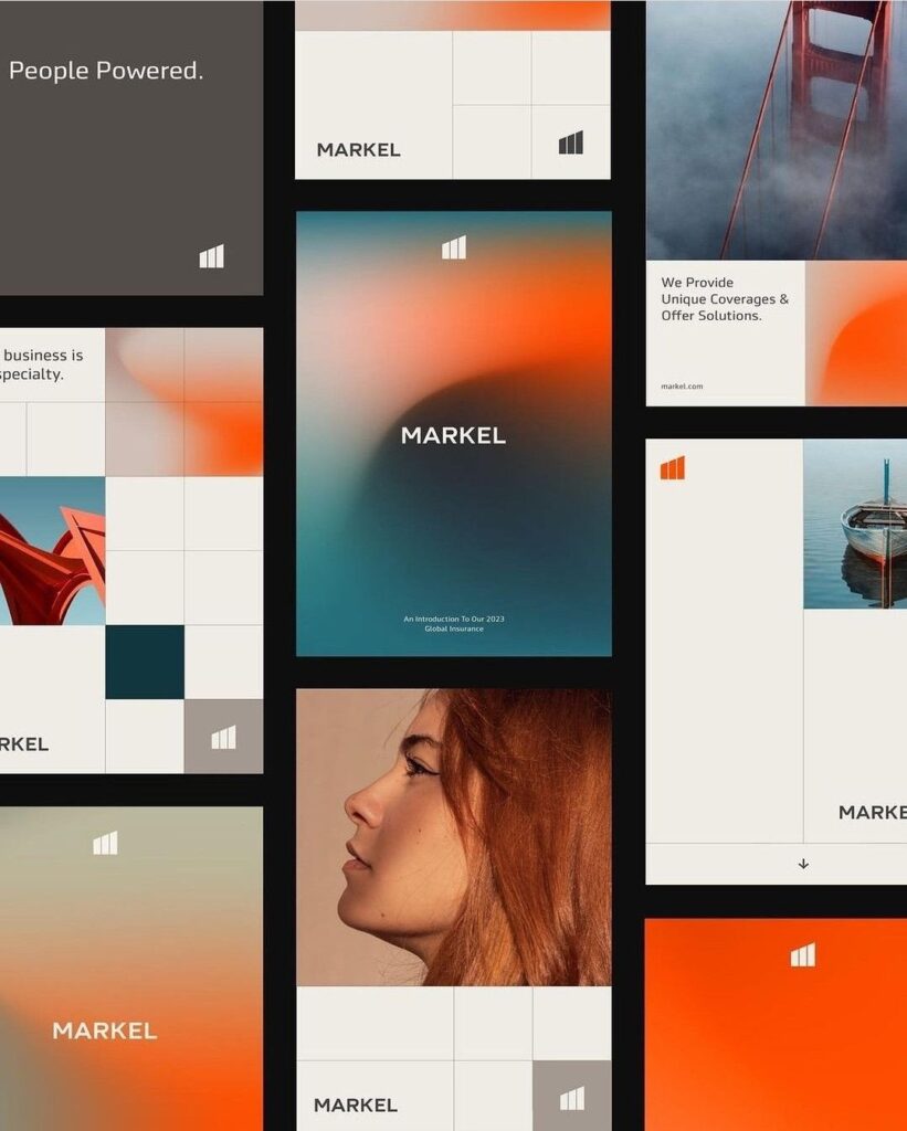
- Why it’s great for UI/UX: Creates high contrast and visual excitement. Perfect for drawing attention to specific elements, like a call-to-action button that needs to stand out vividly. Use one color dominantly and the other as an accent.
- Example: A predominantly blue interface with orange buttons or highlights to grab attention. The high contrast makes elements pop.


#### 4. Triadic
- How it works: Uses three colors evenly spaced around the color wheel (e.g., red, yellow, blue).
- Why it’s great for UI/UX: Offers a vibrant and balanced palette. It’s more daring than analogous but still harmonious. Use one color as dominant and the other two as accents.
- Example: A playful app might use primary red, yellow, and blue, ensuring one color takes the lead and the others provide dynamic support.
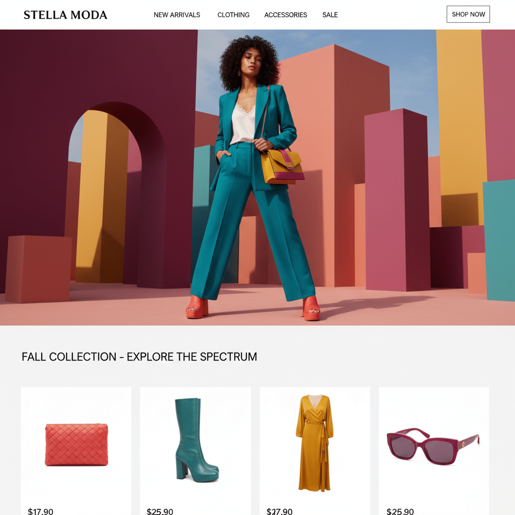
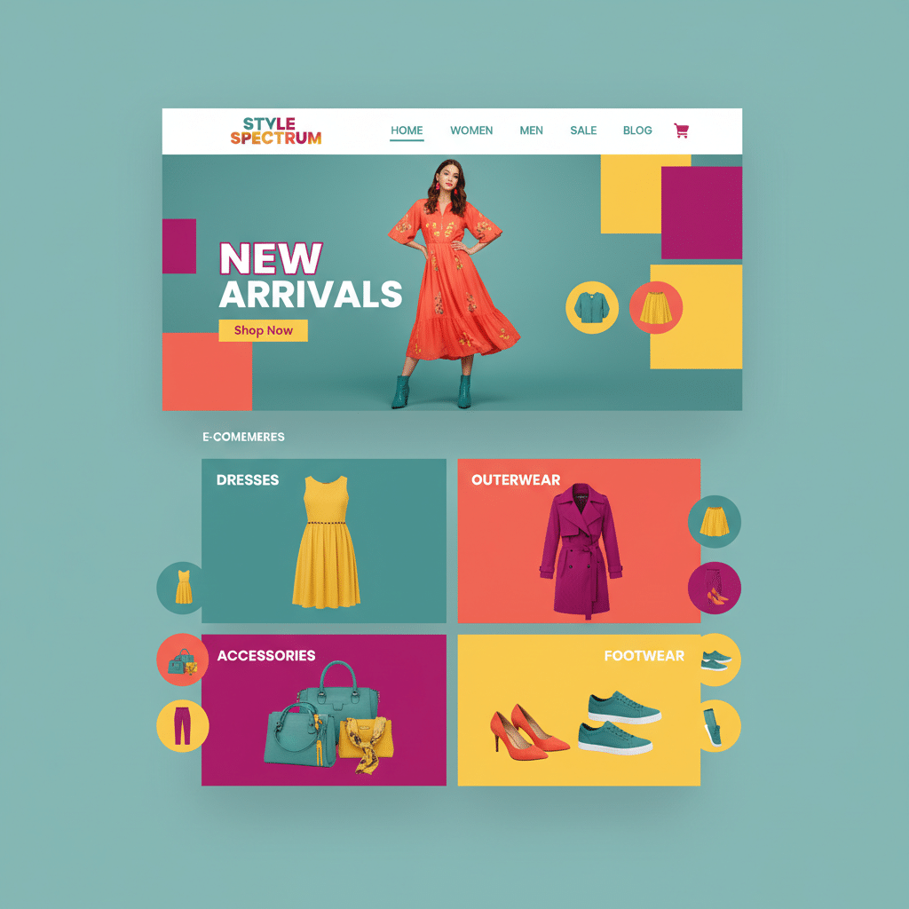
#### 5. Tetradic (Double Complementary)
- How it works: Uses four colors arranged into two complementary pairs, forming a rectangle on the color wheel.
- Why it’s great for UI/UX: It’s the richest and most complex harmony. It offers maximum variety but can be challenging to balance. Best for experienced designers or brands that require a very dynamic visual identity.
- Example: A fashion e-commerce site might use a tetradic scheme to showcase a wide range of products while maintaining a cohesive, energetic feel.
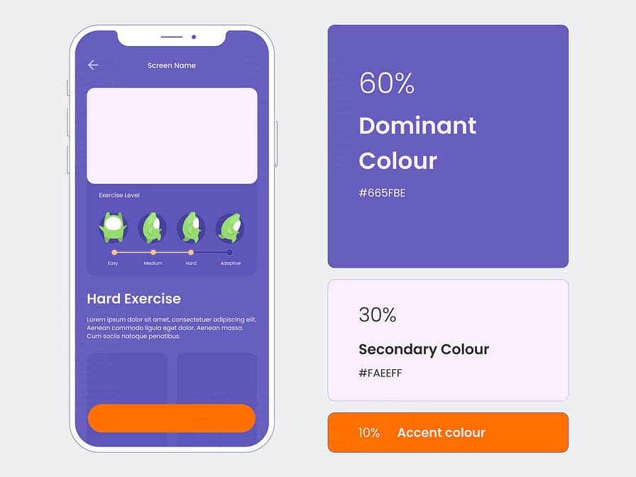
The 60-30-10 Rule: Your Secret Weapon for Balancing Color
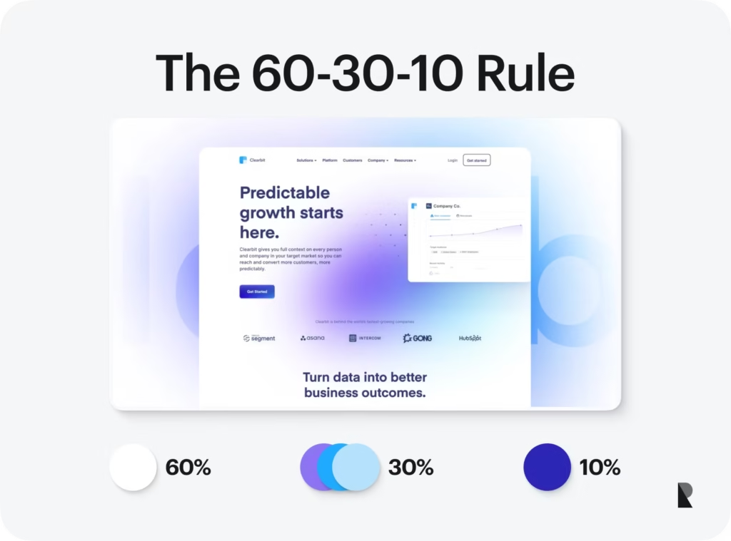
Once you have your color scheme, how do you apply it effectively? The 60-30-10 rule is a timeless design principle that helps you balance colors in any visual composition, including UI.
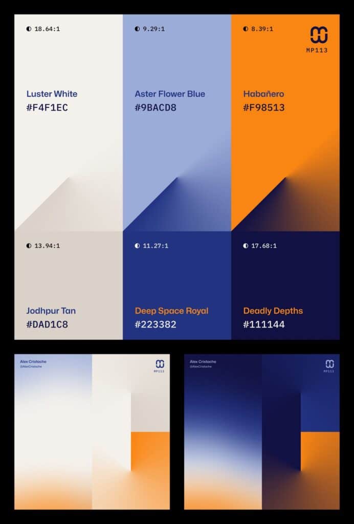
- 60% Dominant Color: This is your primary color, used for large areas like backgrounds, main content panels, or major sections. It sets the overall mood and feel of the interface.
- 30% Secondary Color: This color supports the dominant color and is used for secondary elements like navigation menus, subheadings, cards, or supporting graphics. It provides contrast and visual interest without overpowering the dominant color.
- 10% Accent Color: This is your “pop” color. Use it sparingly for critical elements you want to highlight, such as call-to-action buttons, error messages, important icons, or interactive states. This is where your complementary colors often shine.
Applying this rule brings structure and clarity to your UI, ensuring no single color dominates inappropriately and that important elements stand out. This rule is a fantastic starting point, but feel free to adjust the percentages slightly based on your specific design needs. When thinking about overall design aesthetics, it’s worth exploring how even 10 interior design color trends can offer insights into impactful color use across various design disciplines.
Accessibility: Designing Colors for Everyone
Great UI/UX is inclusive UI/UX. Color choices must ensure everyone can perceive and interact with your product effectively, regardless of their visual abilities. Neglecting accessibility alienates users and can even be a legal compliance issue.
#### Contrast Ratios
- The Problem: Low contrast between text and its background makes content unreadable for many, especially those with visual impairments or in challenging viewing conditions (e.g., bright sunlight).
- The Solution: Adhere to WCAG (Web Content Accessibility Guidelines) standards.
AA Standard: Requires a contrast ratio of at least 4.5:1 for normal text and 3:1 for large text (18pt bold or 24pt regular). AAA Standard: The enhanced standard, requiring 7:1 for normal text and 4.5:1 for large text.
- Tools: Use online contrast checkers (e.g., WebAIM Contrast Checker, Adobe Color) during your design process. These tools allow you to input hex codes and immediately see if your combinations meet the standards.
#### Color Blindness (Color Vision Deficiency)
- The Problem: Approximately 8% of men and 0.5% of women have some form of color blindness. Relying solely on color to convey information (e.g., “red means error, green means success”) can make your UI unusable for them.
- The Solution:
Don’t rely only on color: Always provide an alternative visual cue. For instance, in addition to red for an error message, use an error icon (like an ‘X’ or an exclamation mark), bold text, or a specific border. For success, use a checkmark icon. Avoid problematic combinations: Red-green and blue-yellow combinations are notoriously difficult for various types of color blindness. Test your designs using color blindness simulators. Offer customization:* If possible, provide users with options to adjust color themes (e.g., high-contrast mode, dark mode).
Practical Steps to Building Your UI/UX Color Palette
Ready to get your hands dirty? Here’s a step-by-step approach to creating a winning color palette.
#### 1. Understand Your Brand & Audience
- Brand Identity: What are your brand’s core values? Is it playful, serious, luxurious, minimalist, innovative? Your colors should reflect this.
- Target Audience: Who are your users? What are their cultural backgrounds? What emotional responses do you want to evoke? Are you aiming for interactive website ideas that are vibrant, or a more subdued, professional feel?
- Competitor Analysis: Look at what colors your competitors use. Do you want to fit in or stand out?
#### 2. Start with a Primary Color Pick one dominant color that best represents your brand or the core mood you want to convey. This will be your 60% color. For example, if you’re building a wellness app, perhaps a calming blue or green.
#### 3. Expand Your Palette
- Secondary Colors: Based on your primary color, choose one or two secondary colors using the harmony principles (analogous, complementary, triadic). These will be your 30% colors.
- Accent Colors: Select one or two accent colors (your 10%) that offer high contrast and draw attention to key elements. Complementary colors are often excellent here.
- Neutrals: Don’t forget your neutrals! Grays, whites, and off-whites are essential for backgrounds, text, and providing visual breathing room. They are the unsung heroes of readability.
#### 4. Test and Refine
- Apply the 60-30-10 rule: Sketch out how your colors will be distributed across different UI elements.
- Contrast Check: Run all text-on-background combinations through a contrast checker.
- Color Blindness Simulation: Use tools that simulate various types of color blindness to ensure your design is still comprehensible.
- User Testing: Show your designs to real users. Do they understand the hierarchy? Do they feel the intended emotions?
- Iterate: Design is rarely perfect on the first try. Be prepared to tweak and refine based on feedback and testing.
A great way to find inspiration and experiment is by creating Pinterest aesthetic boards. These visual collections can help you see how different colors, textures, and moods combine, translating abstract concepts into concrete design ideas.
Common Color Mistakes to Dodge
Even seasoned designers can fall into these traps. Being aware of them can save you headaches later.
- Overuse of Bright Colors: While vibrant colors can be exciting, too many can make an interface feel chaotic, overwhelming, and unprofessional. Save your brightest hues for accents.
- Ignoring Contrast: As discussed, poor contrast is a major accessibility barrier and makes your UI hard to use for everyone. Always check your ratios.
- Inconsistent Color Usage: If the same button is red on one page and blue on another, users get confused. Consistency builds intuition and trust.
- Neglecting Cultural Context: What’s positive in one culture might be negative in another. Always research your target audience’s associations with colors.
- Too Many Colors: A complex palette with too many different hues can feel messy and detract from the user experience. Stick to a primary, secondary, and accent, with a few neutrals.
- Lack of Visual Hierarchy: If everything is bold and brightly colored, nothing stands out. Use color to guide the user’s eye, not to shout at them.
- Not Considering Dark Mode: Many users prefer dark mode. Ensure your color palette translates well and maintains readability and accessibility in both light and dark themes.
Tools and Resources to Power Your Color Journey
The good news is you don’t have to tackle color theory alone. Plenty of fantastic tools and resources can help you generate, test, and apply color palettes effectively.
- Color Palette Generators:
Adobe Color (formerly Kuler): A powerful online tool for creating, exploring, and saving color palettes using various harmony rules. It also has an accessibility checker. Coolors.co: Super fast generator that lets you lock colors and generate new ones with a single tap of the spacebar. Great for quick brainstorming. Paletton:* Offers a more in-depth exploration of color harmonies and allows you to fine-tune each shade.
- Contrast Checkers:
WebAIM Contrast Checker: The gold standard for checking WCAG compliance. Stark (plugin for Figma, Sketch, Adobe XD): Allows you to check contrast and simulate color blindness directly within your design software.
- Color Pickers/Analyzers:
Most design software (Figma, Sketch, Adobe XD, Photoshop) have built-in color pickers. Browser extensions like “ColorZilla” allow you to pick colors from any webpage.
- Inspiration:
Dribbble & Behance: Great platforms to see how other designers are using color in their UIs. Pinterest: As mentioned, visual boards for collecting inspiration. Nature:* Seriously, observe the world around you. Nature is the ultimate color palette generator.
Remember, the goal is to create a delightful and intuitive user experience. Using the right colors can significantly enhance user engagement and satisfaction, much like how thoughtful visual presentation helps in creating engaging social media content. By understanding and applying the principles of color theory, you’re not just making things look good; you’re making them work better.
Conclusion: Paint Your Digital World with Purpose
So, there you have it! From the basic color wheel to the subtle psychology of hues, `color theory ui ux` is a powerful discipline that can transform your designs from merely functional to truly captivating. It’s not about being an artist; it’s about being a strategic designer who understands how every shade, tint, and tone impacts the user journey. By embracing color theory, you gain the ability to guide emotions, establish clear hierarchies, build strong brand identities, and ensure your product is accessible and enjoyable for everyone.
Think of color as your secret ingredient. When used with intention and understanding, it has the power to make your UI/UX not just functional, but memorable, delightful, and truly “pop.” So go ahead, experiment, test, and most importantly, have fun painting your digital world with purpose. The right colors can make all the difference, creating an experience that users love and keep coming back to.
- 430shares
- Facebook0
- Pinterest427
- Twitter3
- Reddit0


