Creating a strong logo is one of the most important steps in building your brand. A well-designed logo combines simplicity, relevance, and versatility to make your business stand out and remain memorable over time. Your logo shouldn’t just look good; it needs to communicate who you are and adapt to different uses without losing its impact.
Understanding the core principles behind logo design will help you create a symbol that works across all platforms and resonates with your audience. From balancing visual elements to ensuring it stays timeless, these principles guide you in making a logo that feels natural yet powerful. When you master these basics, your logo can become a lasting asset that grows alongside your brand.
Key Takeways
- Effective logos balance simplicity with meaningful design.
- A logo must work well in different formats and sizes.
- Timeless logos connect with audiences and support brand identity.

Core Logo Design Principles
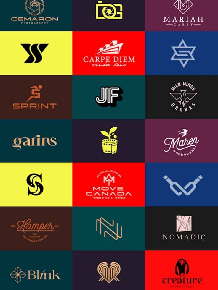
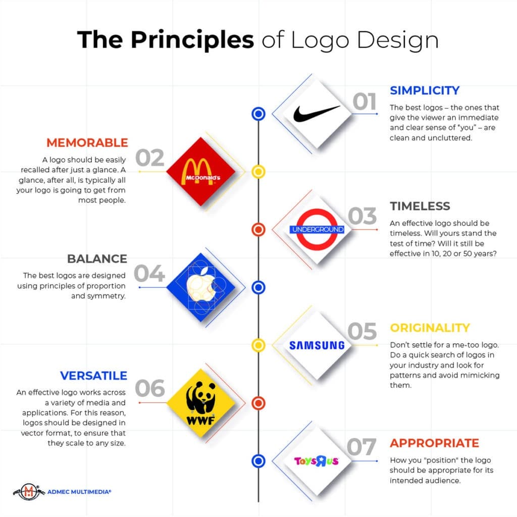
Your logo needs to communicate your brand clearly and leave a lasting impression while standing out from competitors. Focusing on essential aspects like simplicity, memorability, and originality helps you create a logo that works well across different uses and remains effective over time.
Simplicity and Clarity
Keeping your logo simple makes it easier for people to recognize and remember. Avoid using too many colors, fonts, or complex shapes that can confuse viewers or make the logo hard to reproduce.
A clear design means your logo works well in different sizes and formats—from tiny icons on social media to large signs. Simplicity ensures versatility, meaning your logo remains effective whether in black and white or color.
Think of a logo like a visual shortcut to your brand. When it’s straightforward, people can understand your message at a glance without extra effort. This is critical for building a strong brand presence.
Memorability
A memorable logo sticks in your audience’s mind long after they see it. To achieve this, your design needs both clarity and a unique element that sets it apart.
Use distinctive shapes, colors, or symbols tied closely to your brand’s identity or values. These features help your logo stand out amid many others.
Avoid overly trendy details that might be forgotten quickly. Instead, focus on unique yet simple features that people can recall easily. This helps create a stronger brand connection and makes your logo serve as a reliable brand ambassador.
Originality
Originality prevents your logo from blending in with similar designs in your industry. Your logo should reflect what makes your brand special and different.
Steer clear of clichés or copying common design trends. Instead, explore fresh ideas that align with your brand story, audience, and values.
An original logo supports long-term brand growth because it’s exclusive to your brand. When your logo feels authentic, it builds trust and respect among customers, showing that you’ve put thought into your brand identity.

Visual Elements and Balance
Your logo’s success depends on how you arrange and combine its visual parts. Paying attention to shapes, alignment, typography, and colors helps you create a design that feels stable, clear, and meaningful to your audience.
Shapes and Proportion
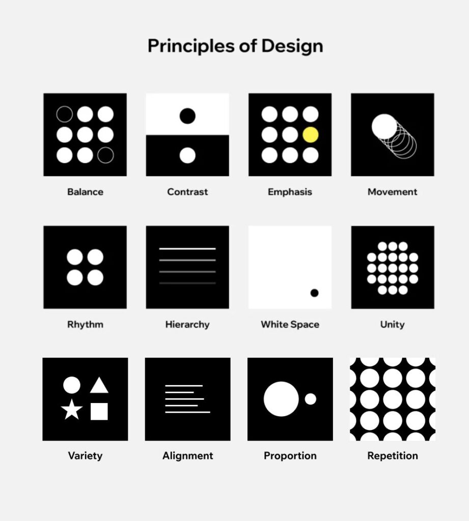
Shapes form the foundation of your logo. Simple shapes like circles, squares, and triangles each evoke different feelings—circles suggest unity, squares communicate stability, and triangles imply movement or direction. Choosing shapes that match your brand personality is key.
Proportion means adjusting the size of shapes so they relate well to each other. If one element dominates too much, it can throw off the balance and make your logo feel awkward. Aim for a harmonious size relationship between elements to keep your design cohesive and pleasing.
Balance and Alignment
Balance in a logo is about distributing visual weight evenly. You can achieve this with symmetrical balance, where elements mirror each other, or asymmetrical balance, where different elements balance visually through contrast or spacing.
Alignment ensures all parts of your logo line up neatly, creating a structured look. Misaligned elements reduce legibility and may confuse viewers. Using grids or guidelines helps keep your logo tidy and professional.
Typography and Typeface
Typography shapes how your brand voice is perceived. Choose a typeface that matches your brand’s tone—serif fonts feel traditional, sans-serif fonts are modern and clean, and script fonts add elegance or creativity.
Legibility and readability are essential. Avoid overly decorative fonts that hinder quick reading. Adjust spacing between letters (kerning) and lines (leading) to improve clarity, especially when your logo is resized for different uses.
Color Psychology and Cultural Connotations
Colors in your logo do more than look good; they communicate emotion and meaning. For example, blue often represents trust, red signals energy or urgency, and green relates to growth or health.
Be mindful of cultural connotations, as colors can symbolize different things worldwide. What feels positive in one culture might be negative in another. Research your target audience to select colors that connect well and avoid misunderstandings.
| Color | Common Associations | Potential Cultural Variations |
|---|---|---|
| Red | Energy, urgency, passion | Luck in China; danger in some contexts |
| Blue | Trust, calm, professionalism | Mourning in some Middle Eastern cultures |
| Green | Growth, health, nature | Fertility in some cultures; jealousy in others |
Adaptability and Versatility
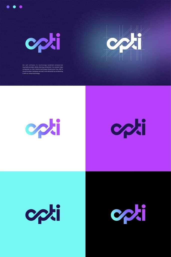
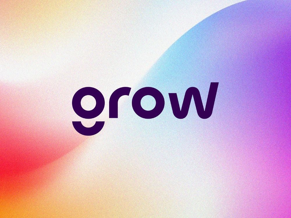
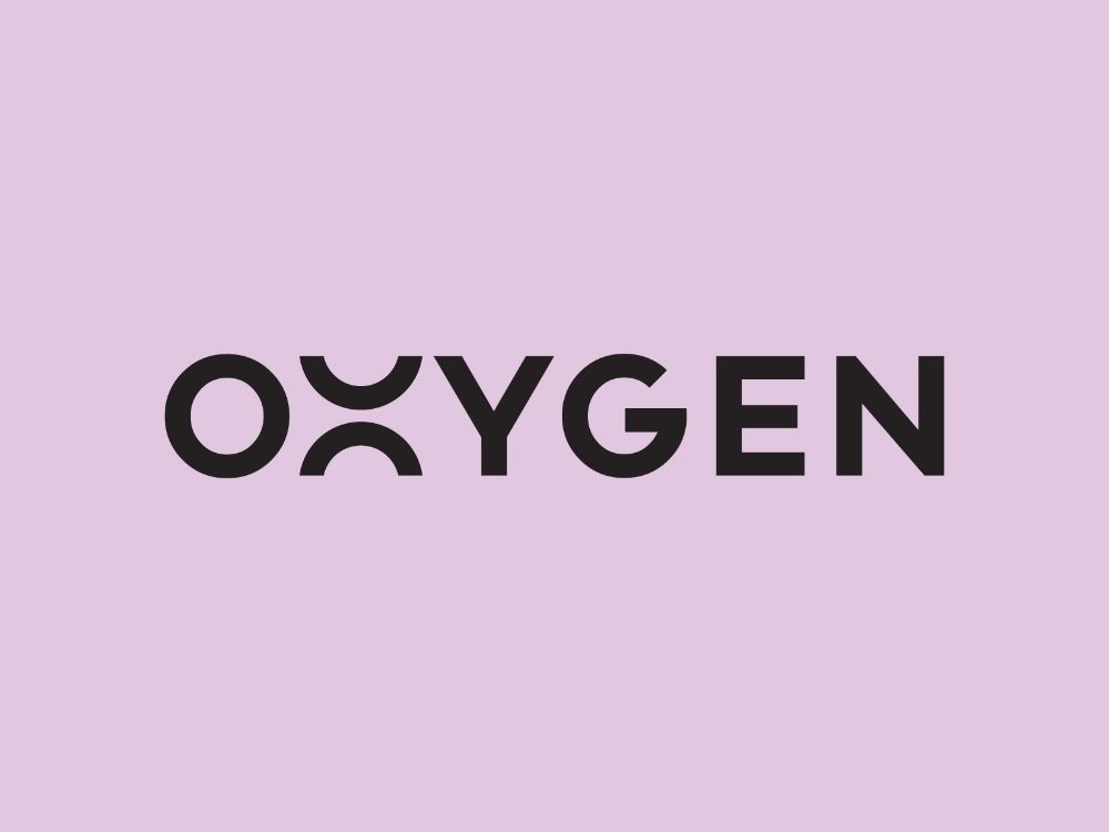
Your logo needs to perform well in many settings, from tiny icons to large prints. Making sure your design adapts smoothly and remains clear across these uses is key. It should work well on different backgrounds, in black and white, or with varying color schemes.
Versatility Across Mediums
A versatile logo stays recognizable whether it’s on a website, a business card, or merchandise. You want your logo’s core elements to remain intact while allowing slight adjustments to fit the medium. For example, simplifying details for embroidery or removing colors for engraving helps maintain clarity.
Think about how your logo looks in digital and physical formats. It should be legible on screens of different sizes and still make an impact on larger prints. To help with this, create several approved variations of your logo — like color, grayscale, and simplified versions — for different uses.
Responsiveness and Scalability
Responsive logos adjust seamlessly to different sizes without losing detail. Your logo should look sharp as a favicon, app icon, or a huge billboard. Scalability means your design has clean lines and simple shapes that won’t blur or pixelate when enlarged or shrunk.
Focus on elements that work well in both large and small scales. Avoid overly complex graphics or thin lines that disappear in smaller formats. Testing your logo at various sizes and contexts ensures it stays effective and memorable everywhere it appears.
Timelessness and Relevance
A logo that stays effective over time is both simple enough to avoid trends and relevant enough to reflect your brand’s core values. It must balance staying visually fresh while clearly communicating what your brand represents. These factors help your logo build strong brand recognition and lasting visual identity.
Creating a Timeless Logo
To create a timeless logo, focus on simplicity and clarity. Avoid overly complex details or trends that may date your design quickly. Use clean shapes and classic fonts that won’t look outdated as styles change.
Think about scalability and versatility—your logo should look good whether it’s on a business card or a billboard. Timeless logos often rely on basic geometric forms and minimal color palettes, which make them adaptable over years.
Prioritizing balance and legibility will ensure your logo serves as a strong, consistent mark that customers can easily recall.
Relevance to Brand Identity
Your logo needs to align with your brand identity to be meaningful. It should visually express your brand values and the message you want to convey to your audience. Colors, shapes, and symbols all affect how people perceive your brand’s personality.
For example, a tech company might use sleek, modern forms that communicate innovation, while a handmade goods brand may choose warm, organic shapes to suggest craft and authenticity.
By keeping your logo true to your brand’s core, you enhance emotional connection and brand recognition, making your visual identity memorable and trustworthy.


Audience Considerations and Feedback
When designing a logo, you must focus on who will see it and how they will respond. Making sure your logo fits your audience’s expectations and gathering their input can shape a design that truly connects.
Understanding the Target Audience
You need to know your target audience’s preferences, values, and behaviors to create a logo that resonates. Think about their age, interests, and cultural background. These factors influence the style, color, and tone your logo should have.
For example, a tech-savvy audience may respond better to modern, minimalist designs. Meanwhile, a traditional crowd might prefer something classic and detailed. Always tailor your visual choices to fit their expectations and lifestyle.
Clear knowledge of your audience ensures the logo feels meaningful and relevant. This connection helps build trust and recognition.
Importance of Feedback
Collecting feedback during your design process is crucial. You want your logo to be not only attractive but also memorable and aligned with your brand’s purpose.
Use multiple channels to gather input—social media comments, client reviews, and direct surveys can provide valuable perspectives. Ask specific questions like, “Does this design reflect our brand values?” or “How does this color make you feel?”
Incorporating honest feedback helps you avoid designs that seem off-brand or confusing. It also leads to a logo that sticks with your audience and supports your overall marketing goals.
Role of the Designer and Final Review
Your designer plays a critical role in shaping your logo’s impact. They balance creative vision with practical elements like visibility and legibility to craft a strong visual identity. This stage is where your ideas are refined into a clear, functional, and visually engaging design.
Collaboration with a Graphic Designer
Working closely with a graphic designer helps ensure your logo matches your brand’s personality and goals. You bring the story and values, while the designer translates them into visual elements such as color, shape, and typography.
Your input is vital during brainstorming and feedback sessions. Be clear about what’s essential—whether it’s a modern look, simplicity, or emotional appeal. A skilled designer will guide you through technical decisions and advise on what works best for different mediums.
Good collaboration means regular check-ins, open communication, and trusting the designer’s expertise. This partnership helps avoid misunderstandings and leads to a logo that genuinely represents you.


Refining for Visibility and Legibility
After the initial design, focus shifts to making sure your logo is readable and recognizable at all sizes and contexts. Your designer tests the logo in various formats—print, digital, small sizes, and large displays—to ensure clarity.
Pay attention to contrast, font choices, and spacing. Even a great concept can fail if the logo becomes blurry or confusing when scaled down or viewed from a distance. Your designer will optimize these details to maintain sharpness and balance.
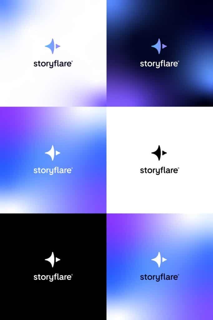
Ask to see your logo in black and white, inverted colors, and on different backgrounds. This helps verify the design’s versatility, so your logo remains consistent and effective everywhere it appears.
- 3shares
- Facebook0
- Pinterest0
- Twitter3
- Reddit0


