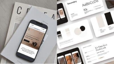
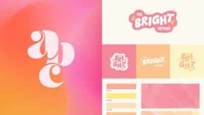
A monogram logo design combines initials or letters into a distinctive symbol that represents your brand identity. These elegant designs have been used for centuries to create memorable visual marks for businesses, personal branding, and products. Creating an effective monogram logo requires careful consideration of typography, spacing, and overall composition to ensure it communicates your brand’s personality while remaining legible and versatile.
Today’s digital design tools have made monogram logo creation more accessible than ever. Whether you’re using platforms like Canva, Adobe Express, or specialized monogram logo makers, you can customize colors, letter styles, and supporting graphics to create a unique emblem. These tools offer templates that serve as excellent starting points for your design journey.
Monogram logos aren’t just for luxury brands—they work effectively across industries to create recognizable brand symbols. From luggage tags and stationery to digital applications and business cards, a well-designed monogram can elevate your visual presence and create a lasting impression on your audience.
Key Takeaways
- Monogram logos combine letters or initials into a single distinctive symbol that represents your brand’s identity and creates visual recognition.
- Effective monogram designs balance typography, spacing, and composition while maintaining legibility across various applications.
- You can create professional monogram logos using accessible design tools with customizable templates for colors, fonts, and supporting graphic elements.
What Is Monogram Logo Design?
Monogram logo design is a stylistic approach that combines initials or letters to create a distinctive brand mark. These logos use letterforms creatively to establish memorable visual identities for businesses, individuals, and organizations.
Monogram Logos vs. Other Logo Types
Monogram logos (also called lettermarks) differ from other logo types primarily in their focus on typography and initials. While wordmarks display the full company name and emblems use symbols without text, monograms specifically utilize letter combinations—typically the initials of a brand name.
Unlike pictorial logos that rely on imagery, monograms emphasize letterforms as the central design element. This makes them more versatile than mascot logos, which feature character illustrations.
Combination marks incorporate both symbols and text, whereas monograms strip away everything except the essential letters. Abstract logos use non-representational shapes, while monograms maintain clear connections to your brand name through recognizable characters.
Key Characteristics of Monogram Logos
Simplicity stands as the hallmark of effective monogram logos. They typically feature 1-3 letters arranged in visually interesting configurations that remain instantly recognizable at various sizes.
Typography plays a crucial role in monogram design. Your choice between serif, sans-serif, script, or custom letterforms dramatically impacts the logo’s personality and brand perception.
Negative space often becomes an intentional design element, creating secondary meanings or visual interest between the letters.
Most monogram logos employ a limited color palette to maintain clarity and recognition. This restraint helps your logo remain effective across different applications and sizes.
The most successful monograms achieve a perfect balance between uniqueness and legibility—distinctive enough to be memorable yet clear enough to be immediately understood.
Popular Uses for Monogram Logos
Luxury brands frequently adopt monogram logos to convey heritage and exclusivity. Think of Louis Vuitton (LV) or Gucci’s interlocking Gs that have become status symbols themselves.
Corporate entities with lengthy names often use monograms for practical reasons. Companies like CNN, HBO, and IBM created monogram logos that communicate more efficiently than their full names.
Personal branding benefits significantly from monogram designs. Freelancers, photographers, and consultants use their initials to create professional, personalized identities.
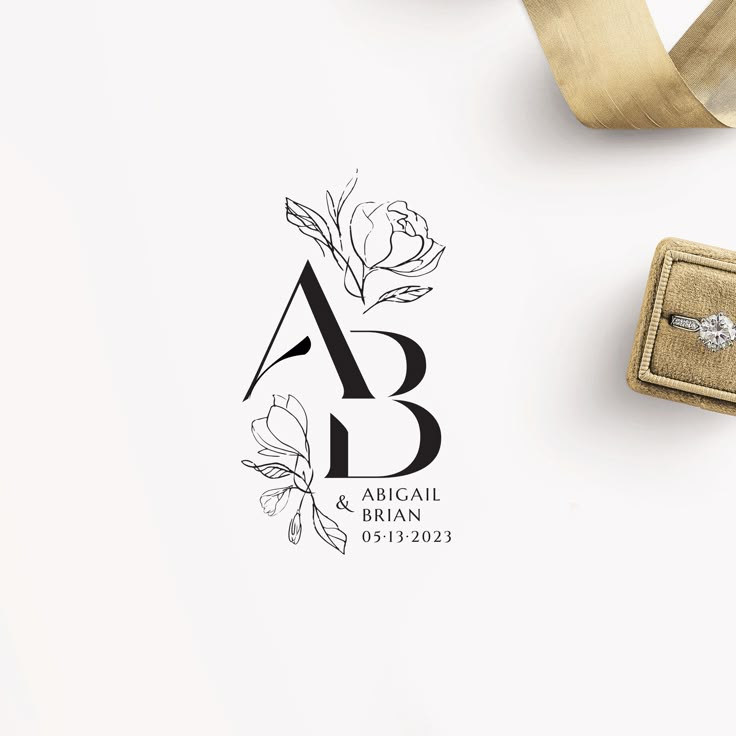
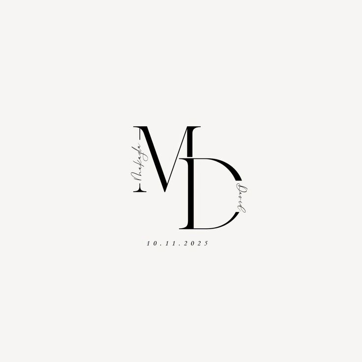
Wedding and event designs commonly feature monograms that combine the couples’ initials in elegant arrangements, symbolizing their union while creating a cohesive visual theme.
Gaming logos and esports teams frequently use monograms to create bold, impactful identities that work well across digital platforms, merchandise, and competitive environments.
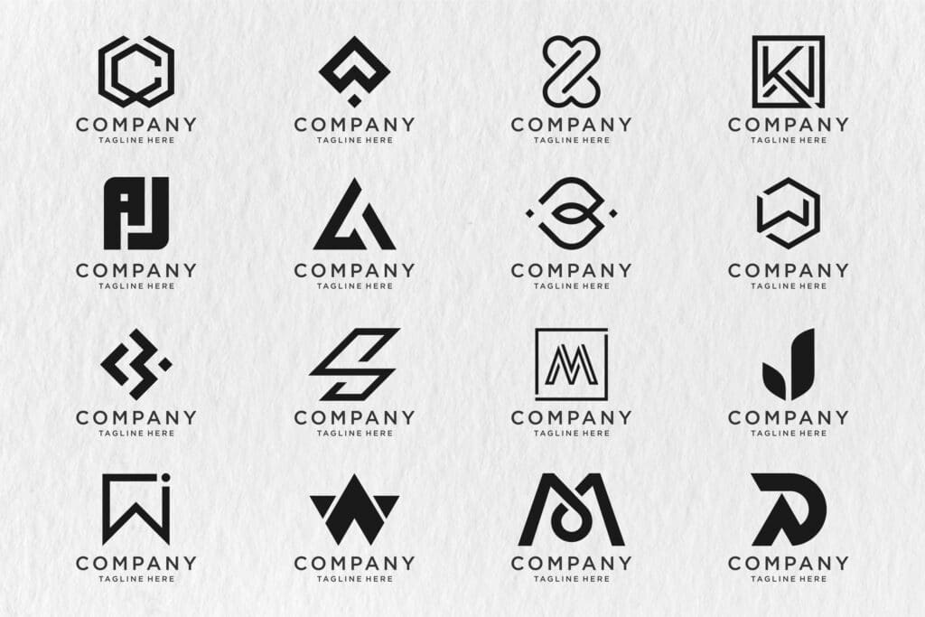
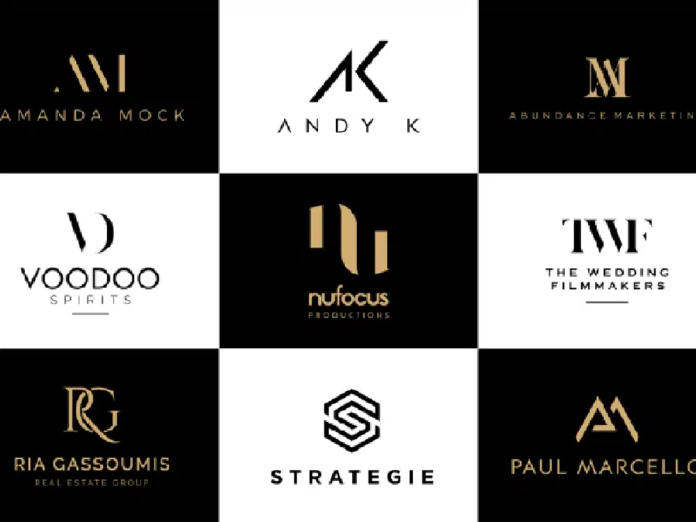
Fundamental Elements of Monogram Logo Design
Creating an effective monogram logo requires careful attention to specific design principles that balance simplicity with brand identity. The right combination of letters, typography, and layout elements forms the foundation of a memorable monogram that resonates with your audience.
Choosing the Right Letters and Initials
Selecting appropriate letters for your monogram logo is the crucial first step in the design process. Most monograms incorporate one to three letters, typically derived from your brand name, company founders, or product line.
For businesses with longer names, focus on using the first letter of each word or the most distinctive letters that capture your brand essence. Consider how these letters will interact visually when combined.
Testing different letter combinations helps identify which arrangement creates the most balanced and aesthetically pleasing design. Some effective approaches include:
- Using all initials from a multi-word brand name
- Highlighting just the first letter for single-word brands
- Creating a unique arrangement that forms a distinctive shape
Remember that your chosen letters should maintain legibility even at smaller sizes across different applications.
Exploring Fonts and Typography
Typography plays a vital role in monogram logo design, as it directly communicates your brand personality. Serif fonts like Times New Roman convey tradition and reliability, while sans-serif options project modernity and accessibility.
Consider these typography elements for your monogram:
Font weight: Bold typography creates impact, while lighter weights suggest elegance.
Kerning and spacing: Proper letter spacing ensures readability while allowing creative overlapping when appropriate.
Custom letterforms: Modifying existing fonts or creating custom letters helps establish a unique identity that competitors can’t easily replicate.
Experiment with contrasting font styles within the same monogram to create visual interest. For example, you might combine thin and thick strokes or mix uppercase and lowercase letters.
Design Elements and Layouts
The arrangement and supporting elements around your monogram significantly impact its effectiveness. Consider geometric shapes like circles, squares, or shields as framing devices that enhance recognition and versatility.
Negative space utilization creates sophisticated monograms that reveal secondary meanings or shapes. This technique adds depth and memorability to your design.
Color selection should align with your brand identity—many successful monogram logos work effectively in single-color applications first, ensuring they remain recognizable even in restricted environments.
Popular monogram layouts include:
- Stacked letters (vertical arrangement)
- Interlocking or overlapping characters
- Side-by-side placement with connecting elements
- Radial arrangements around a central point
Your personalized monogram should maintain balance and proportion regardless of the chosen layout. Test your design across multiple sizes and applications to ensure it remains effective in all contexts.
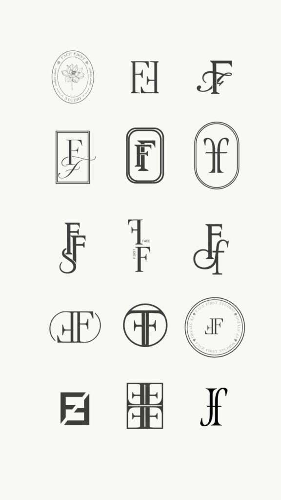
Creating a Monogram Logo: Step-by-Step Process
Creating a professional monogram logo involves careful planning and thoughtful design choices. The process combines selecting appropriate templates, customizing with the right tools, and enhancing with strategic color schemes and graphics.
Selecting a Monogram Logo Template
Begin your monogram journey by choosing the right template that aligns with your brand identity. Many online platforms like Canva, Logomak, and specialized monogram generators offer pre-designed templates as starting points.
When browsing monogram templates, consider your industry standards and target audience expectations. Luxury brands typically use serif fonts, while modern businesses might prefer clean, minimalist designs.
Look for templates that offer:
- Various letter arrangements (overlapping, side-by-side, or stacked)
- Different frame options (circular, square, or shield-shaped)
- Style variations (classic, modern, or artistic)
Free logo generators provide basic templates, but premium options offer more unique designs. Choose a user-friendly platform that allows easy customization without design experience.
Customizing with Design Tools
Once you’ve selected a template, use design tools to personalize your monogram. Most online monogram makers provide intuitive editing interfaces for adjustments.
Focus on typography first. Experiment with different monogram fonts that convey your brand personality. Serif fonts create elegance, while sans-serif options appear more contemporary and approachable.
Adjust letter spacing and proportions carefully. Your monogram should be balanced and legible even at small sizes. Most logo creators allow you to:
- Resize individual letters
- Change letter weight (thickness)
- Adjust the overlap between characters
- Modify the overall proportions
Consider adding distinctive elements that make your monogram unique. AI logo generators can suggest creative combinations based on your inputs and industry preferences.
Adding Color Schemes and Graphic Enhancements
Color selection dramatically impacts how your monogram communicates your brand essence. Choose a color scheme that reflects your brand values and appeals to your target audience.
Limit your palette to 2-3 colors for a clean, professional look. Consider color psychology—blue conveys trust, red suggests passion, while black and gold signal luxury.
Add subtle graphic elements to enhance your monogram:
- Decorative lines or borders
- Simple icons that represent your industry
- Texture effects (embossing, gradient, or shadow)
Test your design across different applications. A good monogram works well on business cards, social media profiles, and product packaging.
Many logo makers offer mockup generators to visualize your monogram in real-world applications. This helps ensure your design maintains its impact across various media and sizes.
Best Practices and Creative Tips for Monogram Logos
Creating an effective monogram logo requires careful consideration of design principles, brand alignment, and technical execution. The following guidelines will help you develop a monogram that stands out while authentically representing your brand’s values.
Ensuring Brand Identity and Differentiation
Start with a clear understanding of your brand’s personality. A luxury brand requires different design elements than a tech startup, so align your monogram with your industry’s expectations while adding unique touches.
Consider your brand’s core values and how they can be expressed through typography. Serif fonts often convey tradition and reliability, while sans-serif options project modernity and accessibility.
Color selection dramatically impacts perception. Choose palettes that reflect your brand essence—blues for trustworthiness, reds for energy, or metallics for luxury brands like Louis Vuitton.
Aim for versatility in your monogram design. Your logo should maintain integrity across various applications:
- Digital platforms (social media, websites)
- Print materials (business cards, letterheads)
- Physical products or signage
Balance simplicity with memorability. The most effective monograms combine distinctive elements while remaining uncluttered and recognizable at various sizes.
Working With Professional Designers
Professional designers bring valuable expertise to your monogram creation process. When selecting a designer, review their portfolio specifically for lettermark and monogram work.
Provide clear brand guidelines including:
- Company history and values
- Target audience demographics
- Competitors’ branding approaches
- Preferred style direction (classic, modern, minimalist)
Be prepared to discuss your business name variations and potential initial combinations. Sometimes non-obvious letter pairings create the most distinctive monograms.
Establish open communication channels with your designer. Regular feedback sessions help refine concepts and ensure alignment with your vision.
Request multiple format deliverables (vector files, PNGs, etc.) and variations for different applications. This ensures your monogram maintains quality across all brand touchpoints.
Design Mistakes to Avoid
Avoid excessive complexity that compromises readability. Your monogram should be instantly recognizable even at small sizes on mobile devices or merchandise.
Beware of trendy design elements that may quickly become dated. A classic approach often ensures longevity for your brand identity.
Don’t sacrifice legibility for creativity. While artistic flourishes can enhance a monogram, they shouldn’t make letters indecipherable to your audience.
Common pitfalls to watch for:
- Inconsistent spacing between letters
- Poor contrast between letters and background
- Overcomplicated embellishments
- Too many colors or gradients
Resist the temptation to imitate famous brand monograms. Your unique logo should differentiate your business, not remind customers of established competitors.
Test your design across multiple platforms and sizes before finalizing. A monogram that looks perfect on your computer screen might lose crucial details when printed on business cards.
Applications of Monogram Logo Design
Monogram logos serve versatile functions across business and personal contexts. They create distinctive brand identifiers that work effectively at various scales and across different media platforms.
Monogram Logos in Marketing Materials
Monogram logos excel in marketing materials due to their versatility and scalability. You can incorporate your monogram across business cards, letterheads, and email signatures to maintain consistent brand identity. These compact designs remain legible even when reduced to small sizes for favicon images or social media profile pictures.
For physical marketing items, monograms work exceptionally well on promotional products like pens, keychains, and tote bags. The simplified nature of monogram designs ensures they remain recognizable even with limited color options or printing techniques.
Digital marketing applications include website headers, app icons, and digital advertisements. Your custom monogram can serve as a powerful visual shorthand that audiences quickly associate with your brand, especially when screen space is limited.
Personal and Event Uses
Personalized monograms add sophistication to individual branding and special occasions. Wedding logos frequently feature the couple’s initials in an elegant monogram that appears on invitations, place cards, and thank-you notes. This creates visual cohesion throughout the celebration.
For personal branding, you might use a monogram on custom stationery, luggage tags, or linens. These personalized touches convey attention to detail and elevate everyday items to heirloom quality.
Event logos for conferences, galas, or anniversaries benefit from monogram designs that convey the essence of the occasion. You can adapt the same base monogram with different color schemes or decorative elements for annual events to maintain recognition while reflecting each year’s unique theme.
Trends Among Modern Brands
Luxury brands consistently utilize monograms to convey heritage and exclusivity. You’ll notice high-end fashion houses like Louis Vuitton and Chanel leverage their iconic monograms across product lines, creating instantly recognizable patterns that signal premium quality.
Tech companies have embraced simplified monograms that work effectively as app icons and favicon images. Your digital brand benefits from clean, geometric monogram designs that remain recognizable even at tiny sizes on mobile devices.
Many modern brands are experimenting with responsive monograms that adapt to different contexts. You might deploy a full wordmark on your website header but use just the monogram element for social media profiles and mobile applications.
Bold color choices and unique letter combinations help your monogram stand out in crowded marketplaces. Brands increasingly use distinctive monograms as the centerpiece of their visual identity rather than just a secondary element.
- 1.1Kshares
- Facebook0
- Pinterest1.1K
- Twitter3
- Reddit0

