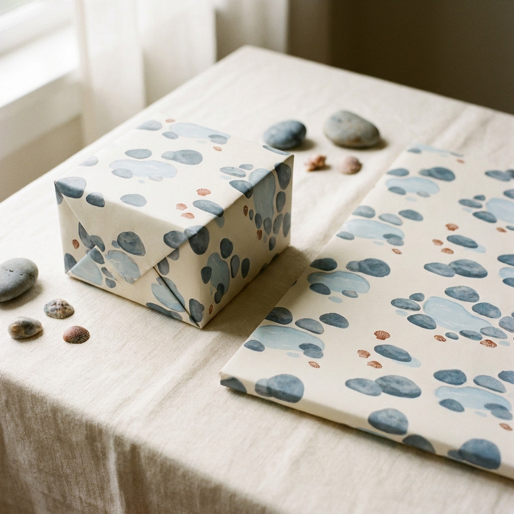
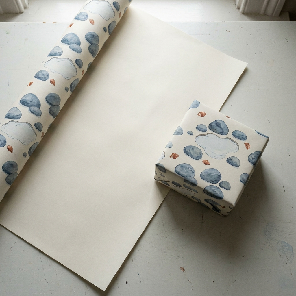
A shell can look lovely on its own and turn awkward across a whole sheet of wrapping paper. Its pointed end starts steering the eye. Identical shadows line up into stripes. A wrapping paper repeat pattern needs a quieter rhythm than a single illustration. For an imagined coastal stationery collection, the brief is simple: rounded stones, shallow pools, a few shells, and enough empty paper to let the gift breathe.
The text-to-image and image-editing capabilities of Seedream 6.0 could help explore those individual motifs. The repeat itself would still be assembled and checked in a layout editor. That split matters. An image that looks patterned does not prove that its edges join cleanly.
Start with a paper brief, not an image
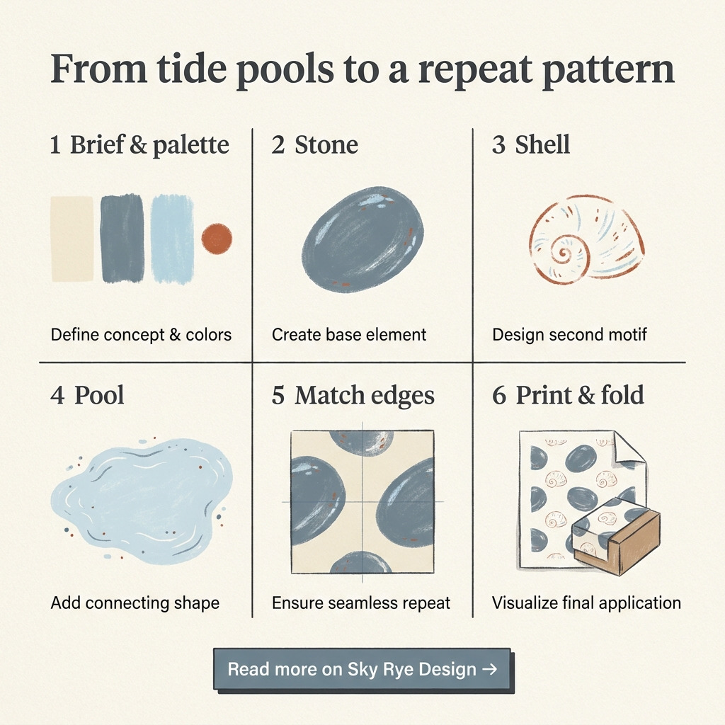
Before making a motif, decide what the paper needs to do. Wrapping paper is rarely seen as one flat sheet. It shows up on a broad box face, across a crease and on a small folded corner. Write down the likely gift sizes, the sheet size and the print method before you write a single prompt. A motif that only works in a large on-screen preview may vanish at print size or bunch up where the paper folds.
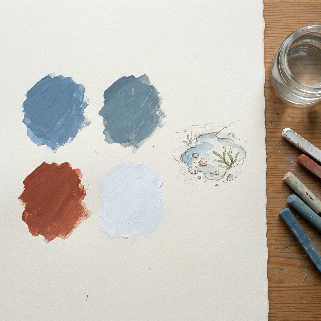
For this collection, chalk, muted blue and one restrained rust accent would set the visual temperature. The palette also assigns jobs. Stones carry the middle value, pools provide pale areas, and shells hold the warm accent. If every motif gets equal contrast, the surface loses its calm.
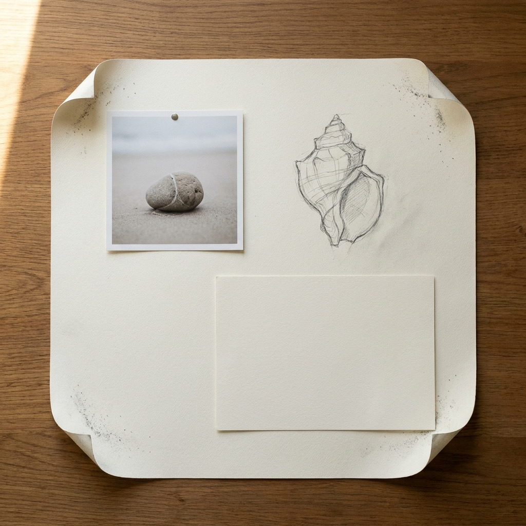
Reference images should have narrow jobs. A photograph of a coastal stone can suggest an uneven silhouette, and a simple pencil study can show which shell ribs matter. Use sketches you made or images you have permission to use. Mixing photographic texture, vector edges and painterly washes in one small repeat makes the sheet feel assembled from unrelated sources. The broader idea of nature-inspired patterns is useful background, but this project needs a tighter rule set: one drawing language, one palette, one accent colour.
Give each coastal motif a distinct role
A good surface pattern has hierarchy even when it has no central subject. Here the stone is the steady form, the shell is a scarce accent, and the pool is breathing room. Make each object readable on its own before asking it to repeat.
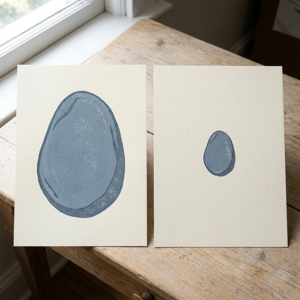
Stone: the quiet anchor
Start with an oval stone whose lower edge is slightly flattened. A Seedream 6.0 exploration prompt could ask for a simplified gouache illustration in chalk blue and pale grey, with soft pigment edges, a flat front-facing view and a plain cream background. It should exclude lettering, extra objects and a hard cast shadow. The prompt has one job: establish shape and surface treatment, not solve the whole sheet.
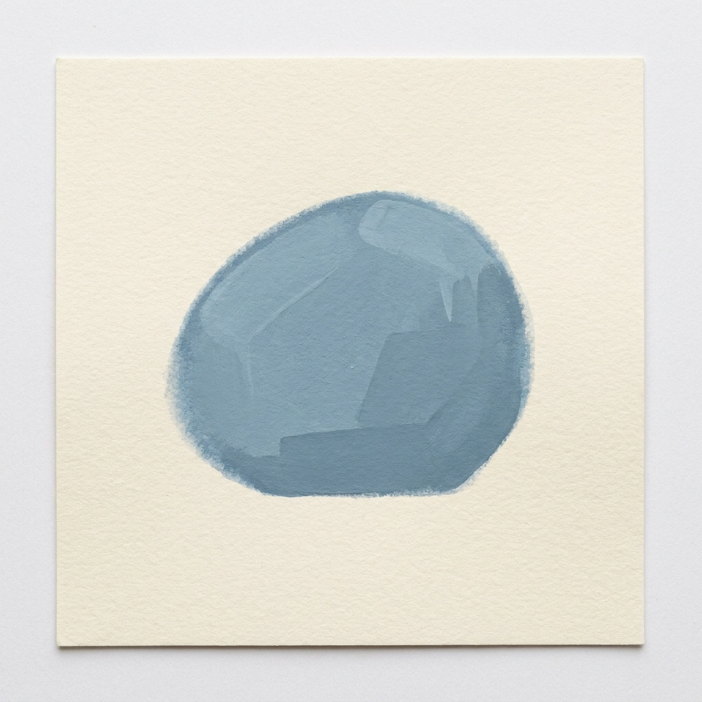
Judge the result at the size it will occupy on the printed sheet. Fine mineral veins can be attractive at full screen and turn to grit when reduced. If the stone looks glossy, revise the surface description before touching the silhouette: soften a narrow highlight into a broad lighter plane, then cut small tonal shifts. Keep a little irregularity along the edge. Perfectly symmetrical stones look stamped once they repeat.
Shell: the accent
The shell should be smaller and less frequent than the stone. Choose a rounded side view with a handful of broad ribs rather than many fine lines. A long, pointed shell sends a strong directional signal, and repeated across a sheet it can become a row of arrows. Keep the rust to a small area instead of washing the whole shell in it.
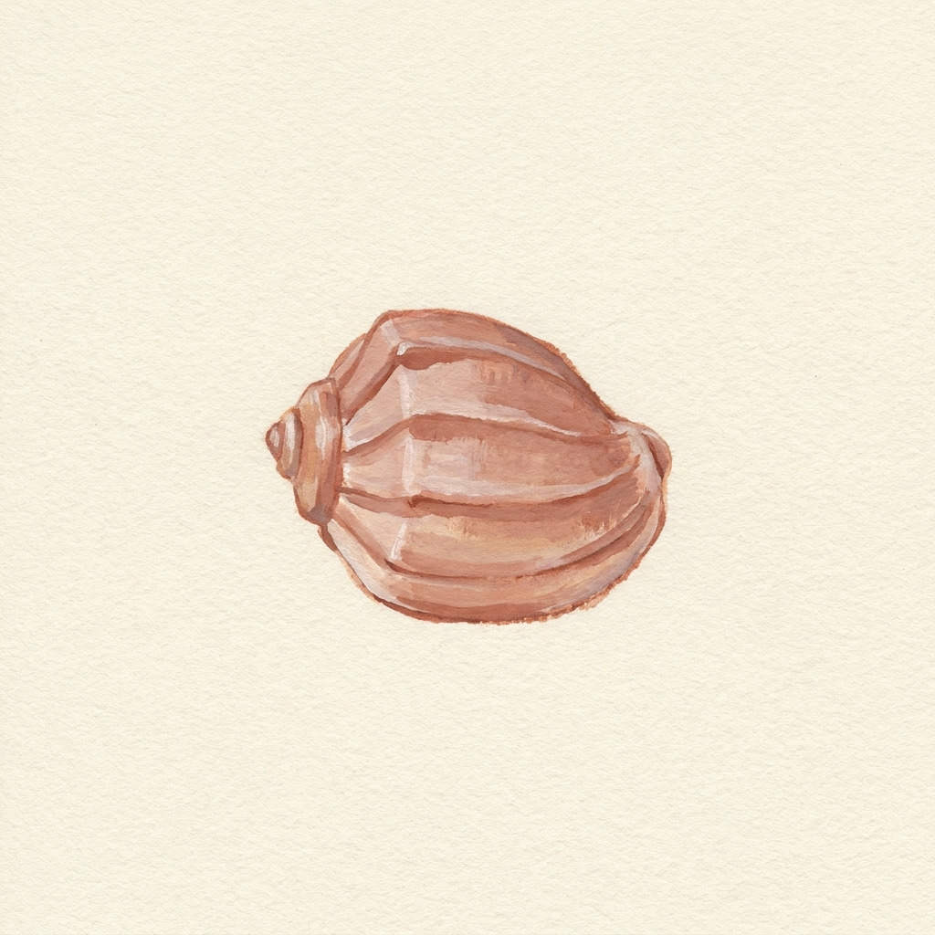
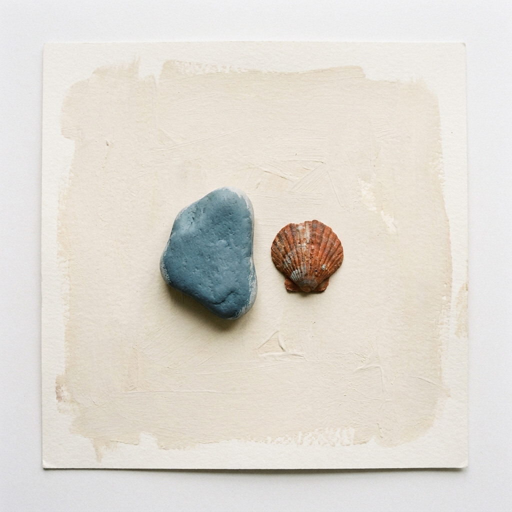
The chosen stone image could serve as a visual reference for the shell's palette and brush scale, paired with an explicit request for a different subject. That may help the two motifs feel related, but it does not guarantee consistency. Compare edge softness, contrast and apparent brush size side by side. If the shell is too detailed, simplify the drawing. Shrinking it only hides the mismatch and may make the accent disappear.
Pool: breathing room
A shallow pool could be an irregular pale-blue loop or patch, with soft internal variation and a clear outer boundary. Resist putting a miniature seascape inside it. A shoreline, reflection and pebbles turn a quiet shape into another focal illustration.
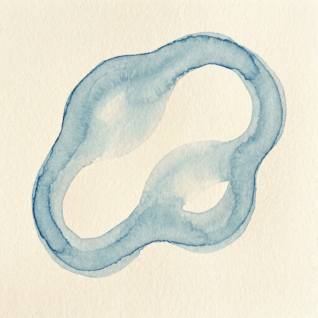
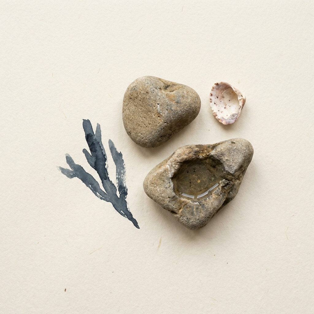
Ask for an open painted water shape, then edit only what distracts: dramatic ripples, dark outlines or busy interior detail. Treat the cream paper around it as part of the design. Negative space should read as a connected field the eye can travel through, not as leftover gaps between objects. A short seaweed curve is a possible fourth motif, but add it only if a trial layout needs a darker line or a change of direction. Extra motifs should solve a composition problem, not postpone one.
| Motif | Role in the repeat | Check at print size |
|---|---|---|
| Stone | Steady mid-tone anchor | Does the silhouette still read when small? |
| Shell | Warm, sparse accent | Do repeated tips line up into a stripe? |
| Pool | Pale pause and negative space | Does it stay quiet beside the shell, without forming blank holes? |
Build the repeat tile in a layout editor
A repeat tile is a unit that sits next to copies of itself without a visible break. Generated wrapping-paper imagery may suggest a pleasing arrangement, but edge matching needs its own check. If a motif crosses the right edge, the same part must continue at the matching height on the left. Top and bottom work the same way. A practical test is to offset the tile by half its width and half its height, so the former edges move to the centre where any break is easy to see.
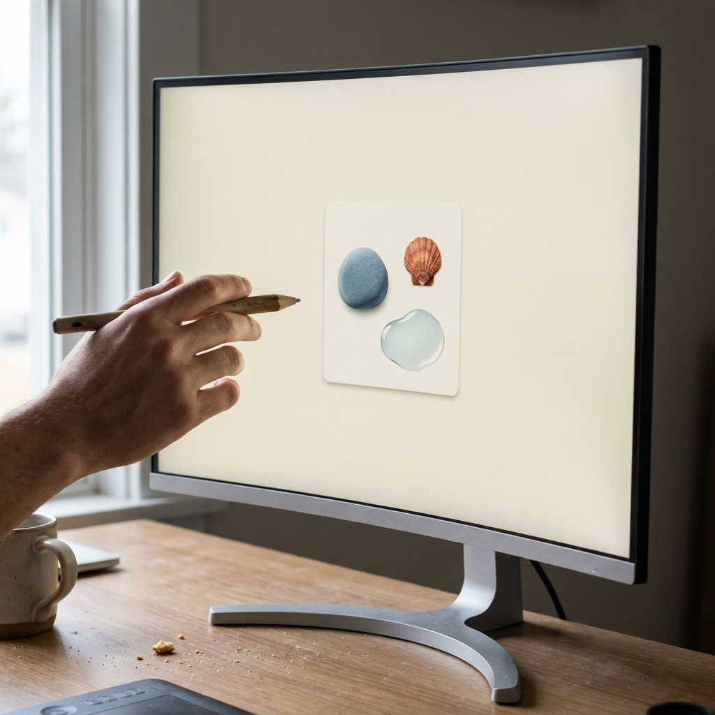
Place one larger pool slightly off centre, a stone nearby and a shell farther away. Rotate some shapes modestly and leave others upright. If everything turns by the same angle, the tile can produce a diagonal stripe. Equal gaps are just as easy to spot, so vary the spacing while leaving room around the shell's ribs. This is where visual rhythm in pattern design stops being abstract and becomes a series of small placement decisions.
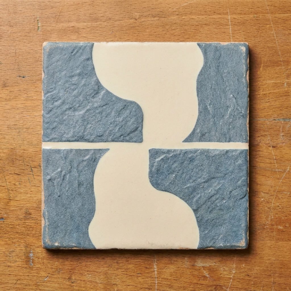
Make a four-tile preview before approving the arrangement. Look at the joins first, then step back and read the whole field. A run of dark shells may form a ladder. Four pale pools may meet to make a blank cross. Move or resize existing motifs before generating anything new. If a gap genuinely needs a different shape, explore a narrower stone using the established palette and edge treatment, and judge it in the preview rather than on its own.
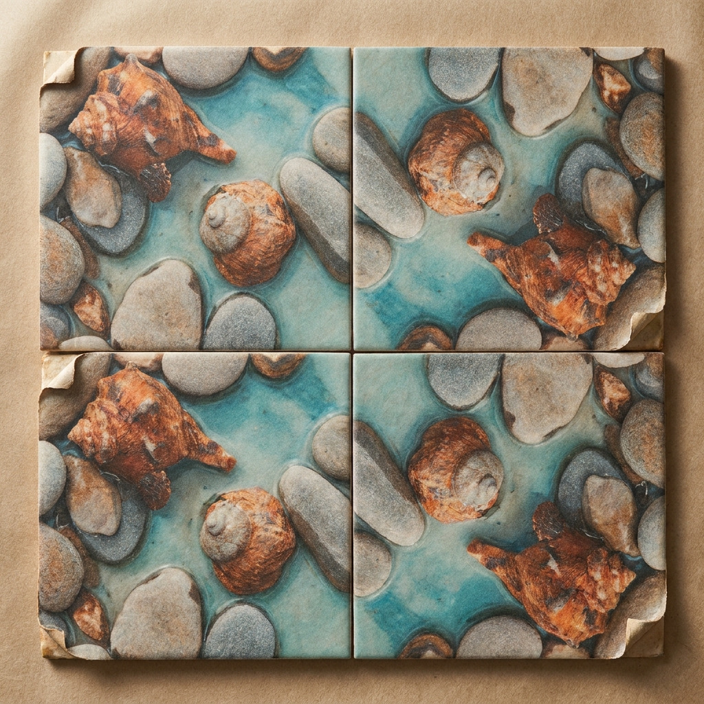
Keep the final repeat tile and the large sheet preview as separate deliverables. A mockup of a wrapped gift can show mood and scale, but it cannot prove that the source tile repeats correctly.
Test scale, seams and a real paper proof
A screen shows light through the image; paper reflects it. Warm stock can weaken the contrast between cream motifs and the background. Rough stock can soften details that already look faint. Print a small proof at the intended motif size on paper close to the planned stock, then fold part of it around a box or a simple paper form. A proof at the wrong scale answers the wrong question.
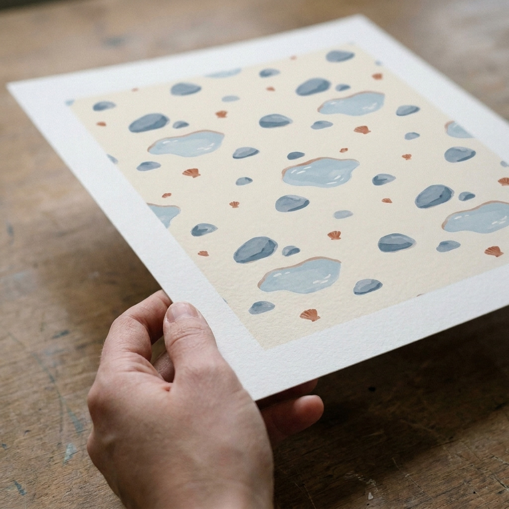
Check three views. From arm's length, do the dark shapes form an unintended line? At normal handling distance, can you tell the stone from the shell? On a folded corner, does the composition still look deliberate when half a pool disappears? These observations tell you more than a zoomed-in tile on a monitor.
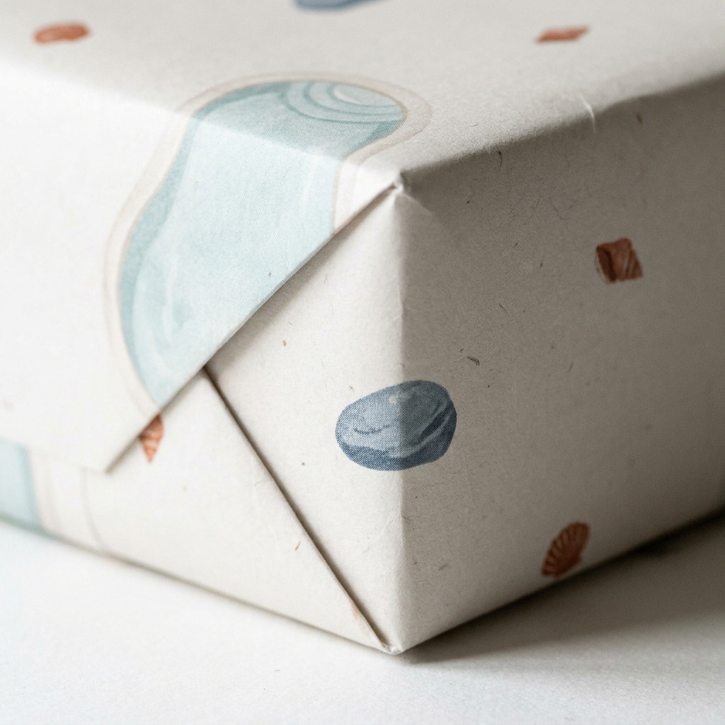
Let the proof guide one correction at a time. If the shell turns muddy, broaden its light areas and drop a few dark rib marks while keeping the silhouette. If the pool nearly vanishes, deepen the blue slightly. Changing every colour and shape at once makes it impossible to tell which revision helped. Once the sheet is resolved, the site's DIY wrapping ideas cover how to present it around a gift.
A short checklist before print
- Each motif has one job: anchor, accent or pause.
- The shell appears less often than the stone and carries the only warm colour.
- Cream paper reads as a connected field, not scattered leftover gaps.
- Left-to-right and top-to-bottom edges match on the actual tile, including after a half offset.
- A grid of at least four tiles shows no accidental stripes, ladders or blank crosses.
- Motif scale has been judged on a printed proof at intended size, not only on screen.
- A folded corner of the proof still looks intentional.
- Export format, bleed and colour requirements are confirmed with the printer.
Final takeaway
The goal is a tile that joins cleanly at every edge and a sheet that holds together at gift scale. Seedream 6.0 can help search for the right stone, shell and water shapes. The design work happens afterwards, when those shapes are simplified, given distinct roles, spaced with real negative space, repeated, printed and judged as one surface. If a decision cannot be checked on the tile or the proof, it is not finished yet.
- 0shares
- Facebook0
- Pinterest0
- Twitter0
- Reddit0