A brand color that reads perfectly on a bright white coated stock can shift noticeably the moment it lands on uncoated recycled kraft, and that shift isn’t a production error to fix after the fact. It’s a design constraint that should have shaped the file from the first sketch. I’ve watched designers hand off a beautifully composed packaging concept only to be surprised when the eco-friendly substrate they specified late in the process changed how every color, every fine line, and every piece of type actually reads.
Sustainable packaging design isn’t a materials swap bolted onto a finished layout. It’s a different design problem from the start, and treating it that way is what separates packaging that looks intentional from packaging that looks like a compromise.
The gap between those two outcomes usually traces back to when material got considered, not how much the designer cared about sustainability in principle. A team that treats the substrate as a late production detail ends up compensating for surprises during the press check. A team that treats it as a design input from the first sketch builds a system that already accounts for how the real material behaves, and the difference shows up in every detail from color to typography to the tactile feel in someone’s hand.
What sustainable packaging design means for visual designers
Sustainable packaging design is the practice of building a brand’s visual identity around materials, inks, and production methods that reduce environmental impact, without treating that reduction as a limitation the design has to apologize for. Consumer preference has moved decisively in this direction too. Recent research covered by Forbes found that shoppers actively prefer brands that utilize sustainable, eco-friendly packaging materials, which means the material choice itself has become part of the brand story a package tells before anyone reads a word of copy on it.
For a visual designer, that shift changes what the job actually is. Instead of designing on a neutral substrate and treating material as a production detail decided later, sustainable packaging design means letting the material’s real behavior, its texture, its color response, its structural limits, inform the visual system from the very first concept sketch.
This isn’t a constraint unique to packaging, even though packaging makes it unusually visible. Any design discipline working with a real physical material, whether that’s paper, metal, or fabric, eventually has to reconcile the version imagined on screen with the version that actually exists in someone’s hands. Packaging just compresses that reconciliation into a much shorter timeline, since a package moves from concept to store shelf far faster than most physical products do.

Why eco materials change the design process
Paper, kraft, and recycled substrates: texture, ink spread, and negative space
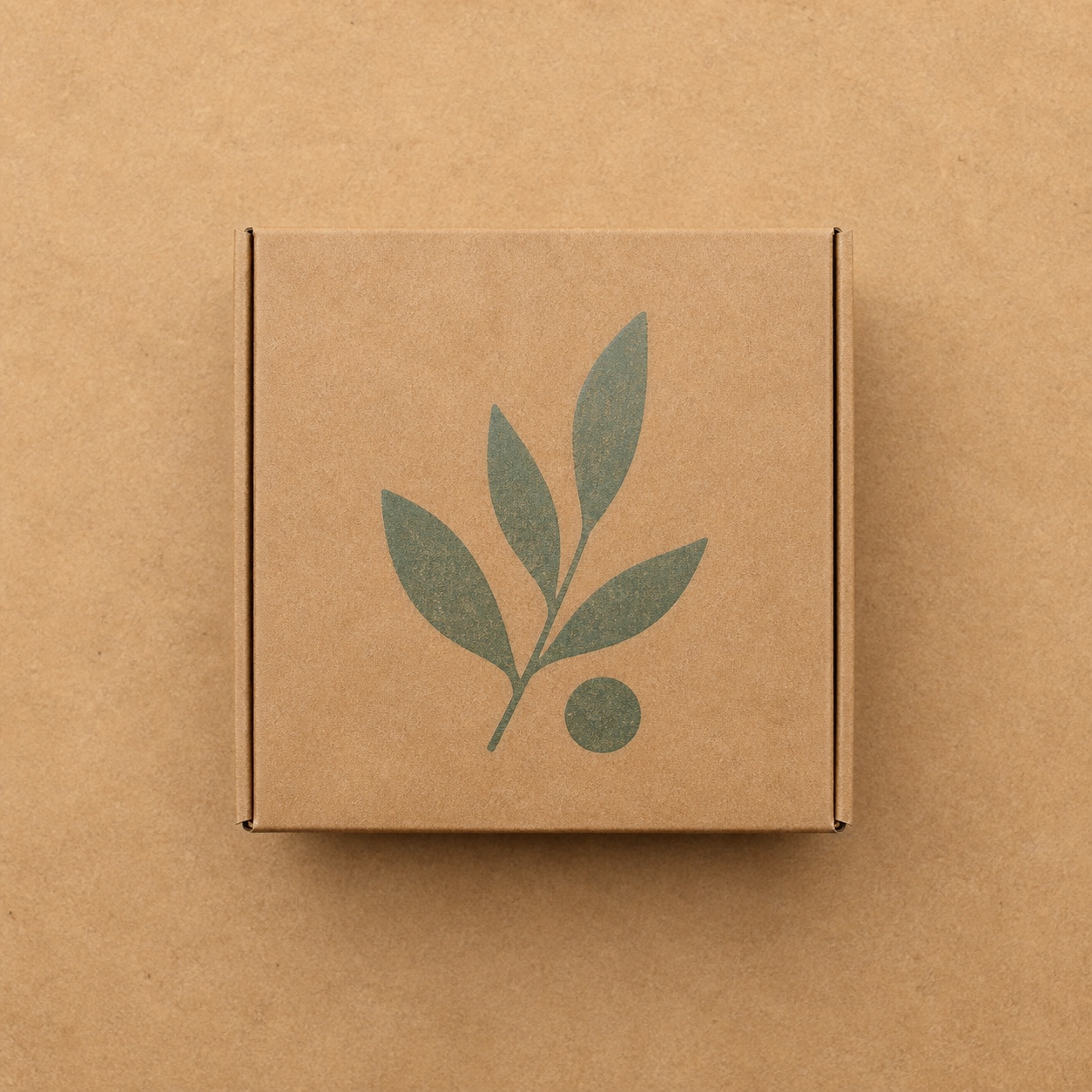
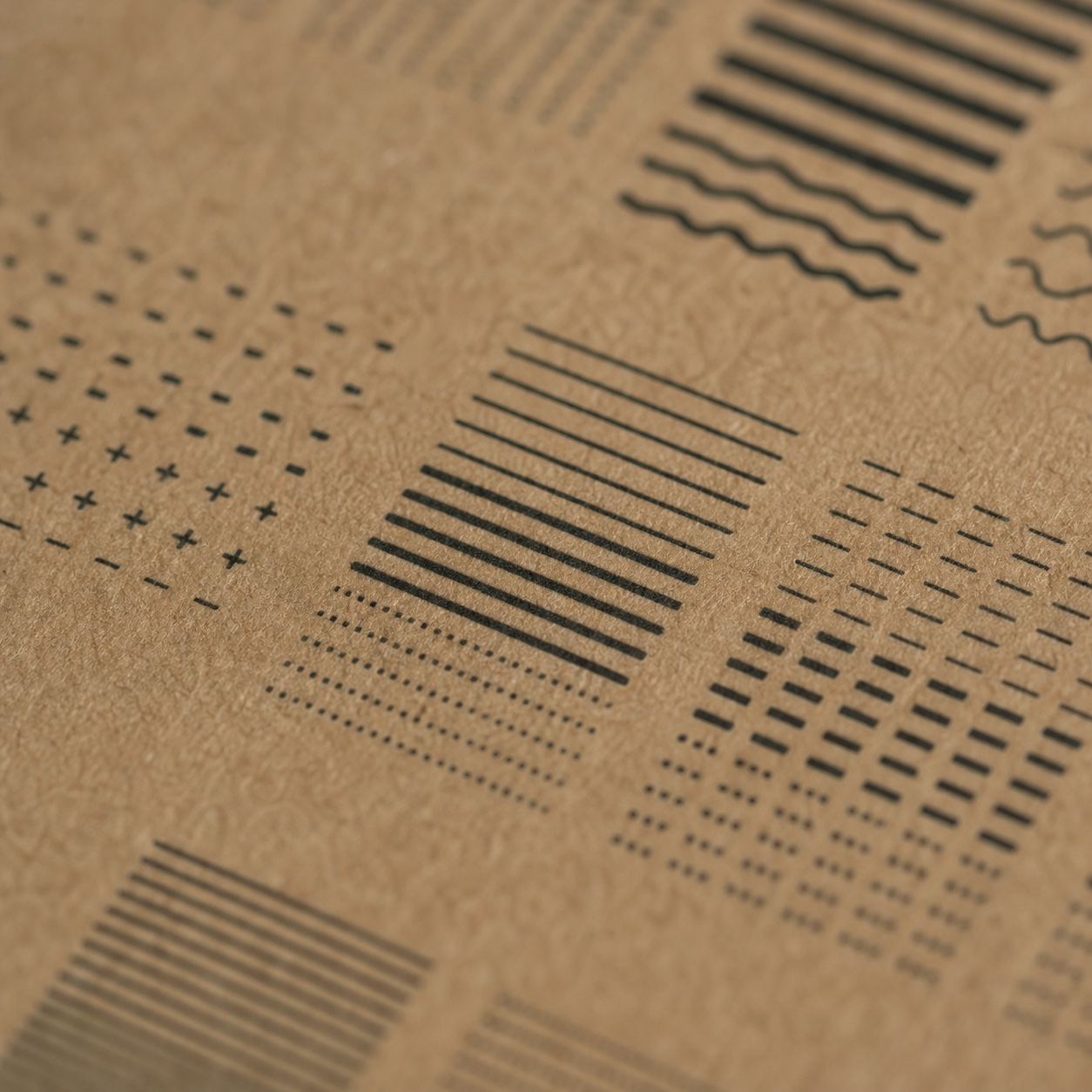
Recycled and kraft substrates are porous in ways coated stock simply isn’t, which means ink spreads differently and fine detail that looked crisp on screen can blur slightly once printed. Designers working in this space lean harder on negative space specifically because it works with the material’s texture instead of fighting it, letting the natural color and grain of the substrate become part of the visual composition rather than something to cover up entirely.
I think about this the same way I’d think about drawing on textured versus smooth paper: the surface itself changes what marks actually read clearly, and a composition planned for one doesn’t automatically translate to the other. A logo mark with fine hairline details that reads perfectly on smooth stock needs real simplification before it survives contact with a porous kraft surface.
The instinct to simplify a mark for a rougher substrate often produces a stronger logo overall, not just a compromise version of the original. Fine detail that only worked because a coated surface could hold it precisely was arguably fragile to begin with. A mark redesigned to survive ink spread on kraft usually ends up bolder and more confident, the kind of simplification that tends to age better regardless of substrate.

Recyclable and biodegradable flexible packaging: distortion, sealing, and registration
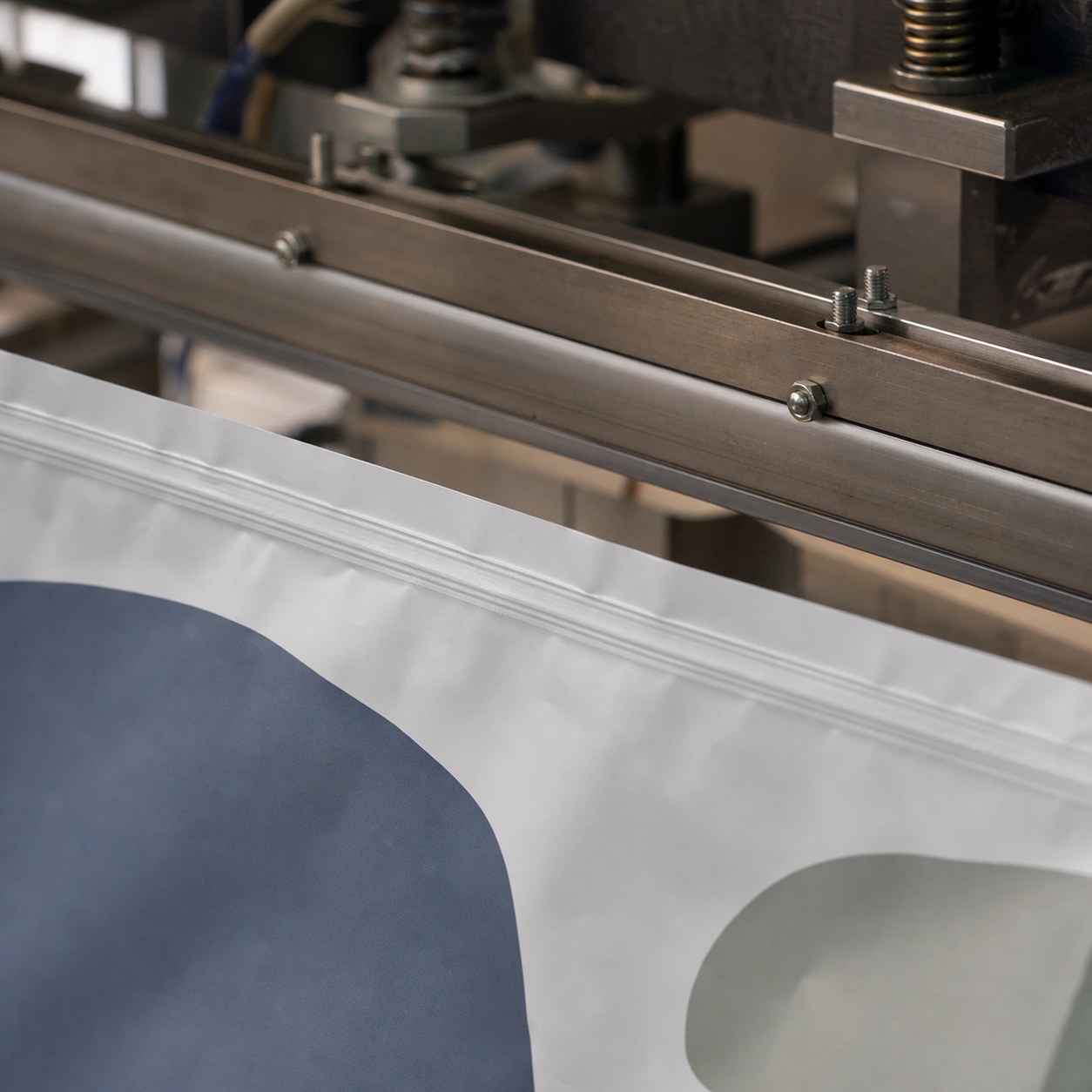
Flexible pouches made from recyclable or biodegradable films behave differently under the heat-sealing process than traditional plastics do, and a design that doesn’t account for that risk can distort exactly where a seal forms. Registration, keeping every printed layer aligned precisely, also demands tighter tolerances on these substrates, since even a small shift becomes visually obvious on a package this size and this close to the consumer’s hand.
Seal-line distortion is the failure mode I’ve seen catch designers most off guard, mostly because it’s invisible on a flat digital proof and only shows up once the material actually goes through a real heat-sealing pass. A design element placed too close to where the seal forms can warp in a way no screen preview would ever predict, which is exactly why understanding the specific film’s behavior matters more here than on a rigid substrate.
Color fidelity on sustainable packaging
Color is where sustainable substrates most often surprise a design team, precisely because color decisions get made and approved digitally, on calibrated monitors, well before anyone sees ink on the actual eco-friendly material. Closing that gap between screen and substrate is where a lot of production budget quietly goes when it isn’t planned for from the start.
Why recycled materials shift CMYK and brand colors
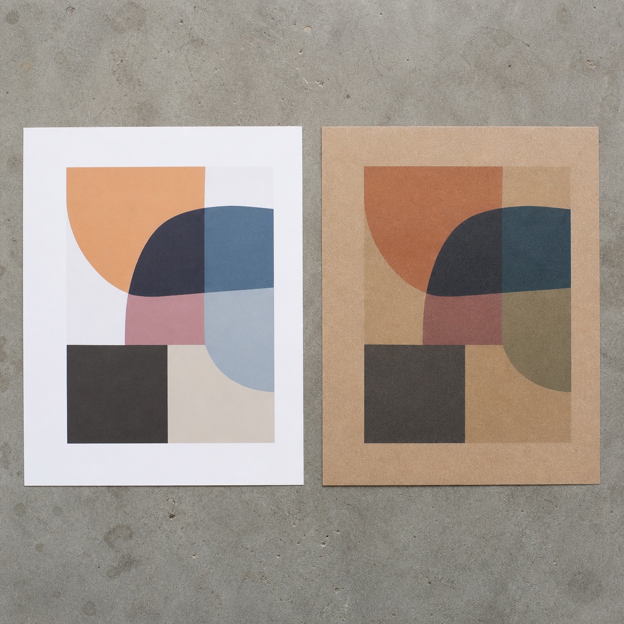
Recycled paper stock often carries a subtle organic tint that standard CMYK values were never calibrated against, which means a brand’s exact color, tested and approved on white coated stock, can read warmer, duller, or simply different once printed on a recycled substrate. This isn’t a flaw in the printing process. It’s a predictable optical effect of printing color onto a surface that isn’t neutral white to begin with, and designers who understand that going in can adjust for it rather than being surprised by it during a press check.
I’ve watched a brand’s signature blue drift toward a muddier, greener tone on recycled stock purely because nobody adjusted the formulation to account for the substrate’s natural yellow undertone. The fix wasn’t complicated once identified, a slight shift in the ink mix, but it required knowing to look for the problem before the first full production run rather than discovering it on finished inventory.
White ink bases, water-based inks, and production proofs
Opaque white ink laid down as a base layer beneath the design gives colors somewhere neutral to sit on top of, correcting for a tinted substrate before the actual brand colors go down. Water-based and soy-based inks bring their own color behavior too, generally softer and less saturated than traditional solvent-based options, which means a designer specifying colors for eco-friendly production needs an actual physical proof on the real substrate, not just a screen preview, before signing off on anything. I’ve pushed teams to request a physical proof specifically because a monitor, calibrated or not, simply can’t predict how a water-based ink will actually sit on a porous kraft surface.
Minimalist packaging design as a sustainability tool
Less ink, more whitespace, clearer hierarchy
Minimalism in sustainable packaging isn’t purely an aesthetic trend. Less ink coverage directly reduces material and production impact, which means a genuinely minimal design is doing real environmental work, not just following a visual fashion. That constraint tends to produce better design anyway, since a smaller amount of ink forces a clearer hierarchy: what actually needs to be on the package, and what was only there because empty space felt uncomfortable to a less confident layout.
I’ve found this constraint genuinely clarifying rather than limiting in practice. Asked to cut ink coverage by a third, a design team has to make real decisions about what actually earns its place on the package, and those decisions almost always produce a stronger hierarchy than a version where everything got to stay simply because there was room for it.
How tactile surfaces become part of the brand system
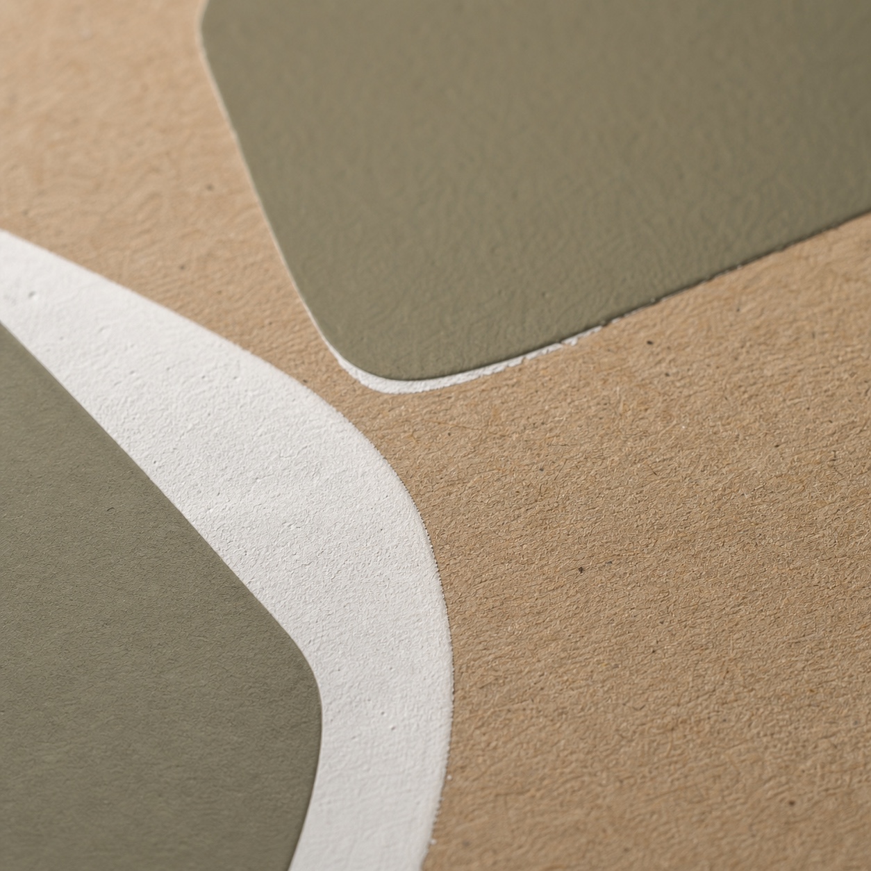
An uncoated, textured substrate isn’t a blank surface waiting for graphics. It has its own tactile presence that becomes part of how a consumer experiences the brand before they’ve even read the packaging. I treat the substrate’s natural texture the way I’d treat any material choice in product design: as an active ingredient in the final experience, not a passive backdrop the graphics sit on top of regardless of what it actually feels like in someone’s hand.
Jewelry design taught me a version of this same principle from a completely different material scale. A stone’s natural inclusions and a metal’s specific finish aren’t flaws to design around. They’re part of what the final piece actually is, and the strongest work incorporates that reality rather than pretending the material could be anything the designer originally imagined on paper.
From digital artwork to manufactured packaging
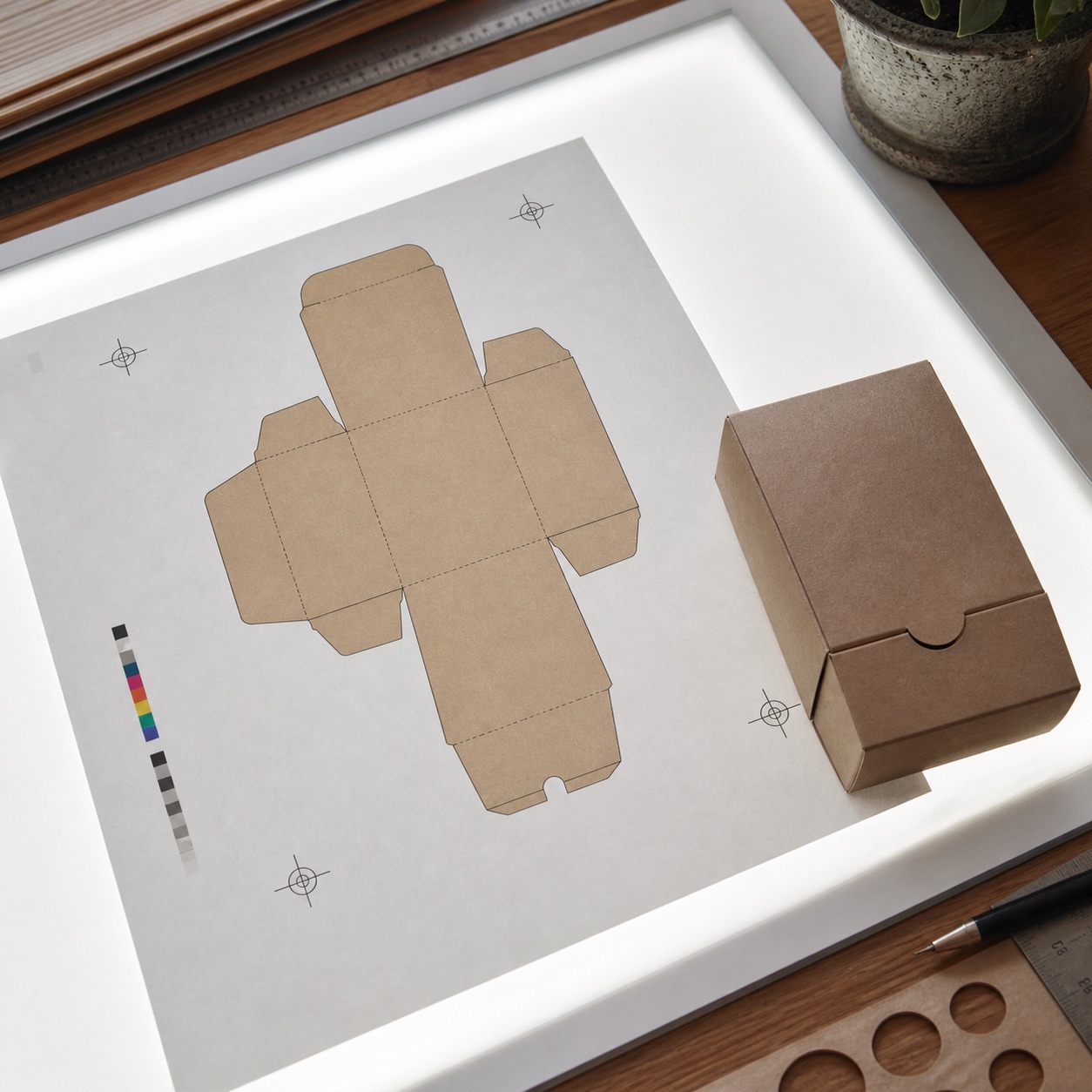
File preparation, dielines, registration marks, and typography checks
A dieline built for a coated stock package doesn’t automatically transfer cleanly to a different substrate with different fold and bend behavior, and typography that reads fine at screen resolution can lose crispness on a more porous surface if the weight and size weren’t adjusted with that specific material in mind. Registration marks matter more on eco-friendly flexible films specifically because the material’s own flexibility introduces more variables than a rigid coated board would.
Test the smallest type size and the thinnest line weight on the actual substrate before locking the full file, not after. A caption that reads perfectly at eight points on screen might genuinely blur past legibility once ink meets a porous kraft surface, and catching that on a test proof costs nothing compared to catching it on a finished production run.
What designers should confirm before production
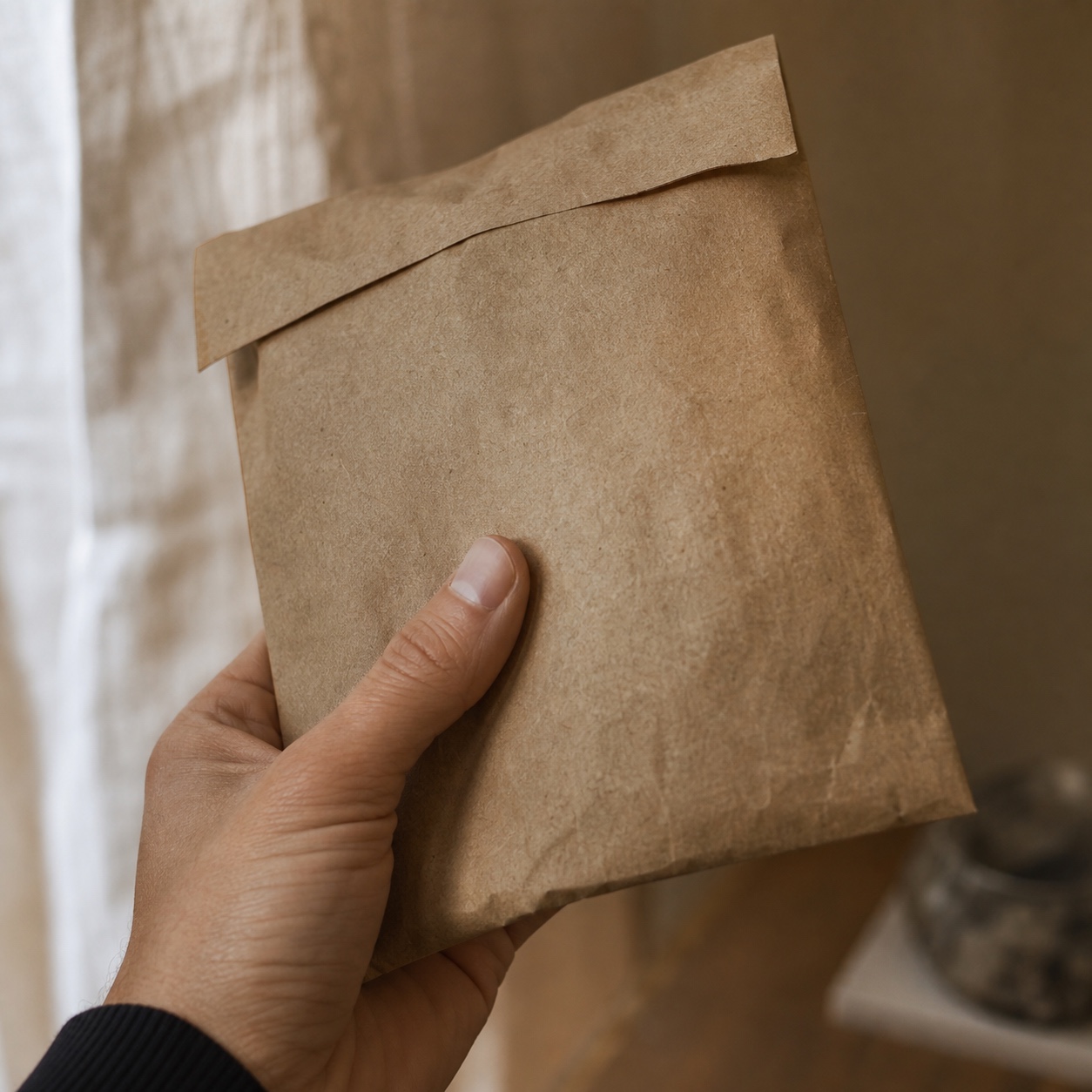
Confirm the actual substrate and ink system before finalizing color values, not after. Ask for a physical proof on the real material, not a digital mockup. Check that fine typography and thin lines survive at the intended print resolution on that specific substrate. I’ve seen studios evaluate manufacturing partners like KETE Group specifically for this kind of precision, since achieving accurate, consistent color reproduction on eco-friendly paper and flexible substrates depends heavily on production expertise that understands these material-specific behaviors rather than treating every substrate as interchangeable.
A manufacturing partner’s actual experience with a specific substrate category matters more than general printing capability, since the failure modes on kraft paper and the failure modes on a recyclable flexible film are genuinely different problems requiring different expertise to anticipate and solve. Asking a prospective partner directly about their track record with the exact material category you’re specifying tends to surface that expertise, or its absence, faster than any general capability conversation would.
Sustainable packaging examples to study
Looking at how different categories have approached this problem shows the range of solutions available within the same basic material constraints, from apothecary-style restraint to functional flexible film work to a genuinely new definition of luxury.
Beauty and wellness packaging
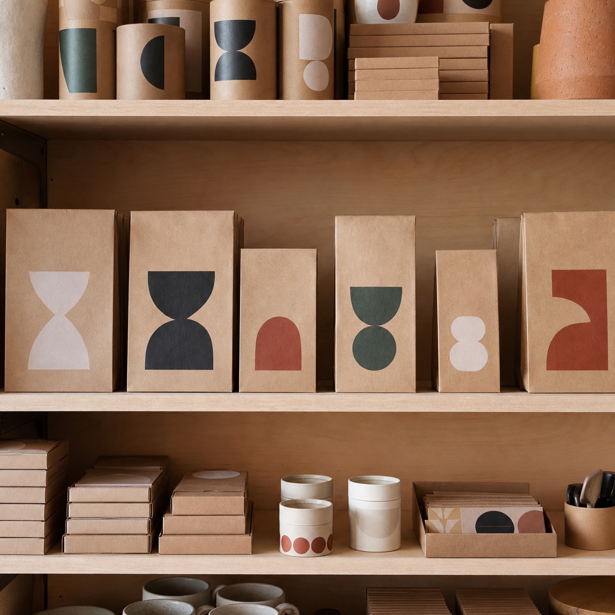
Beauty and wellness brands have led much of the visual language now associated with sustainable packaging: warm kraft tones, minimal single-color printing, and typography that leans into the substrate’s natural texture rather than fighting it. The category works well for this approach because the tactile, almost apothecary-style aesthetic these brands often want aligns naturally with what eco-friendly materials do best.
This alignment isn’t purely accidental. A category built around personal care and self-care naturally values the tactile, sensory qualities that raw, uncoated materials provide, which means sustainability here reinforces the brand experience rather than working against it, unlike categories where a coated, glossy finish has traditionally signaled quality.

Food, coffee, and retail pouches
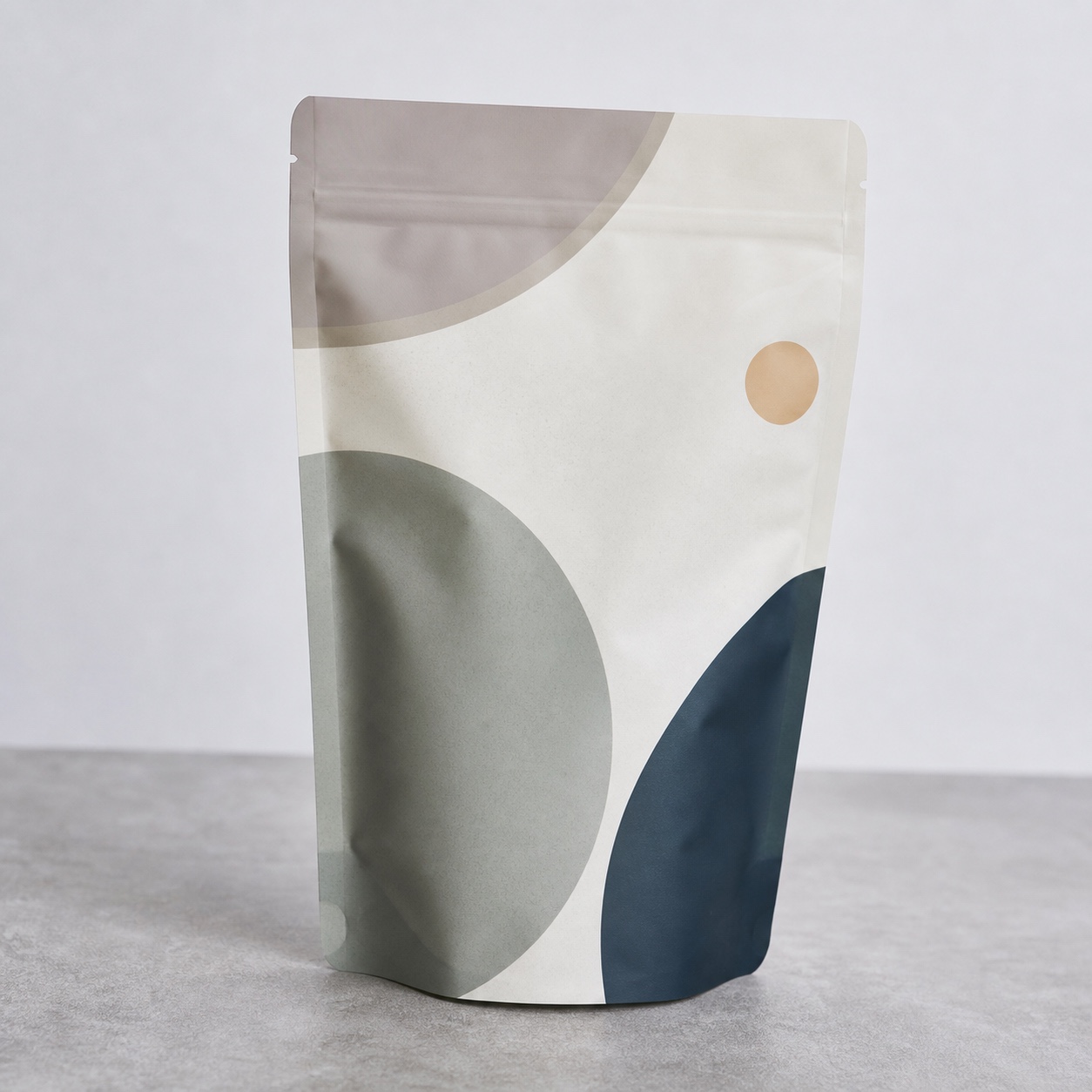
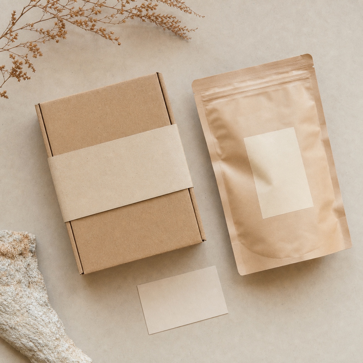
Food and coffee packaging pushes flexible recyclable films harder than almost any other category, since freshness barriers and seal integrity carry real functional stakes alongside the visual design. The best examples in this space treat the material’s natural color and texture as part of the brand palette itself, rather than printing over it as if it were simply a substitute for plastic.
Coffee specifically demonstrates the sealing and registration challenges covered earlier at real scale, since a valve or seal failure on a coffee pouch isn’t just a cosmetic problem, it directly compromises the product’s freshness. That functional pressure has pushed some of the most disciplined material-aware design work in the entire packaging industry, precisely because there’s no room to treat the substrate as an afterthought when the seal actually has to hold.

Luxury packaging without excess material
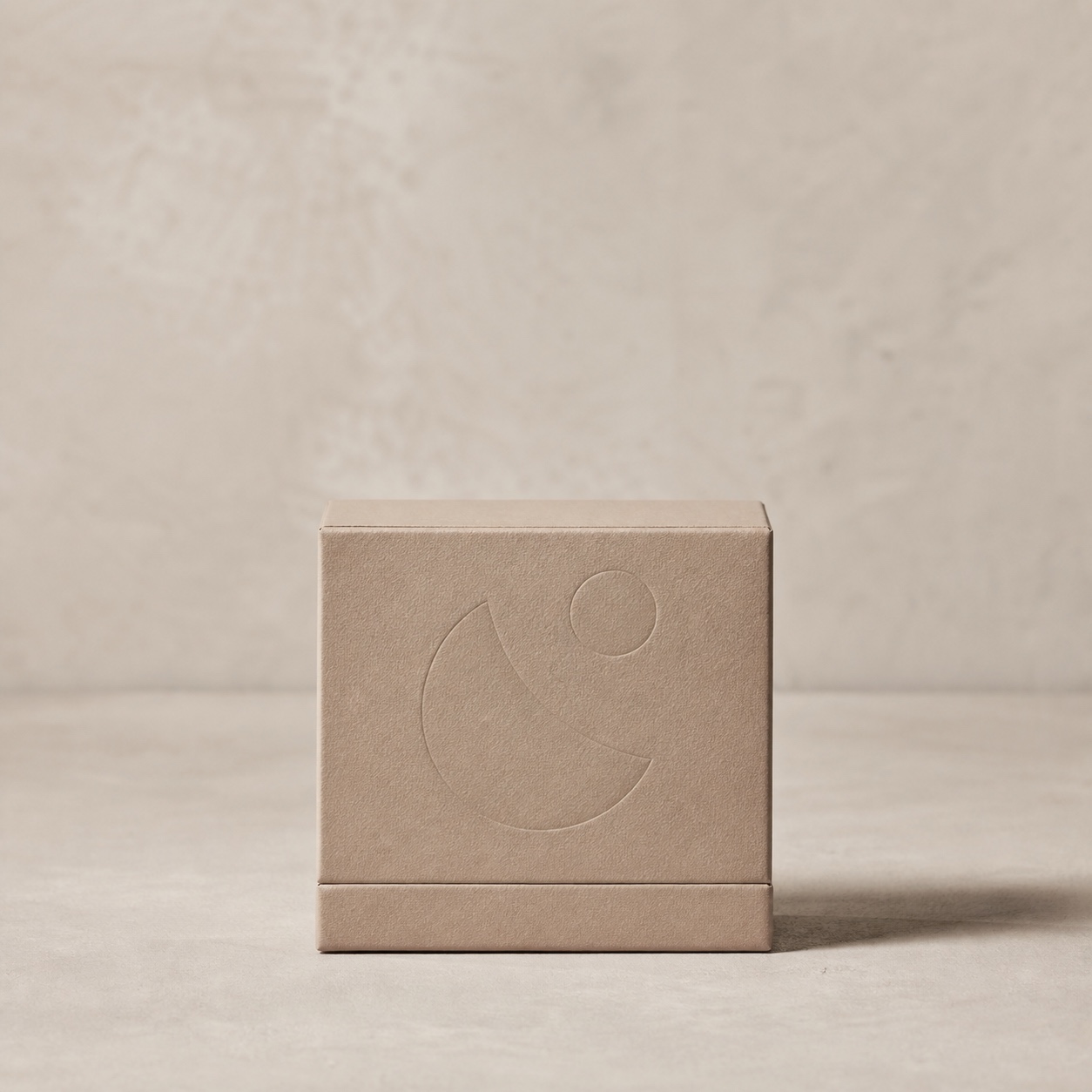
Luxury packaging built around sustainability has to prove that restraint itself can read as premium, without relying on the heavy stock, foil, and layered materials luxury packaging traditionally used to signal value. The strongest examples do this through proportion, considered typography, and material quality rather than material quantity, showing that a smaller, more honest package can carry the same weight of intention as an elaborate one.
This is the hardest category to get right, since decades of luxury design conditioned consumers to associate weight and material excess with quality. Breaking that association requires design confident enough to let precision and proportion do the work that heavy stock and foil used to do, which is a genuinely different skill than simply adding sustainable materials to an otherwise conventional luxury layout.
FAQ
Q: What is sustainable packaging design?
A: Sustainable packaging design is the practice of building a package’s visual identity, materials, and production process around reducing environmental impact, from substrate choice to ink type to structural efficiency, without treating that reduction as a creative limitation. The strongest work in this space treats the material itself as a genuine design input rather than a late-stage swap.
Q: How do eco-friendly materials affect color accuracy?
A: Recycled and kraft substrates often carry a natural tint that shifts standard CMYK values, requiring white ink base layers, adjusted color formulations, or physical proofing on the actual substrate to maintain accurate brand color. Skipping this step is the most common way a well-designed package ends up with visibly inconsistent color once it reaches production.
Q: Why does minimalist design work well for sustainable packaging?
A: Less ink coverage directly reduces material and environmental impact, and the resulting constraint tends to produce clearer visual hierarchy, since every element has to earn its place rather than filling space by default. The environmental benefit and the design benefit reinforce each other rather than competing.
Q: What should designers check before sending sustainable packaging to production?
A: Confirm substrate and ink type before finalizing color values, request a physical proof on the real material rather than relying on a digital mockup, and verify that fine typography and thin linework survive at the intended print resolution on that specific surface. Each of these catches a different failure mode, and skipping any one of them tends to surface as a production surprise later.
Q: Do consumers actually prefer sustainable packaging?
A: Yes. Research covered by Forbes found that shoppers actively favor brands using sustainable, eco-friendly packaging materials, which means material choice has become a genuine part of brand perception rather than a purely internal production decision that stays invisible to the end customer.
The best sustainable packaging design doesn’t read as an eco-friendly version of a conventional package. It reads as a design that understood its material from the beginning, let that material’s real texture, color behavior, and structural limits shape the composition, and turned an environmental constraint into the actual visual identity. Start with the substrate, not the screen, and the rest of the design follows from something real instead of something that only worked until it hit the press.
I keep returning to the same principle across every material I’ve designed for, whether that’s a car’s painted surface, a jewelry setting, or a kraft paper pouch: the material always wins the argument eventually, so the design that starts by listening to it ends up stronger than the one that discovers its limits the expensive way, on a finished production run nobody can quietly redo.
- 21shares
- Facebook0
- Pinterest21
- Twitter0
- Reddit0