I still remember the first thing my drawing instructor put in front of me in my first year of industrial design training: an apple, a desk lamp, and a blank sheet of newsprint. Not a car, not a product sketch, an apple. I thought it was a warm-up. It wasn’t. Three hours later I understood why: an apple’s outline is almost embarrassingly simple, but getting it to look round instead of flat is one of the harder things you’ll do with a pencil.
That’s the gap in almost every apple tutorial online. They walk you through the outline, tell you to color it red, and stop. The result looks like a sticker, not an object sitting on a table. What actually makes a drawing read as three-dimensional is light — where it hits, where it falls off, and where it bounces back.
- Why the apple is still a foundational drawing exercise
- What you need before you start
- Step-by-step — building the apple's form
- Understanding light before you shade anything
- Shading the apple realistically
- Realistic vs. stylized — choosing your approach
- Common mistakes that flatten the drawing
- Conclusion
- FAQ
In this piece I’m going to walk you through the full method: building the shape correctly, understanding the four zones of light every rounded object shares, and shading in a way that actually holds up. Same logic, by the way, that governs how you read a highlight running down a car door panel — light doesn’t care what shape it’s landing on.
Why the apple is still a foundational drawing exercise
Every academic drawing program starts somewhere, and it’s rarely somewhere flashy. Mine started with an apple on a folding table under one desk lamp. I’ve since drawn cars, jewelry, architectural facades, and I still come back to fruit when I want to check if my eye for light has gotten lazy.
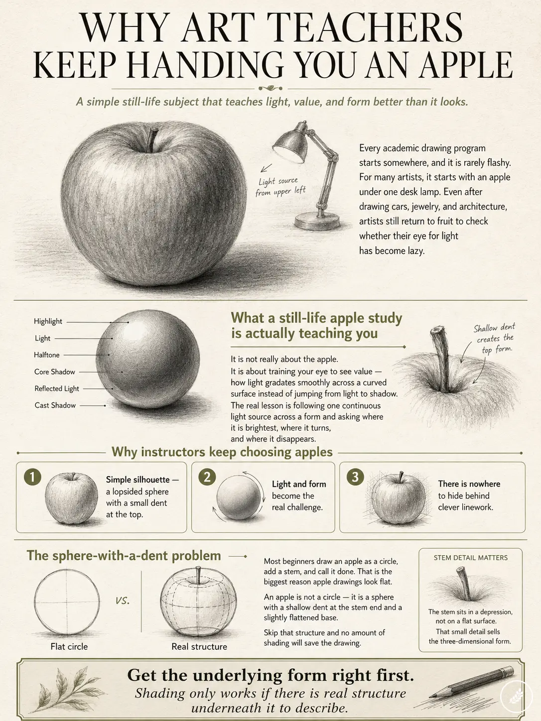
Here’s why instructors keep picking it. An apple’s silhouette is dead simple, a lopsided sphere with a small dent at the top. But that simplicity is the trap. Because the shape asks nothing of you, all the difficulty shifts to how you handle light and form. There’s nowhere to hide behind clever linework. You either understand how a rounded surface catches light, or your drawing looks like a red circle.
What a still-life apple study is actually teaching you
It’s not really about the apple. It’s about training your eye to see value, how light gradates smoothly across a curved surface instead of jumping straight from lit to shadow. I’ve noticed this is the exact same skill I use reading a clay model under studio lights before a surfacing review: you’re tracking one continuous light source across a form and asking where it’s brightest, where it turns, and where it disappears.
The sphere-with-a-dent problem
Most beginners draw an apple as a circle, add a stem, and call it done. That’s the single biggest reason apple drawings look flat. An apple isn’t a circle, it’s a sphere with a shallow dent at the stem end and a slightly flattened base. Skip that structural detail and no amount of shading will save you, because your brain is already reading flat disk, not round fruit.
Get the underlying form right first. Shading only works if there’s real structure underneath it to describe.
What you need before you start
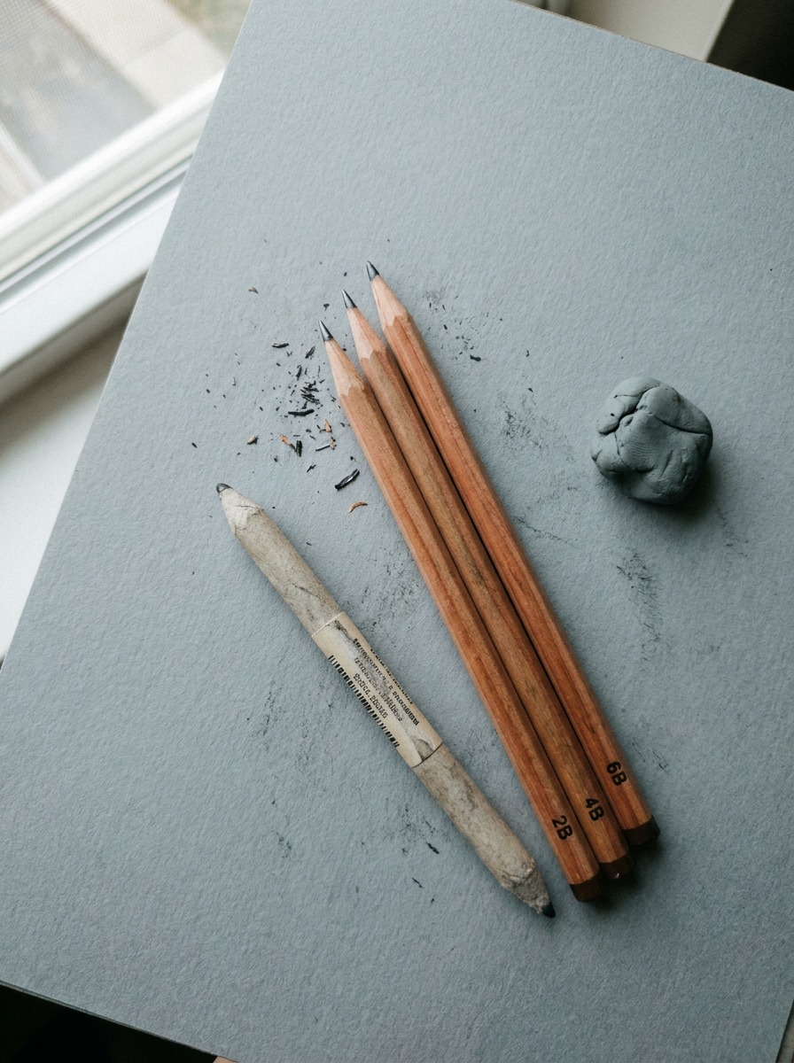
You don’t need a full pencil set to draw a convincing apple. You need the right three or four tools, used deliberately.
Pencil grades that matter
Grab a 2B, a 4B, and a 6B. That’s genuinely enough. The 2B handles your light construction lines and midtones, it’s forgiving and easy to erase. The 4B is your workhorse for building up the mid-to-dark values across the body of the apple. The 6B is reserved for the darkest accents: the core shadow and the tightest part of the cast shadow. I’ve tried working with a single HB pencil for the whole drawing more than once, out of laziness, it never ends well. You end up mashing the graphite trying to force one pencil to do three jobs, and the paper gets shiny and resistant to further layers.
Paper, blending tool, kneaded eraser
Skip printer paper if you can, it’s too smooth and graphite skates across it without building real texture. A basic drawing paper with a slight tooth (90-100 lb) holds layers much better. For blending, a paper blending stump beats a finger every time; fingers leave oil on the paper and dull the graphite’s darks over the next few layers. And a kneaded eraser, not a hard vinyl one, so you can lift out a highlight without tearing the paper surface.
That’s the full kit: three pencils, one blending stump, one kneaded eraser, and paper with a bit of tooth. Nothing fancier than that.
Step-by-step — building the apple’s form
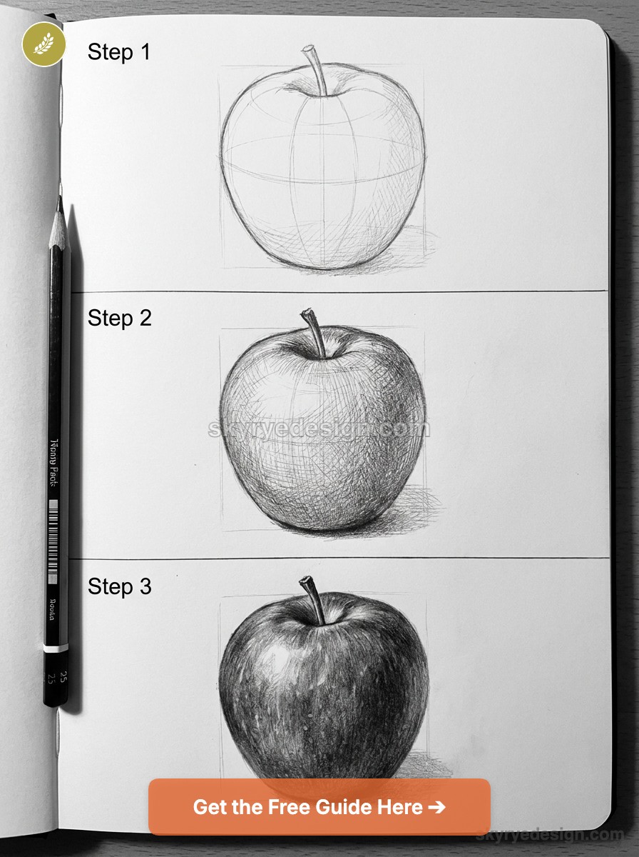
This is the part most tutorials rush through in one panel. Don’t. Getting the construction right here is what makes everything in the shading stage actually work.
Step 1 — Light construction lines
Start with a circle, but keep your hand loose and your pencil light, you’re going to erase most of this. Use the 2B for everything in this step; you want lines you can lift cleanly later. Add a small notch at the top center of the circle, where the stem will eventually sit, and a slight flattening along the bottom edge where the apple would rest on a table.
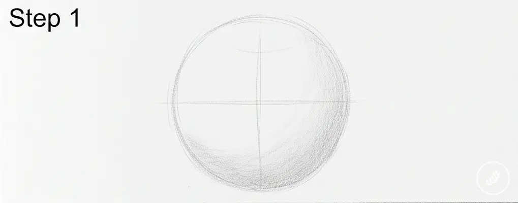
I always draw this stage bigger than feels natural. Beginners tend to draw small and cramped, then run out of room to add detail. Fill most of the page.
Step 2 — Correcting the silhouette
Now look at your circle critically. Real apples aren’t perfectly round, they’re slightly asymmetrical, with one side often bulging a touch more than the other. Push the outline out slightly on one side, and pull it in slightly on the other. This is the single fastest way to make a drawing stop looking like a geometry exercise and start looking observed.
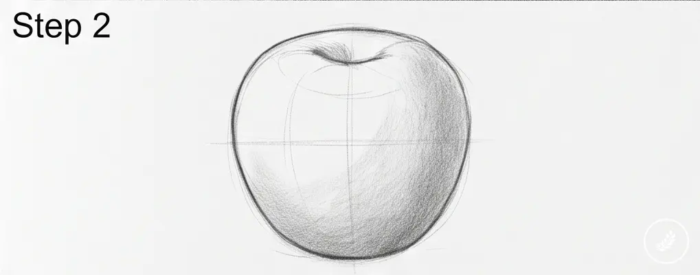
Also deepen that dent at the top. It shouldn’t be a sharp V, it’s a soft, rounded indentation, more like a shallow bowl than a notch.
Step 3 — Placing the stem and adding weight to the base
The stem is a small cylinder, not a stick. Draw it with two parallel-ish lines that taper slightly, sitting inside that dent you created in Step 2. Angle it, a perfectly vertical stem reads as stiff and artificial. Most real apple stems lean a few degrees off center.
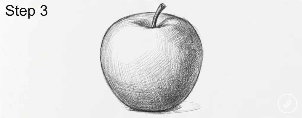
At the base, add a little more weight than you think you need. In my experience, this is where new drawings feel the most off without anyone being able to say why, the base is too narrow, so the whole apple looks like it’s about to tip over. Widen it slightly and let it settle visually onto an implied surface.
Step 4 — Locking in the final outline, erasing guides
Once the proportions feel right, go over your final silhouette with slightly firmer 2B pressure, enough that the line is confident but still light enough to shade over later. Then take your kneaded eraser and lift out all the loose construction lines from Step 1, leaving just the clean, corrected outline.
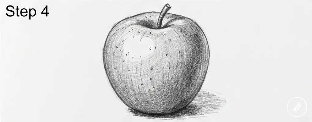
Don’t skip this cleanup. Leftover construction lines will muddy your shading in the next stage, and they’re much easier to remove now, before there’s graphite layered on top of them.
Understanding light before you shade anything
This is the section most apple tutorials skip entirely, and it’s the reason so many finished drawings still look flat even after hours of shading. You can’t shade convincingly until you understand what you’re actually looking at.
The four zones — highlight, core shadow, reflected light, cast shadow
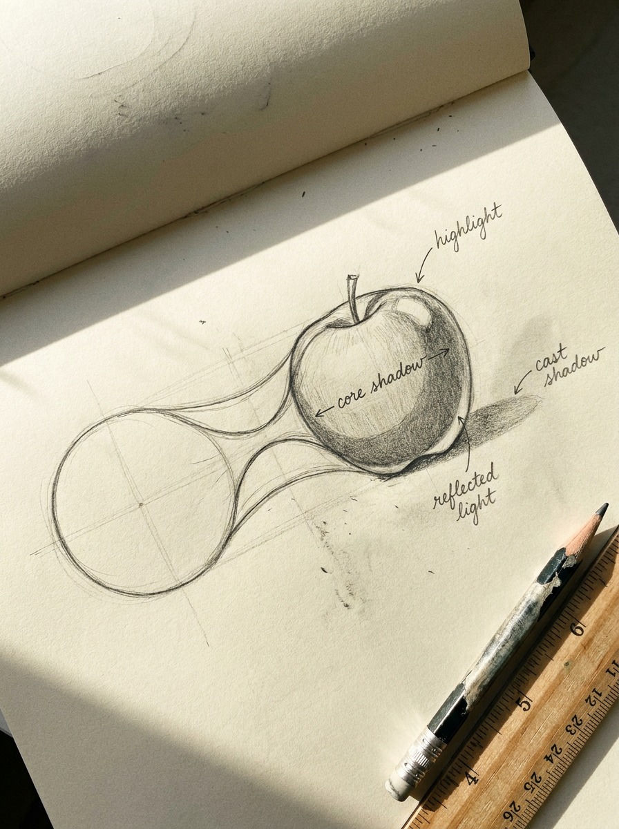
Every rounded object under a single light source breaks into the same four zones, in this order as you move away from the light:
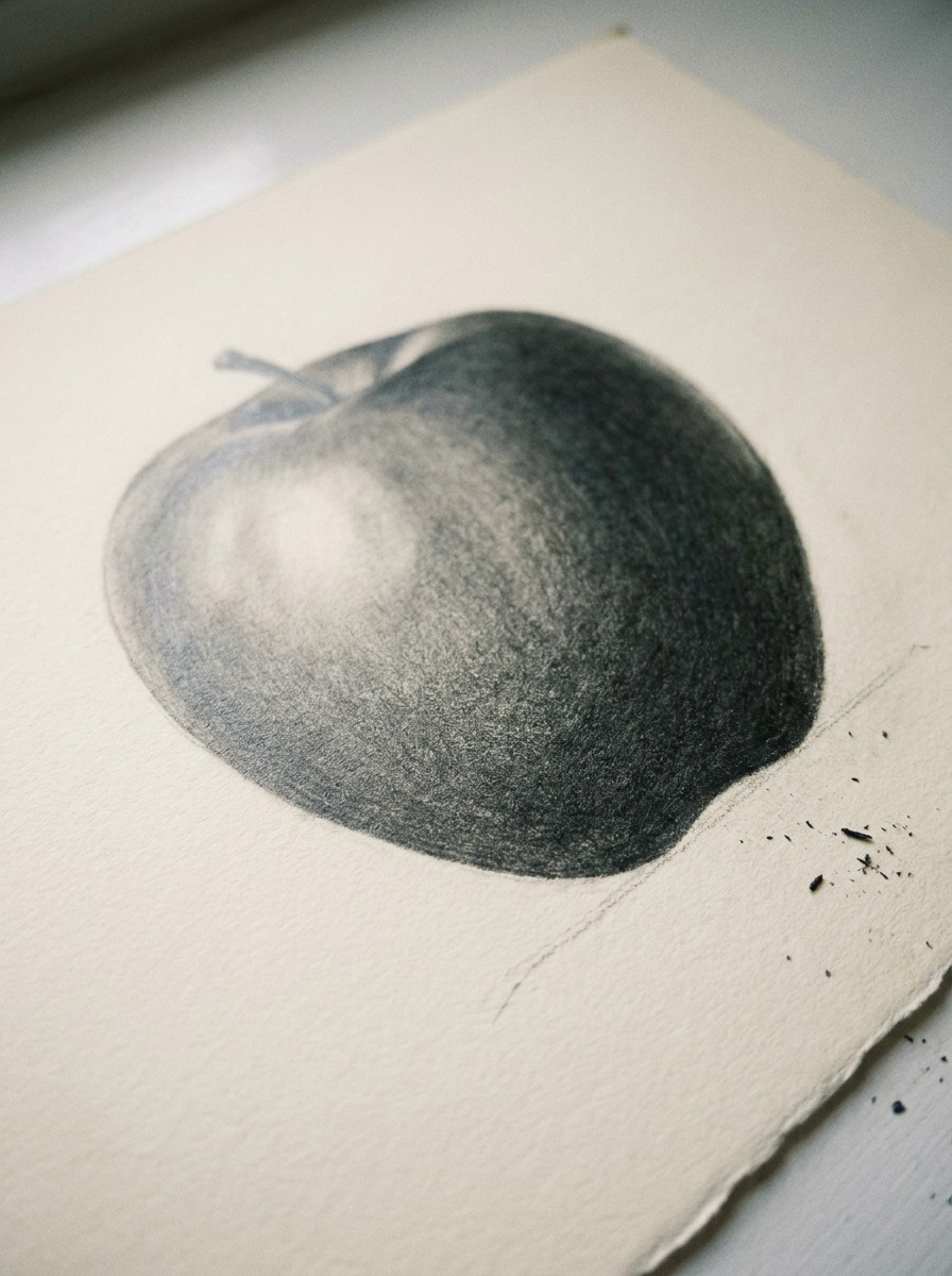
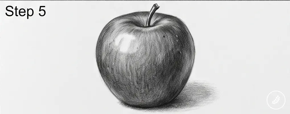
The highlight is the brightest point, where light hits the surface most directly. On an apple, it’s usually a small, soft-edged patch, not a hard white dot. The core shadow sits just past the highlight, on the far side of the curve, this is the darkest band on the object itself, darker than the shadow it casts on the table. Past the core shadow, you’ll usually see reflected light: a faint, subtle brightening where light bounces off the surface the apple is sitting on and hits the underside of the shadow. It’s easy to miss, and it’s the detail that separates a flat drawing from a convincing one.
Finally, the cast shadow, the shadow the apple throws onto the table, anchors the whole object in space.
I use this exact four-zone logic reading a clay model under raking light before a surfacing review. A door panel, a fender, an apple, the physics of how light wraps around a curved form doesn’t change with scale or subject.
Picking one consistent light direction
Before you touch a pencil to shade, decide where your light is coming from and stick to it. Left, right, slightly above, doesn’t matter which, but pick one and commit. The most common beginner mistake here isn’t a shading skill problem at all, it’s inconsistency. Shadows on the left of the stem, highlight on the right of the body, cast shadow going straight down: none of it agrees, and the eye catches it immediately even if the viewer can’t say why.
A simple trick: draw a small arrow off to the side of your page indicating your light direction. Glance at it every few minutes while you shade.
Shading the apple realistically
Now you put the four zones to work. This is where patience matters more than pencil skill.
Building value in layers, not one dark pass
The biggest shading mistake I see is going straight for the darkest tone in one pass. Don’t. Start with the 2B and lay down a light, even layer across the entire shaded side of the apple, skip the highlight completely, leave that paper untouched. Then switch to the 4B and go back over just the core shadow area and the lower half of the apple, building it darker. Save the 6B for the very end, for the tightest band of the core shadow and the darkest edge of the cast shadow.
Three passes, three pencils, each one narrower and darker than the last. It sounds slow. It is slow. It’s also the only way I’ve found to get a gradient that actually looks continuous instead of banded.
Blending without losing texture
Take your paper blending stump and work it gently over the transitions between zones, especially between the core shadow and the reflected light, which should feel like a soft handoff, not a hard edge. Don’t blend the highlight itself; that area needs to stay crisp and untouched paper, or close to it, to read as a true light source.
Go easy here. Over-blending is how a drawing loses its graphite texture and starts looking waxy and lifeless. A little tooth left in the paper actually helps sell the realism.
The cast shadow — the mistake that undoes everything else
If you get the apple itself perfect but skip a proper cast shadow, the whole drawing still fails. Without it, the apple looks like it’s floating. The cast shadow should be darkest right where it touches the base of the apple, then fade out and soften as it extends away from the object, use your 6B close to the base, then switch back to 4B and blend as you move outward.
Realistic vs. stylized — choosing your approach
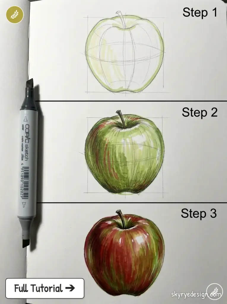
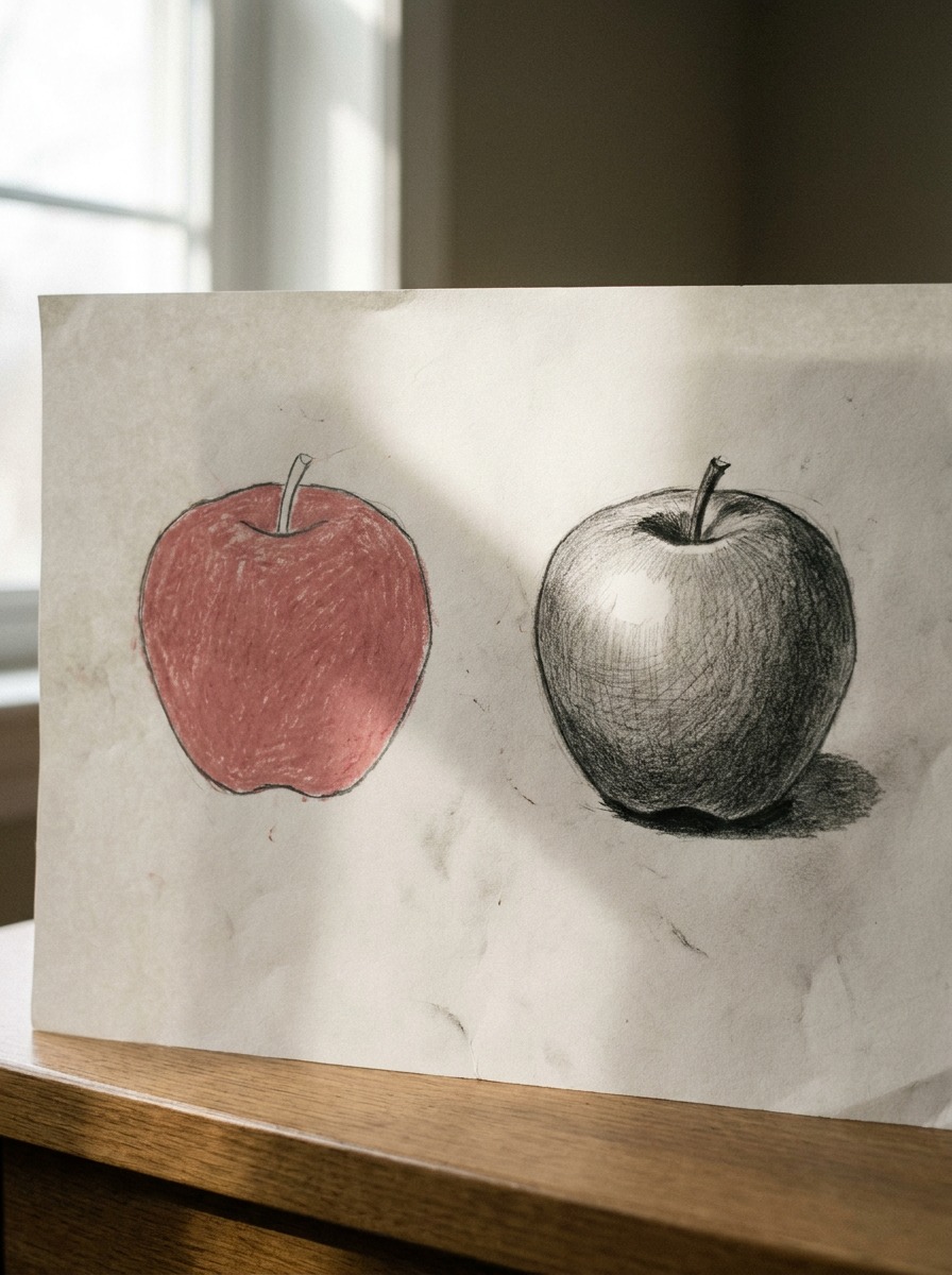
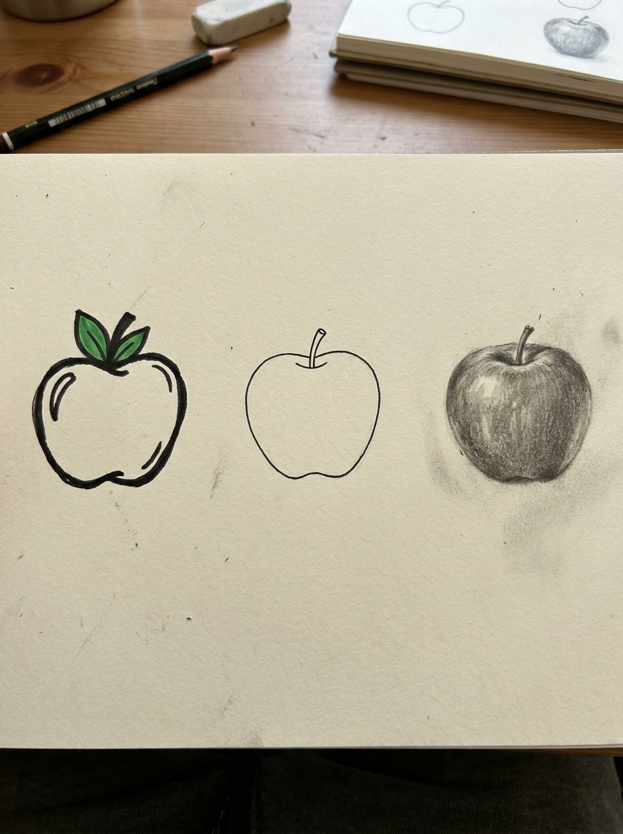
Not every apple drawing needs four shading zones and three pencil grades. Sometimes a clean, simple version is genuinely the right call, the method above is a tool, not a rule you have to apply every time you pick up a pencil.
When a simple/easy apple is the right call
If you’re illustrating a recipe card, sketching a quick icon, or drawing alongside a kid who wants to see fast results, go simple. A rounded outline, a stem, maybe two flat tones for basic dimension, that’s enough, and forcing full realistic shading onto something that needs to read instantly at a small size actually works against you. I keep a stripped-down version of this method in my own sketchbook for exactly that reason: fast personal-project thumbnails where speed matters more than form.
When to go fully realistic
Reach for the complete method when the drawing needs to hold up to close inspection, portfolio pieces, still-life practice, anything where you’re specifically training your eye for light and form. This is also the version worth doing if you’re new to shading in general and want a low-stakes subject to practice the four-zone logic on before applying it to something harder, like a face or a car’s surfacing.
There’s no wrong choice here, just a mismatch when the technique doesn’t match the purpose. A fully rendered apple on a birthday card is overkill. A flat, outline-only apple in a portfolio next to figure studies undersells what you can actually do.
Common mistakes that flatten the drawing
Even with the four-zone method in hand, a few habits keep sneaking back in. Watch for these.
Highlight too big or too white
A highlight that takes up a quarter of the apple’s surface reads as a smudge, not a light source. Keep it small, often no larger than a fingernail relative to the whole apple, and let the surrounding paper do more of the work. If you’ve already blended over your intended highlight area, your kneaded eraser can lift some brightness back, though it’s never quite as clean as leaving it untouched from the start.
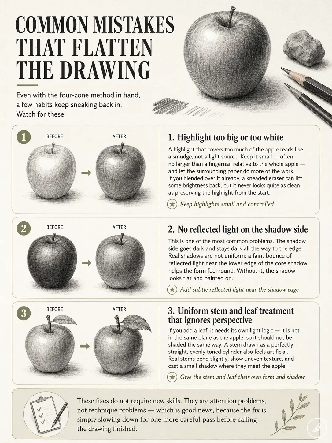
No reflected light on the shadow side
This is the mistake I catch most often when someone shows me their work. The shadow side goes dark and just stays dark, all the way to the edge. Real shadows aren’t uniform, that faint bounce of reflected light near the bottom edge of the core shadow is subtle, but its absence is exactly what makes a shadow read as flat, painted-on darkness instead of a shadow wrapping around a form.
Uniform stem and leaf treatment that ignores perspective
If you add a leaf, it needs its own light logic, it’s not sitting in the same plane as the apple’s body, so it shouldn’t be shaded identically. A stem drawn as a perfectly straight, evenly toned cylinder also gives away the drawing instantly. Real stems have slight bends, uneven bark texture, and their own small cast shadow onto the apple’s skin where they meet.
None of these fixes require new skills. They’re attention problems, not technique problems, which is honestly good news, because it means the fix is just slowing down for one more pass before you call the drawing finished.
Conclusion
The outline was never the hard part. A lopsided circle with a dent takes thirty seconds. What actually separates a flat red shape from something that looks like it’s sitting on a table is light, one consistent direction, tracked honestly across four zones, built up in patient layers instead of one dark pass.
If you take one thing from this: pick a light source and draw three apples this week, focusing on nothing but the four zones each time. Highlight, core shadow, reflected light, cast shadow. Skip the color entirely if it’s distracting you from the form. Once that logic is automatic on something as simple as an apple, it carries straight over to faces, folds of fabric, or a car door catching afternoon light, the object changes, the physics of light doesn’t.
FAQ
How do you draw an apple easy?
Skip the four-zone shading method and stick to construction: draw a lopsided circle, add a small dent at the top for the stem, and a slight flat spot at the base. Fill it with one or two flat tones instead of a full gradient. Takes under five minutes and works fine for icons, recipe cards, or quick sketches.
How do you draw a realistic apple?
Start with accurate construction (an asymmetrical sphere, not a perfect circle), then shade in three pencil passes (2B, 4B, 6B) tracking four light zones: highlight, core shadow, reflected light, and cast shadow. The cast shadow onto the table is what sells the realism.
How do you shade an apple with a pencil?
Work in layers, lightest to darkest. Lay a flat 2B pass everywhere except the highlight, deepen the core shadow with a 4B, then use a 6B only for the darkest edge of the core shadow and cast shadow. Blend transitions gently with a paper stump, leaving the highlight untouched.
What pencil grade is best for shading an apple?
A 2B for construction and light midtones, a 4B for building general shadow depth, and a 6B reserved for the darkest accents only. A single pencil for the whole drawing usually ends up over-worked and shiny.
Why does my apple look flat?
Almost always one of two things: the outline was drawn as a perfect circle instead of an asymmetrical sphere-with-a-dent, or the shading skipped reflected light and the cast shadow. A shadow side that goes uniformly dark with no bounce-light near the edge is the biggest giveaway.
Can you draw an apple digitally the same way?
Yes, the four-zone light logic is medium-independent. Digitally you’d typically block in flat color first, then use layered brushes for the same gradients a 2B-to-6B pencil sequence builds by hand. The construction and light-direction planning carry over exactly.
How long does it take to learn to shade realistically?
A careful single apple study with the layered-pencil method usually takes 45 minutes to over an hour once you know the four zones. Getting the judgment to place those zones without a diagram takes closer to a few weeks of regular practice.
- 508shares
- Facebook0
- Pinterest508
- Twitter0
- Reddit0