I once sent a hero image to a print shop at 150 DPI because the file “looked fine on screen” and watched a six-foot trade show poster come back with a subject’s face reading like a pixelated screenshot from across the room.
- What changes when you move to digital output
- Getting color right before the run, not after
- Resolution and where output actually fails
- Choosing a substrate that matches the space
- Finishes that decide how long it lasts
- Working at large format without losing control
- Durability: indoors versus outdoors
- When digital output actually makes sense
This isn’t a walkthrough of software or layout. It’s the production side — the decisions that happen after the artwork is finished and before it’s hanging on a wall, decisions that determine whether that poster still looks sharp a year from now or fades and curls within a season.
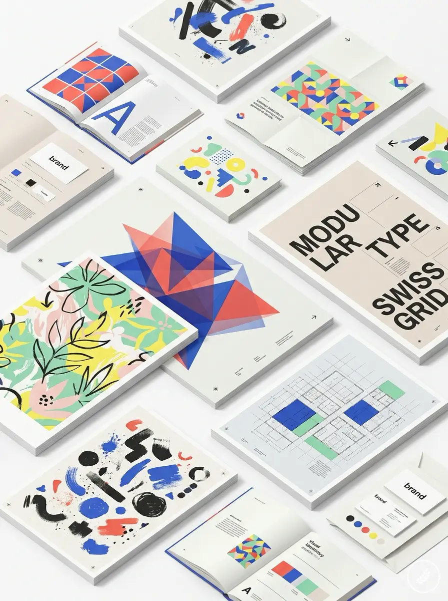
That mistake taught me more about production than any brief ever did. Digital poster printing has made the technical side of getting a poster right more forgiving than it used to be — no plates, no long setup, fast turnaround on both a single proof and a full run — but it hasn’t made the fundamentals optional. Resolution, color, substrate, and finish still decide whether a poster reads as professional or looks like it was rushed.
For poster and print projects that include a new brand mark, export a clean Canva logo file early and check whether it stays sharp before the layout is enlarged for production.
What changes when you move to digital output
The core shift with digital output is that artwork goes straight from file to substrate, with no plates and no fixed minimum run. That sounds like a footnote, but it changes how you should treat every file you send. With plate-based methods, a mistake caught after setup was expensive enough that shops built in extra proofing steps almost by necessity. With digital output, a flawed file gets printed exactly as flawed as it was made — fast, and often before anyone catches the issue.
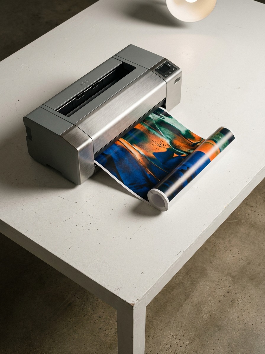
I’ve noticed this cuts both ways on real jobs. A gallery client of mine reprints exhibition posters between shows with small text and pricing changes, and being able to update one line without touching the rest of the layout has saved her real money over three years of shows. But I’ve also watched a marketing team send five versions of the same poster in one afternoon because nothing forced them to slow down and check color and resolution before hitting send. Speed removes friction. It doesn’t remove responsibility for the file itself.
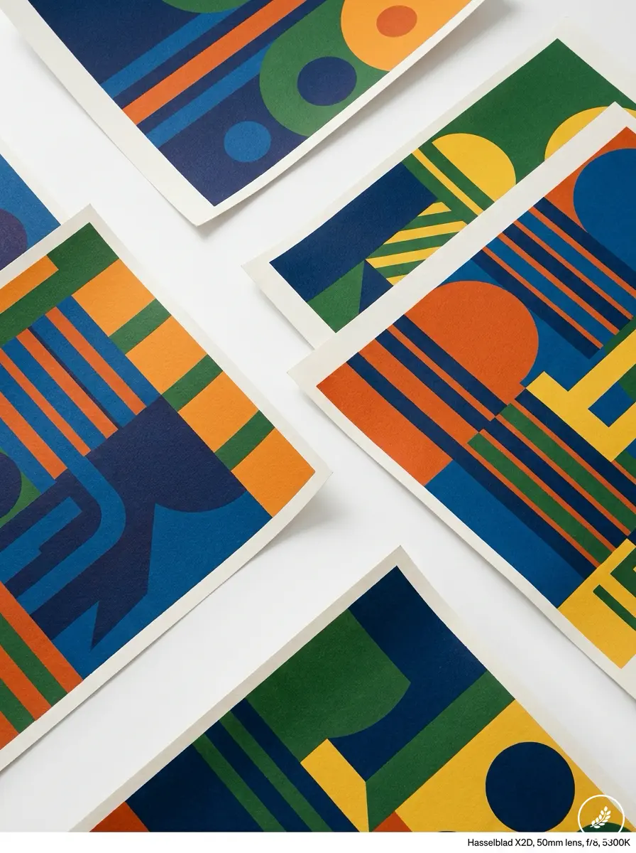
The practical takeaway: treat every file as final the moment you export it, because increasingly, it functions that way. There’s no proofing stage built into the process the way there once was — that stage is now on you.
Getting color right before the run, not after
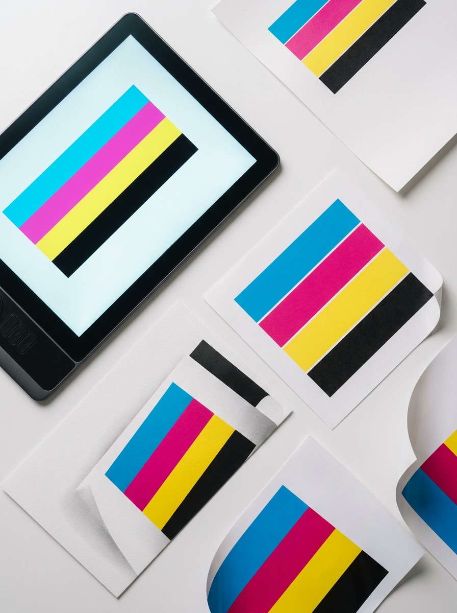
Color is where most poster problems start, and it happens well before ink touches paper. Your monitor and the printer’s output device are two completely different systems for describing color, and if you don’t reconcile them with a proper color profile, what you approved on screen and what comes off the printer can diverge more than people expect — sometimes only slightly, sometimes enough to shift a brand red into something closer to orange.
This is where working in CMYK from the start matters more than most people realize. RGB files hold a wider range of color than most printers can physically reproduce, so a saturated blue or a neon green that looks perfect on a laptop screen often has no direct equivalent in ink. Converting to CMYK early — not as a last step before export — lets you see and correct those shifts while you can still adjust the design, rather than discovering them on a finished poster.

I request a soft proof or a physical test swatch on every job that involves brand color, the same instinct I picked up matching automotive paint codes early in my career, where “close enough” on a screen was never close enough on a finished panel. A calibrated monitor helps, but it doesn’t replace a real color profile matched to the specific printer and substrate being used. Different papers absorb ink differently — a matte stock and a gloss stock can render the same file’s color noticeably differently, which is one more reason to test on the actual material before committing to a full run.
Resolution and where output actually fails
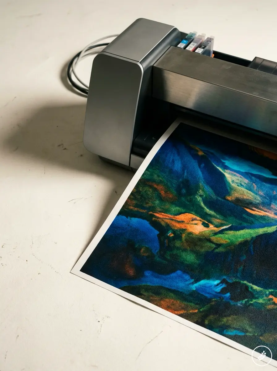
Every poster failure I’ve traced back to its source comes down to one of two things: a file that wasn’t built for its final size, or an image that was upscaled past what it could support. Neither is a printer problem. Both start at the file stage.
The standard for close-viewing print is 300 DPI at final size, but posters aren’t viewed up close, so that number needs adjusting rather than treated as gospel. A bus shelter poster or a large trade show backdrop viewed from six feet away can hold up at 150 DPI, sometimes lower, because the viewing distance does some of the work your resolution doesn’t have to. The mistake I see constantly is designers building at screen resolution — 72 DPI — and only discovering the gap once a file is enlarged for a banner-sized print.
Vector elements — logos, typography, icons — should stay vector through the entire process rather than getting flattened into a raster file early. A vector logo scales to any poster size without losing a single sharp edge. A raster version of that same logo, even at high resolution, starts to soften the moment you push it past its native size. I keep source logo files in vector format specifically so a poster job scaling from a flyer to a five-foot standee doesn’t require rebuilding assets from scratch.
Choosing a substrate that matches the space
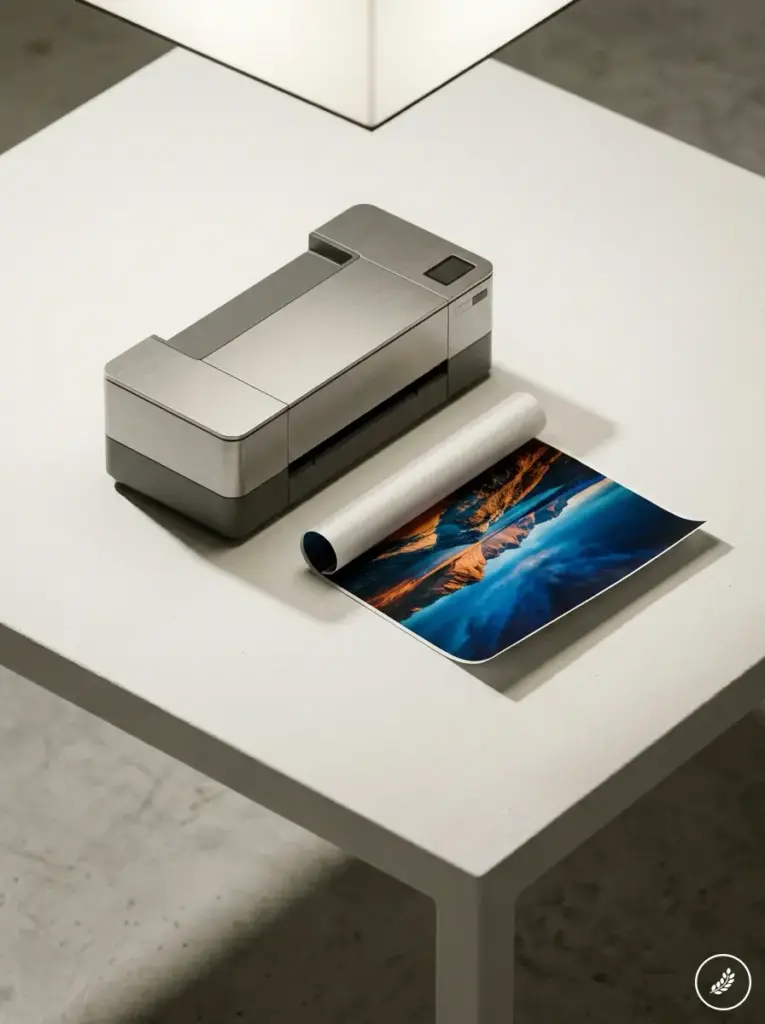
The material a poster gets printed on isn’t a finishing choice — it’s a structural one, and it should get decided before the file is even finalized, because different substrates handle ink and light differently.
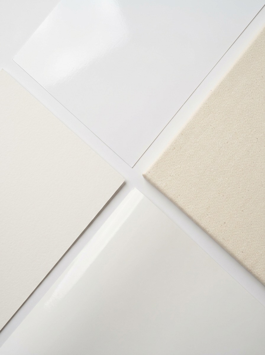
Gloss stock pulls the most out of photography. Saturated color, sharp contrast, real depth in an image — I reach for gloss on anything image-heavy, gallery prints, product photography, portrait-driven event graphics. The tradeoff is glare under direct light, which makes it a poor choice for a poster mounted across from a window or under harsh overhead fixtures.
Matte stock trades some of that vibrancy for legibility. Text stays sharp and readable from an angle, and there’s no reflection competing with the content, which is why I default to matte for anything text-heavy — informational displays, wayfinding, conference signage where someone needs to read it walking past rather than standing still in front of it.
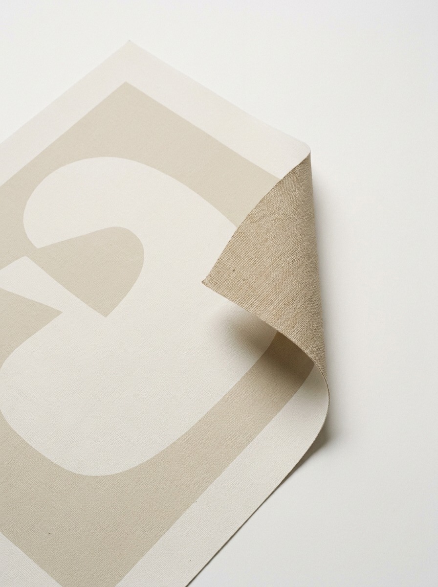
Canvas earns its keep on anything meant to read as an art object rather than a flat print. The texture catches light the way a painted surface does, and it changes how a piece feels on a wall even before anyone gets close enough to look at detail. I’ve used it for limited-run prints where the client wanted something that didn’t look mass-produced, even though the production process behind it absolutely was.
For anything going outdoors or into a high-traffic space, vinyl and polypropylene substrates handle moisture and UV exposure in a way paper stocks simply can’t. A construction site banner or an outdoor event sign on standard paper stock will curl and fade within weeks. The same graphic on a synthetic substrate holds its color and shape through a full season of weather.
Finishes that decide how long it lasts
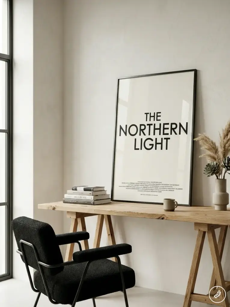
A finish isn’t decoration. It’s the layer that determines whether a poster survives handling, humidity, and sunlight, or starts degrading the first time someone brushes against it.
Laminate is the finish I specify most often for anything that gets touched, moved, or displayed for more than a few weeks. A matte laminate cuts glare while adding real scratch resistance — useful for anything at hand height, like a retail display or a poster near a doorway. Gloss laminate does the opposite job: it deepens color and adds shine, which works well for anything meant to look premium under gallery-style lighting, but it will pick up fingerprints and show every smudge faster than matte will.
UV coating is worth the added step for anything spending real time in sunlight. It’s a thin protective layer that slows fading significantly compared to an uncoated print, and on outdoor or window-facing pieces, that difference shows up within the first month rather than the first year.
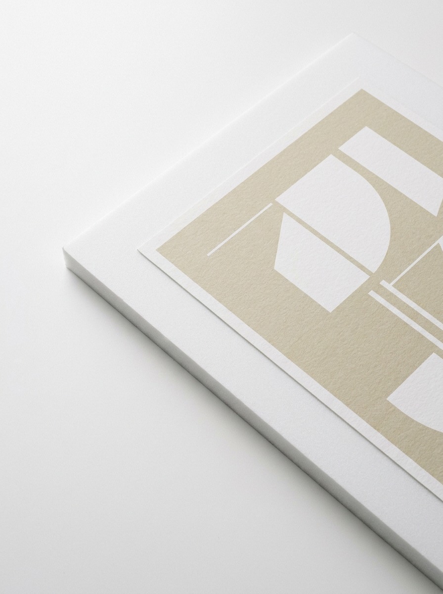
Mounting changes the physical behavior of a poster more than people expect going in. A print mounted to rigid foam board holds flat without warping and reads as a finished object rather than a sheet of paper pinned to a wall — I use this constantly for standees and any display meant to stand on its own without a frame. For something long-term and higher-value, mounting to acrylic or aluminum composite adds real rigidity and a cleaner edge, at a cost that only makes sense once you’re past a temporary campaign and into something meant to last.
Working at large format without losing control
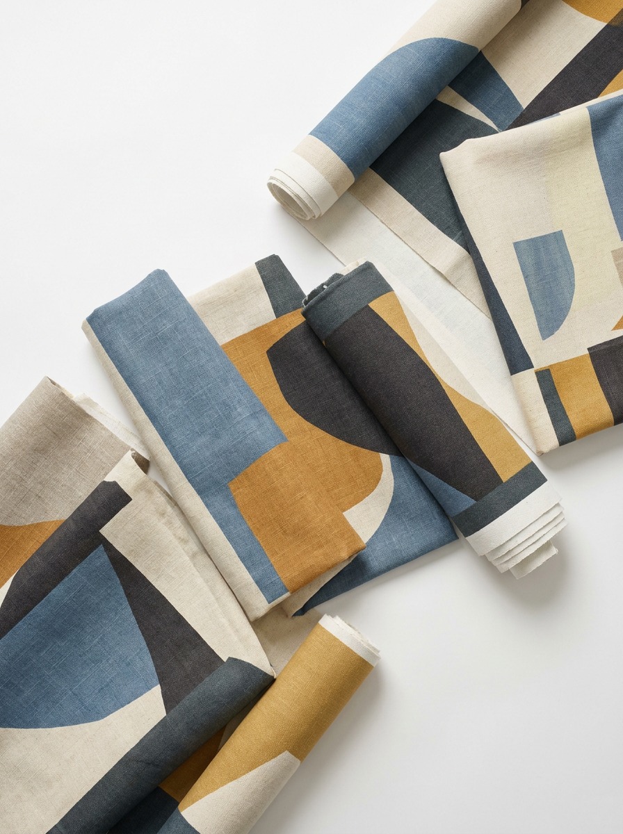
Large format is where the small mistakes in a file stop being small. A resolution gap that’s invisible on a letter-sized proof becomes obvious the moment that same file gets scaled to fill a six-foot banner, because the viewing distance doesn’t always compensate the way people assume it will.
I build large-format files at a fraction of final size — usually 25 to 50 percent — with resolution set high enough that scaling up doesn’t introduce visible softness. This keeps file sizes workable without sacrificing the sharpness the final piece needs at true scale. It also means proofing on a standard desk printer at reduced size still gives you an honest read on color and layout before committing to the full run.
Bleed and safe margins matter more at large format, not less, because the physical trimming and mounting tolerances scale up along with everything else. I build in generous bleed on any large-format job — more than I’d use on a standard flyer — because a half-inch trimming variance that’s invisible on a small print becomes a visible white edge on something eight feet wide.
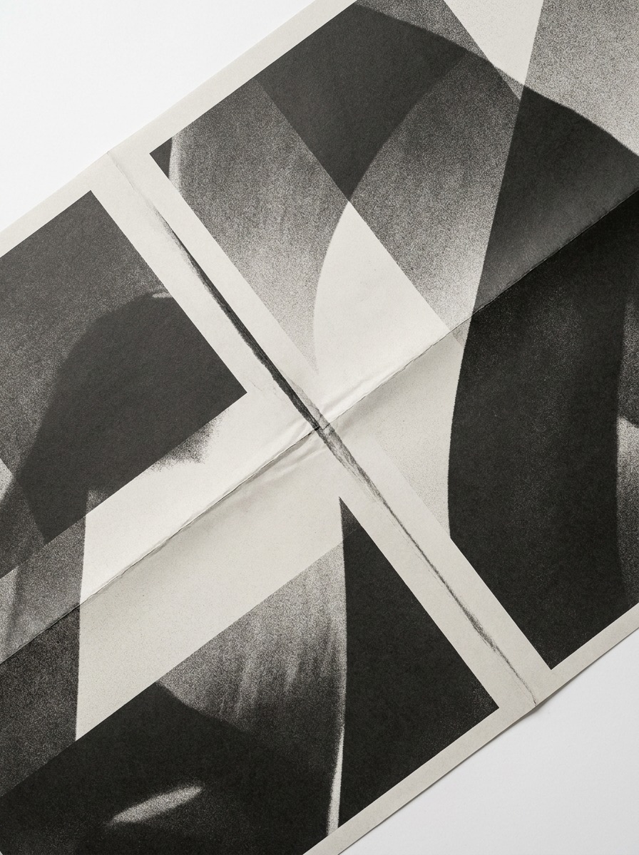
Seams are the other large-format detail people underestimate until they’ve been burned by one. Anything beyond a printer’s maximum roll width gets split into panels, and how those panels get planned — where the seam falls relative to the image content — decides whether the final piece reads as one continuous graphic or as two obviously stitched-together halves. I plan seam placement at the layout stage specifically to land in negative space or along a natural break in the composition, never through a face or a focal point.
Durability: indoors versus outdoors
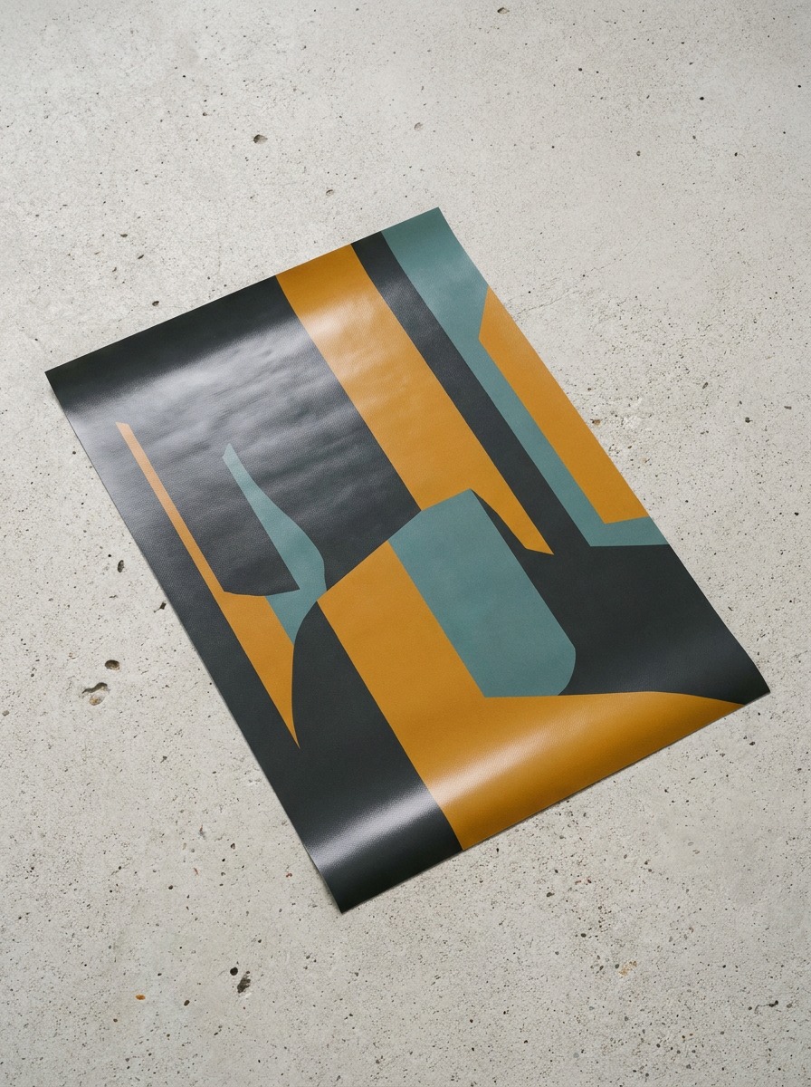
Indoor and outdoor posters are two different production problems, and treating them the same is the fastest way to end up replacing something that should have lasted.
Indoors, the main threats are handling and indirect light — fading from a sunny window over months, not weeks, along with wear from being touched, bumped, or repositioned. A laminated print on a solid substrate handles typical indoor conditions for a year or more without visible degradation, assuming reasonable lighting and no direct sun exposure.
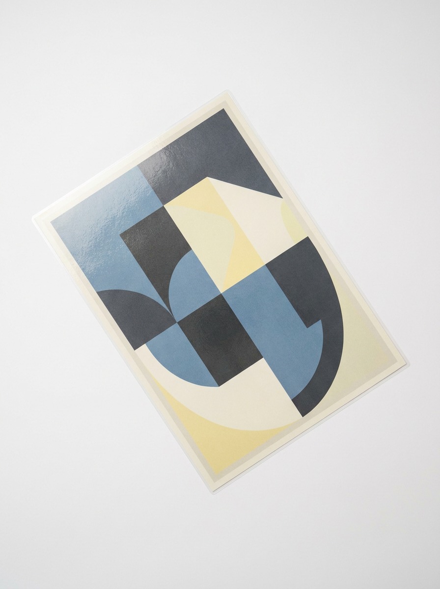
Outdoors, the calculus changes entirely. UV exposure, moisture, temperature swings, and wind all act on the material simultaneously, and a print built for indoor conditions won’t survive more than a few weeks outside. Synthetic substrates, UV-protective coatings, and weatherproof inks aren’t upgrades for outdoor work — they’re the baseline requirement. I specify vinyl with a UV laminate as the default for anything going outside for more than a single-day event, because the cost difference between that and a standard paper print is small compared to the cost of reprinting a faded banner mid-campaign.
For print-heavy projects, these portfolio examples for print designers are a useful reminder to show scale, material, file preparation, and final production context, not only the flat poster image.
When digital output actually makes sense
Digital output earns its place on jobs where speed, flexibility, or personalization matter more than the lowest possible per-unit cost at massive volume. A single proof, a short run of twenty event posters, a series where each piece needs a different name or date printed in — these are exactly the situations where digital production outperforms plate-based methods on both timeline and practicality.
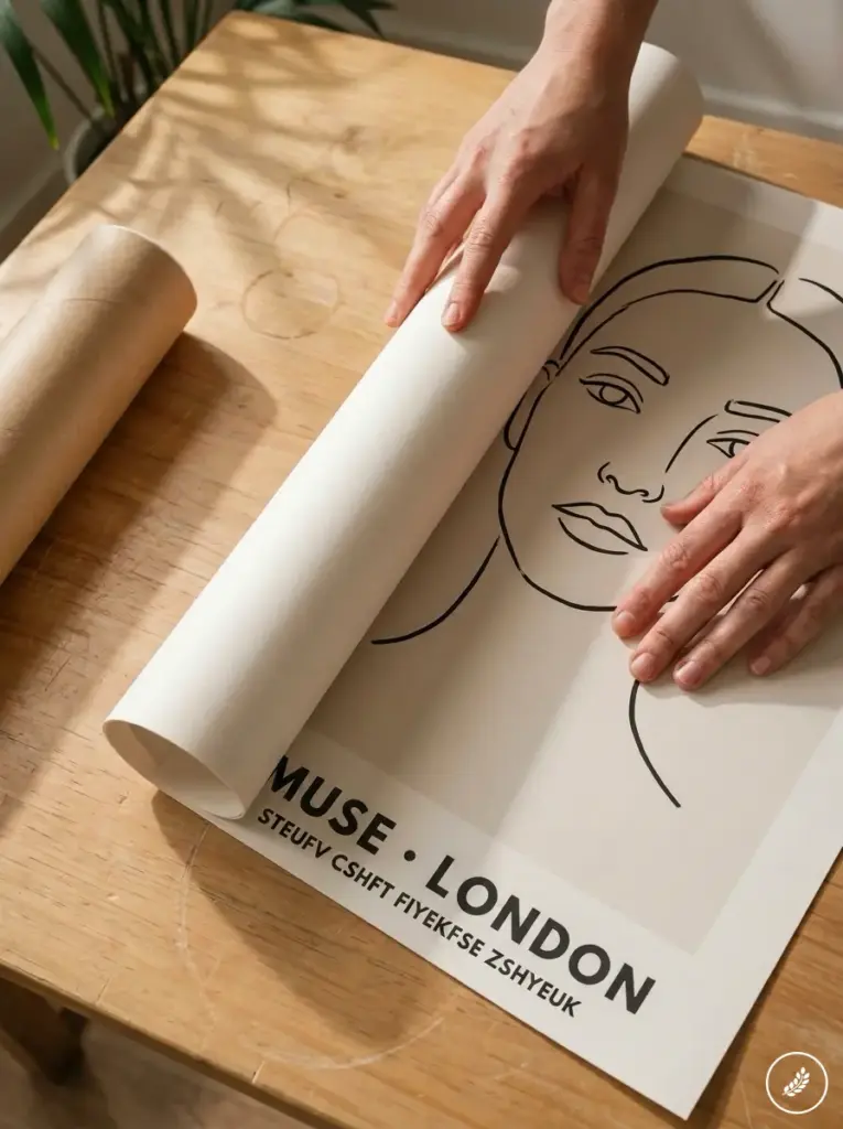
Where it makes less sense is extremely high-volume, single-design runs where the economics of scale start to favor other methods instead — tens of thousands of identical pieces with zero variation, where the setup cost that digital output avoids stops being a meaningful factor. Most of the work I do — gallery runs, event graphics, retail displays, campaign materials that get refreshed every season — sits well inside the range where digital output is the more practical, and often the better-looking, choice.
The decision that actually matters isn’t digital versus anything else. It’s whether the file, the color profile, the substrate, and the finish were chosen deliberately for where that poster is going to live — because that’s what decides whether it still looks right in a year, not which printing technology produced it.
- 35shares
- Facebook0
- Pinterest35
- Twitter0
- Reddit0