I’ve noticed something walking past tattoo shops and scrolling through client reference photos over the years: infinity tattoos are one of the few designs that consistently look worse at five years than they did at five weeks. Not because people regret them — because the symbol itself is deceptively hard to execute well, and almost nobody talks about why.
- What an Infinity Tattoo Actually Means
- Why a Simple Symbol Is the Hardest Tattoo to Get Right
- Placement Logic — Where an Infinity Tattoo Actually Reads Well
- Fitting Names Into an Infinity Symbol Without It Looking Cramped
- The Infinity Heart — A Combination That's Easy to Get Wrong
- Infinity Tattoos for Couples — Avoiding the Generic Matching-Set Look
- Styles That Pair Well With an Infinity Symbol
- Conclusion
- FAQ
- What does an infinity tattoo mean?
- Is an infinity tattoo a bad or overdone choice?
- Where should an infinity tattoo go on the body?
- How do you add names to an infinity tattoo?
- What does an infinity heart tattoo mean?
- How small can an infinity tattoo be and still hold up?
- What's a good infinity tattoo idea for couples?
Search “infinity tattoo ideas” right now and you’ll get stock photo galleries and a definition that stops at “it means forever.” True, but not useful. What actually determines whether an infinity tattoo still looks sharp in a decade has almost nothing to do with meaning and everything to do with line weight, scale, and placement — the kind of design reasoning that never makes it into a Pinterest board.
This isn’t another gallery. It’s what the symbol actually communicates beyond “forever,” why a simple loop is one of the harder tattoos to get right, where it actually reads well on the body, how to handle names and hearts without the composition falling apart, and how to avoid the generic matching-couple version everyone’s already seen.
What an Infinity Tattoo Actually Means
The infinity symbol didn’t start as a tattoo motif at all — it started as math. Understanding that origin actually explains a lot about why the symbol carries the emotional weight it does today.
Beyond “forever” — the mathematical lemniscate origin and how meaning shifted
The infinity symbol, technically called a lemniscate, was introduced by mathematician John Wallis in 1655 to represent an unbounded quantity — a value with no limit. It took another few centuries for the shape to migrate from equations into jewelry and eventually tattoos, picking up “eternity” and “forever” as its popular meaning along the way.
That’s worth knowing because it slightly reframes the symbol: it’s not originally a romantic or spiritual icon at all. It’s a shape borrowed from a field that had nothing to do with emotion, which is part of why it reads as clean and abstract rather than decorative — there’s no built-in ornamentation the way a rose or a cross carries centuries of symbolic detail. The meaning is entirely what you bring to it.
Contexts where it carries specific weight
Beyond the generic “forever,” the infinity symbol shows up in a few contexts worth naming directly. It’s become associated with mental health awareness and recovery in some communities, sitting alongside the semicolon as a quiet marker of an ongoing story rather than an ending. It shows up as a memorial symbol too — a way to mark a continuing bond with someone who’s died, without the more literal imagery a portrait or a date might carry. And increasingly it shows up in sobriety and recovery contexts, marking a commitment with no defined endpoint.
None of these meanings are mutually exclusive, and none of them require explanation to a stranger — which is part of the symbol’s appeal. It can carry real personal weight while reading, to anyone who doesn’t know the context, as simply elegant.
Why a Simple Symbol Is the Hardest Tattoo to Get Right
Here’s the part almost nobody tells you before you get one: a simple, single-line infinity tattoo is one of the least forgiving designs in tattooing, precisely because it has nowhere to hide.
Line weight and why thin infinity tattoos blur first
Skin isn’t paper. Ink spreads slightly under the skin over time, a process tattoo artists call blowout, and how visible that spread becomes depends heavily on how thin the original line was. A single delicate line — the kind that makes an infinity symbol look elegant on day one — has almost no margin before it starts reading as fuzzy rather than crisp. A thicker line has room to soften slightly and still hold its shape. A hairline single-needle infinity loop doesn’t have that cushion, which is exactly why so many end up looking like a smudge within a few years, especially in higher-friction placement areas like the wrist or fingers.
This isn’t a reason to avoid fine line work. It’s a reason to have an honest conversation with your artist about line weight relative to where the tattoo is going, rather than defaulting to “as thin and delicate as possible” because that’s what looks best in the reference photo.
Scale-to-placement ratio — why “small and simple” has a floor
The other issue is scale. An infinity symbol has two tight curves that meet at a central crossing point, and that crossing point is where ink is most likely to blur into an illegible blob if the whole design gets shrunk too far. I’ve seen the same design look perfectly clean at two inches and completely collapse at half an inch, because nobody accounted for how much detail the crossing point actually needs to stay legible.
There’s a real floor to how small this specific shape can go before it stops reading as an infinity symbol and starts reading as an ambiguous loop. Anyone promising a tiny, delicate infinity tattoo that will “still look perfect” in five years is skipping over a real physical constraint of the design.
TIP: ask your artist to show you the design at actual size on your skin, with the intended line weight, before committing — not just the digital reference art. What reads as clean on a screen doesn’t always survive translation to actual scale on skin.
Placement Logic — Where an Infinity Tattoo Actually Reads Well
Placement isn’t just about visibility preference — it directly interacts with everything covered in the last section. Some spots on the body are simply more forgiving to a design this dependent on precise line weight.
Wrist, ankle, and finger — small-format placements and their tradeoffs
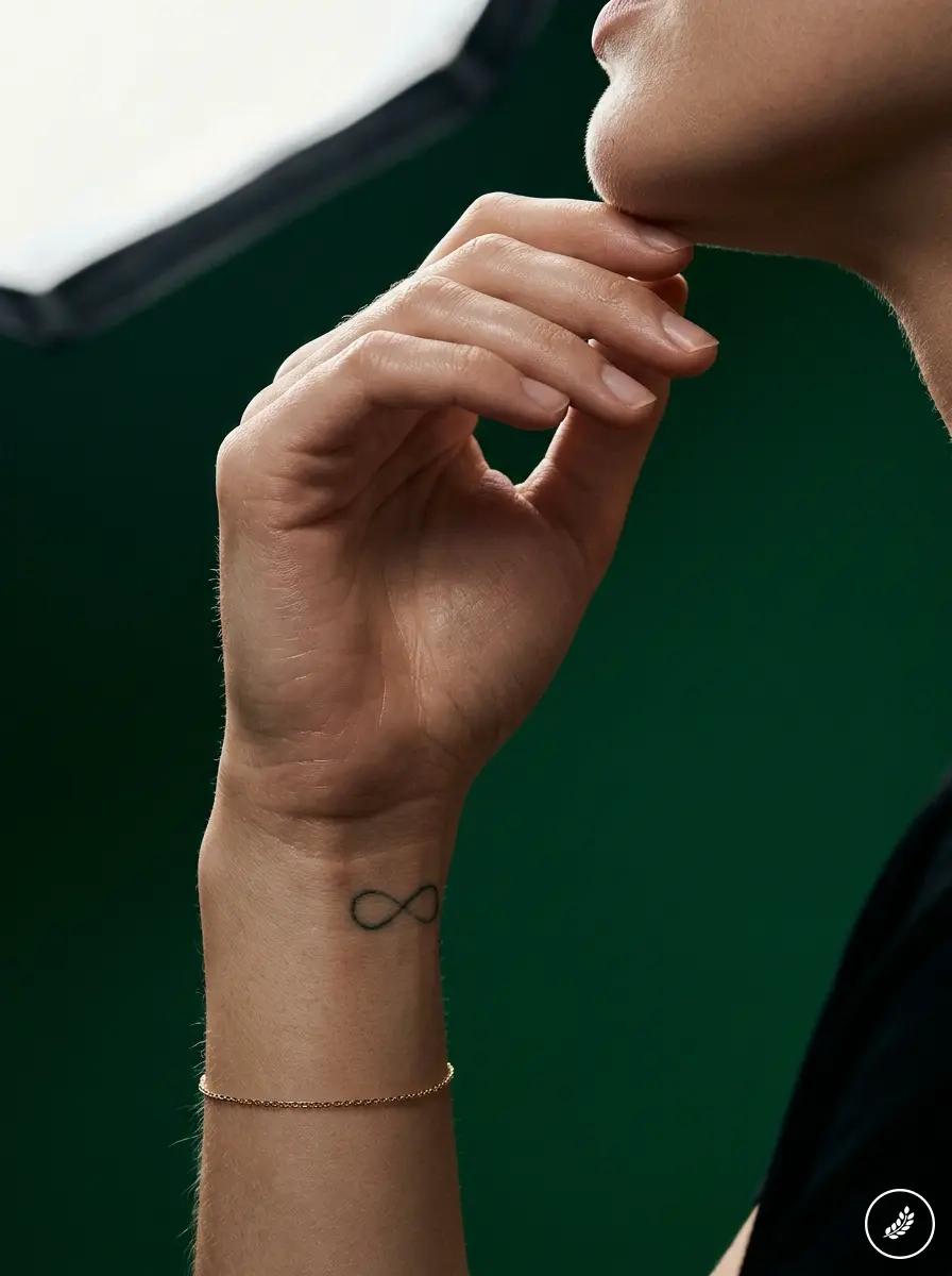
The wrist is the single most common placement for a reason: it’s a naturally flat, low-movement surface that holds fine linework reasonably well, and the horizontal orientation matches the symbol’s natural shape without needing to rotate or compress it. That said, the wrist also gets more sun exposure and friction than most people account for, which speeds up the fading that thin lines are already vulnerable to.
Finger placements are the riskiest of the small-format options. Fingers see constant friction and fastest ink migration of almost anywhere on the body — a fine-line infinity symbol on a finger has a real chance of looking blurred within a year or two, not five. Ankles fall somewhere in between: reasonably flat, moderate exposure, generally more forgiving than fingers but not as ideal as a less-exposed flat surface like the ribs or upper back.
Ribs, collarbone, behind the ear — larger-format or hidden placements
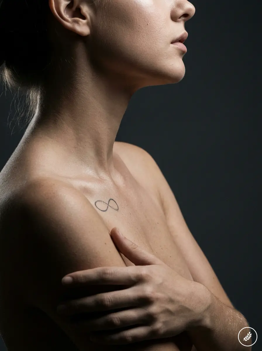
If you want a design with more longevity and don’t mind less everyday visibility, ribs, the upper back, or behind the collarbone give you a flatter, less-exposed surface that holds detail significantly better over time. These spots also give you room to go slightly larger, which — per the scale discussion above — is one of the most reliable ways to keep the crossing point from blurring into illegibility.
Behind the ear has become a popular placement for smaller infinity designs specifically because it’s both visible when wanted and easily hidden, though the skin there is thinner and can be more sensitive during the actual tattooing.
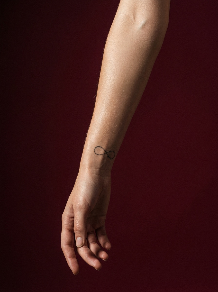


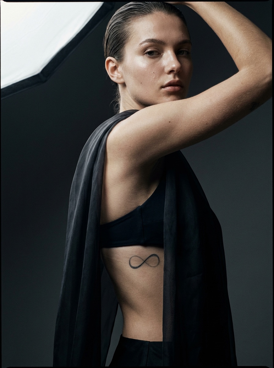


TIP: if you’re drawn to a very fine, minimal linework style, lean toward the more protected placements — ribs, upper back, behind the ear — rather than hands, fingers, or wrists, where friction and sun exposure work against the design’s longevity fastest.
Fitting Names Into an Infinity Symbol Without It Looking Cramped
This is one of the most-searched variations of this design, and also the one most likely to go wrong. An infinity loop has a specific, limited amount of usable space, and text is unforgiving about how much room it actually needs to stay legible.
Why more than two names breaks the composition
An infinity symbol has two roughly equal loops. Fitting one name along the top of each loop works reasonably well — the composition has a natural logic to it, one name per half. The moment you try to fit three or four names into the same design, something has to give: the names get compressed into a size that won’t age well, or they start stacking and crossing the symbol’s own linework in ways that fight the shape instead of working with it.
I’ve seen requests for four-name infinity tattoos that technically fit on paper and would be nearly illegible within two years on skin, simply because there wasn’t enough room for adequate line weight per letter. If you have more than two names you want included, it’s worth being honest about that early — sometimes the better solution is a larger design, a different symbol entirely, or splitting the names across two smaller companion pieces rather than cramming everything into one loop.
Lettering style and how it interacts with the loop’s negative space
Script lettering follows the loop’s curve naturally and tends to look more integrated with the symbol than block lettering, which fights the organic curve with hard right angles. That said, script also needs more vertical space to stay legible than block letters do, so the tradeoff between style and available room matters here too.
The negative space inside and around the loop matters as much as the text itself — a design where the names crowd every available inch reads as busy, while one with a little breathing room around the lettering reads as considered. That’s the same proportion principle that applies to any composition with text and shape sharing the same small space: restraint is what makes it look intentional rather than crammed.
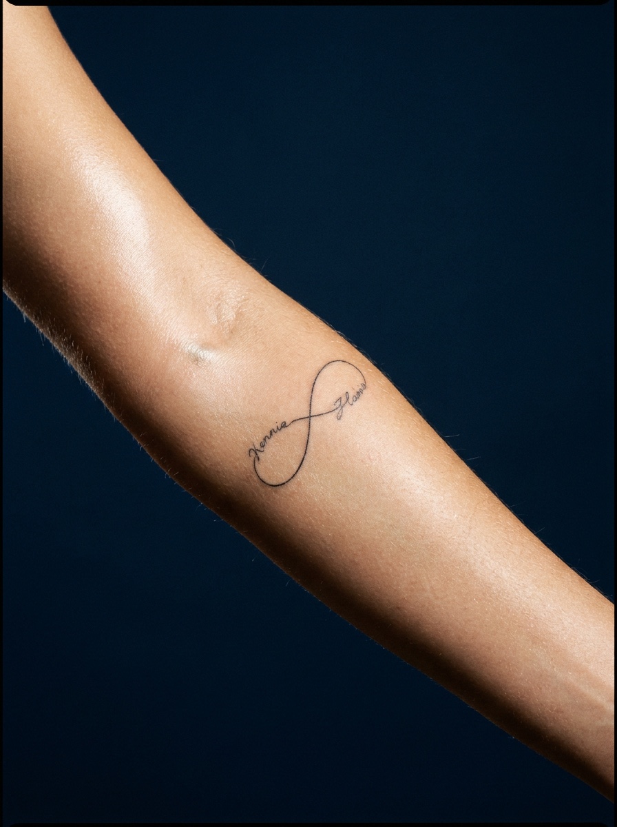
TIP: sketch your names at the actual intended tattoo size before finalizing anything. If the lettering looks tight or illegible on paper at that scale, it will look worse on skin once lines soften slightly over time.
The Infinity Heart — A Combination That’s Easy to Get Wrong
Combining an infinity loop with a heart sounds simple — two well-known shapes, one clear meaning — but the combination is trickier to execute cleanly than either symbol on its own.
What the combination actually communicates vs. the symbol alone
An infinity symbol alone reads as open-ended — forever, without specifying forever what. Add a heart and the meaning narrows immediately to romantic or familial love specifically, which is exactly why the combination has become such a common choice for couples, parents, and close family tattoos. It’s a more specific statement than the infinity symbol carries by itself, which is worth knowing if you want the open-ended, more universal version instead.
Common execution mistakes (proportion between the two shapes)
The most common mistake I see in this combination is proportion mismatch — a heart that’s either so small it reads as an afterthought stuck onto the loop, or so large it overwhelms the infinity shape and the design stops reading as an infinity symbol at all and starts reading as a heart with a decorative flourish. The two shapes need to carry roughly equal visual weight for the combination to actually read as intentional rather than one symbol awkwardly modified to include the other.
The other frequent issue is where the heart gets placed relative to the loop’s crossing point. A heart integrated directly at the crossing, replacing or overlapping that central intersection, tends to read more cleanly than one floating separately above or beside the loop, because it uses the existing structure of the symbol rather than adding a second, disconnected element competing for attention.
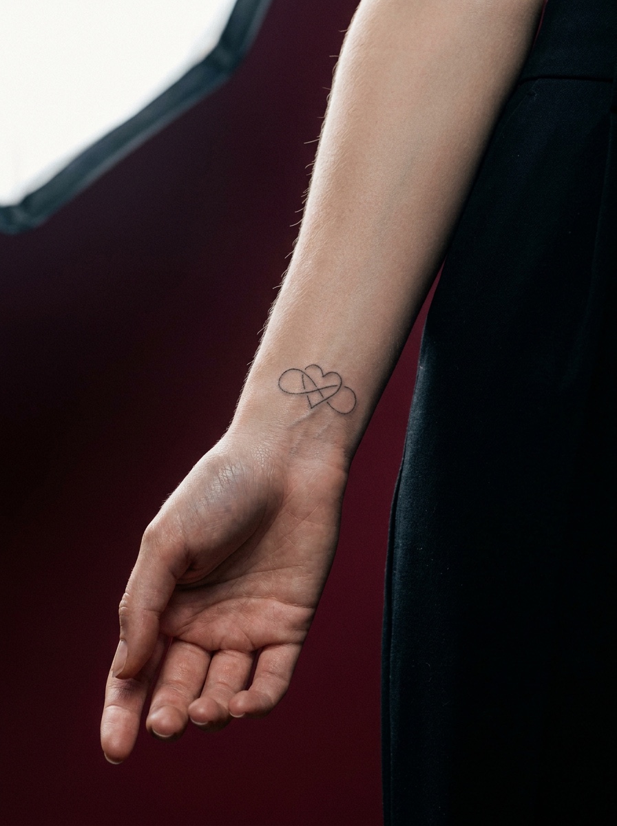
TIP: if you’re set on this combination, ask to see it sized at actual scale before committing — proportion problems between two shapes are much easier to catch on paper at real size than to fix once the tattoo exists.
Infinity Tattoos for Couples — Avoiding the Generic Matching-Set Look
Matching infinity tattoos are one of the most requested couple’s designs, and also one of the easiest to make forgettable if both people just get the exact same symbol in the exact same spot.
Why identical matching designs read as less considered than complementary ones
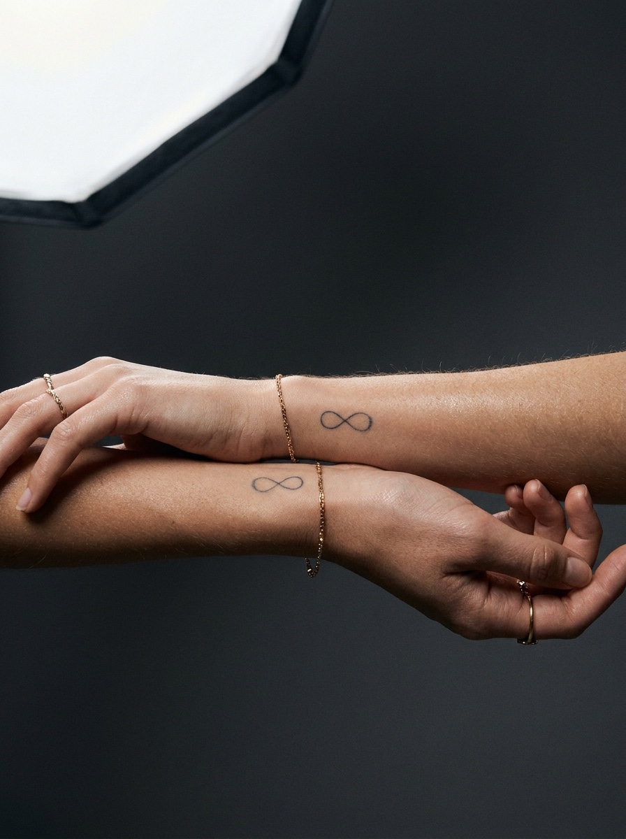
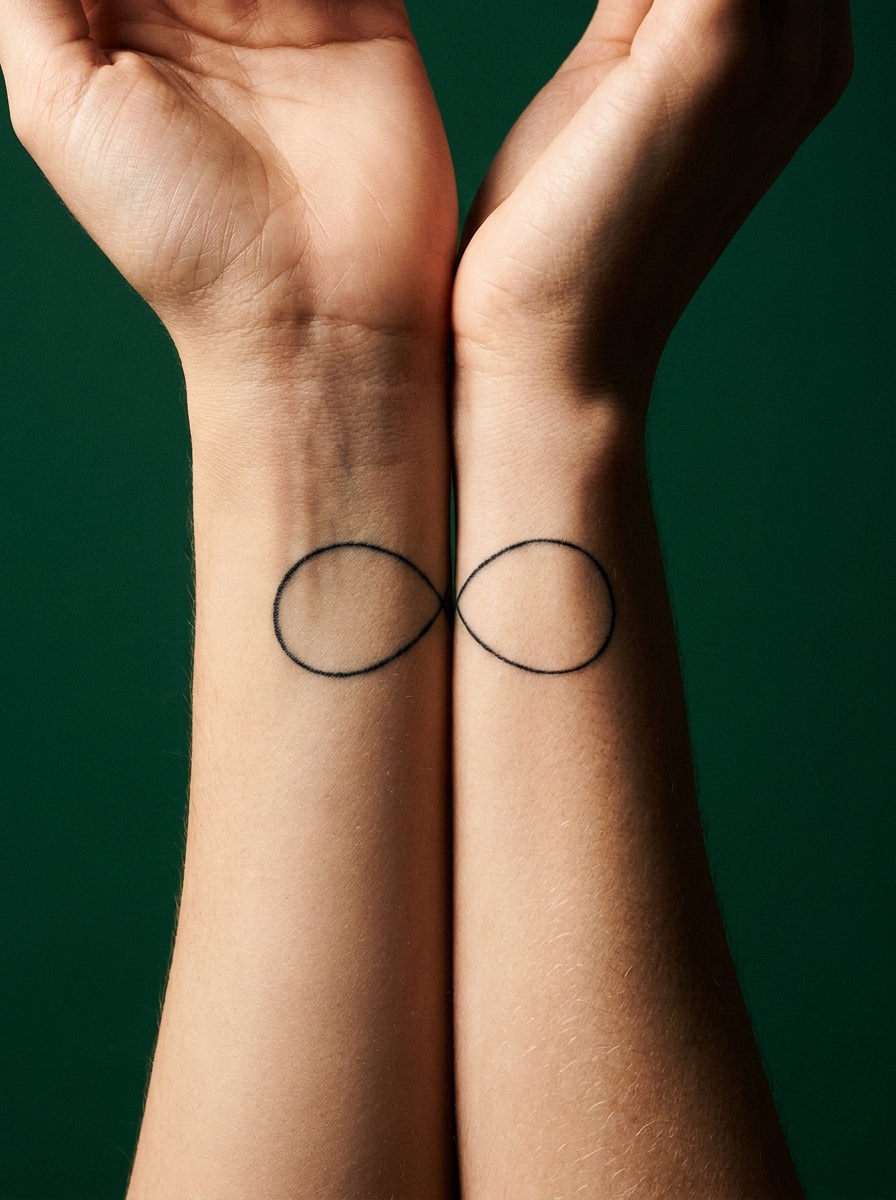
An identical matching tattoo isn’t wrong, but it’s the default version everyone’s already seen, and it misses an opportunity that a slightly more considered design doesn’t. A complementary approach — two halves of a single infinity symbol, split so that each person wears one loop rather than the full shape — reads as more specific to the relationship than two identical complete symbols ever could. The design only reads as “whole” when both people are considered together, which is a more literal expression of the symbol’s meaning than simply duplicating it.
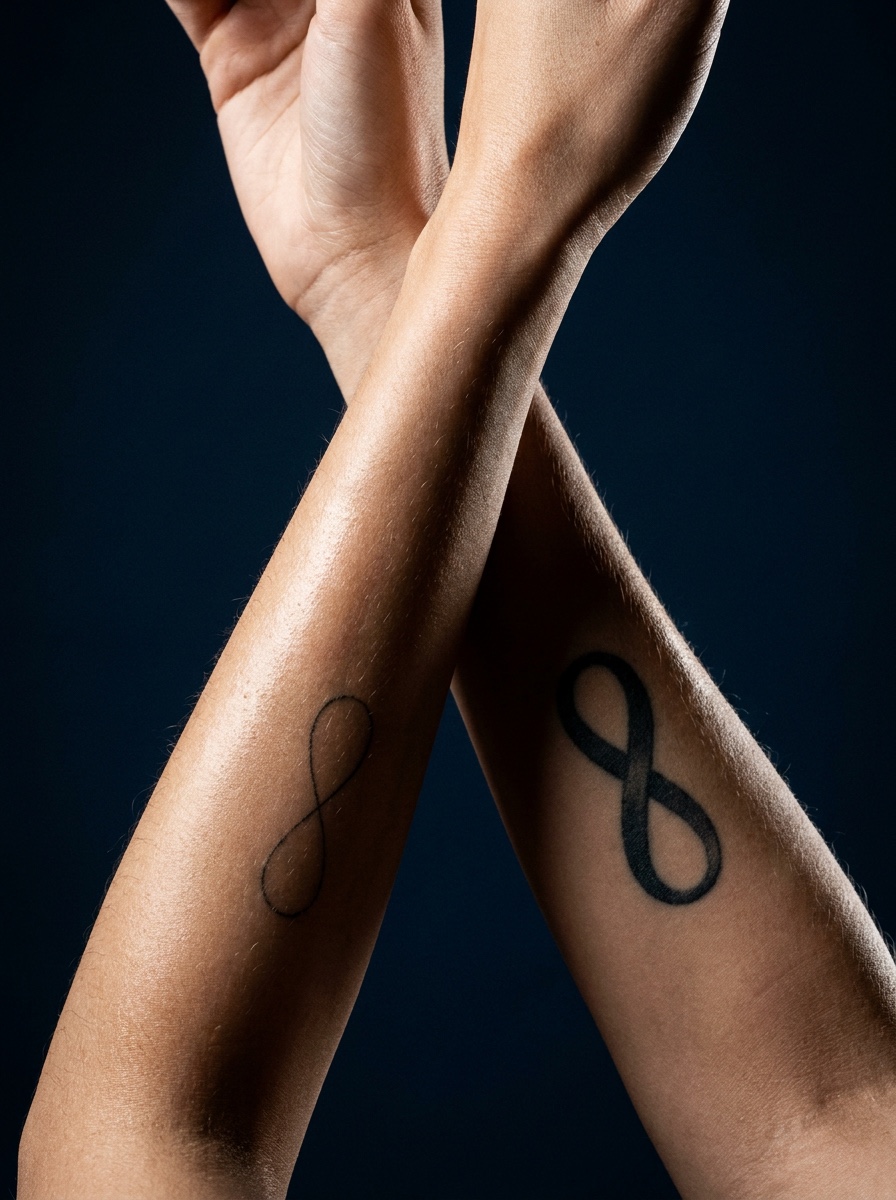
Small variations also work well without sacrificing the matching concept entirely: same symbol, different line weight; same placement, mirrored orientation; same design with one small personal detail unique to each person (a birth month color, a tiny added element) breaking up the total uniformity just enough to feel specific rather than generic.
Placement choices that make a couple’s tattoo feel intentional
Placement can do a lot of this work too. Two wrists side by side in a shared photo is the expected version. Placing the design somewhere less obviously “matching couple” — inner forearm, behind the ear, ribs — changes the tattoo from a public statement piece into something closer to a private, shared detail, which for a lot of couples ends up feeling more meaningful than the version designed to be visibly matching in every photo.
TIP: if you want a couple’s tattoo that doesn’t feel like a template, start the conversation with your artist around what’s different about your relationship rather than what infinity design looks best generically — the personal detail is what keeps it from blending into every other matching infinity tattoo.
Styles That Pair Well With an Infinity Symbol
The style choice interacts directly with everything already covered — line weight, scale, and longevity aren’t abstract concerns, they’re determined largely by which tattooing style you pick.
Fine line and single-needle work
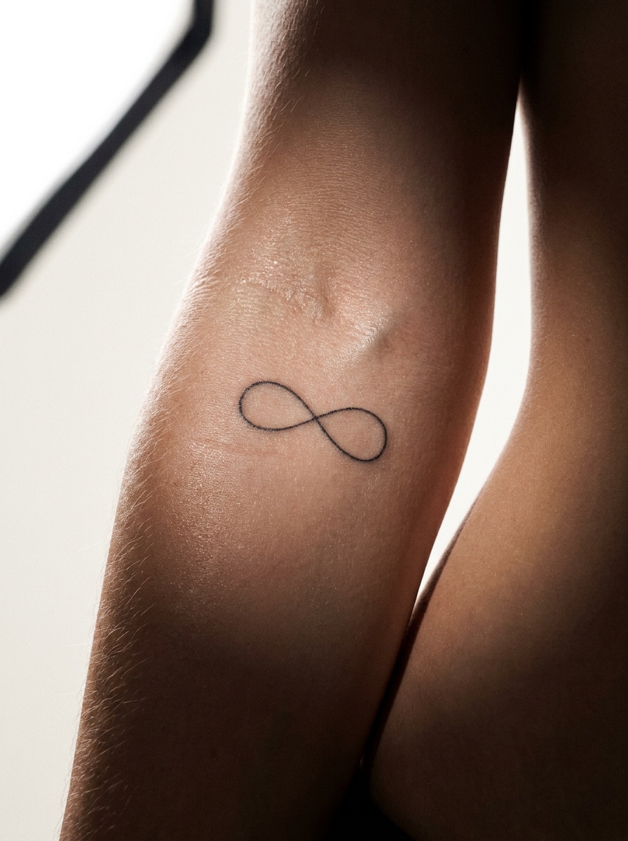
Fine line and single-needle styles are what most people picture when they think “infinity tattoo” — delicate, minimal, understated. It’s a genuinely good aesthetic match for the symbol’s clean geometry, but it’s also the style most exposed to the blowout and blurring problems covered earlier. If you’re drawn to this look, protected placement and a slightly more generous scale than you initially picture will do more for the tattoo’s longevity than anything else.
Blackwork and bolder linework for longevity
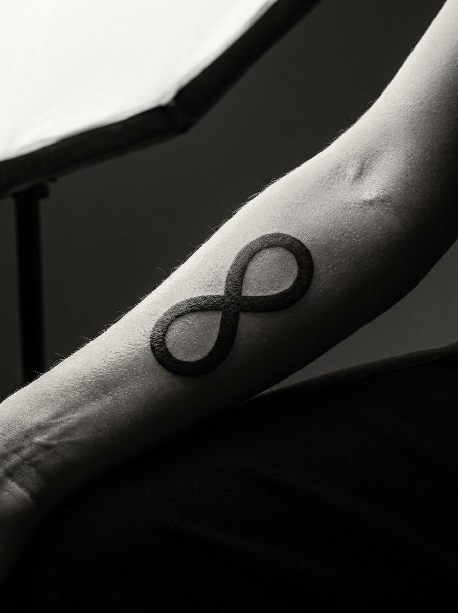
A slightly bolder line — not thick enough to look heavy, but with more substance than a true hairline — holds its shape dramatically longer, especially in higher-friction placements like the wrist or hands. Blackwork treatments, where the line has real weight and solid density rather than a delicate single pass, trade a little of that ultra-minimal look for a design that will still read clearly a decade out.
I’d rather see someone choose a slightly bolder line and keep the design simple than chase the thinnest possible line and end up with something unrecognizable in a few years. The elegance of an infinity symbol comes from its shape and proportion, not from how thin the ink is — a well-proportioned design in a moderate line weight still reads as clean and considered, and it actually survives the years better than the ultra-fine version.
Conclusion
An infinity tattoo is deceptively simple — one continuous line, one clear shape, one widely understood meaning. That simplicity is exactly why it’s harder to get right than it looks. Line weight, scale relative to placement, how names or a heart actually fit within the loop’s limited space, and which style will actually hold up over time all matter more than the shape itself. Skip that reasoning and even a beautifully drawn design can blur into an ambiguous smudge within a few years.
You don’t need to memorize all of this before your appointment.
Bring the placement you’re considering and any names or extra elements you want included, and have an honest conversation with your artist about line weight and scale before finalizing anything — not just the shape on paper. That conversation is the actual difference between an infinity tattoo that still looks sharp in a decade and one that becomes a lesson in why simple symbols aren’t always simple to execute.
FAQ
What does an infinity tattoo mean?
The infinity symbol, technically called a lemniscate, originated in mathematics before becoming a popular tattoo motif representing “forever” or eternity. Beyond that general meaning, it’s commonly used to mark ongoing bonds after loss, commitment in recovery or sobriety, and mental health awareness alongside symbols like the semicolon. Because the symbol has no built-in imagery of its own, the specific meaning is largely whatever context the wearer brings to it.
Is an infinity tattoo a bad or overdone choice?
It’s a common design, but “overdone” has more to do with execution than the symbol itself. A poorly planned infinity tattoo — too thin a line, too small a scale, placed somewhere with heavy friction — will blur and lose definition within a few years, which is what gives the design a reputation for looking generic or dated. A well-proportioned version with appropriate line weight for its placement holds up well and reads as considered rather than trendy.
Where should an infinity tattoo go on the body?
The wrist is the most common placement because it’s flat and matches the symbol’s horizontal shape, though it sees more sun and friction than people expect. Fingers wear fastest and are the least forgiving placement for fine linework. Ribs, the upper back, and behind the collarbone are flatter, less-exposed surfaces that hold detail significantly longer, making them a better choice for very fine or minimal designs.
How do you add names to an infinity tattoo?
One name per loop is the composition that works best, since an infinity symbol has two roughly equal halves. Adding three or more names usually forces the lettering too small to stay legible over time, or crowds the design until it fights the symbol’s own linework. Script lettering tends to follow the loop’s curve more naturally than block lettering, but it also needs more vertical space, so the tradeoff is worth discussing with your artist before finalizing the design.
What does an infinity heart tattoo mean?
Combining an infinity loop with a heart narrows the symbol’s open-ended “forever” meaning specifically to romantic or familial love, which is why it’s a popular choice for couples, parents, and close family tattoos. The two shapes need roughly equal visual weight to read as intentional — a heart that’s too small looks like an afterthought, while one too large overwhelms the infinity shape entirely.
How small can an infinity tattoo be and still hold up?
There’s a real physical floor to this. The symbol’s central crossing point needs enough space to stay legible once ink softens slightly under the skin over time, and shrinking a design too far collapses that detail into an illegible blob. A design that looks clean at two inches can fail completely at half that size. Asking to see the design at actual intended size, in the intended line weight, before committing is the most reliable way to catch this problem early.
What’s a good infinity tattoo idea for couples?
Identical matching symbols are the most common choice but also the least specific to the relationship. A complementary design — where each person wears one half of a single infinity symbol that only reads as complete when both halves are considered together — carries more meaning than duplicated matching tattoos. Small individual variations (line weight, a personal detail, mirrored orientation) or a less obviously “matching” placement can also make the design feel considered rather than templated.
For more placement and style starting points, browse the broader tattoo ideas archive before narrowing the design with your artist.
- 51shares
- Facebook0
- Pinterest51
- Twitter0
- Reddit0