Most people who want a zodiac tattoo start and stop at the same place: the plain glyph, copied straight off a Pinterest board, inked at whatever size the artist suggests. It’s fine. It’s also the reason so many zodiac tattoos end up looking identical to a thousand others, or worse, blur into an illegible smudge five years later because nobody thought about how that specific shape holds up at that specific size.
- What Actually Makes a Zodiac Tattoo Work
- Fire Signs: Aries, Leo, Sagittarius (Bold Lines, Visible Placement)
- Earth Signs: Taurus, Virgo, Capricorn (Understated, Botanical)
- Air Signs: Gemini, Libra, Aquarius (Geometric, Asymmetric)
- Water Signs: Cancer, Scorpio, Pisces (Flowing, Intimate Placement)
- Beyond the Glyph: Constellations, Moon Phases, and Combination Designs
- Placement, Sizing, and Testing It First
- Conclusion
- FAQ
- What is the best zodiac sign tattoo design?
- What does a zodiac tattoo actually mean?
- Where should I place a zodiac tattoo?
- Can you combine two zodiac signs in one tattoo?
- What's a good cancer zodiac tattoo idea?
- What's a unique sagittarius tattoo idea for men or women?
- Is a semi-permanent zodiac tattoo worth trying first?
Here’s what most zodiac tattoo content skips entirely: the sign tells you the meaning, but it doesn’t tell you the composition. A Scorpio glyph and a Virgo glyph don’t behave the same way on skin — one has sharp angles that hold ink cleanly at almost any size, the other has a delicate loop that turns to mud if you go too small. I think about this the way I’d think about any small symbolic mark in a design brief: line weight, negative space, and scale aren’t decoration, they’re the difference between a piece that reads clearly in ten years and one that doesn’t.
This guide breaks down all 12 signs by element — Fire, Earth, Air, Water — because the element is really a shorthand for the design logic that suits each sign, not just a personality trait. Plus where the trend has moved past the plain symbol entirely, into constellations, moon phases, and combination pieces.
What Actually Makes a Zodiac Tattoo Work
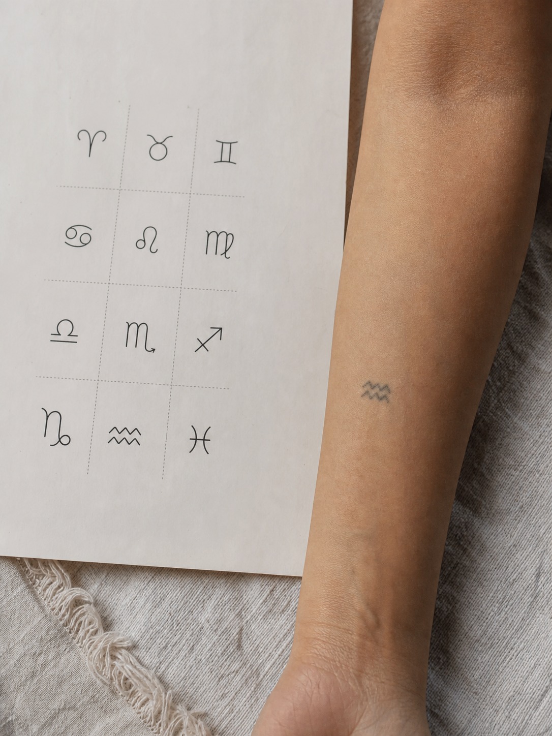
A zodiac glyph is a small mark doing a lot of work. Most of them are built from just a few curved or straight lines, which means every one of those lines has to earn its place — there’s no room in a design that small for a line that isn’t pulling weight.
Scale is where most zodiac tattoos go wrong first. A glyph with tight loops or thin crossing lines (Virgo, Pisces) can look crisp on a reference sheet and turn into a dark, illegible blob once it’s actually inked at two centimeters on a wrist. Ink spreads slightly under skin over time, no matter how skilled the artist is, so a design with fine detail needs either a slightly larger scale or a bolder line weight than it looks like it needs on paper. I’ve seen this exact problem play out with printed logos scaled down for business cards — the same lesson, different material. Detail that reads fine on a screen or a large sketch doesn’t automatically survive a size reduction.
This is also where the element groupings actually earn their keep, beyond being a fun personality framework. Fire signs (Aries, Leo, Sagittarius) tend to suit bold, confident linework because their symbols and associated motifs — horns, an arrow, a mane — already have strong angular shapes that hold up at most sizes.
Earth signs (Taurus, Virgo, Capricorn) lean toward smaller, more understated treatments because their visual language is naturally quieter — botanical detail, soft curves. Air signs (Gemini, Libra, Aquarius) suit geometric, asymmetric compositions since their symbols are more abstract to begin with. Water signs (Cancer, Scorpio, Pisces) suit flowing, curved linework, which happens to also suit the intimate placements — chest, ribs, inner wrist — most people choose for them.
None of this means you’re locked into your element’s “style.” It means understanding it gives you a reason for your choices instead of picking whatever looks good in a thumbnail.
Fire Signs: Aries, Leo, Sagittarius (Bold Lines, Visible Placement)
Fire signs get the most forgiving design math of the four elements. Their symbols and associated motifs are already bold and angular, which means they hold up at a wider range of sizes and placements than almost anything in the earth or water groups.
Aries
The Aries glyph (♈) is two curved lines meeting at a point — visually, it’s ram’s horns, and it’s one of the simplest, most recognizable marks in the entire zodiac. That simplicity is the whole appeal: it works as a minimalist tattoo without needing embellishment, and it scales down further than most other glyphs before losing clarity.
For something with more presence, a stylized ram’s head or the Aries constellation rendered as a dot pattern both read well. An arrow motif works too — it leans into the sign’s forward-moving, impulsive energy without being literal about it. Forearm, shoulder, or neck placement suits Aries best; the sign’s visual language is meant to be seen, not tucked away.

Leo
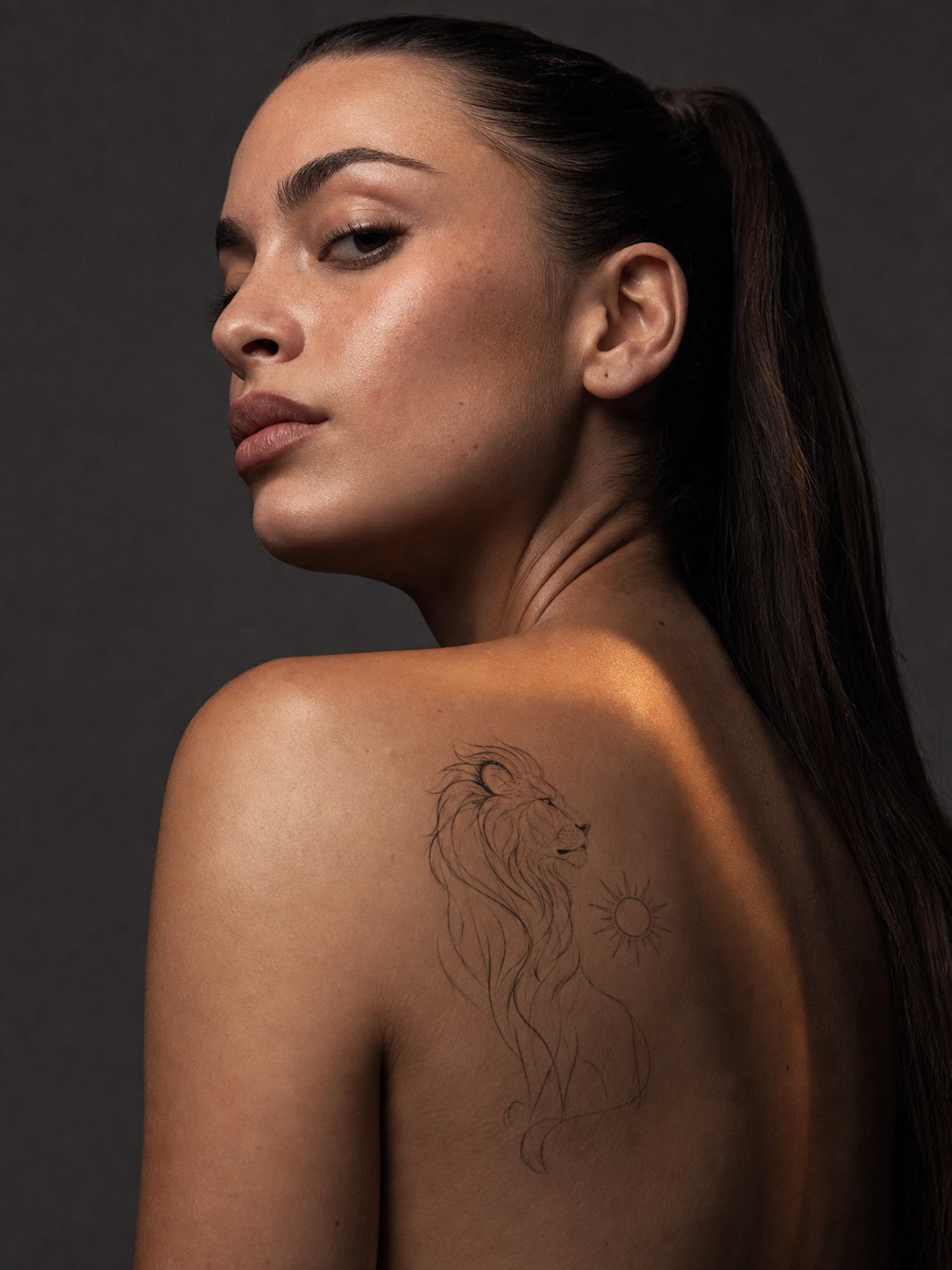
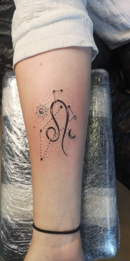
Leo wants room. The glyph (♌) has an elegant curve that works fine at small sizes, but most Leos I’ve seen go with something larger — a stylized lion’s head, a sun motif (Leo’s ruling body), or the constellation across the shoulder blade, where there’s enough space for the design to actually make a statement.
If you’re set on the glyph alone, keep the line weight bold rather than delicate — a thin, wispy Leo glyph undersells a sign whose whole visual identity is confidence. Upper arm, shoulder, and back are the placements that give a Leo design the room it wants.
Sagittarius
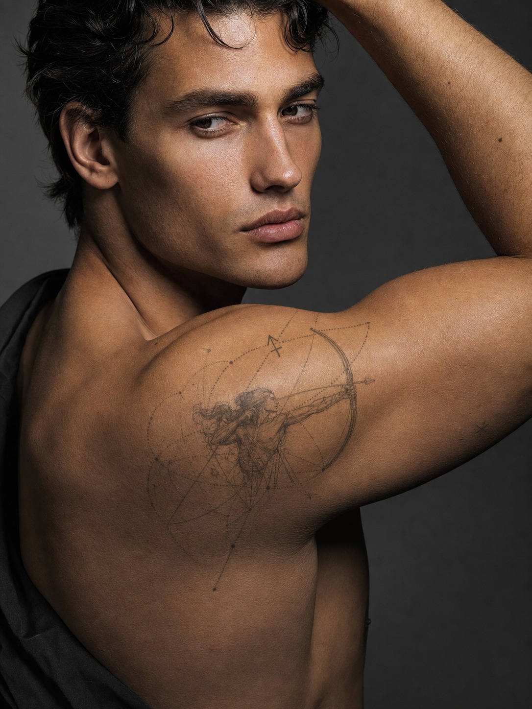
Sagittarius tattoo ideas usually center on the archer — either the literal bow-and-arrow motif or a single arrow as shorthand for the same idea. The glyph (♐) itself is a stylized arrow, so there’s a natural bridge between the symbol and the fuller archer imagery if you want to go bigger.
For sagittarius tattoo ideas male clients tend to lean toward, the archer motif combined with geometric or dotwork shading reads well on the shoulder or forearm — it has enough visual weight to hold a larger placement. For sagittarius tattoo ideas that suit female clients more often, a smaller single-arrow version on the wrist or behind the ear keeps the same symbolism without the scale. Neither is a rule — it’s about matching the design’s visual weight to how much space you actually want it to occupy.
Earth Signs: Taurus, Virgo, Capricorn (Understated, Botanical)
Earth signs are where restraint does the design work. Where fire signs can carry a bold, visible placement, earth signs generally read better small and slightly hidden — the visual language here is quieter by nature, and fighting that with an oversized, heavy-lined piece tends to look off.
Taurus
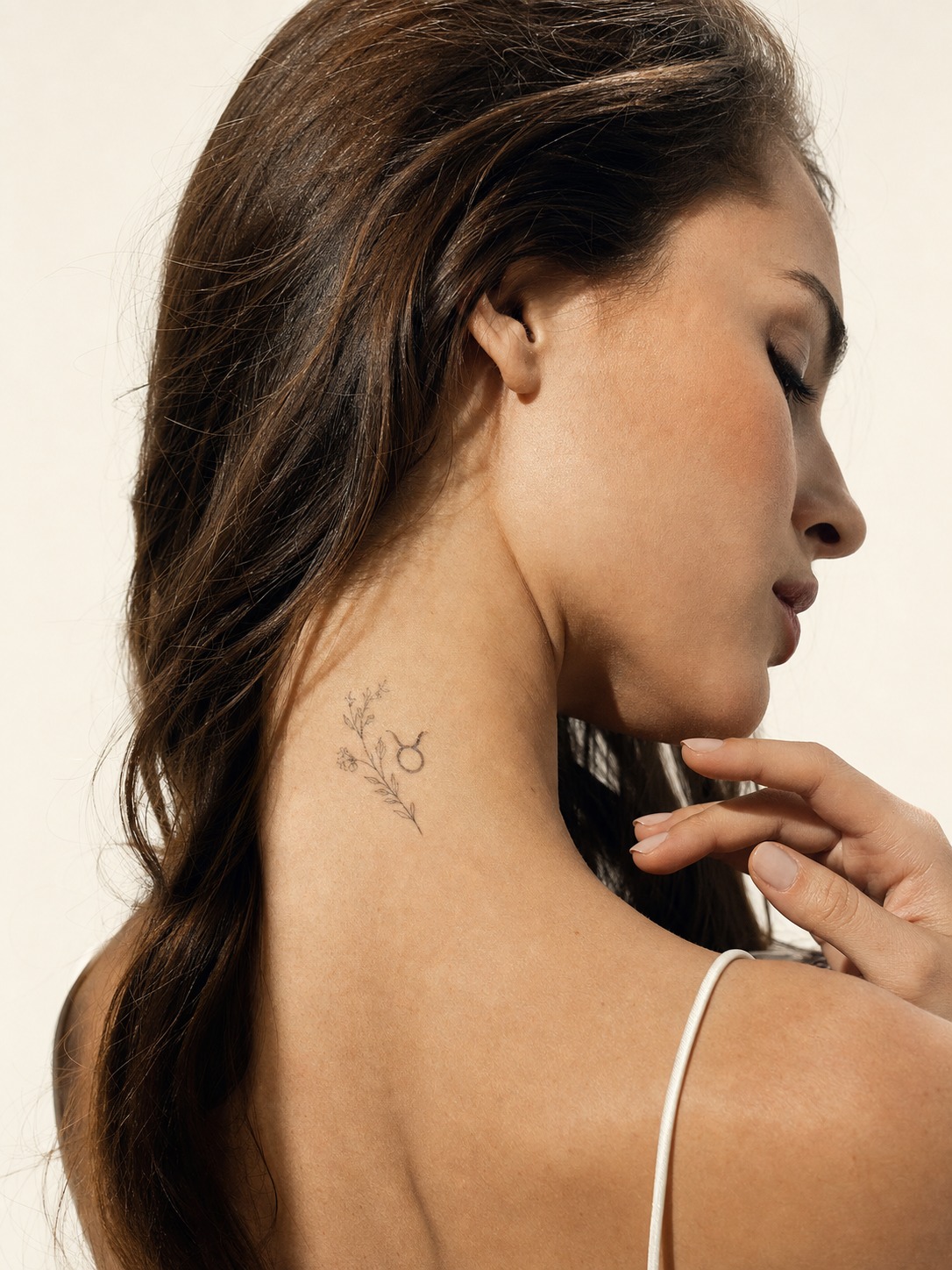
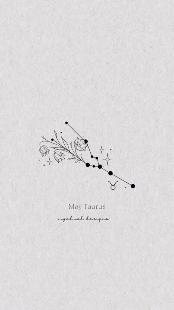
The Taurus glyph (♉) is a circle with a curved line on top — simple enough to sit cleanly at almost any size, though most Taurus tattoos I’ve come across stay small: the wrist, behind the ear, back of the neck. Venus rules Taurus, which opens the door to botanical pairings — a small floral cluster alongside the glyph nods to that connection without needing an explanation.
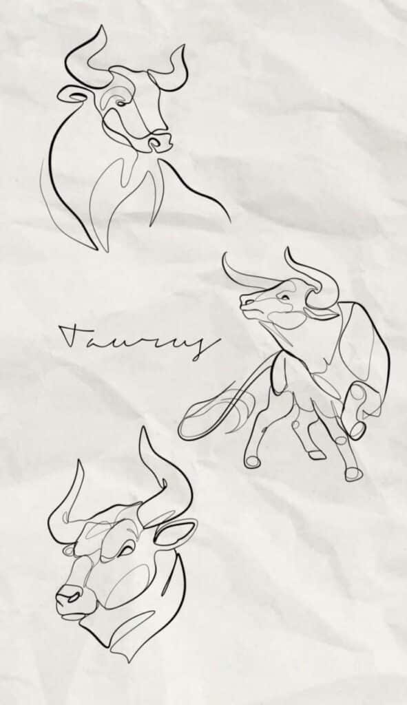
For a bolder approach, a stylized bull’s head works well as a shoulder piece, but it’s a genuinely different design decision than the glyph-and-flower route — less about quiet refinement, more about a deliberate statement. Pick one direction rather than trying to split the difference.
Virgo
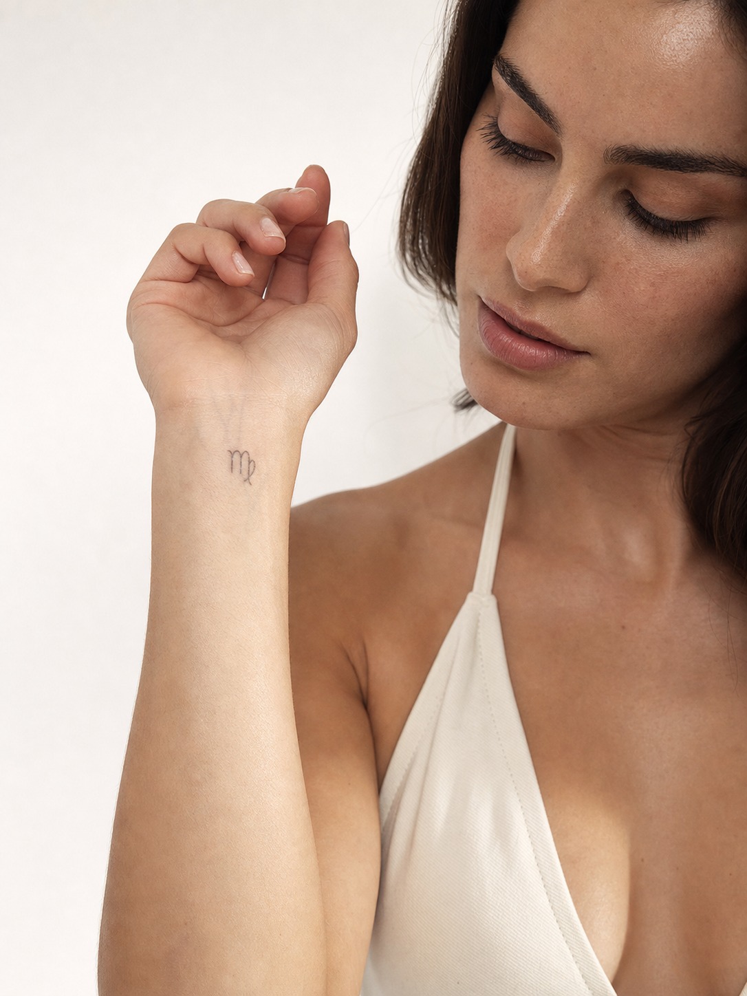
Virgo is the sign where fine-line work either shines or falls apart, depending on execution. The glyph (♍) has a delicate loop that looks beautiful rendered small and precise — but it’s exactly the kind of detail that turns to mud if the artist doesn’t size it correctly, so this is one sign where going slightly larger than you think you need is the safer call.
Botanical motifs suit Virgo naturally: wheat, herbs, and leaf details echo the sign’s earth-element practicality without leaning on anything literal. Keep the composition uncluttered — Virgo’s whole aesthetic identity is precision, and a busy design works against that.
Capricorn
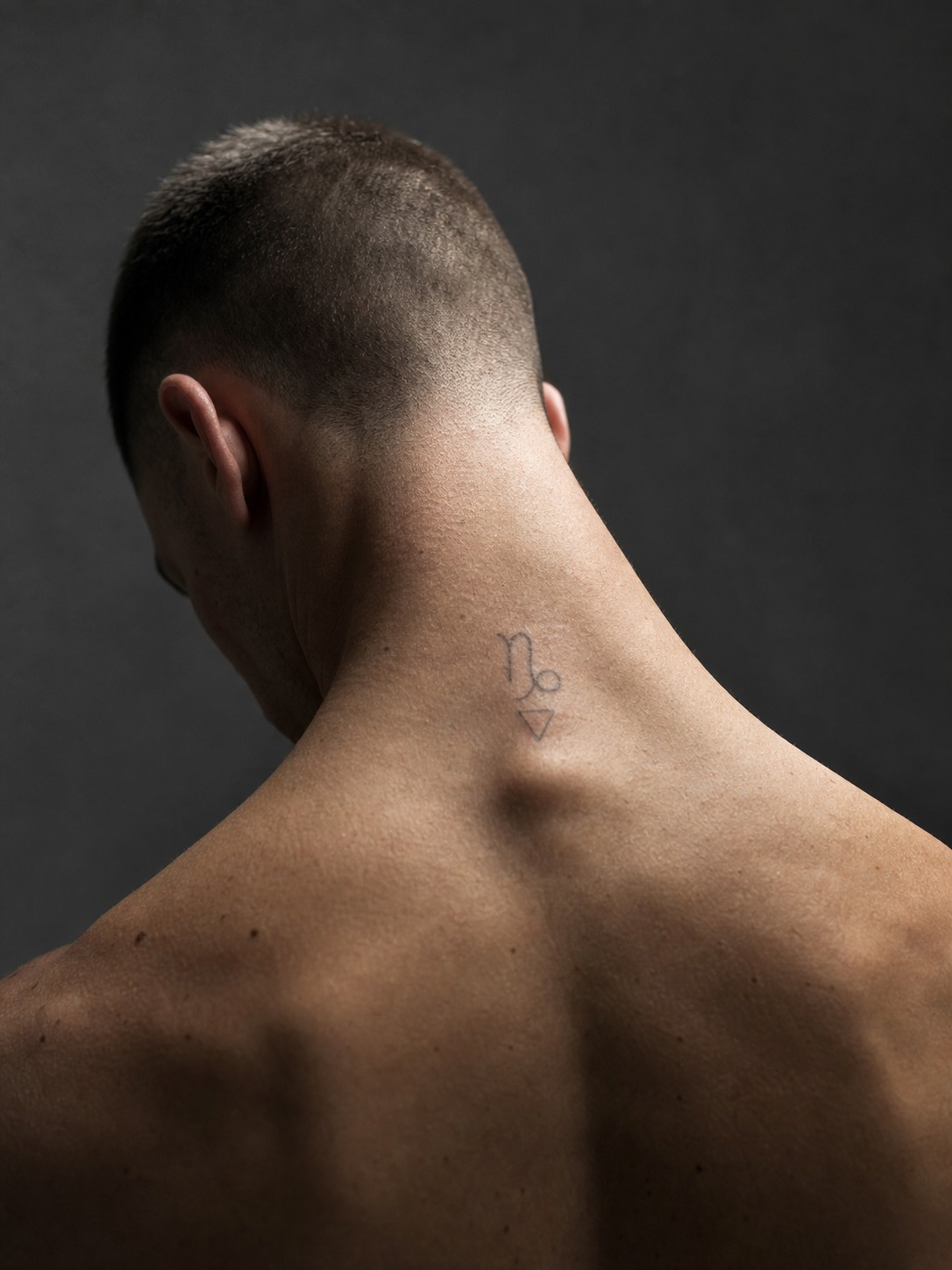
The Capricorn glyph (♑) is a sea-goat — part goat, part fish tail — and it’s visually one of the more unusual symbols in the zodiac, which makes it a strong choice for people who want something a little less common than the others. A mountain motif is the more literal alternative, playing on Capricorn’s association with ambition and high ground.
Geometric pairings work well here too — clean triangular or angular shapes alongside the glyph reinforce the sign’s structured, disciplined character without adding visual noise. Back of the neck is the classic Capricorn placement: visible when you want it to be, easy to keep private otherwise.
Air Signs: Gemini, Libra, Aquarius (Geometric, Asymmetric)
Air signs are the most abstract group to design for, which is exactly why geometric and asymmetric compositions suit them so well. There’s less of an obvious literal motif to fall back on compared to fire or water, so the design has more freedom to be unconventional.
Gemini
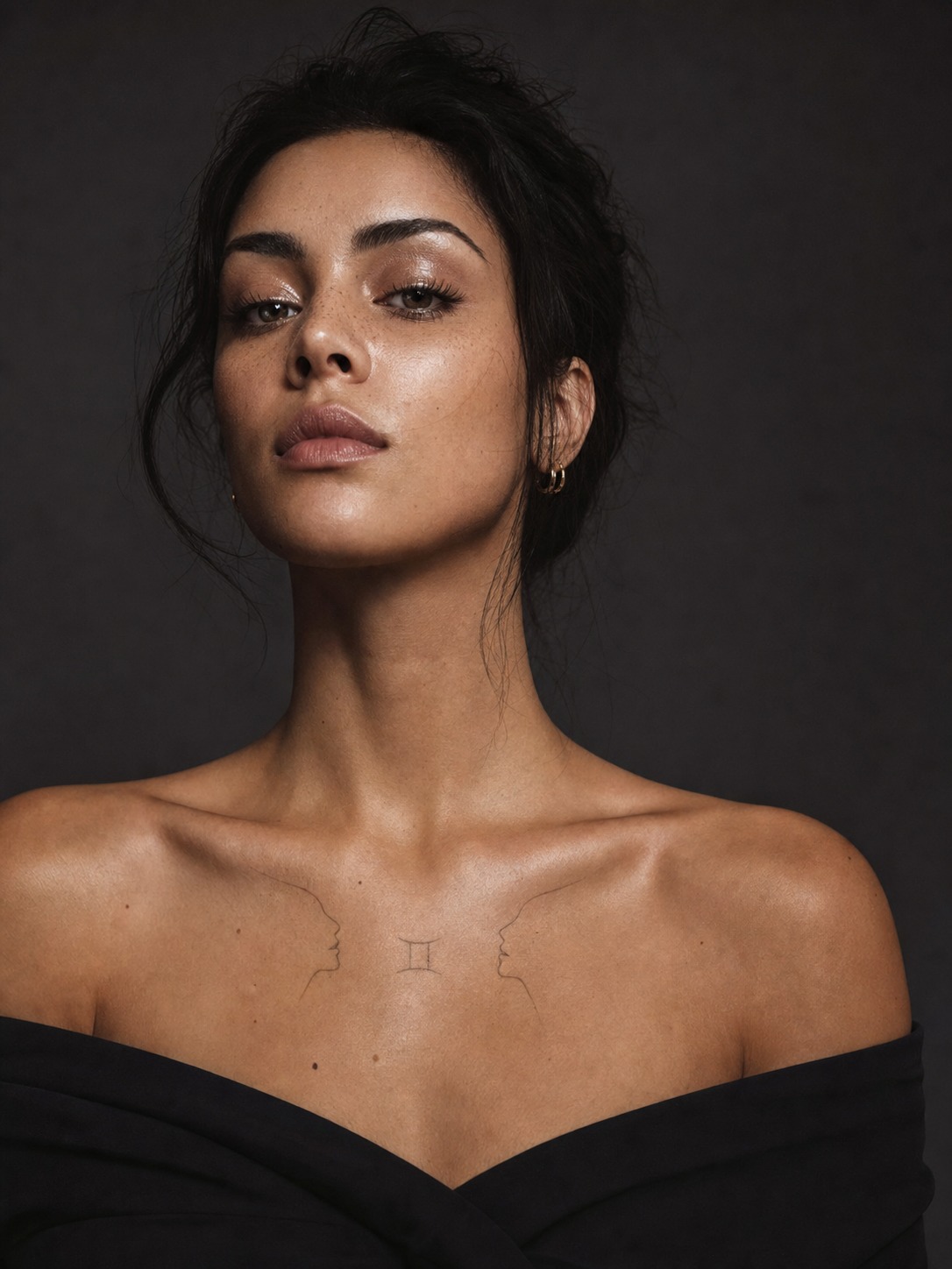
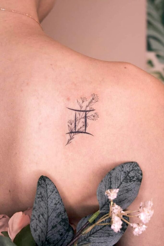
The Gemini glyph (♊) is built entirely around duality — two parallel vertical lines connected top and bottom, visually representing the twins. It’s one of the most graphically distinct symbols in the zodiac and works confidently on its own at almost any size.
Where Gemini gets interesting is in mirrored compositions: two matching or slightly varied marks, sometimes split across a couple as a two-person tattoo, each partner wearing one half. The Gemini constellation is another strong option, and it sits especially well on the forearm or collarbone, where there’s enough length to let the star pattern breathe.
Libra
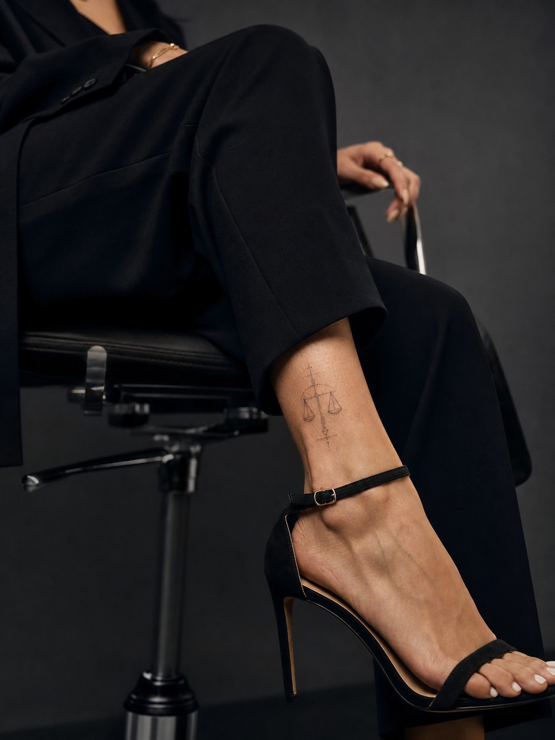
Libra’s glyph (♎) is the scales, and it’s one of the more literal symbols to work with — the challenge is keeping it from looking static. A slightly asymmetric rendering, or scales tipped rather than perfectly balanced, actually reads as more dynamic and intentional than a rigid, textbook version.
Geometric framing works naturally here — thin triangular or linear elements around the scales reinforce the idea of balance without stating it outright. Ankle and rib placements suit Libra well; both are spots where a horizontally-oriented design like scales has room to sit properly.
Aquarius
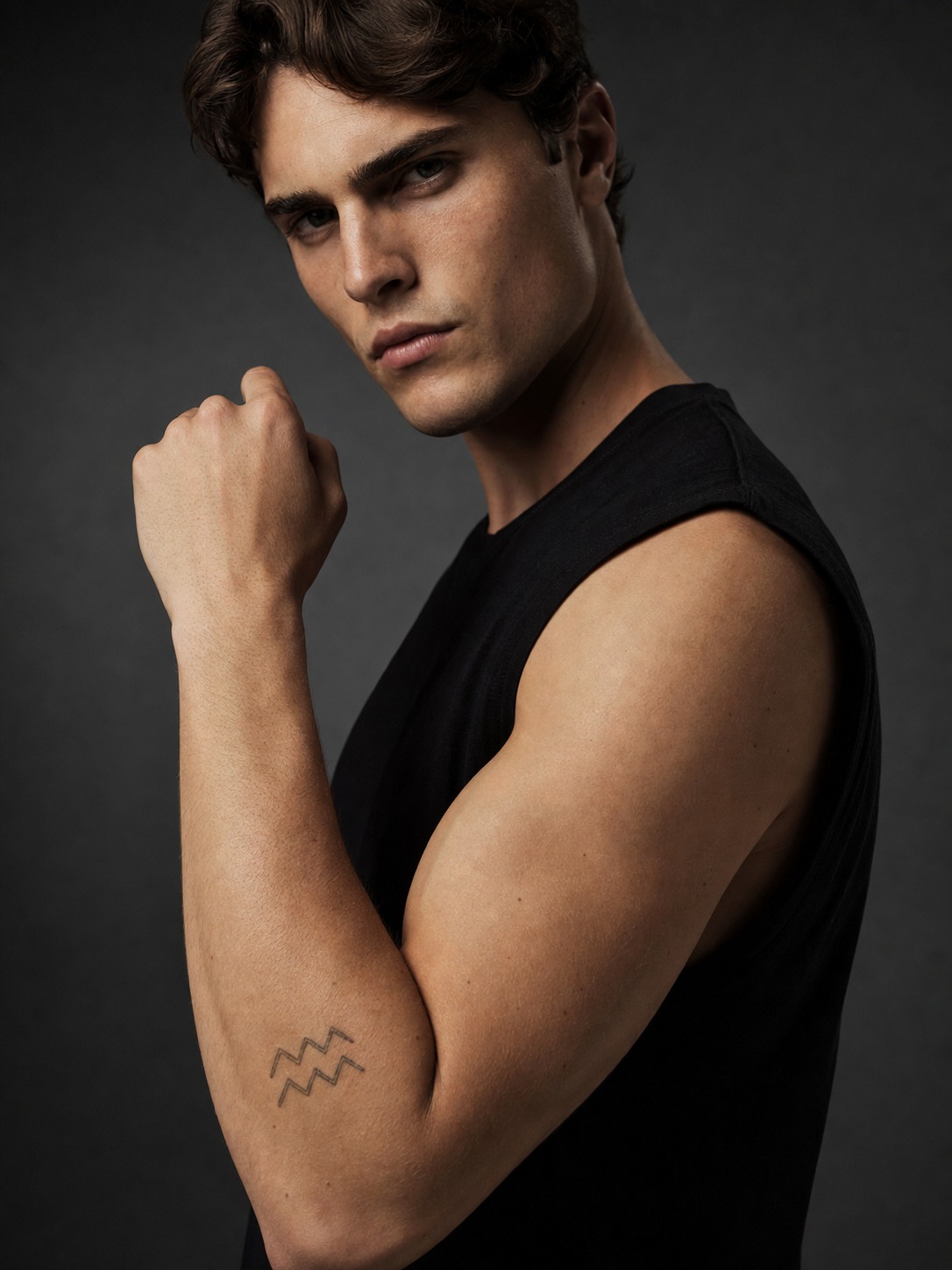
Aquarius tattoos benefit the most from moving past the glyph. The symbol (♒) is two wavy horizontal lines — often mistaken for a water sign because of that, even though Aquarius is air — and on its own it can read as fairly generic. Unique aquarius tattoos male clients often gravitate toward pair the wave-line glyph with something more distinct: a geometric wave pattern, an abstract lightning motif, or the constellation rendered in a more architectural, structured style than a typical dot map.
That structured, slightly unconventional approach fits Aquarius better than a soft or delicate treatment would — the sign’s whole identity is originality, and a design that looks like everyone else’s undersells that. Forearm and shoulder placements give an Aquarius piece enough room for the extra detail to actually register.
Water Signs: Cancer, Scorpio, Pisces (Flowing, Intimate Placement)
Water signs share a visual language that leans curved, soft-edged, and personal — which lines up naturally with the placements most people choose for them. Chest, ribs, inner wrist: spots that are more about what the wearer sees than what everyone else does.
Zodiac symbols can stay tiny or become part of a larger piece, so compare them with other tattoo ideas for women before deciding how much space the design needs.
Cancer
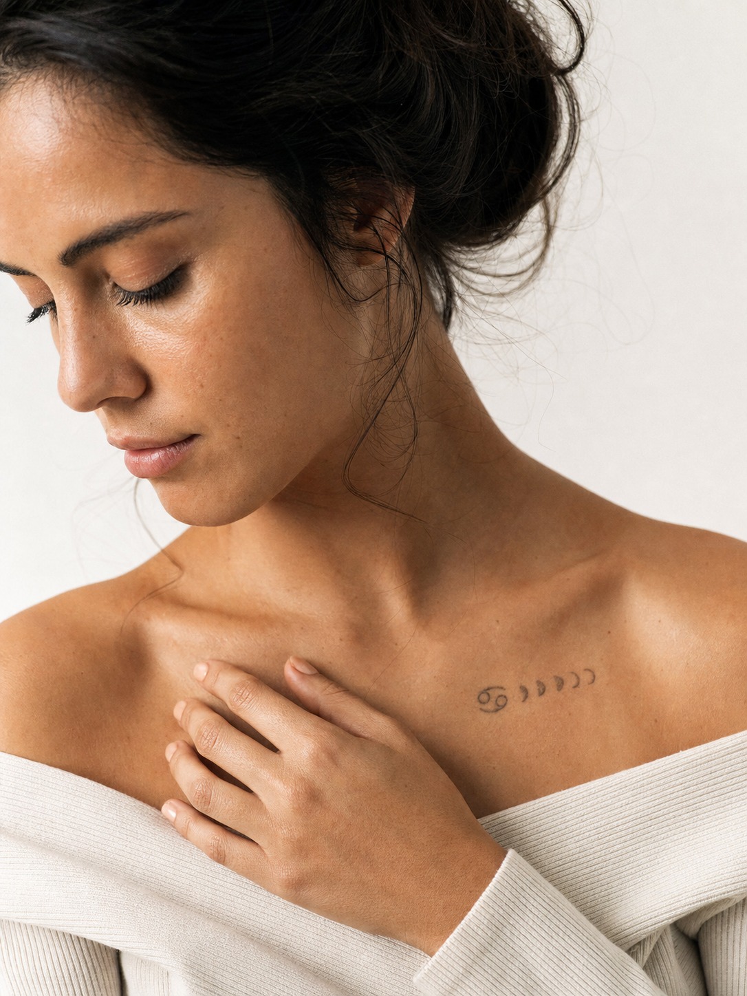
A zodiac sign tattoo cancer design usually starts with one of two directions: the glyph (♋), which resembles two curled, opposing crescents, or the crab motif that represents the sign more literally. The glyph is the better choice for anyone who wants something subtle — it’s compact and holds up well at small sizes, particularly on the inner wrist or ribs.
Since the Moon rules Cancer, moon-phase pairings come up constantly in cancer zodiac sign tattoo design requests — a small crescent or phase sequence alongside the glyph reinforces the emotional, intuitive character the sign is known for without needing the crab imagery at all. For anyone who does want the crab, keep the linework soft rather than heavily shaded; an overly rigid, angular crab works against the sign’s whole visual identity. Chest placement, close to the heart, is the classic Cancer choice for a reason — it fits both the symbolism and the flowing style.
Scorpio
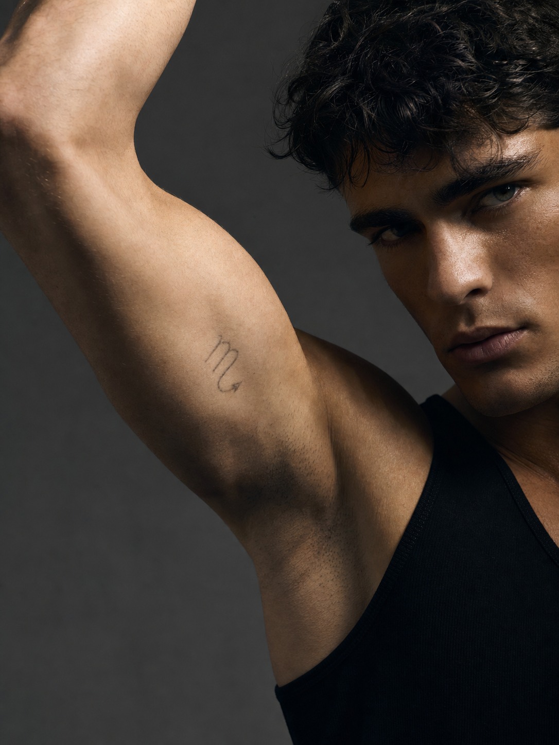
Scorpio’s glyph (♏) looks similar to Virgo’s at a glance — both use a looped M-shape — but Scorpio’s ends in a small arrow-like flick, which is the detail that actually reads as “Scorpio” rather than being mistaken for its earth-sign cousin. Get that final stroke right and the glyph works cleanly even at a smaller scale.
The scorpion motif itself gives you more room to choose intensity: a minimal single-line outline keeps things understated, while a bolder, more detailed rendering with shading leans into Scorpio’s reputation for intensity. Neither is more “correct” — it depends on how loud you want the piece to read. Ribs and inner arm are the go-to placements, both private enough to match the sign’s guarded reputation.
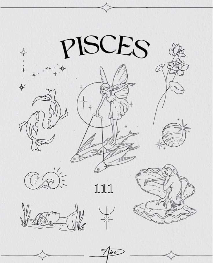
Pisces
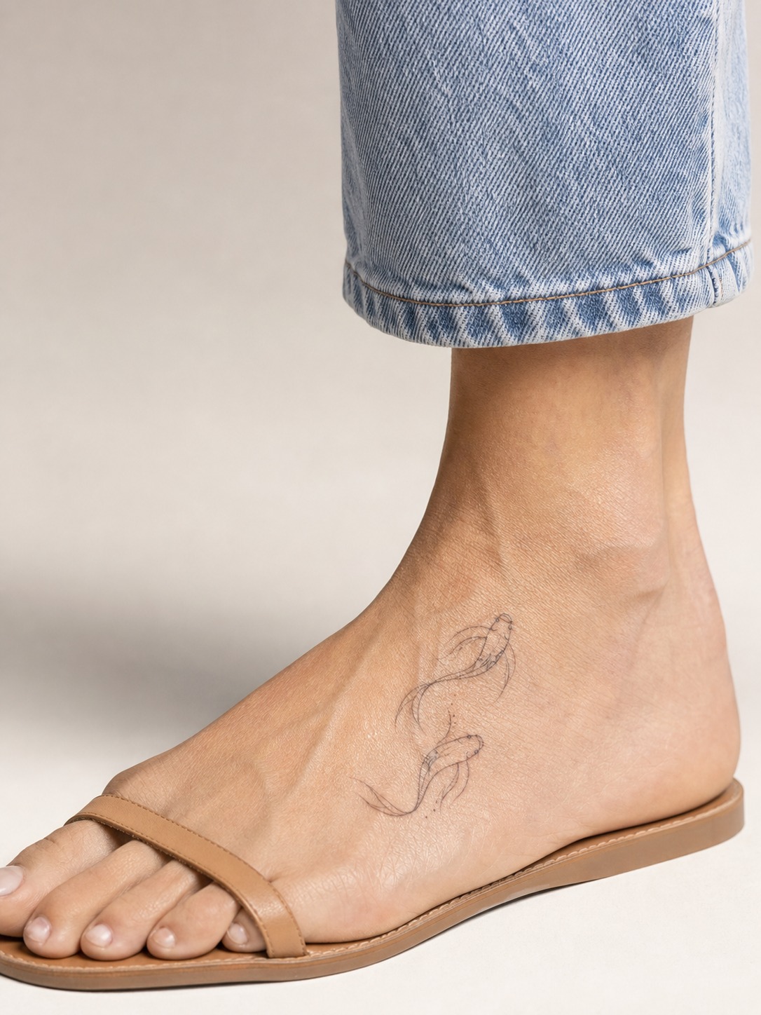
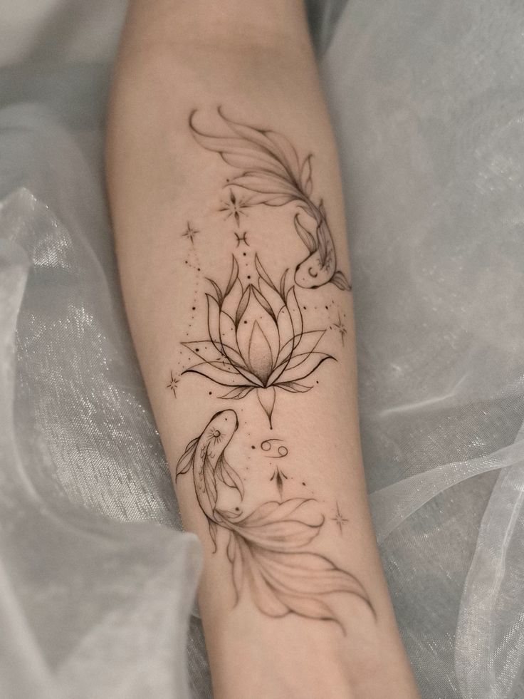
The Pisces glyph (♓) is two fish facing opposite directions, connected by a single line — visually one of the most fluid symbols in the zodiac, and it genuinely benefits from a design style that leans into that movement rather than stiff, straight linework. Curved, slightly irregular lines suit Pisces better than anything rigid.
Ankle and top-of-foot placements come up often for Pisces, partly because the elongated shape of the two-fish motif fits that narrow canvas well, and partly because water signs generally favor placements that feel personal rather than performative. A wave-line treatment, echoing the water element directly, is a solid alternative for anyone who wants something a little less literal than the fish themselves.
Beyond the Glyph: Constellations, Moon Phases, and Combination Designs
The plain glyph is the default, not the ceiling. Once you’re past deciding on a sign and an element-appropriate style, there’s a whole second layer of options that most zodiac tattoo content mentions in passing without actually explaining how to make them work.
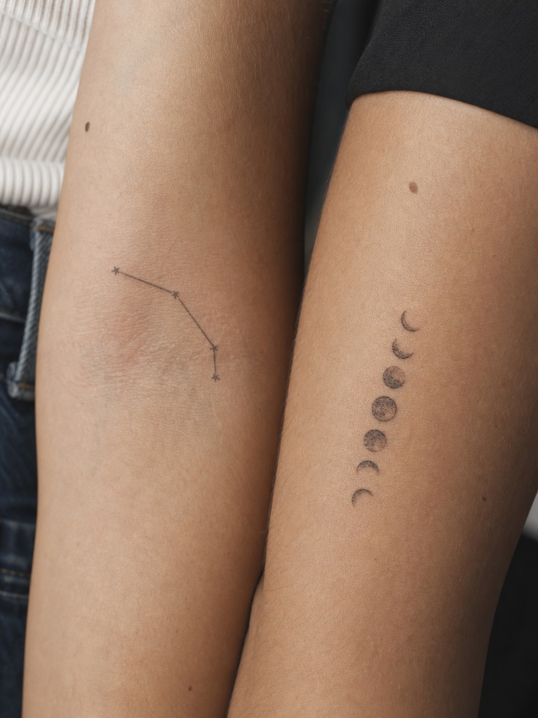
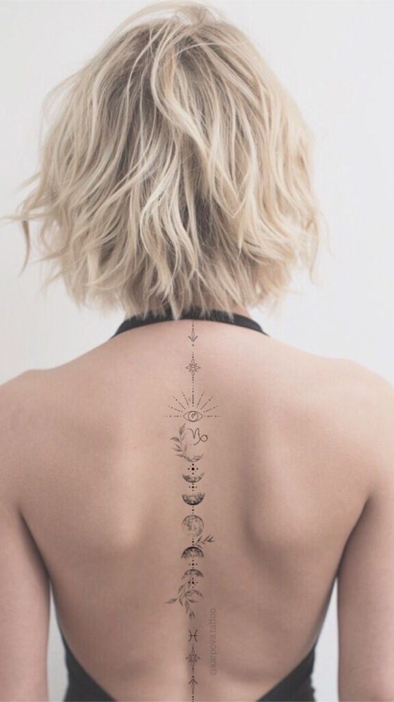
Constellations are the most requested alternative to the glyph, and also the easiest to get wrong. A constellation is just dots connected by thin lines, which sounds simple — but too many dots crammed into too small a space turns into a blurry cluster within a few years, the same ink-spread problem that affects fine-detail glyphs. Keep the star count low (five to seven points is usually plenty to suggest a specific constellation without overcrowding it), and give the connecting lines enough length between dots that they don’t visually merge as the ink settles. Forearms, collarbones, and the space along the spine all give a constellation piece room to actually breathe.
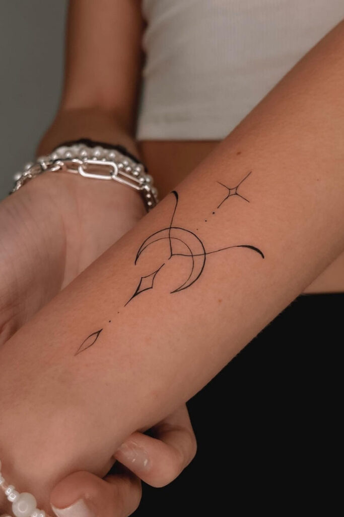
Moon phases work well as a stand-alone alternative or a pairing element, especially for Cancer given the sign’s lunar rulership, though they suit any sign as a secondary motif. A sequence running from new moon to full moon, usually rendered as a horizontal or vertical line of phases, reads clearly even as a fairly small design because each individual phase shape is simple. This is one of the few zodiac-adjacent designs that genuinely photographs and ages well at small scale.
Combination and cusp designs come up a lot for people born near a sign boundary, couples who want to represent both partners, or families combining multiple members’ signs into one piece. The trap here is trying to render both glyphs at full detail side by side — it usually just looks cluttered. A cleaner approach is to let one symbol lead and treat the second as a smaller supporting element, or to merge specific lines from both glyphs into a single blended mark rather than placing two complete symbols next to each other. It takes more design thought than a straightforward single-sign piece, but it holds up better over time.
Placement, Sizing, and Testing It First
Everything covered so far comes down to matching a design’s visual weight to where it’s going to live on your body — worth pulling together into one quick reference before you sit down with an artist.
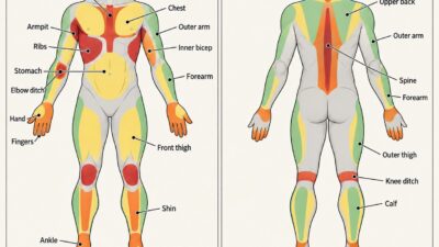
Fire signs generally want visible, higher-traffic placements (forearm, shoulder, upper back) because their bold linework and larger motifs need room and want to be seen. Earth signs lean toward quieter spots (wrist, behind the ear, back of the neck) that match their understated visual language. Air signs suit placements with some length or unconventional shape (collarbone, ankle, ribs) where geometric or asymmetric compositions have space to work. Water signs favor intimate, personal placements (chest, inner wrist, ribs, top of the foot) that fit both the flowing linework and the emotional character of the element.
None of these are rules — plenty of great Scorpio pieces live on a forearm, plenty of Leo tattoos stay small on a wrist. They’re a starting logic, not a restriction.
Test it first
One genuinely useful step before committing to permanent ink: try the design temporarily. Semi-permanent tattoo options, lasting one to two weeks, let you see how a specific size and placement actually look day to day — under different clothes, in different lighting — before anything is permanent. Especially worth it for constellations or delicate glyphs like Virgo’s or Pisces’s.
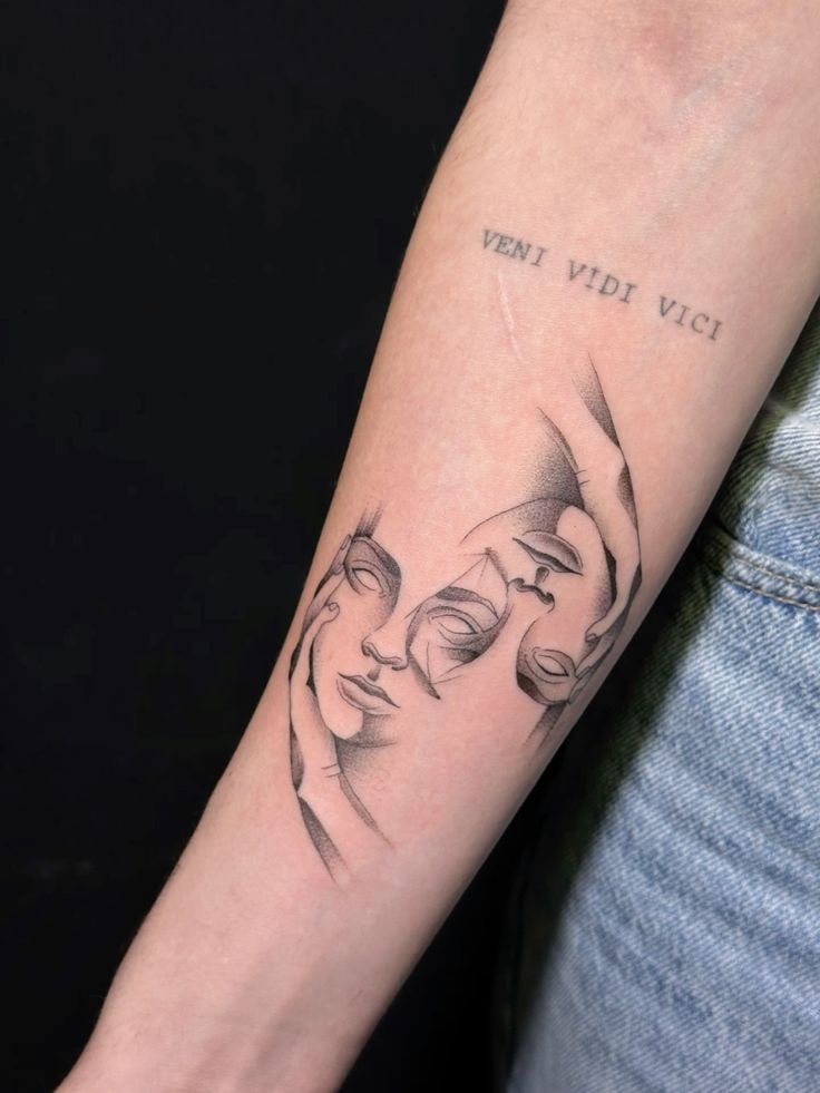
For people choosing symbolic ink by identity rather than trend, a crown tattoo meaning guide is useful before pairing the design with zodiac signs, initials, dates, or other personal symbols.
Conclusion
Every sign has a symbol, and every symbol has a meaning — but meaning alone doesn’t make a tattoo work. Line weight, scale, and placement decide whether a design still reads clearly in ten years or turns into a soft, illegible smudge. That’s the part most zodiac tattoo guides skip, and it’s the part worth actually thinking through before you sit down in the chair.
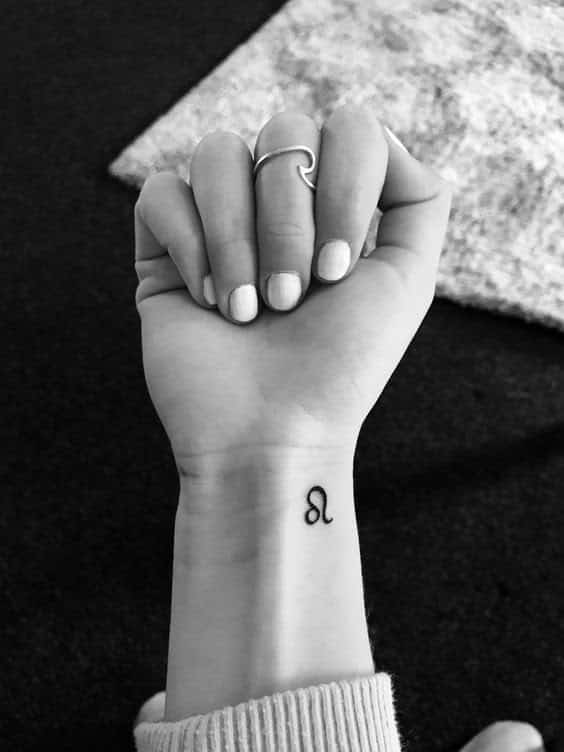
Start with your element. It’ll point you toward a design language — bold and visible, quiet and botanical, geometric and asymmetric, or flowing and intimate — that suits your sign better than the plain glyph on its own usually does. From there, pick the motif, the placement, and the scale as one decision, not three separate ones.
Your sign isn’t going anywhere. Take the time to get the design right.
FAQ
What is the best zodiac sign tattoo design?
There’s no single “best” design — it depends on your sign’s element. Fire signs (Aries, Leo, Sagittarius) suit bold, visible linework; Earth signs (Taurus, Virgo, Capricorn) suit small, understated botanical pairings; Air signs (Gemini, Libra, Aquarius) suit geometric or asymmetric compositions; Water signs (Cancer, Scorpio, Pisces) suit flowing lines in intimate placements. Matching the design style to your element’s natural visual language is what makes a piece look intentional rather than generic.
What does a zodiac tattoo actually mean?
Most commonly it represents your sun sign — the sign associated with your birth date — and by extension, the traits linked to that sign. Beyond the glyph itself, people often add personal meaning through pairings: a moon phase for Cancer, a botanical motif for Taurus, a constellation for any sign wanting something more specific than the basic symbol.
Where should I place a zodiac tattoo?
It depends on the design’s visual weight. Bold fire-sign motifs read well on the forearm, shoulder, or upper back. Quieter earth-sign designs suit the wrist, behind the ear, or the back of the neck. Air-sign geometric pieces work on the collarbone, ankle, or ribs. Water-sign flowing designs favor the chest, inner wrist, or top of the foot. These are starting points, not rules.
Can you combine two zodiac signs in one tattoo?
Yes, and it’s common for cusp births, couples, or family pieces. The key is not rendering both glyphs at full detail side by side, since that tends to look cluttered. A cleaner approach lets one symbol lead with the second as a smaller supporting element, or blends specific lines from both glyphs into one combined mark.
What’s a good cancer zodiac tattoo idea?
The Cancer glyph alone works well for something subtle, especially on the inner wrist or ribs. Since the Moon rules Cancer, pairing the glyph with a small moon-phase sequence is one of the most requested cancer zodiac sign tattoo designs. For a more literal option, a soft-lined crab motif on the chest is the classic choice — keep the linework flowing rather than rigid to match the sign’s character.
What’s a unique sagittarius tattoo idea for men or women?
For sagittarius tattoo ideas male clients often choose, an archer or bow-and-arrow motif with geometric or dotwork shading on the shoulder or forearm carries enough visual weight for a larger placement. For a smaller approach that works well as sagittarius tattoo ideas for female clients, a single stylized arrow on the wrist or behind the ear keeps the same symbolism at a smaller scale.
Is a semi-permanent zodiac tattoo worth trying first?
Yes, especially for detailed designs like constellations or fine-line glyphs (Virgo, Pisces) where sizing mistakes are easy to make. Semi-permanent versions typically last one to two weeks, long enough to see how the placement and scale actually look day to day before committing to permanent ink.
For more placement and style references across the whole category, browse the Sky Rye Design tattoo ideas hub.
- 158shares
- Facebook0
- Pinterest158
- Twitter0
- Reddit0