- Why Static Portraits Stopped Being Enough
- What “Surreal” Actually Means Here
- The Motion Question: How Much Is Too Much
- Three Contexts Where This Format Actually Works
- What Makes the Polished Ones Look Expensive
- Why This Format Fits Right Now
- A Practical Starting Point
- FAQ
- Q: What makes surreal portrait edits different from regular photo animation?
- Q: Do I need a high-end source photo to make this work?
- Q: What’s the most common mistake beginners make with portrait motion?
- Q: Are face swap tools appropriate for editorial or professional creative work?
- Q: How long should a surreal portrait loop be?
- Q: What platforms perform best for this type of content?
- Q: Is this style going to feel dated quickly?
I got obsessed with a single frame last year. It was a portrait — a woman, dark background, nothing technically special about the source image. But someone had added the smallest possible movement to it: her eyes shifted maybe three degrees, her hair lifted slightly, and the light source breathed. Fifteen seconds looped. I watched it four times before I even understood what I was looking at.
That’s what good surreal portrait work does. It borrows just enough from animation to feel alive without becoming something else entirely.


This isn’t about a tool going viral or an algorithm pushing a format. It’s about an aesthetic need that’s been building for a while — the space between a still image and a film, where most interesting visual work seems to be happening right now.
Why Static Portraits Stopped Being Enough
Scroll any creative platform for twenty minutes and you’ll feel it before you can name it. Still portraits are everywhere. They’re technically strong, well-lit, carefully edited. And a lot of them barely register.

The image itself isn’t the problem. Attention is rhythmic now in a way it wasn’t five years ago. A perfectly composed portrait competes with content that has timing, atmosphere, motion — things that pull you in for a second longer than a static frame can. One extra second is the difference between a save and a scroll.
I think that’s the real reason surreal portrait editing is spreading — not because the tools got easier (they did, but that’s always been true), and not because everyone suddenly has a taste for the uncanny. It’s because a single image, no matter how well-made, needs something extra to hold ground in that environment.
Surreal portrait work solves this without becoming video production. You’re not shooting B-roll. You’re not writing a script. You’re taking one strong source image and giving it a pulse.
What “Surreal” Actually Means Here

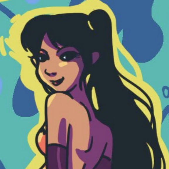
The word gets misused. Surreal doesn’t mean chaotic or bizarre. In portrait editing, the best surreal work is actually quite restrained. One unexpected layer on top of a solid foundation.


That layer might be a dreamlike texture bleeding in from the edges. A face that seems to shift slightly — not into someone else, but into an alternate version of itself, like a memory rather than a fact. Background elements that move independently of the subject. Color that drifts between states. A detail that shouldn’t logically be there but feels emotionally correct.
The identity play is where things get interesting. Tools like GoEnhance AI face swap have moved past the low-effort meme use case. In the hands of a photographer or art director working with them deliberately, they’re a way to suggest alternate personas without reshooting — to push a portrait toward a concept rather than a literal record. Think editorial campaign work where the question isn’t “who is this person” but “what does this person become.”
That’s a genuinely different creative problem, and it produces genuinely different images.
The Motion Question: How Much Is Too Much

Here’s where most people go wrong on their first attempt. They have a beautiful portrait. They find a tool, apply movement, and the result looks like a video game cutscene from 2009.
The problem is almost always too much movement, applied to too many things at once.
The best portrait motion follows a simple principle: one element moves, everything else holds. Hair shifts while the face stays. Light pulses while the figure is perfectly still. Eyes track slowly while the background stays locked. That contrast — between what moves and what doesn’t — is where the tension lives. It’s what makes the image feel like it’s breathing rather than performing.
Micro-motion is harder to execute than dramatic animation, but it reads as more sophisticated every time. When you make photo animation online free, the instinct is to push every slider and use every effect available. Don’t. Pick one thing. Make it subtle. Let the stillness do the heavy lifting.
The goal isn’t to prove the image can move. The goal is to make the movement feel like it was always there.
Three Contexts Where This Format Actually Works

I keep seeing surreal portrait work land well in the same three situations. Worth naming them because the context shapes how you approach the edit.
Editorial-Inspired Portrait Design
These pieces feel like magazine spreads that learned how to breathe. The reference point is usually high-fashion or art photography — strong directional light, minimal styling, a face doing something specific.


The motion is almost imperceptible at normal scrolling speed: a slight gaze shift, a barely-there camera drift. You’re not making something move so much as making something feel present.
This works because the source material is already doing most of the work. The movement is a finish, not a feature.
Fashion Moodboards and Campaign Concepts


Motion adds atmosphere without overpowering the styling — which matters because the clothes, the palette, the concept are supposed to be the focus. What you want is a feeling, not a distraction.
I’ve noticed that the most effective fashion portrait edits use motion in the background rather than the subject. Fabric floats slightly. A gradient shifts. The model stays completely static while the world around her moves. It creates a sense of controlled unreality that photographs don’t achieve on their own.
Concept-Driven Social Content


When someone wants a post to feel artistic rather than promotional, surreal portrait treatment is one of the few formats that consistently bridges that gap. It signals craft without requiring a production budget. It looks considered.
The risk here is leaning too hard into the effect and losing the original point. The edit should support whatever concept you’re working with — not replace it.
What Makes the Polished Ones Look Expensive

I’ve spent probably more time than I should analyzing why certain portrait edits feel high-end and others feel cheap. The technical quality is rarely the main difference.
What the expensive-feeling ones share:
The source image was already strong. No amount of movement rescues a bad portrait. If the light is flat, the expression is nothing, and the composition is off-center in the wrong way — adding motion just makes all of that more obvious. The edit amplifies what’s there. Make sure what’s there is worth amplifying.
The light direction is consistent. If your portrait has light coming from the left and you add a particle effect with light coming from the right, it breaks immediately. The viewer might not consciously notice, but something feels wrong. Every layer of a surreal edit needs to respect the original physics of the image.
There’s one emotional direction. The best edits feel like they’re about something — a mood, a tension, a quality. Melancholy, or quiet power, or unease. Decide what you’re going for before you start adding layers, and let that choice govern every decision after.
The movement is timed, not just looping. A random loop often feels mechanical. A loop where the movement has a clear arc — rises, holds, falls, holds — feels intentional. Even a three-second loop can have pacing.
Why This Format Fits Right Now

Surreal portrait work sits at an unusual intersection: it offers cinematic feeling without cinematic production, and it offers visual sophistication without requiring the viewer to sit through a narrative. That’s a genuinely useful combination for how creative content actually gets consumed.
It’s also repeatable and adaptable across platforms in a way that traditional video isn’t. A fifteen-second portrait loop plays on Instagram, on Pinterest, in a portfolio, in a pitch deck. It scales without losing its quality.
And honestly — there’s something about this format that feels honest about the moment. We’re in a period where the line between designed and generated is increasingly blurry, and surreal portrait work leans into that ambiguity deliberately rather than pretending it doesn’t exist. The slightly uncanny face, the impossible light, the texture that doesn’t belong — they acknowledge the artifice. That acknowledgment is part of the aesthetic.
A Practical Starting Point

If you want to try this and you haven’t before, here’s what I’d actually suggest:
Start with a portrait where the expression does something. Neutral faces are harder to animate convincingly than faces with a specific mood already in them. A slight tension in the jaw, a gaze that’s looking at something just off-camera, an expression that reads as thinking rather than posing — these give the motion something to work with.
Add movement to one thing only. Hair is forgiving. Light is forgiving. Eyes are harder but high-impact if you get it right. Don’t animate the face and the background and add a texture overlay on your first attempt.
Loop it cleanly. The beginning and end of your loop should be close enough in state that the transition is invisible. A jarring loop break is the fastest way to make something feel cheap.
Then step back and ask: does the movement add to what was already in the image, or is it competing with it? If it’s competing, you’ve done too much.
FAQ
Q: What makes surreal portrait edits different from regular photo animation?
Regular photo animation aims for naturalism — making a still image look like footage. Surreal portrait work is deliberate about artifice. The movement creates a specific emotional quality the static image could not hold alone. The goal is atmosphere, not realism.
Q: Do I need a high-end source photo to make this work?
Not high-end in terms of gear, but yes in terms of quality. The portrait needs strong light, a clear expression, and a composition that works on its own. Motion amplifies what’s already there — flat lighting gets flatter, an unclear expression gets more confusing. Work with your best source material.
Q: What’s the most common mistake beginners make with portrait motion?
Too much movement applied to too many things at once. Pick one element to animate — usually something in the background or the lighting — and let everything else hold completely still. That contrast between movement and stillness is where the effect lives.
Q: Are face swap tools appropriate for editorial or professional creative work?
Yes, when used with intention. In editorial contexts — campaign art, concept portraits, visual storytelling — they’re a legitimate tool for suggesting alternate identities or personas without reshooting. The difference is whether you’re using them for a creative concept or just swapping faces for novelty.
Q: How long should a surreal portrait loop be?
Three to fifteen seconds is the practical range. Shorter loops are more hypnotic but leave less room for a motion arc. Longer loops give more pacing options but risk losing attention. Five to eight seconds tends to work well: long enough to feel intentional, short enough to loop cleanly.
Q: What platforms perform best for this type of content?
Instagram Reels and Pinterest video pins both handle the format well. The portrait aspect ratio suits it naturally. For portfolio purposes, a looping embed on a personal site or Behance tends to get strong engagement because those contexts allow slightly longer viewing time.
Q: Is this style going to feel dated quickly?
Heavy VFX-style edits with obvious filters will date fast. But the underlying principle — using controlled minimal motion to add atmosphere to a strong still image — is durable. That’s been true in film titles, fashion photography, and motion graphics for decades. The tools change. The principle doesn’t.
- 251shares
- Facebook0
- Pinterest251
- Twitter0
- Reddit0