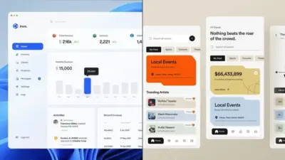
You’ve opened a new project file and you’re staring at a blank canvas. You need a button. You’ve made this exact button before — same size, same padding, same colour — but it was in last month’s project, so you’re building it again from scratch. Twenty minutes later, you realize you just redrew something you’ve already solved three times this year.
Sound familiar?
I’ve noticed this is how most designers work for years before something clicks. Not because they’re disorganized or slow — but because nobody ever showed them there’s a different way to think about design altogether.
- Modular Design in Plain English (No Jargon, Just the Idea)
- The Physical World Already Taught You Modular Design
- How Modular Design Works in Digital Products (The Part That Changes Your Workflow)
- The 5 Core Principles of Modular Design (What Makes a Module a Module)
- When Modular Design Is NOT the Answer (An Honest Take)
- How to Start Thinking Modularly Right Now (Even If You're Not a UI Designer)
- FAQ
- Q: What is modular design in simple terms?
- Q: What is the difference between modular and responsive design?
- Q: Is modular design only for web and UI designers?
- Q: What's the difference between a module and a component?
- Q: What are the biggest mistakes beginners make with modular design?
- Q: How is modular design related to a design system?
- Q: What tools support modular design best?
- Conclusion
That way of thinking has a name: modular design.
It’s the same principle behind IKEA’s PAX wardrobe system (one frame, infinite configurations), behind how Apple builds iOS with reusable UI components, and behind Figma’s component libraries that update across 200 screens the moment you change one master element. Modular design isn’t a trend or a tool — it’s a mental model. And once you see it, you can’t unsee it.
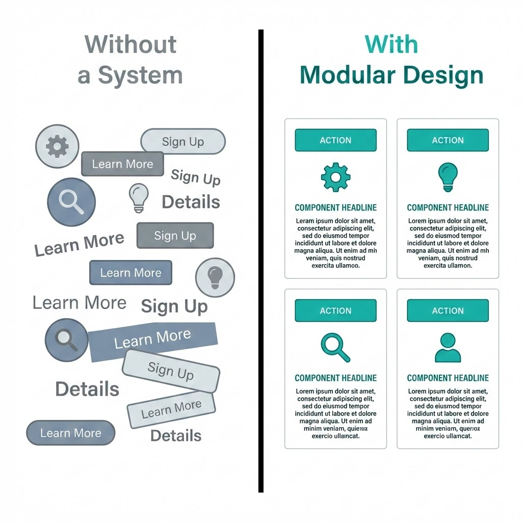
In this article, you’ll learn exactly what modular design is, why the world’s best design teams swear by it, and — most importantly — how to start applying it, whether you work in Figma, Canva, or even just designing Pinterest templates.
No dev background required. Just a new way of seeing.
Modular Design in Plain English (No Jargon, Just the Idea)
Here’s the shortest definition I know: modular design means breaking something complex into smaller, independent pieces — and building a system where those pieces can be mixed, swapped, or reused.
That’s it. No computer science degree needed.
The dictionary puts it this way: “constructed with standardized units for flexibility and variety in use.” Which sounds dry until you realize that sentence describes everything from LEGO bricks to the iPhone to your Figma component library.
The LEGO Analogy (And Where It Actually Breaks Down)

Every LEGO brick follows one standard: the stud spacing is exactly 8mm. That single decision made in 1958 means any brick from any set made in any decade will connect with any other. You’re not locked into one design. You’re free to build anything — because the interface between pieces is fixed, even when the pieces themselves change.
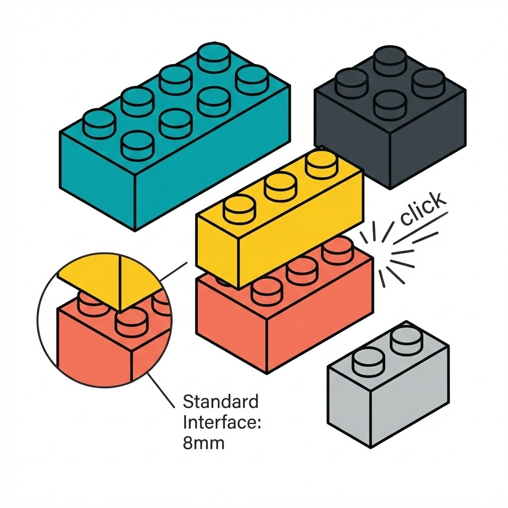
That’s the core idea. Modular design isn’t about making everything look the same. It’s about defining how pieces connect so the system stays flexible.
Where the analogy breaks down: real design modules aren’t always physical. A button in Figma, a content block in WordPress, a recurring illustration style in your brand kit — these are modules too. Invisible ones.
It’s Not Just a UI Thing
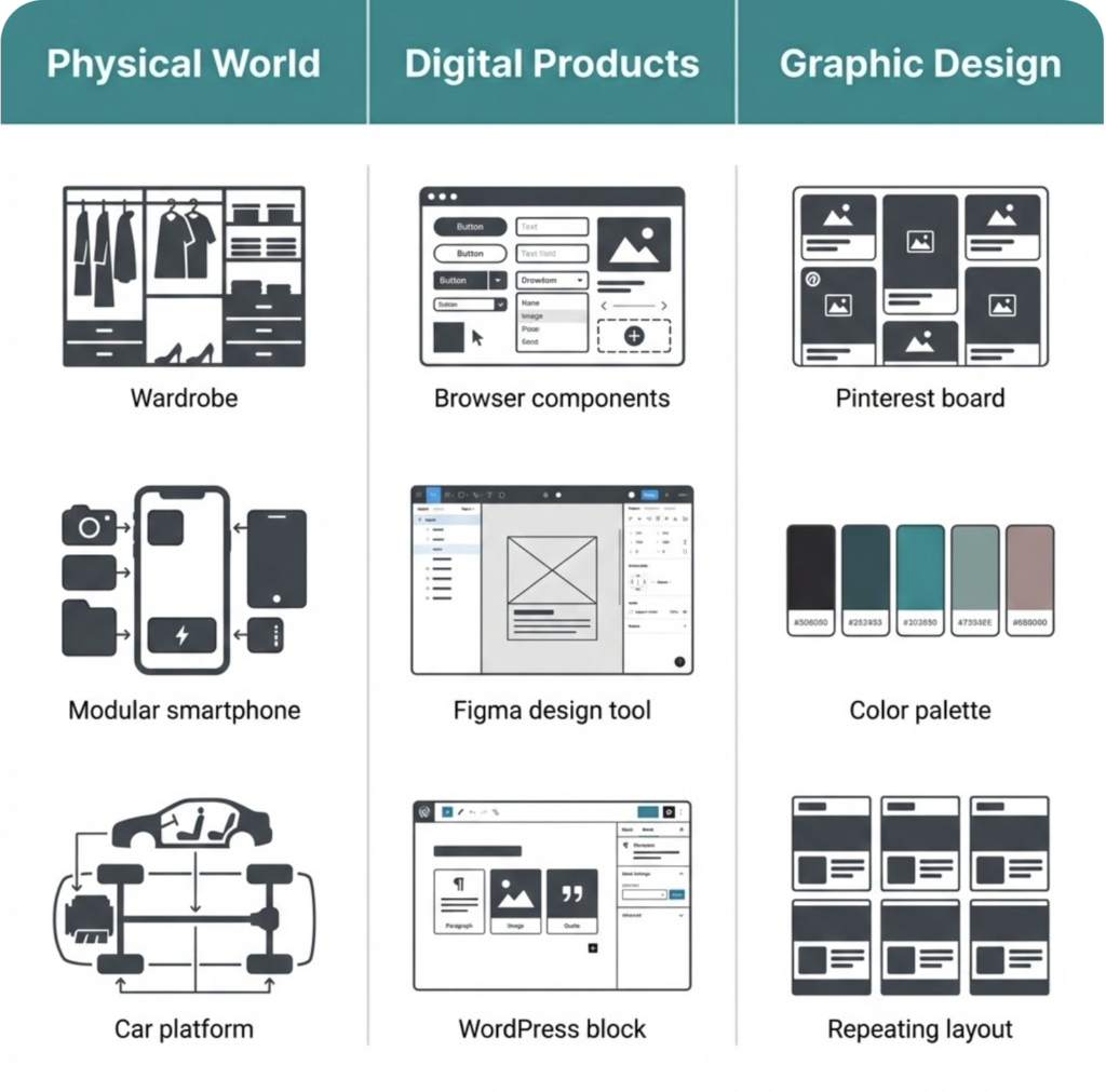
Most articles about modular design talk exclusively about web interfaces. But the principle shows up everywhere once you start looking.
IKEA’s KALLAX shelf ($69–$185 depending on size) uses the same modular logic — standard 33×33cm compartments that accept any insert, box, or basket in the IKEA system. Fairphone built an entire company around it: their Fairphone 5 (€699) lets you replace the battery, camera, or screen independently, extending the device’s life to 10+ years.
Graphic designers use it too — brand systems, template families, repeating grid structures. If you’ve ever built a set of Pinterest templates where you swap the image and headline, you’ve already been thinking modularly. You just didn’t have a name for it.
Why This Matters More Than It Sounds
The real value of modular design isn’t aesthetic — it’s cognitive. When your design is built from defined modules, you spend less energy on decisions you’ve already made. That button’s color, size, and behaviour? Solved. Now you can focus on the actual problem in front of you.
Brad Frost, the designer who formalized this thinking into the Atomic Design methodology in 2013, put it bluntly: stop designing pages and start designing systems.
That shift — from pages to systems — is what separates designers who feel constantly behind from designers who feel in control.
The Physical World Already Taught You Modular Design
Before modular design had a name, manufacturers were already obsessed with it. Not for aesthetic reasons — for survival. Building one complex, custom thing is expensive. Building one smart system that generates thousands of variations? That scales.
You’ve seen this logic in action. You’ve probably lived with it.
IKEA’s Secret Weapon: The PAX System
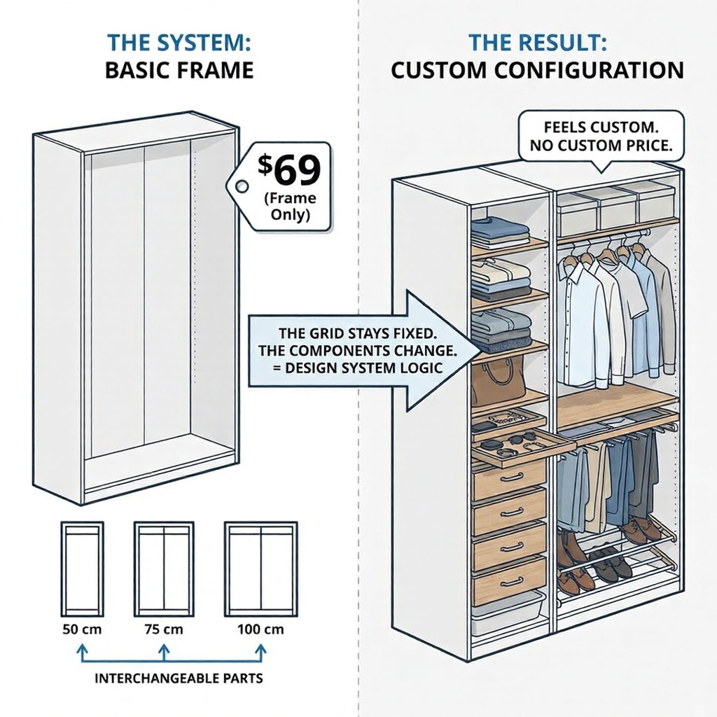
Walk into any IKEA store and find the PAX wardrobe section. What you’re looking at isn’t a collection of wardrobes — it’s a modular system with one job: make every configuration feel custom without custom pricing.
The frame comes in three widths (50cm, 75cm, 100cm) and two heights. Everything else — shelves, drawers, shoe racks, pull-out trays — fits any frame in the lineup. You’re not buying a wardrobe. You’re assembling a system from interchangeable parts.
IKEA introduced this logic in the 1970s and hasn’t needed to reinvent it since. The base module stays stable; the variations multiply. A PAX frame starts at around $69. The “customization” happens through inserts, not through bespoke manufacturing.
That’s exactly how a good design system works. The grid stays fixed. The components change.
Fairphone 5: When Modularity Becomes a Value Statement
The Fairphone 5 (€699) is the most explicit argument for modular design you can hold in your hand. Its camera, battery, display, and USB-C port — all replaceable without special tools or a trip to a repair shop. The company promises software support until 2031 at a minimum.
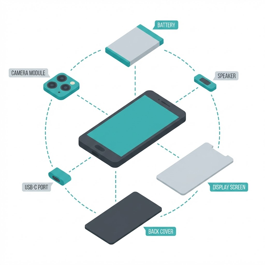
I find this fascinating, not just as a product but as a design philosophy. Fairphone essentially said: we’ll sacrifice some performance optimization in exchange for flexibility and longevity. That’s a real trade-off modular design always involves — and it’s worth being honest about.
The result? A phone designed to last 10+ years in a market where the average device gets replaced every 2.5 years.
The Car Platform Principle (The One Behind Every Design System)
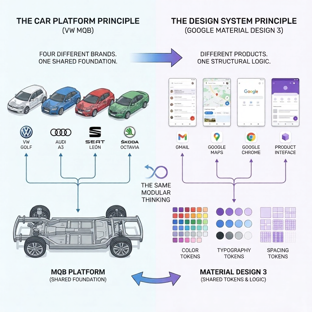
Volkswagen Group builds the Golf, Audi A3, SEAT León, and Škoda Octavia on the same MQB platform. Four different brands, four different price points, four different identities — one shared structural foundation.
This is the most quietly powerful example of modular thinking in manufacturing. The platform handles the hard engineering problems once. Each brand solves the identity and experience problems separately.
Sound familiar? Google’s Material Design 3 works the same way. One token system — spacing, typography, color roles — deployed across Gmail, Maps, Chrome, and dozens of other products. Different surfaces, one structural logic underneath.
How Modular Design Works in Digital Products (The Part That Changes Your Workflow)
Everything in the previous section — the PAX system, the MQB platform — translates directly into how digital products get built. The vocabulary changes. The logic doesn’t.
And once you understand how it works in digital design, going back to the old way feels like building furniture without instructions.
Atomic Design: The Framework That Named Everything
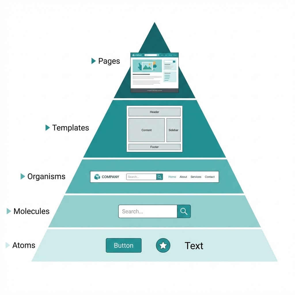
In 2013, designer Brad Frost sat down and wrote out a framework that formalized what the best design teams were already doing intuitively. He called it Atomic Design — and borrowed the structure from chemistry.
The hierarchy goes like this:
- Atoms — the smallest possible element. A button. A text label. An icon.
- Molecules — a few atoms combined. A search bar (input field + button + icon).
- Organisms — a functional section. A navigation header (logo + search bar + menu links).
- Templates — the layout without real content. Wireframe-level structure.
- Pages — templates filled with actual content. What the user sees.
Shopify’s design system, Polaris, is built exactly this way. Their button component is defined once — color, padding, hover state, and disabled state — and used across every screen in the Shopify admin. When they updated the button radius in 2023, it changed everywhere. One edit, thousands of instances updated automatically.
That’s not convenience. That’s a completely different relationship with your own work.
[Image: Atomic Design pyramid — Atoms → Molecules → Organisms → Templates → Pages, clean minimal diagram, teal accent color]
Figma Components: Modularity Inside Your Daily Tool
If you use Figma, you already have everything you need to work modularly. The feature is called Components — and it’s the closest thing to a superpower the tool offers.
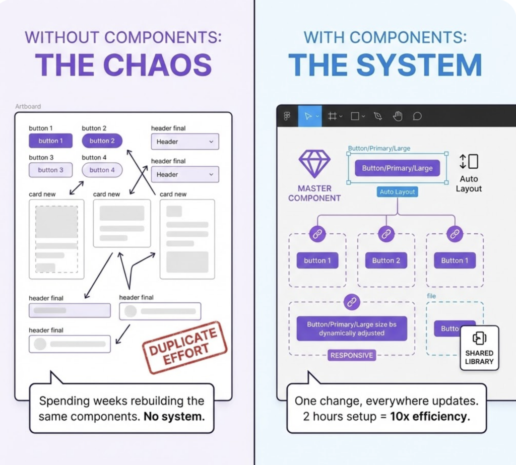
Here’s how it works: you design one master component (say, a card element). Every time you use it elsewhere in your file, Figma creates an instance — a linked copy. Change the master, and every instance updates. Add Auto Layout to control spacing and resizing behavior, and your module adapts to different content lengths without breaking.
The detail most people miss: naming matters enormously. “Button” is not a module name. “Button/Primary/Large” is — because it tells you exactly where this piece lives in your system hierarchy.
I’ve seen designers spend weeks rebuilding the same components across projects simply because they never took two hours to set up a shared library. That two-hour investment pays back inside the first month.
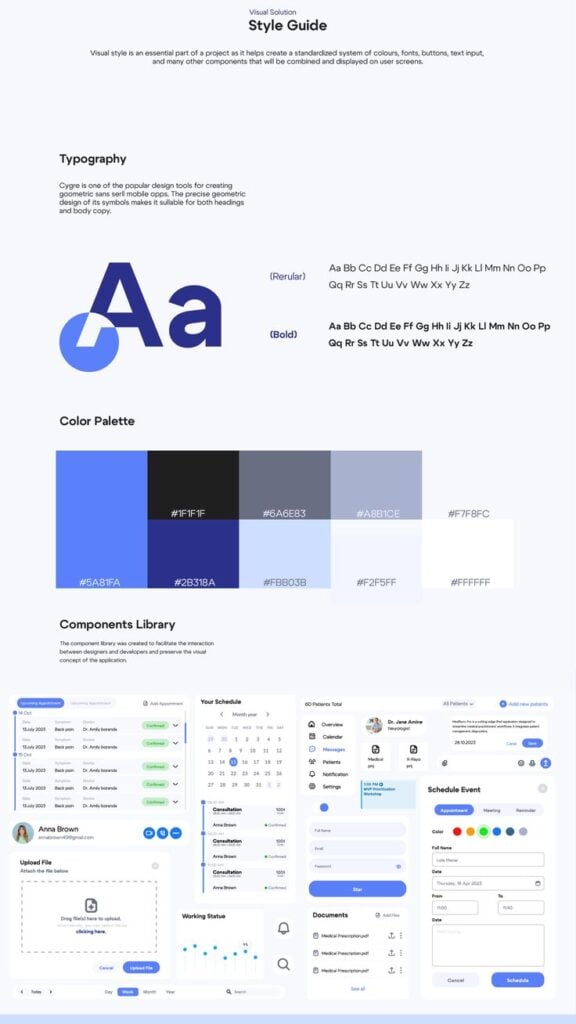
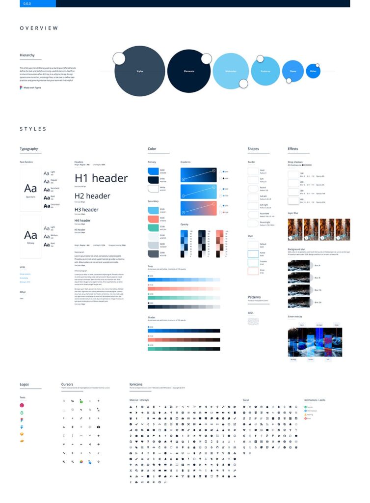
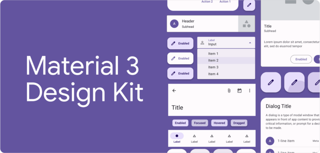
A practical starting point: Figma’s free Community templates include Google’s Material Design 3 kit and IBM’s Carbon Design System — both built on strict modular principles. Download one, poke around, and you’ll understand the structure faster than any tutorial explains it.

WordPress Gutenberg and Shopify Sections: Modular Design for Everyone
Here’s a number worth sitting with: WordPress powers 43.5% of all websites on the internet. And since 2018, every single one of those sites has been built with a block editor — a modular content system called Gutenberg.
Every paragraph, image, button, and column on a WordPress site is a discrete block. You add them, reorder them, and remove them independently. The page has no fixed structure — it’s assembled from modules each time.
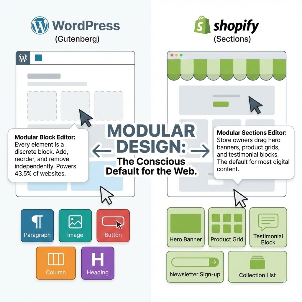
Shopify does the same thing with its Sections editor. Store owners who’ve never heard the term “modular design” use it every day when they drag a hero banner above a product grid and drop a testimonial block below it.
This matters for a simple reason: modular design isn’t a specialist skill reserved for senior product designers at big tech companies. It’s already the default way most digital content gets made. The question is whether you’re doing it consciously — or just getting lucky.
The 5 Core Principles of Modular Design (What Makes a Module a Module)
Not every reusable element is a good module. A button you copy-paste between files isn’t modular design — it’s just copy-paste with extra steps. Real modularity has structure behind it.
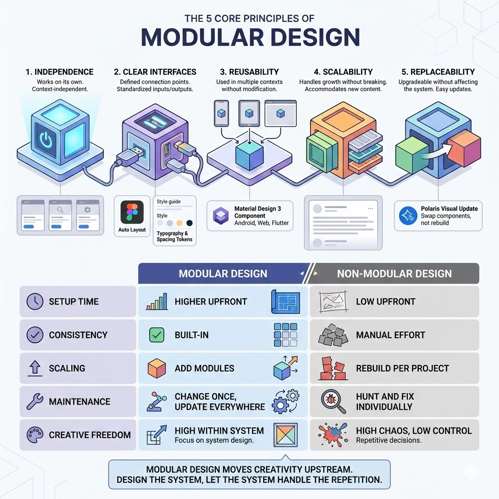
These five principles separate a genuine modular system from a folder of recycled assets.
1. Independence
A module should work on its own. It doesn’t rely on knowing what’s around it, what came before it, or what comes after. A card component doesn’t care whether it’s on a homepage or a search results page — it just does its job.
This is harder to achieve than it sounds. The temptation is always to design things in context. But context-dependent design breaks the moment the context changes.
2. Clear Interfaces
Every module needs defined connection points — what goes in, what comes out, how it attaches to other modules. Think of the USB standard: it doesn’t matter what’s inside the cable or the port, as long as the connection point follows the spec.
In Figma, this means Auto Layout constraints and clearly named properties. In a brand system, it means defined spacing tokens and type scales. The interface is the contract between modules.
3. Reusability
If you’ve built it once and it can only be used once, it’s not a module — it’s a one-off with ambitions. True modules are designed to appear in multiple contexts without modification.
Google’s Material Design 3 ships with over 25 components, each designed to work across Android, web, and Flutter apps simultaneously. One component spec, three platforms. That’s reusability at scale.
4. Scalability
A modular system should handle growth without falling apart. Adding a new page, a new section, a new product — none of these should require rebuilding what already exists.
In practice, this means designing modules that are complete enough to be useful but open enough to accommodate content you haven’t thought of yet. A card module that only works with three-word headlines will break the moment a real copywriter gets involved.
5. Replaceability
Any module should be upgradeable or swappable without touching the rest of the system. When Shopify updated the visual style of Polaris in 2022, teams could update individual components without rebuilding entire product surfaces.
This is the principle most designers forget during the build — and regret most during the update.
| Modular Design | Non-Modular Design | |
|---|---|---|
| Setup time | Higher upfront | Low upfront |
| Consistency | Built-in | Manual effort every time |
| Scaling | Add modules, don’t rebuild | Rebuild per project |
| Maintenance | Change once, update everywhere | Hunt and fix individually |
| Creative freedom | High within the system | High chaos, low control |
The last row is the one worth reading twice. Modular design doesn’t kill creativity — it just moves it upstream. You make the interesting decisions when you design the system. After that, the system handles the repetitive ones for you.
When Modular Design Is NOT the Answer (An Honest Take)
Every tool has a wrong moment to use it. Modular design is no different — and most articles won’t tell you this because it complicates the pitch.
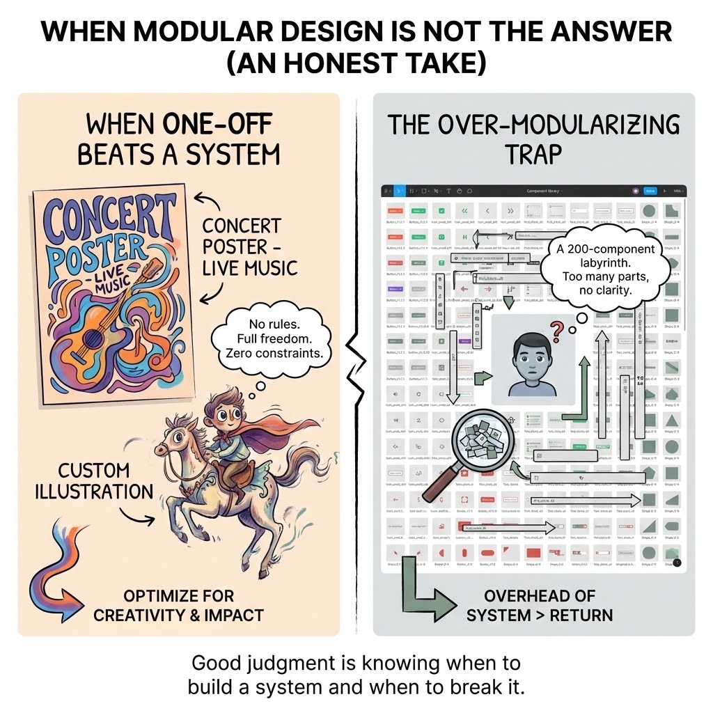
Here’s the honest version.
When One-Off Beats a System
A concert poster. A one-page editorial illustration. A custom lettering piece for a single client. These don’t need a system — they need full creative freedom and zero constraints.
I’ve started projects by instinctively reaching for a component library when what the work actually needed was a blank canvas and no rules. The result was technically consistent and creatively dead.
Modular design optimizes for repetition and scale. If neither of those is present in your project, the overhead of building a system costs more than it returns. A wedding invitation suite of five pieces doesn’t need Atomic Design. It needs a good eye and a strong concept.
The Over-Modularizing Trap
The opposite failure mode is just as real: breaking a design into so many small modules that the system becomes harder to navigate than the original problem.
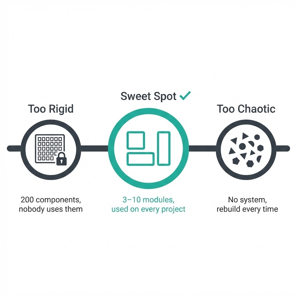
If your Figma file has 200 components and nobody on the team can find the right one without a 10-minute search — that’s not a system, that’s a labyrinth.
The sweet spot is fewer, well-named modules that cover 80% of your real use cases. The remaining 20% can be one-offs. That’s not failure — that’s good judgment.
How to Start Thinking Modularly Right Now (Even If You’re Not a UI Designer)
The mistake most people make is waiting until they have a “big enough” project to justify building a system. That moment never comes. You start small, or you don’t start.
Here’s a three-step entry point that works whether you design in Figma, build in Canva, or create Pinterest templates every week.
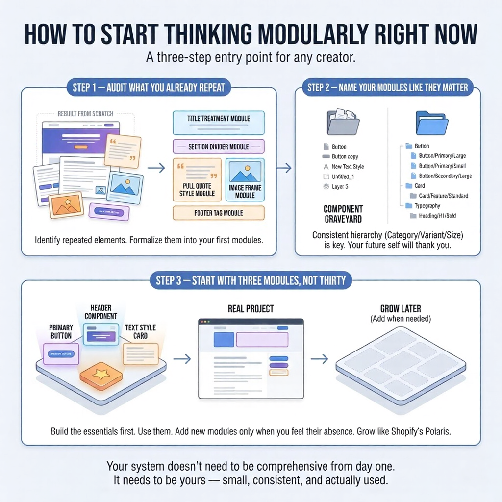
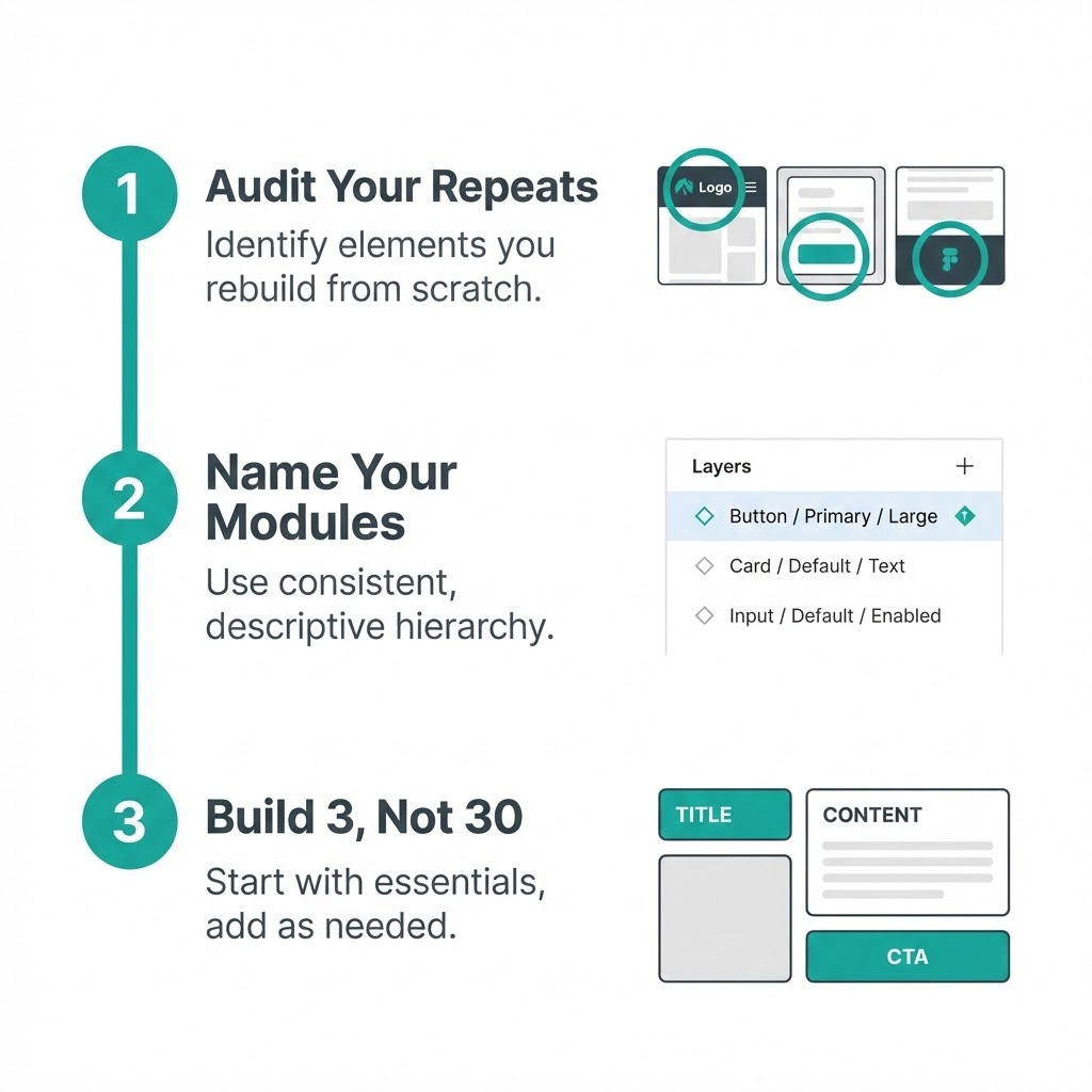
Step 1 — Audit What You Already Repeat
Open your last three projects. Look for elements you rebuilt from scratch each time — a header layout, a text style, a recurring illustration element, a call-to-action button. Write them down.
Those repeated elements are your first modules. You’ve already done the creative work. Now you just need to formalize it.
I did this with my blog graphics last year and found I was rebuilding the same five elements every single time — title treatment, section divider, pull quote style, image frame, and footer tag. Five modules. That’s a system.
Step 2 — Name Your Modules Like They Matter
This step feels administrative. It isn’t.
A module called “Button” is useless in a system with four button types. A module called “Button/Primary/Large” tells you exactly what it is, where it lives, and when to use it — without opening it.
Consistent naming is what separates a component library from a component graveyard. Use the slash hierarchy in Figma (Category/Variant/Size), stick to it, and your future self will thank you every single week.
Step 3 — Start With Three Modules, Not Thirty
Pick the three elements you use most. Build those first — properly, with defined properties, clear naming, and realistic variants. Use them on a real project.
Only add new modules when you feel the absence of them. Need a card component? Now you build it. Not before.
Shopify’s Polaris design system — used across one of the world’s largest e-commerce platforms — started as a small internal component library built by a handful of designers. It grew because it was useful, not because someone planned it to be comprehensive from day one.
Your system doesn’t need to be Polaris. It needs to be yours — small, consistent, and actually used.
FAQ
Q: What is modular design in simple terms?
Modular design means building something from independent, reusable pieces instead of creating everything as one fixed unit. Each piece — called a module — works on its own and connects to others through defined rules. Think of it like IKEA furniture: the frame is standard, the inserts are interchangeable. You get infinite configurations without starting from scratch every time.
Q: What is the difference between modular and responsive design?
They solve different problems. Responsive design controls how a layout adapts to different screen sizes — desktop, tablet, mobile. Modular design controls how that layout is built — from reusable, independent components. Most modern websites use both simultaneously: a modular component library assembled into responsive grid layouts. One is about structure, the other is about behaviour.
Q: Is modular design only for web and UI designers?
Not even close. IKEA uses it for furniture systems. Fairphone built an entire business model around it. Brand designers use it for visual identity kits. If you create Pinterest templates by swapping headlines and images within a consistent layout — that’s modular thinking. The principle applies anywhere repetition and scale exist, not just on screens.
Q: What’s the difference between a module and a component?
In everyday practice, designers use these terms interchangeably. If there’s a technical distinction: a module is a self-contained, independently functioning unit; a component can be a smaller part within a module. In Figma, what you’ll work with are called components — but they function exactly like modules. Don’t get stuck on terminology. Focus on the principle.
Q: What are the biggest mistakes beginners make with modular design?
Three come up constantly. First: building modules that are too large actually to reuse across contexts. Second: inconsistent naming — “Button,” “button 2,” “NEW button final” in the same file. Third: trying to build a complete system before using any of it on a real project. Start with three well-named modules on a live project. Everything else follows from there.
Q: How is modular design related to a design system?
A design system is what you get when modular design matures. It’s a collection of organized modules — buttons, typography scales, spacing rules, color tokens — combined with documentation explaining when and how to use each one. Modular design is the philosophy. A design system is the practical, shareable result of applying that philosophy consistently over time.
Q: What tools support modular design best?
Figma leads for UI and product design — its Components and Auto Layout features are built specifically for modular workflows. Sketch uses Symbols for the same purpose. For content and web: WordPress Gutenberg (blocks), Webflow (components), Shopify (sections). For graphic design and social content: Canva’s Brand Kit gets you 80% of the way there. The tool matters less than the mindset you bring to it.
Conclusion
Remember that button you were drawing for the third time?
That’s not a workflow problem. That’s a thinking problem — and modular design fixes it at the root. Not by making you faster at repetitive work, but by eliminating the repetition entirely.
You don’t need to build Shopify’s Polaris or Google’s Material Design to benefit from this. You need three well-named modules, one real project to test them on, and the patience to resist rebuilding what you’ve already solved.
Start with your next project. Open your last three files, find what you keep recreating, and formalize it. One master component in Figma. One reusable template in Canva. One consistent grid for your Pinterest graphics.
That’s your system. Small, yours, and actually used — which makes it better than 90% of design systems that exist only as Notion docs nobody opens.
- 44shares
- Facebook0
- Pinterest44
- Twitter0
- Reddit0

