Choosing the right colors can make a design stand out or fall flat. The best color combinations balance contrast and harmony, making designs eye-catching and easy to look at. Whether for websites, branding, or art, good color pairs bring energy and clarity to any project.
Designers often look for palettes that fit the mood or message they want to share. Some color combos are bold and bright, while others are calm and subtle. Knowing which pairs work well together helps create a professional and appealing look every time.
Many successful color combinations come from understanding basic color theory and current trends. Mixing warm and cool tones, or using complementary colors, often leads to strong designs. This article will explore popular and effective combinations to inspire creative projects.
Understanding Color Theory
Color theory helps designers pick colors that work well together. It explains how colors relate to each other, and how using the right combinations can make designs look balanced and clear. Key ideas include the basics of color groups, how colors are arranged on the color wheel, and how warmth and contrast affect visual impact.
Primary, Secondary, and Tertiary Colors
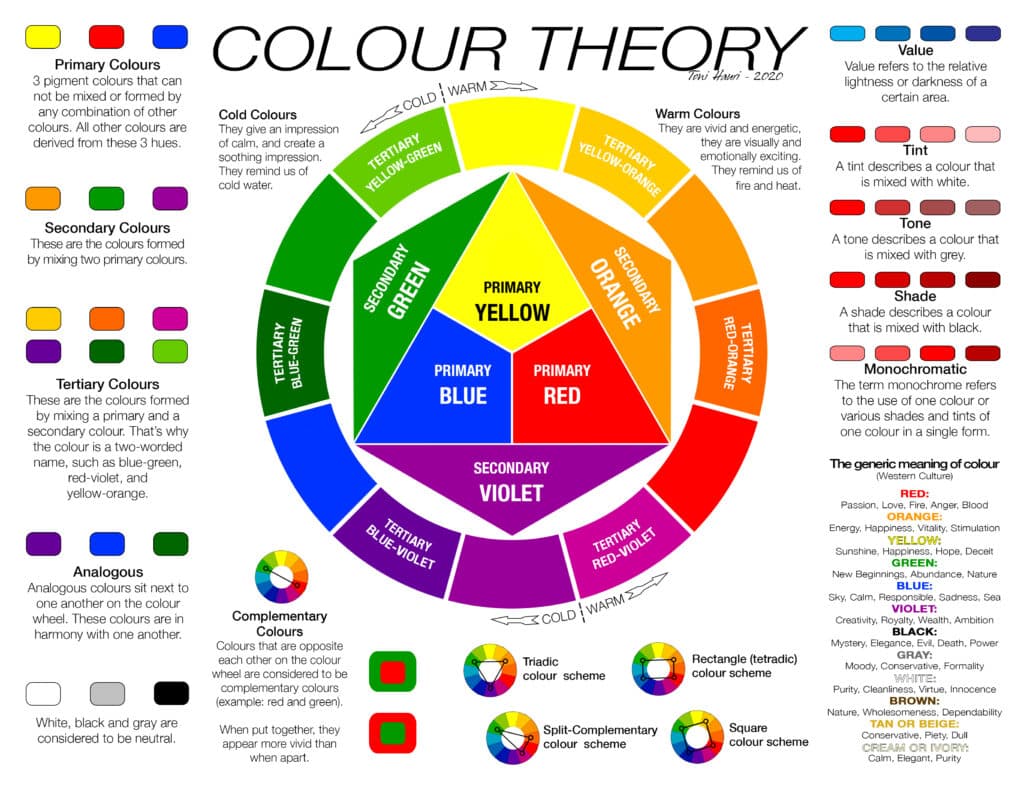
Primary colors are the base colors that cannot be made by mixing others. These are red, blue, and yellow. From these, secondary colors form by mixing two primaries: green, orange, and purple.
Tertiary colors come from mixing a primary color with a neighboring secondary color. Examples include red-orange and blue-green. These color groups help create a wide range of palettes by combining different types.
Knowing these colors and their relationships is important. It helps designers choose shades that either blend smoothly or create striking contrasts in a design.
Color Wheel Basics
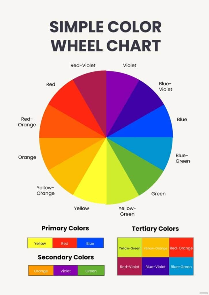
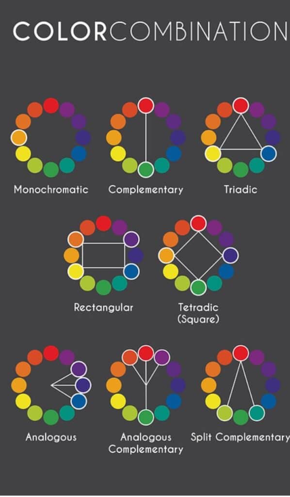
The color wheel is a circle that shows the relationship between colors. It organizes primary, secondary, and tertiary colors in a way that helps find matching schemes.
Common types of schemes include:
- Complementary: Colors opposite each other (e.g., blue and orange) for high contrast.
- Analogous: Colors next to each other (e.g., green, yellow-green, yellow) for harmony.
- Triadic: Three colors evenly spaced (e.g., red, yellow, blue) for balance and vibrancy.
Designers use these schemes to guide their choices and create pleasing or bold looks depending on their goals.
Color Temperature and Contrast
Colors are divided into warm (reds, oranges, yellows) and cool (blues, greens, purples) groups. Warm colors often feel energetic or inviting. Cool colors usually create calm or relaxed moods.
Contrast happens when two very different colors are placed together. It makes important parts of the design stand out. For example, light text on a dark background is easy to read because of contrast.
Balancing warm and cool colors with contrast helps designers control the mood and focus of their work. This balance is key for clear, attractive designs.
Popular Color Combinations for Design
Certain color combinations work well together because they create balance and interest. Some pairs bring strong contrast, while others offer smooth transitions or vibrant energy. These combinations help designers craft visuals that feel right to the eye.
Complementary Color Pairings
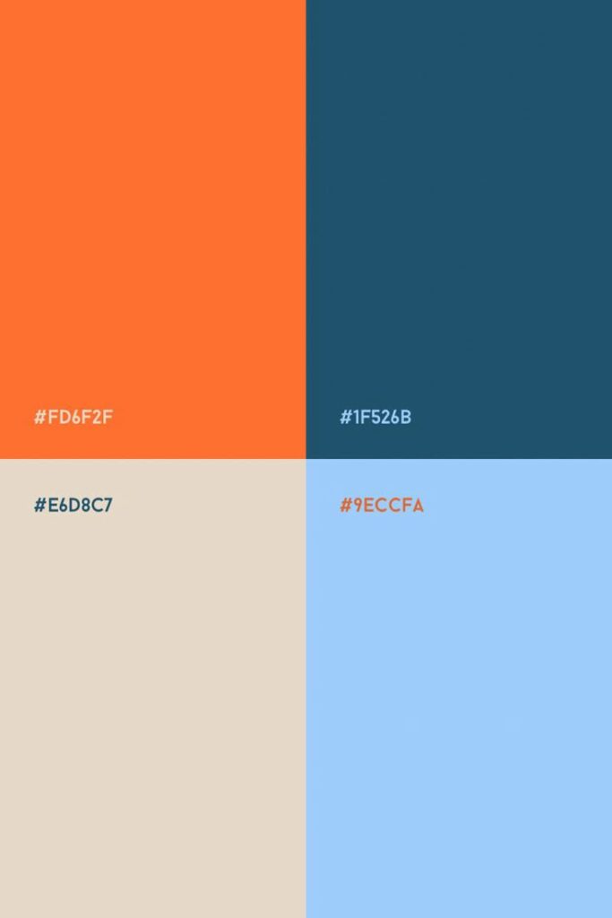
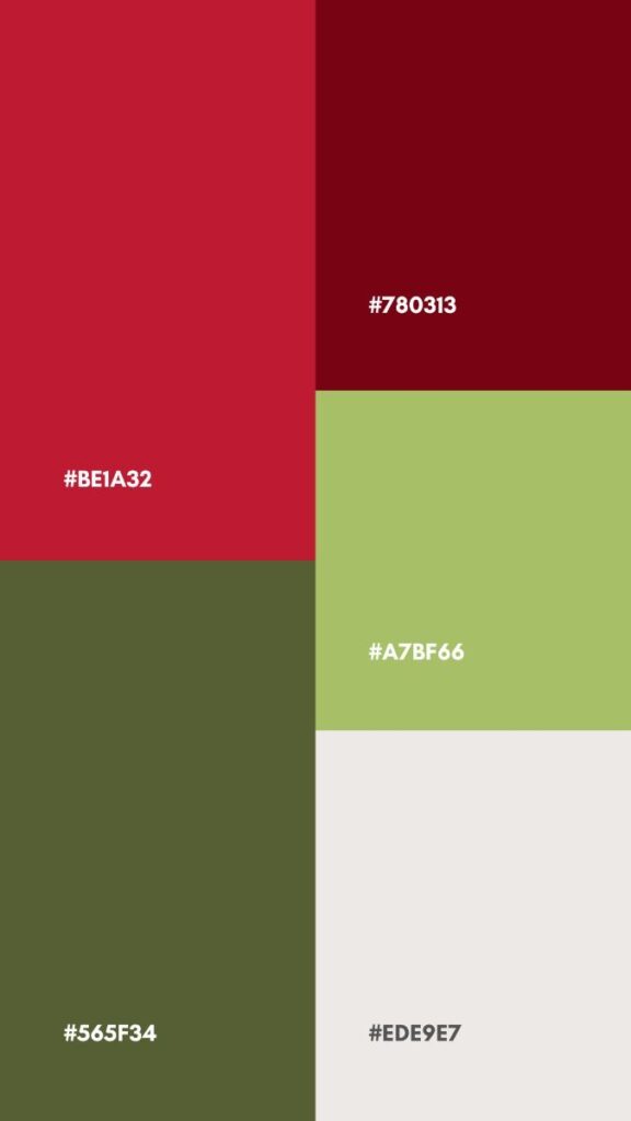
Complementary colors sit opposite each other on the color wheel, such as blue and orange or red and green. These pairs create high contrast and draw attention, making them perfect for elements that need to stand out.
Using complementary colors can make designs bold and energetic. However, it’s best to use one color more dominantly and the other as an accent to avoid overwhelming the viewer.
This pairing works well in branding, logos, and calls to action where clear distinction is important. It’s also great for adding visual excitement without losing harmony.
Analogous Color Schemes
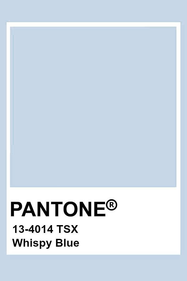
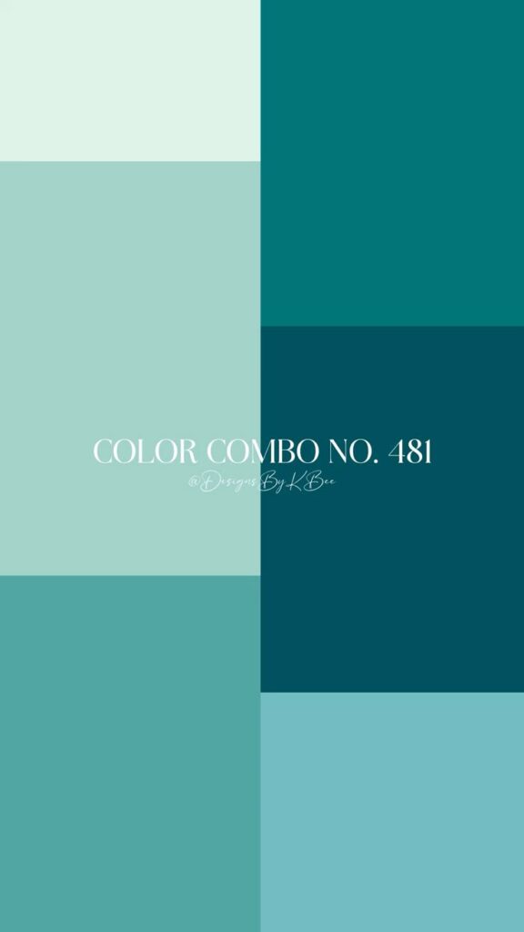
Analogous colors are located next to each other on the color wheel, like blue, blue-green, and green. These schemes feel natural and harmonious because the colors share similar tones.
Designs using analogous colors create a calm and balanced look. They work well for backgrounds, websites, and projects needing a soothing or cohesive feel.
Working with 2-4 adjacent colors helps maintain visual unity. Designers often choose one main color and use the others to support or highlight key areas.
Monochromatic Palettes
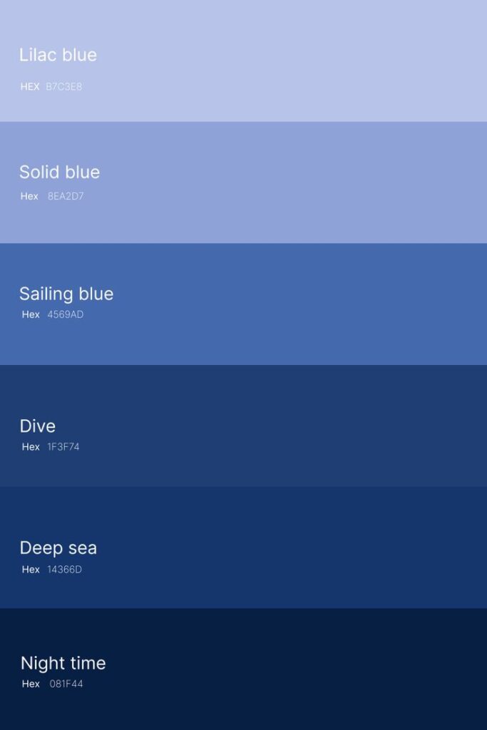
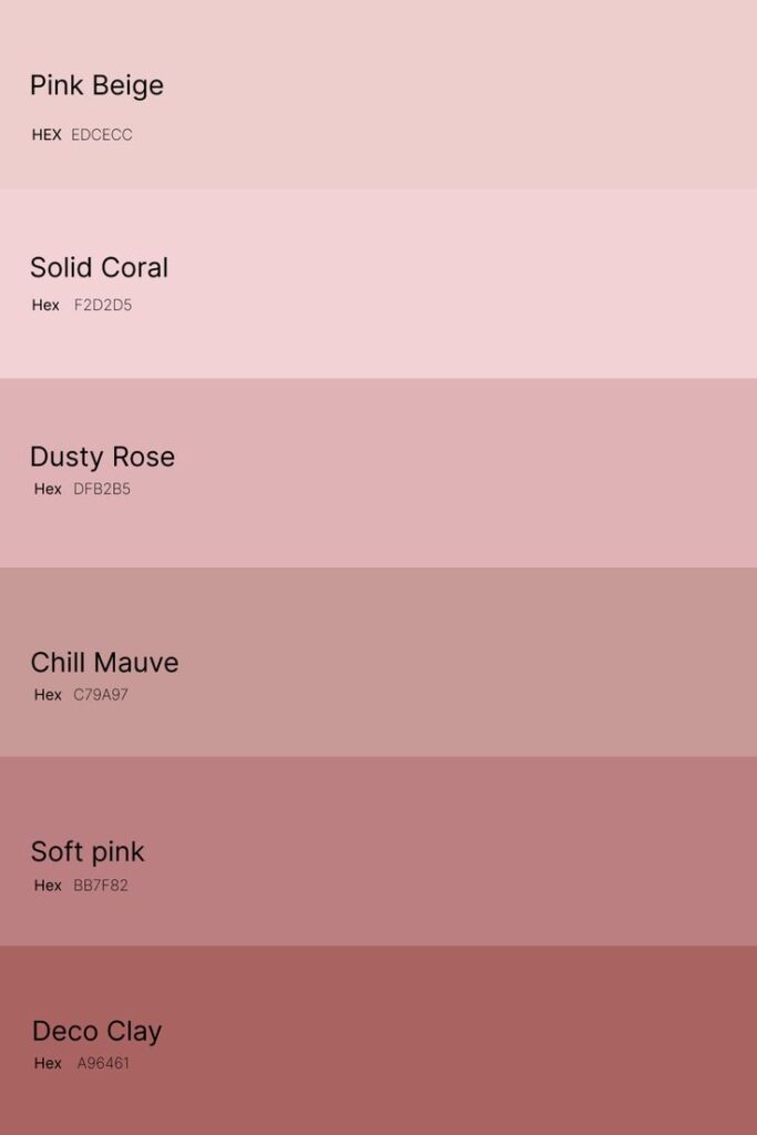
Monochromatic palettes use different shades, tints, and tones of a single color. This means light blues to dark blues or soft pinks to deep pinks.
The result is a clean, simple, and elegant look. It avoids color clashes and keeps the design focused and consistent.
This scheme is easy to control, making it great for minimalistic designs or when subtlety is needed. It can also emphasize textures and shapes without color distractions.
Triadic Color Harmonies
Triadic schemes involve choosing three colors evenly spaced on the color wheel, such as red, yellow, and blue. This setup offers a balanced yet vibrant mix.
Using triadic colors creates a lively feel without strong tension. Designers can use one color as the base and the other two as highlights.
This combination works well for playful or creative projects that want energy but not chaos. It balances contrast and harmony effectively, making designs engaging and well-rounded.
| Combination Type | Effect | Use Cases | Tips |
|---|---|---|---|
| Complementary | Bold, high contrast | Attention-grabbing elements | Use one dominant + one accent |
| Analogous | Harmonious, calm | Backgrounds, soothing interfaces | Limit to 2-4 adjacent colors |
| Monochromatic | Simple, elegant | Minimalist designs | Focus on shades and tones |
| Triadic | Vibrant, balanced | Creative, playful designs | Base color + 2 highlight colors |
How to Choose the Best Colors for Your Design
Choosing the right colors means thinking about what the brand stands for, who will see the design, and where it will be used. These elements guide color choices to make the design clear, appealing, and effective.
Considering Brand Personality


Colors reflect a brand’s character. For example, a tech company might use cool blues to show trust and professionalism. A children’s toy brand may prefer bright, playful colors like reds and yellows to feel fun and energetic.
Matching colors to values helps create a consistent image. A luxury brand often sticks to black, gold, or deep purples to express elegance and quality. Meanwhile, an eco-friendly brand might choose greens and browns to connect with nature.
Designers should list key brand traits first, then pick colors that naturally symbolize those traits. This makes the brand easy to recognize and remember.
Audience and Cultural Meanings
Colors can mean different things to different groups. Before choosing colors, it’s important to know the culture and preferences of the audience.
For instance, white is for weddings in many Western countries, but in some Eastern cultures, it’s linked to mourning. Red is exciting and lucky in some places but can also mean danger elsewhere.
Age and gender matter, too. Younger people might like bold, bright colors, while older groups often prefer softer shades. Using colors that fit the audience’s cultural values and tastes helps avoid confusion and connects better.
Purpose and Context of Use

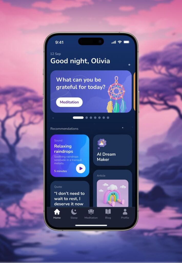
Colors should fit the design’s goal and where it appears. For example, a website aimed at sales might use red or orange to catch attention, while a health app might use calming blue or green.
The environment also matters. Bright colors work well online or in ads but might be too harsh in printed materials or physical spaces.
Designers can use simple rules like the 60-30-10 method to balance colors: 60% main color, 30% secondary, and 10% accent. This keeps designs balanced and easy on the eyes, no matter the purpose or place.
Color Combinations for Digital and Print
Choosing the right color combinations depends on whether the design is for digital screens or printed materials. Digital work needs colors that shine on various devices, while print requires attention to how inks mix and appear on paper. Accessibility also plays a key role to make designs easy to see for everyone.
Web Design Color Palettes
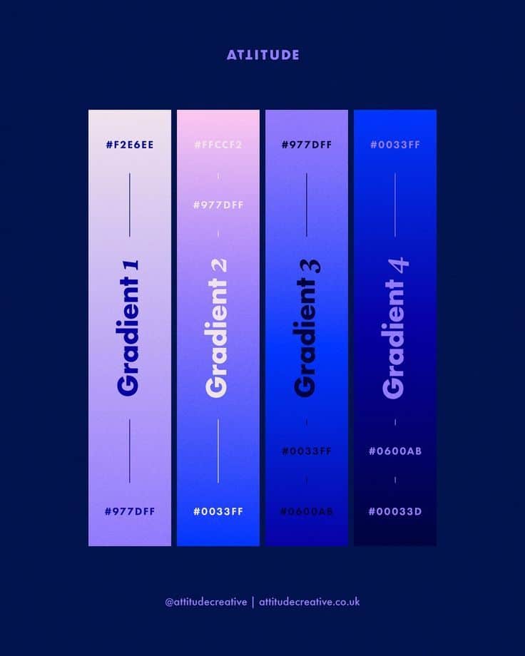
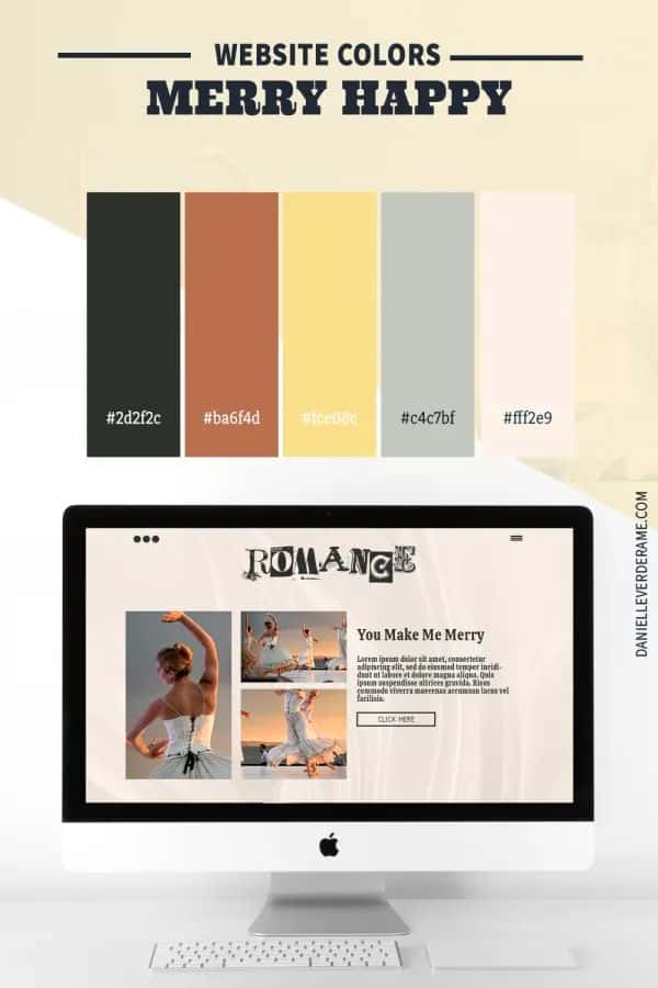
Web design color palettes must work on many screens with different brightness and settings. Designers often use RGB colors with HEX codes because they display well digitally. Using a primary, secondary, and accent color helps create clear hierarchy and guides users’ eyes.
Popular combos include cool blues with warm oranges or neutral greys with bold accent colors. Using colors with good contrast supports readability, especially for texts and buttons. Many designers pick palettes from trusted tools and trendsetters to balance modern looks with usability.
Print Media Recommendations
Colors in print rely on CMYK values, which are different from screen colors. Designers must prepare colors that look sharp and consistent on paper. Paper type and finish affect color brightness, so testing proofs is important.
Using fewer colors can reduce printing costs and avoid muddy results. Common palettes include earth tones, classic black-and-white with a splash of color, or bold color blocks for posters and flyers. Designers often create color swatches to check actual print output before final production.
Accessibility Considerations
Accessibility is crucial for both digital and print designs. High contrast between text and background is key for people with vision difficulties. Tools can test color contrast ratios, ensuring they meet standards like WCAG 2.1.
Avoid color combinations that confuse color-blind users, such as reds and greens together. Using patterns or shapes alongside colors helps signal meaning more clearly. Designers should include multiple ways to convey information, not relying on color alone.
Tips for Creating Eye-Catching Color Palettes
Creating a strong color palette means carefully mixing different tones to guide the viewer’s eye and create balance. Designers should think about how bold colors work with neutral shades, how to use accent colors to highlight key parts, and the importance of testing colors in real settings.
Balancing Bold and Neutral Shades
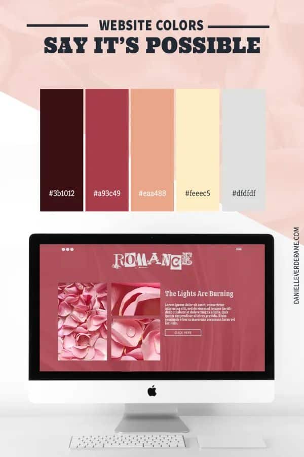
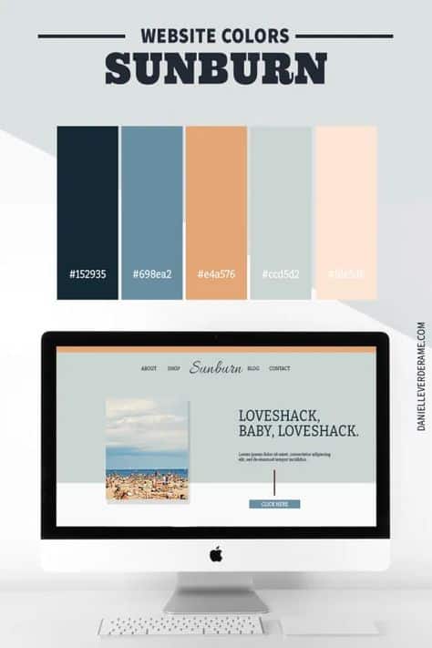
When pairing bold colors with neutrals, balance is key. Bold colors attract attention but can overwhelm if used too much. Neutrals such as whites, grays, and soft browns help calm the design and give the eyes a place to rest.
A good rule is to use bold colors for about 20-30% of the design, with the rest covered in neutral tones. This creates contrast without being too loud. For example, a bright red might pair nicely with soft gray or beige for a stylish, readable look.
Neutral colors also make bold shades pop more. This balance helps keep designs clean and professional, while still being dynamic and fun.
Using Accent Colors Effectively
Accent colors should not compete with main colors but highlight important elements like buttons, links, or headlines. They work best when used sparingly.
Choose accents that contrast well with the main palette but still feel connected. For example, a palette dominated by blues might have a bright orange or yellow accent to draw attention.
Using accents in small doses creates visual interest without overwhelming the design. It helps direct focus where it’s needed, such as calls to action or special offers.
Testing and Refining Color Choices
Colors can look very different depending on lighting, materials, or screen types. That’s why testing color palettes in real contexts matters.
Designers should view their palette on multiple devices and in both light and dark environments. Small tweaks to brightness or saturation often improve clarity and harmony.
Getting feedback from others also helps spot issues the designer might miss. Testing ensures the colors create the right mood and have the right impact before finalizing the palette.
- 1.9Kshares
- Facebook0
- Pinterest1.9K
- Twitter0
- Reddit0

