Retro illustration styles bring a unique feel that captures the look and mood of past decades. These styles often use bold lines, simple shapes, and bright colors to create images that feel both familiar and timeless. They offer a way to connect modern design with classic visuals that people recognize and enjoy.
People use retro illustrations in many places, from advertising to book covers and digital art. They often feature popular themes like vintage cars, old-school technology, or classic fashion. These motifs help create a sense of nostalgia and add charm to contemporary work.
Understanding what makes retro styles distinct helps artists and designers recreate authentic looks. Knowing the common techniques and visual cues used in these styles can make new projects feel true to the past while still fresh and engaging.
Key Takeways
- Retro styles use simple shapes and bold colors to create timeless images.
- Popular themes draw on vintage culture to evoke nostalgia.
- Learning key techniques helps create authentic retro artwork.
Understanding Retro Illustration Styles
Retro illustration styles focus on designs that bring back the look of past decades, mainly from the mid-20th century. These styles use specific colors, shapes, and themes that were popular during those times. They stand out because of their unique visual traits and clear differences from similar styles like vintage.
Definition of Retro Illustration
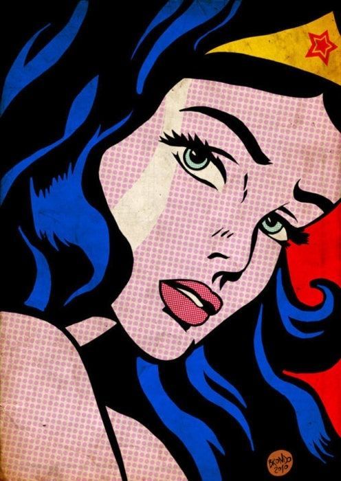
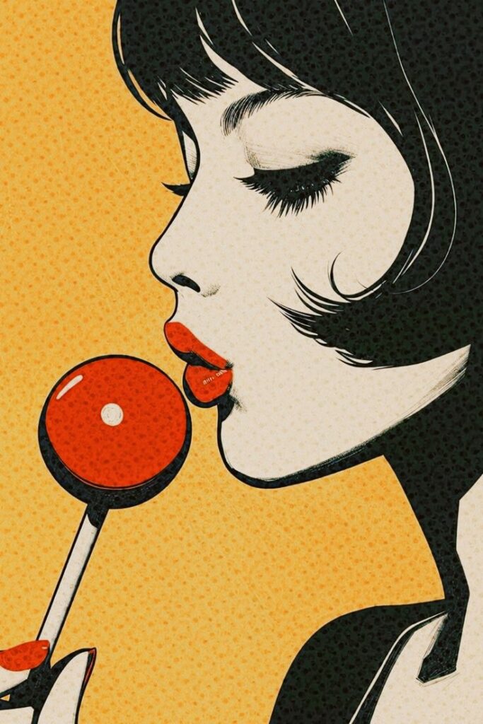
Retro illustration refers to artwork that imitates styles from the 1940s to the 1980s. It often recreates popular culture, advertising, and everyday life from those decades. Unlike modern illustration, retro uses older techniques, simpler lines, and limited color palettes.
Artists use retro illustration to give a nostalgic feel or to evoke a sense of the past. It is not just copying old art but reinterpreting it in new ways. This style is common in posters, packaging, and digital media that aim to connect with memories of earlier times.
Key Characteristics
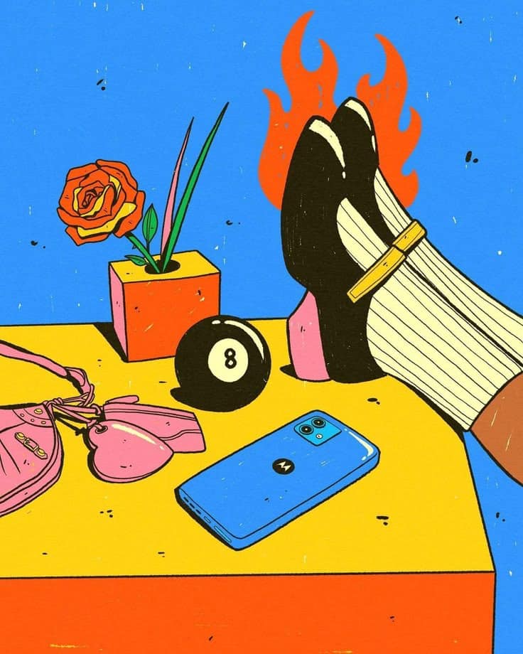
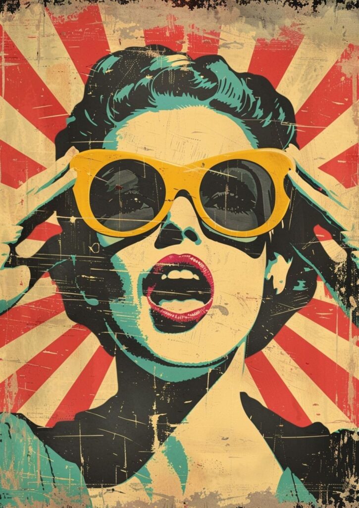
Retro illustrations often feature bold, flat colors and strong outlines. Patterns like stripes, dots, and geometric shapes are usual elements. Fonts in retro art tend to be thick and rounded or sharp and angular, matching the design era.
The color schemes are generally warm or muted, such as oranges, yellows, browns, and pastels. These colors reflect the printing techniques and trends of the mid-century period. The artwork often has a playful or optimistic tone, reflecting the social culture of the time.
Differentiating Retro from Vintage
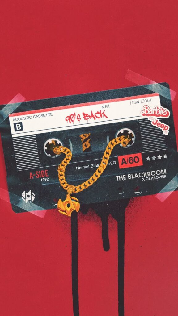
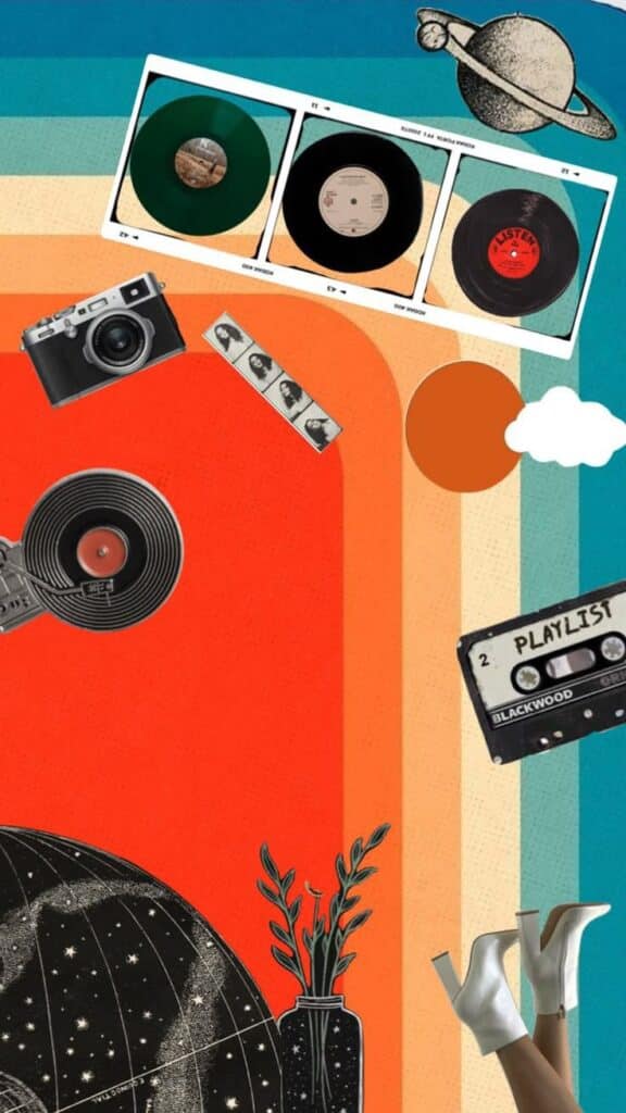
Retro and vintage styles are related but different. Vintage refers to original items or art from the past, showing natural wear and authentic period details. Retro is a modern creation made to look like it came from the past.
Vintage art often shows signs of aging, like faded colors or paper texture. Retro art is usually clean and new but designed with old style elements. This key difference helps artists and designers choose the right look for their projects.
Major Retro Illustration Movements
Retro illustration includes styles from different time periods, each with unique shapes, colors, and ideas. These movements show how art and design changed over time and influenced the way people make images.
Art Deco Influences
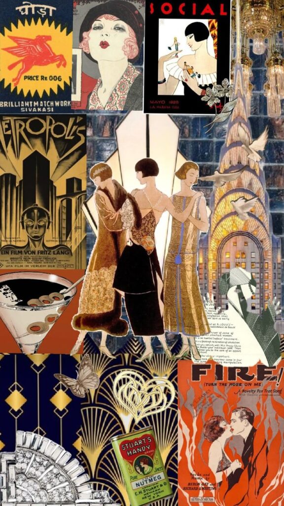
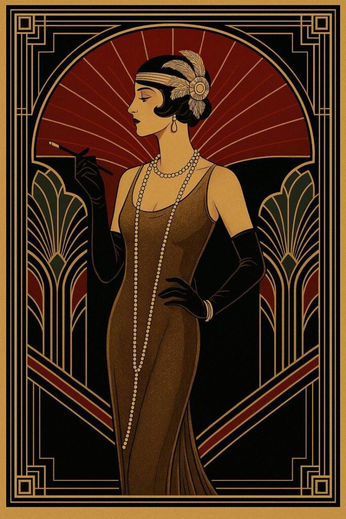
Art Deco is known for its bold geometric shapes and strong lines. This style often uses symmetrical designs with sharp angles and patterns. Colors are usually rich and metallic, like gold, silver, and black.
Illustrators in this style focus on luxury and modernity. Common themes include skyscrapers, machines, and sleek fashion. The look feels elegant but also powerful.
Many posters, book covers, and ads from the 1920s to 1940s used Art Deco. Its clean, flashy look makes it stand out today as a symbol of progress and style.
Mid-Century Modern Styles
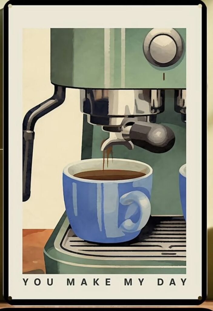
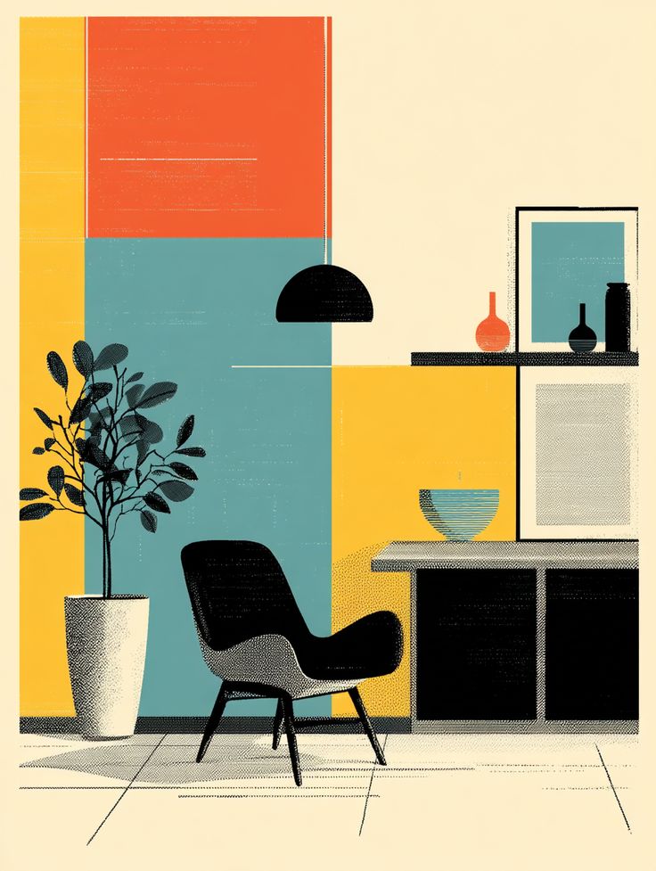
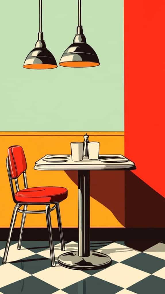
Mid-Century Modern uses simple forms and organic shapes. It prefers minimalism, with less detail and more open space. Colors tend to be muted but warm, such as olive green, mustard yellow, and burnt orange.
This style grew popular between the 1940s and 1960s. It often shows everyday life, nature, and futuristic ideas. The focus is on function and easy-to-understand design.
Illustrators use flat colors and clean lines. This movement is known for blending art and industry in a way that is both practical and creative.
Pop Art Elements
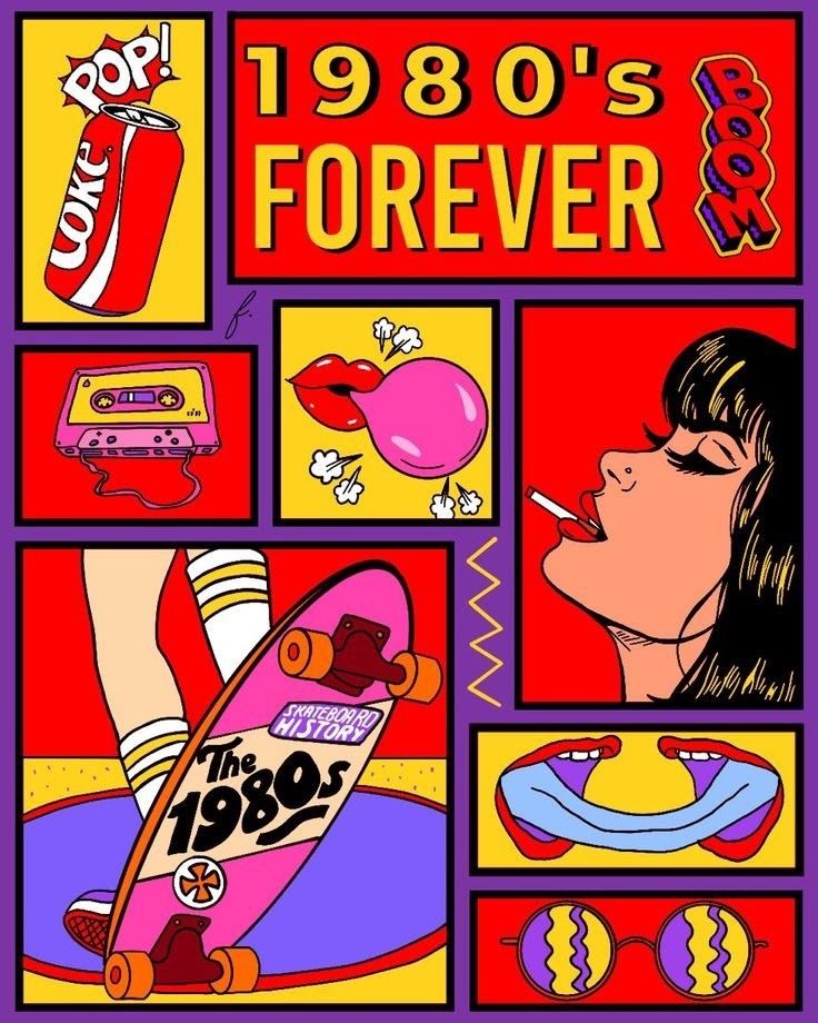
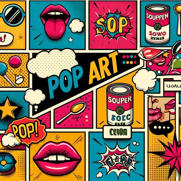
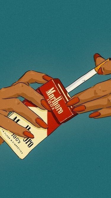
Pop Art is bright, bold, and inspired by popular culture. It uses bright primary colors and repeated patterns. People and objects from ads, comics, and mass media are common subjects.
This style emerged in the 1950s and 1960s as a reaction to traditional art. It challenges what is considered “high art” by using everyday images. Techniques include dots, lines, and high contrast.
Illustrators often play with irony and humor. Pop Art visuals are eye-catching and direct, making art more accessible to the public.
Popular Themes and Motifs in Retro Illustration
Retro illustration often uses distinct visual elements that give it a unique, vintage look. These elements include specific letter styles, repeating shapes, and chosen color combinations. Each aspect helps build the nostalgic feel that defines retro art.
Typography in Retro Styles
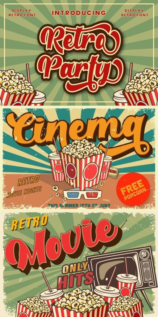
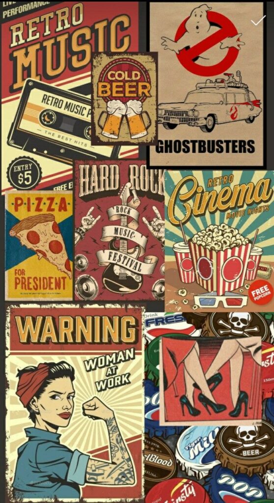
Typography in retro illustration features bold and decorative fonts. Many use serif fonts with thick and thin strokes for contrast. Script fonts with curls and swashes are common, especially to evoke the 1950s or 1960s.
Letter spacing can be tight or loose, depending on the design’s energy. Shadow effects and outlines help letters stand out, adding depth. Fonts often mimic hand-lettering to give a personal, crafted touch.
Patterns and Textures
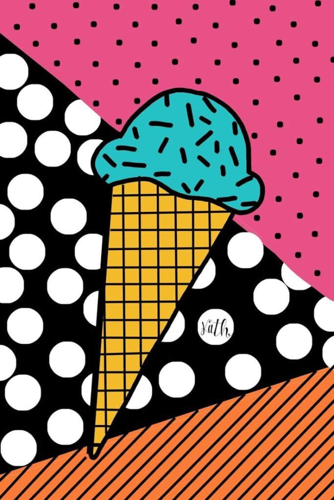
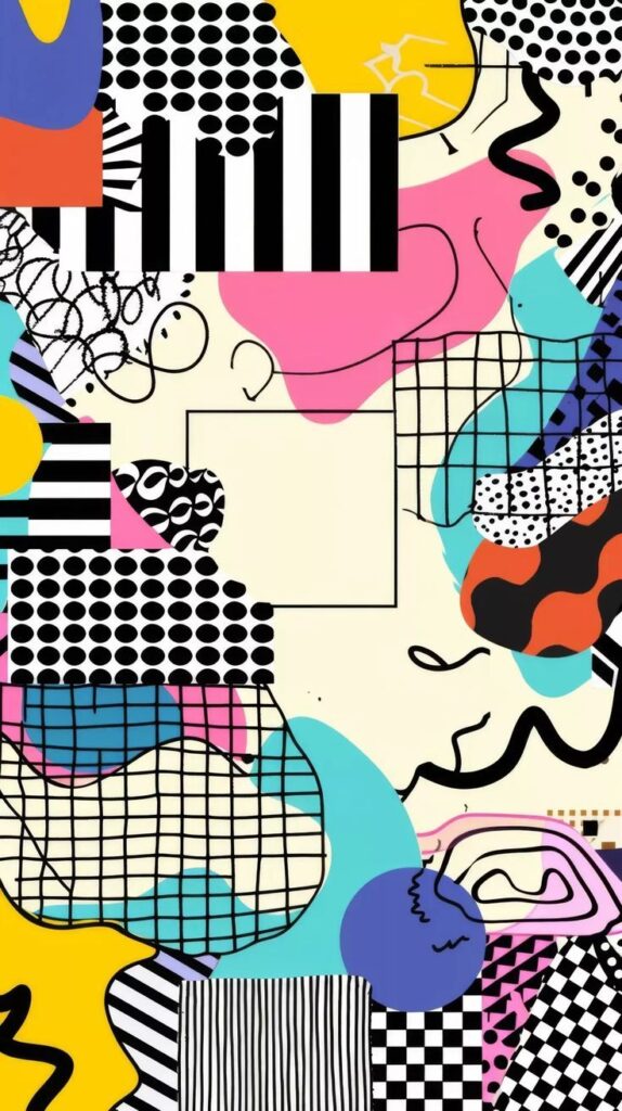
Retro illustrations rely heavily on patterns like polka dots, stripes, and geometric shapes. These patterns add rhythm and movement to the design while staying simple.
Textures mimic the look of older printing methods, with grainy, distressed surfaces or halftone dots. These textures make illustrations look aged or worn, enhancing the retro feel.
Color Palettes

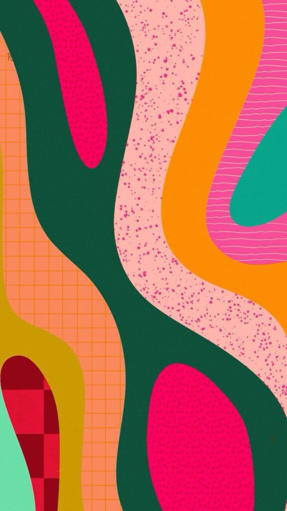
Color palettes in retro styles use muted yet lively shades. Popular colors include mustard yellow, teal, coral, and avocado green. These colors were widely used in the mid-20th century in packaging, ads, and fashion.
Combining warm and cool tones helps create balance and nostalgia. Colors are often flat with minimal gradients, keeping the design clean and bold.
Techniques Behind Retro Illustration
Retro illustration uses specific methods to capture a vintage look. These methods include working with physical materials, using modern digital programs, and applying patterns that mimic old printing styles. Each technique helps create a unique, recognizable retro style.
Traditional Media
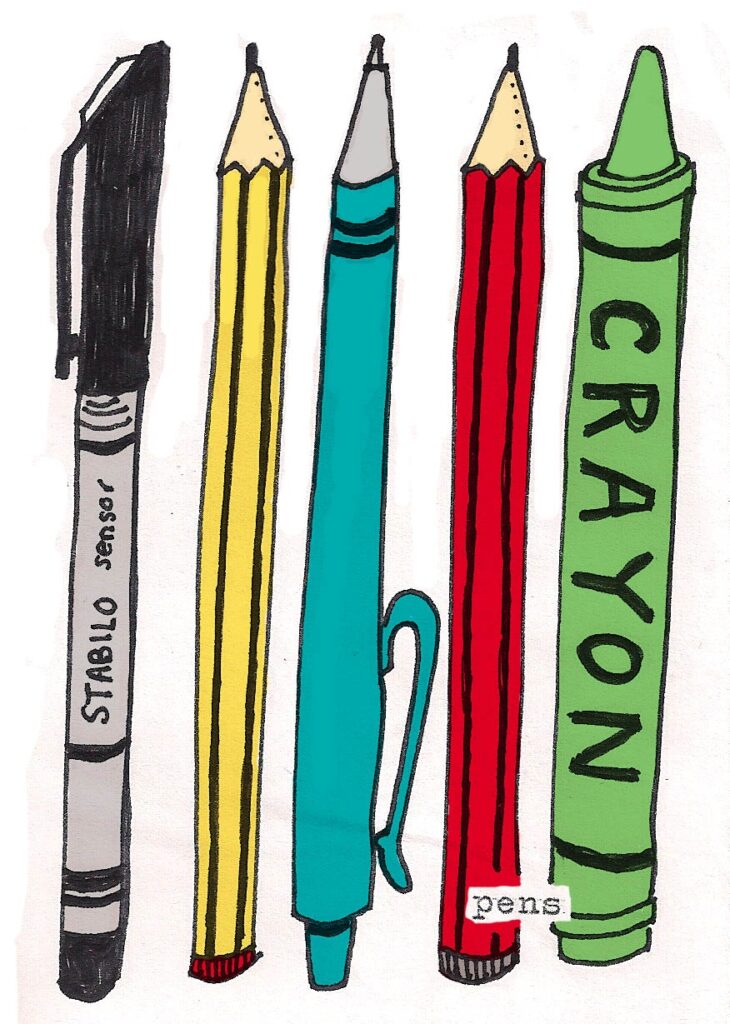
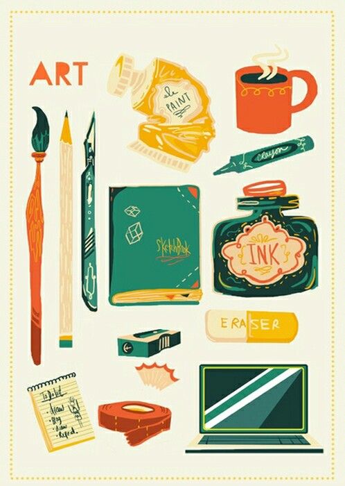
Many retro illustrations start with traditional tools like ink pens, markers, and brushes. Artists often use textured paper to add a natural feel to their work. This texture can create subtle imperfections that make the image look aged or handcrafted.
Shading is commonly done with cross-hatching or stippling, which adds depth without smooth gradients. These methods emphasize line work and create strong contrasts.
Artists also use limited color palettes, often favoring muted or earthy tones. This choice echoes the colors available in older printing processes and keeps the look consistent with past decades.
Digital Tools
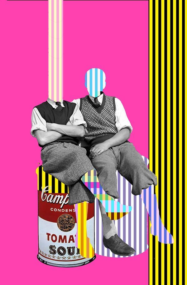
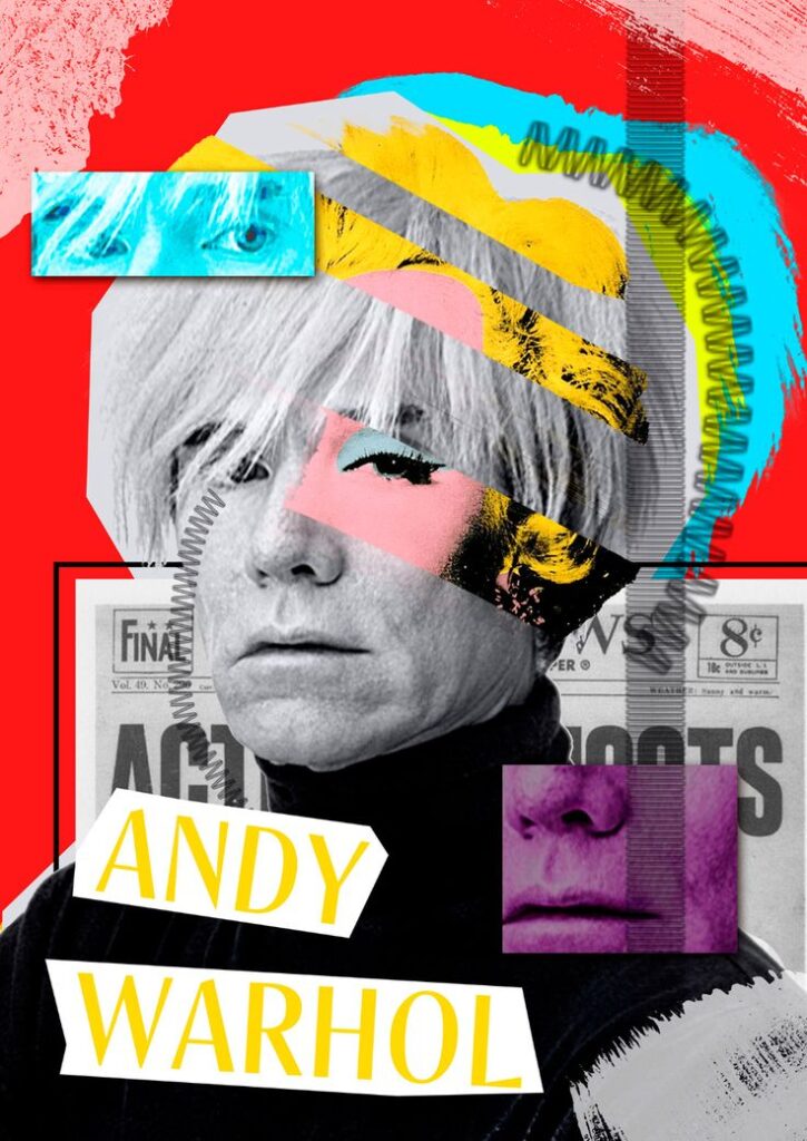
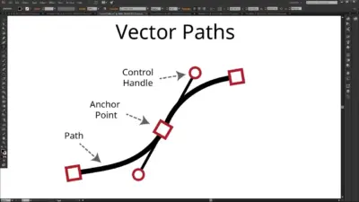
Digital technology offers precise control while still replicating retro effects. Programs like Adobe Photoshop and Illustrator allow artists to use custom brushes that mimic ink splatters and hand-drawn textures.
Layers and masks help in building complex compositions and correcting mistakes without ruining the artwork. Many digital artists also incorporate scanned traditional drawings to keep the organic feel.
Color palettes can be saved and reused to maintain authenticity. Digital tools also support retro fonts and patterns that match old graphic design styles.
Halftone Effects
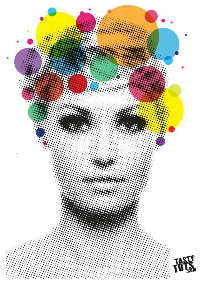
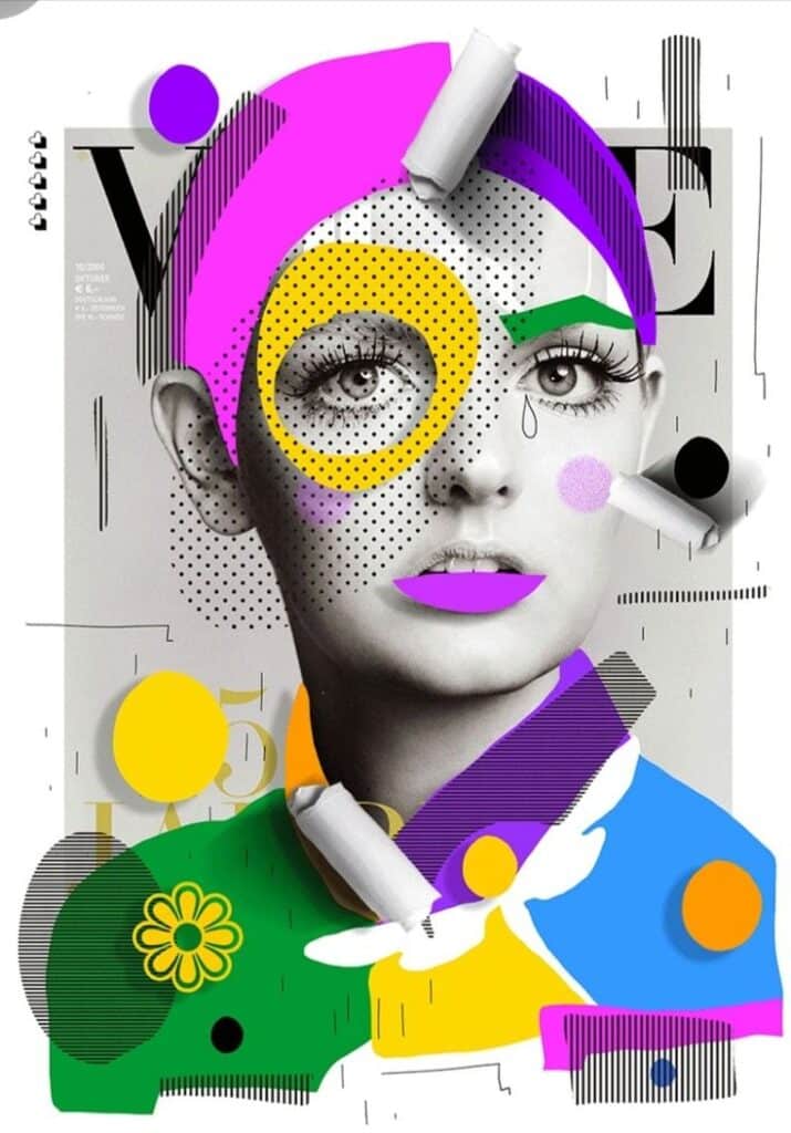
Halftone patterns are dots of varying sizes used to simulate gradients in printing. This technique was common in vintage newspapers and comic books.
Artists recreate halftone effects digitally by using filters or creating their own dot patterns. These dots can be uniform or irregular, depending on the desired era or effect.
Halftones add texture and depth while keeping the illustration flat and graphic. They often appear in backgrounds, shadows, or overlays to enhance the retro vibe.
Using halftones correctly requires balancing dot size and spacing to avoid making the image look blurry or too busy.
Iconic Artists and Illustrators
Several key artists shaped retro illustration styles with their unique techniques and visual storytelling. Their work reflects the trends and culture of past decades, influencing many creatives today.
Influential Figures
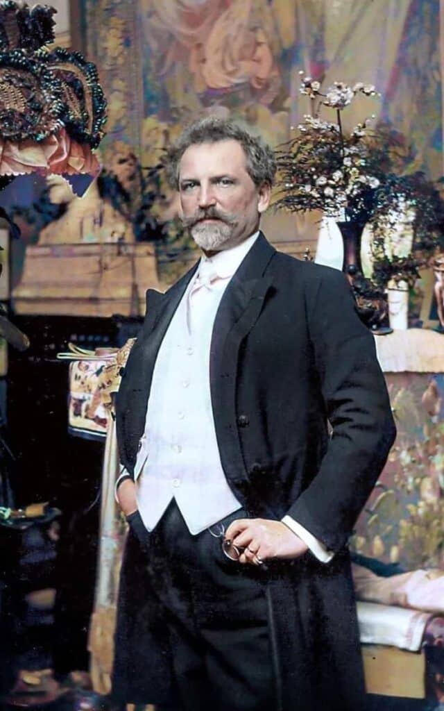
Alphonse Mucha is a pioneer of the Art Nouveau style, known for his flowing lines and decorative elements. His posters and illustrations set the foundation for modern retro art.
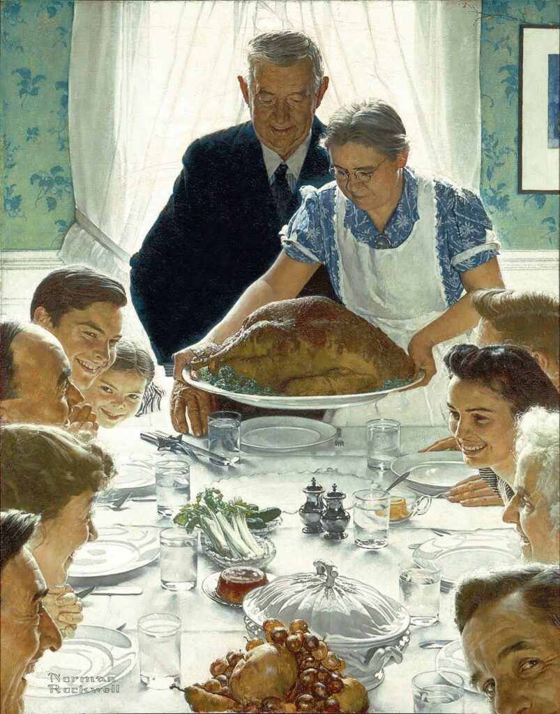
Norman Rockwell captured everyday American life in a nostalgic way. His realistic but warm paintings shaped how retro Americana style is viewed.
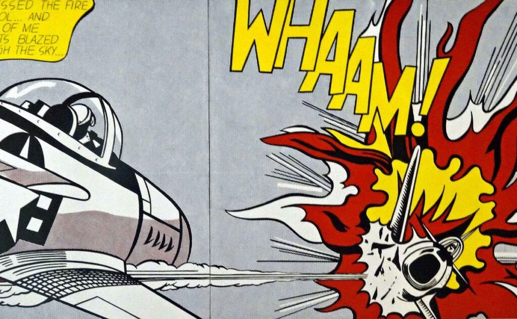
Roy Lichtenstein used comic book aesthetics, with bold dots and lines, to create pop art in the 1960s. His work mixed commercial art with fine art.
These artists impacted visual styles by introducing clear shapes, bold colors, and cultural references still seen in retro designs.
Notable Works in Retro Style
The Mucha Posters like “Job Cigarettes” are famous for elegant, ornate details and pastel colors. They show the idealized beauty common in early 1900s art.
Rockwell’s “The Four Freedoms” series highlights strong narrative and emotional appeal, reflecting post-war Americana with detailed, realistic imagery.
Lichtenstein’s “Whaam!” and “Drowning Girl” bring comic book style to gallery walls, emphasizing bright colors and dramatic expression, hallmarks of 1960s retro art.
These works stand as clear examples of how retro styles use specific techniques to tell stories and evoke past times.
Practical Applications of Retro Illustration Styles
Retro illustration styles are used in many areas where a vintage or nostalgic feel is needed. These styles help brands and editors create a specific mood and connect with audiences through familiar visual elements.
Branding and Advertising
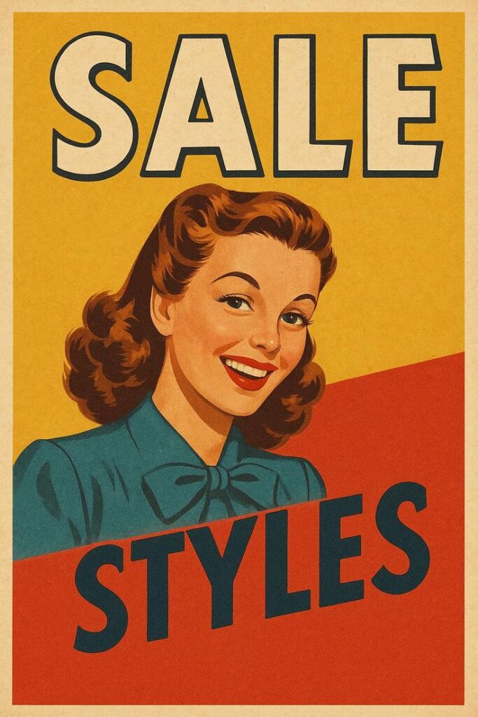
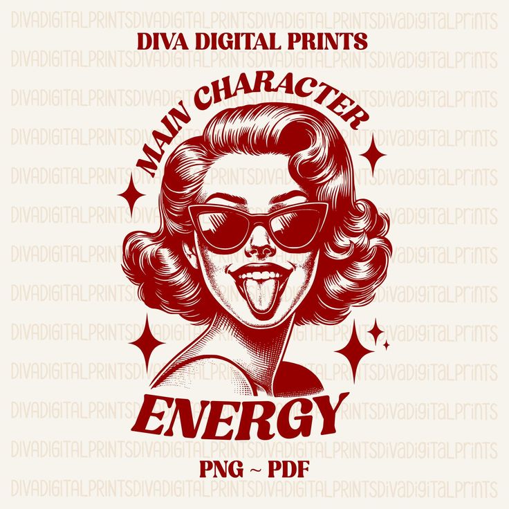
Retro illustrations are popular in branding to give products a timeless, trustworthy look. Companies often use old-school typography and color schemes to evoke memories or feelings from past decades. This helps brands stand out in a crowded market.
Packaging design frequently uses retro styles to suggest quality and tradition. For example, food brands might use 1950s-inspired illustrations to imply homemade or classic recipes.
In advertising, retro styles can target certain age groups who feel nostalgic about past eras. They create a visual story that grabs attention and increases brand recognition.
Editorial Illustration
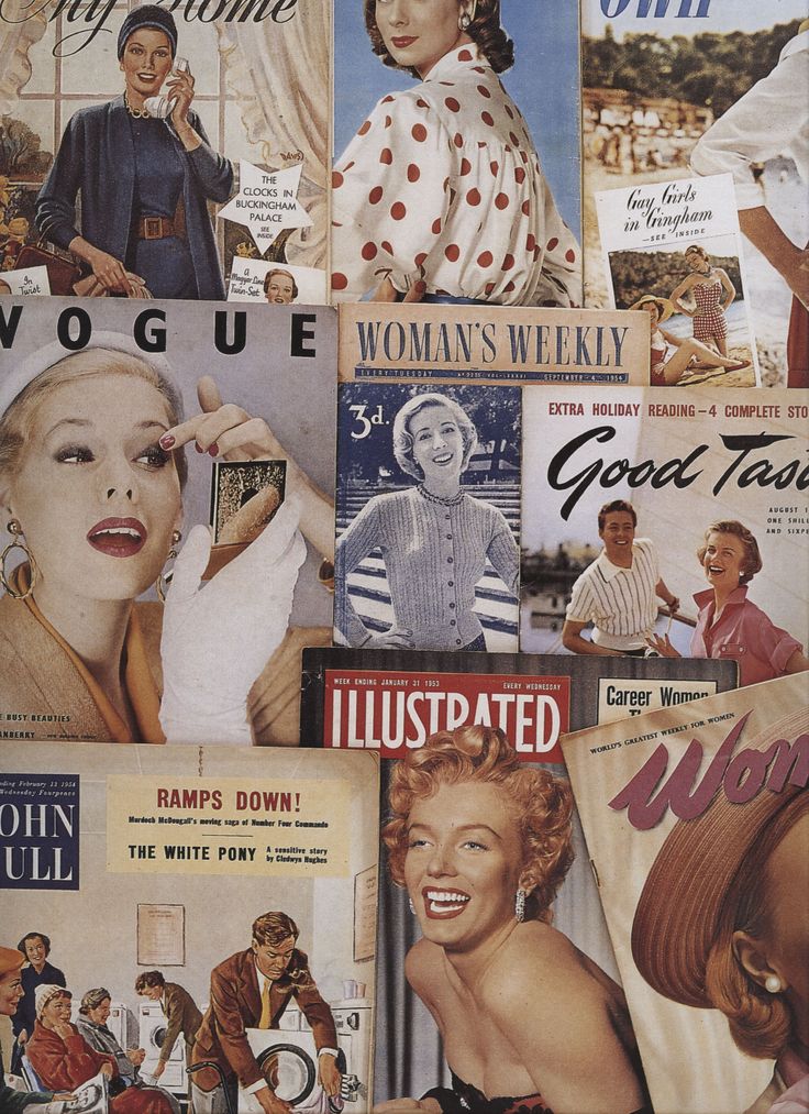
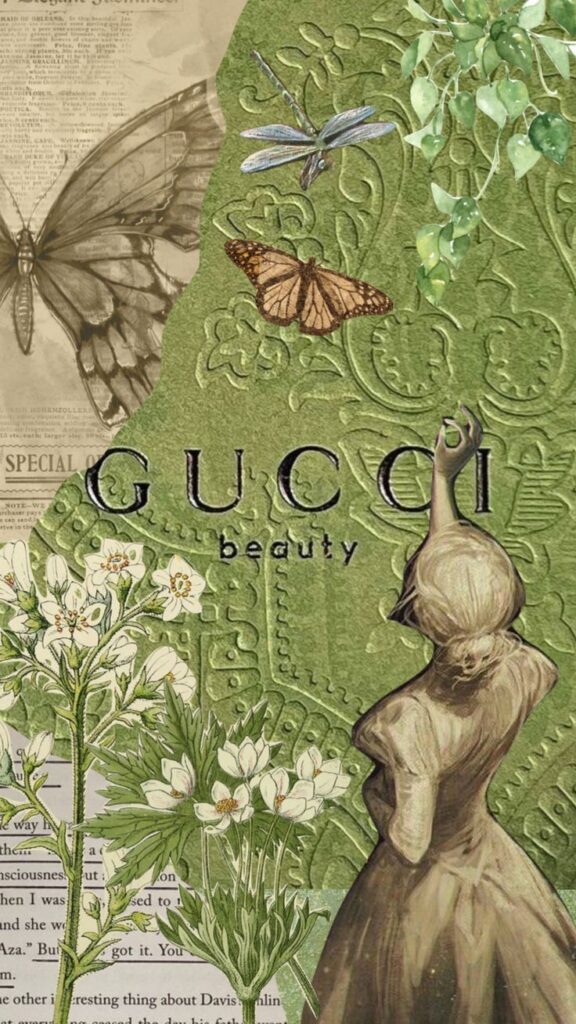
Editors use retro illustration to add personality to articles and magazines. This style helps communicate ideas with a clear, vintage vibe, making content more engaging.
Retro illustrations can simplify complex subjects by using bold lines and limited colors. This draws readers’ eyes and helps them understand the story faster.
Magazines often use retro styles when covering history, culture, or lifestyle topics. The look supports the theme and adds visual interest without overwhelming the text.
Key Uses in Editorial:
- Headlines and feature art
- Infographics with a vintage twist
- Theming special issues or sections
Contemporary Trends in Retro Illustration
Retro illustration styles are being updated with new techniques and fresh ideas. Artists combine old-school looks with today’s culture and technology. These changing trends impact how retro art appears in different industries.
Modern Adaptations
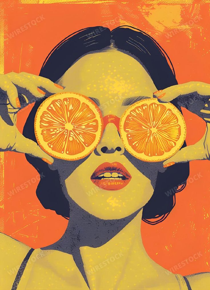
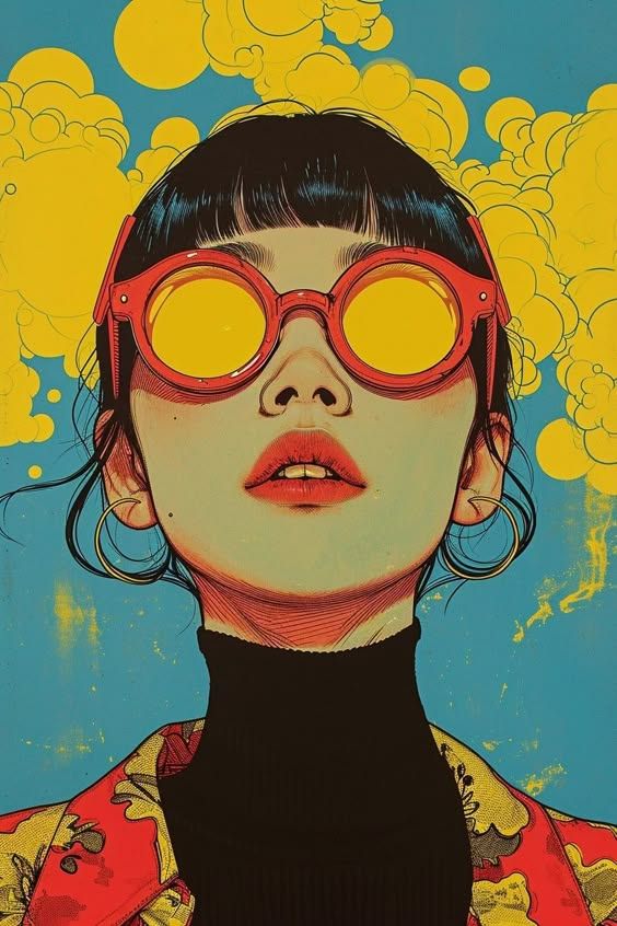
Artists use digital tools to recreate retro illustration with sharper lines and brighter colors. This mix of old and new methods keeps the vintage feel but allows easier editing and sharing online. Some designs blend 1950s comic styles with modern minimalism.
There is also a rise in using retro palettes with current graphic trends like flat design. This creates artwork that feels familiar but fits modern tastes. Animation and motion graphics now often borrow from retro styles, keeping the nostalgia but adding movement.
Collaborations with Fashion and Music
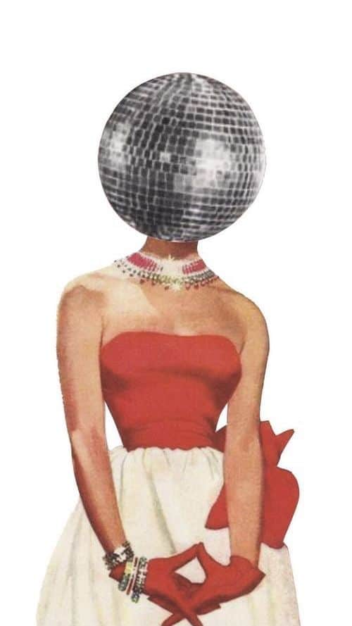
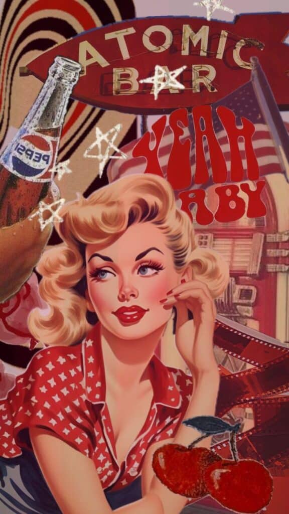
Retro illustration is popular in fashion, helping brands connect with fans of past decades. Many clothing lines use vintage-inspired prints and posters as part of their marketing and product design. This often includes bold 70s and 80s color themes.
In music, album covers and promotional art often feature retro illustrations to evoke specific eras. Musicians may work with illustrators to capture a certain mood or style that links to their sound. These partnerships help both artists and musicians reach broader audiences.
Tips for Creating Authentic Retro Illustrations
Creating authentic retro illustrations requires careful research and a clear sense of balance between old styles and new ideas. It is important to use the right sources and keep the design fresh while staying true to the past.
Choosing the Right References
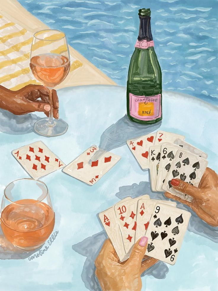
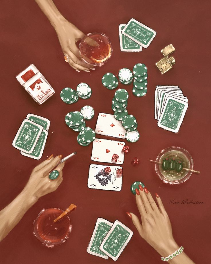
He should start by studying artwork from the specific decade he wants to represent. This means looking closely at color palettes, shapes, and textures used in vintage posters, magazines, and ads.
Using original sources helps avoid modern alterations that can change the feel of retro art. He can find many examples in archives, libraries, or online databases focused on design history.
He should also note specific details like typefaces, line weights, and patterns common in that era. These small elements build the overall look.
Organizing references by style, color, and subject can make the design process smoother. Keeping a folder or a mood board with these examples works well.
Balancing Nostalgia with Innovation

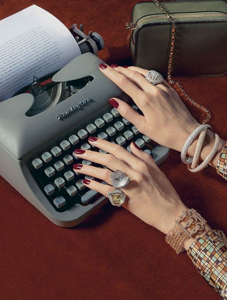
He needs to mix old styles with new ideas to keep the work interesting and relevant. Copying a style exactly can make the art feel outdated or like a pastiche.
Using modern tools like digital brushes or layering techniques can refresh retro styles. New textures or color shifts might update the look without losing the vintage vibe.
He should decide which parts of the past to keep and which to change. For example, keeping bold colors but adding cleaner lines can give a retro look a fresh touch.
This balance avoids the art feeling stuck in time but still honors the original style. It also helps reach wider audiences who appreciate both old and new.
- 1.6Kshares
- Facebook0
- Pinterest1.6K
- Twitter0
- Reddit0
