There’s a reason surfers stare at the ocean for hours before paddling out. Waves aren’t random—they have rhythm, personality, logic. Learning to read them takes years. Learning to draw them? That’s a different kind of patience.
I remember my first serious attempt at a waves drawing. I’d seen Hokusai’s “Great Wave” a thousand times, figured I understood the basic shape. Curling crest, foam fingers, dramatic spray. How hard could it be? Three hours later, my sketchbook looked like a crumpled bedsheet with anger issues.
The problem wasn’t talent. It was observation. I was drawing what I thought waves looked like, not what they actually do—the way the lip throws forward before it breaks, how foam patterns change between the peak and the shoulder, the difference between a wave rising and a wave collapsing.
This guide is what I wish I’d had back then. We’ll cover styles (from Hokusai to minimalist line art), techniques for capturing movement and texture, and how to showcase your finished work so it doesn’t just disappear into a drawer.
Grab your pencil. Let’s make some water move.
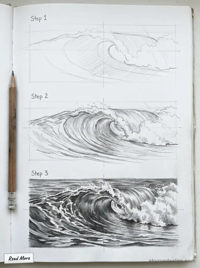


Fundamentals of Waves Drawing
Drawing waves requires understanding their natural movement and characteristics. Mastering the basic shapes, developing observational skills, and working with proper perspective are essential elements that will help you create realistic water illustrations.
Understanding Ocean Waves
Waves aren’t just simple little swoops in the water – they’re actually pretty complicated when you think about it. They’re the result of wind blowing across the surface of the ocean. So before you even bother trying to draw one, you really need to get your head around the whole thing and how it works. The highest point of the wave is known as the crest, and the lowest is the trough. And then there’s the face of a wave – the steepest bit that’s pointing forwards when it’s breaking.
When a wave is making its way to the shore, one thing happens – it changes from just a big rolling swell into a breaking wave with a nice curl to it. This change happens because the bottom of the wave hits the ocean floor and the top just keeps on going, eventually ending up in a heap on the beach.
Different types of waves are gonna need a different sort of approach. Ripples on the water might just be a simple curve – but the big breaking waves, those need a lot more detail – foam, spray, and all that transparency stuff has got to be just right.
Basic Shapes and Lines
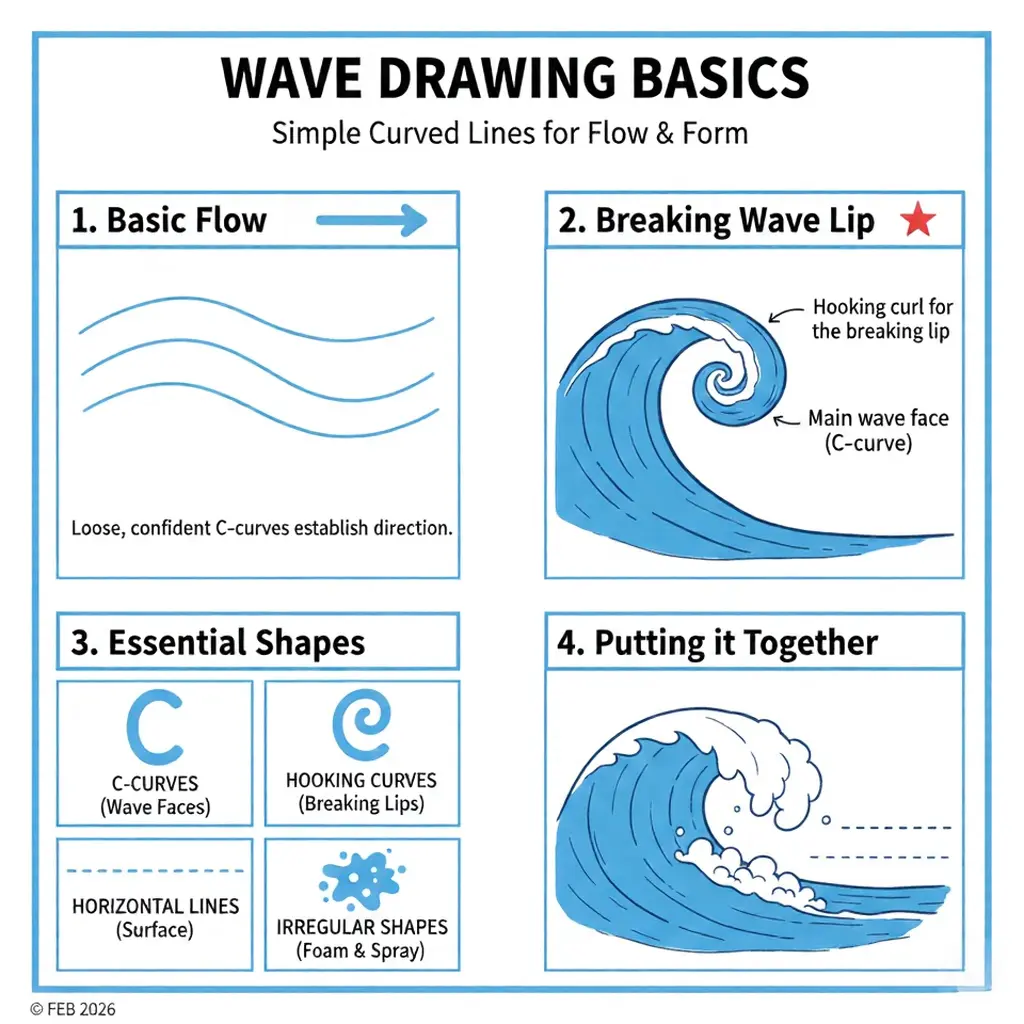
Start your wave drawings with simple curved lines that establish the basic flow and direction. Use loose, confident strokes rather than timid, broken lines.
For breaking waves, begin with a curved line representing the main wave shape. Add a curling or hooking line at the top to show where the wave folds over itself. This “lip” or “curl” is a distinctive feature of breaking waves.
Essential wave shapes include:
- C-curves for wave faces
- Hooking curves for breaking lips
- Horizontal lines for water surface
- Irregular shapes for foam and spray
Use light pencil strokes (6B graphite works well) when establishing these foundational shapes. You can later refine the drawing by adding details and varying your line weight to create depth.
Observation and Perspective
Real waves are a game changer when it comes to drawing waves that look realistic. Try to grab a trip to the beach and study the real thing whenever you can – or failing that – look at lots of reference photo’s. Take a look at how the light catches the water – it’s amazing how some bits of it can just seem to disappear because of the way the light is passing through, while other bits create a sort of mirror-like reflection.
Perspective is a pretty big deal when it comes to drawing waves. Depending on where you are relative to the waves, they’re going to look totally different. If you’re standing on the shore and looking out, you’re probably going to see loads of wave lines receding off into the distance – they start to fade off into the horizon. If you turn round and look at the wave from the side, you’ll get a much better idea of how it’s actually moving – you can see the full swoop of it breaking.
When it comes to drawing waves, pay a bit of attention to the relationship between how big the waves are and how far away they are from you. The waves that are closest to you should be the biggest and most detailed, while the waves that are way off in the distance are going to look pretty small and pretty vague.


Light and shadow are what really give the illusion of depth to waves. Take a look at how the sunlight catches the crest of the wave – it can create these little highlights that look really nice. Then, contrast that with the way the light doesn’t reach into the troughs – they can look pretty dark and dramatic. These kinds of contrasts are what help bring the whole scene to life.
Essential Techniques for Drawing Waves
Drawing realistic ocean waves requires mastering specific techniques that capture their fluid movement and dynamic nature. These methods will help you create waves that appear to flow naturally across your page while incorporating important elements like horizon lines and celestial objects.
Sketching Flow and Movement
Begin by lightly marking the borders of your drawing area to establish scale. Rough in the basic wave shape using curved lines that show the direction of water movement. Focus on creating rhythm in your strokes to mimic the natural flow of waves.
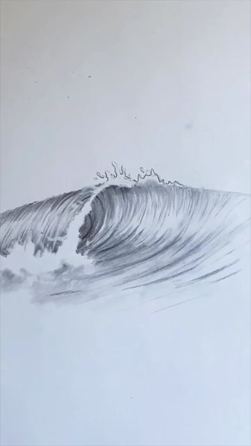
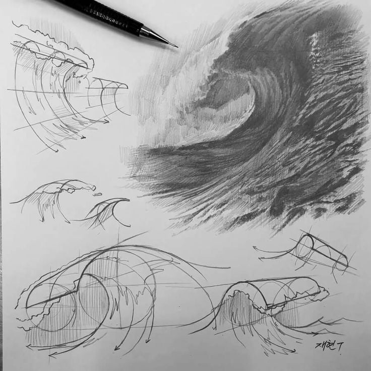
Pay attention to the crest of the wave, where the most dramatic action occurs. Use quick, confident strokes to indicate foam and spray at the top of breaking waves. This creates a sense of motion and energy.
Remember that ocean waves have a distinct pattern – they build gradually, peak, then crash. Draw your lines accordingly, with gentle curves that grow steeper as they approach the breaking point. This progression helps convey the wave’s power and momentum.
Incorporating Horizon and Moon
The horizon line is crucial for establishing perspective in your wave drawings. Position it about one-third from the top of your page for a balanced composition. This creates proper scale and gives your waves a setting.
When adding a moon, consider how its light affects the water’s surface. Moonlight creates a reflective path across waves, which you can achieve by leaving negative space or adding highlights along the water’s surface.
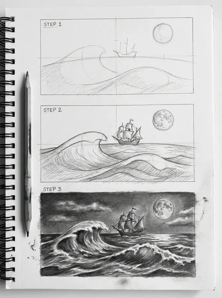
Use the moon’s position to inform your shading choices. Waves catching moonlight will have brighter edges and deeper shadows. This contrast adds depth and drama to your ocean scene while creating a focal point that draws the viewer’s eye across your composition.
Creating Fine Line and Watercolor Effects
Fine line work brings detail and texture to your waves. Use thin, varied lines to indicate ripples, spray, and foam patterns. Alternate between continuous flowing lines for smooth water and broken, jagged lines for turbulent areas.
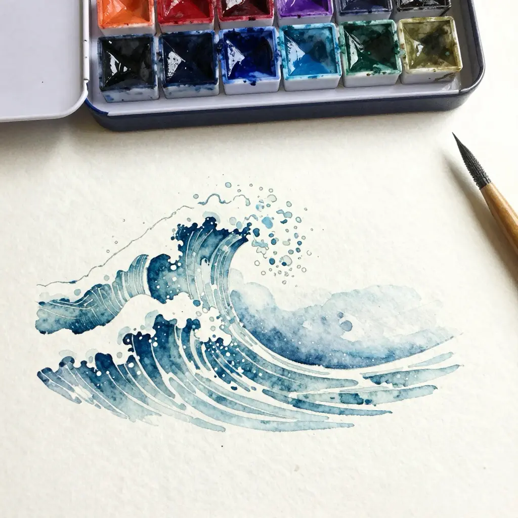
For watercolor effects, start with light washes to establish the base color of your ocean. Build up layers gradually, allowing each to dry before adding the next. Use wet-on-dry technique for crisp wave edges and wet-on-wet for softer, blended areas.
Combine fine ink lines with watercolor for a striking mixed-media approach. Draw your wave outlines first, then add watercolor to fill areas between lines. Leave white spaces for foam and spray, using the natural paper color to represent the brightest highlights on your waves.
Waves Drawing Styles and Formats


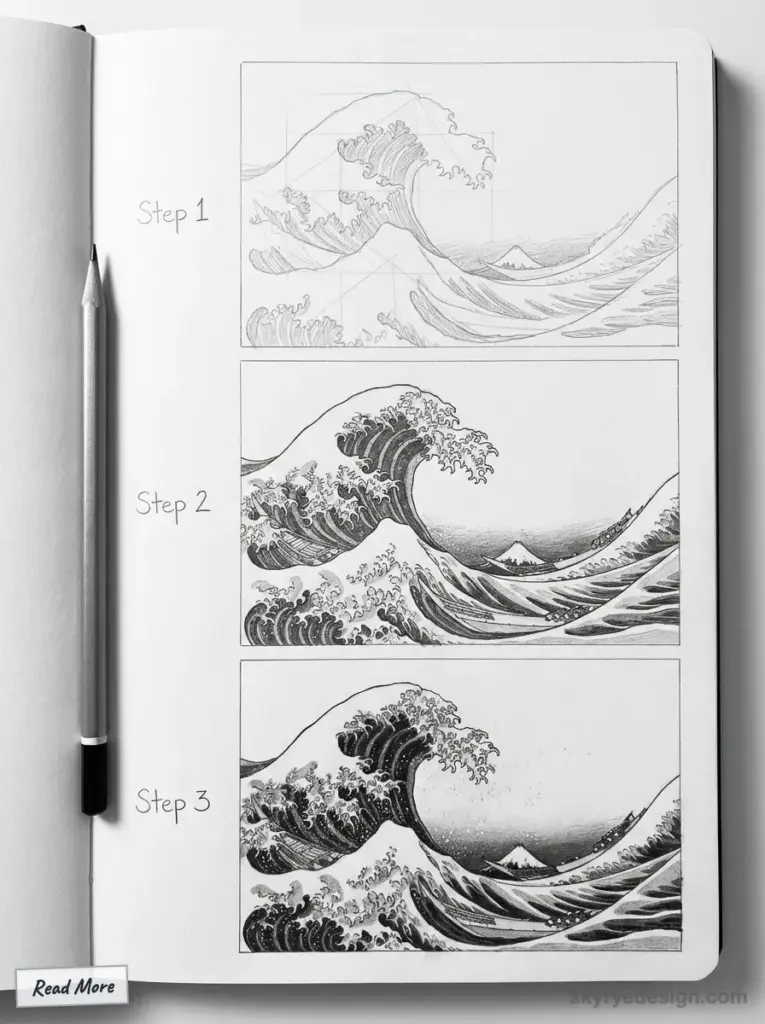
Hokusai’s “The Great Wave off Kanagawa” is probably the most reproduced wave in human history. You’ve seen it on phone cases, tattoo sleeves, coffee mugs, and dorm room posters from Tokyo to Toronto. It sold as a woodblock print for about the cost of a bowl of noodles in 1831. Nearly two centuries later, it still defines how most people picture a wave drawing.
But here’s the thing—Hokusai’s style is just one approach. Waves can be geometric or organic, minimal or chaotic, realistic or completely abstract. The style you choose changes everything about the mood, difficulty, and final impact of your work.
Japanese Ukiyo-e Style
Hokusai didn’t invent wave art, but he perfected a specific visual language: bold outlines, flat color areas, dramatic curves, and those iconic claw-like foam fingers reaching into the sky. His contemporary, Utagawa Hiroshige, took a softer approach—his waves in “The Sea at Satta” (1858) feel gentler, more atmospheric, with subtle gradients instead of hard edges.
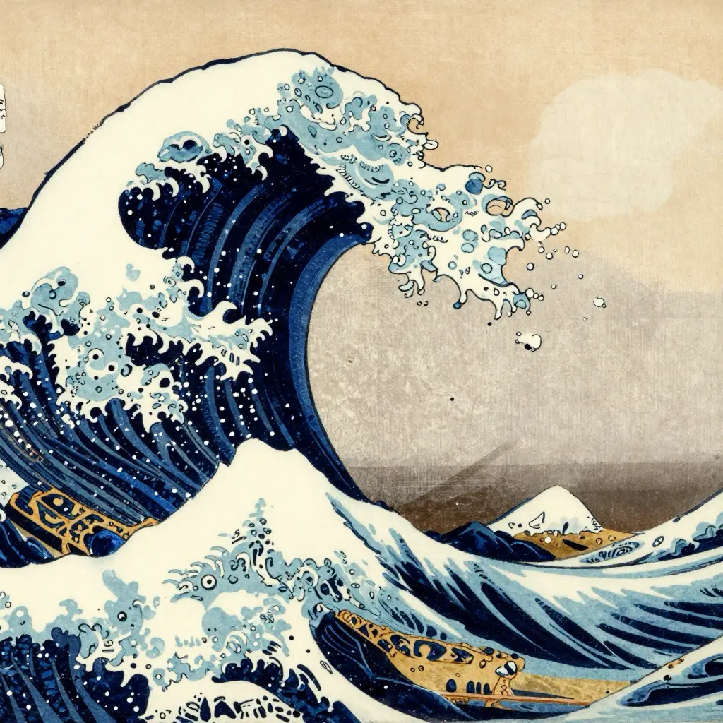
If you want to try this style, think in layers. The wave itself is a series of curved shapes stacked on top of each other, outlined in dark blue or black. The foam is white with stylized, almost decorative curls. There’s no realistic blending—everything is graphic and intentional.
One tip: Study the original prints, not modern reproductions. The Met Museum and Library of Congress both have high-resolution scans online for free. The difference in detail is significant.
Minimalist Line Waves
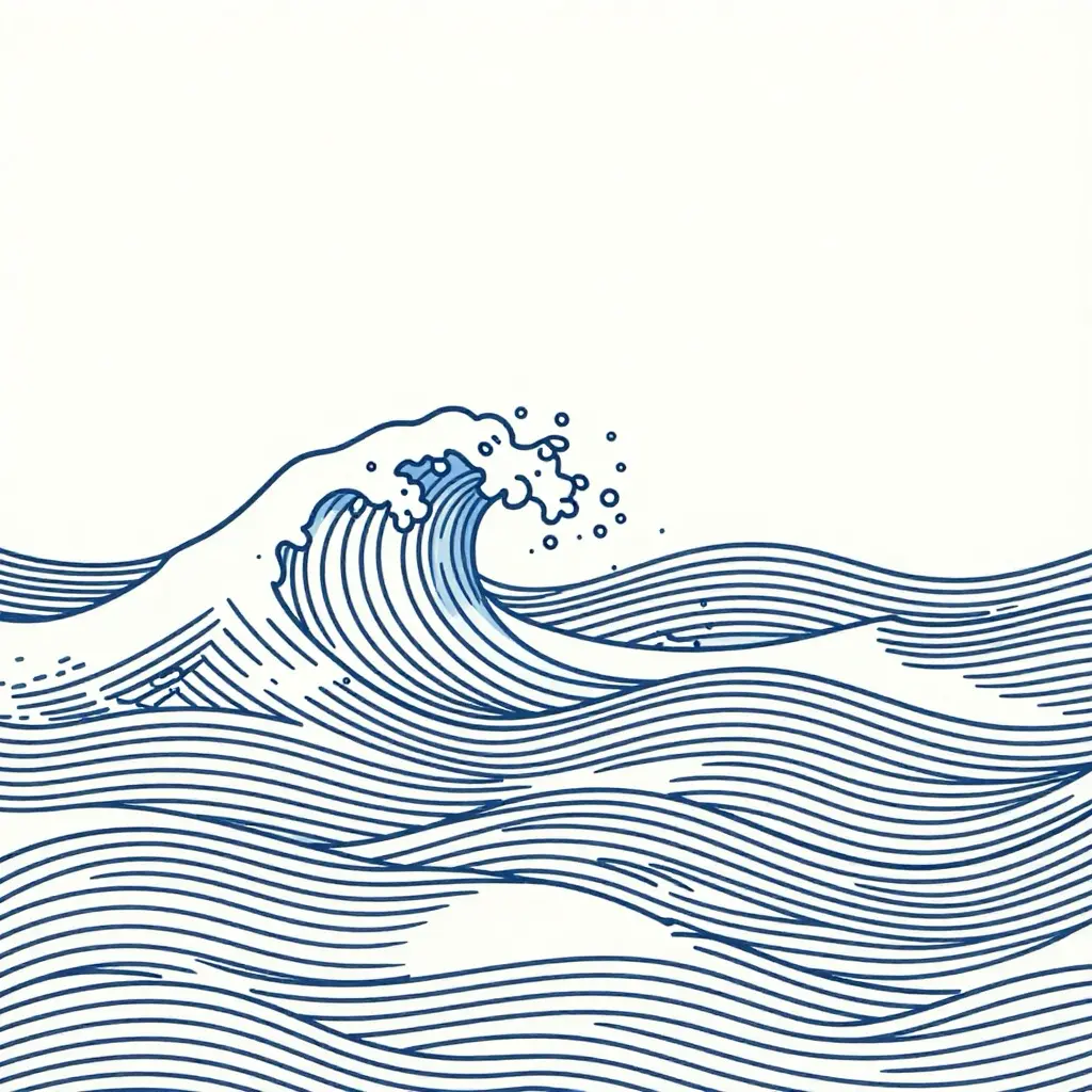
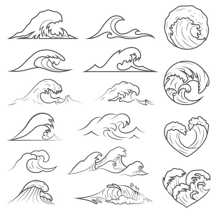
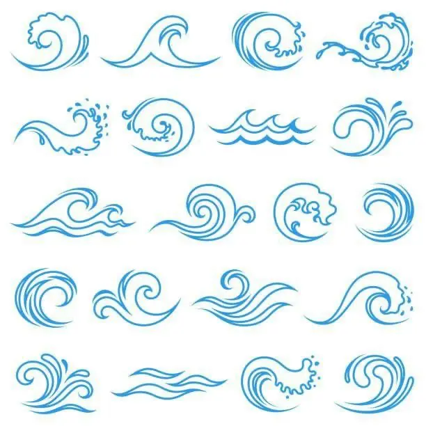
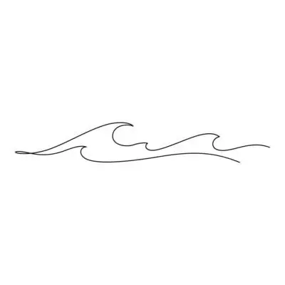
At the opposite end of the spectrum, you’ve got single-line wave drawings—one continuous stroke that captures the essence of motion without any detail at all. This style exploded on Instagram around 2018-2019, and it’s still everywhere: surf brand logos, tattoo flash sheets, Etsy prints.
The appeal is obvious. It looks effortless (it’s not). It works at any scale. And it forces you to really understand the shape of a wave before you can reduce it to a single gesture.
In my experience, minimalist waves are harder than they look. You don’t get to hide behind shading or detail. Every wobble in your line shows. I spent an embarrassing amount of time practicing single-line waves before one finally felt right—fluid, confident, not overthought.
Try this: draw twenty waves in under two minutes. Don’t lift your pen. Most will be garbage. One or two might surprise you.
Realistic and Hyper-Detailed Waves
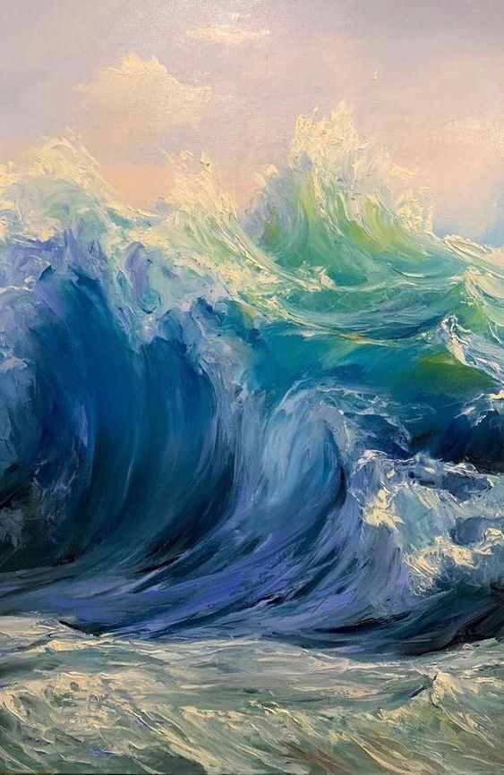
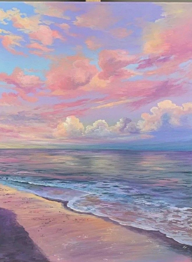
If you want to go the other direction—toward photorealism—you’re entering different territory entirely. Artists like Ran Ortner (whose massive oil paintings sell for six figures) spend months on a single wave, building up layers of transparent glazes to capture light moving through water.
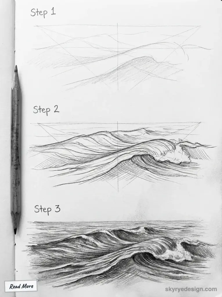
For pencil or charcoal work, the challenge is rendering transparency and motion simultaneously. You’re drawing something that doesn’t hold still, doesn’t have hard edges, and changes depending on light conditions.
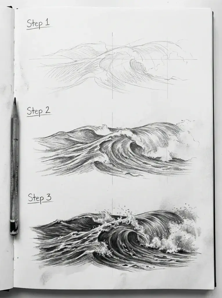
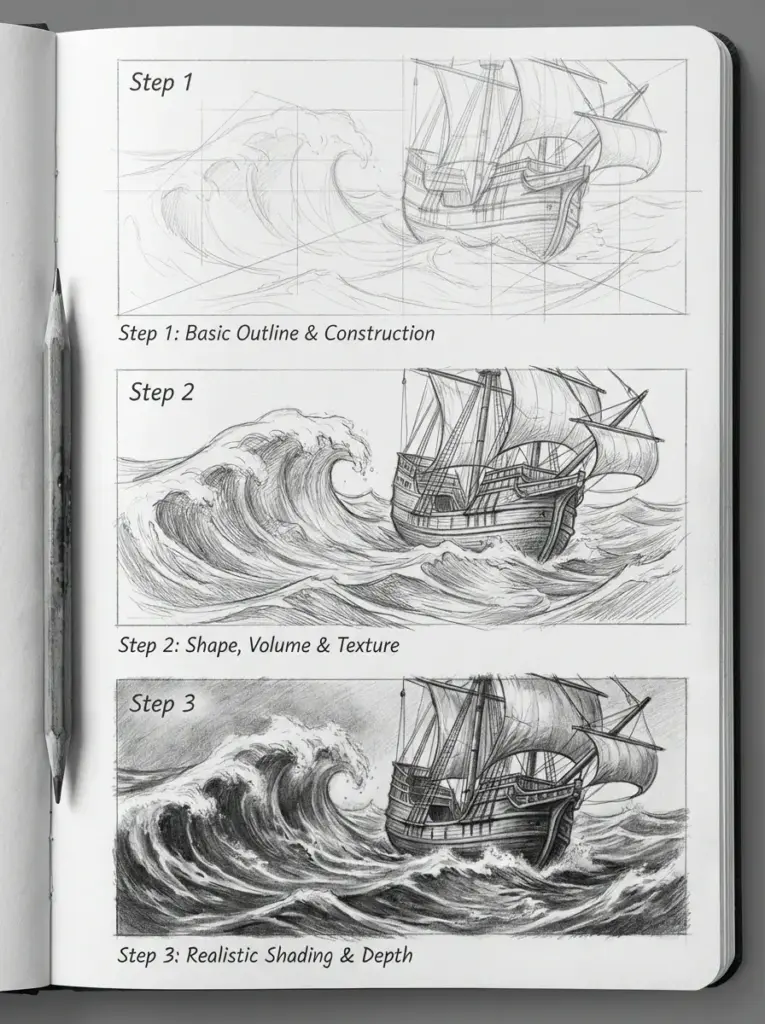
The key technique here: work in values, not lines. Waves aren’t outlined in nature. They’re defined by shifts in light and dark—bright foam against dark troughs, sunlight catching a crest. Block in your darkest darks first, then lift highlights with a kneaded eraser.
Choosing Your Style
| Style | Best For | Difficulty | Time Investment |
|---|---|---|---|
| Japanese Ukiyo-e | Graphic projects, bold visuals | Moderate | 2-4 hours |
| Minimalist Line | Logos, tattoos, quick sketches | Deceptively hard | 5-30 minutes |
| Realistic/Detailed | Portfolio pieces, fine art | Advanced | 4-20+ hours |
There’s no wrong answer. But pick a style before you start sketching—it’ll shape every decision you make, from paper choice to pencil pressure.
Optimizing and Showcasing Waves Art
You’ve finished your wave drawing. It’s sitting on your desk, and you’re pretty happy with it. Now what?
This is where most artists drop the ball. They post a quick phone photo to Instagram, toss the original in a drawer, and move on. But the difference between a drawing that gets ignored and one that stops people mid-scroll? Presentation. How you photograph, frame, and display your waves art matters almost as much as the work itself.
Photographing Your Work (Without a Professional Setup)
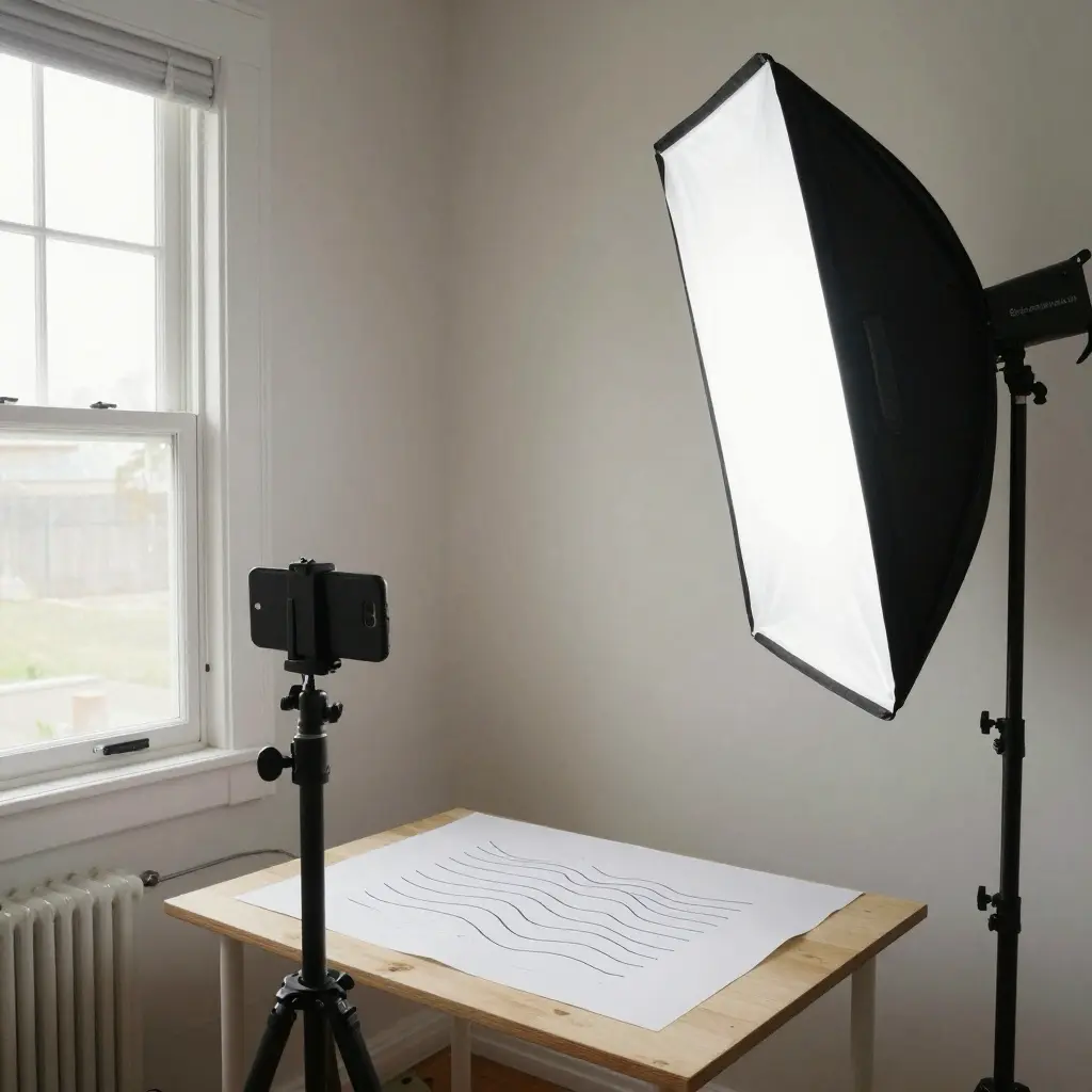
You don’t need a studio. You need window light and five minutes of patience.
Shoot during the “golden hours”—early morning or late afternoon—when natural light is soft and directional. Position your drawing flat on a table near a window, but not in direct sunlight (harsh shadows will kill the detail). Stand directly above it, phone parallel to the paper, and take the shot.
Here’s my setup: a $15 phone tripod from Amazon, a sheet of white foam board to bounce light onto shadow areas, and my iPhone. That’s it. I resisted buying a “real” camera for years, convinced my phone wasn’t good enough. It was fine. The lighting mattered more than the megapixels.
One common mistake: Shooting at an angle to “add interest.” Don’t. Angles distort proportions and make waves look warped. Save the creative angles for Instagram Stories, not your portfolio.
For color accuracy, include a small gray card or white paper edge in frame, then crop it out later. This gives you a reference point when editing—so your ocean blues don’t accidentally turn teal.
Framing and Display Options
The right frame transforms a sketch into something worth hanging. The wrong one makes it look like a dentist’s office print.
For minimalist wave drawings, I like thin black or natural wood frames with wide white mats. The mat creates breathing room—waves need space around them, or they feel cramped. A general rule: the mat width should be at least 2-3 inches on all sides for standard 8×10″ work. For larger pieces, go wider.
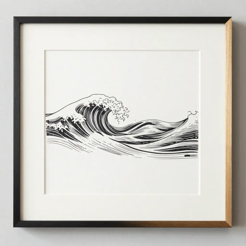
Ikea’s RIBBA frames (around $10-15) are surprisingly decent for the price. For something nicer, Framebridge offers custom framing starting at about $65—they mail you a box, you send the art, they ship it back framed. I’ve used them for client gifts, and the quality holds up.
If you’re displaying wave art in a bathroom or humid space (thematically appropriate, sure), consider museum glass or acrylic glazing. Regular glass fogs and can trap moisture against the paper over time. Not a problem for a living room, but worth thinking about near a shower.
| Frame Style | Best For | Price Range |
|---|---|---|
| Thin black metal | Minimalist waves, modern spaces | $10-30 |
| Natural oak/maple | Japanese-style, organic work | $25-80 |
| White gallery frame | Bold, graphic waves | $15-50 |
| Floating frame (no mat) | Textured paper, deckled edges | $40-100+ |
Building a Cohesive Series
One wave drawing is nice. A series of three or five? That’s a statement.
In my experience, waves art works best when displayed in odd numbers—three small studies in a horizontal row, or a grid of five showing different styles or moments in the same wave’s life cycle. Consistency matters: same paper size, same frame style, even same dominant color temperature.
Surf photographer Clark Little built an entire career shooting the inside of breaking waves—same subject, endless variation. Your sketchbook can work the same way. Constraints breed creativity.
Actionable tip: Before framing, lay your pieces out on the floor in different arrangements. Photograph each layout with your phone. You’ll see the best composition immediately—and avoid putting unnecessary holes in your wall.


Highlighting Price Level and Royalty-Free Choices
When selling wave artwork, clearly communicate your pricing structure. Original wave drawings typically command higher prices than prints, while digital downloads offer affordable options for buyers.
Consider offering your wave drawings at various price points. Simple wave sketches might sell for $20-50, while detailed, large-format seascapes could command $200-500 depending on your experience level.
Clarify copyright terms when showcasing your work. You might offer some basic wave studies as royalty-free resources for art students while retaining full rights to your finished pieces.
Watermark preview images lightly if concerned about unauthorized use. Place the mark in a position that doesn’t distract from the wave’s focal points but provides adequate protection.
Include information about custom commissions if you’re willing to create specific wave scenes upon request. Many collectors prefer personalized artwork depicting waves from meaningful locations.


Finding and Selling Waves Drawings Online
Your waves drawings don’t have to live in a sketchbook forever. There’s a real market for ocean art—and getting started is simpler than you think.
Where to Sell
Etsy remains the easiest entry point. Low barrier, built-in audience, and ocean art consistently performs well there. Search “wave drawing” and you’ll find prints selling from $15 for a digital download to $150+ for original ink work. The sweet spot for most emerging artists? $25-45 for an 8×10″ print.
Society6 and Redbubble handle printing and shipping for you—upload your art, set a margin, and they do the rest. The tradeoff: lower profit per sale (often $3-8), but zero logistics headaches.
For higher-end originals, Saatchi Art and Artfinder attract collectors willing to pay more. I’ve seen wave drawings sell for $300-800 on these platforms, though competition is stiffer and curation matters.
What Actually Sells
In my experience, minimalist line waves outsell detailed realistic work by a wide margin—at least for prints. They’re versatile. They fit modern interiors. They photograph well for Instagram previews.
Series sell better than singles. A set of three wave studies (priced together at a slight discount) converts better than three separate listings. Buyers like cohesion.
One Tip Before You List
Watermark your preview images, but keep the watermark subtle—a small signature in the corner, not a giant logo across the center. Aggressive watermarks kill sales. They make the work look cheap, even when it isn’t.
| Platform | Best For | Typical Price Range |
|---|---|---|
| Etsy | Prints + originals | $15-150 |
| Society6/Redbubble | Passive print sales | $3-8 profit/sale |
| Saatchi Art | High-end originals | $200-1,000+ |


Simple Tips for Better Wave Drawings
You can study wave anatomy for months. Or you can start with these seven tricks that fix most beginner mistakes in about ten minutes.
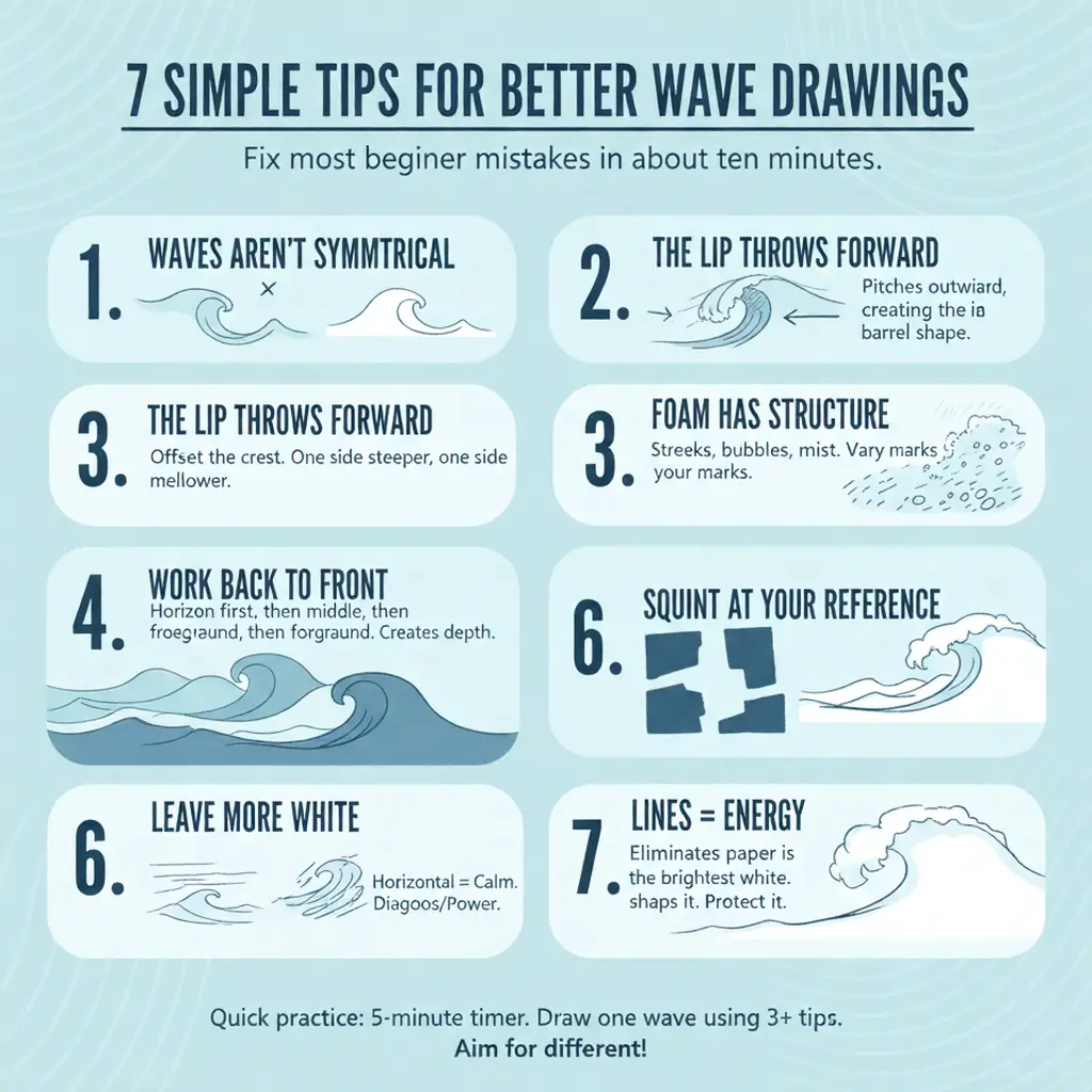
1. Waves Aren’t Symmetrical—Stop Drawing Them That Way
Real waves are lopsided. One side steeper, one side mellower. The peak rarely sits in the center. Next time you sketch a wave, intentionally offset the crest to one side. Instant improvement.
2. The Lip Throws Forward, Not Down
This one changed everything for me. When a wave breaks, the top doesn’t just fall—it pitches outward, creating that hollow barrel shape surfers chase. Draw the lip extending horizontally before it curves down. It’s counterintuitive until you see it in slow-motion footage.
3. Foam Has Structure
White water isn’t just scribbles. Look closer and you’ll see patterns—streaky lines following the wave’s direction near the base, chunkier bubbles near the impact zone, fine mist at the top. Vary your marks. I use short dashes for streaky foam, small circles for bubbles, and a kneaded eraser lifted gently for mist.
4. Work Back to Front
Start with the furthest wave on the horizon. Add the middle-ground swell. Finish with your foreground wave and foam. This layering creates automatic depth—and prevents you from running out of space for your main subject (I’ve done that more times than I’ll admit).
5. Squint at Your Reference
Sounds ridiculous. Works immediately. Squinting eliminates detail and shows you the big value shapes—where the darks are, where the lights are. Copy those shapes first. Detail comes last.
6. Horizontal Lines = Calm, Diagonal Lines = Energy
Want peaceful, glassy water? Keep your strokes mostly horizontal. Want chaos and power? Angle everything. The direction of your pencil strokes subconsciously communicates motion to the viewer. Surf artist Matt & Agnes & Bondi (known for their line-work posters) use this principle constantly—their storm waves are all diagonals, their calm swells nearly flat.
7. Leave More White Than You Think
Beginners overdraw foam. They fill every inch with texture and detail, and the wave loses its punch. The brightest whites in your drawing should be untouched paper—pure, clean, bright. Protect those whites. They’re doing the heavy lifting.
Quick practice: Set a five-minute timer. Draw one wave using at least three of these tips. Don’t aim for perfection—aim for different than your last attempt. That’s progress.
Conclusion: Your Turn to Make Waves
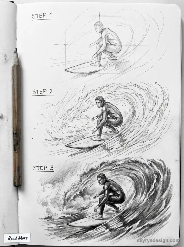
A wave is just water moving. But on paper, it becomes something else—a record of motion frozen mid-crash, a meditation on chaos and rhythm, a single moment that never actually existed until you drew it.
That’s the strange magic of waves art. You’re not copying nature. You’re interpreting it. And every artist who picks up a pencil brings something different to that interpretation—Hokusai’s drama, Hiroshige’s calm, or your own thing entirely.
So start simple. One wave. One style. Don’t worry about making it perfect; worry about making it yours. Then draw another. And another. Build a series. Frame the ones that surprise you.
And when you’ve got something you’re proud of—or even something you’re just curious about—share it. Tag me @skyryedesign. Use #SkyRyeDesign.
I want to see what the water looks like through your eyes.
- 2.1Kshares
- Facebook0
- Pinterest2.1K
- Twitter3
- Reddit0
