Fire doesn’t follow rules. It flickers when you expect it to hold still. It shifts colors—white at the core, orange in the middle, red at the edges—in ways that make zero logical sense until you actually look at a flame. And that’s exactly what makes fire drawing ideas so frustrating for beginners and so satisfying once you crack the code.
I spent years avoiding fire in my sketches. Too unpredictable. Too “advanced.” Then I realized something: fire is actually one of the most forgiving subjects to draw. Unlike faces or hands, where one wrong line screams “mistake,” flames are inherently chaotic. Your wobbly lines? They look intentional. Your uneven shapes? That’s just how fire moves.
This guide breaks down everything I’ve learned about drawing fire—from the basic teardrop flame you’d put on a birthday candle to the roaring infernos that make fantasy art come alive.
Why Fire Is Easier to Draw Than You Think
Here’s a secret most tutorials won’t tell you: fire has no “correct” shape. A nose has specific proportions. A tree has a trunk and branches. But fire? Fire is whatever you want it to be.
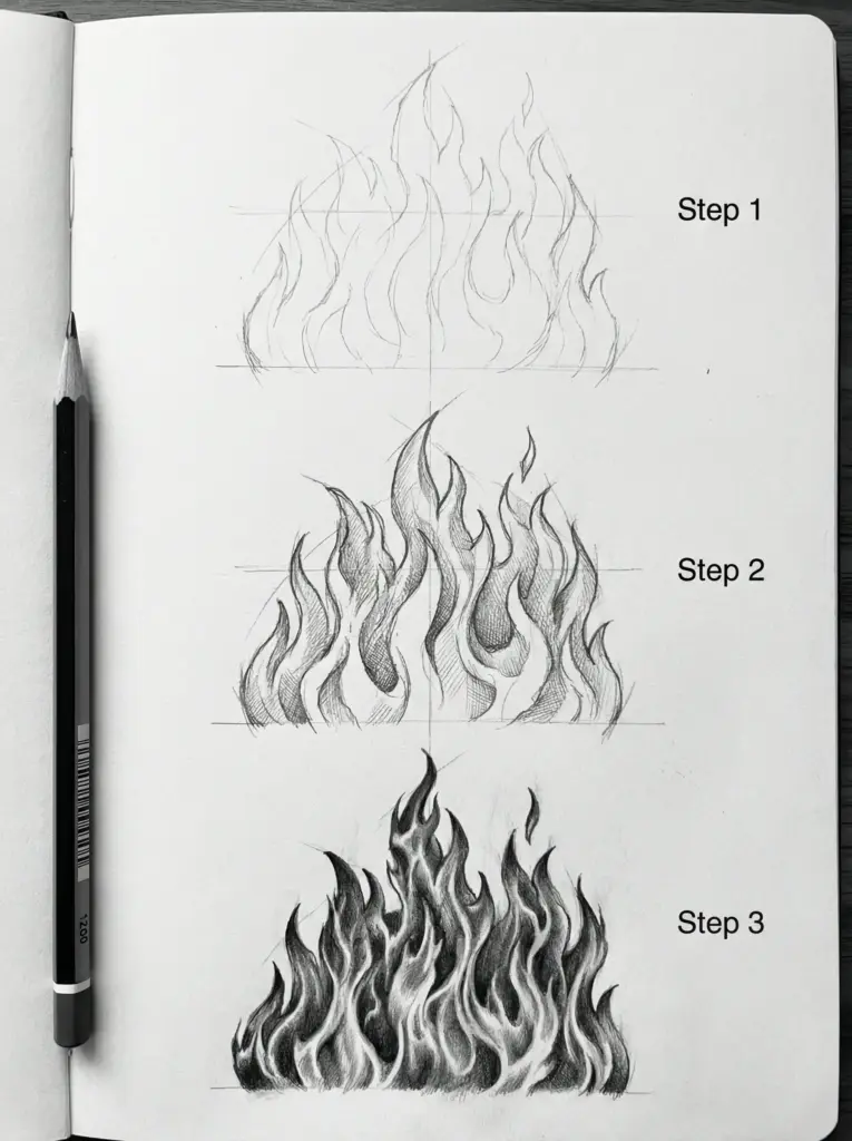
The chaos works in your favor. Every flame is unique. Every fire burns differently. So when your drawn flame looks slightly off from your reference photo, that’s not a mistake—that’s just a different moment in time.
What actually matters in fire drawing:
Direction. Flames rise. Always. Even in wind, they’re reaching upward while bending sideways. Forget this, and your fire looks like melting ice cream.
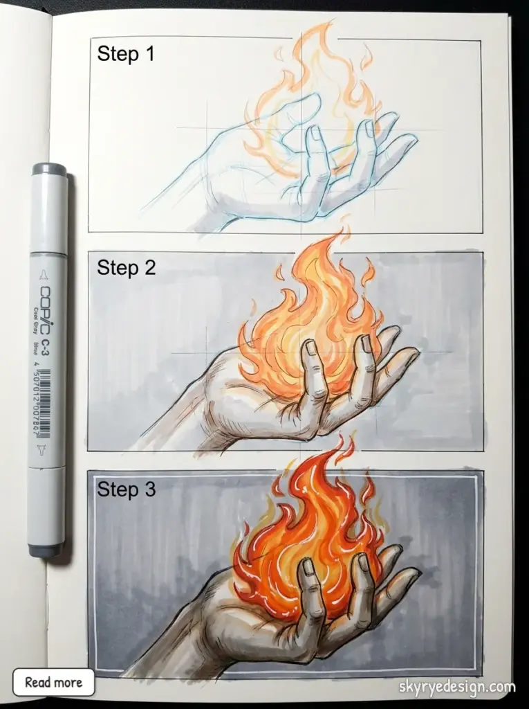
Layering. Fire isn’t a single shape. It’s dozens of overlapping tongues of flame, each with its own peak and curve. One outline won’t cut it.
Temperature gradient. The hottest part (center/base) is brightest. The cooler outer edges are darker. This is backwards from how we usually shade objects, which is why fire drawings often look wrong—people shade the center darker out of habit.
Fire Drawing Ideas: 15 Projects From Beginner to Advanced
Beginner Fire Drawing Ideas
1. Single Candle Flame
Start here. Seriously. A candle flame is contained, predictable, and teaches you the core teardrop shape that all fire drawing builds on.
Draw an elongated teardrop pointing upward. Add a smaller teardrop inside it. The inner shape is yellow-white; the outer shape transitions from yellow to orange to a thin red outline at the very edge. That’s it. Five minutes, and you’ve drawn fire.
The wick matters more than people think. A dark vertical line at the base, slightly curved, with a tiny orange glow where it meets the flame. This anchors your fire to reality.
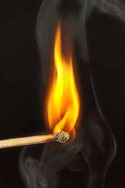
2. Matchstick Flame
Similar to the candle but with more character. The match head adds a burnt, bulbous shape below the flame. Draw the wooden stick at a slight angle—nobody holds a match perfectly vertical.
The flame should be smaller and more compact than a candle flame. Matches burn faster and hotter, so the shape is tighter, more aggressive.
3. Cartoon Fire Emoji Style
The 🔥 emoji is actually excellent reference. It breaks fire down to its most essential form: a base wider than the top, three or four peaks of varying heights, and simple color blocking.
This style works great for:
- Stickers and icons
- Comic book effects
- Quick doodles in the margins of your notebook
- Tattoo flash designs
No shading needed. Just bold outlines and flat color fills.
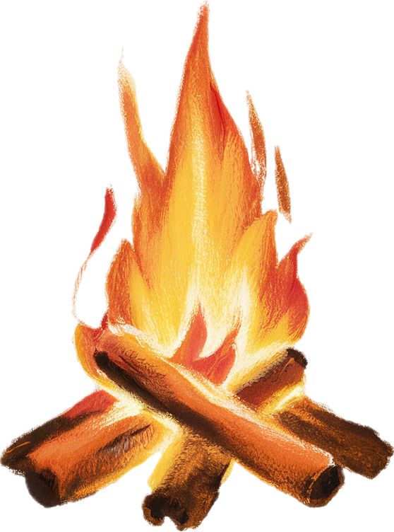
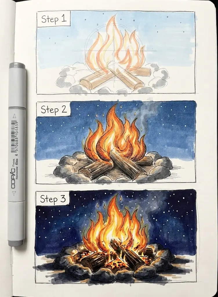
4. Simple Campfire
Three logs arranged in a triangle or tepee shape. Flames rising from where they meet. Stones in a circle around the base (optional but adds context).
The logs should show wood grain—parallel curved lines running lengthwise. Where the fire touches them, add some charring: darker color, maybe some cracks or peeling bark.
Your flames here should be multiple separate tongues, not one unified shape. Some tall, some short, some bending slightly different directions. Randomness is your friend.
Intermediate Fire Drawing Ideas
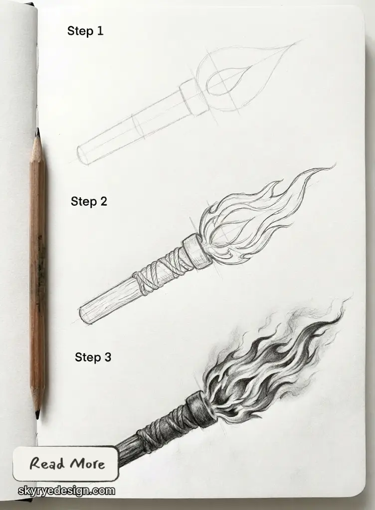
5. Torch or Lantern Flame
The container changes everything. A torch flame is directional, often blown by movement. A lantern flame is protected, more controlled.
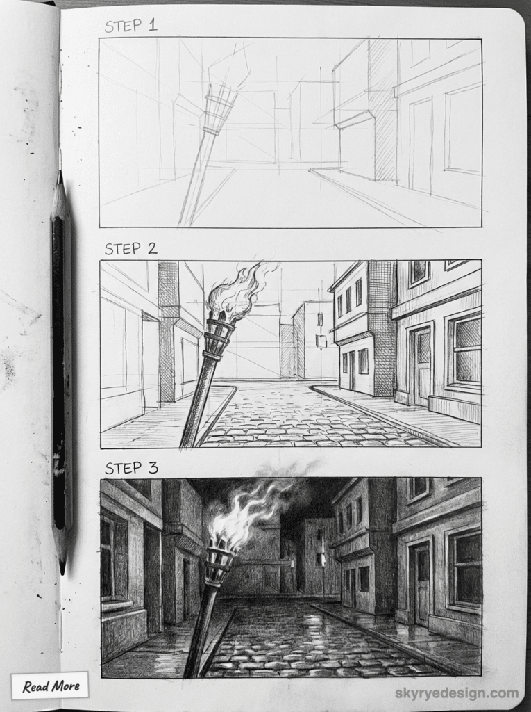
For torches, extend one side of the flame longer than the other, like it’s being pulled by wind. Add a trail of smaller flames or sparks coming off the extended side.
For lanterns, keep the flame more symmetrical but add the glass reflection around it—curved lines that follow the lantern’s shape, with a warm glow radiating outward.
6. Fireplace Scene
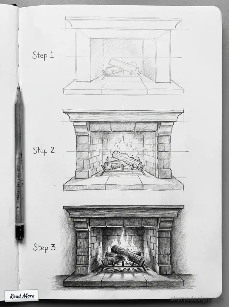
This combines fire drawing with environmental context. You’re not just drawing flames; you’re drawing warmth, comfort, atmosphere.
The fire sits inside a dark frame (the fireplace opening). Logs at the bottom, main flames in the middle, smaller flames and embers scattered throughout. The key is the glow on surrounding surfaces—the brick or stone should have warm highlights on the side facing the fire.
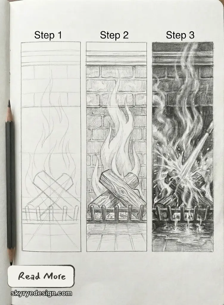
Add a few floating sparks rising into the chimney. Maybe some ash on the hearth. These details sell the scene.
7. Fire Spreading on an Object
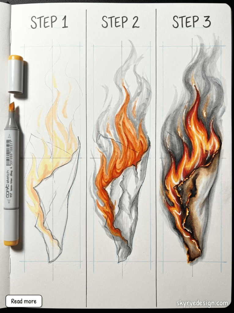
Pick something burning: a book, a photograph, a piece of paper. The fire follows the object’s edges, consuming it progressively.
The unburnt area remains normal. The burning edge shows the transition: intact material → browning/curling → active flame → char/ash. This gradient tells the story of destruction in progress.
Paper curls inward when it burns. Wood cracks and glows from within. Fabric shrivels and blackens. Research your material for authenticity.
8. Blue Fire / Gas Flame
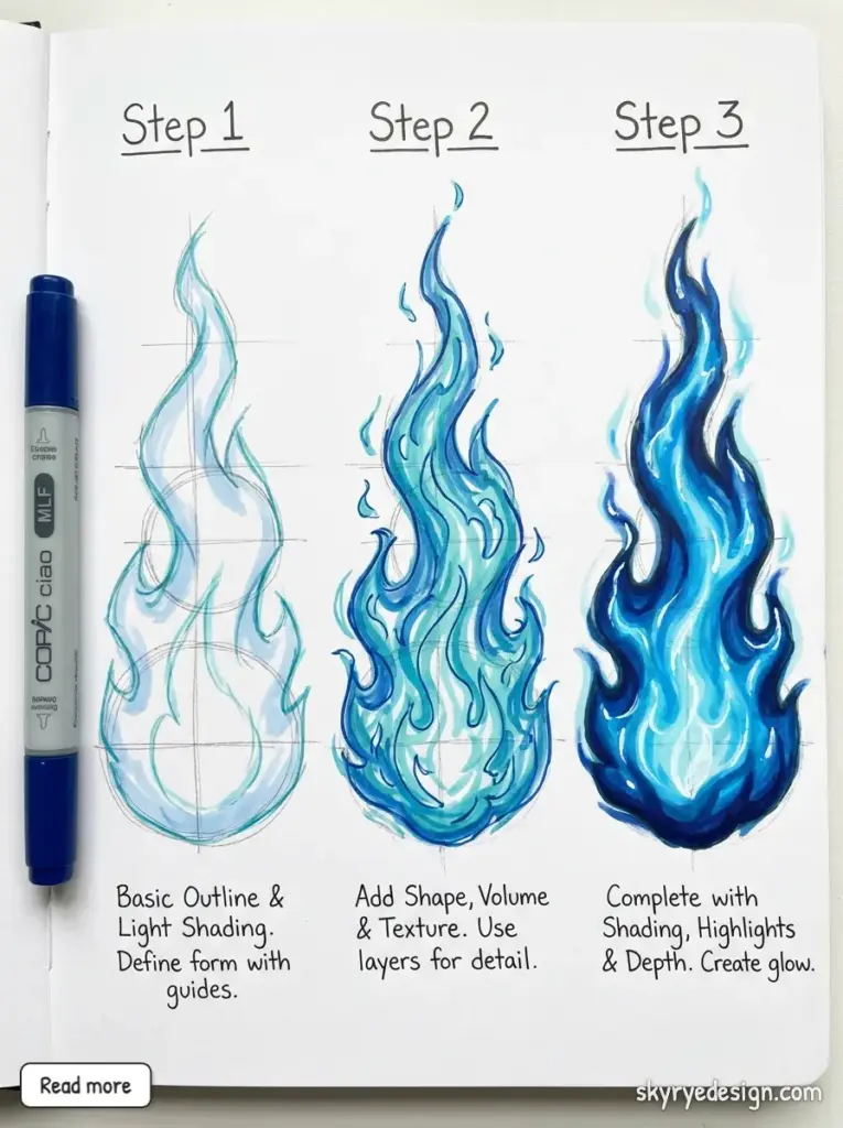
Blue fire is actually hotter than orange fire, which most people don’t realize. Gas stoves, Bunsen burners, and certain magical effects use this palette.
The shape is tighter and more defined than wood fire. Almost crystalline. The gradient runs from near-white at the base through light blue to a darker blue at the tips, with no red or orange at all.
This is a great drawing exercise because it forces you to abandon your “fire = orange” instinct.
Advanced Fire Drawing Ideas
9. Explosion / Fireball
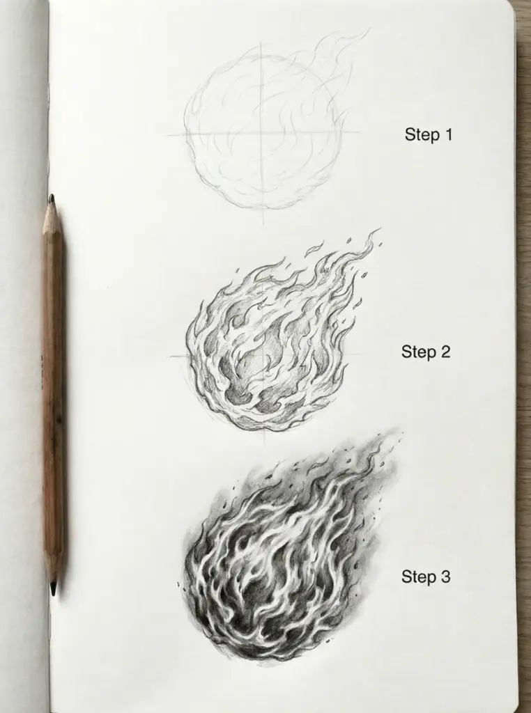
Explosions expand outward from a central point. The shape is roughly spherical but wildly irregular—tendrils of flame shooting in all directions, some longer than others.
Color shifts dramatically: white-hot center, yellow mid-zone, orange outer ring, dark smoke and debris at the edges. Add motion lines radiating outward. Flying chunks of whatever exploded. Shockwave rings if you want to get really dramatic.
The smoke is almost as important as the fire. Dark, billowing, obscuring parts of the flame behind it.
10. Dragon’s Breath
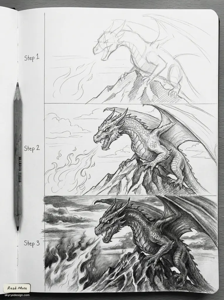
The classic fantasy fire drawing challenge. A stream of flame projected from a source (the dragon’s mouth) that spreads as it travels.
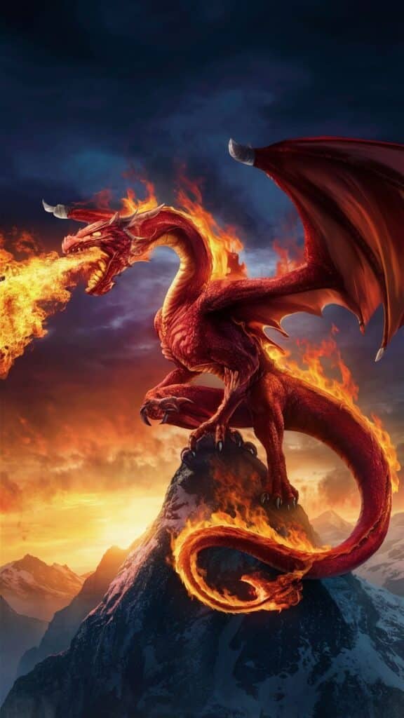
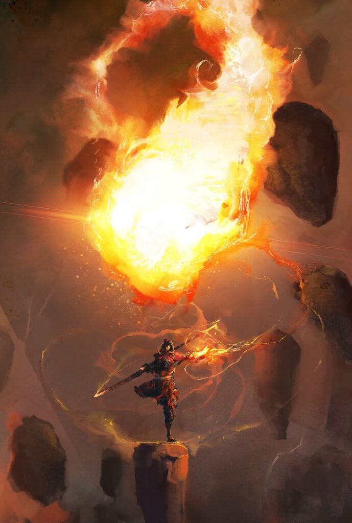
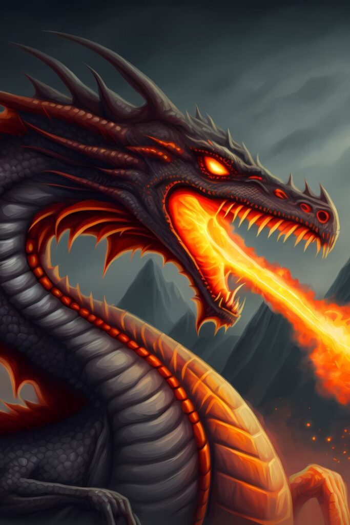
Think of it like a cone shape, tight at the origin and expanding outward. The closest part to the dragon is white-hot and narrow. As it travels, it yellows, oranges, and begins to dissipate into individual flame tongues and smoke.
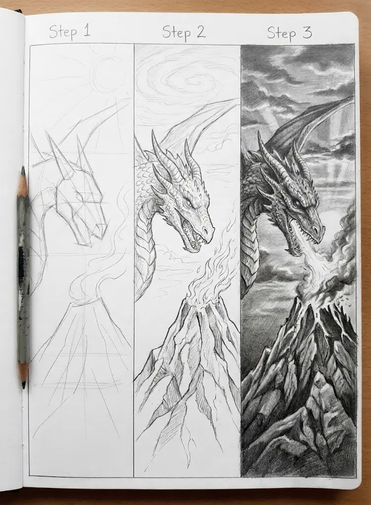
The dragon’s throat should glow from within. Hint at the fire building before it releases—an internal light source that makes the whole creature feel alive with power.
11. Fire Surrounding a Character
This tests your understanding of fire as a light source. The character is lit entirely by the flames around them—warm highlights on the side facing fire, deep shadows opposite.

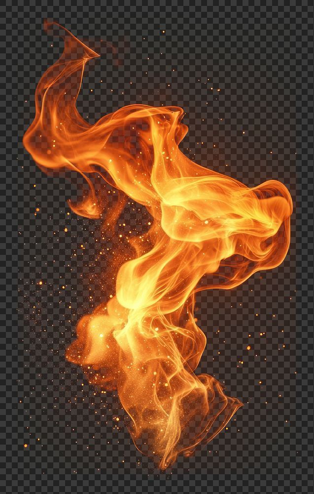
The fire should interact with the environment. Flames licking around the character’s silhouette. Heat distortion in the air above. Sparks caught in their hair or clothes.
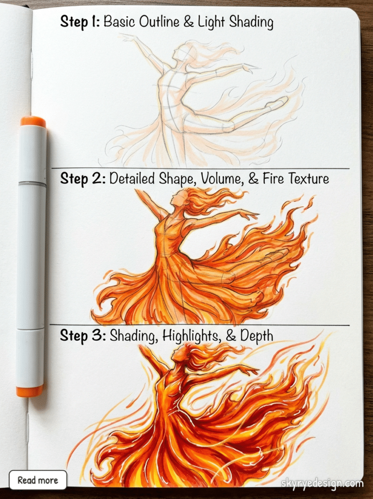
Consider the mood: is this fire threatening or protective? Destructive or magical? Your composition and character’s expression guide the interpretation.
12. Anime/Manga Style Fire
Anime fire is stylized for impact and clarity. Sharp, angular shapes. High contrast between colors. Often uses speed lines or impact marks around the flames.
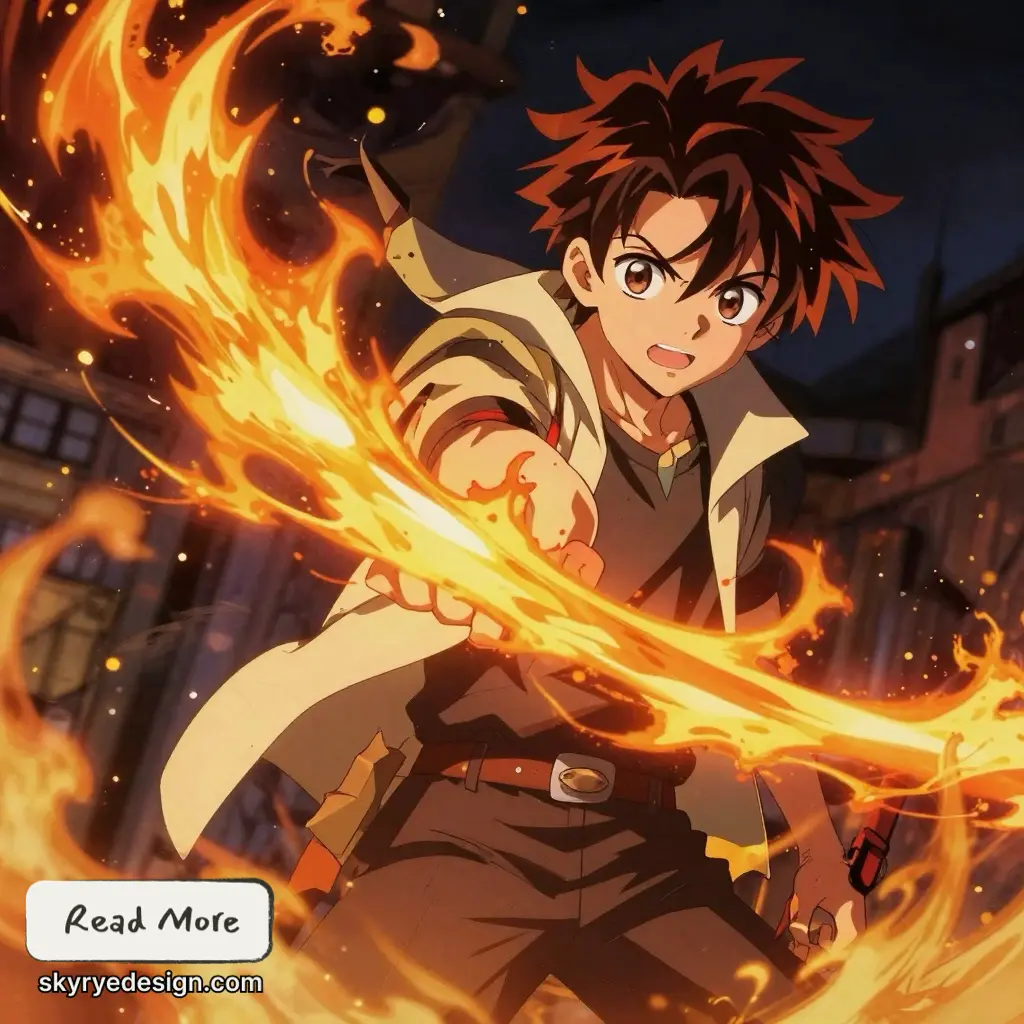
The “cel shaded” look means distinct color zones rather than smooth gradients: bright yellow, medium orange, dark red, each clearly separated with minimal blending.
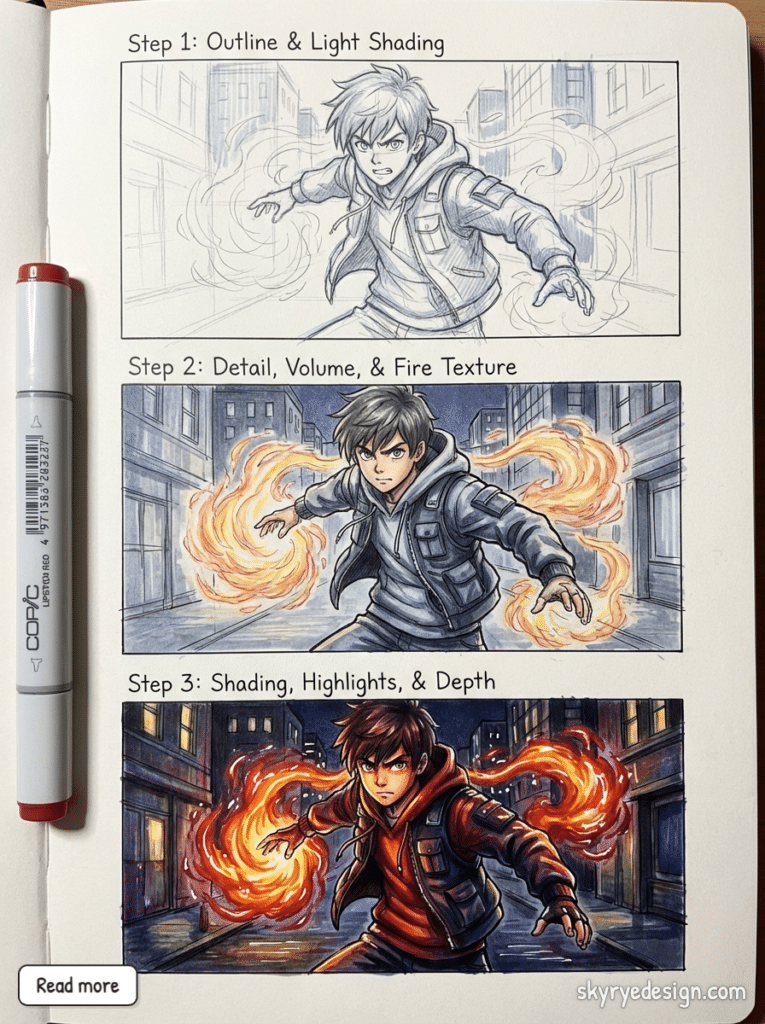
Motion effects are exaggerated. A character throwing fire doesn’t just produce flame—they produce trails, afterimages, radiating force lines.
13. Realistic Fire Study
Grab a reference photo of actual fire. Not a drawing, not a video game screenshot—real flame. Photograph your own candle or fireplace if you can.
Study the translucency. You can see through fire to objects behind it, but those objects are distorted and color-shifted. Study the edge quality—fire edges are soft, not hard lines. Study the internal structure—the way individual flame streams merge and separate.
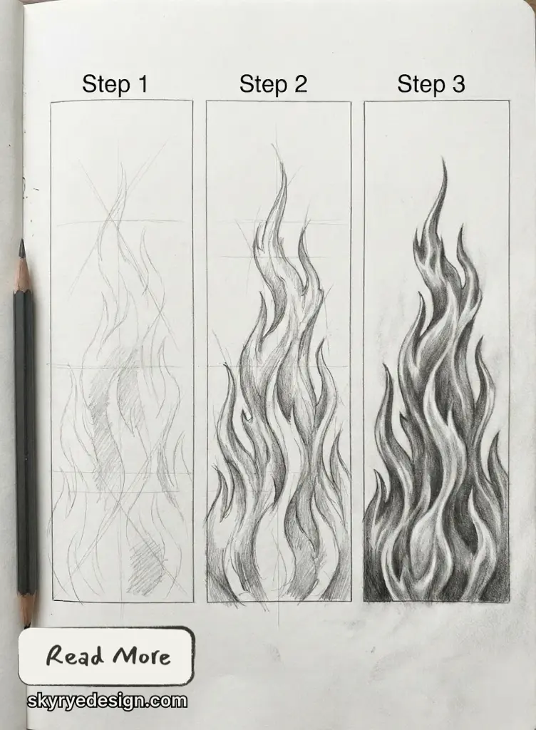
This exercise isn’t about copying exactly; it’s about training your eye to see what fire actually does versus what you assume it does.
14. Fire and Water Interaction
Steam is the star here. Where fire meets water, you get a violent hiss and a cloud of white vapor. The fire shrinks and sputters. The water boils and evaporates.
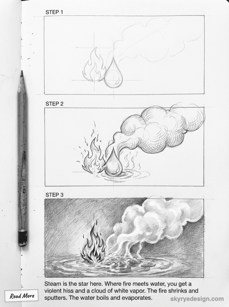
This creates a beautiful contrast: warm colors fighting cool colors, with neutral white steam as the battleground between them. The composition almost draws itself around that tension.
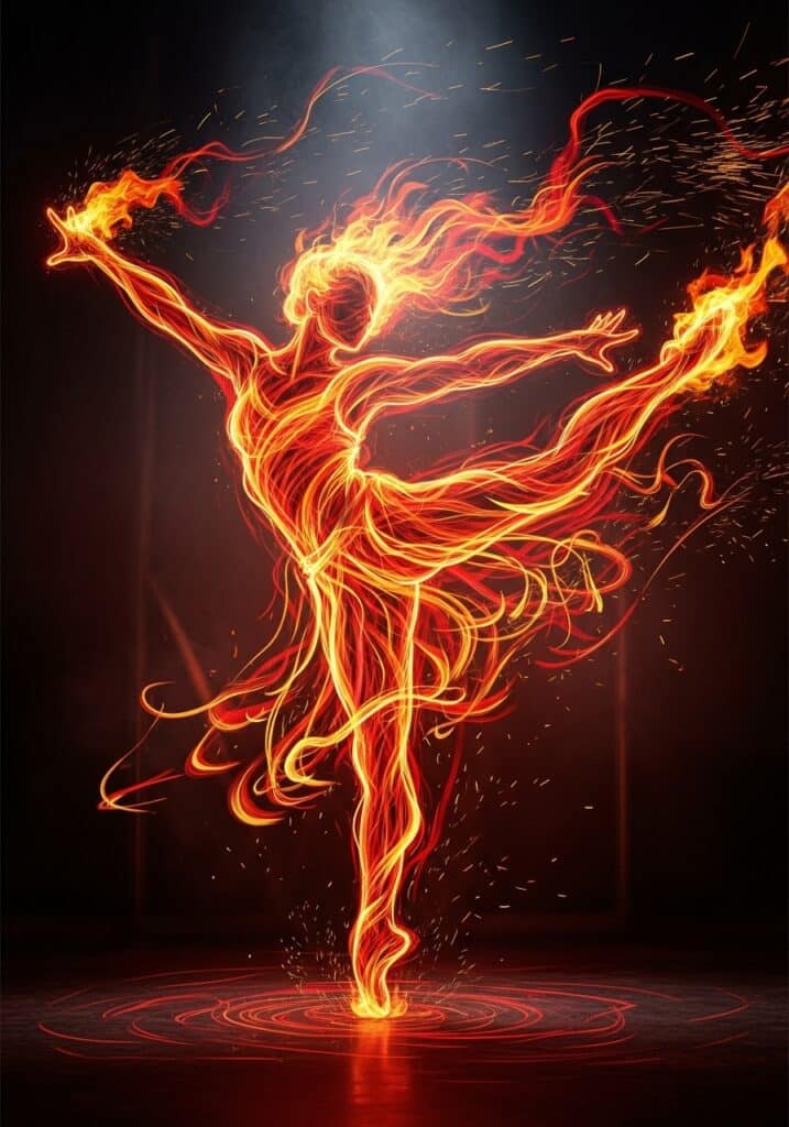
15. Abstract Fire / Fire Spirit
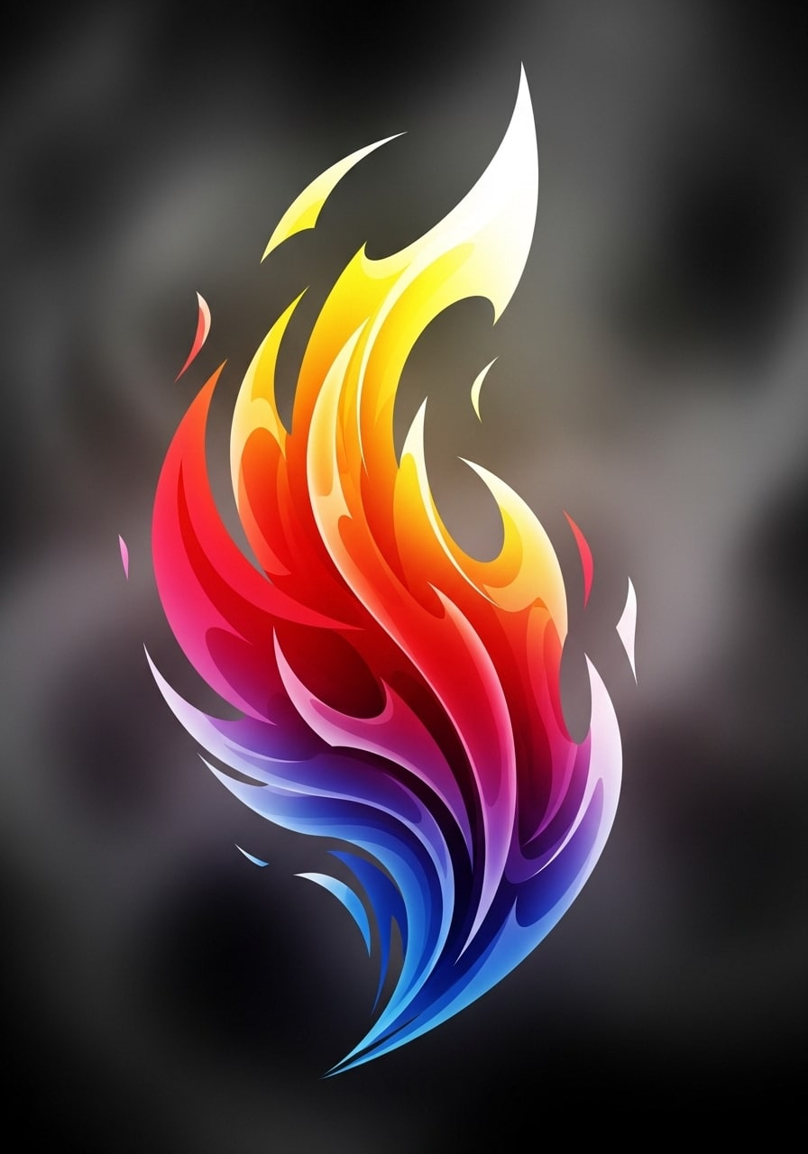
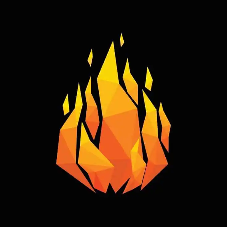
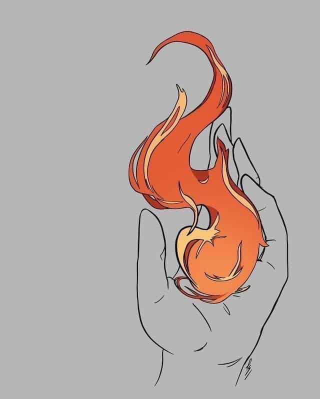
Break free from literal flames entirely. Fire as an entity, a being, a force with personality.
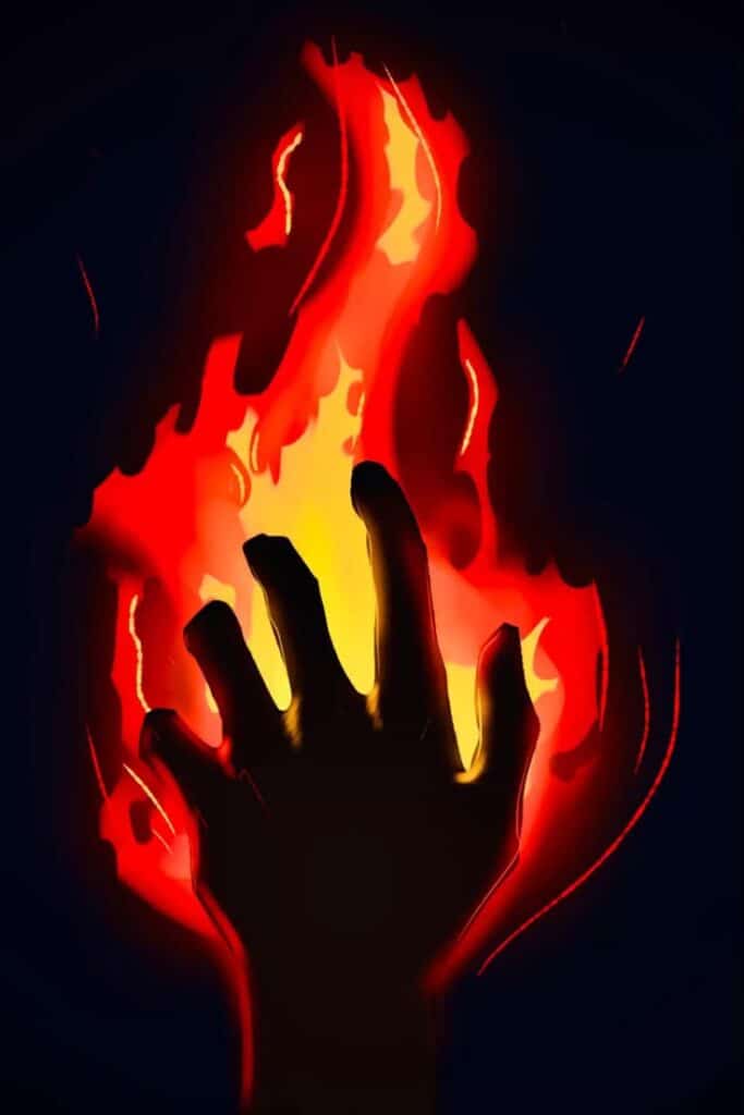
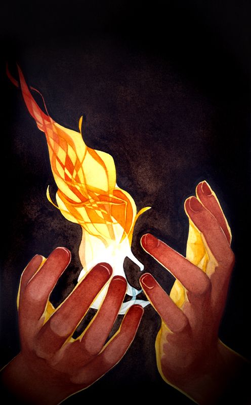
The shape might suggest a human form—a dancer made of flame, a face emerging from the fire, hands reaching out. Or it might be pure abstract: swirling patterns, color fields, energy without defined edges.
This is where fire drawing becomes genuine artistic expression rather than technical exercise.
The Color Theory of Fire (And Why You’re Probably Doing It Wrong)
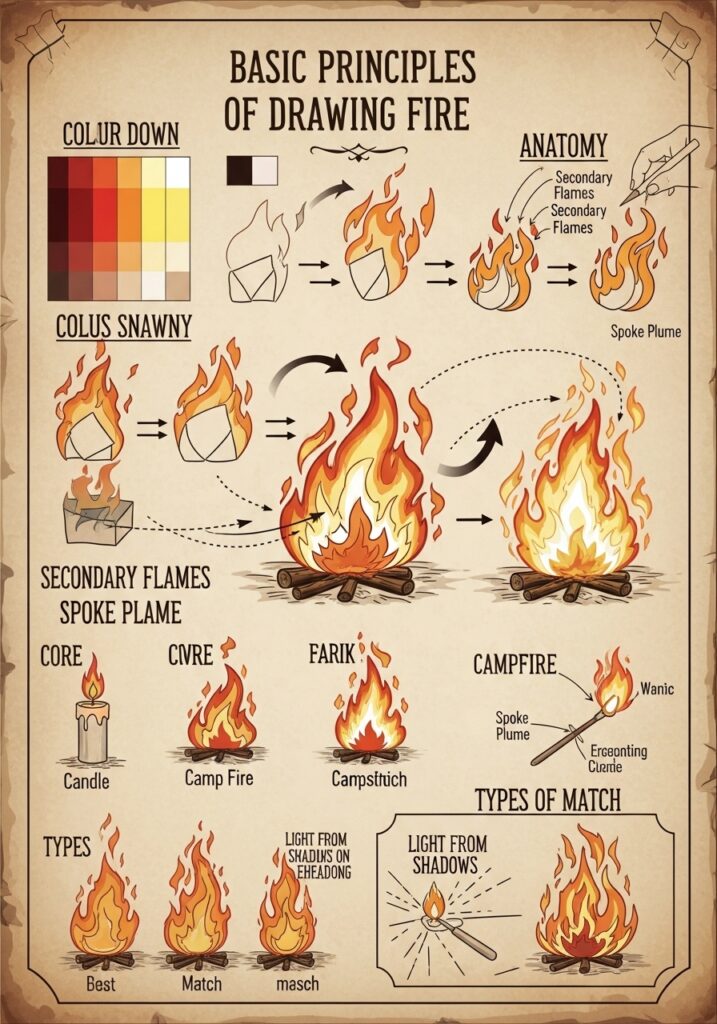
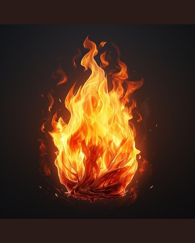
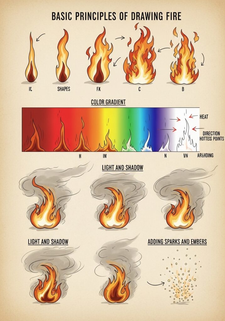
Most beginners grab red and orange and call it done. Here’s what fire actually looks like:
The core (hottest): White to pale yellow. Nearly colorless from pure heat. This is the part most people forget entirely.
Inner flames: Bright yellow. Still extremely hot but starting to show color.
Mid flames: Orange. The color we associate most with fire. This should be your largest zone, not your only zone.
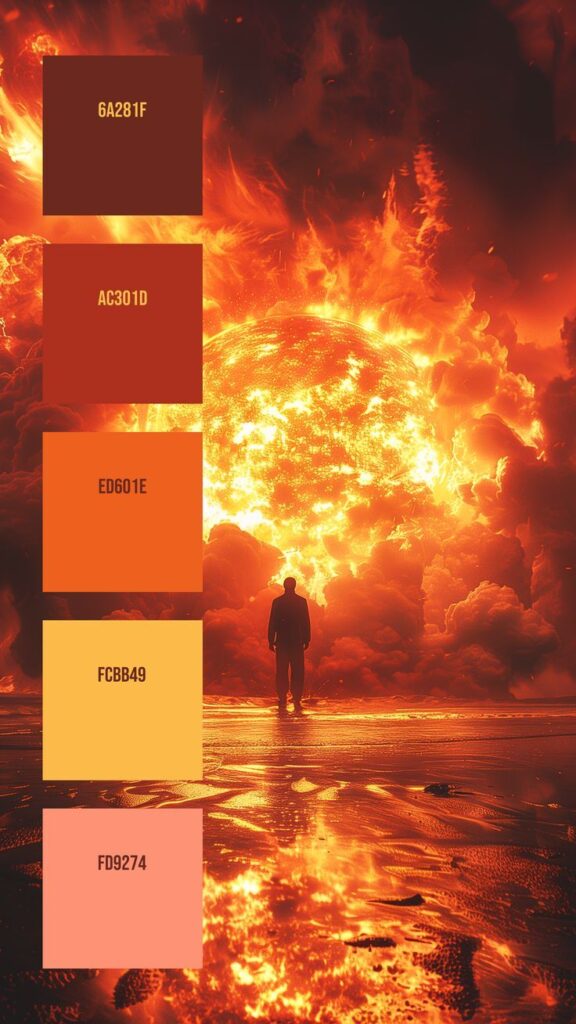
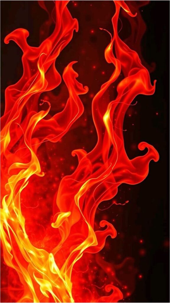
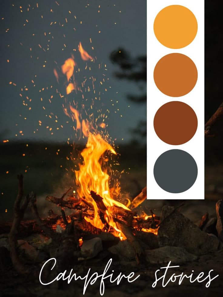
Outer flames: Red-orange to red. Cooler edges where the flame meets air.
Very outer edge: Can include deep red, purple, or even blue depending on what’s burning and how hot it is.
The missing colors: Most fire has hints of pink, magenta, and violet at certain temperatures. Blue appears in very hot fires or gas flames. Even green is possible with certain chemical burns (copper, for instance).
Don’t forget transparency. Fire is not opaque. Objects behind the flame should be visible, just color-shifted and distorted.
Common Fire Drawing Mistakes (And How to Fix Them)


Mistake 1: Making fire symmetrical
Fire doesn’t balance. It doesn’t care about your composition. If your left side mirrors your right side, your fire looks fake instantly.
Fix: Draw one side first, completely. Then add the other side independently, not as a mirror.
Mistake 2: One solid outline
Fire isn’t a single shape with one edge. It’s layers upon layers of overlapping flames.
Fix: Draw multiple flame shapes on top of each other. Let them intersect, merge, separate. Depth comes from overlap.
Mistake 3: Shading like a solid object
Objects are light on top, dark on bottom (usually). Fire is the opposite—brightest at the core, darker at the edges.
Fix: Reverse your shading instincts. The “shadow” is on the outside, the “highlight” is in the center.
Mistake 4: Forgetting the light it casts
Fire illuminates everything around it. A campfire drawing with no glow on the surrounding logs, rocks, or faces looks disconnected.
Fix: Add warm highlights to nearby surfaces. The closer to the fire, the brighter and more orange the reflected light.
Mistake 5: Static flames
Fire moves. Always. Even in still air, it flickers and shifts.
Fix: Add smaller detached flames above the main body. Floating sparks. Wisps of smoke. Motion lines if you’re working in a cartoon style.


Tools for Fire Drawing
Traditional media:
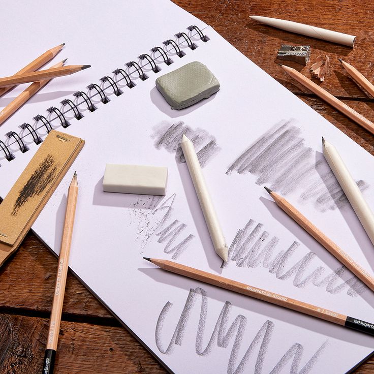
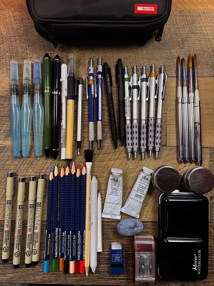
Colored pencils work beautifully for fire because they layer and blend. Start with yellow, add orange over top, then red at the edges. The layering mimics how fire colors actually overlap.
Pastels give you that soft, glowing quality instantly. The powder spreads naturally, creating gradients with minimal effort. Just be ready for messy fingers.
Markers require more planning since they don’t blend as easily. Work in layers, lightest to darkest, and use colorless blenders to smooth transitions.
Digital tools:
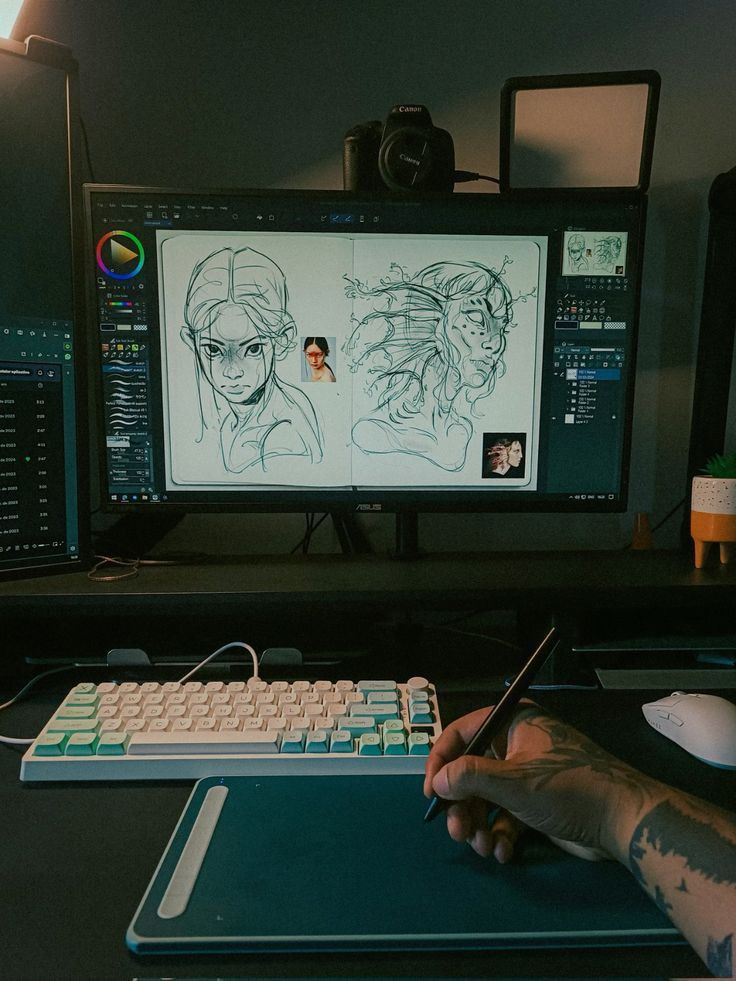
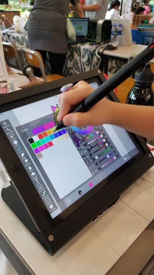
Any drawing software with layer blend modes is perfect for fire. “Add,” “Screen,” and “Overlay” modes make colors glow like nothing else can.
Start with your base fire shape on one layer. Add a duplicate layer set to “Add” or “Screen” mode and paint only the brightest areas (core and inner flames). Instant luminosity.
Procreate, Photoshop, Clip Studio Paint, and Krita all handle this workflow well. The specific brushes matter less than understanding how blend modes create light effects.
FAQ
How do you draw fire for beginners?
Start with the basic teardrop shape—wider at the bottom, pointed at the top. Add smaller teardrops inside for layering. Color from white/yellow at the center to orange and red at the edges. Practice with a simple candle flame before attempting larger fires.
What colors do you use for fire drawing?
The essential palette is white, yellow, orange, and red. But don’t stop there—realistic fire includes hints of pink, magenta, and even blue or purple at certain temperatures. The hottest parts (center) are lightest; the cooler edges are darkest.
Why does my fire drawing look flat?
Likely because you’re using one outline and one color. Fire needs layers—multiple overlapping flame shapes of different sizes. It also needs a temperature gradient from bright center to darker edges, which is the opposite of how we normally shade objects.
How do you draw fire coming from something?
Anchor your flames to the source. If fire is coming from a torch, the flames should be narrowest at the torch head and expand outward/upward. Add char marks and glow where the fire meets the object. The source material should show signs of burning—darkening, cracking, or smoldering.
Can you draw fire with just a pencil?
Absolutely. Graphite fire drawings focus on value contrast rather than color. The core flame is your lightest area (paper white or very light shading). Flames get progressively darker toward the edges. Strong contrast between the fire and the dark background makes the flame “glow” even in grayscale.
How do you make digital fire glow?
Use layer blend modes. Paint your base fire normally, then duplicate the layer and set the duplicate to “Add,” “Screen,” or “Overlay.” Adjust opacity until you get the intensity you want. You can also add a Gaussian blur to the glowing layer for extra softness.
What to Draw Next
Fire pairs naturally with other elements. Once you’re comfortable with flames, try:
- Fire and smoke: Smoke rises from fire but behaves completely differently. It’s soft, billowing, and gray rather than bright and sharp.
- Fire reflections: How fire reflects on water, metal, or glass surfaces.
- Fire lighting scenes: Use fire as your only light source for a nighttime scene—campfire, torch in a cave, fireplace interior.
- Fire in motion: Sequential flames that suggest animation, like a torch being swung or a fireball being thrown.
The skills you build drawing fire—layering, color gradients, light effects—transfer directly to drawing other luminous subjects: lightning, magic effects, glowing technology, even sunsets.
Pick one fire drawing idea from this list. Just one. Finish it before moving to the next. Fire is learned through repetition, not through reading. Your first flame will look rough. Your tenth will surprise you. Your fiftieth will be something you’re genuinely proud of.
Now go set something on fire. On paper, obviously.
- 3.4Kshares
- Facebook0
- Pinterest3.4K
- Twitter0
- Reddit0
