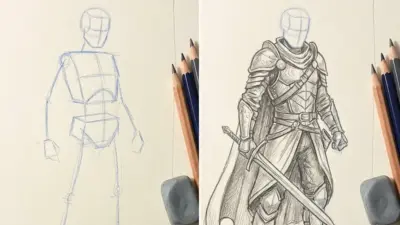
Ever stared out at the vast expanse of the ocean, felt the salty spray on your face, and wished you could capture that mesmerizing beauty on paper? You’re not alone! The ocean, with its endless moods, shimmering light, and dynamic movement, is one of nature’s most captivating subjects. It can seem daunting to translate that immense, ever-changing entity into a static drawing, but trust me, it’s not as hard as it looks. Learning how to draw an ocean that truly wows is a journey of observation, technique, and a little bit of artistic magic. This guide is here to help you dive in, step-by-step, and unlock the secrets to drawing stunning seascapes.
We’ll explore everything from choosing the right tools to mastering the subtle nuances of waves, light, and color. By the end of this, you’ll have a solid foundation to create ocean drawings that feel alive and truly breathtaking. So, grab your pencils and let’s embark on this artistic adventure!
Gearing Up: Your Essential Ocean Drawing Toolkit
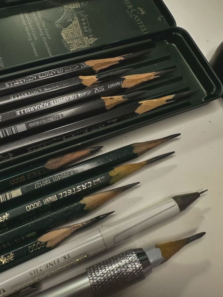


Before you can bring the ocean to life on paper, you need the right tools. Think of it like a sailor preparing their ship – having the right equipment makes all the difference. You don’t need a fancy art studio, but a few key items will set you up for success.
First, pencils are your best friends. A good range of graphite pencils, from hard (2H, H) for light sketching and detailed lines to soft (2B, 4B, 6B) for shading and darker values, will be incredibly useful. If you’re planning on adding color, colored pencils are fantastic for detail and layering, while pastels offer a softer, more blended feel. For those who love vibrant hues, watercolors and acrylics can truly capture the ocean’s depth and light.
Next up, paper. A sturdy sketch pad is perfect for practice. If you’re using watercolors or acrylics, make sure to get appropriate paper that can handle wet mediums without buckling. Watercolor paper, often textured, is designed for this.
Don’t forget your erasers! A kneaded eraser is excellent for lifting graphite gently without smudging, while a standard gum eraser can clean up larger areas. A fine-point eraser or an electric eraser can be a game-changer for creating tiny highlights and crisp edges, especially in foam and reflections.
Finally, and perhaps most importantly, reference images. Unless you’re lucky enough to live right by the sea, photos and videos are indispensable. Collect a variety of images: calm seas, crashing waves, sunsets over the water, different coastlines. Pay attention to how light hits the water, the patterns of foam, and the variations in color. These references will be your guide, inspiring your composition and helping you understand the ocean’s intricate details.

Understanding the Ocean’s Moods: Observation is Key
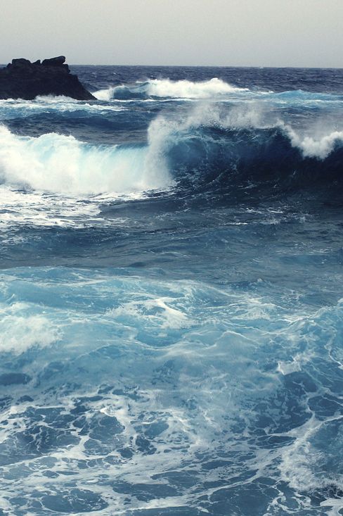
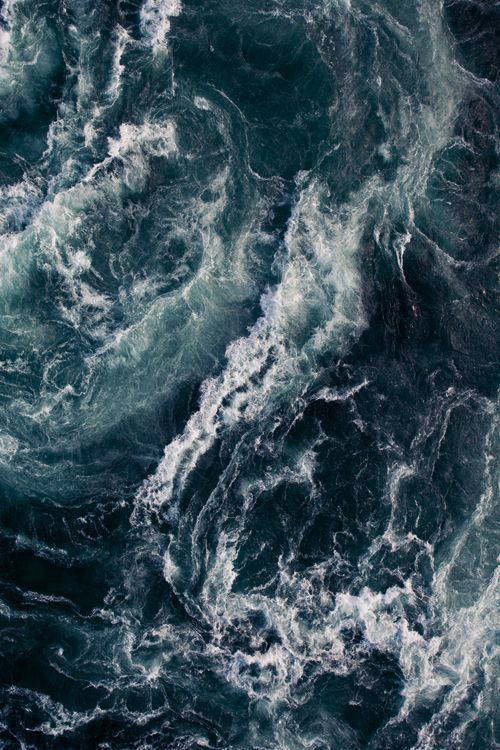
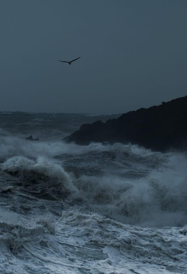
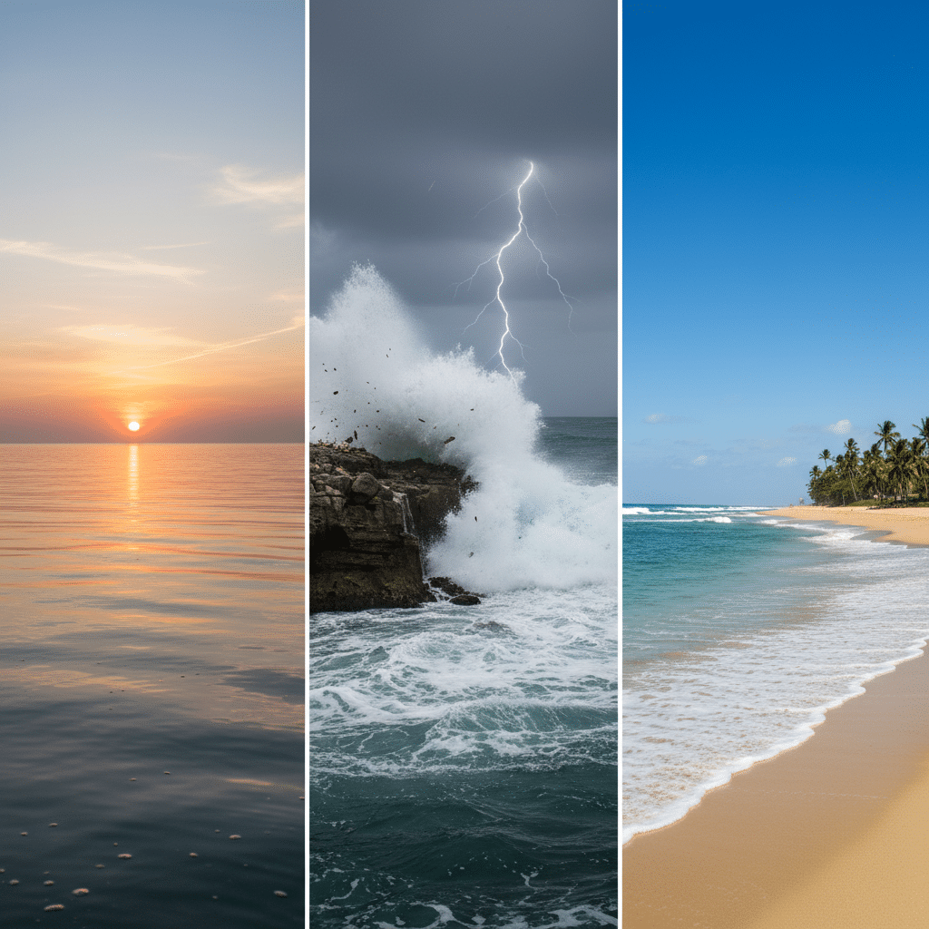
The ocean isn’t a static blue mass; it’s a living, breathing entity with countless moods. To draw a convincing ocean, you need to become a keen observer of its diverse personalities. This is where your reference images truly shine, but also take time to simply look at real water whenever you can – even a puddle can teach you about reflections!
Consider the different states of the ocean. Is it a tranquil, glassy surface reflecting the sky? Or is it a wild, stormy expanse with towering, turbulent waves? Perhaps it’s a lively beach scene with gentle rollers lapping at the shore. Each state demands a different approach in your drawing. The texture of calm water is vastly different from the frothy chaos of a breaking wave.
Light plays a monumental role in how the ocean appears. Think about the time of day: a vibrant sunrise casts warm oranges and pinks, a midday sun creates sparkling highlights and deep shadows, and a sunset bathes the water in a dramatic array of fiery hues. Notice how light interacts with the water – it can penetrate it, reflect off its surface, or create translucent effects within the waves. The angle of the sun changes everything. For instance, sun directly overhead will look different from sun low on the horizon, creating a pathway of light across the water. Capturing these subtle lighting effects is key to bringing your drawing to life. To really hone your observation skills for capturing dynamic light and interesting compositions, you might even consider looking into some 7 photography hacks for content creators – understanding how photographers capture light can greatly inform your drawing process.
The color palette of the ocean is incredibly diverse. While we often think of “blue,” the sea actually encompasses a spectrum of blues, greens, greys, and even purples. Deeper water tends to be darker blue, while shallower areas or those with sandy bottoms might appear turquoise or emerald green. Overcast skies can lend the ocean a steely grey tone. The foam of waves is rarely pure white; it often picks up subtle blues, greens, or even the colors of the sky.
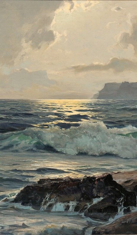
Finally, understand perspective. The horizon line is your anchor. Waves closer to you will appear larger and more defined, while those in the distance will be smaller, less detailed, and blend towards the horizon. Atmospheric perspective will make distant elements appear lighter and bluer. Training your eye to see these variations is the first and most crucial step in mastering ocean drawing.
The Foundation: Sketching Your Ocean Scene

Every great drawing starts with a solid foundation. For the ocean, this means careful sketching to establish your composition, perspective, and the basic structure of your waves. Don’t rush this stage; a strong sketch will make the coloring and detailing much easier.
Begin with your horizon line. This is the line where the sky meets the water. Its placement is crucial for setting the perspective and mood of your scene. A high horizon line gives a sense of looking down on the water, emphasizing its vastness. A low horizon line makes the sky more prominent, giving a feeling of grandeur or openness. Decide where you want the viewer’s eye to be. Use a light hand and a hard pencil (like an H or 2H) for this, as you might want to adjust it later, or even erase it entirely if you’re drawing a scene with no visible horizon.
Next, rough in your basic shapes. Don’t try to draw every wave immediately. Instead, block out the large masses of water, any landforms like cliffs or distant islands, and the sky. Think in terms of simple geometric shapes first – a large trapezoid for the water, a rectangle for the sky, and abstract shapes for land. This helps you establish the overall composition and ensure your elements are well-balanced.
Now, let’s talk about wave structure. This is where many beginners get stuck, but understanding a wave’s anatomy makes it much simpler. A typical breaking wave has a few key parts:
- The Face: This is the smooth, sloping front of the wave as it rises.
- The Crest: The highest point of the wave, just before it breaks.
- The Curl/Tube: The hollow part formed as the wave breaks.
- The Foam/Whitewater: The bubbly, aerated water created by the breaking wave, extending into a receding foam line on the surface.
- The Trough: The lowest point between two waves.
Sketch these elements with fluid, curved lines. Remember that waves are rarely perfectly straight; they often have a slight curve or bend. Use gentle, sweeping motions. For the foam, use loose, organic shapes, not rigid lines. Think about the direction the waves are moving and how they diminish in size as they recede towards the horizon.
Finally, consider your composition. The rule of thirds is a great guideline here: imagine your drawing surface divided into nine equal parts by two horizontal and two vertical lines. Placing key elements, like a prominent wave or a distant rock, along these lines or at their intersections can create a more dynamic and pleasing composition. Waves themselves can act as leading lines, guiding the viewer’s eye through your drawing and creating a sense of movement.
Adding Depth with Color: A Symphony of Hues

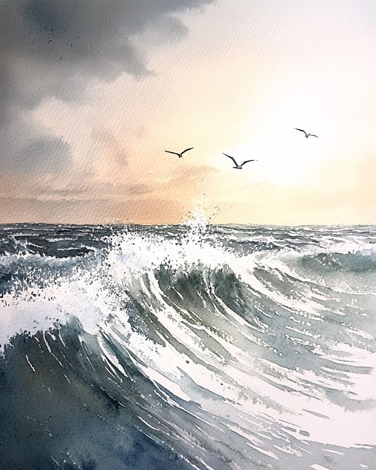

Once your sketch is solid, it’s time to bring your ocean to life with color! This is where you truly start to define the ocean’s mood, depth, and the impact of light. Don’t be afraid to experiment; the ocean’s color palette is incredibly rich.
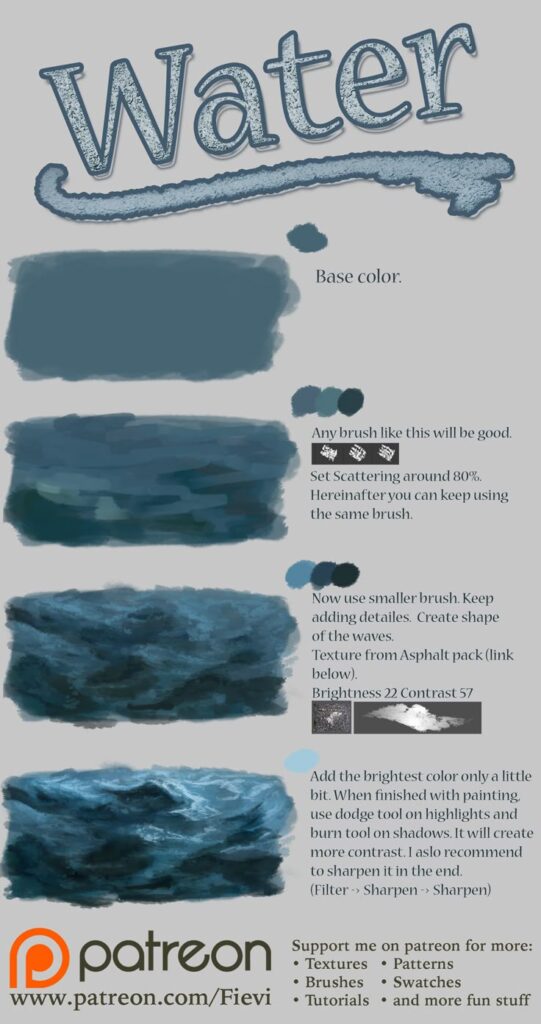
Start by thinking about your water colors. It’s rarely just one shade of blue. For deeper, distant water, use darker, cooler blues (like ultramarine or indigo). As the water gets shallower or closer to the shore, introduce greens, turquoises, and teals. These greens are often caused by sunlight reflecting off sand or marine plants below the surface. Mix your blues and greens – a touch of cerulean blue with emerald green can create a stunning tropical water effect. Remember to consider the sky’s reflection; if the sky is cloudy, your water might have more grey or muted tones. If it’s a bright, sunny day, the water will appear more vibrant.
Now, let’s tackle foam and highlights. The whitewater of breaking waves and the sparkling glints of sunlight on the surface are essential for realism. Don’t just use pure white for foam; it often has subtle undertones of light blue, green, or even purple depending on the surrounding water and light. Build up these foamy areas with layers, using light strokes to create texture. For highlights, especially those reflecting the sun, use the lightest colors – pure white, a very light yellow, or even leaving the paper blank if you’re working with watercolors. These small, bright spots instantly add sparkle and life.
Shadows are equally important for creating depth. The underside of waves, the deeper parts of the ocean, and areas where light is blocked will have darker values. Use darker blues, deep greens, or even a touch of purple mixed with your blues to create these shadows. This contrast between light and dark is what gives your ocean drawing dimension.
When working with color, especially with paints or pastels, blending techniques are crucial for achieving smooth transitions. For watercolors, wet-on-wet techniques can create soft, flowing color changes. For colored pencils, layer multiple colors lightly to build up rich, complex hues and blend them seamlessly. Mastering tools to master color accuracy while converting modes can also be incredibly helpful in ensuring your digital references translate perfectly to your chosen art medium, allowing you to replicate those precise oceanic tones.
Remember, the ocean is rarely uniform. Vary your colors, even within a single wave, to suggest movement and shifting light.
Mastering Movement: Drawing Dynamic Waves


One of the most captivating aspects of the ocean is its constant motion, and drawing dynamic waves is a skill that truly elevates an ocean scene. It’s not just about drawing a curved line; it’s about conveying energy, power, and fluidity.
Let’s break down how to capture different types of wave movement. Breaking waves are perhaps the most exciting to draw. To depict their energy, focus on the moment of impact. The crest of a breaking wave explodes into a burst of splash and spray. Use quick, sharp, and irregular strokes for these elements. Don’t make them too uniform; the beauty of spray is its chaotic, ephemeral nature. Think about the direction of the wind if you want to show spray being carried. The foam itself will have a distinct, frothy texture that you can build up with small, swirling marks or dabs of light color.
Rolling waves, on the other hand, convey a sense of smooth, powerful flow. These are the waves that haven’t fully broken yet, or are receding. Focus on their elegant, smooth curves. Use long, unbroken lines to define their faces and backs. Vary the thickness of these lines to suggest changes in depth and light. Pay attention to how light glides over the curves, creating subtle gradients of color and shadow. The goal here is to show the volume and weight of the water as it moves.
For calmer waters, you’ll need to illustrate ripples and swells. These are much more subtle but add immense realism. Ripples are small, concentric circles or elongated ovals on the water’s surface, often caused by wind or disturbances. Swells are larger, undulating movements that create broad, gentle hills and valleys in the water. For ripples, use fine, light lines or subtle shifts in tone. For swells, use very gradual changes in shading to indicate their form, reflecting the light and sky above.
Texture is vital for making your waves feel real. For foam, short, broken lines, stippling, or dabs of paint can create a bubbly, irregular surface. For the main body of the water, long, horizontal strokes can suggest its breadth, while slightly curved strokes along the wave face can enhance its form. Don’t be afraid to leave some areas less defined, letting the viewer’s imagination fill in the blanks. Practicing various strokes and textures is a fantastic way to improve your overall drawing skills, and you might find some 10 genius drawing hacks every artist should know to be incredibly useful across all your art projects.
Reflections and Light: The Ocean’s Sparkling Persona
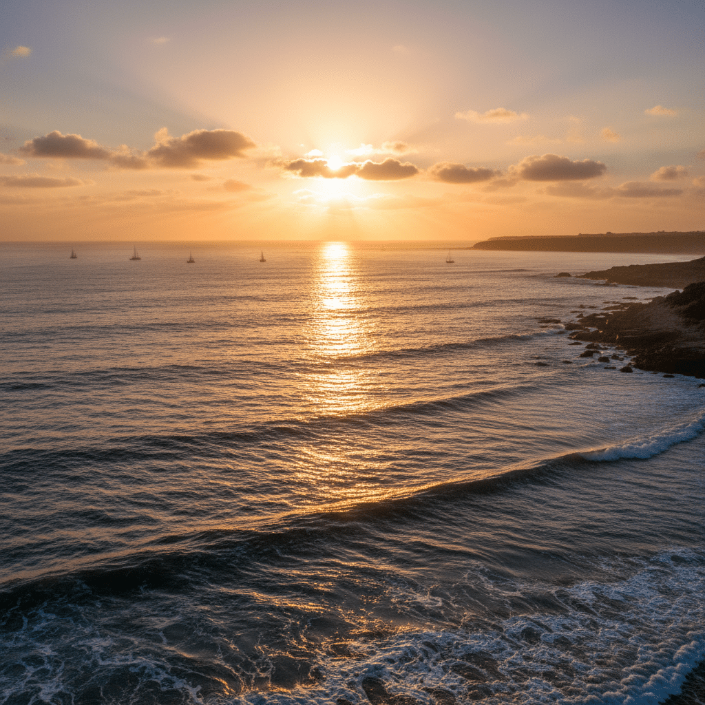
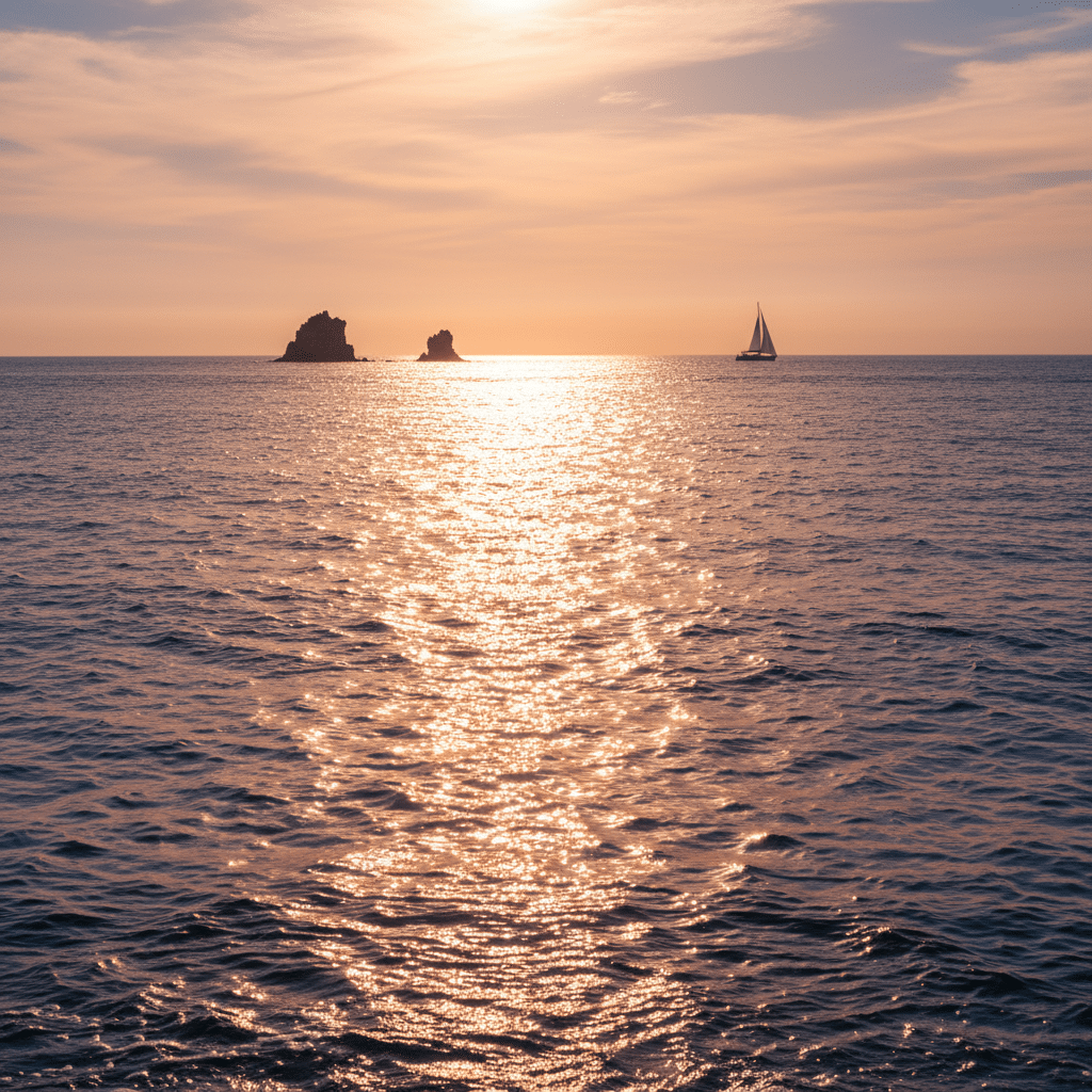
The ocean’s ability to capture and reflect light is what gives it its magical, ever-changing quality. Mastering reflections and highlights is paramount to drawing an ocean that truly sparkles and feels alive. This is where your observation skills, especially regarding how light interacts with water, will pay off big time.
Let’s talk about sunlight on water. When the sun hits the surface, it creates dazzling shimmering effects and bright highlights. These aren’t uniform blobs; they appear as broken, elongated shapes or small, intense points of light. The pattern of these highlights changes dramatically based on the angle of the sun and the choppiness of the water. On calm water, you might see a more defined pathway of light. On choppy water, the highlights will be scattered and irregular. Use your brightest whites or lightest colors, and apply them with confident, often short and sharp, strokes to create that sparkling effect. Remember the light source – the brightest highlights will be closest to the sun’s reflection point.
The ocean also acts as a giant mirror, reflecting the sky and clouds above it. This is a fantastic way to integrate the sky into your seascape and add visual interest. If there are dramatic clouds in the sky, you’ll see their shapes, albeit distorted and elongated, mirrored on the water’s surface. The colors of the sky, especially during sunrise or sunset, will be echoed in the water. For instance, a fiery sunset sky will paint the ocean in oranges, reds, and purples. Pay attention to how these reflections are broken up by waves and ripples – they won’t be perfect, crystal-clear images, but rather fragmented and shimmering versions.
If you’re drawing clearer, shallower water, you can also explore underwater light and translucency. Light penetrates the surface, creating fascinating patterns on the sandy bottom, known as caustics. This effect often manifests as wavy, rippling lines of light and shadow on the seabed. You can suggest this with subtle variations in color and light, making the water appear less opaque.
To make reflections convincing, remember a few rules:
- Reflections are always dimmer and less detailed than the actual objects.
- They stretch and distort due to the water’s movement.
- The color of the reflection will be influenced by the water’s color and what’s being reflected.
By carefully observing and depicting these interactions of light, your ocean drawing will transition from flat to truly luminous.
Adding Details and Finishing Touches
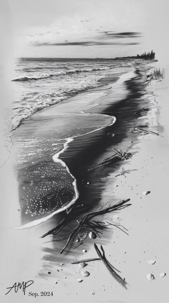

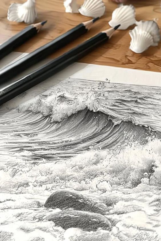
The devil, as they say, is in the details. Once you’ve got the main forms, colors, and movement established, it’s time to refine your ocean drawing with those smaller elements that make it truly convincing and captivating.
One of the most important details is seafoam. This isn’t just a generic white line. Seafoam has delicate patterns and varying textures. Closer to the viewer, you might see intricate lace-like patterns as the foam dissipates. Further out, it might appear as a soft, ethereal mist. Use fine lines, stippling, or dry brush techniques to create these varied textures. Pay attention to how the foam interacts with the water – it sits on the surface, often slightly raised, and then gently recedes.
Consider the wet sand and shoreline. This area offers another opportunity for subtle reflections and varying tones. Wet sand is often darker than dry sand and has a reflective sheen. You might see faint reflections of the sky or distant waves on its surface. Use slightly darker values and perhaps a touch of the sky’s color in the sand closest to the water. The transition from wet to dry sand should be gradual, not a sharp line.
If your scene includes rocks or cliffs, these elements provide excellent contrast and texture. Draw their rugged surfaces, paying attention to how shadows fall on their facets. Crucially, show their interaction with the water. Where waves crash against them, there will be splashes, spray, and foam. Where the water recedes, the rocks will appear wet and darker. This interplay connects the land and sea seamlessly.
Don’t forget the broader environment. A well-drawn sky and clouds provide context and reinforce the overall mood of your ocean. Whether it’s a clear blue expanse, fluffy white cumulus, or dramatic storm clouds, the sky influences the light and reflections on the water. Distant elements like marine life (seabirds, distant boats) or even very faint silhouettes of trees on a faraway coast can add a sense of scale and story to your drawing.
Finally, review your contrast and values. Does your drawing have enough darks, lights, and mid-tones? Good contrast makes elements pop and prevents your drawing from looking flat. Push your darks a little further, and make your highlights truly bright. This final refinement can make all the difference, transforming a good drawing into an exceptional one. Consider your overall composition and ensure all elements are working together to tell your ocean’s story.
Common Pitfalls and How to Avoid Them
Even seasoned artists encounter challenges, and drawing the ocean is no exception. Being aware of common pitfalls can help you sidestep them and improve your artwork significantly.
One of the most frequent issues is flatness. A drawing can look flat if it lacks depth, perspective, or a good range of values. To combat this, always establish a clear horizon line. Remember that things closer to the viewer are larger and more detailed, while distant elements are smaller, less saturated, and often blend into the atmosphere. Use varying shades of color and different pressures with your drawing tools to create a full spectrum of darks, mid-tones, and lights. Don’t be afraid to go dark in the shadows and bright in the highlights.
Another common mistake is creating a monochromatic ocean. While the ocean is predominantly blue, relying on just one or two shades can make it look uninteresting and unrealistic. As we discussed, the ocean is a symphony of blues, greens, greys, and even purples, influenced by depth, seabed, sky, and light. Incorporate these diverse hues. Look for subtle shifts in color in your reference photos and try to replicate them.
Stiff or unrealistic waves are another pitfall. Waves are fluid and dynamic, not rigid structures. Avoid drawing them with straight or overly symmetrical lines. Focus on organic curves, the natural way water crests and breaks, and the chaotic beauty of foam and spray. Study real waves to understand their unique forms and movements. Don’t draw individual lines for foam; instead, use textural marks that suggest its frothy, irregular nature.
Finally, overworking your drawing can sometimes diminish its impact. There’s a point where adding more details starts to clutter the image or muddy the colors. Knowing when to stop is a skill that comes with practice. Sometimes, leaving certain areas slightly less defined can add to the atmosphere or direct the viewer’s eye to the focal points. Step back from your drawing regularly to assess it with fresh eyes. If you feel like you’re losing the initial energy or clarity, it might be time to put down your tools. Sometimes, a simple, clear expression is more powerful than excessive detail.
By being mindful of these common challenges and actively working to overcome them, you’ll find your ocean drawings becoming more expressive, realistic, and truly captivating. It’s all part of the artistic journey!
Conclusion
Phew! You’ve just navigated the vast, beautiful world of drawing the ocean, from picking up your first pencil to finessing those shimmering highlights. We’ve explored the importance of observing the ocean’s moods, setting a strong foundation with your sketch, and layering colors to create depth. You’ve learned how to capture the dynamic energy of waves, the sparkling dance of light, and the subtle details that bring your seascape to life.
Remember, drawing is a skill that grows with practice and patience. Don’t be discouraged if your first few attempts aren’t exactly what you envisioned. Every stroke, every smudge, and every experiment is a step forward in your artistic journey. The ocean itself is ever-changing, and so is your artistic growth!
The true magic of drawing the ocean lies in conveying its boundless spirit and personal connection you feel to it. So, grab your tools, find some breathtaking reference photos, and let the rhythmic beauty of the waves inspire your next masterpiece. The canvas is waiting, and the ocean is calling!
How can I observe the ocean’s moods to improve my drawings?
Spend time looking at real water or reference images to notice different states of the ocean, such as calm, stormy, or lively scenes. Pay close attention to how light, color, and texture change with weather, time of day, and wave movement.
How do I depict realistic waves and their movement?
Study wave anatomy, focusing on parts like the face, crest, curl, foam, and trough. Use organic, curved lines and vary your strokes for different wave types such as breaking waves, rolling waves, or ripples to convey energy, flow, and motion.
What techniques help make my ocean drawing more lively and realistic?
Use varied colors for depth, apply highlights and reflections carefully to simulate light, and add details like foam and spray with textured strokes. Contrast dark shadows with bright highlights and layer colors smoothly to create a vibrant, dynamic ocean scene.
What tools do I need to draw the ocean?
You’ll need a range of graphite pencils from hard (2H, H) for light sketches to soft (2B, 4B, 6B) for shading, good quality paper suited to your mediums, erasers like kneaded and gum erasers, and reference images. For color work, colored pencils, pastels, watercolor, or acrylics are ideal.
How do I start drawing an ocean scene effectively?
Begin by sketching a strong foundation with a clear horizon line and basic shapes to establish your composition, perspective, and the structure of waves before adding details.
- 0shares
- Facebook0
- Pinterest0
- Twitter0
- Reddit0


