Watercolor mixing often frustrates beginners who throw colors together hoping for the best, only to end up with muddy, dull results. The key to successful watercolor mixing is understanding basic color theory principles and learning which pigment combinations create clean, vibrant hues instead of murky tones. Once you grasp these fundamentals, you’ll be able to predict and control your color outcomes with confidence.
The transparency of watercolors makes them unique among painting mediums, but this same quality requires a different approach to mixing than opaque paints. You need to consider how colors layer and blend when wet, how much water to use, and which pigments work well together. Many artists find that mastering these techniques transforms their paintings from flat and lifeless to luminous and professional.
Learning watercolor mixing doesn’t have to be complicated. With a few essential techniques, some basic color recipes, and practice with mixing charts, you’ll develop an intuitive sense for creating any color you envision. This guide will walk you through everything you need to mix watercolors successfully and avoid common pitfalls that lead to disappointing results.
Key Takeaways
- Understanding color relationships and transparency is essential for creating clean watercolor mixes
- Proper water control and knowing which pigments to combine prevents muddy, dull colors
- Creating mixing charts and learning basic color recipes builds confidence and predictable results
Understanding Watercolor Mixing Basics
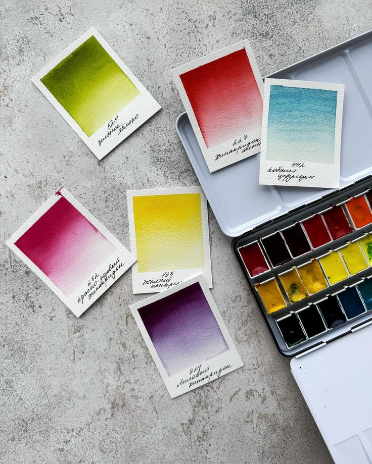
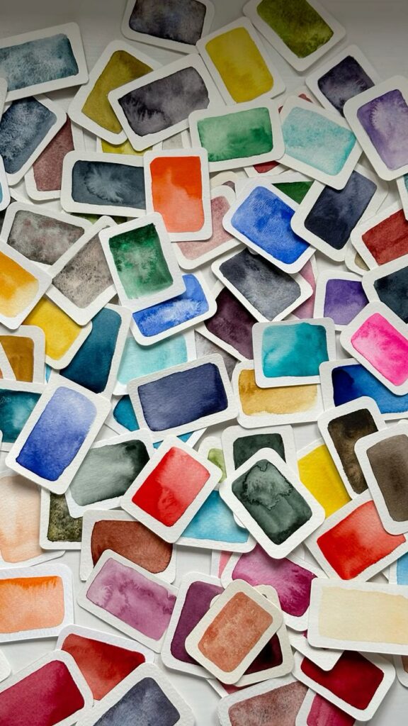
Watercolor mixing relies on understanding how pigments interact with water and each other, starting with the foundational role of primary colors in creating every hue on your palette.
What Is Watercolor Mixing?
Watercolor mixing is the process of combining pigments with water to create new colors and values for your paintings. Unlike other mediums, watercolor paints consist of colored pigments suspended in a water-soluble binder, which makes them behave differently than oils or acrylics.
When you mix watercolors, you’re controlling both the pigment combinations and the water-to-paint ratio. This dual control affects the intensity, transparency, and shade of your colors. You can mix directly on your palette before applying paint to paper, or you can layer colors on the paper itself to create visual mixing effects.
The transparency of watercolor makes mixing unique. Each layer you add influences the layers beneath it, allowing you to build depth and complexity in ways that opaque paints cannot achieve.
How Pigments Behave in Watercolor
Pigments in watercolor have specific properties that affect how they mix and appear on paper. Transparent pigments allow light to pass through them and reflect off the white paper below, creating luminous effects. Opaque pigments block more light and can create muddy mixtures when overused.
Each pigment also has a staining quality. Some pigments stain the paper fibers permanently, while others lift easily when rewetted. This matters when you’re layering colors or trying to correct mistakes.
The granulation of pigments affects texture in your watercolor painting. Granulating pigments settle into the valleys of textured paper, creating a speckled appearance. Smooth pigments distribute evenly across the surface. Understanding these behaviors helps you predict how your color mixing will look when dry, since watercolor typically dries lighter than it appears when wet.
Primary Colors and Their Importance
Primary colors are red, blue, and yellow—the only colors you cannot create by mixing other pigments together. These three colors form the foundation of all color mixing in watercolor painting.
You use primary colors to create secondary colors: red and yellow make orange, blue and yellow make green, and red and blue make purple. By adjusting the ratios of your primary colors, you can create countless variations of each secondary color.
Most artists keep at least two versions of each primary on their palette—a warm and a cool version. For example, you might have a warm red (like cadmium red) and a cool red (like quinacridone magenta). This expanded primary palette gives you cleaner, more vibrant secondary colors because you can choose primaries that lean toward the color you’re trying to mix.
Color Theory in Watercolor
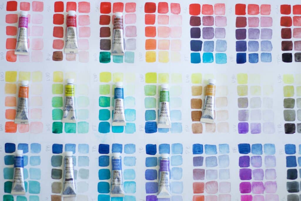
Understanding how colors interact on the color wheel helps you mix cleaner, more intentional hues. Temperature differences between pigments affect mixing results, while harmonious color relationships create cohesive paintings.
The Color Wheel in Watercolor
The color wheel organizes colors in a circular format to show their relationships. Primary colors in traditional watercolor are red, yellow, and blue, though many artists use a split-primary palette with warm and cool versions of each primary for better mixing range.
A typical watercolor color wheel includes twelve positions: three primaries, three secondaries, and six tertiaries. Each color sits opposite its complement, which is the color that contrasts most strongly with it. Understanding these positions helps you predict mixing outcomes and choose colors that work well together.
Watercolor pigments don’t always behave like pure theoretical colors due to their unique chemical properties. Some reds lean toward orange while others lean toward violet, affecting what you can mix from them.
Secondary and Tertiary Colors Explained
Secondary colors result from mixing two primary colors in roughly equal proportions:
- Orange = Red + Yellow
- Green = Yellow + Blue
- Violet = Blue + Red
These mixtures vary significantly depending on which specific primaries you use. A warm red and warm yellow create a bright, fiery orange, while cool versions produce a more subdued result.
Tertiary colors appear when you mix a primary with an adjacent secondary color. The six tertiary colors are red-orange, yellow-orange, yellow-green, blue-green, blue-violet, and red-violet. These intermediate hues expand your mixing possibilities and create more nuanced color schemes.
The transparency of watercolor means these mixed colors maintain luminosity when applied in thin washes. Layer secondary and tertiary colors wet-on-dry to create optical mixing effects that differ from palette mixing.
Warm and Cool Colors in Mixing
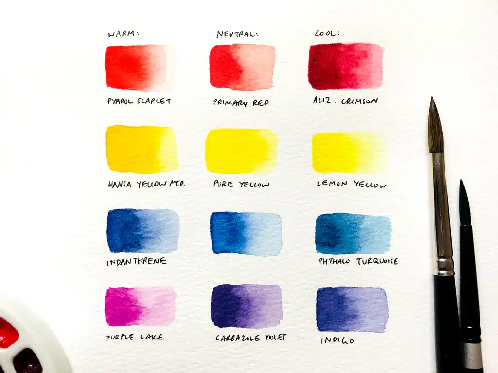
Warm colors (reds, oranges, yellows) appear to advance in paintings, while cool colors (blues, greens, violets) recede. This temperature distinction affects both spatial relationships and mixing clarity.
Most pigments have a temperature bias. Cadmium Yellow leans warm toward orange, while Lemon Yellow leans cool toward green. Ultramarine Blue has a warm violet undertone, whereas Phthalo Blue is a cool, greenish blue.
Mixing colors with opposing temperature biases often creates muddy or dull results. For clean, vibrant greens, combine a cool yellow with a cool blue rather than a warm yellow with a warm blue. This principle applies across all color combinations and explains why a split-primary palette (warm and cool versions of each primary) gives you more mixing control.
Color Harmony and Relationships
Color harmony creates visual coherence through intentional color relationships. Complementary colors sit opposite each other on the wheel and create high contrast when placed side by side. Mixed together, complements neutralize each other into browns and grays useful for shadows.
Analogous colors are neighbors on the wheel, like blue, blue-green, and green. These create peaceful, unified color schemes with natural transitions. Triadic harmony uses three colors equally spaced on the wheel, offering variety while maintaining balance.
Split-complementary schemes pair one color with the two colors adjacent to its complement. This provides contrast with less tension than direct complements. Testing these relationships through quick color studies before starting a painting helps you choose palettes that support your artistic intent.
Essential Watercolor Mixing Techniques
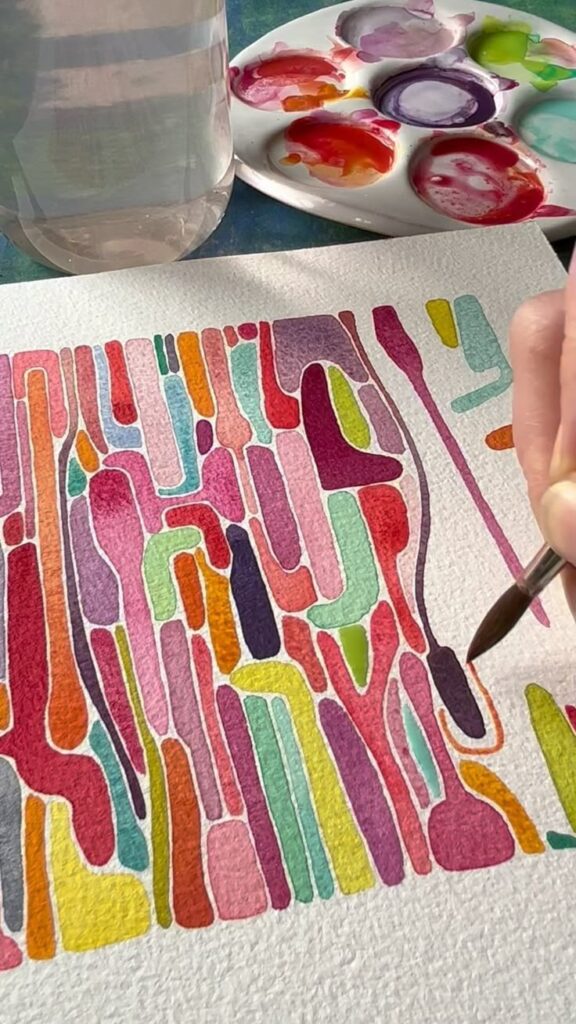
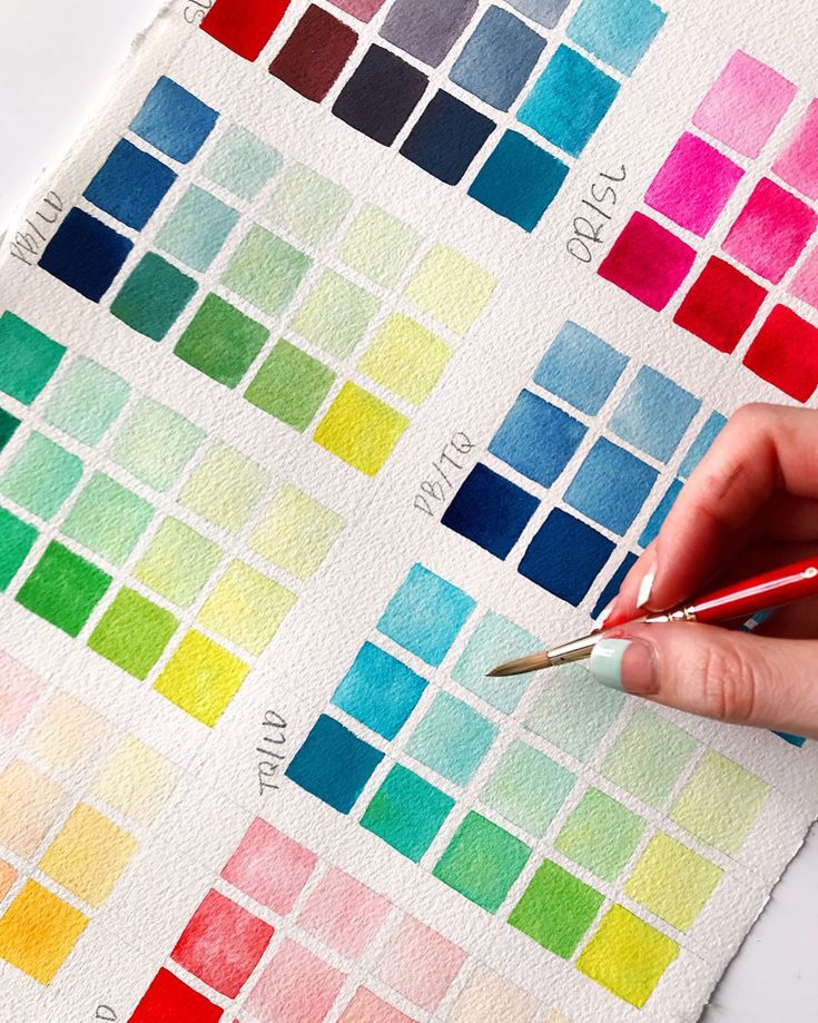
Successful watercolor painting depends on understanding where and how you combine your colors, managing the balance between water and pigment, and building colors through transparent layers.
Mixing on the Palette versus on Paper
Palette mixing gives you complete control over your colors before they touch your painting. You can test and adjust hues until they match your vision exactly. This approach works best when you need a specific color repeatedly or want to ensure consistency across larger areas of your work.
Mixing directly on paper creates more spontaneous and organic color transitions. The wet-on-wet technique allows pigments to blend naturally on your surface, producing soft edges and unexpected color interactions that add life to your painting. This method requires confidence and practice since you have less control over the final result.
When to use each method:
- Palette mixing: Flat washes, precise color matching, large uniform areas
- Paper mixing: Skies, water, organic textures, atmospheric effects
You can also combine both approaches in a single painting. Mix your base colors on the palette, then allow them to interact on paper for added depth and interest.
Controlling Water-to-Paint Ratio
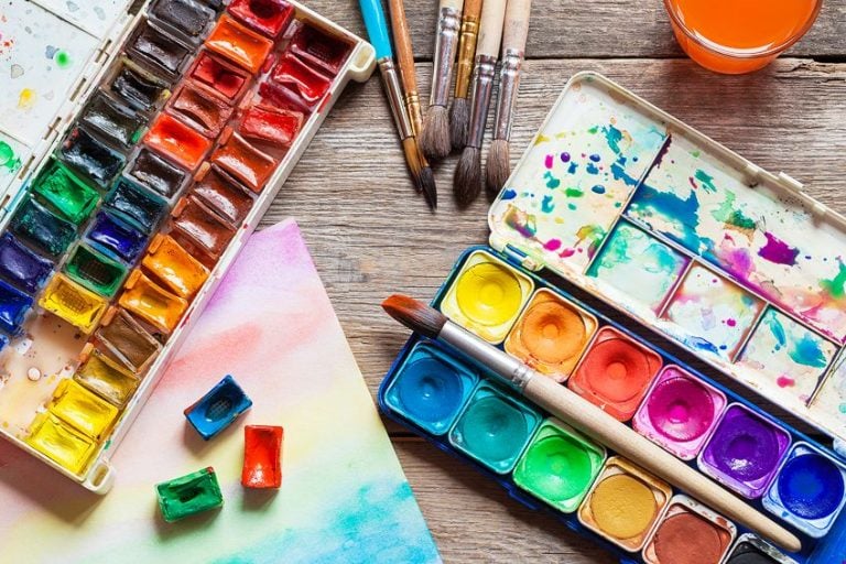
The amount of water you add to your pigment determines color intensity and transparency. More water creates lighter, more transparent washes, while less water produces rich, saturated color.
Start with a small amount of pigment and gradually add water until you achieve your desired consistency. Test your mixture on scrap paper before applying it to your painting. Different pigments absorb water differently, so some colors need more adjustment than others.
A good rule is to aim for a consistency similar to milk for medium-value washes. For bold, dark areas, use less water to create a mixture closer to heavy cream. Very light washes should be as thin as tinted water.
Keep a clean water container nearby and change it regularly. Dirty water muddles your colors and reduces their clarity.
Layering and Glazing Methods
Glazing builds colors through multiple transparent layers applied after previous layers dry completely. Each layer modifies the colors beneath it, creating depth and complexity impossible to achieve with single applications.
Wait until your first layer is completely dry before adding the next. Wet paint will lift and blend with new applications, creating muddy results instead of clean glazes. Use light pressure with your brush to avoid disturbing dried layers.
Basic glazing process:
- Apply your first color as a light wash
- Let it dry completely (5-15 minutes depending on humidity)
- Add your second color over specific areas
- Repeat as needed to build depth
Transparent pigments work best for glazing because they allow underlying colors to show through clearly. Opaque pigments can create chalky effects when layered heavily. You can glaze complementary colors to create natural-looking shadows or layer similar hues to intensify specific areas of your painting.
Creating Vibrant Colors and Avoiding Muddy Mixes
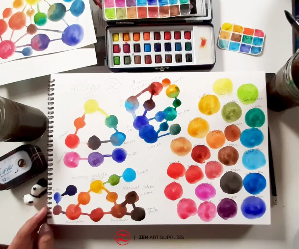
Muddy colors appear when you accidentally create unwanted browns or grays by mixing pigments that contain hidden complementary colors. Using single-pigment paints and understanding how different pigments interact helps you maintain brightness and achieve color harmony in your work.
Why Muddy Colors Happen
Muddy colors occur when you unintentionally mix all three primary colors together. This happens more easily than you might think because many watercolor paints contain multiple pigments.
When you mix a blue that contains red undertones with an orange, you’re actually combining all three primaries. The result is a dull, grayish color instead of the vibrant mixture you expected.
Common causes of muddy mixes include:
- Using multi-pigment paints that contain hidden colors
- Mixing complementary colors without intention
- Combining too many colors in a single mixture
- Failing to clean your brush between applications
- Over-mixing colors on your palette or paper
The type of pigment matters significantly. Some pigments naturally granulate or have strong tinting strength, which affects how they interact with other colors. Checking the pigment codes on your paint tubes helps you understand what’s actually in each color.
Using Limited Palettes for Clean Results
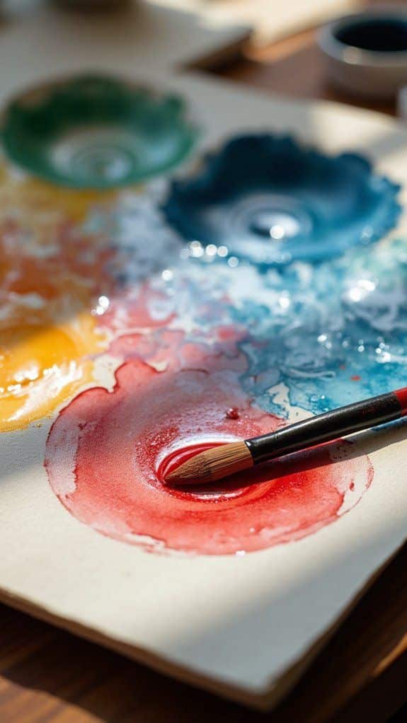
A limited palette typically includes three to six carefully selected colors. This approach forces you to mix intentionally and helps you avoid muddy results.
Working with fewer colors creates automatic color harmony throughout your painting. When all your mixtures come from the same small group of pigments, your artwork naturally holds together visually.
Benefits of limited palettes:
- Easier to predict mixing results
- More cohesive color schemes
- Less chance of creating unwanted neutrals
- Faster decision-making while painting
Start with a simple split-primary palette: one warm and one cool version of each primary color. This gives you six colors total but allows you to mix nearly any hue while maintaining vibrancy.
Choosing and Combining Pigments
Single-pigment paints produce the cleanest, most vibrant mixes. These paints contain only one pigment code, which you can find on the tube label (like PY3 for yellow or PB29 for blue).
Read your paint tubes carefully. A color labeled “Sap Green” might contain yellow and blue pigments mixed by the manufacturer. While convenient, these multi-pigment colors create muddy results when you mix them with other paints.
Rules for clean mixing:
- Limit mixtures to two or three colors maximum
- Choose pigments that don’t contain complementary colors
- Mix warm colors with warm colors and cool with cool
- Test combinations on scrap paper before using them
Some pigments are naturally more transparent or opaque, which affects how they layer. Transparent pigments like Quinacridone Rose or Phthalo Blue maintain vibrancy when mixed. Opaque pigments like Cadmium Yellow or Cerulean Blue can dull your mixtures if you’re not careful with proportions.
Practical Watercolor Mixing Recipes and Charts
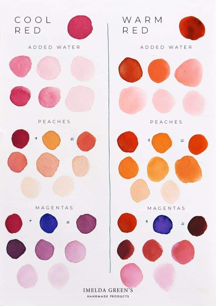
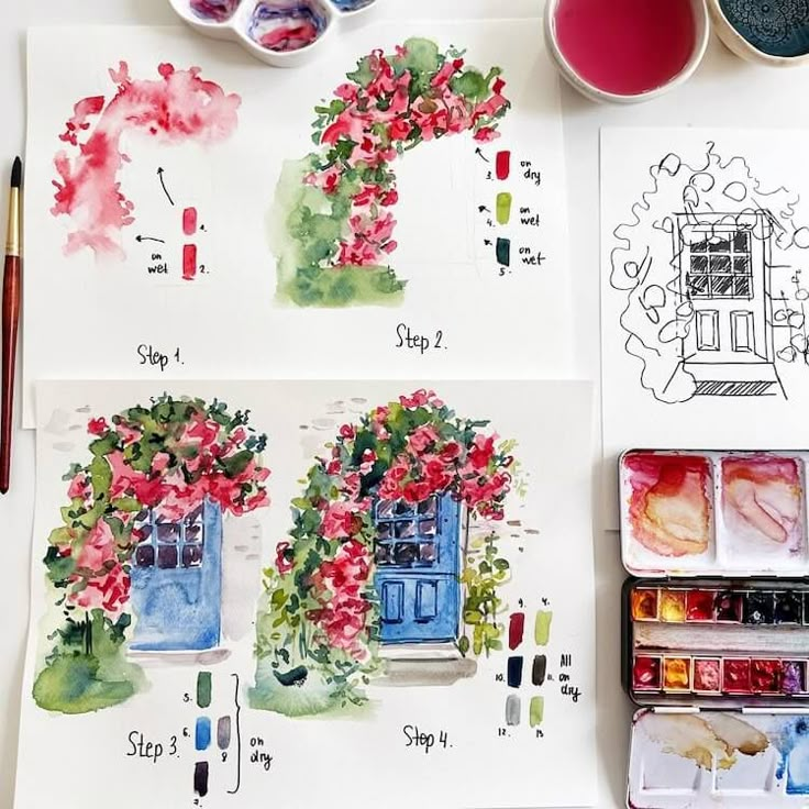
Color charts provide visual references for mixing consistent hues, while specific recipes help you achieve colors like olive greens, rich purples, and warm browns. Understanding how to dilute pigments or add complementary colors allows you to control intensity and create nuanced tones.
How to Use a Color Chart
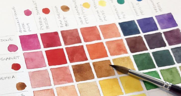
A color chart maps out the results when you combine different pigments from your palette. Create a grid where one set of colors runs along the top and another down the side. In each intersecting square, mix the two corresponding colors.
Label each pigment clearly. For example, mark phthalo blue, ultramarine blue, azo yellow, and cadmium red along your axes. This way you’ll know exactly which combination created each result.
Test your mixes at the same consistency for accurate comparisons. Use equal parts of each color unless you’re deliberately exploring ratios. Keep your chart as a reference when painting, noting which combinations produce the effects you want. You can also create smaller charts focused on specific color families or add notes about transparency and staining properties.
Mixing Specific Colors (Greens, Purples, Browns)
For greens, combine yellow with blue. Azo yellow mixed with phthalo blue creates vibrant, cool greens, while the same yellow with ultramarine blue produces softer, earthier greens. Add a touch of red to neutralize overly bright greens.
Purples require blue and red or magenta. Ultramarine blue and cadmium red yield muted purples with a grayish quality. For brighter purples, use magenta with ultramarine blue or phthalo blue. Adjust the ratio to shift between violet and plum tones.
Browns emerge when you mix complementary colors. Combine red and green, blue and orange, or yellow and purple. A practical recipe uses cadmium red with phthalo blue and a bit of yellow for warm browns. Adjust proportions to create everything from burnt sienna to deep chocolate tones.
Adjusting Color Intensity and Tone
Add water to reduce color intensity without changing the hue itself. More water creates transparent washes, while less water produces saturated applications. This dilution method maintains the original color temperature.
Mix complementary colors to mute or gray a hue. A small amount of red neutralizes overly bright greens, while adding yellow softens intense purples. Use this technique when you need subtle, natural-looking colors rather than pure pigments straight from the tube.
Add white or a pale yellow for tints, though in watercolor you typically use water instead. For darker tones, layer glazes or add a complement rather than black, which can deaden your colors. Test adjustments on scrap paper first to avoid muddy results in your final painting.
- 23shares
- Facebook0
- Pinterest20
- Twitter3
- Reddit0
