Ever picked up a marker and wished you could blend colors as smoothly as paint, but without all the mess? Well, get ready, because that’s exactly what you can do when you start drawing with alcohol markers! These vibrant, versatile tools have taken the art world by storm, and for good reason. They offer a unique blend of control and fluidity that makes creating stunning, professional-looking artwork incredibly fun and surprisingly accessible, even if you’re just starting out. Think rich, seamless colors that dry in a flash, letting you build up layers and create beautiful gradients with ease. Whether you’re sketching, illustrating, or just doodling, alcohol markers unlock a whole new world of creative possibilities. Let’s dive in and discover how these amazing art supplies can transform your casual drawing sessions into something truly special.
Why Alcohol Markers Are So Awesome (and Different!)
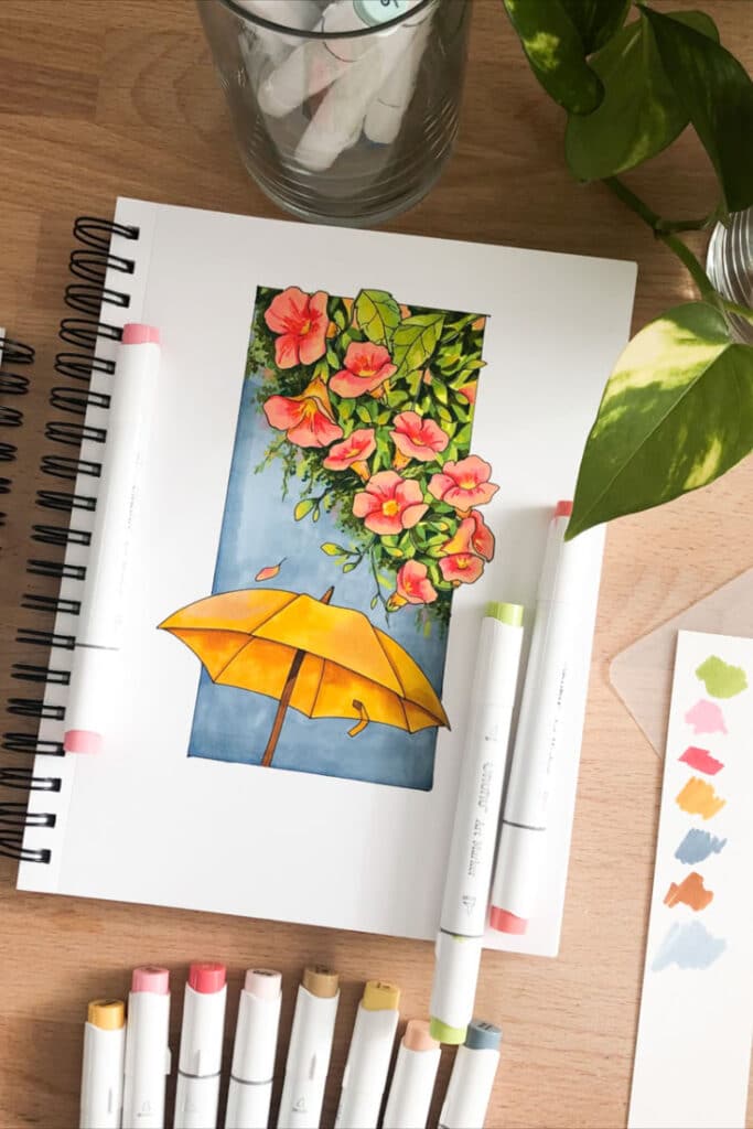
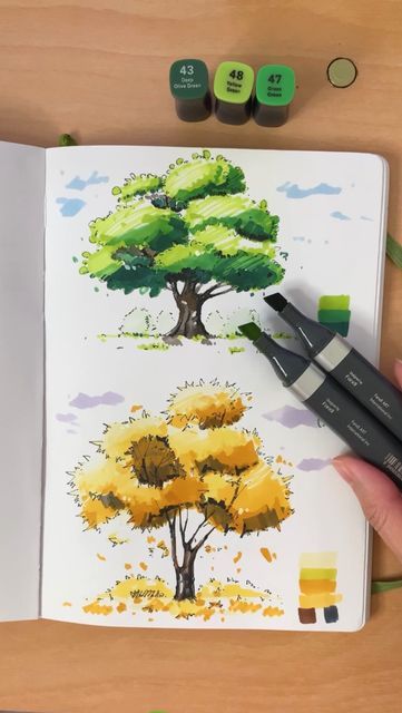
So, what exactly are alcohol markers? At their core, they’re pens filled with a dye-based ink suspended in an alcohol solvent. This might sound technical, but it’s the secret sauce that gives them their superpowers. Unlike water-based markers, which tend to pill up paper and leave harsh lines, alcohol markers flow smoothly, allowing colors to merge beautifully without damaging your surface. They dry super fast, which means less waiting and more creating!
What Makes Them Unique?
The magic truly happens with how alcohol markers interact with each other. Because the ink is alcohol-based, when you layer one color over another, the alcohol in the new layer reactivates the ink beneath it. This allows the colors to blend together seamlessly, much like watercolors, but with far greater control and without the same drying time challenges. This blending capability is what artists absolutely adore. You can achieve smooth transitions, rich depth, and vibrant hues that pop right off the page.
Dye vs. Pigment: A Quick Look
While some art mediums use pigment-based inks (like many colored pencils or gel pens), alcohol markers rely on dye. Dyes are typically more transparent and vibrant, allowing for brilliant, luminous colors. This transparency is crucial for layering and blending, as you can see the colors beneath showing through, creating new intermediate shades. Pigments, on the other hand, are opaque particles, which tend to sit on top of the paper. Neither is inherently “better,” but for the smooth, blendable effects we’re chasing with markers, dye-based ink is the champion.
The Blending Magic
Imagine drawing a dark green leaf, then adding a lighter green right next to it, and watching them melt into each other without a visible line. That’s the blending magic of alcohol markers. Their ability to create smooth gradients and soft transitions is unparalleled among pen-style mediums. This makes them ideal for rendering realistic textures, subtle shadows, and vibrant landscapes. You can even use a special “blender” marker, which is just pure solvent, to push colors around, lighten areas, or create interesting textures. It’s like having a brush and paint in a pen, but without the need for water or a palette!
Getting Started: Your Essential Alcohol Marker Toolkit
Ready to jump in? Great! You don’t need to break the bank to start, but having the right tools makes a huge difference. Think of it as setting yourself up for success.
Choosing Your Markers
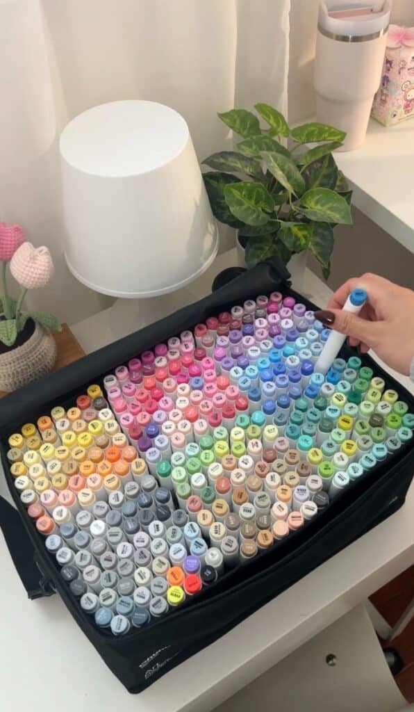
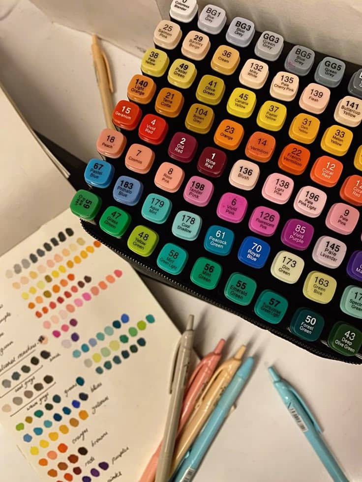
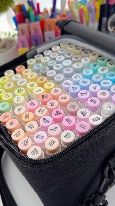
This is where it can get a little overwhelming. There are tons of brands out there, from budget-friendly options to professional-grade sets.
- Beginner-Friendly Sets: Brands like Ohuhu, Arrtx, or Caliart offer excellent starter sets with a wide range of colors at an affordable price. These are perfect for getting a feel for the medium without a huge investment. Look for sets with at least 30-60 colors to give you a good spectrum to play with, especially a decent range of greens, blues, reds, and grays.
- Mid-Range Markers: If you’re ready to upgrade or know you’ll be serious about this, brands like Bianyo or Art-n-Fly offer higher quality ink and more durable nibs without the premium price tag of pro markers.
- Professional Markers: Copic, Prismacolor, and Winsor & Newton Promarkers are the gold standard. They offer refillable ink, replaceable nibs, and an incredibly extensive color range. While pricier, they are an investment for artists who use markers extensively.
- Pro Tip: Even if you’re aiming for pro markers eventually, start with a smaller, more affordable set to practice. You might find you love them and then gradually upgrade. Many artists mix and match brands, too!
The Right Paper Matters
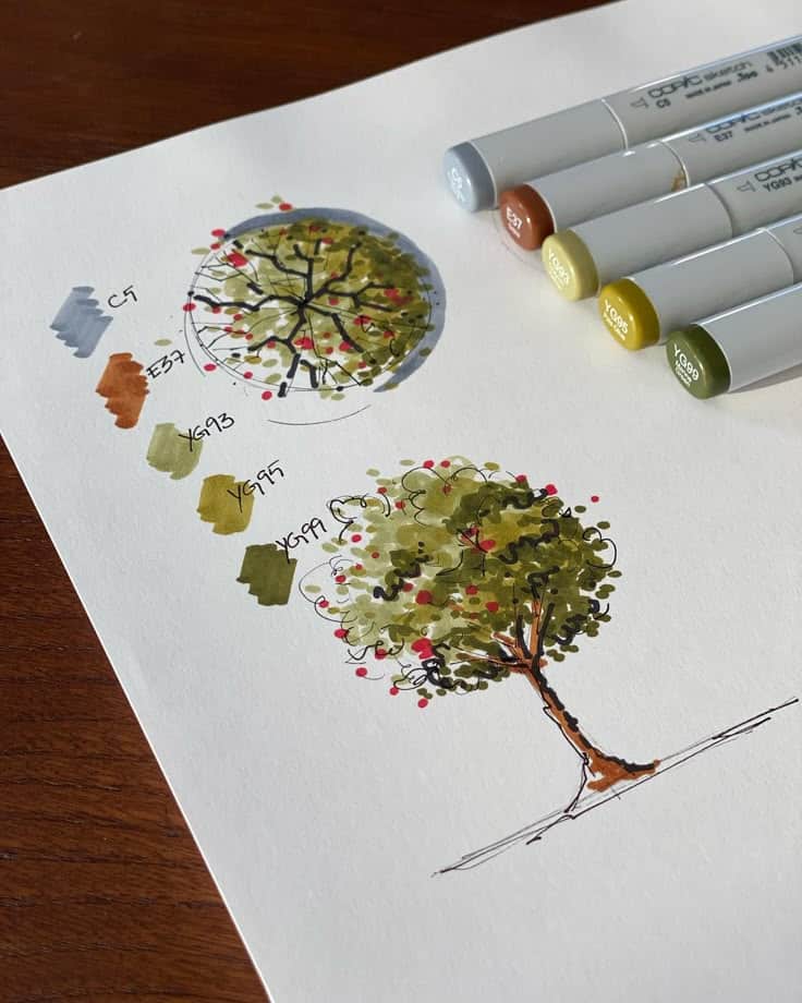
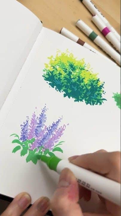
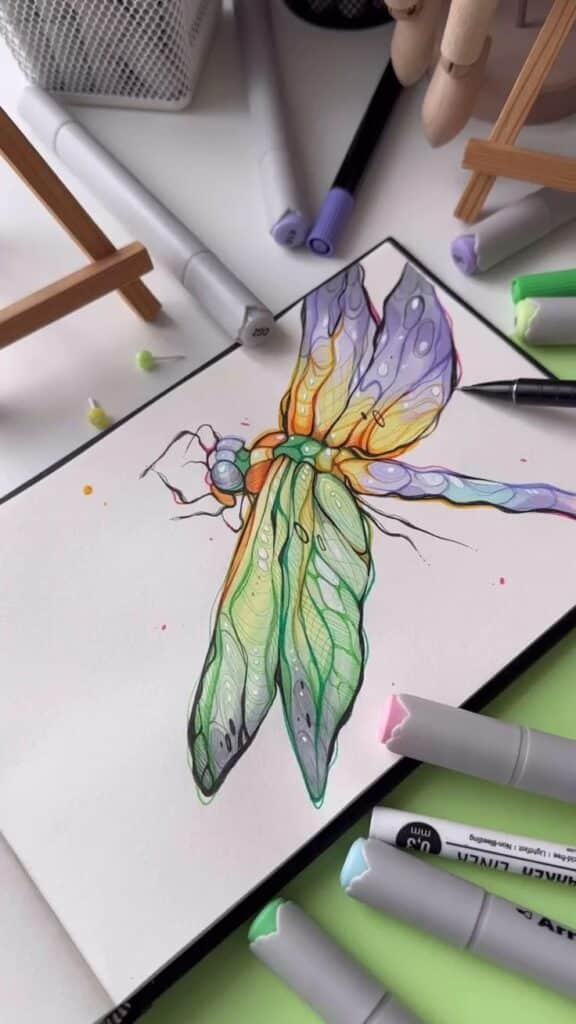
This is arguably the most crucial component after the markers themselves. Alcohol markers will bleed through regular printer paper like nobody’s business. You need paper that can handle the ink and allow for smooth blending.
- Marker Paper: This is specifically designed for alcohol markers. It’s usually very smooth and has a special coating that prevents the ink from bleeding through too quickly, allowing for better blending on the surface. It’s also often thinner, but don’t let that fool you – it’s engineered for markers.
- Bristol Board: A thicker, smoother paper with a plate or vellum finish. It’s excellent for marker art because it’s very durable and holds up well to layering without too much bleeding.
- Cardstock: A thick, smooth cardstock (around 80-100lb or 200-270gsm) can work well, especially if it’s coated or has a low absorbency. Test it first!
- Avoid: Anything too thin, textured (like watercolor paper, unless you want a different effect), or very absorbent.
Must-Have Accessories
Beyond the markers and paper, a few other items will make your life much easier:
- Blender Marker: This is a clear, colorless marker filled with the same alcohol solvent. It’s essential for achieving seamless blends, lightening colors, or even creating textured effects.
- Fine Liners/Ink Pens: After your marker base is dry, you’ll want to add outlines, details, and crisp lines. Look for waterproof, fade-resistant black ink pens in various nib sizes (e.g., 0.05mm, 0.1mm, 0.3mm, 0.5mm). Brands like Micron or Copic Multiliner are popular choices.
- White Gel Pen or Opaque White Ink: Perfect for adding highlights, reflections, and tiny details that pop, especially over darker marker colors.
- Pencil and Eraser: For your initial sketch. A light, non-smudging pencil (like an H or 2H) is ideal, along with a good kneaded eraser that won’t damage your paper.
- Protective Sheet: Always place a scrap piece of paper or a plastic sheet under your artwork. Even with good marker paper, some ink might still bleed through, protecting your desk is key!
Mastering the Basics: Techniques to Get You Started
Now that you have your tools, let’s get down to business! The beauty of alcohol markers lies in their user-friendly nature, but a few core techniques will elevate your art from good to fantastic.
Know Your Colors: Swatch, Swatch, Swatch!
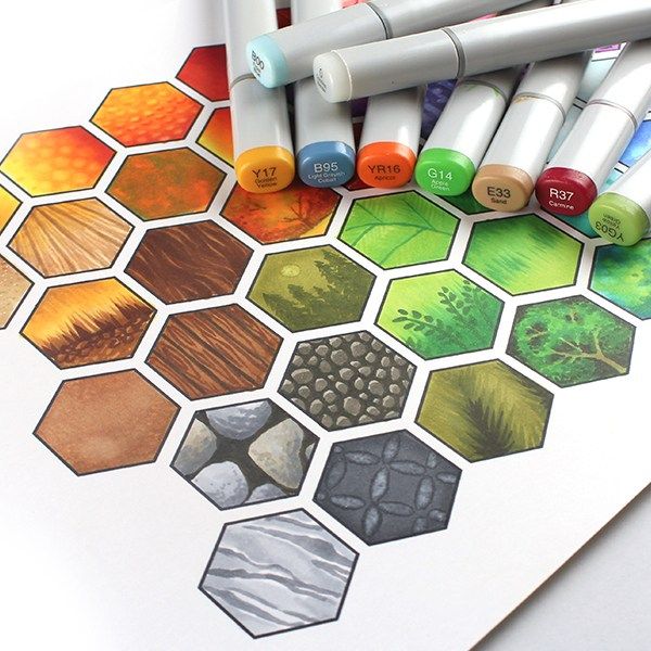
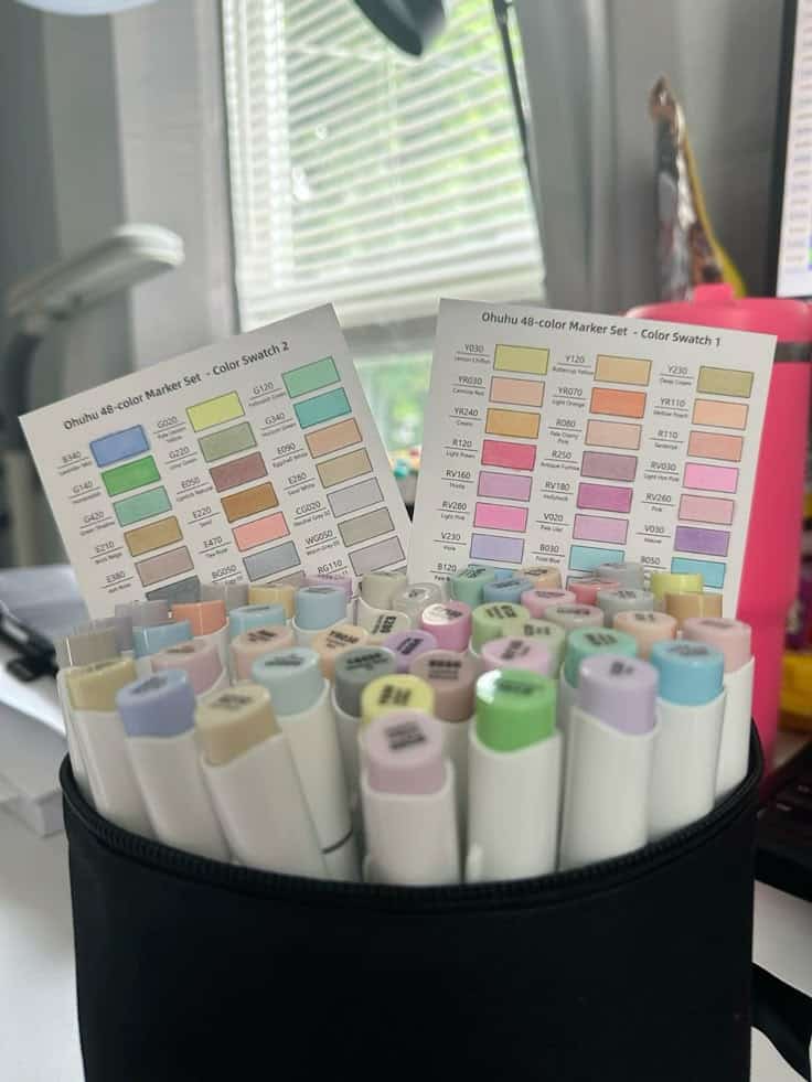
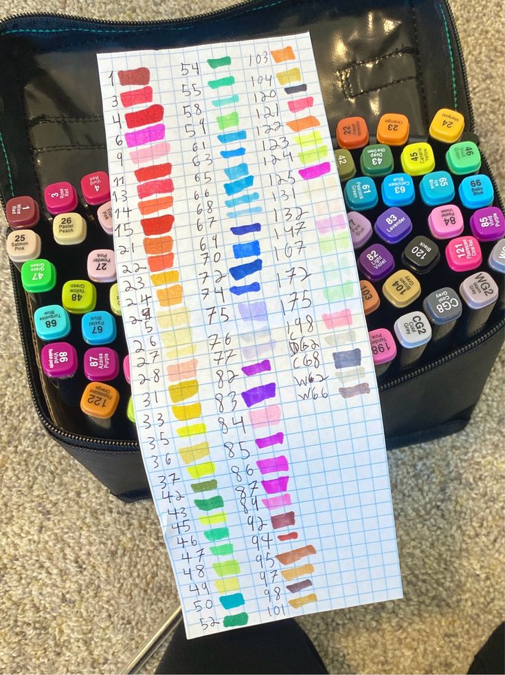
Seriously, this isn’t optional. The color on the marker cap is often not the true color of the ink once it’s on paper, and certainly not once it’s dry and blended.
- Create a Color Chart: Take a piece of your chosen marker paper and draw small squares or circles. Label each swatch with the marker’s name or number. This chart will become your best friend.
- Observe Drying: Notice how the color changes slightly as it dries. Most markers will lighten a bit.
- Layering Test: Try overlapping two different colors to see what new shade they create. This is invaluable for blending.
- Blender Test: Use your blender marker on a swatch to see how it lightens the color.
This initial exercise will help you truly understand your palette and how each color behaves, saving you headaches down the line.
Building Layers for Depth
Alcohol markers thrive on layering. You rarely get the full depth and vibrancy of a color with just one pass.
- Start Light: Begin with your lightest color in an area. Apply it evenly.
- Gradually Darken: Once that first layer is mostly dry (which is fast!), apply a slightly darker shade over specific areas where you want shadows or more intensity.
- Blend as You Go: As you add new layers, the alcohol will reactivate the previous layers, allowing them to blend. Don’t press too hard; let the ink do the work.
- Work from Light to Dark: This is a golden rule for many art mediums, and especially so for alcohol markers. It’s much easier to add darkness than to remove it. You can always go darker, but going lighter (without the blender) is tough.
Seamless Blends: The Cornerstone Technique
This is the technique everyone wants to master. There are a few ways to achieve those beautiful, smooth transitions.
- Layering/Feathering: This is the most common method. Apply your lightest color. While it’s still slightly damp, apply the next darker shade, overlapping into the lighter one. The alcohol will do the blending. For a really soft edge, use quick, flicking motions (feathering) where the colors meet.
- Colorless Blender: Use the blender marker before applying a light color to create a “wet” area. Then, apply your color, and it will spread and blend softly into the pre-wet area. You can also use the blender after applying colors to soften harsh lines or lighten a small area.
- “Wet-on-Wet” (or Marker-on-Marker): Apply a light color to an area. Immediately, while it’s still wet, bring a darker color right up to and slightly over the edge of the first color. The wet inks will naturally bleed into each other, creating a smooth transition. This takes a bit of practice to control.
Gradient Magic
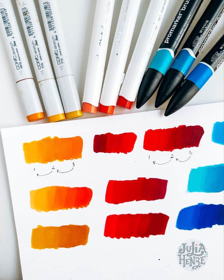
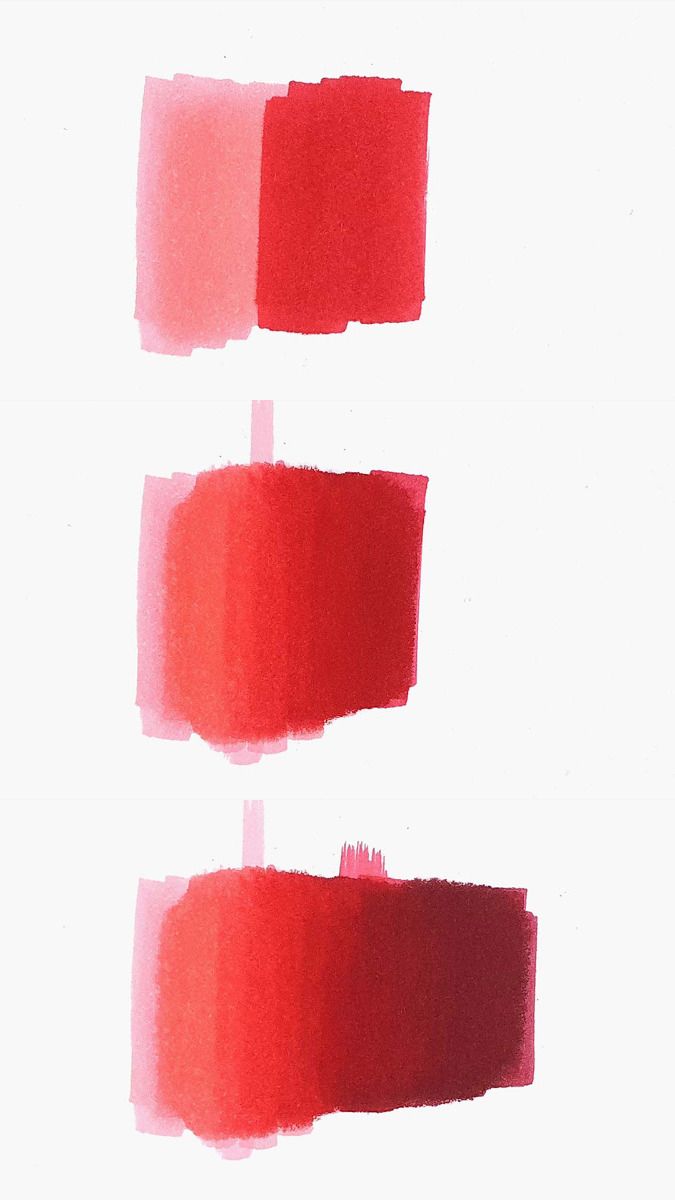
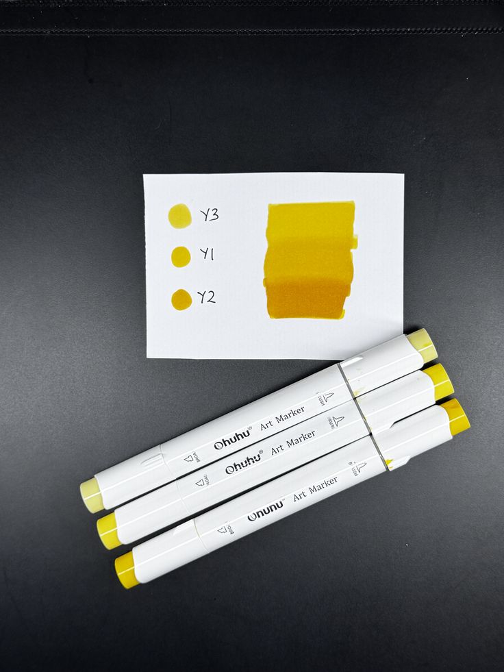
Creating a smooth color gradient, like a sunset sky or a shaded sphere, is a fantastic way to show off the blending power of alcohol markers.
- Start with Light: Apply your lightest color over the entire area you want to gradient.
- Introduce Mid-Tone: From one end of the area, apply your mid-tone color, blending it into the lighter one by overlapping.
- Add Darkest Tone: From the same end, add your darkest color, overlapping it into the mid-tone and ensuring it blends.
- Go Back and Forth: You might need to go back with your mid-tone or even the lightest color to smooth out any transitions and remove harsh lines. The key is to work quickly while the previous layers are still somewhat active.
Embracing No-Line Art
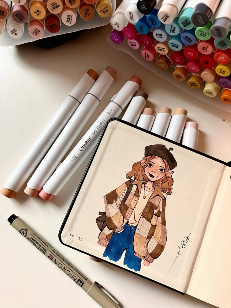
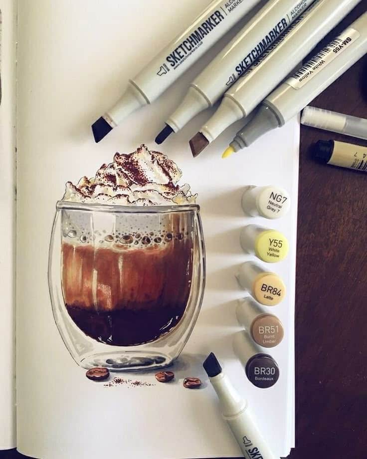
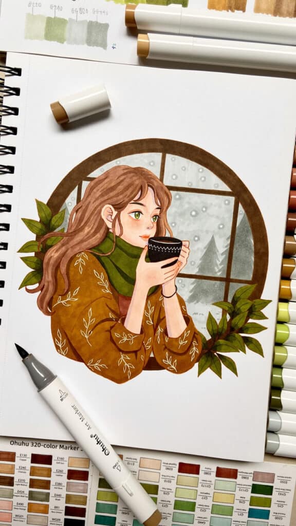
A popular style with alcohol markers is “no-line” art. Instead of using black outlines, you create your lines and shading purely with color.
- Light Sketch: Start with a very faint pencil sketch.
- Erase Lightly: Once your sketch is clear, use a kneaded eraser to lighten the lines significantly, so they’re barely visible.
- Color and Define: Use your markers to color the illustration, using slightly darker shades of the base color to create “lines” and define edges and shadows. For example, if you’re drawing a leaf, use a darker green to define its veins and edges.
- Subtle Detail: This technique results in a softer, more painterly look, which is incredibly charming. If you want to refine your characters for this style, exploring stylized portrait drawing variations can provide excellent inspiration.
Beyond the Basics: Advanced Tips & Tricks
Once you’re comfortable with the fundamentals, it’s time to push your skills further. These tips will help you add more complexity, realism, and personal flair to your marker art.
Understanding Color: Theory in Practice
You don’t need a degree in art history, but a basic grasp of color theory will transform your work.
- Warm and Cool Colors: Understand how warm colors (reds, oranges, yellows) tend to advance and cool colors (blues, greens, violets) tend to recede. Use this to create depth.
- Complementary Colors: Colors opposite each other on the color wheel (e.g., red and green, blue and orange). A small touch of a complementary color in a shadow can make the main color pop.
- Limited Palettes: Sometimes, using fewer colors can force you to be more creative with blending and layering, leading to more harmonious results.
- Harmonious Color Schemes: Experiment with analogous colors (next to each other on the color wheel) for calm, cohesive pieces, or triadic colors (evenly spaced) for vibrant, balanced compositions.
Textural Play
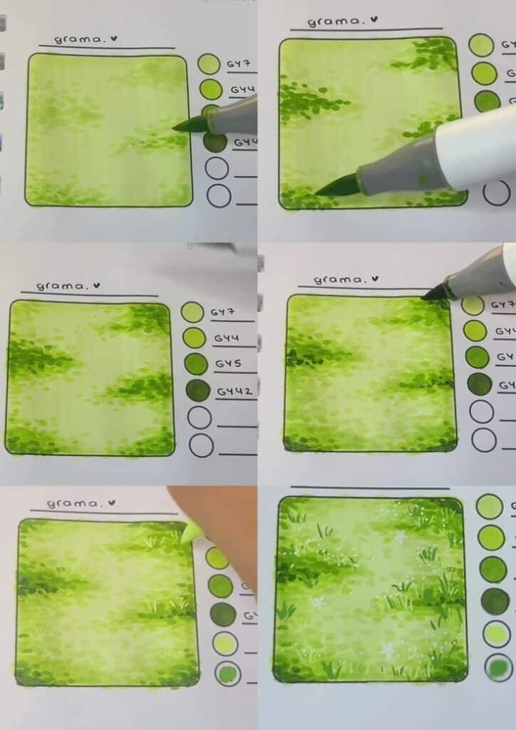
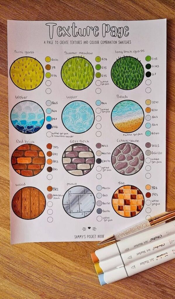
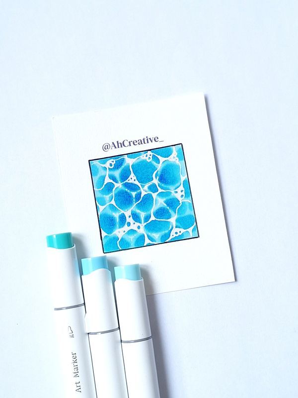
Alcohol markers might seem too smooth for texture, but with a little ingenuity, you can achieve amazing effects.
- Stippling: Use the tip of your marker to create tiny dots. Denser dots create darker, more textured areas. Great for rough surfaces, stone, or even skin texture.
- Cross-Hatching: Build up tone and texture with overlapping sets of parallel lines. Different angles and density create varied effects.
- Flicking/Dashing: Use quick, short flicks of the marker to simulate grass, fur, or wood grain.
- Rubbing Alcohol: For truly unique effects, try dropping a tiny bit of rubbing alcohol onto wet marker ink on your paper. It will push the ink, creating interesting speckled or mottled textures. Experiment on scrap paper first!
Bringing Dimension: Lighting and Shadows
Good lighting and shadow work are what make flat drawings come alive.
- Establish a Light Source: Decide where your light is coming from before you start. This dictates where highlights and shadows will fall consistently.
- Form Shadows: These are the shadows on the object itself, caused by its form turning away from the light.
- Cast Shadows: These are the shadows an object throws onto another surface. Remember they aren’t just dark blobs – they should reflect the shape of the object casting them and also pick up subtle reflected light from their surroundings.
- Reflected Light: Even in shadow, objects often catch a bit of light reflected from nearby surfaces. Don’t make your shadows completely flat and dark.
Project Ideas to Spark Your Creativity
Ready to put your newfound skills to the test? Here are some fun ideas to get you started, ranging from simple to more intricate.
Simple Illustrations
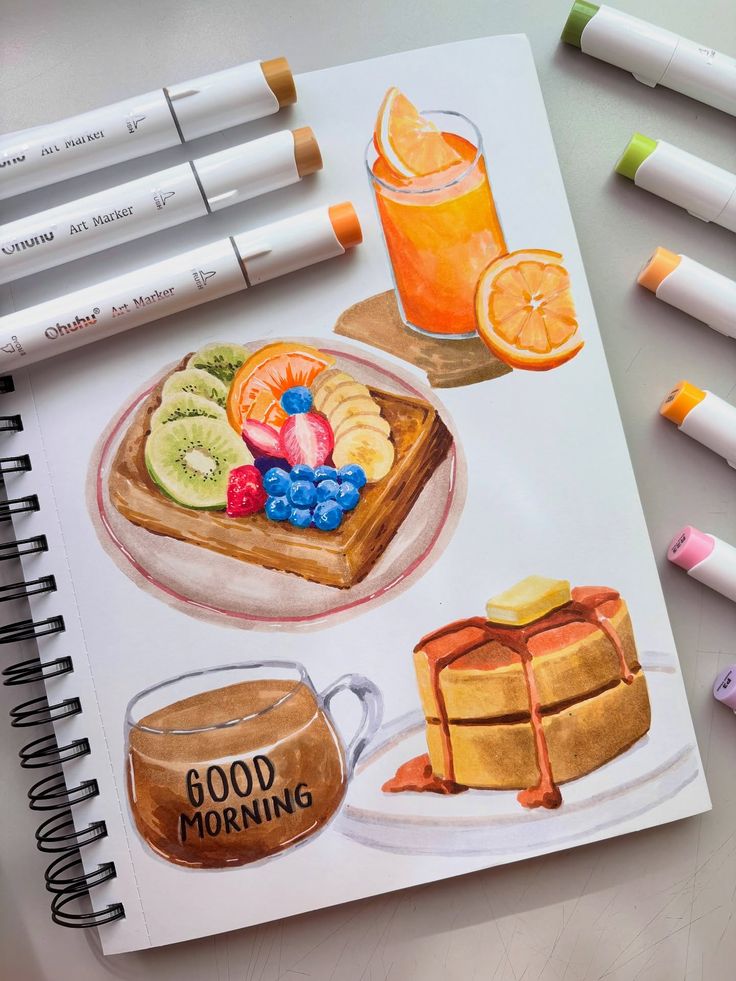
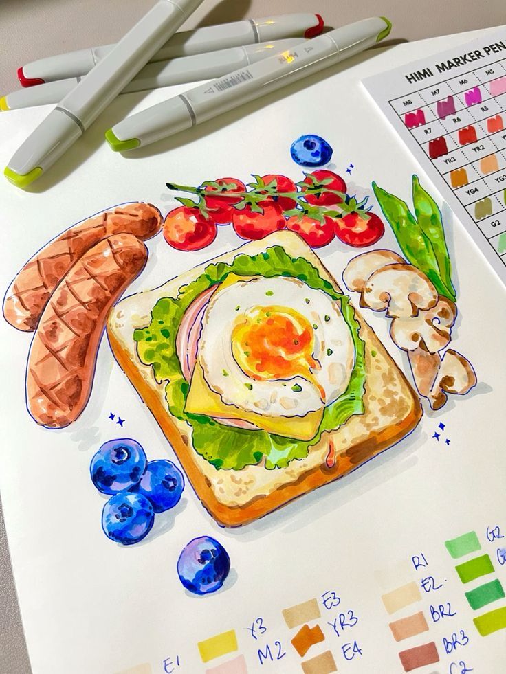
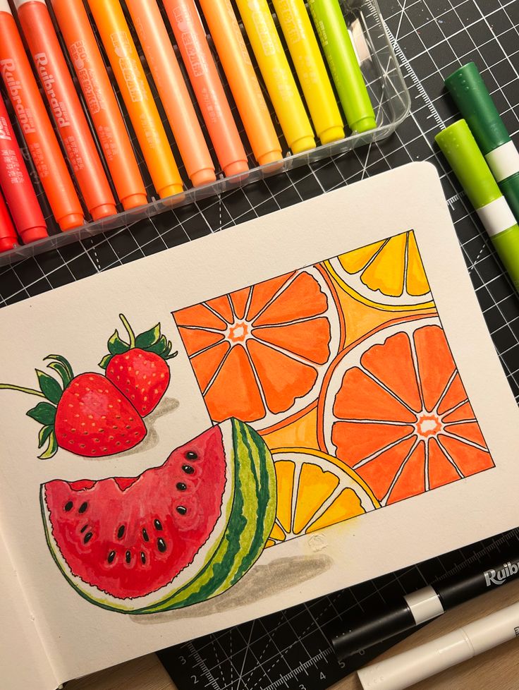
- Cute Animals: Start with basic shapes and gradually build up your favorite critters. From a whimsical fox to a sleepy cat, animals are great for practicing fur texture and blending. Our article on animal watercolor might inspire some color palettes.
- Everyday Objects: A coffee mug, a succulent plant, a stack of books – these are fantastic for practicing light, shadow, and simple forms. Focus on making them look three-dimensional.
- Food Illustrations: Think vibrant fruits, delicious pastries, or a gourmet burger. The varied textures and colors are perfect for marker work.
Nature’s Beauty: Botanical & Landscape Art
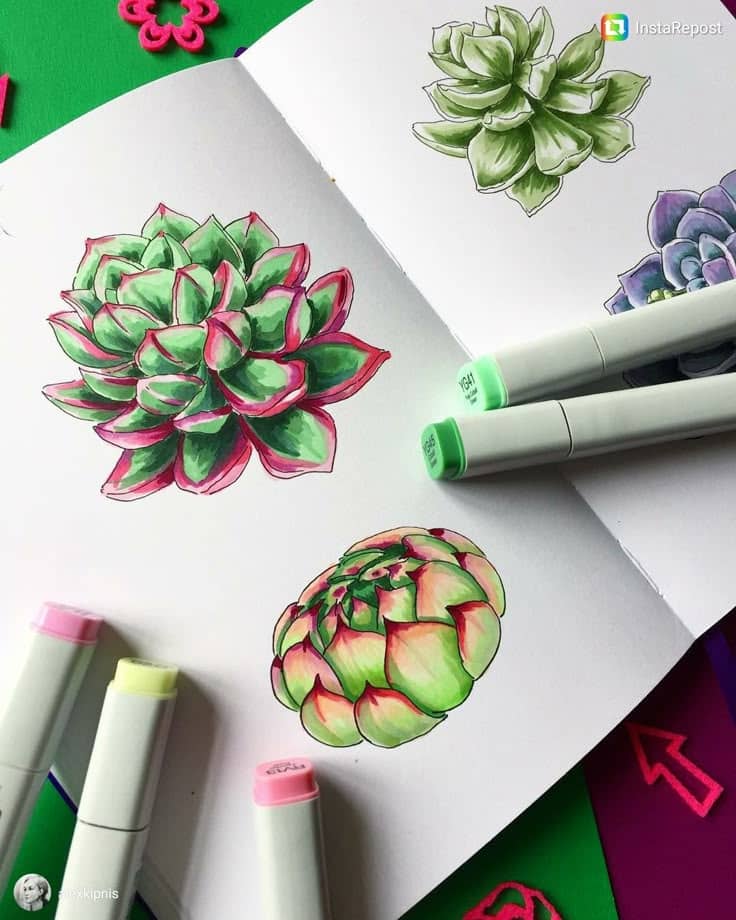
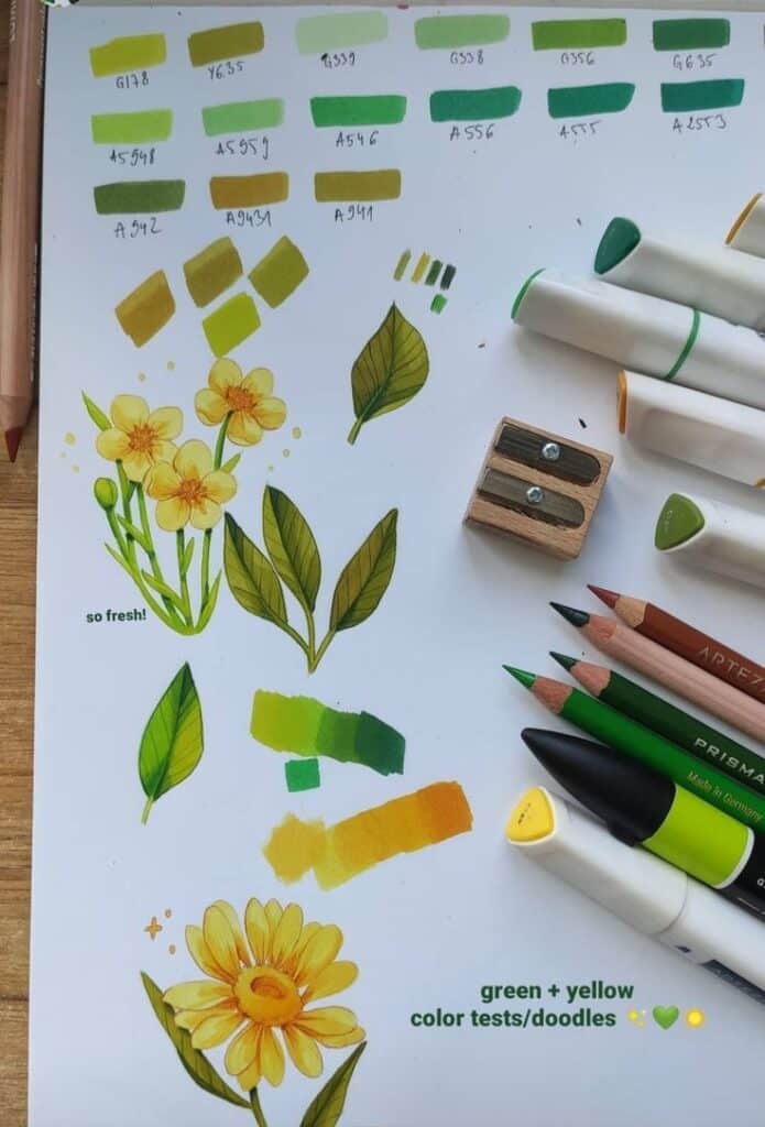
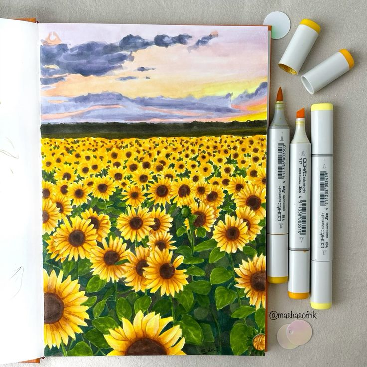
- Flowers and Foliage: The smooth blending of alcohol markers is perfect for petals, leaves, and stems. Experiment with different shades of green for depth in foliage. You can even try recreating concepts from our forest art concepts guide using markers.
- Landscapes: From rolling hills to a serene sunset, alcohol markers can capture the vibrant hues and soft transitions of natural scenes. Start with a simple horizon and build up layers for sky, land, and water.
- Clouds: Practice soft, fluffy clouds by layering light grays and blues and using your blender to soften edges.
Character Creations
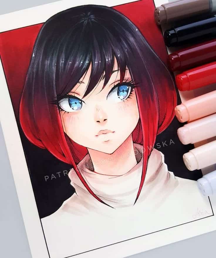
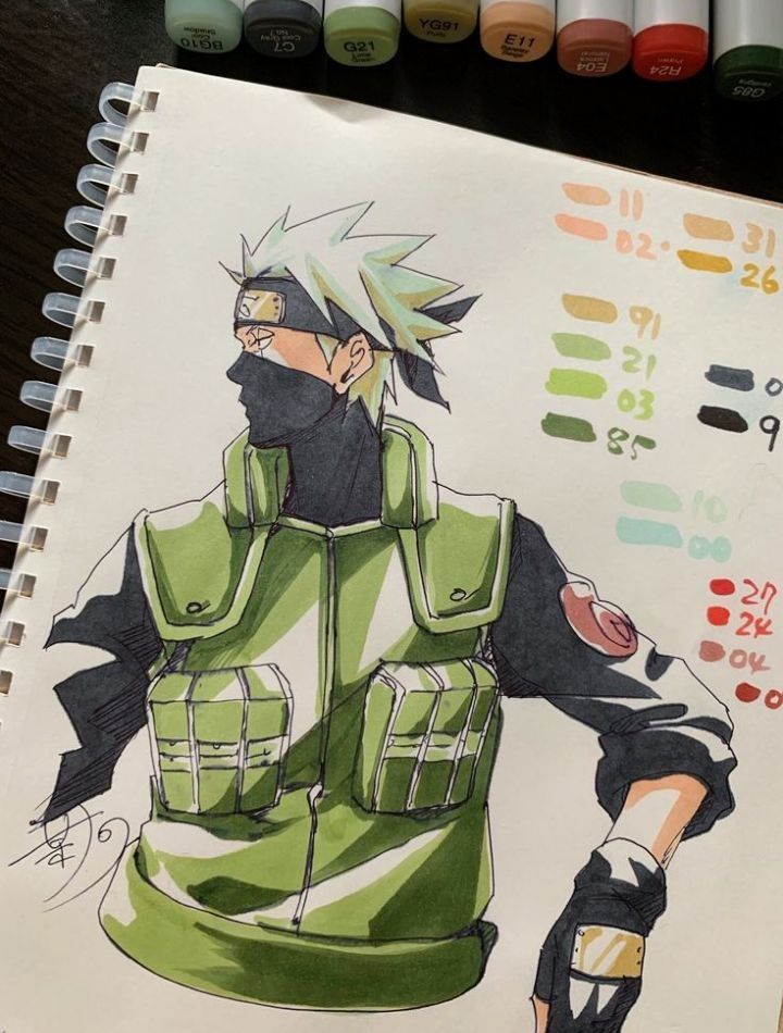
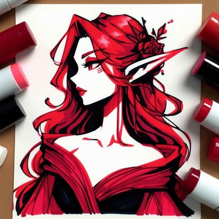
- Anime/Manga Characters: Alcohol markers are a go-to medium for many anime and manga artists due to their vibrant colors and ability to create smooth skin tones and hair gradients. Mastering various anime sketching techniques can give you a solid foundation for this.
- Fantasy Characters: Give your elves, wizards, or superheroes stunning color and depth. Focus on skin tones, flowing capes, and intricate armor.
- Stylized Portraits: Move beyond traditional portraits and explore exaggerated features, bold colors, and unique styles. This is where your creativity can really shine.
Design with Markers
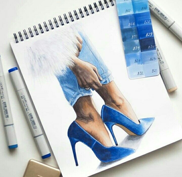
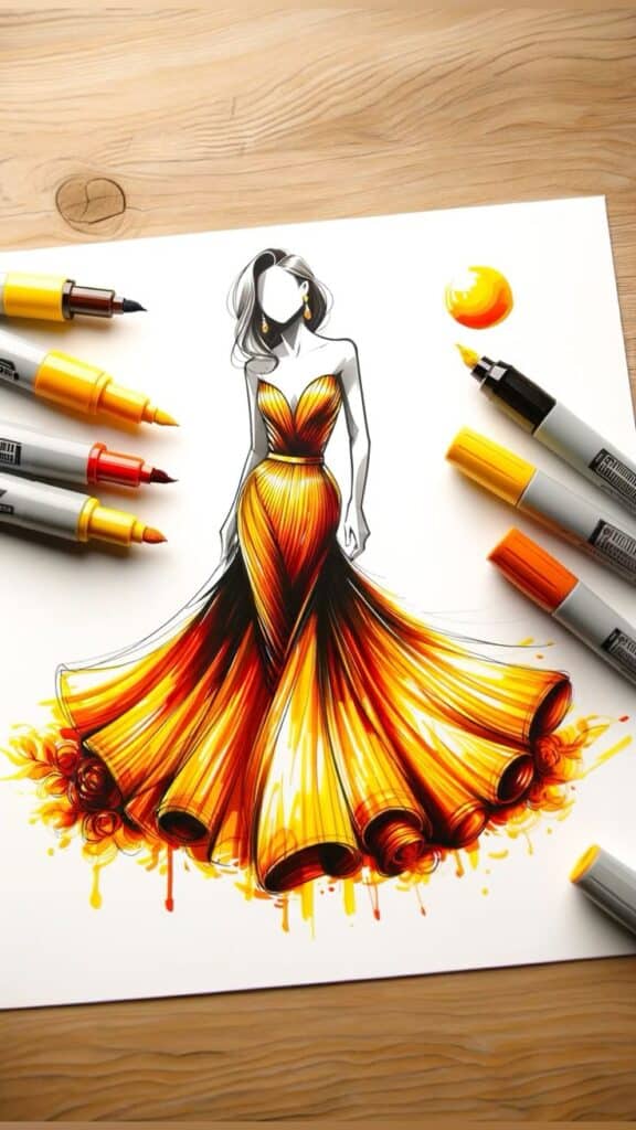
- Fashion Sketches: Alcohol markers are a favorite among fashion designers for quickly rendering fabrics, textures, and drapes. Practice drawing clothes on croquis to see how different marker strokes mimic silk, denim, or velvet.
- Product Design: Illustrate product concepts with smooth shading and vibrant colors that make them pop.
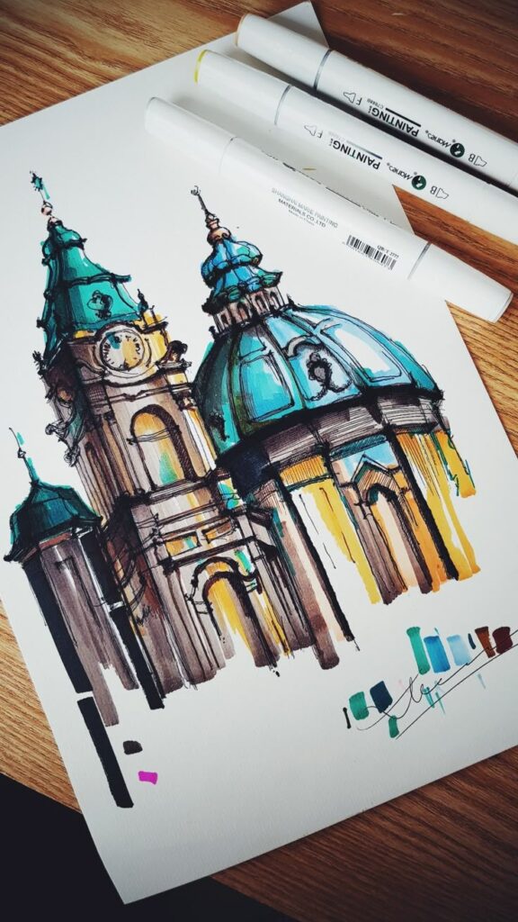
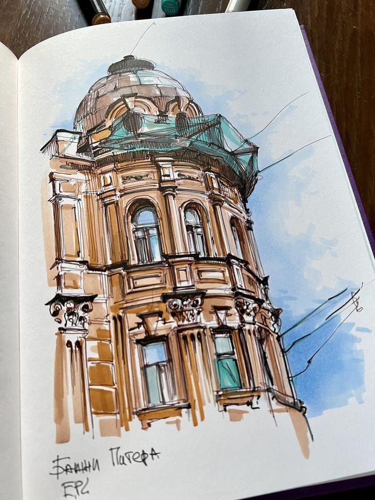
- Architectural Renderings: Markers can be used to quickly add color and texture to architectural sketches, giving them a professional finish.
Troubleshooting Common Alcohol Marker Hurdles
Even experienced artists encounter little hiccups. Knowing how to handle common issues will save you frustration and improve your results.
Tackling Streaks
Ah, streaks! The bane of many a marker artist. Streaks happen when the ink doesn’t flow evenly or dries before you can blend it out.
- Work Fast: Alcohol markers dry quickly, so apply your ink swiftly and efficiently, especially in large areas. Don’t dither.
- Saturate Evenly: For large areas, make sure you’re applying enough ink. Don’t be shy! A well-saturated, single pass is often better than multiple light, uneven passes.
- “Colorless Blender” Overlap: When blending two colors, make sure your overlap area is sufficiently wet. For large, single-color areas, you can sometimes use your lightest marker or a colorless blender to “wet” the paper just ahead of your main color to help it flow more smoothly.
- Use the Broad Nibs: For covering larger areas, use the chisel or broad nib for consistent coverage.
Stopping the Bleed
“Bleeding” means the ink seeps beyond the lines you intended.
- Paper Choice is Key: As mentioned, good marker paper or Bristol board is your first line of defense.
- Don’t Over-Saturate Edges: Be careful not to apply too much ink right up to your outline, especially if your paper isn’t perfectly bleed-proof. Leave a tiny, tiny gap, then let the ink naturally spread to the line.
- Outline Last (Sometimes): If you’re using a black fine liner, sometimes it’s better to do your marker work first, let it dry, and then add your outlines. This prevents the marker ink from bleeding into and muddying your fine lines.
- Protective Sheet: Always have that scrap paper or plastic sheet under your work to protect your table.
Conclusion
So there you have it – a casual guide to the wonderfully colorful world of drawing with alcohol markers! From understanding their unique blending power to gathering your essential toolkit, mastering basic techniques, and even troubleshooting common issues, you’re now equipped to embark on your creative journey.
What makes alcohol markers so exciting is their incredible versatility. They bridge the gap between drawing and painting, offering the vibrant intensity of dyes with the precision of a pen. Whether you’re aiming for photorealistic depth, bold graphic illustrations, or whimsical character art, these markers are an absolute joy to use.
The key to unlocking their full potential, like with any artistic medium, is practice and experimentation. Don’t be afraid to try new techniques, mix colors in unexpected ways, or even make “mistakes” – often, those lead to the most interesting discoveries. So, grab your markers, find some good paper, and let your imagination run wild. You’re not just drawing; you’re creating vibrant, seamless worlds, one beautiful blend at a time. The only limit is your creativity, so go forth and have fun!
What are some essential tools to improve alcohol marker art?
Key accessories include a colorless blender marker for blending and lightening, waterproof fineliners for details, white gel pens for highlights, good quality sketching pencils, kneaded erasers, and protective sheets to prevent bleed-through.
How do alcohol markers blend colors so seamlessly?
They blend seamlessly because the dye-based ink in alcohol markers is reactivated by the alcohol solvent, allowing the colors to merge beautifully, much like watercolor, but with greater control.
What makes alcohol markers different from water-based markers?
Alcohol markers flow more smoothly, allow seamless blending, dry faster, and do not pill or damage the paper like water-based markers, giving artists more control and vibrant results.
Why are alcohol markers so popular among artists?
Alcohol markers are popular because they offer vibrant, smooth color blending, quick drying times, and excellent control, making them ideal for professional-looking artwork and easy for beginners to use.
What should I consider when choosing paper for alcohol markers?
You should choose marker-specific paper or smooth Bristol board that can handle the ink without bleeding or warping, as regular paper is too thin and absorbent for alcohol markers.
- 1.3Kshares
- Facebook0
- Pinterest1.3K
- Twitter0
- Reddit0

