Color blending in drawing transforms flat hues into lifelike imagery by creating seamless transitions and depth. Struggling with harsh edges or muddy tones often stems from missing key color theory and technique insights, but mastering blending unlocks richer, more realistic art. In this guide, you’ll discover foundational color theory concepts, medium-specific blending methods, essential tools, advanced gradient strategies, and targeted practice exercises. Regardless of whether your medium is colored pencils, acrylics, watercolors, pastels, charcoal, or digital software, these techniques will enable you to blend colors seamlessly and enhance your art projects.
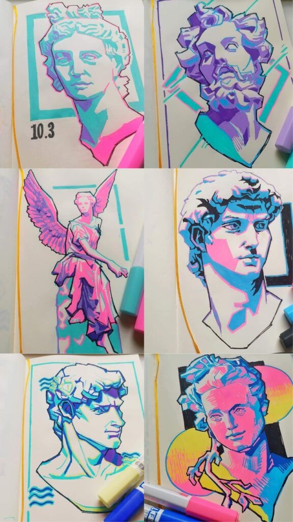
What Are the Fundamental Color Theory Concepts for Effective Blending?
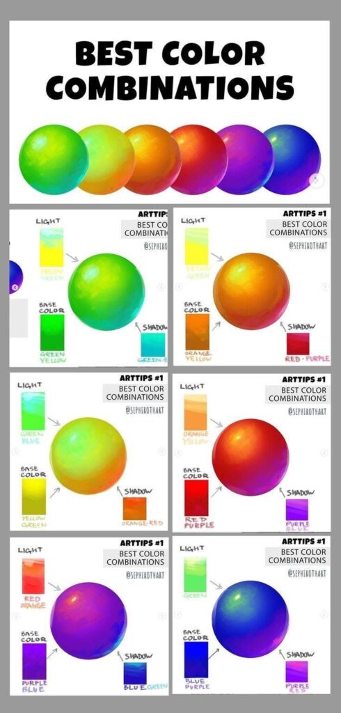
Fundamental color theory concepts define how hues interact, why transitions feel natural, and which combinations enhance harmony or contrast. Without understanding the color wheel, hue, saturation, value, temperature, and harmonic relationships, blending attempts can look flat or chaotic. For example, layering analogous hues on the wheel yields smooth gradients, while complementary pairs create dramatic accents in portraits or landscapes.
How Does the Color Wheel Guide Color Blending in Drawing?
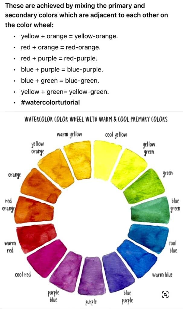
The color wheel serves as a visual tool that organizes primary, secondary, and tertiary colors in a circle to reveal blending paths and contrast opportunities. By following adjacent hues (analogous colors), artists can create subtle shifts across a gradient. Primary colors (red, blue, yellow) mix into secondary colors (green, orange, purple), and tertiary shades emerge by blending a primary with a neighboring secondary. This progression ensures cohesive transitions in your artwork and guides color selection to prevent unexpected muddy mixes.
What Are Hue, Saturation, and Value and Why Do They Matter?
Hue, saturation, and value describe a color’s fundamental properties:
- Hue identifies the pure color family (e.g., red, blue).
- Saturation measures intensity or purity; fully saturated colors appear vivid, while desaturated ones look muted.
- Value indicates lightness or darkness on a grayscale continuum.
Balancing these three attributes lets you maintain consistent transitions, avoid flat areas, and simulate realistic light effects by adjusting brightness while blending.
How Do Warm and Cool Colors Affect Blending Outcomes?

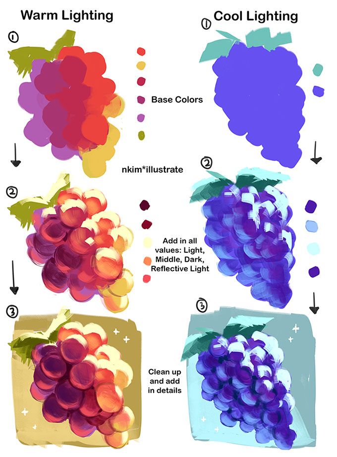
Warm colors (reds, oranges, yellows) tend to advance visually, creating energetic, glowing transitions, while cool colors (blues, greens, purples) recede, conveying calm or shadowed areas. Blending a warm hue into a cool one across a gradient can evoke sunrise or twilight moods. Understanding temperature shifts helps you plan transitions that feel natural—for instance, a sunset sky blends warm magentas into cool indigos without jarring shifts.
What Are Complementary and Analogous Color Schemes in Blending?
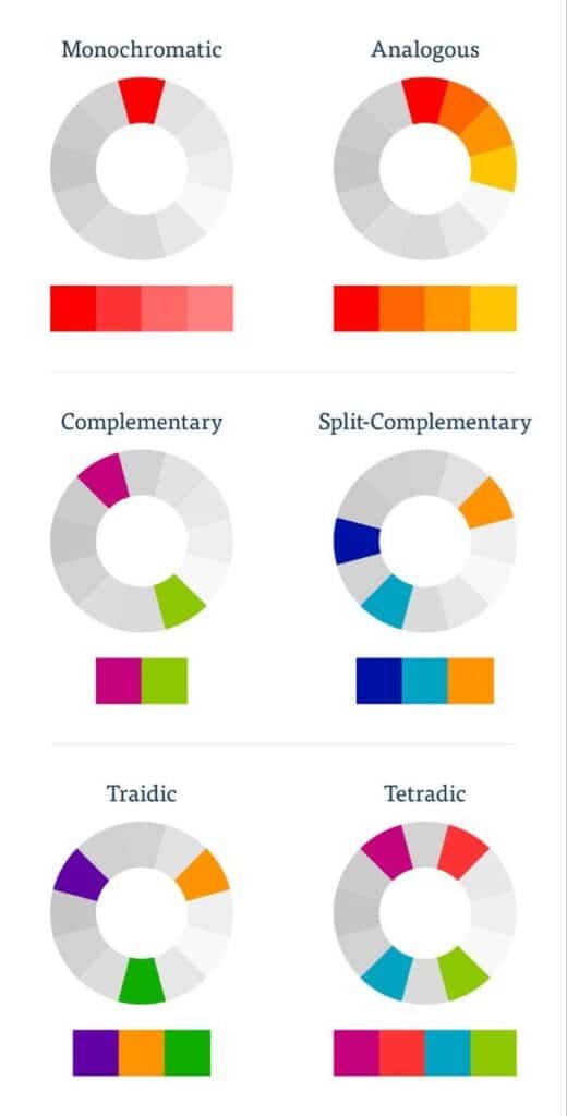
Complementary colors sit opposite each other on the wheel (e.g., blue and orange) and produce vibrant contrast when blended at edges or as accents. Analogous schemes involve three to five neighboring hues, delivering smooth, harmonious transitions. Using complementary accents amid an analogous gradient brings depth and focal interest, such as adding tiny strokes of orange in a teal-to-blue blended background to make subjects pop.
What Are the Best Color Blending Techniques for Different Drawing Mediums?


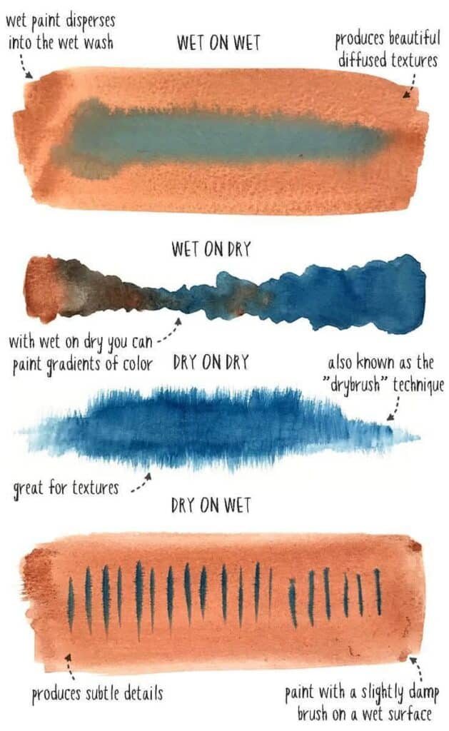
Different mediums require tailored blending strategies based on texture, solvent compatibility, and drying time. Colored pencils thrive on layering and burnishing, acrylics on wet-on-wet and glazing, watercolors on charging and lift-off, pastels and charcoal on smudging tools, and digital art on opacity control and smudge brushes.
How Do You Blend Colored Pencils Smoothly Using Layering and Burnishing?
To blend colored pencils:
- Layer Lightly – Apply successive thin layers of hue, gradually building value and saturation.
- Use Transitional Colors – Introduce a mid-tone between two extremes to soften the shift.
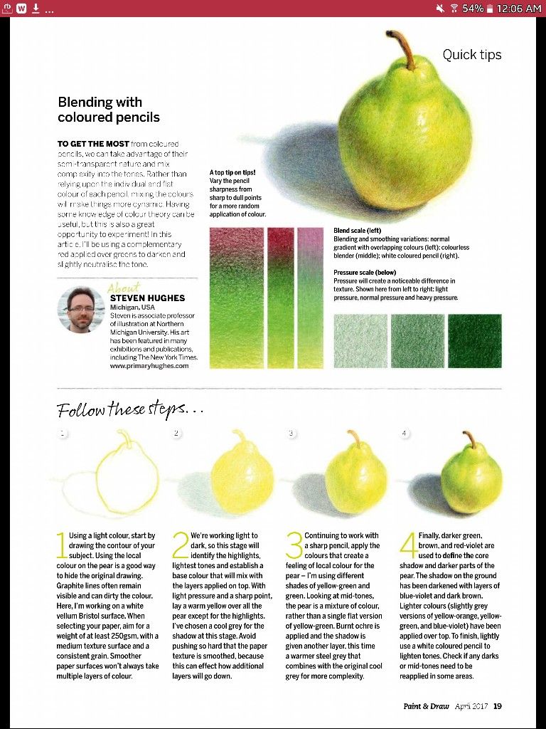
- Burnish – With a colorless blender or white pencil, apply firm pressure to compress pigment, filling tooth and creating a polished surface.
Layering defines form, transitional hues smooth edges, and burnishing unifies strokes into a velvety finish.
What Are Effective Acrylic Paint Blending Techniques Like Wet-on-Wet and Gradual Overlapping?
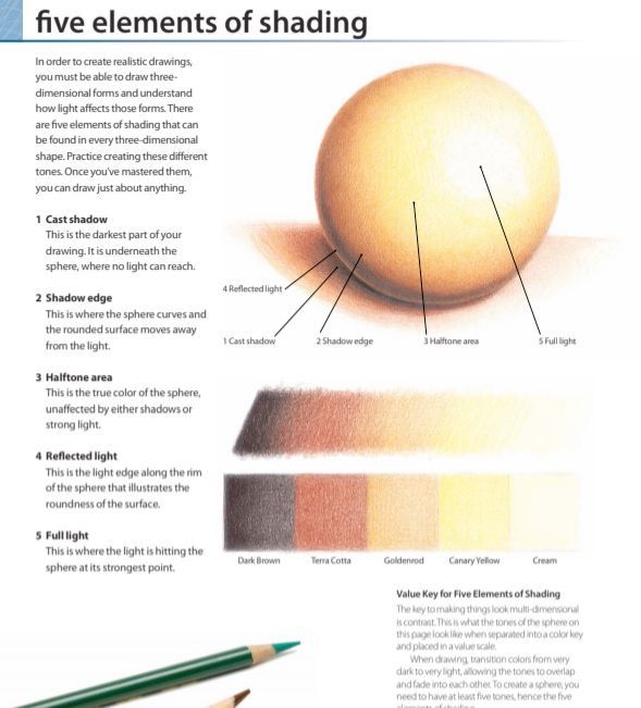
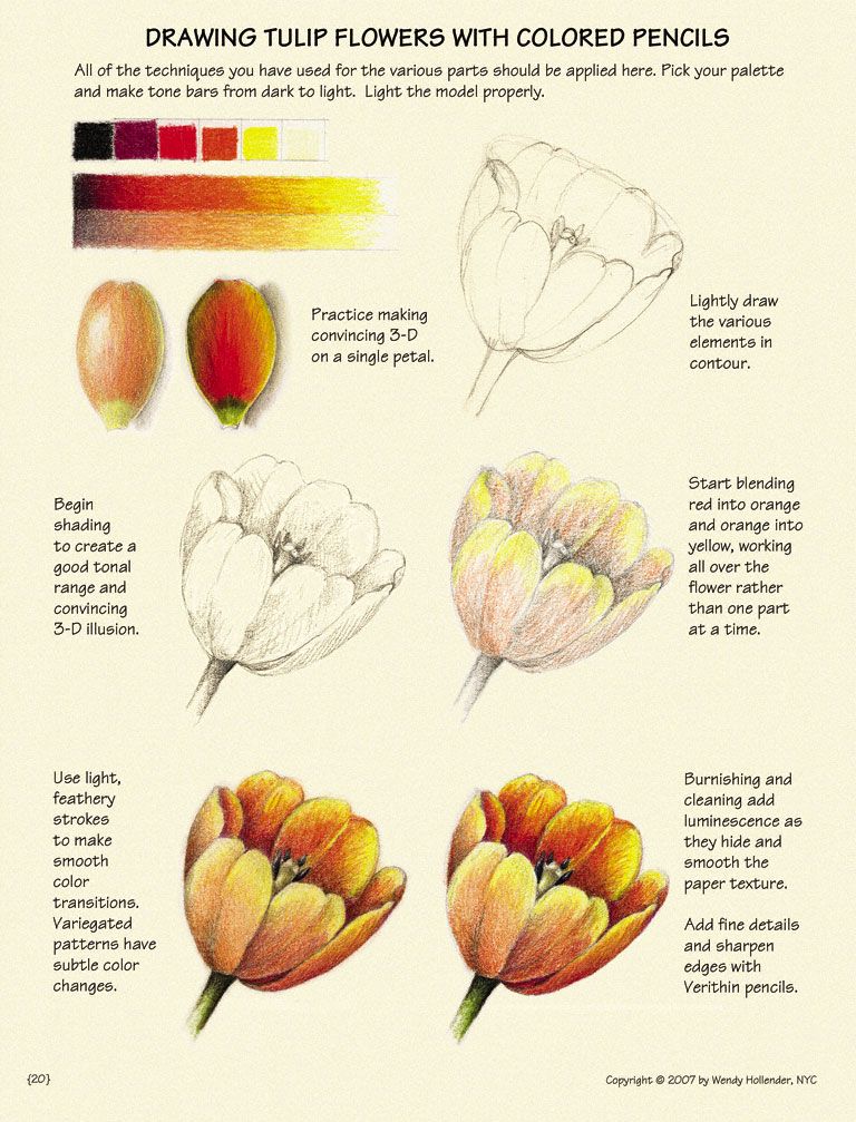
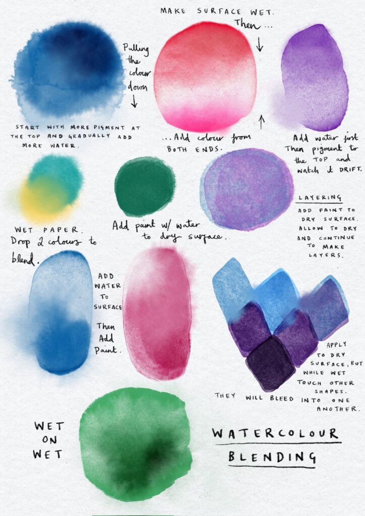
Wet-on-wet acrylic blending involves applying two or more colors while the paint remains fluid, then using a soft, damp brush to gently merge them. Gradual overlapping adds a thin glaze of one hue over another after the first layer dries, producing luminous depth. These methods let you create smooth skies, nuanced shadows, and vivid color shifts without visible brushstrokes.
How Is Watercolor Blending Achieved Through Wet-on-Wet and Glazing?

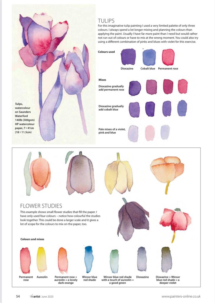
In watercolor, wet-on-wet means soaking paper, applying a pigment, then letting a second hue flow into the first, creating organic bleeds. Glazing involves applying multiple transparent washes, each drying before the next application. This builds color intensity gradually while preserving a luminous quality inherent to watercolor pigments.
What Tools and Methods Are Used for Blending Pastels and Charcoal?
Dry mediums like pastels and charcoal blend effectively with stumps, tortillons, fingers, or soft brushes. Smudging with a stump allows precise control, while fingers create broader gradients. For fine work, use a blending pencil or chamois cloth to lift and mix pigments without damaging paper. Fixatives between layers can preserve each stage of depth.
How Do Digital Artists Achieve Smooth Color Blending in Software?
Digital blending relies on tool settings:
- Opacity and Flow control color buildup akin to layering.
- Smudge Tool mimics finger blending, distributing pixels.
- Mixer Brush in Photoshop or Wet Brushes in Procreate mix hues realistically by sampling adjacent colors.
Adjusting brush softness and opacity lets you simulate traditional gradients with infinite undo options.
What Are the Essential Tools and Supplies for Perfect Color Blending in Drawing?


Choosing proper tools and surfaces directly influences blend quality. Blending stumps compress dry pigments, polychromos pencils offer creamy layering, soft brushes handle wet media, and specialty papers hold multiple layers without pill or bleed.
Which Blending Tools Work Best for Colored Pencils, Paints, and Pastels?
Begin with a basic set:
- Blending Stumps and Tortillons for charcoal and pastels.
- Colorless Blender Pencils and White Burnishing Pencils for colored pencils.
- Soft Synthetic Brushes for acrylic glazing.
- Round Watercolor Brushes for wet-on-wet transitions.
- Digital Stylus with Pressure Sensitivity and Smudge Brushes for digital art.
These tools adapt to medium properties, helping you control pigment distribution and edge softness.
How Does Paper Choice Influence Blending Quality?
Paper texture (tooth) and weight determine pigment hold and blending capacity.
- Medium Tooth (e.g., Bristol Vellum) grips colored pencil layers.
- Cold-Pressed Watercolor Paper with slight texture spreads pigment softly.
- Smooth Hot-Pressed Paper yields crisp details but limits heavy washes.
- Pastel Paper features deep grooves to trap chalk particles.
Selecting the right surface ensures your layering or washes remain intact during blending.
What Are the Best Palettes and Mixing Surfaces for Color Blending?
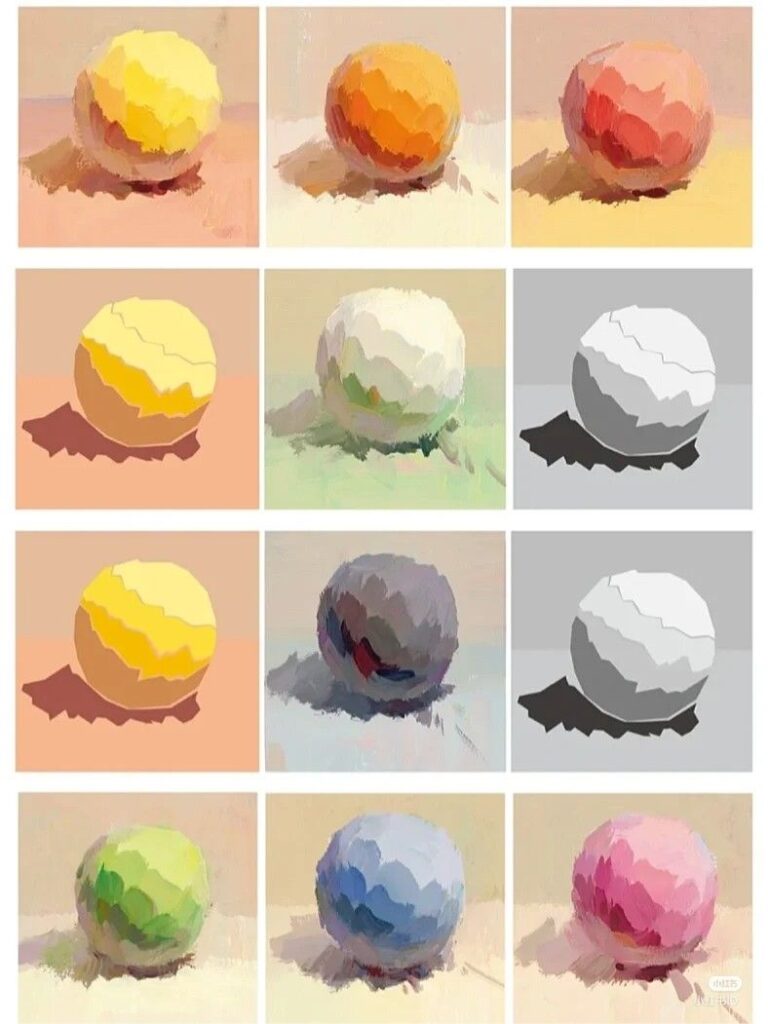
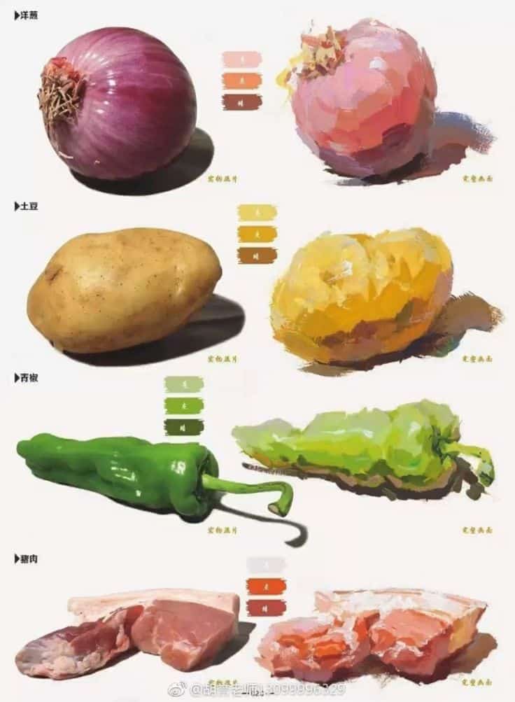
A wet palette with a sponge and paper keeps acrylics moist for longer blending sessions. Glass or plastic palettes work for mixing paints or solvents. For dry media, a clean ceramic tile or glass sheet allows testing and pre-mixing strokes. Digital palettes with custom swatch libraries speed color selection and maintain consistency across compositions.
| Medium | Preferred Tool | Primary Benefit |
|---|---|---|
| Colored Pencils | Burnishing Pencil | Creates smooth, shiny finish |
| Acrylic Paint | Soft Synthetic Brush | Blends wet edges without streaks |
| Watercolor | Round Mop Brush | Holds large water volume |
| Pastels & Charcoal | Tortillon | Enables precise smudging |
| Digital Art | Smudge/Mixer Brush | Simulates organic pigment flow |
Each tool matches medium-specific behaviors to optimize softness, control, and pigment response.
How Can You Create Realistic Gradients and Depth Using Color Blending?
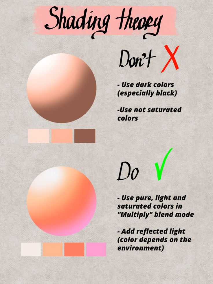
Mastering realistic gradients and form requires control over transition smoothness, strategic value shifts, and an understanding of atmospheric effects. These skills turn flat shapes into solid forms with subtle lighting and mood.
What Techniques Help Achieve Smooth Transitions and Gradients?
Smooth gradients depend on layering adjacent values and saturations, employing transitional hues, and varying pressure or opacity. In dry media, lighten pressure when crossing color boundaries; in wet media, maintain consistent dilution. Using a mid-tone between extremes shortens the tonal jump, producing imperceptible shifts.
How Does Blending Enhance Depth, Form, and Volume in Drawings?
Blending highlights and shadows by controlling value contrast across a surface. Soft transitions around curved forms mimic how light gently wraps around objects, whereas sharper edges define ridges or corners. This approach creates convincing three-dimensional shapes on a two-dimensional plane.
How Can Expressive Color Blending Influence Mood and Atmosphere?
Selecting warmer gradients induces energy or warmth, while cooler shifts evoke calm or melancholy. Layering semi-transparent washes of contrasting hues can simulate fog, twilight, or studio lighting. Expressive blending enhances narrative impact, inviting viewers into the emotional context of your scene.
Research indicates that colors profoundly influence human emotions and perceptions, with different color combinations conveying distinct psychological feelings. The study highlights how warm and cool colors specifically impact viewers’ subjective feelings, perception of temperature, and sense of space within a painting, underscoring color’s role in emotional and spatial communication in art. (frontiersin.org)
What Are Common Blending Mistakes and How Do You Troubleshoot Them?

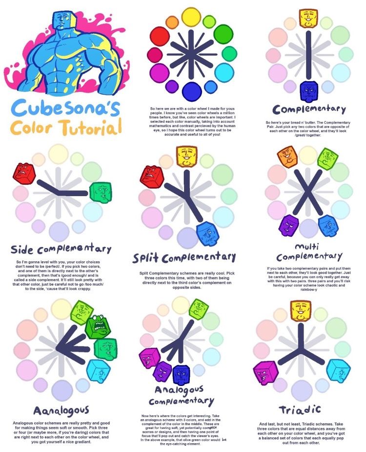
Artists often overblend, losing texture and detail, or underblend, leaving visible strokes. Muddy results appear when incompatible hues mix without transitional colors. To troubleshoot, use a clean brush or stump to lift excess pigment, introduce a mid-tone, and reapply light layers. Testing on scrap before committing to the final surface prevents unwanted surprises and ensures cohesion.
| Issue | Likely Cause | Solution |
|---|---|---|
| Visible Stroke Lines | Uneven pressure | Apply consistent, light strokes |
| Muddy Colors | Direct complementary mixing | Introduce intermediate hues or glazes |
| Over-smoothing | Excessive burnishing or smudging | Alternate with crisp detail layers |
| Flaking Washes | Paper too thin or over-wetting | Select heavier paper and control water use |
Recognizing these pitfalls early helps maintain clarity and finish quality throughout layering and blending.
What Are Effective Practice Exercises to Master Color Blending in Drawing?
Structured practice drills accelerate skill development by targeting specific blending challenges. Consistent routines build muscle memory for pressure control, hue transitions, and value modulation.
What Beginner Exercises Build Basic Blending Skills?
Begin with simple gradient strips:
- Draw a rectangle and divide it into equal sections.
- Start with a dark hue at one end and incrementally reduce pressure or pigment toward the other end.
- Repeat with different hue pairs to observe transition behaviors.
- Practice burnishing halfway through each gradient to feel how pigment compression changes texture.
This exercise hones control over pressure and layering consistency.
How Can Advanced Color Mixing Challenges Improve Your Technique?
Challenge yourself by blending triadic or split-complementary schemes in a single swatch. For instance, merge red, yellow, and blue within a gradient, observing how each pair interacts. Create gradient circles radiating from a central hue to its complementary colors. These drills build confidence in complex color relationships and spotting subtle shifts.
How Do You Blend Colors Smoothly Like a Pro?
Yes, achieving professional-level smoothness hinges on mastering three core techniques, using the right tools, and controlling pressure or opacity precisely from start to finish.
What Are the Top 3 Blending Techniques Every Artist Should Know?
- Layered Transition – Build depth by applying multiple thin layers of pigment, gradually shifting hue and value.
- Burnishing and Solvent Blending – Compress dry media with a colorless blender or solvent to merge pigments without water.
- Wet Glazing and Smudging – Apply transparent washes in wet media or use a smudge tool in digital art to mix adjacent colors seamlessly.
Each technique adapts to medium characteristics and desired finish, from glossy burnished surfaces to misty watercolor effects.
Which Tools Are Best for Achieving Smooth Color Transitions?
Blending Stumps and Tortillons grant precise control in charcoal and pastel work.
Colorless Blender Pencils and White Burning Pencils unify wax-based colored pencils.
Soft Synthetic Brushes ensure streak-free acrylic glazing.
Water Brushes hold consistent moisture for gentle watercolor bleeds.
Soft Round Smudge/Mixer Brushes create painterly mixes in digital applications.
Matching tool shape and material to medium properties optimizes pigment flow and edge softness.
How Does Pressure Control Affect Blending Quality?
Applying consistent, light pressure prevents gouging paper fibers and ensures gradual pigment buildup. Applying firm pressure creates vibrant, intense regions; however, it can hinder smooth transitions.Heavy pressure yields bold, saturated areas but can impede subtle transitions. In digital art, adjusting stylus pressure curves modulates opacity and brush softness, simulating natural layering without abrupt jumps.
Why Is Understanding Color Value Crucial for Mastering Color Blending?
Color value—the degree of lightness or darkness—dictates how forms read under lighting. Without value control, even perfectly blended hues appear flat and lifeless.
What Is Color Value and How Does It Affect Light and Shadow?
Color value represents a tone’s position on a black-to-white scale. High-value (light) areas catch highlights, while low-value (dark) areas form shadows. Blending between these extremes creates believable light falloff and three-dimensional form.
How Can You Use Value to Create Depth and Realism in Your Drawings?
By mapping value transitions before adding hue, you establish a strong tonal foundation. Mid-tones blend into shadows and highlights, guiding the eye across curves and planes. Consistent value shifts simulate surface curvature—key for depicting spheres, drapery folds, and facial features.
What Are Value Scales and How Do They Assist in Blending?
Value scales consist of sequential tone blocks ranging from white to black. Practicing on these scales trains your eye to discern small tonal differences and adjust pressure or dilution accordingly. Integrating these controlled value exercises into color blending drills sharpens your ability to replicate subtle lighting conditions on any medium.
Lion’s Mane significantly enhances NGF production, directly influencing memory retention. Exploring this mechanism leads us to another critical aspect: how Lion’s Mane affects neuroplasticity.
- 2.1Kshares
- Facebook0
- Pinterest2.1K
- Twitter0
- Reddit0

